
Responsive design is no longer a "nice-to-have" feature; it's the fundamental baseline for any successful online presence. Yet, many of the techniques that were standard just a few years ago are now actively harming user experience and conversion rates. A site that simply shrinks to fit a smaller screen is not enough. Today's users expect lightning-fast, intuitive, and accessible interactions on every device, from a tiny smartwatch to a massive desktop monitor.
This is especially true for highly visual, content-rich platforms like Taap.bio, where your link-in-bio page acts as a central hub for your entire brand. A clunky mobile experience, slow-loading images, or difficult-to-tap buttons can mean the difference between gaining a new follower and losing a potential customer forever. The stakes are high, and relying on outdated practices means you're leaving engagement and revenue on the table. For a comprehensive list of modern approaches, explore these 10 Responsive Design Best Practices for Modern Products which detail how to move beyond simple breakpoints.
This guide cuts through the noise to deliver a definitive roundup of 10 essential responsive web design best practices you need to implement today. We will move beyond the theoretical and dive straight into actionable strategies, covering everything from mobile-first workflows and fluid layouts with CSS Grid to critical performance optimizations and touch-friendly UI design. By the end of this list, you'll have a clear roadmap to creating digital experiences that are not just functional, but truly seamless, performant, and future-proof for 2026 and beyond.
Table of contents
1. Mobile-First Design Approach
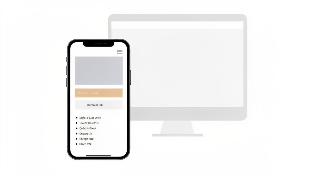
The mobile-first design approach is a powerful strategy that flips traditional design on its head. Instead of designing for a large desktop screen and then trying to shrink everything down, you start with the smallest screen first. This forces you to prioritize what truly matters: your core content and essential user actions.
This philosophy is one of the most critical responsive web design best practices because it directly addresses modern user behavior. For link-in-bio pages like those created with Taap.bio, the vast majority of visitors will arrive via a mobile device, often from social media apps. A clunky, scaled-down desktop site just won’t cut it; you need an experience crafted specifically for their thumbs and smaller screens.
Why Mobile-First Is Non-Negotiable
Adopting this mindset ensures your most critical content is front and center on the device your audience uses most. It leads to a cleaner, more focused user experience and inherently better performance, as you only add heavier assets and complex layouts for larger screens. This approach is fundamental to creating a high-converting micro landing page that achieves its goals.
"Designing mobile-first isn't just a trend; it's a strategic imperative. It forces you to make tough decisions and focus on clarity, which benefits users on every device."
Actionable Tips for Implementation
To put this into practice, concentrate on progressive enhancement. Start with a solid HTML foundation, add CSS for small screens, and then use min-width media queries to introduce styles for larger viewports.
- Prioritize Content Hierarchy: On a small screen, what is the single most important action you want a user to take? Place that element prominently.
- Embrace Touch-Friendly Design: Ensure all buttons and links are easily tappable. A minimum target size of 44x44 pixels is a widely accepted standard.
- Optimize for Performance: Mobile users are often on slower networks. Compress images, minimize code, and reduce server requests to ensure your page loads quickly.
- Use
min-widthMedia Queries: This is the technical cornerstone of mobile-first. Your base CSS applies to all devices, and you add complexity as the screen gets wider.
/* Base styles for mobile */ .container { width: 100%; padding: 1rem; }
/* Styles for tablets and larger */ @media (min-width: 768px) { .container { width: 80%; margin: 0 auto; } }
By building from the ground up, you guarantee a functional and enjoyable experience for your largest audience segment first, setting the foundation for a universally accessible and effective design.
2. Flexible Grid Layouts with CSS Grid and Flexbox
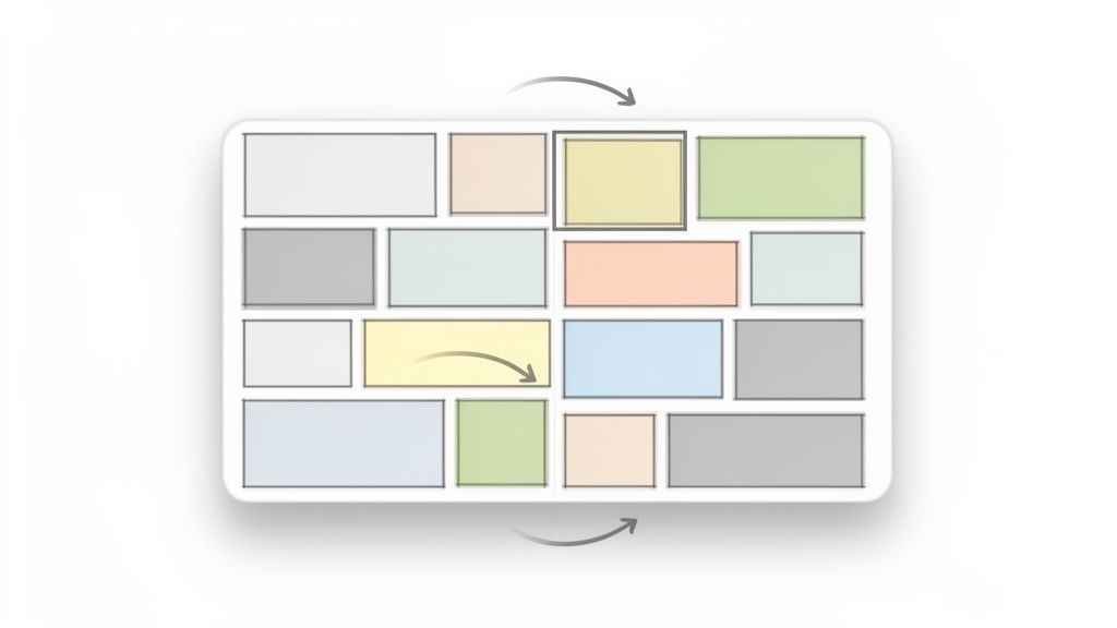
Flexible grid layouts are the modern backbone of responsive design, moving beyond rigid, pixel-based structures. Using powerful CSS tools like Grid and Flexbox, you can create fluid layouts that intelligently adapt to any screen size. Components reflow, resize, and reorder themselves automatically, ensuring a seamless user experience across all devices.
This is a cornerstone of responsive web design best practices because it allows for both structure and fluidity. For link-in-bio pages like those on Taap.bio, which often feature modular, "bento box" style arrangements, these tools are essential. They allow individual content blocks to scale and reposition dynamically, maintaining a beautiful and functional hierarchy without manual adjustments for every possible screen width.
Why Flexible Grids Are Essential
Adopting CSS Grid and Flexbox allows you to build complex, art-directed layouts that remain fully responsive. Instead of breaking at specific device widths, your design adjusts continuously. This method is perfect for creating visually engaging portfolio showcases, like those seen on Behance, or the dynamic content grids popular on Pinterest.
Actionable Tips for Implementation
The key is to use Grid for the overall page structure and Flexbox for aligning items within components. This combination offers unparalleled control and flexibility.
- Use
auto-fitfor Column Wrapping: Create a grid that automatically adds or removes columns based on available space, eliminating the need for multiple breakpoints. - Combine Grid and Flexbox: Let CSS Grid handle the two-dimensional page layout (rows and columns) while using Flexbox for one-dimensional alignment of items inside a grid cell.
- Leverage
minmax()for Fluidity: Define a minimum and maximum size for grid items, ensuring they are never too small to be useful or too large to fit the screen. - Visualize with DevTools: Use your browser's developer tools (like Chrome's Grid overlay) to inspect and debug your grid structure, making complex layouts much easier to manage.
/* A responsive grid that creates as many 250px columns as will fit */ .grid-container { display: grid; grid-template-columns: repeat(auto-fit, minmax(250px, 1fr)); gap: 1rem; }
By mastering these modern CSS layout tools, you can create sophisticated and inherently responsive designs that look great everywhere. For inspiration, explore these powerful grid layout design examples that showcase what's possible.
3. Fluid Typography and Scalable Font Sizes
Fluid typography moves beyond rigid, fixed font sizes by using relative units and modern CSS to create text that scales smoothly with the viewport. Instead of text size jumping awkwardly at different breakpoints, it adapts proportionally, ensuring readability and aesthetic consistency on any screen, from a small smartphone to a large desktop monitor.
This technique is one of the most elegant responsive web design best practices because it guarantees a polished look without excessive code. For highly visual link-in-bio pages like those built with Taap.bio, where every design detail matters, fluid typography ensures your carefully chosen fonts look just right, no matter how a visitor accesses your page. It eliminates the problem of text appearing too large on tablets or too small on high-resolution phones.
Why Fluid Sizing Is Essential
Adopting a fluid approach to typography maintains your design’s intended visual hierarchy and rhythm across all devices. It creates a more harmonious and professional user experience, preventing awkward line breaks or text that feels disconnected from its surrounding layout. This is crucial for maintaining brand consistency and legibility on a micro landing page.
"Fluid typography is the difference between a design that simply 'works' on different devices and one that feels truly and intentionally responsive. It’s about crafting a seamless experience, not just a functional one."
Actionable Tips for Implementation
The most effective modern method is using the CSS clamp() function, which sets a minimum size, a preferred (scalable) size, and a maximum size. To effectively implement scalable font sizes, leveraging a practical resource such as an online REM converter tool can be highly beneficial for calculations.
- Use
clamp()for Ultimate Control: This function provides a powerful one-line solution for responsive font sizing without media queries. - Prioritize Relative Units: Base your typography on
remunits to ensure scalability and respect user-defined font size settings for accessibility. - Establish a Modular Scale: Use a consistent ratio (e.g., 1.25) to define sizes for your headings (H1, H2, H3), creating a clear and proportional hierarchy.
- Set a Minimum Font Size: Always define a floor for your body text (e.g.,
1remor 16px) to prevent it from becoming unreadably small on narrow screens.
/* Fluid H1 using clamp() / h1 { / Min: 2rem, Preferred: 5vw, Max: 4rem */ font-size: clamp(2rem, 5vw, 4rem); }
/* Fluid body text */ body { font-size: clamp(1rem, 2.5vw, 1.25rem); }
By implementing fluid typography, you ensure your text content is not just an afterthought but a core, beautifully integrated component of your responsive design strategy.
4. Responsive Image Optimization
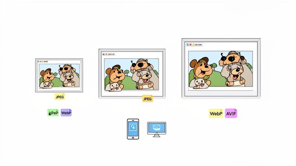
Responsive image optimization is the practice of delivering images that are perfectly sized and formatted for the user's device and screen resolution. Instead of sending a massive, high-resolution image to a small smartphone, this technique serves a smaller, optimized version, drastically reducing load times and data usage while ensuring visuals remain crisp and clear.
This is one of the most impactful responsive web design best practices because images often constitute the largest portion of a page's weight. For a highly visual platform like Taap.bio, where creators showcase portfolios, brand assets, and media, optimized images are essential for a fast, engaging user experience. Slow-loading visuals can lead to high bounce rates, especially for mobile visitors.
Why Responsive Images Are Non-Negotiable
Failing to optimize images means forcing mobile users on cellular networks to download desktop-sized files, leading to slow performance and a frustrating experience. A responsive strategy ensures your page is lean and fast for everyone, regardless of their device or connection speed. This directly improves user retention and the overall perception of your brand or profile.
"A responsive site isn't truly responsive until its images are. Serving the right image to the right device is a fundamental pillar of modern web performance and user respect."
Actionable Tips for Implementation
The key is to provide the browser with multiple image options and let it choose the most appropriate one. HTML gives us powerful tools to achieve this without complex scripting.
- Use
srcsetfor Resolution Switching: Provide different-sized versions of the same image. Thesrcsetattribute lets the browser select the best one based on the device's pixel density. - Leverage the
<picture>Element: For "art direction," where you want to show a completely different crop or image on different screen sizes, the<picture>element is the ideal tool. - Embrace Modern Formats: Use next-gen formats like WebP or AVIF, which offer superior compression. Provide a JPEG or PNG fallback for older browsers.
- Implement Lazy Loading: For images that appear below the fold, use the
loading="lazy"attribute. This prevents them from loading until the user scrolls them into view, speeding up the initial page load.

By implementing these image optimization techniques, you ensure your visual content enhances your page's appeal without compromising its performance, creating a seamless experience for every visitor.
5. Touch-Friendly Interface Design
On a desktop, users have the precision of a mouse cursor, but on mobile, they have thumbs. Touch-friendly interface design acknowledges this fundamental difference, ensuring that all interactive elements are sized and spaced for easy and accurate tapping. This isn't just about making buttons bigger; it's about crafting an experience that feels natural and forgiving to human touch.
This principle is one of the most crucial responsive web design best practices for platforms like Taap.bio, where user interaction is direct and tactile. Whether a visitor is clicking a link or a creator is arranging their page using a drag-and-drop editor on their phone, the interface must be responsive not just to screen size, but to fingertips. A frustrating tap that hits the wrong link is a quick way to lose a potential follower or customer.
Why Touch-Friendly Is Non-Negotiable
A non-touch-friendly design leads to high bounce rates and user frustration. When links are too small or too close together, users make mistakes, get annoyed, and leave. Optimizing for touch ensures a smooth, error-free journey, which is vital for building a strong online presence where every click counts. It directly impacts usability, accessibility, and ultimately, your conversion rates.
"Designing for touch isn't an 'add-on' for mobile. It's the core of the mobile experience. If users can't tap it confidently, the design has failed."
Actionable Tips for Implementation
To implement this, think about the physical context of your mobile users: they might be walking, using one hand, or in bright sunlight. Your design needs to accommodate this.
- Generous Tap Targets: Ensure all buttons, links, and interactive elements have a minimum size of 44x44 pixels. Google's Material Design guidelines suggest an even safer 48x48dp.
- Provide Adequate Spacing: Add sufficient space (at least 8-10 pixels of margin) between tap targets to prevent accidental "fat-finger" errors.
- Use Visual Feedback: Use
:activeand:focuspseudo-classes to provide immediate visual feedback when an element is tapped. This confirms the interaction for the user since hover states don't exist on touch devices. - Test on Real Devices: The only way to truly know if your design is touch-friendly is to use it. Tap through your Taap.bio page on your phone and ask friends to do the same.
By prioritizing touch-friendly design, you show respect for your mobile audience and create an interface that is not only functional but also a pleasure to use.
6. Viewport Meta Tag and Proper Scaling
The viewport meta tag is the essential instruction that tells a browser how to control the page's dimensions and scaling. Without it, mobile browsers will often render the page at a desktop screen width and then shrink it down, resulting in tiny, unreadable text and a poor user experience. This single line of code is the foundational switch that activates your responsive design.
This tag is one of the most fundamental responsive web design best practices because it establishes the baseline for how your content is presented on a mobile device. For a link-in-bio page, where the mobile view is paramount, getting the viewport right is a non-negotiable first step. It ensures that the browser understands it should render the page at the device's actual screen width, allowing your media queries to work as intended.
Why the Viewport Tag Is a Must-Have
Proper viewport configuration prevents mobile browsers from making incorrect assumptions about your content. It ensures that 1 CSS pixel corresponds to 1 device-independent pixel, creating a predictable and reliable canvas for your responsive layouts. This allows your carefully crafted mobile experience, like the clean grid layouts on a Taap.bio page, to be displayed correctly from the moment the page loads.
"Forgetting the viewport meta tag is like building a house without a foundation. No matter how well you design the rest, it simply won't stand up correctly on a mobile device."
Actionable Tips for Implementation
The great news is that implementing this is straightforward. The standard tag covers most use cases and should be placed within the <head> section of your HTML document. For Taap.bio users, this is all handled automatically.
- Include the Standard Tag: Always start with
<meta name="viewport" content="width=device-width, initial-scale=1.0">in your HTML<head>. This sets the width to the device's screen width and the initial zoom level to 100%. - Never Disable User Zooming: Avoid using
maximum-scale=1.0oruser-scalable=no. Restricting a user's ability to zoom is a major accessibility issue and creates a frustrating experience. - Verify with Browser Tools: Use your browser's developer tools and toggle the device toolbar (or device emulation) to see how your site behaves with and without the viewport tag. The difference is immediately obvious.
- Ensure
initial-scale=1: This part of the tag prevents some mobile browsers, particularly older versions of iOS Safari, from automatically zooming in on page load, which can disrupt your layout.
By including this simple yet powerful meta tag, you ensure your responsive design has the correct starting point to deliver a seamless experience across all devices.
7. CSS Media Queries and Breakpoints Strategy
CSS media queries are the engine behind responsive design, allowing you to apply specific styles based on a device's characteristics, most notably its viewport width. A breakpoint is the exact point where a media query kicks in, triggering a layout change. A well-defined breakpoint strategy is the key to creating a design that adapts flawlessly across every screen.
This is one of the most fundamental responsive web design best practices because it provides the technical mechanism for a layout to transform. For a highly visual link-in-bio page like Taap.bio, a smart breakpoint strategy ensures that intricate layouts, like bento grids, realign perfectly from a single mobile column to a multi-column desktop view, preserving both aesthetics and usability.
Why a Breakpoint Strategy Is Crucial
Without a thoughtful strategy, your design can look awkward at intermediate sizes, with elements either too crowded or too sparse. A deliberate approach ensures smooth, logical transitions between layouts. It’s not about targeting specific devices, but rather allowing your content to dictate when the layout needs to adapt to remain effective and visually pleasing.
"Your breakpoints shouldn't be based on today's devices; they should be based on your content. The content should tell you when it's time to adjust the layout."
Actionable Tips for Implementation
The goal is to use the minimum number of breakpoints necessary to make your design work everywhere. This keeps your CSS cleaner and more maintainable. Start with a mobile-first approach and add complexity as the screen expands.
- Design, Not Device, Driven: Choose breakpoints where your layout naturally breaks, not based on popular phone or tablet dimensions.
- Keep It Minimal: Start with 3 to 5 core breakpoints: a mobile base, a small tablet (
768px), a desktop (1024px), and perhaps a large monitor (~1440px). - Use
min-widthQueries: This aligns perfectly with a mobile-first philosophy, where base styles apply to the smallest screens and you add rules for larger ones. - Test Between Breakpoints: Drag your browser window slowly to check for awkward spots between your defined breakpoints and adjust as needed.
/* Base mobile styles are the default */ .grid-container { display: grid; grid-template-columns: 1fr; }
/* Tablet and larger styles */ @media (min-width: 768px) { .grid-container { grid-template-columns: repeat(2, 1fr); } }
/* Desktop and larger styles */ @media (min-width: 1024px) { .grid-container { grid-template-columns: repeat(3, 1fr); } }
By strategically defining where your design adapts, you create a robust and fluid experience that feels tailor-made for every user, regardless of their device.
8. Accessible Color Contrast and Visual Hierarchy
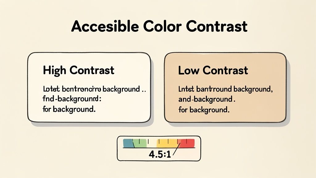
Accessibility isn't an optional feature; it's a core component of effective design. Ensuring accessible color contrast means your text is readable for everyone, including users with vision impairments, while a strong visual hierarchy guides users through your content logically. This is one of the most vital responsive web design best practices for creating a universally usable experience.
For highly customizable platforms like Taap.bio, where users pick their own color schemes, this principle is paramount. A beautiful design is useless if it's unreadable. Adhering to Web Content Accessibility Guidelines (WCAG) standards for contrast ensures that every visitor can clearly understand your message and take action, regardless of their visual ability or the device they're using.
Why Contrast Is Non-Negotiable
Good contrast improves readability in various conditions, from low-light environments to bright sunlight on a mobile screen. It directly impacts user experience and is a legal requirement in many regions. A well-structured page with clear contrast and hierarchy reduces cognitive load, allowing users to find what they need quickly and efficiently. You can learn more about how to structure your page content effectively by understanding visual hierarchy in web design.
"Accessibility is not a constraint, but a catalyst for innovation. Designing with high contrast and a clear hierarchy from the start leads to a more robust and user-friendly experience for all."
Actionable Tips for Implementation
Integrating accessibility into your design process is straightforward with the right tools and mindset. Focus on meeting established standards and testing your choices to confirm they work for everyone.
- Aim for WCAG AA Standards: Target a contrast ratio of at least 4.5:1 for normal-sized text and 3:1 for large text (18pt or 14pt bold).
- Use Contrast Checking Tools: Use free online tools like the WebAIM Contrast Checker to test your foreground and background color combinations before you finalize them.
- Don't Rely on Color Alone: Convey important information using more than just color. Use icons, text labels, or patterns to ensure everyone understands the context.
- Test Focus States: Ensure that links and buttons have a highly visible and high-contrast focus state for users navigating with a keyboard.
/* Accessible link colors / .link-accessible { / Blue that has 4.5:1 contrast on white */ color: #005A9C; text-decoration: underline; }
/* High-contrast focus state for keyboard users */ .link-accessible:focus { outline: 3px solid #005A9C; background-color: #E6F1F9; }
By prioritizing accessible color contrast and a logical visual hierarchy, you create a more inclusive, professional, and effective page that serves your entire audience.
9. Performance Optimization Through Code Splitting and Lazy Loading
Performance is not just a feature; it's a fundamental part of the user experience. Code splitting and lazy loading are two powerful techniques that directly tackle slow load times by delivering only what's necessary, right when it's needed. This means breaking up large code bundles and deferring off-screen content, ensuring visitors see your most important content instantly.
These techniques are essential responsive web design best practices, especially for media-rich link-in-bio pages. For a platform like Taap.bio, where users might embed Instagram feeds, YouTube videos, or Spotify playlists, loading everything at once would create a frustratingly slow experience. By loading these heavy widgets only when a user scrolls to them, the initial page remains fast and responsive.
Why Performance Optimization Is Critical
A fast-loading page keeps users engaged and reduces bounce rates. For a link-in-bio page, every second counts in converting a visitor into a follower, subscriber, or customer. Implementing code splitting and lazy loading ensures that even pages with multiple rich media embeds feel snappy and professional, which directly impacts user perception and conversion.
"Don't make users pay a performance tax for content they might never see. Deferring the load of non-critical assets is one of the highest-impact optimizations you can make."
Actionable Tips for Implementation
To implement these strategies, focus on identifying non-critical assets and deferring their load until they are required.
- Implement Lazy Loading for Media: Use the native
loading="lazy"attribute for images and iframes. For more control, use the Intersection Observer API to detect when an element is about to enter the viewport. - Use Dynamic
import(): Split your JavaScript into smaller chunks using dynamic imports. This allows you to load code for specific features, like a contact form or a video player, only when the user interacts with them. - Provide Loading States: While assets lazy-load, show skeleton screens or placeholders. This improves the perceived performance and informs the user that content is on its way.
- Analyze Your Bundles: Use tools like Webpack Bundle Analyzer to visualize what’s in your JavaScript bundles. This helps identify large dependencies that are prime candidates for code splitting.
// Example of lazy loading a component with a dynamic import const videoPlayerButton = document.getElementById('play-video');
videoPlayerButton.addEventListener('click', async () => { const { playVideo } = await import('./video-player-module.js'); playVideo(); });
By intelligently managing how and when your assets load, you create a significantly faster and more pleasant experience, encouraging users to explore all the content you have to offer.
10. Semantic HTML and Progressive Enhancement
Beneath the visual layer of any great responsive design lies a solid, meaningful foundation. Semantic HTML provides this structure by using elements that describe their content's purpose, like <nav>, <article>, and <button>. This is then paired with progressive enhancement, a strategy where you build a core experience in HTML that works for everyone, then add layers of CSS and JavaScript to enhance it for more capable browsers.
This dual approach is one of the most fundamental responsive web design best practices because it ensures your content remains accessible and functional, regardless of the user's device, browser, or network conditions. For a link-in-bio page, where a single broken script could prevent a potential client from reaching you, this resilience is invaluable. It guarantees that the core function, providing links, always works.
Why a Solid Foundation Is Crucial
Using semantic HTML makes your site more understandable to search engines and assistive technologies like screen readers, directly improving SEO and accessibility. Progressive enhancement ensures that if CSS fails to load or JavaScript is disabled, the user isn't left with a blank or unusable page. Instead, they get a functional, if simplified, version of your content. This philosophy perfectly complements a modular design approach, where each component is built to be independently functional.
"Semantic HTML isn't just for machines; it's the blueprint for a universally accessible and resilient user experience. Progressive enhancement is the strategy that brings that blueprint to life, layer by layer."
Actionable Tips for Implementation
Start by structuring your content with meaning, not just with <div> tags. Think about the role each piece of content plays and choose the appropriate HTML element for the job.
- Choose the Right Element: Use
<nav>for navigation links,<main>for your primary content, and<button>for actions. Avoid using a<div>when a more specific element exists. - Ensure Form Accessibility: Always pair form inputs with
<label>elements using theforattribute. This is critical for usability and accessibility. - Prioritize Content Over Effects: Ensure your core content, like the links on a Taap.bio page, are standard
<a>tags. They should be fully functional before any JavaScript-driven animations or tracking is applied. - Test with JavaScript Disabled: A simple but powerful test. Open your browser's developer tools and disable JavaScript. Can you still navigate your site and access all critical content?
- Maintain Heading Hierarchy: Structure your page with a single
<h1>, followed by<h2>for major sections, and so on. Never skip heading levels, as this confuses both search engines and screen readers.
By building on a semantic and progressively enhanced foundation, you create a robust, accessible, and future-proof web presence that serves every single visitor effectively.
10-Point Responsive Web Design Comparison
| Feature | Implementation Complexity 🔄 | Resource Requirements | Speed / Efficiency ⚡ | Expected Outcomes 📊 | Ideal Use Cases 💡 | Key Advantages ⭐ |
|---|---|---|---|---|---|---|
| Mobile-First Design Approach | Medium — enforces priority-driven design 🔄🔄 | Low — design/dev discipline, testing devices | ⚡ Improves initial load and perceived speed | 📊 Better mobile UX, higher mobile SEO and engagement | Link-in-bio pages and any mobile-first product | ⭐⭐⭐⭐ Prioritizes essential content; predictable performance |
| Flexible Grid Layouts (CSS Grid & Flexbox) | Medium–High — layout logic and reflow rules 🔄🔄🔄 | Medium — CSS expertise, dev time for complex grids | ⚡ Efficient layout resizing; fewer media queries | 📊 Consistent responsive layouts; modular placement | Modular/bento interfaces, dynamic content grids | ⭐⭐⭐⭐ Highly flexible layouts; simple reordering and spanning |
| Fluid Typography & Scalable Fonts | Low–Medium — math for scales and clamp() 🔄🔄 | Low — CSS only, some design testing | ⚡ Improves readability across viewports with no extra assets | 📊 Smoother text scaling; improved accessibility and legibility | Content-rich pages, responsive design systems | ⭐⭐⭐ Ensures consistent, accessible typography with minimal code |
| Responsive Image Optimization | Medium–High — build or service for variants 🔄🔄🔄 | High — image pipeline, storage, CDNs | ⚡ Big wins for load times and bandwidth savings | 📊 Lower LCP, better Core Web Vitals, reduced bandwidth | Media-heavy profiles, portfolios, embedded feeds | ⭐⭐⭐⭐ Reduces payload and layout shift; large performance impact |
| Touch-Friendly Interface Design | Low–Medium — layout and gesture work 🔄🔄 | Low — design adjustments, testing on devices | ⚡ Improves interaction efficiency on touch devices | 📊 Fewer mis-taps, higher engagement and conversion on mobile | Drag-and-drop UIs, mobile controls, CTA-heavy pages | ⭐⭐⭐ Improves accessibility and usability for touch users |
| Viewport Meta Tag & Proper Scaling | Very Low — single config but critical 🔄 | Minimal — one-line implementation | ⚡ Enables correct scaling; prevents zoom issues | 📊 Proper responsive behavior and reliable media query base | Every responsive website, especially mobile-first sites | ⭐⭐⭐⭐ Essential quick win; foundational for responsive design |
| CSS Media Queries & Breakpoints Strategy | Medium — planning and maintenance 🔄🔄 | Low — CSS management and testing | ⚡ Targeted efficiency at breakpoints (depends on strategy) | 📊 Tailored layouts per device class; smoother transitions | Multi-layout sites needing distinct breakpoints | ⭐⭐⭐ Enables precise control across device ranges |
| Accessible Color Contrast & Visual Hierarchy | Low–Medium — color system and testing 🔄🔄 | Low — tooling and design time | ⚡ Neutral for speed; big UX/accessibility gains | 📊 Improved readability, WCAG compliance, broader reach | Platforms with user color customization and strong branding | ⭐⭐⭐⭐ Ensures readability, legal compliance, and better engagement |
| Performance Optimization (Code Splitting & Lazy Loading) | High — bundler config and careful architecture 🔄🔄🔄🔄 | Medium — build tooling and monitoring | ⚡ Major improvements to initial load and JS execution | 📊 Faster FCP/LCP, better Core Web Vitals, scalable UX | SPAs, pages with heavy embeds/widgets (e.g., Taap.bio) | ⭐⭐⭐⭐ Reduces initial payload; loads features on demand |
| Semantic HTML & Progressive Enhancement | Low — mindful markup and fallback planning 🔄🔄 | Low — developer discipline and testing | ⚡ Often reduces JS dependency and improves perceived speed | 📊 Better SEO, resilience without JS, improved accessibility | Content-first sites and accessibility-focused products | ⭐⭐⭐⭐ Robust, maintainable, and accessible foundation |
Building the Future-Ready Web, One Device at a Time
We've journeyed through the core tenets of modern web design, exploring the essential practices that separate a functional website from a truly exceptional one. The landscape of digital interaction is no longer monolithic; it's a vibrant, ever-shifting mosaic of devices, screen sizes, and user contexts. Mastering responsive web design best practices isn't just a technical skill to add to your resume; it's a fundamental shift in mindset towards user-centric, future-proof development. It's the commitment to delivering a seamless, high-quality experience to every single visitor, regardless of whether they're on a 4-inch smartphone in a busy cafe or a 32-inch desktop monitor in a quiet office.
The principles we’ve covered are not isolated tricks. They are deeply interconnected components of a holistic strategy. A mobile-first approach forces you to prioritize content and performance from the ground up, which naturally leads to a cleaner, more efficient design. This foundation is then brought to life by flexible layouts using CSS Grid and Flexbox, allowing your content to elegantly reflow and adapt, rather than breaking at arbitrary screen widths. This structural fluidity is complemented by fluid typography and optimized images, ensuring that your content is both readable and fast-loading across the entire spectrum of devices.
From Technical Implementation to User Empathy
Ultimately, responsive design is an exercise in empathy. When you implement touch-friendly interfaces, you're respecting the native interaction patterns of mobile users. When you prioritize accessible color contrast and semantic HTML, you're ensuring that your message reaches individuals with disabilities, expanding your audience and creating a more inclusive web. And when you obsess over performance optimization through techniques like lazy loading, you're valuing your users' time and data plans, a crucial consideration in a world where attention is the most valuable currency.
These aren't just checkboxes on a development list. They are the building blocks of user trust. A website that loads quickly, is easy to navigate with a thumb, and presents information clearly on any screen sends a powerful message: we value you, and we have designed this experience with your needs in mind. This user-first philosophy is what transforms a simple webpage into a powerful communication tool, whether it's for a small business, a content creator, or a freelancer showcasing a portfolio. Adopting these responsive web design best practices is your investment in digital resilience, ensuring your online presence remains effective and relevant for years to come.
Your Next Step: Putting Principles into Practice
The journey doesn't end here. The true test is in the application. Begin by auditing your current projects. Are you truly building mobile-first, or are you just shrinking a desktop design? How are you handling images, typography, and interactive elements across different breakpoints? Challenge yourself to go beyond simply making things "fit" and start crafting experiences that feel native to each device.
Embracing these principles will set you apart. You will build faster, more accessible, and more engaging websites that deliver tangible results. You will create digital spaces that are not just functional but delightful to use. As the digital world continues to fragment into new devices and form factors, your commitment to these foundational, responsive web design best practices will ensure you're not just keeping up, but leading the way.
Tired of wrestling with media queries and performance audits for your link-in-bio page? taap.bio bakes all these responsive web design best practices directly into its platform, giving you a stunning, mobile-first, and lightning-fast hub for your content without writing a single line of code. Start building your beautiful, future-ready page in minutes at taap.bio.