Let’s start with the basics. A landing page isn’t just any page on your website. It’s a standalone web page, custom-built for a specific marketing campaign. It’s the very first thing a person sees—where they land—after clicking a link in an email, a Google ad, or a social media post.
Its entire reason for existing is to accomplish one single goal, which we call the call to action (CTA).
Table of contents
The Core Concept of a Landing Page
Think of your main website as a sprawling department store. It has tons of aisles, endless products, and plenty of staff to help. A visitor can wander, browse, and explore to their heart's content.
A landing page, on the other hand, is more like a focused pop-up shop. It has one product, one message, and one goal. There are no other doors, no distracting side aisles—just a straight, clear path from the moment someone walks in to the moment they make a decision.
This singular focus is what makes landing pages so incredibly powerful. By stripping away all the usual distractions you’d find on a full website (like navigation menus, sidebars, or links to other articles), you guide your visitor directly toward the one action you want them to take.
From Ad Click to Conversion
The journey to a landing page is always intentional. No one just stumbles upon one by accident; they are sent there for a very specific reason. This direct path is designed to create a seamless, persuasive experience from the ad they just clicked to the action you want them to complete.
This idea really took off with the rise of pay-per-click advertising. When Google AdWords (now Google Ads) launched back in 2000, marketers quickly learned a painful lesson: sending expensive, paid traffic to a generic homepage was a complete waste of money. It killed conversion rates.
By 2004, the solution was clear. Marketers started creating dedicated, standalone pages that perfectly matched the promise of the ad. This targeted approach keeps the message consistent and persuasive, dramatically increasing the odds of achieving a campaign goal.
What kind of goals? Things like:
- Capturing a new lead with a simple sign-up form.
- Getting someone to download a free ebook or guide.
- Driving a direct sale for a featured product.
- Registering attendees for an upcoming webinar.
While a landing page serves a very specific, immediate purpose, it often fits into a much bigger strategy. For instance, you might use landing pages to drive traffic to key pieces of a larger content collection. To learn more about that, check out our guide on what is a content hub and see how it all fits together.
The Anatomy of a High-Converting Landing Page
A great landing page isn't just about looking good; it's a finely tuned engine built for one thing: conversion. Every single piece, from the headline to the button, has a specific job to do, all working together to guide your visitor toward taking that one important action.
Think of it like a specialist versus a general practitioner. Your homepage is the generalist, trying to serve everyone. Your landing page is the specialist, laser-focused on a single goal. Understanding this anatomy is the key to building pages that don't just get clicks, but actually get results.
This breakdown highlights just how different their performance is.
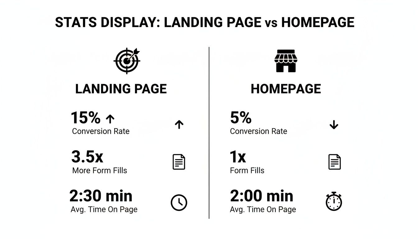
As you can see, the singular focus of a landing page makes it a much more powerful tool for any targeted campaign. It’s designed to convert, and the numbers don't lie.
Core Conversion Elements
To really nail this, you'll want to dig into various landing page optimization best practices. But at the heart of every winning page, you'll find these fundamental components working in perfect sync.
A Magnetic Headline and Subheading: Your headline has one job: to instantly tell visitors, "You're in the right place." It has to be crystal clear and match the promise from the ad or link they just clicked. The subheading then adds a quick, powerful punch to expand on that value.
Compelling Visuals: We are visual creatures. A strong image or video can do the heavy lifting for you, showing your product in action and making an emotional connection. Good visuals guide your visitor's eyes right where you want them to go. If you want to dive deeper, our guide on visual hierarchy in web design is a great place to start.
Persuasive Copy: This is where you speak directly to your visitor’s problems and aspirations. Ditch the long, dense paragraphs. Instead, use short, punchy sentences and bullet points to show them exactly what's in it for them. It’s all about the benefits, not just the features.
Key Takeaway: A landing page is a dead end, and that's a good thing. Its only job is to get a conversion. That means stripping away all distractions like navigation menus, sidebars, and extra links. This relentless focus is its superpower.
Driving Action and Building Trust
Once you've grabbed their attention, it's time to seal the deal. This is where you bring in the heavy hitters: powerful visuals and undeniable proof that you deliver on your promises.
While where your traffic comes from matters, it's what's on the page that ultimately convinces someone to act. For instance, videos are an absolute powerhouse, known to boost conversions by up to 86% because a whopping 90% of users say they're more helpful than text. The same goes for images—people retain 80% of what they see compared to just 20% of what they read. It's no surprise that 73% of the best-performing landing pages use photos of real people to build an instant human connection.
An Irresistible Call-to-Action (CTA): Your CTA button needs to be the most obvious thing on the page. Use strong, action-oriented words like "Get Your Free Guide" instead of a boring "Submit." Make it pop with a color that stands out from everything else.
Social Proof: People trust people. Nothing eases a visitor's mind like seeing that others have already had a great experience with you. Weave in testimonials, logos of companies you've worked with, or short case studies to build credibility and make their decision feel safe.
Choosing the Right Type of Landing Page
Let’s get one thing straight: there’s no such thing as a one-size-fits-all landing page. Using the wrong type for your campaign is like trying to use a screwdriver to hammer a nail—you might make a dent, but you won't get the job done right.
The secret is to match the page’s entire purpose to the single action you need your visitor to take. Think of your campaign goal as the destination. The landing page is the specific vehicle you choose to get them there. Picking the right one creates a direct, frictionless path for your audience, which is the key to turning a casual click into a genuine conversion.
The Two Big Players: Lead Generation vs. Click-Through
Most landing pages fall into one of two main camps, and knowing the difference is your first step toward building something that actually works.
A Lead Generation Page has one job and one job only: to capture a visitor's information. The star of the show here is always a form. You're asking for a name, an email, or a phone number in exchange for something valuable—a free guide, a webinar spot, a consultation, you name it. Every single element on the page, from the headline to the button, is there to convince the visitor that your offer is worth handing over their details for.
On the other hand, a Click-Through Page doesn't have a form at all. Its purpose is to get someone warmed up and excited enough to click a button that takes them to the next step, usually a checkout or a detailed product page. It’s like a friendly and persuasive salesperson, giving you all the compelling benefits and building trust before sending you to the cash register.
Specialized Pages for Pinpoint Goals
Once you get past the two main types, you'll find a whole toolkit of specialized pages, each designed for a very specific job.
Squeeze Page: Think of this as a super-concentrated lead gen page. It's incredibly minimal—often just a killer headline, a quick sentence about the offer, and a form. Its whole purpose is to "squeeze" an email out of a visitor with zero distractions.
Sales Page: This is where you go for the direct sale. These pages are often the longest of the bunch because they have to do all the heavy lifting. They’re packed with in-depth details, customer stories, answers to common questions, and a powerful pitch designed to walk someone all the way from curious to "take my money!"
Link in Bio Page: This is the modern hub for creators, brands, and anyone juggling multiple online presences. It’s not just a list of links anymore. With a simple landing page builder, these pages become interactive, visually stunning micro-sites that direct followers exactly where you want them to go.
Which Landing Page Type Should You Use?
Feeling a bit lost? Don't worry. Choosing the right page is all about clarifying your end goal. I've put together this simple table to help you match your objective to the perfect landing page type.
| Your Goal | Best Landing Page Type | Key Feature |
|---|---|---|
| Build your email list | Lead Generation Page | A compelling form and a valuable offer. |
| Warm up traffic for a sale | Click-Through Page | A single, persuasive call-to-action button. |
| Drive direct purchases | Sales Page | In-depth copy, testimonials, and a clear "buy" button. |
| Grow your social following | Link in Bio Page | A central hub for all your important links and content. |
| Get webinar sign-ups | Lead Generation Page | An opt-in form paired with event details. |
| Capture emails quickly | Squeeze Page | A hyper-focused, minimal design with just a form. |
Ultimately, the type of page you build will make or break your campaign's success. By starting with your goal and working backward, you can select the right tool and build a page that converts like a charm.
Why a Simple List of Links Just Doesn't Cut It Anymore
For most creators and brands, that "link in bio" is your digital front door. It’s the one place you send everyone from Instagram, TikTok, or X to see what you're all about. But what do they find when they get there? Far too often, it’s just a boring, vertical list of links. That’s a massive missed opportunity.
Think about it this way: handing someone a plain list of links is like giving them a bland business card when you could be giving them an interactive tour of your world. Sure, it’s functional, but it’s completely passive. It forces your visitor to do all the heavy lifting to figure out what’s interesting. In an age of goldfish-like attention spans, that's a gamble you can't afford to take. Most people will scan, maybe click one thing, and bounce.
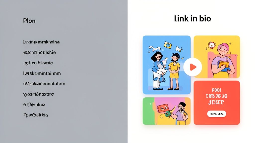
This bare-bones approach completely misses the chance to engage your audience, show off your personality, and build a genuine connection. A simple list doesn't tell a story or create an experience. It’s a directory, not a destination.
From a Directory to a Destination
The real magic happens when you stop thinking of your "link in bio" as a menu and start treating it like an immersive experience. Instead of immediately sending people away, you create a space that makes them want to stick around, explore, and play with your content right there.
This is where a dynamic, visual layout changes everything. Imagine your visitor lands on a page where they can:
- Watch your latest YouTube video without ever leaving the page.
- Listen to your new podcast episode or Spotify track instantly.
- Scroll a live feed of your Instagram posts to catch your vibe.
- Read glowing testimonials that build trust on the spot.
This isn’t just about aesthetics; it's about making things ridiculously easy for your audience. By embedding rich media, you eliminate friction. No more opening new tabs or fumbling between apps. They get a taste of your best work immediately, which keeps them engaged and dramatically increases the time they spend interacting with your brand.
By transforming your link hub into a mini-website, you’re not just directing traffic—you’re capturing attention. You create a cohesive brand story where every element works together to guide your audience and strengthen your digital presence.
The Power of Visual Storytelling
A static list of links is visually flat. Every link looks the same, so how is your visitor supposed to know what matters most? A modern landing page, on the other hand, uses size, color, and layout to guide the eye and tell a compelling story.
You can make your most important call-to-action—like signing up for your newsletter—the biggest, boldest thing on the page. Your portfolio can become a beautiful, clickable grid. Your social links can be tucked away as smaller, supporting elements.
This kind of intentional design turns a simple page into a strategic asset. It puts you in control of the narrative, letting you highlight what’s important and create an experience that’s far more persuasive and memorable. The goal is to make your page a destination in itself, not just a pit stop on the way to somewhere else.
How to Build a Modern Landing Page
Alright, let's move from theory to action. The good news? You no longer need to be a coding wizard or have a team of developers on standby to build a seriously impressive landing page. With the right tools, you can create a page that not only looks fantastic but also works hard to pull your audience in from the very first click.
The secret is to think beyond old-school, static designs. Today's best platforms let you build dynamic, interactive pages using simple, no-code interfaces. This frees you up to focus on what really matters: crafting an experience that connects with people, instead of getting bogged down in technical details.
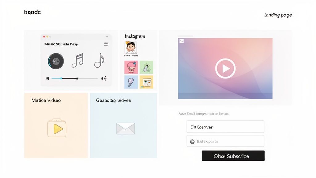
Embrace Modular Bento Box Layouts
Imagine your page is a digital bento box. Instead of a single, long-winded column of text, your content is neatly arranged in individual, self-contained modules. This approach lets you place different elements on a flexible grid, creating a much more interesting and visually balanced layout that naturally guides the eye.
With a bento box layout, you're in complete control of the visual hierarchy. Want to spotlight your newsletter sign-up? Make it the biggest block. Just dropped a new video? Give it the most prominent spot. This modular design isn't just about looking good; it's a powerful strategy for directing attention and driving the exact actions you want.
If you're ready to jump in and start building this way, a good drag-and-drop page builder makes the whole process incredibly straightforward.
Supercharge Your Page with Smart Widgets
This is where things get really exciting. The true power of modern landing pages comes from using smart widgets. These aren't just basic buttons or links; they are living, breathing windows into your other online homes, embedded right on the page. Your landing page is no longer just a signpost—it becomes a central hub where people can engage with your content without ever having to leave.
Think about it. A visitor arrives and can immediately:
- Listen to your latest Spotify track through a built-in player.
- Watch your new YouTube video right then and there.
- Scroll through your live Instagram feed to catch up on recent posts.
These widgets make everything seamless. By removing friction, you dramatically increase engagement and forge a much deeper connection with your audience.
When you bring the content directly to your audience, you eliminate the need for them to click away. That one simple change turns passive browsers into active fans, keeping them on your page longer and making them far more likely to take the next step.
Build and Test with No Code Needed
When it comes to landing pages, more is often more. In fact, companies with 31-40 landing pages generate seven times more leads than businesses that only have a few. This used to be an impossible task for small teams, but platforms like Taap.bio have completely changed the game.
With its no-code, physics-based drag-and-drop builder, anyone can create stunning pages. A podcaster can instantly embed their latest episode player. A designer can arrange and resize their Dribbble portfolio shots in seconds. Every page is automatically responsive, looking perfect on both desktop and mobile. This freedom to quickly create, test, and launch new pages is what separates the most effective strategies from the rest.
Measuring Your Landing Page Success
So you’ve built a great-looking landing page. That’s a fantastic start, but it’s only half the battle. If you aren't measuring its performance, you're essentially flying blind.
Think of it this way: launching a landing page without tracking is like telling a joke and then leaving the room before you hear the punchline. You have no idea if it landed. Data is what tells you if your audience is laughing, cringing, or just plain confused. It transforms guesswork into a clear, actionable strategy.
The Metrics That Really Matter
To understand how your page is truly performing, you need to watch a few key numbers. These are the vital signs that tell you if your page is healthy and doing its job.
Conversion Rate: This is the big one. It's the percentage of visitors who actually did the thing you wanted them to do, whether that was signing up, downloading a guide, or buying a product. A strong conversion rate is the ultimate sign of a successful page.
Bounce Rate: This number tells you how many people landed on your page and left almost immediately without clicking anything. A high bounce rate is a red flag—it could mean your message isn't hitting the mark or your design isn't grabbing their attention.
Session Duration: How long are people sticking around? A longer average session time usually means your content is engaging and visitors are genuinely interested in what you have to say.
Your goal isn't just to get traffic; it's to get the right traffic to take the right action. Monitoring these metrics helps you fine-tune your page to speak directly to your ideal audience.
Turning Insights into Improvements
Once you have your data, it's time to put it to work. The secret to a high-performing landing page isn't getting it perfect on day one—it's about continuously testing and tweaking.
This is where A/B testing becomes your best friend. The concept is simple: you create two versions of your page (an "A" and a "B") with one small difference, like a different headline, a new image, or a button in another color. Then, you see which one gets better results. You'd be surprised how a seemingly minor change can lead to a huge lift in conversions.
To get clean data, you absolutely need proper tracking. Using UTM codes is a non-negotiable step for figuring out which ads, social posts, or emails are sending you the best traffic. For a deeper dive, check out these UTM parameter best practices.
Proper tracking isn’t just a nice-to-have; it's one of the most powerful social media marketing tools for small business you can have in your corner. It allows you to double down on what works and cut what doesn't, saving you time and money.
Still Have Questions? Let's Clear Things Up.
We've covered a lot of ground, from what a landing page is to how you can build your own. But a few common questions always pop up, so let's tackle them head-on. These quick answers should help cement what you've learned.
Can't I Just Use My Homepage Instead?
Look, technically you can, but it's one of the biggest mistakes you can make in a targeted campaign. Think of your homepage as a general store—it’s built for browsing, with all sorts of aisles and distractions. It has to serve everyone.
A landing page, on the other hand, is a specialist. It’s a boutique shop with one single, clear purpose. By sending your campaign traffic there, you eliminate all the noise and guide visitors straight toward the one action you want them to take. This singular focus is precisely why dedicated landing pages have much, much higher conversion rates.
So, How Many Landing Pages Do I Actually Need?
There’s no magic number here, but more is almost always better. The real goal is relevance. It’s not uncommon for top-performing companies to have 30 or more landing pages running at once, each tailored to a specific audience or campaign.
A good rule to live by is this: create a unique landing page for every distinct marketing push. Got a new email promo? It gets its own page. Running a special ad on Instagram? That gets its own page, too. Aligning the page directly with where the visitor came from is a game-changer for your results.
The more relevant the page is to the visitor's initial click, the higher the chance of conversion. Specificity is your greatest asset.
What’s a "Good" Conversion Rate Anyway?
This is the million-dollar question, isn't it? The truth is, "good" varies wildly depending on your industry, your traffic source, and what you’re asking people to do. While you might hear a cross-industry median of around 6.6%, that number can be seriously misleading.
Instead of getting hung up on a universal benchmark, focus on your own numbers. Establish your baseline, and then work to improve it, one test at a time. Pushing your conversion rate from 2% to 4% might not sound like much, but that’s a 100% increase in your results. That's the kind of steady, focused improvement that truly wins.
Ready to build a "link in bio" page that’s more than just a list of links? With Taap.bio, you can create a visually stunning, interactive landing page using smart widgets and a flexible bento box layout. Start designing your perfect page today at https://taap.bio.