
Think of visual hierarchy as the silent director of your webpage. It’s how you arrange every element—text, images, buttons—to guide a visitor's eye through your content in a specific, intentional order. It’s what tells them, "Start here, look here next, and then click this."
A great newspaper uses a massive, bold headline to scream "Read me first!" Visual hierarchy does the same thing online, using size, color, and placement to signal importance without a single word of instruction.
Table of contents
Why Visual Hierarchy Is Your Secret Weapon
In an age of goldfish-like attention spans, visual hierarchy isn't just a nice-to-have design detail; it's a critical tool for turning clicks into conversions. It’s the invisible hand that pulls a user through a confusing page and transforms it into a clear, compelling story.
Without a strong visual guide, even your most brilliant content can become a wall of noise. Users get overwhelmed, confused, and frustrated. What happens next? They leave. In fact, a study found that a staggering 38% of people will ditch a website if the layout is clunky or unattractive. That's a massive missed opportunity, and it's where a smart hierarchy makes all the difference.
A well-planned design gives the human eye a roadmap, ensuring your most important message is seen first. It carves a clear path through the chaos, making your content easy to digest and your calls-to-action impossible to miss.
The Business Case for Clear Design
Great visual hierarchy is more than just looking professional—it directly impacts your bottom line by creating a smoother, more intuitive user experience. When you guide visitors effortlessly, you get real results:
- Drives Deeper Engagement: A clear visual path reduces the mental effort needed to understand your page. This frees up users to actually interact with your content instead of just trying to figure it out.
- Skyrockets Conversion Rates: When your main call-to-action—that "Sign Up" or "Shop Now" button—is the most visually dominant element on the page, you're practically paving the way for users to click it.
- Builds Instant Trust: An organized, thoughtfully designed page screams professionalism. It tells visitors you're competent and trustworthy, making them feel much more confident in your brand.
Visual hierarchy is what separates a page that just shows information from one that truly communicates a message. It’s the art of designing with purpose, making sure every element works together to lead the user on a journey.
This is especially true for modern modular layouts, like the "bento grids" you see on platforms like Taap.bio. They masterfully use different widget sizes and smart spacing to create pages that are scannable, engaging, and incredibly effective from the moment they load.
Let's break down exactly how you can use these same principles to build designs that don't just look amazing, but actually work.
The Core Principles That Shape User Perception
To really get a handle on visual hierarchy, you have to understand the tools designers use to guide your eyes across a page. Think of these principles less as rigid rules and more like a secret language your website uses to talk to visitors. They're the invisible strings that pull our focus, tell us what's important, and help us make sense of how different pieces of content relate to each other.
These concepts work because they tap directly into how our brains are wired to see the world. We're constantly looking for patterns, prioritizing some visual cues over others, and making snap judgments about what deserves our attention. By using these principles intentionally, you can turn a jumbled mess of a page into a clear, persuasive story that leads users exactly where you want them to go.
Use Scale to Establish Importance
The simplest and most powerful tool in your design arsenal is scale. It's straightforward: bigger things grab more attention. Our brains are hardwired to see larger objects as more significant, a primal instinct that works just as well on a screen as it does in the wild.
If you want something to be the undeniable star of the show, just make it bigger than everything else. This is why a massive hero image dominates a homepage or a key headline is set in a giant font. That difference in size creates an instant focal point, telling the user, "Start here. This is the most important thing."
For instance, on a Taap.bio page, a large, double-wide YouTube widget will naturally become the centerpiece. People's eyes will land on it long before they even notice the smaller, single-block links, establishing it as the primary content without you having to spell it out.
Key Takeaway: Scale isn't just about blowing things up; it's about creating meaningful size differences. The contrast in scale between elements is what truly forges a strong visual hierarchy.
Create Focus with Color and Contrast
While scale shouts, color and contrast can either whisper or scream, all depending on how you use them. Our eyes are naturally drawn to things that stand out from their background. A bright button on a muted page, or light text on a dark image, creates a point of high contrast that's nearly impossible to ignore.
This is the principle that powers effective calls-to-action (CTAs). A "Sign Up Now" button splashed in a brand's most vibrant accent color will practically jump off the page, begging to be clicked. On the flip side, less critical info, like footer links, often uses low-contrast colors so they can gracefully recede into the background.
This little pyramid does a great job of showing how these design elements work together to guide users from seeing what's important to actually taking action.
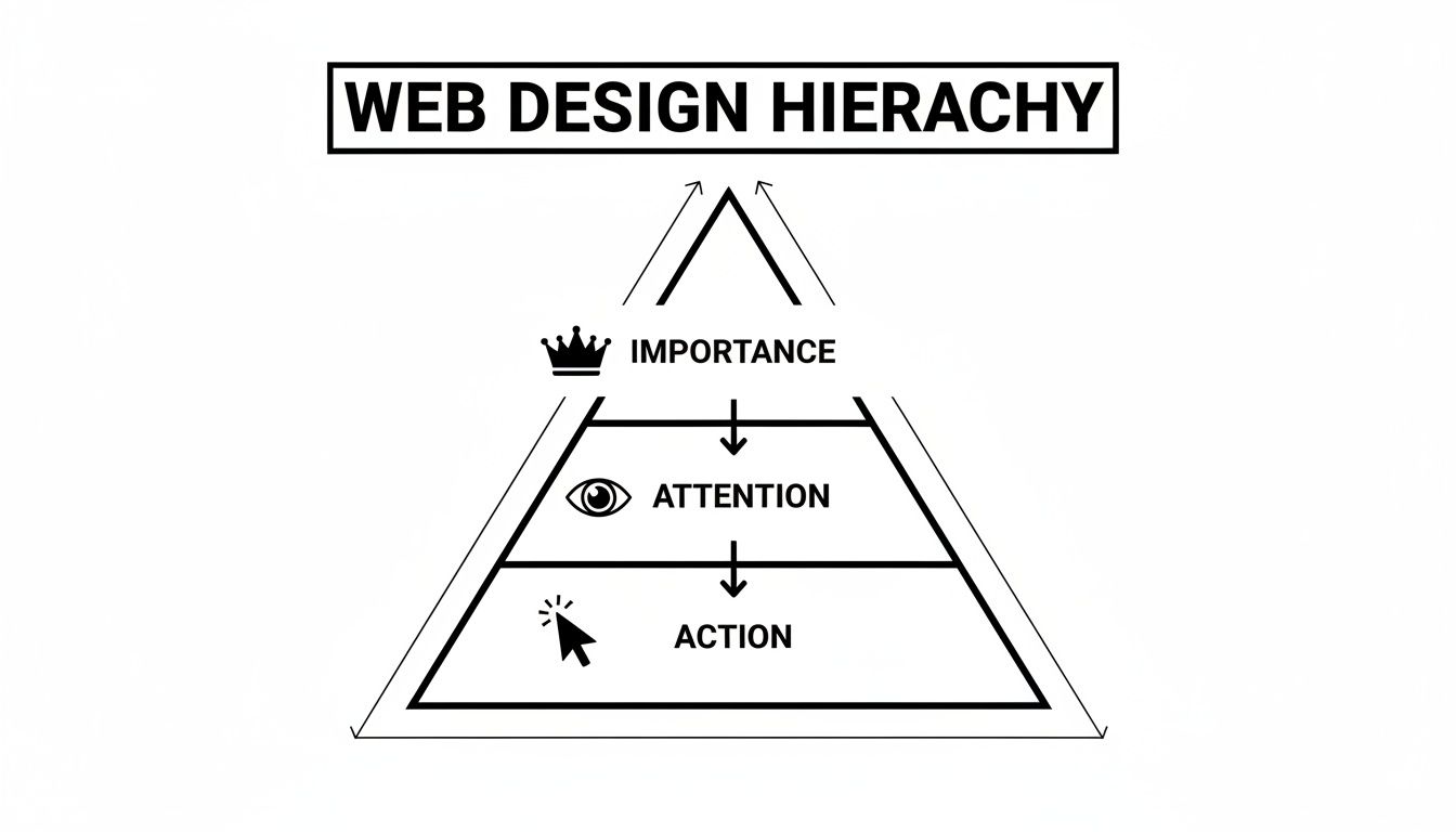
As you can see, once you define what’s important, you can capture attention and then steer that attention toward the action you want someone to take.
Build Relationships with Proximity
Proximity is a fancy word for a simple idea from Gestalt psychology: we see things that are close together as a related group. This concept is absolutely fundamental for creating layouts that feel organized and are easy to scan. By grouping related items, you take the guesswork out of it for the user, lowering their mental effort.
You see this everywhere:
- Navigation Menus: Links are bunched together to signal they're all part of the site's main navigation.
- Contact Info: Your address, phone, and email are grouped because they all serve the same function.
- Product Features: A list of benefits is clustered right under a product image, visually tying them together.
On a modular grid like Taap.bio, you could place a text block title directly above three link widgets to instantly create a "My Socials" section. The tight arrangement tells the user, without a doubt, that these elements are a single unit.
Let Your Design Breathe with Whitespace
Often misunderstood as just "empty space," whitespace (or negative space) is anything but. It's an active and powerful design element—the visual breathing room around your content. It's what separates a cluttered, stressful design from a clean, professional one.
Whitespace does two critical jobs for your hierarchy:
- Separation: It creates clear lines between things that aren't related. The more space you put between two items, the less connected they feel.
- Emphasis: Surrounding an element with generous whitespace makes it pop. It acts like a picture frame, isolating your focal point from all the surrounding noise.
Think about an art gallery. A single masterpiece gets a whole wall to itself to give it importance. In the same way, putting plenty of space around your most crucial CTA makes it a clear target. On a Taap.bio grid, the gaps between your widgets are just as important as the widgets themselves, creating a sense of rhythm and clarity across the entire page.
Core Principles of Visual Hierarchy at a Glance
To bring it all together, here's a quick cheat sheet summarizing how these foundational principles translate into real-world design choices on a modular platform like Taap.bio.
| Principle | What It Does | Taap.bio Application Example |
|---|---|---|
| Scale | Makes elements feel more or less important. | Use a 2x2 widget for your main video or product and smaller 1x1 widgets for regular links. |
| Color & Contrast | Draws attention to key interactive elements. | Make your primary CTA button a bright, high-contrast color that stands out from your background. |
| Proximity | Groups related items to create logical sections. | Place a "Header" widget directly above a series of "Link" widgets to form a category. |
| Whitespace | Separates content and creates focal points. | Increase the "Gap" setting between your widgets to make each one feel more distinct and important. |
Think of this table as your starting point. Mastering how these elements play off each other is where you can truly start to craft an effective and intuitive user experience.
How People Actually Look at Your Page
When someone lands on your page, their eyes don't just wander aimlessly. They follow predictable paths, almost like well-worn trails through a forest. This isn't a guess; it's backed by decades of eye-tracking research.
Understanding these scanning patterns is like being handed a map to your visitor's attention. Instead of randomly placing buttons and text, you can align your design with how people already look at screens. This makes your key message not just visible, but practically unavoidable.
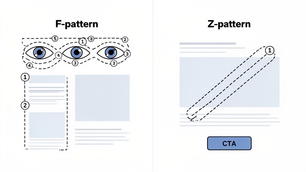
Two of the most dominant patterns are the F-Pattern and the Z-Pattern. Each one is suited for different kinds of layouts, and knowing how to use them is a serious design superpower.
The F-Pattern: Your Go-To for Content-Rich Pages
Think about how you read an article or a blog post. You scan across the top (the headline), then move down a bit and scan across again (a subheading or first sentence). After that, you typically scan down the left side, looking for keywords or interesting starting phrases. Sound familiar?
That’s the F-Pattern in action. It’s why the top-left portion of any page is considered prime real estate. Research from the Interaction Design Foundation confirms that this is how most people scan text-heavy desktop sites. Placing headlines or CTAs in these hotspots can boost their visibility by as much as 80% compared to a scattered layout. For a deeper dive, plenty of comprehensive web design statistics back this up.
On your Taap.bio page, this translates directly to:
- Your profile photo and name at the very top create the first anchor point.
- Your bio or a critical headline should run across that first horizontal line.
- Key links or section titles should be left-aligned to catch that vertical scan.
The Z-Pattern: Mastering Visually-Driven Layouts
What happens when there’s less text and more imagery, like on a landing page or a clean, simple Taap.bio profile? The Z-Pattern comes into play. The eye starts at the top-left, sweeps across to the top-right, cuts diagonally down to the bottom-left, and then finishes by moving across to the bottom-right. It literally draws a "Z" across the screen.
This pattern is perfect for guiding someone through a simple, four-step visual journey. You can place your logo in the top-left, a compelling image in the middle, and your most important call-to-action (CTA) in the bottom-right, right where the journey naturally ends.
By understanding these scanning patterns, you're no longer just arranging elements; you're choreographing the user's attention. You are intentionally building a visual hierarchy in web design that feels intuitive and effortless for every visitor.
Applying this to a modular grid like Taap.bio is a game-changer. You can create a Z-flow by placing a large, attention-grabbing widget in the top-left, guiding the eye diagonally with smaller widgets, and finishing with a high-contrast “Book a Call” or “Shop Now” widget in the bottom-right. It builds a natural story, leading your visitor exactly where you want them to go.
Using Color and Contrast to Drive Action
While a big, bold element can shout for attention, color and contrast are the whispers that actually persuade people to click. Don't think of color as just window dressing—it’s a powerful, non-verbal language. It's how you paint a clear path on your page, shining a spotlight on exactly where you want your visitor to go next.
Mastering color and contrast is a huge part of creating an effective visual hierarchy in web design. A bright, vivid button popping against a more subdued background doesn't just look nice; it creates a natural focal point the human eye can't help but notice. This visual tension is what makes a call-to-action (CTA) feel like an irresistible next step.
The Psychology of Color in Design
Color directly influences our mood and what we decide to focus on. When you use a consistent brand color palette, you build a subtle sense of trust and professionalism. Your page feels intentionally designed and reliable. Once visitors start to recognize your colors, they feel more at home and are much more likely to interact with your content.
On the flip side, a jumble of clashing colors can make a page feel chaotic and confusing, causing visitors to bounce. The data backs this up: 39% of consumers say color is the single most important visual element on a website. High-contrast elements grab our attention two to three times faster than low-contrast ones, while poorly chosen color schemes can lead to 38% higher bounce rates. You can find even more insights into how users perceive visual elements on Gaia Designs.
The takeaway is simple: your color choices aren't arbitrary. They have a direct and measurable impact on how people behave on your page.
Putting It to Work on a Modular Grid
On a link-in-bio platform like Taap.bio, you can use these principles to make certain widgets the undeniable star of the show. Let’s say your page has a sleek, dark background. A Spotify widget, with its signature bright green play button, will instantly pop, drawing the eye and practically begging visitors to hit play.
Here are a few ways to apply this right now:
- Spotlight Your Main CTA: Pick the single most important action you want someone to take. Give that button or link your brightest, highest-contrast color. Everything else should play a supporting role.
- Color-Code Your Brand: Use your primary brand color for all the interactive elements, like links and buttons. This teaches visitors over time, "if you see this color, you can click it."
- Let Secondary Info Fade: For less critical links, text, or widgets, use colors with lower contrast. This allows them to recede into the background, keeping the focus where it matters most.
Contrast is all about creating a clear difference. It isn't just about light vs. dark; it's about making one thing stand out from its surroundings so the user knows exactly where to look next.
Don't Forget Accessibility and Contrast
Using contrast effectively is also about being inclusive. Not everyone perceives color in the same way, and text with low contrast can be completely unreadable for people with visual impairments. This is where web accessibility guidelines become non-negotiable.
The Web Content Accessibility Guidelines (WCAG) give us a clear roadmap. For standard text, the minimum recommended contrast ratio is 4.5:1 against its background. Hitting this target ensures your content is legible for the widest possible audience.
You don’t have to guess, either. There are plenty of free online tools that can instantly check the contrast ratio between any two colors. Making this a quick, final check in your design process is a small step that makes a world of difference for your users.
When you get a handle on color and contrast, you stop just arranging things on a page. You start guiding your audience with intention, turning visual appeal into clicks, conversions, and a better experience for absolutely everyone.
Creating Flow with Scale, Proximity, and Rhythm
While color and contrast are great for shining a spotlight on key actions, the real foundation of your page is its structure—the size of your elements and the space between them. This is what creates an effortless, intuitive flow for your visitors.
Think of it like composing music. You need loud notes and quiet notes, sure. But it's the deliberate pauses and consistent tempo that turn a jumble of sounds into a memorable melody.
In the same way, mastering scale, proximity, and rhythm transforms a collection of widgets into a cohesive experience. These principles form the architectural backbone of a strong visual hierarchy in web design, guiding visitors so smoothly they don’t even realize they're being led.
Command Attention with Scale
Scale is your most direct and powerful tool for establishing importance. It’s dead simple: larger elements feel more significant and will almost always be seen first. This isn't just a design trend; it's basic human psychology. Our brains are hardwired to notice bigger things first.
Want to make a specific widget the undeniable star of your page? Just make it bigger. On a modular grid like Taap.bio, for instance, using a double-wide portfolio widget instantly makes it the centerpiece. It becomes the visual anchor that everything else revolves around, silently telling visitors, "This is my most important work. Look here first."
This doesn't mean everything else needs to be tiny. The real magic of scale lies in the relative difference between elements. Even a small increase in size can create a subtle but clear distinction in priority, building a page that’s layered and easy to scan.
Build Intuitive Groups with Proximity
Proximity is the simple idea that we see objects placed close together as a related group. It’s a deceptively simple concept with a massive impact on clarity. By grouping related items, you do the mental work for your visitors, pre-organizing the information so they don't have to.
You see this principle in action everywhere online:
- An image is always right next to its caption.
- A product title, price, and "Add to Cart" button are clustered together.
- Social media icons are huddled in one block.
On a Taap.bio page, you could create a "My Music" section by placing a text header widget right above your Spotify and Apple Music widgets. The tight spacing instantly signals they belong together, creating an intuitive cluster that’s understood in a split second.
By mastering proximity, you stop just placing things on a page. You start building logical relationships between them, turning a random collection of links into a well-structured and scannable dashboard.
These principles aren't just theory; they have a real impact. Websites that properly use scale and proximity see 80% higher user interaction with their images and videos. Eye-tracking data shows that larger elements demand 58% more fixations from users. These tactics are rooted in Gestalt psychology from the 1920s, and you can learn more about how these timeless visual hierarchy principles shape user experience.
Create a Predictable Rhythm with Spacing
If scale and proximity are about individual elements, rhythm is about the harmony of the entire page. You create rhythm by using consistent, repeating patterns of spacing. It’s what makes a layout feel balanced, professional, and easy to follow.
When the gaps between your widgets are consistent, you create a visual beat that the user’s eye can follow comfortably. This predictability makes the content easier to scan and digest. It establishes a sense of order and calm, signaling that the page is well-thought-out and trustworthy.
A layout with random, inconsistent spacing feels chaotic and jarring. It forces the user to work harder to make sense of the content, which can lead to frustration and a quick exit. A consistent rhythm, on the other hand, creates a seamless journey, letting your visitor's eye glide from one element to the next without a hitch. It's the final touch that pulls it all together.
Your Hierarchy Must Adapt for Mobile and Desktop
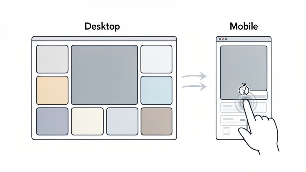
Let’s be honest: a visual hierarchy that looks incredible on a huge desktop monitor can feel like an absolute train wreck on a phone. That beautiful, wide-open grid with multiple columns just doesn't translate to the small screen. When you switch from a mouse to a thumb, the entire game changes.
This is where responsive design becomes your most valuable player. It’s not about just shrinking your design down. It’s about completely rethinking it.
Desktop users have a ton of screen real estate and the pinpoint accuracy of a cursor, which makes complex layouts like bento grids possible. Mobile users? They’re navigating with a thumb, usually one-handed, within a small, specific area we call the "thumb zone." A truly effective visual hierarchy in web design has to be fluid enough to serve both experiences perfectly.
Rebuilding for the Vertical Scroll
On a phone, the horizontal landscape is gone. The user’s journey is no longer a side-to-side scan but a straight-down vertical scroll. This means that wide, multi-column grid has to collapse into a clean, single-column stack. It forces you to get laser-focused on what really matters.
This is something platforms like Taap.bio handle brilliantly by giving you separate editing views for desktop and mobile. You’re not just hoping for the best; you’re intentionally designing two distinct, optimized experiences using the same core content.
- On a Desktop: You might place a big portfolio widget alongside three smaller social media links, creating a nice, balanced feel.
- On Mobile: That same layout instantly reconfigures itself. The portfolio widget now takes up the full width at the top, followed by the three social links stacked cleanly below it.
With this approach, your main focal point stays the hero on mobile instead of getting squished into an unreadable mess. It keeps the flow logical and guides the eye exactly where you want it to go.
A great responsive hierarchy doesn't just make your content fit on a smaller screen; it re-prioritizes it for a different mode of interaction. The goal is to preserve the intent of your design, even if the layout changes completely.
Being Ruthless with Your Mobile Priorities
With much less space to work with, you have to be cutthroat about what stays at the top. Ask yourself: what is the one thing I absolutely need a mobile visitor to do? That question should drive every single choice you make.
Think about making these kinds of smart adjustments:
- Move CTAs into the Thumb Zone: Your most important buttons—like "Subscribe" or "Book a Call"—need to live in the lower half of the screen. Make them easy to tap.
- Let Key Elements Dominate: Got a killer featured video or a must-click link? Let it take up the full screen width to grab all the attention.
- Simplify Complex Widgets: An element that shows a ton of detailed stats on a desktop can be streamlined for mobile, showing only the most critical piece of information.
By thoughtfully adapting your visual hierarchy for each device, you create an experience that feels intuitive and effortless for everyone. You’re not just building a single page; you're creating a flexible system that respects your user's context. And that's what leads to real engagement and better results, no matter where people find you.
Answering Your Top Visual Hierarchy Questions
Even when you've got the basics down, putting visual hierarchy into practice can bring up some tricky questions. It's one thing to know the theory, but it's another to confidently apply it to a real-world project. Let's dig into some of the most common questions designers have.
Think of this as moving from the textbook to the studio. We'll clear up any lingering confusion so you can start making smarter, more effective design choices right away.
How Does Visual Hierarchy Actually Affect SEO?
This is a great question. While visual hierarchy is a user experience (UX) principle at its core, it has a massive—though indirect—impact on your SEO. Here's how: search engines want to send people to websites they’ll love. A clear, intuitive layout is a huge part of that.
When someone lands on your page and can instantly find what they're looking for, they stick around. They click on things. They don't immediately hit the back button and return to the search results. These positive behaviors—like increased time on page and a lower bounce rate—are powerful signals to Google. You're essentially showing the search engine that your page is high-quality and delivers on its promise, which can give your rankings a serious boost over time.
Can I Really Use Too Much White Space?
Honestly, it's much, much easier to use too little. White space (or negative space) is the breathing room your design needs to feel clean and focused. It’s what separates the signal from the noise and gives your most important elements the spotlight they deserve.
Of course, it’s all about balance. If your elements start to feel disconnected or lost on the page, you might have gone a bit too far. But don't ever be afraid of generous spacing.
A rookie mistake is cramming everything together, creating a visual mess. Plenty of white space isn't empty—it's a sign of a confident, modern design that guides the eye with purpose instead of chaos. It turns a cluttered page into a clear story.
What’s the Single Most Important Element of Visual Hierarchy?
If I had to pick just one, it's Scale. No contest. Making something bigger is the quickest, most surefire way to tell someone, "Hey, look at this first!" It’s an instinctive, universal cue that works every single time.
Want to make absolutely sure your new YouTube video or your main "Shop Now" button gets seen? Make it noticeably larger than everything else around it. That element becomes your anchor. From there, you can use color, contrast, and spacing to support that focal point and guide the user through the rest of the page.
Ready to build a link-in-bio page with a visual hierarchy that actually converts? With Taap.bio, our modular grid and smart widgets make it easy to guide your audience with beautiful, effective designs. Start building your perfect page for free on Taap.bio.


