Ever felt like you had a brilliant idea for a webpage but got stuck at the first hurdle: the code? A no-code landing page builder is your solution. Think of it less like a complex engineering project and more like building with digital LEGOs. You get a box of pre-made, beautifully designed blocks—text, images, videos, buttons—and you simply click, drag, and arrange them to create a professional-looking page.
No coding degree required.
Table of contents
What Exactly Is a No Code Landing Page Builder
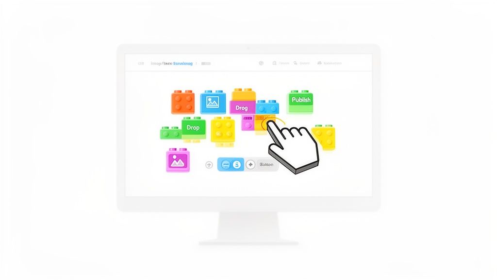
At its heart, a no-code landing page builder is a tool that puts the power of web design back into your hands. It's built for the rest of us—the creators, marketers, and entrepreneurs who need to get things done without getting bogged down in technical details. Instead of staring at lines of HTML or CSS, you work in a visual, what-you-see-is-what-you-get editor.
This is a game-changer, especially for anyone feeling the squeeze from the upcoming Bento.me shutdown. You're not just finding a replacement; you're upgrading. You can move beyond a simple list of links and start building a genuine online home for your brand. If you want to dive deeper into the basics, our guide on what is a landing page is a great place to start.
The Shift from Code to Creativity
Not long ago, launching a custom webpage was a major undertaking. You’d have to hire a developer, go through endless rounds of feedback, and watch the costs pile up. No-code builders completely flip that script.
The real magic of a no code landing page builder is its immediacy. What once took weeks of development can now be designed, published, and shared in a single afternoon, giving you the agility to launch campaigns and update your brand presence on the fly.
This shift isn't just a niche trend; it's a massive movement. The market for these intuitive platforms is exploding and is projected to hit $13.52 billion by 2025. The message is loud and clear: people are choosing speed and creative control over the old, slow way of doing things.
To give you a clearer picture, let's break down the differences.
No Code Builders vs Traditional Web Development
| Aspect | No Code Landing Page Builder | Traditional Web Development |
|---|---|---|
| Technical Skill | None needed. Visual drag-and-drop. | Requires expert coding knowledge (HTML, CSS, JS). |
| Speed | Launch in minutes or hours. | Can take weeks or months. |
| Cost | Low monthly subscription fees. | High upfront and ongoing maintenance costs. |
| Flexibility | Great for most standard business needs. | Limitless customization, but at a high cost. |
This table really highlights the value. For most creators and businesses, the speed and affordability of no-code are impossible to ignore.
The Evolution of Link-in-Bio Tools
This no-code philosophy is also completely transforming the link-in-bio space. Tools like Taap.bio are leaving the "simple list of links" model in the dust. They’ve evolved into true landing page builders, using modular, grid-based designs that let you create something truly engaging and unique. This is part of a larger trend where a no-code automation platform can streamline all sorts of business tasks, not just web design.
Why You Need a No Code Builder for Your Brand
So, we know what they are, but what's the real story? Why should you actually bother with a no code landing page builder? It all comes down to three things every single creator and business is desperate for: speed, savings, and total creative freedom.
In a world where an idea today is old news by next week, speed is everything. Building a webpage the old-fashioned way is a marathon. You’ve got designers, developers, and an endless chain of emails and meetings. A no-code builder lets you sprint through that entire process in a single afternoon.
This kind of agility is a game-changer. You can spin up a page for a new product launch, a sign-up form for your next webinar, or a portfolio refresh in just a few hours. A no-code landing page builder is an incredible tool for boosting your content distribution strategy and making sure your online presence keeps up with your ideas.
Reclaim Your Time and Budget
Let's talk about the money and time you get back, because it's a lot. Just think about the bill for a freelance developer to build one simple page—we're talking hundreds, often thousands, of dollars. Now, stack that against a small monthly subscription. It’s not even a fair fight.
By taking coding out of the equation, no-code builders put the power back in your hands. You can bring your vision to life yourself, saving a ton of cash and—just as importantly—all those hours you’d normally lose trying to explain your ideas to a developer.
That time and money can be poured right back into what really moves the needle: making great content, talking to your audience, and actually growing your brand. The efficiency you gain isn't just a nice perk; it’s a serious competitive edge.
Achieve Absolute Creative Control
Maybe the biggest win here is getting complete creative control. Your corner of the internet should look and feel like you, not like some cookie-cutter template everyone else is using. So many of the standard link-in-bio tools box you into a rigid, boring format.
A modern no code landing page builder blows those limits wide open. Take a platform like Taap.bio, for instance. It gives you dynamic tools that turn a boring page into a genuine experience:
- Modular Grids: Forget rigid lists. You can arrange content blocks anywhere on the page, creating beautiful, unique layouts that draw people in.
- Physics-Based Animations: Add a little life to your page with subtle movements that make your content feel responsive and fun to interact with.
- Smart Widgets: Why just link to your Spotify when you can embed a song people can play right there? Instead of a boring GitHub link, you can show off your live contribution graph.
This is what turns a simple link page from a static menu into a destination. It becomes the one place where your entire digital world comes together, grabbing your audience's attention and inviting them to stick around. You’re no longer just sending people to links; you're building a world for them to explore.
Key Features Every Great Builder Should Have
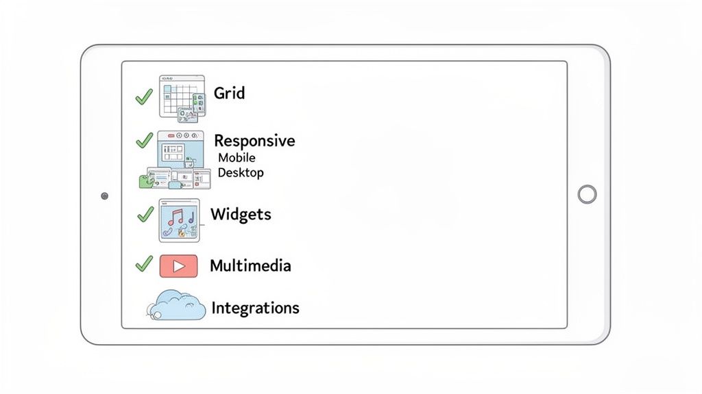
When you start shopping for a no-code landing page builder, it's easy to get lost. Dozens of tools are out there, and they all seem to promise the moon. But here’s the secret: the truly great builders all share a core set of features. Knowing what to look for is how you find a powerful creative partner instead of just another basic tool.
Think of it like choosing a camera. A simple point-and-shoot gets the job done, but a camera with manual controls and interchangeable lenses lets you capture your vision perfectly. The same goes for builders. The right features give you total control over your brand’s digital first impression.
Dynamic Visual Customization
The single most important feature is a flexible layout. Forget those platforms that trap you in a single, boring column of links. You need a system that lets you break free from that linear list and design a page that actually reflects your style.
That's where a drag-and-drop grid changes everything. Instead of just reordering links in a list, a grid-based builder gives you a canvas. You can place content blocks—text, images, videos, anything—wherever you want. Resize them to create a visual hierarchy and arrange them in unique layouts. Suddenly, your page feels like a custom-designed portfolio, not just a generic directory. For a deeper dive, check out our guide on the power of a drag-and-drop page builder.
Smart Widgets and Live Integrations
A great landing page should be more than a static collection of links. It should be a living, breathing dashboard of your online presence. This is where smart widgets make all the difference. These aren't just fancy buttons; they're live windows into your other platforms.
Look for a builder with deep integrations that pull real-time data right onto your page.
- Musicians: Embed a Spotify widget that shows your latest album and monthly listener count. Let visitors play your tracks without ever leaving the page.
- Developers: Showcase your work with a live GitHub widget that displays your contribution graph.
- Designers: Pull in your latest portfolio pieces automatically with a Dribbble or Behance integration.
These dynamic elements transform your page from a simple redirect hub into an engaging destination that gives your audience immediate value.
True Mobile Responsiveness
With more than half of all web traffic coming from mobile devices, your page must look perfect on a phone. But be careful—not all "responsive design" is created equal. Many builders just stack your desktop content into one long column, which often looks clunky and awkward on a smaller screen.
A top-tier no-code landing page builder gives you independent control over your desktop and mobile layouts. You should be able to rearrange, resize, or even hide specific elements on the mobile version to create a perfectly optimized experience for phone users.
This dual-layout control is non-negotiable. It ensures your page isn't just functional on mobile, but genuinely delightful to use, no matter the device.
Robust Multimedia Support
Your brand is more than just words and links. A powerful builder has to let you weave in all kinds of media to tell a more compelling story. We're talking about way more than just static images.
Your checklist should absolutely include support for:
- Video embeds from platforms like YouTube and Vimeo, with options for autoplay and looping.
- Animated GIFs to inject some personality and visual interest.
- Interactive embeds like Google Maps for your business location or Calendly for booking appointments.
The ability to mix these media types seamlessly is what turns a good page into a great one. It creates a rich, multi-sensory experience that grabs and holds your visitor's attention. The demand for this flexibility is why the website builder market is projected to hit $3.57 billion by 2026 and explode to $7.67 billion by 2031. This growth is driven by creators like you—from musicians embedding full albums to consultants mapping their business locations.
Choosing Between Link Lists and Visual Grids
When you’re looking at no-code landing page builders, you'll quickly notice two main camps emerge. You've got the classic, straightforward link list on one side, and the more modern, dynamic visual grid on the other. This isn't just about looks—it's a strategic choice that defines how your audience interacts with your brand.
Think of a simple link list, like the kind you see on Linktree, as a digital business card. It’s clean, it’s direct, and it gives people the basics. But its main job is to send people somewhere else. They land, they click, they leave. Your page is just a quick stop on the way to their real destination.
The Problem with Traditional Link Lists
Here’s the thing about those standard link lists: they tend to create a very generic, forgettable experience. Because you're locked into a single column of buttons, it's incredibly tough to inject any real brand personality. After a while, they all start to look the same, and your page just blends into the noise.
This rigid format often leads to a high bounce rate. People show up looking for one specific link, click it, and the opportunity to show them anything else is gone in a flash. It's a functional directory, sure, but it’s not a destination that invites people to stick around.
A vertical list of links is a tool for redirection. A visual grid is a tool for connection. The first sends your audience away, while the second invites them to stay, explore, and form a deeper relationship with your brand.
The Power of a Visual Grid Experience
Now, let's flip the script. Imagine your page not as a business card, but as a mini-website or an interactive portfolio. That’s exactly what a visual grid delivers. By breaking out of that single-column box, a grid-based no code landing page builder turns your page into an engaging, immersive dashboard for your brand.
Instead of a boring list, you get a creative canvas. Every piece of content—a new video, a featured product, your latest blog post—becomes its own visual block. You can drag, drop, and resize these blocks to create a layout that tells a story and guides your visitor’s eye. This immediately makes your page more interesting and encourages people to explore. Take a look at these grid layout design examples to see what a huge difference it makes.
A grid doesn't just look better; it works better. It transforms your page from a simple menu into a true online hub, making it far more likely that visitors will discover content they didn't even know they were looking for.
Feature Showdown: Link Lists vs. Visual Grids
To really drive the point home, let's break down how these two approaches stack up side-by-side on the features that truly matter for building a compelling online presence.
This table cuts right to the chase, comparing the old-school list with the modern grid.
| Feature | Traditional Link Lists (e.g., Linktree) | Visual Grid Builders (e.g., Taap.bio) |
|---|---|---|
| Creative Freedom | Very limited; stuck in a single-column layout. | Complete control with drag-and-drop grids. |
| User Engagement | Low; encourages quick exits. | High; promotes exploration and discovery. |
| Brand Identity | Difficult to express; templates are generic. | Highly customizable to reflect your unique brand. |
| Content Display | Limited to simple text links and thumbnails. | Rich multimedia support and live data widgets. |
So, what's the verdict? If all you need is a quick, no-frills menu to point people to a few external sites, a traditional link list can get the job done. But if your goal is to build a true digital home—a place that captures attention, showcases your brand, and keeps your audience engaged—a visual grid is the clear winner.
How to Migrate From Bento to a Better Alternative
So, you heard the news: Bento.me is shutting down in February 2026. While that might feel like a headache, I want you to see it as a golden opportunity. This is your chance to break free from a simple list of links and build a truly dynamic online hub for your brand. Moving on isn't just about copying what you had—it's about a serious upgrade.
Think of it as perfect timing. The market for these kinds of tools is exploding, with projections showing it will leap from $715.5 million in 2025 to a staggering $2.72 billion by 2035. That growth means you have an incredible selection of powerful, visually stunning platforms at your fingertips.
Step 1: Audit Your Existing Bento Page
First things first, let's take stock of what you've got. Open up your current Bento page and make a quick inventory of every single link, social profile, and piece of content. This list will be your roadmap for the move.
But don't just copy and paste. Look at each item with a critical eye. Are all those links still relevant? Is there a better way to showcase your latest project? This is the perfect moment to do some spring cleaning and refocus on what truly matters.
Here’s what a typical Bento page looks like—clean, but ultimately just a vertical list.
Your mission is to evolve beyond this static format into something far more engaging.
Step 2: Reimagine Your Layout With a Visual Grid
Okay, now for the fun part. Instead of just recreating your old link list, it's time to think like a designer. A modern builder like Taap.bio gives you a visual grid—a blank canvas where you can arrange your content with total freedom.
Don’t just transfer your links—transform them. A visual grid turns a boring directory into an interactive dashboard that tells a story and invites people to explore.
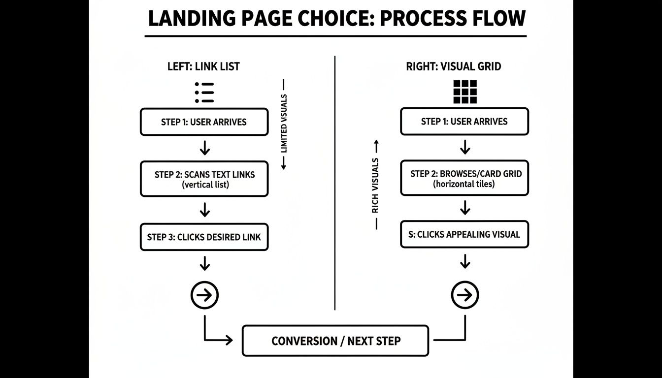
This is more than just aesthetics; it fundamentally changes how people interact with your page. The diagram below shows just how different the user journey is when you move from a simple list to an engaging grid.
The takeaway is simple: a visual grid grabs and holds attention, guiding visitors through your world instead of just sending them away.
Step 3: Replace Static Links With Smart Widgets
Your old Bento page probably had a plain link to your Spotify or GitHub profile. A real upgrade means swapping those static URLs for dynamic "smart widgets" that pull in live content.
This is where the magic really happens. Instead of just pointing people elsewhere, you bring the experience directly to them, right on your page.
- Musicians: Ditch the simple Spotify link. Add a widget that lets visitors play your latest track without ever leaving your page.
- Developers: That GitHub link is fine, but a live contribution graph showcasing your recent activity is so much better.
- Designers: Embed your Dribbble or Instagram feed to automatically display your newest work.
Widgets like these turn your page from a list of directions into a living, breathing destination. It's one of the biggest leaps forward you'll make by switching. For more ideas on what's possible, check out our guide on the top link-in-bio alternatives that do this brilliantly.
By following these steps, you can turn the Bento shutdown from a problem into a strategic move. You'll end up with a page that's more professional, more engaging, and far more effective at telling your unique story.
Building Your First Page with Taap Bio
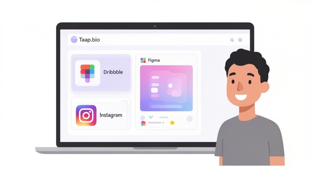
Alright, enough theory. Let's get our hands dirty and see just how easy it is to bring your page to life. We're going to walk through building a page from scratch using Taap.bio, a seriously powerful no-code landing page builder made for creators. In just a few minutes, you can go from a blank slate to a professional, interactive hub.
To keep things grounded, let’s follow the journey of a freelance designer. Their mission? To build a central "link-in-bio" that pulls together their portfolio, useful resources, and social media channels into one cohesive experience.
Getting Started: Your Profile and Canvas
First things first, you need to set up your profile. This is your digital handshake, so make it a good one. You'll snag a unique username, pop in a profile picture (or even a GIF to show some personality), and craft a short, punchy bio that instantly tells people who you are and what you're about.
With that sorted, you’re looking at the drag-and-drop grid. Think of it like your personal digital artboard. It's a completely flexible space where you can place, resize, and arrange different content blocks to build a layout that’s 100% you.
The grid is your creative playground. It completely frees you from the boring, single-column lists you see everywhere else. This is all about creating a visual hierarchy that pulls your visitor's eye to what matters most.
This intuitive canvas is where the magic begins, giving you total freedom to design without getting stuck in a template.
Adding Your First Content Blocks
Now for the fun part: adding your content. Our freelance designer needs to show off their skills and build some social proof. With a no-code builder like Taap.bio, this is ridiculously simple.
Here’s what they add in just a few clicks:
- Dribbble Portfolio: Instead of a boring old link, they drop in a Dribbble smart widget. This block automatically pulls in a live grid of their latest design work, complete with like counts. It’s a dynamic, self-updating portfolio.
- Figma Template Link: Our designer has a UI kit they share with the community. They add a link block but give it a big, bold preview image. This makes it impossible to miss and way more enticing to click.
- Instagram Feed: To give visitors a peek behind the curtain, they embed their Instagram feed. The widget shows their latest six photos and their follower count, acting as a live window into their creative world.
Each of these blocks is added in seconds. No code, no headaches. Taap.bio handles all the backend connections, pulling in the content for you.
Arranging Your Layout and Going Live
With the main content blocks on the page, the final step is to arrange them perfectly. This is where that drag-and-drop grid really flexes its muscles. Our designer decides their Dribbble portfolio is the main event, so they resize it to make it larger and more prominent.
They then place the Figma template and Instagram feed alongside it, creating a layout that feels balanced and visually engaging. Honestly, it feels more like arranging a mood board than building a webpage.
A game-changing feature here is the ability to tweak the desktop and mobile layouts separately. The designer gets the grid looking perfect on a big screen, then switches to the mobile view to quickly re-stack the blocks for a flawless vertical experience. Every visitor gets the best version of the page, no matter their device.
After a few final touches to the colors and fonts to match their branding, the page is done. They hit publish, and in less than an hour, they've launched a stunning, functional landing page that brings their entire online presence together. That’s the real power of a modern no-code landing page builder—it turns what used to be a complex technical task into a simple, creative, and incredibly satisfying process.
Got Questions? Let's Get Them Answered
It's totally normal to have a few questions before trying out a new tool. Here are the things most people wonder about when they're getting started with a no-code landing page builder.
How Fast Can I Actually Build a Page?
Forget the weeks-long timeline of traditional web development. With a no-code builder, you can go from zero to a fully-functional, beautiful landing page in under an hour.
Honestly, the longest part of the process is usually just deciding on your colors and what you want to say. The technical side of things? That’s the easy part now. You can literally dream up a page and launch it in the same afternoon.
Will My No-Code Page Show Up on Google?
Yes, absolutely. This isn't the old days of clunky, hidden web pages. Modern builders are built from the ground up with search engines in mind.
Tools like Taap.bio give you full control over the SEO essentials: your page title, meta description, and even the alt text for your images. While it's not meant to replace a massive corporate website, your page will be fully optimized to rank for your name and brand.
The best builders automatically handle the stuff Google really cares about, like making sure your page is mobile-friendly and loads lightning-fast. Your no-code page starts with a rock-solid SEO foundation right out of the box.
Can I Use My Own Domain Name?
You bet. Most professional-grade builders let you connect a custom domain you already own. This is a game-changer for branding.
Instead of a generic URL like taap.bio/yourname, you can use something clean and professional like hello.yourdomain.com. It’s a small detail that makes your brand feel instantly more established and trustworthy.
Ready to create a landing page that actually feels like you? With Taap.bio, you can build an impressive, interactive hub for your online world in just a few minutes. Stop settling for a boring list of links and start showing off what you do with a powerful visual grid.