
Your link-in-bio page is no longer just a list of links. It's your personal billboard, your digital storefront, and your first impression. Traditional, single-column layouts are functional but completely forgettable. They fail to capture the personality and dynamism that creators, freelancers, and small businesses need to project. The future of personal landing pages lies in intentional, visually compelling compositions that tell a story at a glance.
This is where the strategic power of a grid system comes in. By moving beyond simple stacks of buttons, you can create a memorable experience that not only directs traffic but also captivates your audience. A well-executed grid layout organizes information, establishes a visual hierarchy, and transforms a utility page into a curated canvas. It allows you to prioritize your most important content, from a new podcast episode to your professional portfolio, guiding your visitor’s eye exactly where you want it to go.
In this deep dive, we will explore 10 powerful grid layout design examples, breaking down the strategy behind each one. You'll learn not just what they are, but why they work and precisely how you can implement these exact concepts to build a page that truly stands out. Forget the boring list. We are providing actionable blueprints, complete with block composition, spacing rules, and implementation tips. Each example is a replicable strategy to help you build a more effective, engaging, and professional digital presence. Let's get started.
Table of contents
1. Asymmetric Grid Layout (Bento Box Style)
The Asymmetric Grid, often called the "bento box," is one of the most dynamic and visually compelling grid layout design examples you can implement. Inspired by the compartmentalized Japanese lunchbox, this design uses an irregular grid where content blocks, or widgets, vary in size and position. This approach breaks free from rigid, uniform columns, allowing you to create a sophisticated visual hierarchy that naturally guides the visitor's eye.
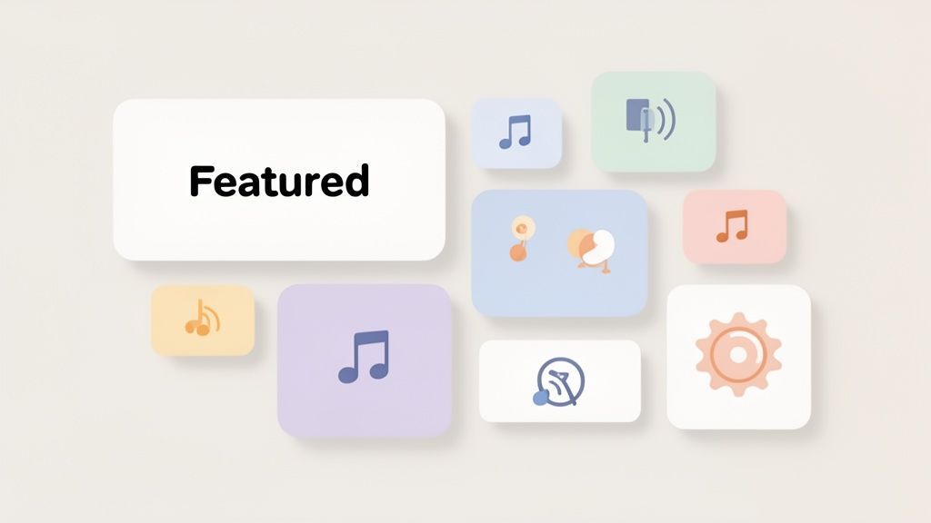
Unlike simple link lists, the bento style gives each piece of content its own distinct space and importance. A large block might feature your latest YouTube video, while smaller adjacent blocks could house social media links or a newsletter sign-up. This is the foundational design philosophy of Taap.bio, which empowers you to freely resize and place widgets to craft a truly unique and engaging micro-landing page.
Strategic Use Cases & Personas
This layout is perfect for creators who need to showcase a diverse range of content types without overwhelming their audience.
- Content Creators & Influencers: A bento grid allows you to feature a primary piece of content (like a new video or partnership) in a large block, surrounded by smaller links to your TikTok, Instagram, and merch store.
- Musicians & Artists: Showcase your latest album art with an embedded Spotify player in a prominent block, while smaller ones link to tour dates, your portfolio, and social profiles.
- Designers & Freelancers: Make your portfolio the hero. Use a large block for a project case study or Dribbble shot, with smaller blocks for your contact information, services, and client testimonials.
Actionable Implementation Tips for Taap.bio
Crafting a balanced asymmetric grid requires a strategic approach. Start by prioritizing your content and then build the layout around your most critical call-to-action.
- Establish a Focal Point: Place your most important widget, like a "Book a Call" link or a featured video, in a large 2x2 or 2x1 block. This creates an immediate anchor for the visitor's attention.
- Create Visual Rhythm: Use a mix of block sizes. Surround your large focal point with smaller 1x1 blocks for secondary links (e.g., social icons, quick links) to create balance and flow.
- Group Related Content: Cluster related widgets together. For instance, place all your social media links in a single row or column to create a clean, organized section within the larger grid.
- Mind the Gaps: Consistent spacing is key. Taap.bio's grid system handles this automatically, ensuring a polished look. Focus on the block arrangement, and let the platform maintain visual coherence.
2. Modular Block System with Drag-and-Drop
The Modular Block System is an intuitive and empowering approach to grid layout design examples that places creative control directly in your hands. This component-based layout uses discrete, movable blocks as the foundational unit of organization. You can drag widgets onto a canvas, resize them, and arrange them into any configuration, making it a highly flexible and user-centric design method.
This system, popularized by platforms like Notion and Webflow, prioritizes experimentation and freedom. It transforms page building from a rigid, code-heavy process into an interactive, visual experience. Taap.bio is built on this philosophy, offering a seamless drag-and-drop editor that lets you build a professional-looking micro-landing page without needing any design skills. It’s all about giving you the tools to craft your vision block by block.
Strategic Use Cases & Personas
This layout is ideal for users who want complete control over their page's structure and feel empowered by a hands-on, visual building experience.
- Small Business Owners: Quickly build a simple landing page by dragging blocks for services, customer testimonials, a contact form, and a map. No need for a developer.
- Podcasters & Newsletter Creators: Drag and drop an embedded player for your latest episode, a sign-up form for your newsletter, and links to your sponsors in a custom layout.
- Agency & Freelance Teams: Use modular blocks to rapidly prototype and build client micro-sites, showcasing portfolios, case studies, and team member profiles with complete design freedom.
Actionable Implementation Tips for Taap.bio
Mastering the drag-and-drop system is about combining intuition with a little planning. Think of it as assembling digital LEGOs to build your brand’s home.
- Sketch First, Build Second: Before you start dragging, have a rough mental sketch of your desired layout. This helps you place your main call-to-action and supporting content with purpose.
- Use Snap-to-Grid: Let the platform’s built-in alignment guides do the heavy lifting. Taap.bio’s snap-to-grid ensures your blocks align perfectly, giving you a clean, professional look without manual adjustments.
- Create Visual Zones: Group related widgets, like all social media icons or all project links, into distinct visual areas on your canvas. This creates an organized and easy-to-navigate experience for visitors.
- Lock Key Elements: Once you have your most important blocks perfectly placed, use a locking feature if available. This prevents accidental movement while you arrange less critical elements around them.
3. Multi-Column Responsive Grid
The Multi-Column Responsive Grid is a foundational and highly reliable entry among grid layout design examples. This classic approach uses a series of uniform columns that automatically reflow and stack based on the viewer's screen size. It’s the workhorse of web design, seen everywhere from e-commerce product listings to app stores, offering a clean, predictable, and user-friendly experience.
Unlike the more artistic asymmetric grid, this layout prioritizes order and scannability. Each content block is given equal visual weight, making it perfect for presenting a series of related items, such as links, blog posts, or portfolio pieces. This organized structure ensures your content is always accessible and easy to navigate, regardless of whether it's viewed on a phone, tablet, or desktop.
Strategic Use Cases & Personas
This layout is ideal for creators who need to display a large collection of links or content in a clear, organized fashion without establishing a strong visual hierarchy.
- Podcasters & Newsletter Creators: Display an archive of past episodes or newsletter issues in a clean, multi-column grid. Each block can feature a title, a brief description, and a direct link, making it easy for followers to browse your back catalog.
- Small Business Owners: Showcase a range of services or products. Use each block for a different offering, with an image and a short title, allowing customers to quickly scan and find what they need.
- Affiliate Marketers: Create a visually appealing "shopping list" or "toolkit" page. Each block can link to a different recommended product, complete with a small image and a clear call-to-action.
Actionable Implementation Tips for Taap.bio
Implementing a responsive column grid in Taap.bio is straightforward and focuses on maintaining uniformity and balance across your page.
- Maintain Consistent Block Sizes: For a true multi-column feel, use only 1x1 blocks. This ensures every item in your grid has the same size and proportion, creating a clean, repeating pattern.
- Organize in Rows: Arrange your 1x1 blocks in distinct rows. For example, create a row of three 1x1 blocks for your top links, followed by another row for social media profiles. This structure makes the content easy to scan.
- Use Dividers for Separation: To enhance clarity, place a "Divider" widget between different rows or categories of links. This adds visual breathing room and helps organize your content into logical sections.
- Check Mobile View: While Taap.bio handles responsiveness automatically, use the mobile preview to ensure your columns stack logically. The top-to-bottom, left-to-right order becomes crucial on a single-column mobile layout.
4. Masonry Grid Layout
The Masonry Grid Layout is a highly efficient and visually dynamic system for displaying content of varying heights. Popularized by platforms like Pinterest, this layout arranges items in columns, intelligently staggering them to eliminate large vertical gaps. This approach creates a seamless, "brick-like" tapestry of content, making it one of the most engaging grid layout design examples for image-heavy pages.
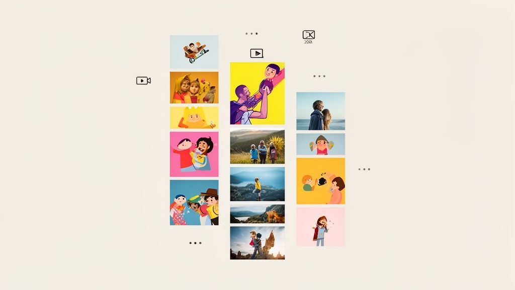
Unlike standard grids that force content into uniform boxes, the masonry style adapts to the natural dimensions of your media. This makes it perfect for presenting a continuous stream of visual information, such as a photo gallery or portfolio, without awkward cropping or excessive white space. The result is a page that feels both organized and organically curated.
Strategic Use Cases & Personas
This layout is ideal for creatives and brands whose primary content is visual and comes in a variety of aspect ratios. It allows for a dense, captivating presentation of work.
- Designers & Photographers: A masonry grid is perfect for showcasing a portfolio. You can display a Dribbble feed or a gallery of recent photos, allowing each piece to retain its original dimensions while fitting together cohesively.
- Bloggers & Curators: If you aggregate visual content like mood boards, recipes, or product roundups, this layout presents a rich, explorable feed that encourages users to keep scrolling.
- E-commerce Brands: Use a masonry layout to display product shots of different sizes and orientations on a category page, creating a more engaging and less repetitive shopping experience.
Actionable Implementation Tips for Taap.bio
Implementing a masonry grid in Taap.bio is straightforward with widgets like the Dribbble feed, which automatically adopts this structure.
- Select the Right Widget: Start by adding a visually-driven widget like the Dribbble or Gallery widget. These are purpose-built to handle multiple images of varying sizes and will automatically create the masonry effect.
- Optimize for Visual Flow: Ensure your images have high contrast and clear subjects. Since the layout is dense, strong visuals will prevent the page from looking cluttered and will draw the user's eye from one item to the next.
- Use It as a Focal Section: A masonry grid is visually demanding, so it works best as a primary content block. Surround it with simpler elements, like 1x1 text links or social icons, to avoid overwhelming the visitor.
- Consider Column Count: While Taap.bio handles responsiveness, be mindful of how your grid looks on mobile. A two-column masonry grid is often ideal for smaller screens, ensuring images are large enough to be appreciated.
5. Card-Based Grid Layout
The Card-Based Grid Layout is a highly structured and intuitive approach, making it one of the most reliable grid layout design examples for organizing information. This design arranges content into individual "cards," which are self-contained blocks with consistent styling like padding, borders, and shadows. Popularized by platforms like Dribbble, Pinterest, and Google's Material Design, this layout creates a clean, scannable, and familiar user experience.
Unlike a simple list, each card acts as a mini-information hub, often containing an image, a title, a short description, and a clear call-to-action. This modularity makes it incredibly effective for presenting multiple distinct items, such as blog posts, products, or portfolio pieces, in an orderly fashion that’s easy for visitors to browse and digest.
Strategic Use Cases & Personas
This layout is ideal for creators and businesses that need to display a collection of similar items in a visually organized and appealing manner.
- Designers & Freelancers: Perfect for a portfolio page. Each card can represent a different project, featuring a thumbnail, project title, and a link to the full case study.
- Small Business Owners: An excellent choice for showcasing products or services. Each card can highlight a specific offering with an image, price, and an "Add to Cart" or "Learn More" button.
- Bloggers & Publishers: Use a card grid to display your latest articles. This format allows readers to quickly scan headlines and featured images to find content that interests them.
Actionable Implementation Tips for Taap.bio
Building an effective card-based grid is all about consistency and clear hierarchy. Taap.bio's widgets naturally function as cards, making this layout simple to execute.
- Maintain Consistent Sizing: Use uniform block sizes, like all 1x1 or 2x1 widgets, to create a neat, predictable grid. This consistency is the hallmark of the card layout.
- Style Your Cards: In the design settings, add a subtle border radius and a soft box-shadow to your widgets. This visually lifts them off the background, defining each one as a distinct, clickable card.
- Establish Internal Hierarchy: Within each widget, ensure a clear visual order. A header image, followed by a bolded title and then smaller descriptive text, guides the user’s eye effectively.
- Add Interactive Feedback: Use hover effects. Configure your widgets to slightly scale up or change color on hover to provide clear feedback that the element is interactive, encouraging clicks.
6. Featured Hero with Grid Sidebar
The Featured Hero with Grid Sidebar is a powerful hybrid layout that gives your most important content a dedicated spotlight while still showcasing secondary links. This is one of the most effective grid layout design examples for creating a strong visual hierarchy. It dedicates a large, prominent "hero" block to your primary call-to-action and complements it with a smaller, organized grid of additional content, often arranged like a sidebar.
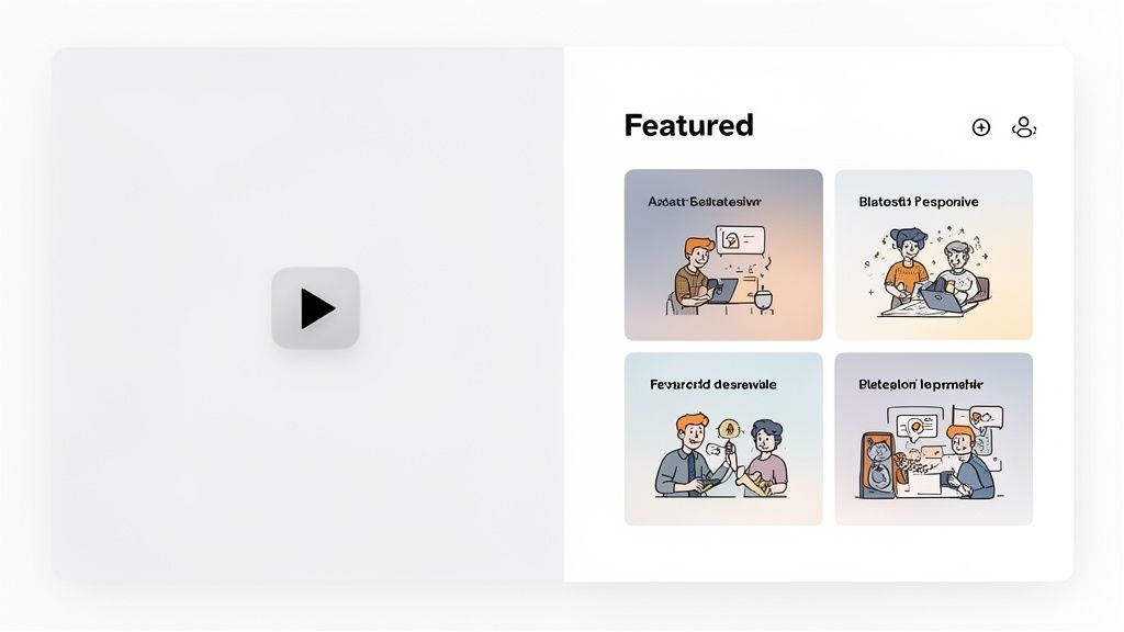
This layout immediately tells visitors what you want them to see first, whether it's a new YouTube video, a featured product, or a portfolio piece. The sidebar grid then provides an organized, scannable collection of other relevant links, preventing the page from feeling one-dimensional. It’s a classic, high-converting design seen on platforms like YouTube and Spotify, where a featured item is paired with a list of recommendations.
Strategic Use Cases & Personas
This layout is ideal for anyone with a clear primary objective who also needs to provide easy access to other resources.
- YouTubers & Podcasters: Embed your latest video or episode in a large hero block. The sidebar grid can then link to your channel subscription, popular playlists, and social media profiles.
- Small Business Owners: Use the hero section to feature a new product or a limited-time promotion. The grid sidebar can house links to your full store, contact information, and customer reviews.
- Musicians & Bands: Make your new single or music video the hero. The sidebar can feature an embedded Spotify player, links to purchase tickets, and your social media accounts.
Actionable Implementation Tips for Taap.bio
Achieving the hero-sidebar effect on Taap.bio is about strategic block sizing and placement to create a clear visual divide.
- Define Your Hero Block: Dedicate a large block (e.g., 2x2 or 3x2) on one side of your canvas for your primary content. Use a Video, Image, or Link widget to make it highly engaging.
- Build the Sidebar Grid: To the side of your hero block, arrange smaller 1x1 widgets in a vertical column. This creates the "sidebar" effect. Use these for social icons, quick links, or a newsletter signup.
- Create Visual Separation: Use different background colors for the hero and sidebar widgets. This simple trick enhances the distinction between the two sections, guiding the user's eye more effectively.
- Optimize for Mobile: On mobile, Taap.bio will naturally stack these blocks. Ensure your hero block is placed first in the sequence so it appears at the top when viewed on a smaller screen, followed by the sidebar grid.
7. Timeline/Sequential Grid Layout
The Timeline or Sequential Grid is a powerful narrative tool among grid layout design examples, arranging content chronologically to tell a story. This layout uses a linear progression, either vertically or horizontally, to guide visitors through a sequence of events, milestones, or project steps. It's an incredibly effective way to showcase history, progress, or a detailed process.
Unlike static grids, this layout creates a dynamic flow that encourages scrolling and exploration. By visually connecting points in time with lines or indicators, you transform a simple list of achievements into a compelling journey. It’s perfect for adding depth to a portfolio or giving context to a brand's evolution, showing not just what you did, but the path you took to get there.
Strategic Use Cases & Personas
This layout excels at storytelling and is ideal for professionals and brands who want to demonstrate growth, experience, or a detailed process.
- Freelancers & Consultants: Display your career progression or a detailed project case study. Start with the initial client brief, move through key milestones, and end with the final results and testimonials.
- Brands & Startups: Create an "About Us" page that visually walks through your company's history, from its founding date to major product launches and recent achievements.
- Developers & Designers: Showcase the evolution of a project. Use the timeline to detail each stage, from wireframing and prototyping to the final UI and launch, similar to a Behance case study.
Actionable Implementation Tips for Taap.bio
Building a timeline in Taap.bio is about creatively using the grid to imply sequence. You can guide the eye vertically to create a clear chronological path.
- Create a Central Axis: Use a single-column layout as your timeline's spine. Arrange your widgets vertically down this central line to establish a clear chronological flow.
- Alternate for Visual Interest: Place image or text widgets slightly to the left and right of your central column, creating a staggered effect. This prevents monotony and makes the timeline more engaging to follow.
- Use Headers as Date Markers: Use a Text or Header widget for each key date or milestone (e.g., "2023: Project Launch"). Place these markers strategically to segment your timeline.
- Connect the Dots: While Taap.bio doesn't have a line tool, you can use thin, single-column blocks with a solid background color between your main content blocks to create the visual effect of a connecting line.
8. Stacked/Single-Column Layout
The Stacked or Single-Column Layout is a foundational design that prioritizes clarity, readability, and a mobile-first user experience. As one of the most straightforward grid layout design examples, it arranges content vertically in a single feed, with each item stacked on top of the next. This linear approach is perfect for presenting information sequentially, guiding the user through content in a natural, scroll-based flow.
Popularized by platforms like Instagram, Twitter, and the original Linktree, this layout excels where content needs to be consumed in a specific order. By removing horizontal distractions, it focuses the user’s attention entirely on the content itself. This makes it a powerful choice for creators who want to deliver a clear, no-fuss list of their most important links and updates without visual complexity.
Strategic Use Cases & Personas
This layout is ideal for creators whose primary goal is to provide a direct and scannable list of resources. It's built for efficiency and speed.
- Podcasters & Newsletter Writers: Present a chronological list of your latest episodes or issues. A single-column format makes it easy for your audience to find and click on the most recent content first.
- Authors & Speakers: Use a stacked layout to list links to buy your book, sign up for your mailing list, and view your speaking schedule. The clear hierarchy ensures your most important calls-to-action are easily found.
- Small Business Owners: Provide essential business information in a clean, accessible format. Links to your "Menu," "Online Ordering," "Hours & Location," and "Contact Us" can be stacked for ultimate clarity.
Actionable Implementation Tips for Taap.bio
While simple, an effective single-column layout requires attention to spacing and visual rhythm to avoid becoming a monotonous list.
- Set a Consistent Width: All your widgets should be full-width (2-columns wide in Taap.bio's editor). This creates the unified vertical line that defines the single-column aesthetic.
- Vary Widget Types: Break up the visual monotony of simple link blocks. Alternate between a standard link, a social embed (like a recent Tweet or Instagram post), and a text block to add rhythm and interest.
- Use Visual Separators: Add a "Separator" widget between groups of related links. For instance, place one between your social media links and your content links to create distinct, digestible sections.
- Prioritize the Top: Place your most critical link or call-to-action at the very top of the stack. This is the first thing users will see and is most likely to be tapped, following the natural top-to-bottom reading order.
9. Hierarchical Zone-Based Grid
The Hierarchical Zone-Based Grid is a powerful method for organizing a large amount of diverse content into a clean, digestible narrative. This approach divides the page into distinct horizontal zones, where each zone acts as a self-contained section with its own internal grid structure. This is one of the most strategic grid layout design examples for guiding a visitor through a complete story, from introduction to action.
Think of it like a well-structured landing page. The top "hero" zone might use a single, wide block for a powerful headline, while a middle zone uses a 3-column layout for services, and a lower zone features a 2-column testimonial grid. This modularity allows you to present different types of information logically without overwhelming the user, making it ideal for more comprehensive micro-landing pages.
Strategic Use Cases & Personas
This layout excels for professionals and businesses who need to present more than just a list of links, guiding visitors through a specific journey.
- Freelancers & Consultants: Start with a bold hero section stating your value proposition (Zone 1), followed by a grid of your core services (Zone 2), and end with a contact form or booking link (Zone 3).
- Small Business Owners: Use the top zone for a featured product or promotion. Follow it with a categorized grid of products or menu items, and conclude with customer reviews and location information.
- Course Creators & Coaches: Dedicate the first zone to your main course offering. The next zone can detail the curriculum or modules, with a final zone for testimonials and an enrollment CTA.
Actionable Implementation Tips for Taap.bio
Building effective zones requires thinking about your page's narrative flow. Use Taap.bio's flexible grid to create visual separation and guide the eye downward.
- Define Your Zones: Before adding widgets, map out your sections. A common flow is: Introduction (who you are), Offering (what you do), and Action (what to do next).
- Create Visual Breaks: Use a "Spacer" widget or a full-width "Header" widget with a distinct background color to act as a divider between your zones. This signals a transition to a new content category.
- Vary Grids Within Zones: Make your top zone a single 4x1 "Text" block for a strong headline. Follow it with a series of 2x2 "Image" or "Link" blocks for your services. This contrast in grid density creates a clear hierarchy.
- Anchor the Bottom: End with a strong call-to-action. Use a full-width, visually distinct "Link" widget for your primary goal, like "Schedule a Consultation" or "Shop Now," to give your page a definitive conclusion.
10. Interactive/Animated Grid with Physics-Based Movement
Moving beyond static arrangements, the Interactive/Animated Grid transforms your page from a simple layout into an engaging, responsive playground. This advanced approach uses physics-based animations and dynamic interactions, making content blocks respond to user input with momentum, easing, and satisfying visual feedback. This is one of the most innovative grid layout design examples because it prioritizes user experience and delight.
Instead of just presenting information, this layout invites users to play. When a visitor drags a block, it moves with realistic momentum, and other elements might subtly react. This concept is central to the Taap.bio editor, where arranging widgets feels fluid and intuitive, much like organizing apps on an iOS home screen. The goal is to make the interaction itself a memorable part of the brand experience.
Strategic Use Cases & Personas
This layout is ideal for brands and creators who want to stand out with a cutting-edge, tech-forward presentation that feels premium and interactive.
- Tech Brands & SaaS Companies: An interactive grid mirrors the slick, polished feel of a software product, making it perfect for showcasing features, demos, or company culture in a modern way.
- Digital Agencies & Studios: Demonstrate your design and development prowess directly on your link-in-bio page. The fluid animations act as a mini-portfolio of your interactive capabilities.
- Gaming Influencers & Developers: Create a layout that feels as dynamic as the games you play or create. The physics-based movement resonates with an audience that appreciates high-quality digital experiences.
Actionable Implementation Tips for Taap.bio
While Taap.bio's core editor already incorporates these physics, you can enhance the user's interactive experience through strategic design choices.
- Create an "Interactible" Focal Point: Use a widget that encourages interaction, like an embedded video or a music player. When users engage with it, the high-quality feel of the platform becomes more apparent.
- Guide with Subtle Motion Cues: Although Taap.bio handles the core animations, consider adding widgets with built-in hover effects or subtle animations (like a glowing "New" badge) to draw attention and encourage clicks.
- Keep Performance in Mind: Interactive grids rely on smooth performance. Stick to optimized images and avoid overloading the page with too many heavy media embeds to ensure the animations remain fluid at 60fps on all devices.
- Prioritize Accessibility: Remember that not all users want motion. Taap.bio's platform respects the
prefers-reduced-motionsetting, ensuring your page is accessible to everyone without you needing to configure anything extra.
10-Style Grid Layout Comparison
| Layout | Complexity 🔄 | Resource / Performance ⚡ | Expected outcomes ⭐ / 📊 | Ideal use cases 💡 | Key advantages ⭐ |
|---|---|---|---|---|---|
| Asymmetric Grid Layout (Bento Box Style) | Medium 🔄🔄 | Moderate ⚡⚡ | Distinctive visual impact, strong hierarchy ⭐⭐⭐⭐ 📊 | Creators, artists, influencers for expressive link-in-bio pages 💡 | Visual uniqueness; flexible emphasis and customization ⭐ |
| Modular Block System with Drag-and-Drop | Medium‑High 🔄🔄🔄 | Moderate‑High ⚡⚡⚡ | Fast iteration and high usability for non-designers ⭐⭐⭐⭐ 📊 | Non-designers, small businesses, creators who edit frequently 💡 | Intuitive editing, real-time preview; empowers users ⭐ |
| Multi-Column Responsive Grid | Low 🔄 | Low ⚡ | Predictable, accessible layout; reliable presentation ⭐⭐⭐ 📊 | Blogs, e‑commerce, professional portfolios needing clarity 💡 | Easy implementation, consistent readability, SEO-friendly ⭐ |
| Masonry Grid Layout | Medium 🔄🔄 | Low‑Moderate ⚡⚡ | Engaging visual flow; efficient vertical use for images ⭐⭐⭐⭐ 📊 | Photographers, designers, visual portfolios and galleries 💡 | Natural rhythm, efficient space use for variable heights ⭐ |
| Card-Based Grid Layout | Low 🔄 | Low ⚡ | Highly scannable, organized presentation ⭐⭐⭐⭐ 📊 | Freelancers, consultants, product/service listings 💡 | Self-contained items, clear CTAs and predictable layout ⭐ |
| Featured Hero with Grid Sidebar | Medium 🔄🔄 | Moderate ⚡⚡ | Strong focal emphasis; drives attention to featured content ⭐⭐⭐⭐ 📊 | Musicians, podcasters, creatives spotlighting a key item 💡 | Clear hierarchy: spotlight + supporting items; balanced layout ⭐ |
| Timeline / Sequential Grid Layout | Medium‑High 🔄🔄🔄 | Moderate ⚡⚡ | Effective narrative and chronological clarity ⭐⭐⭐ 📊 | Case studies, career portfolios, release histories 💡 | Guides viewers through progression; memorable storytelling ⭐ |
| Stacked / Single-Column Layout | Low 🔄 | Low ⚡ | Excellent mobile readability and focus; simple consumption ⭐⭐⭐⭐ 📊 | Mobile-first creators, long lists, podcasts, simple link lists 💡 | Simplicity, low cognitive load, fastest to scan vertically ⭐ |
| Hierarchical Zone-Based Grid | High 🔄🔄🔄 | High ⚡⚡⚡ | Strong organization and conversion-oriented flow ⭐⭐⭐⭐ 📊 | Comprehensive profiles, SaaS/e‑commerce landing experiences 💡 | Sectioned journey, category-specific optimization, clarity ⭐ |
| Interactive / Animated Grid (Physics-Based) | Very High 🔄🔄🔄🔄 | Very High ⚡⚡⚡⚡ | Highly engaging and memorable when performant ⭐⭐⭐⭐ 📊 | Design-forward creators, portfolios, interactive dashboards 💡 | Delightful interactions, strong differentiation and engagement ⭐ |
From Blueprint to Reality: Build Your Perfect Grid Today
We've journeyed through a dynamic landscape of grid layout design examples, deconstructing ten distinct blueprints for building a compelling and high-converting link-in-bio page. From the structured chaos of the asymmetric bento box to the elegant storytelling of a timeline grid, a powerful theme has emerged: a grid is more than just a container for links. It is a strategic framework for communication, a canvas for your brand, and a direct line to your audience's attention.
The most impactful layouts we analyzed share a common foundation. They are not random assortments of blocks but carefully orchestrated systems built on a clear understanding of content hierarchy. Whether it was placing a "Featured Hero" at the top to spotlight a new product or using a "Hierarchical Zone-Based Grid" to separate professional services from creative projects, the goal was always to guide the user's eye and actions with intention.
Key Takeaways for Your Grid Strategy
Mastering these grid concepts moves you from a passive content curator to an active digital architect. The difference lies in a few core principles:
- Prioritization is Paramount: Your most crucial call to action, whether it's a newsletter sign-up or your latest YouTube video, should occupy a visually dominant position. Use size, color, and placement to create an undeniable focal point.
- Rhythm and Flow Matter: The interplay between large feature blocks and smaller utility links is what creates visual interest. Thoughtful use of negative space prevents clutter and helps each element breathe, making your page feel professional and easy to navigate.
- Mobile is Non-Negotiable: A stunning desktop layout is only half the battle. As we've seen, successful grids adapt gracefully to smaller screens. This often means transitioning from multi-column complexity to an elegant, single-column stack that preserves the intended hierarchy and user experience.
Turning Inspiration into Action
The true value of exploring these grid layout design examples is not just in admiring them, but in applying their underlying strategies to your own canvas. You now have a versatile toolkit of replicable methods. Think of the "Modular Block System" when you need ultimate flexibility, or the "Card-Based Grid" when presenting a portfolio of similar items. These aren't rigid rules; they are starting points for your own creative exploration.
The power to build these sophisticated layouts is no longer reserved for those with deep coding knowledge. The purpose of this deep dive is to empower you, the creator, the freelancer, the artist, to realize your vision. By leveraging the principles of visual weight, responsive design, and strategic widget composition, you can transform a simple utility page into a memorable brand experience. Your link-in-bio is often the first, and sometimes only, impression you make. Don't let it be a generic list of links. Make it an engaging, interactive, and effective extension of who you are and what you offer.
Ready to stop dreaming and start building? The flexible, drag-and-drop grid system at taap.bio was engineered to bring these advanced grid layout design examples to life without a single line of code. Sign up for free today at taap.bio and build the powerful, professional link-in-bio page your brand deserves.


