Let's get one thing straight: if you want to improve your conversion rates, you have to completely rethink your "link in bio." It's not just a menu of links. It's your most valuable piece of digital real estate—a high-intent landing page where casual followers decide if they're going to become fans, clients, or customers.
This is your digital storefront, plain and simple.
Table of contents
Your Link in Bio Is Your Most Important Landing Page
Forget the sprawling, multi-page websites for a second. For most creators, influencers, and small brands, that single link in your social media bio is where the real action happens. It's the critical moment where someone who just discovered you on Instagram or TikTok decides whether to dive deeper or just tap away forever. That one link is carrying your entire conversion strategy on its shoulders.
We also need to broaden our definition of "conversion." It isn't just a sale or a generic email signup. For a musician, a conversion is someone hitting play on their latest track right from the page. For a consultant, it's a new meeting booked in their calendar. For a YouTuber, it’s a new subscriber earned from an embedded video. Each goal is unique.
Why Traditional Link Lists Fail
The old-school approach of just listing out a bunch of plain text links is fundamentally broken. It’s a recipe for disaster because it gives every single option the same weight, creating instant decision paralysis for your visitor. There's no visual hierarchy, no story, no guidance. You're basically forcing your audience to guess what you want them to do.
This is where so many people go wrong. When a visitor lands on a wall of text, their attention scatters. Your most important goal—whether it's selling a new product or promoting a podcast—gets completely buried in the noise. To really dig into the strategic power of this space, check out our deep dive on the true link in bio meaning.
The Power of a Strategic Layout
Now, let's try a different approach. Instead of a boring list, picture a dynamic, visual grid—almost like a bento box. This is the whole philosophy behind Taap.bio. It’s about turning your page from a passive list into an active conversion machine.
Using a modular layout puts you back in the driver's seat. You can intentionally guide your visitor's attention by making your main call-to-action—like a "Listen on Spotify" widget—physically larger and more visually dominant than anything else on the page.
A well-designed visual hierarchy isn't just about looking good; it's about taking control. You're telling your visitor exactly where to look first and what to do next. That clarity is what convinces them to take the action you care about most.
Getting your layout right is the single most important thing you can do to optimize your page. It ensures that the second someone arrives, they know exactly what your top priority is. All your other links, like your social profiles or blog, can still be there—they just take a backseat visually. This simple shift turns passive scrollers into active participants and drives the results that actually grow your brand.
Designing a Layout That Converts
Let's be honest, a pretty landing page is nice, but a page that converts is what really matters. Great design isn't just about aesthetics; it’s about strategically guiding your visitor's eye straight to the one action you want them to take. That's where Taap.bio's modular grid comes in—it gives you the power to build a clear visual path that turns casual visitors into engaged followers, subscribers, or clients.
Think of your page as a story with a single, crucial plot point. Your main goal, whether that's getting more podcast streams or booking a discovery call, needs to be the hero. This is where large, attention-grabbing widgets are your best friend. A podcaster, for example, could feature their latest episode with an oversized Spotify widget, making it impossible to ignore. A UX designer? They could embed a massive Figma prototype to show off their skills right away.
This simple diagram shows exactly what I mean—the shift from a jumbled list to a focused, high-converting grid.
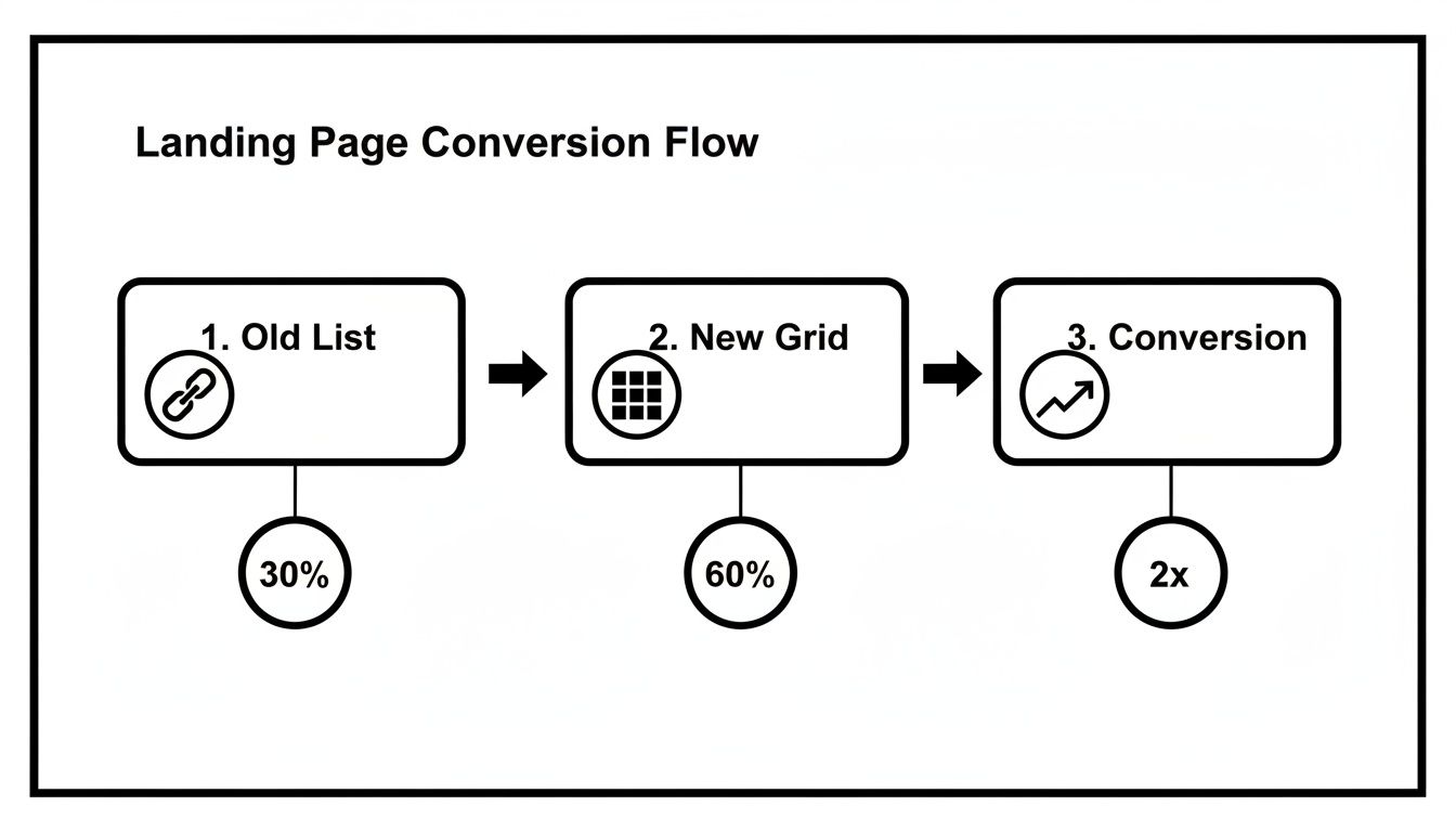
By ditching the standard link list for a strategic grid, you create a powerful focal point that can seriously boost engagement and, more importantly, conversions.
Create a Single Point of Focus
Here's the single biggest mistake I see creators make: they give every link equal visual weight. When everything screams for attention, nothing gets heard. This isn't just my opinion; the data backs it up. One study found that pages with a single call-to-action (CTA) convert 28% better than those with five or more. That’s a jump from a 10.5% to a 13.5% conversion rate just by simplifying.
This "less is more" approach is exactly why moving away from basic link-in-bio lists is so effective. Instead of forcing users to scroll through a long, confusing list of options, Taap.bio lets you create one "hero" block—like a huge Spotify artist widget displaying your monthly listeners and new album art—while tucking your secondary links neatly into the surrounding grid.
Your primary CTA should be the hero of your page. Make it big, make it bold, and give it the visual space it deserves. Everything else on the page should play a supporting role.
Use Visual Hierarchy to Guide the Eye
Visual hierarchy is just a fancy term for arranging things to show what's most important. With Taap.bio's drag-and-drop grid, you don't need to be a designer to get this right. It’s incredibly intuitive.
Here are a few practical ways to nail it:
- Size Matters: Your most important widget should be your largest. It’s a simple, powerful visual cue that tells visitors, "Hey, look here first!"
- Color and Contrast: Use custom colors to make your main CTA button pop. A bright, contrasting color for your "Subscribe Now" or "Book a Call" button is a classic trick because it works. It draws the eye instantly.
- Strategic Placement: People tend to scan pages in an F-pattern or a Z-pattern online. Put your most critical element in the top-left or center of the grid, right where their eyes will naturally land first. We actually wrote a whole guide on using visual hierarchy in web design if you want to dive deeper into the psychology behind it.
Layout Strategies for Different Creator Goals
To make this even more practical, let's look at how different creators can configure their Taap.bio page. The right layout depends entirely on what you want your audience to do.
| Creator Type | Primary Conversion Goal | Recommended Hero Widget | Supporting Widgets |
|---|---|---|---|
| Podcaster | Increase episode streams | Large Spotify or Apple Podcasts widget | Smaller links to social media, a "Support the Show" link, and a newsletter signup form. |
| Freelancer/Consultant | Book client calls | Embedded Calendly or Typeform widget | Testimonial text blocks, a link to your portfolio, and your LinkedIn profile. |
| YouTuber | Drive channel subscriptions | Large YouTube video embed of your latest release | "Subscribe" button link, links to your merch store, and a link to your Discord community. |
| Musician | Promote new album/single | Large Spotify Artist or SoundCloud widget | Links to tour dates, a "Follow on Spotify" button, and links to other streaming platforms. |
This table is just a starting point. The beauty of the grid is that you can experiment to find the perfect combination that tells your story and drives action.
Balance Your Page with Supporting Content
Once your hero CTA is in place, you can flesh out the rest of the grid with supporting content. These secondary elements are there to build trust and add context, not to compete for the spotlight.
Think about adding smaller text blocks for a killer headline or a few glowing client testimonials. These bits of social proof reinforce the value of your main offer without being distracting. You can also use compact link blocks for your other social profiles or a newsletter signup form. They’re still important, just not the most important thing on the page.
It all comes down to balance. Give your main goal the spotlight and let your other links provide value in the background. If you're looking for more tips on this, there’s a great resource on how to create a landing page that actually converts that goes into even more detail. By engineering your layout this way, you're not just organizing links; you’re building a conversion machine.
Use Smart Widgets to Cut Out Clicks and Keep People Hooked
Your page layout is the foundation, but it's the smart widgets that bring the whole thing to life. If you’re serious about getting more conversions from your landing page, you need to understand one thing: every single click you can save your audience is a huge win. This is where interactive, embedded content becomes your secret weapon against user friction.
What’s friction? It’s anything that gets in the way of a visitor doing what you want them to do. A classic example is making someone leave your page to listen to your new track on Spotify. That extra step, that new tab opening up, is a perfect opportunity for them to get distracted and disappear forever. Smart widgets solve this by bringing the entire experience directly to your visitor.
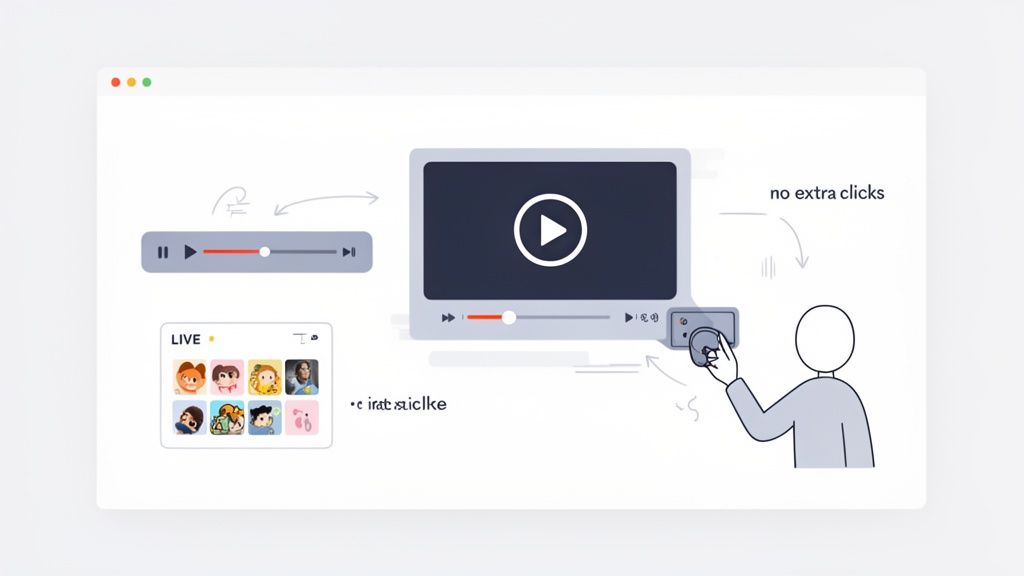
By cutting out these unnecessary steps, you create a seamless journey for your audience. Your page stops being just a list of links and becomes an interactive space where people can engage, listen, and watch without ever having to go somewhere else.
Keep Them on Your Page with Inline Content
The guiding principle here is simple: the less your visitors have to travel, the more likely they are to convert. Every time you send someone to another platform, you’re gambling with their attention.
Think about a musician dropping a new single. The old way meant a simple link that said, "Listen on Spotify." This forces the user to open a new app, wait for it to load, and then navigate to the song. But with a Taap.bio Spotify widget, they just hit play and listen to the whole thing right there on your page. The album art, the play button—the whole experience is self-contained.
This strategy works for just about anyone:
- Podcasters: Embed your latest episode with an inline player. A visitor can listen to your discussion while still looking at your other links, like your Patreon or newsletter signup.
- YouTubers: Instead of just linking to your channel, embed your latest video. It's a much lower commitment for someone to watch it directly on your page than to open the YouTube app. If you want to dive deeper, check out our guide on how to add a full video to your link in bio.
- Coaches: Pop in an embedded Calendly widget. A potential client can see your availability and book a discovery call without ever leaving your page, which slashes the drop-off rate for scheduling.
Bringing the content directly to the user keeps them locked into your world, right where you want them.
Build Instant Credibility with Live Social Proof
Trust is a massive piece of the conversion puzzle. People need to believe you're the real deal. Smart widgets that pull in live data from other platforms act as powerful, automated social proof. They show, in real-time, that you have an active and engaged audience.
Picture a freelance designer looking for new clients. A static link to their Dribbble profile is fine, but an embedded Dribbble widget showing off their latest work with real like-counts? That’s compelling. It’s instant, visual proof of their skills and popularity.
When visitors see live, dynamic content from platforms they already trust—like Instagram, YouTube, or GitHub—it lends immediate credibility to your personal brand. This isn't a static testimonial; it's living proof of your work and influence.
This kind of automated credibility is a game-changer for all kinds of creators:
- Instagram Influencers: A real-time grid of your latest posts does way more than a simple link. It showcases your aesthetic and proves your content is fresh and current.
- Developers: An embedded GitHub widget that displays your contribution graph is the ultimate resume. It visually demonstrates your coding activity and commitment without you having to say a single word.
- Brands: A widget showing your latest TikToks with follower counts gives visitors a quick snapshot of your community and content style, encouraging them to follow you right then and there.
This kind of social proof feels authentic because it is authentic. It’s not a curated screenshot; it’s a live window into your world, and that builds the trust you need to drive conversions.
Make Converting Effortless
At the end of the day, improving your landing page’s conversion rate comes down to making the desired action as easy as humanly possible. Every widget, every design choice, should be focused on removing roadblocks and guiding the user to your goal.
Think of it as setting up an express checkout lane. Smart widgets clear the path. A user doesn’t have to hunt for your podcast, find your portfolio, or manually open their calendar app. You're bringing the finish line right to their fingertips.
A newsletter creator, for instance, can embed a simple signup form directly on their Taap.bio page. Instead of clicking a link, going to another site, and then filling out the form, a visitor just types their email into the widget and hits "Subscribe." You've just cut a three-step process down to one.
This is the real magic of a well-designed, widget-driven page. It respects your visitor's time and attention by making engagement effortless. When you remove friction at every turn, you’re not just creating a better user experience—you’re building a much more effective conversion machine.
Tailor the Experience for Mobile and Desktop Visitors
Thinking a one-size-fits-all landing page will cut it is one of the fastest ways to kill your conversion rates. Let's be real: someone scrolling on their phone has a completely different mindset, screen size, and attention span than a person browsing on a 27-inch monitor. If you ignore this, you're willingly creating a frustrating experience for a huge chunk of your audience.
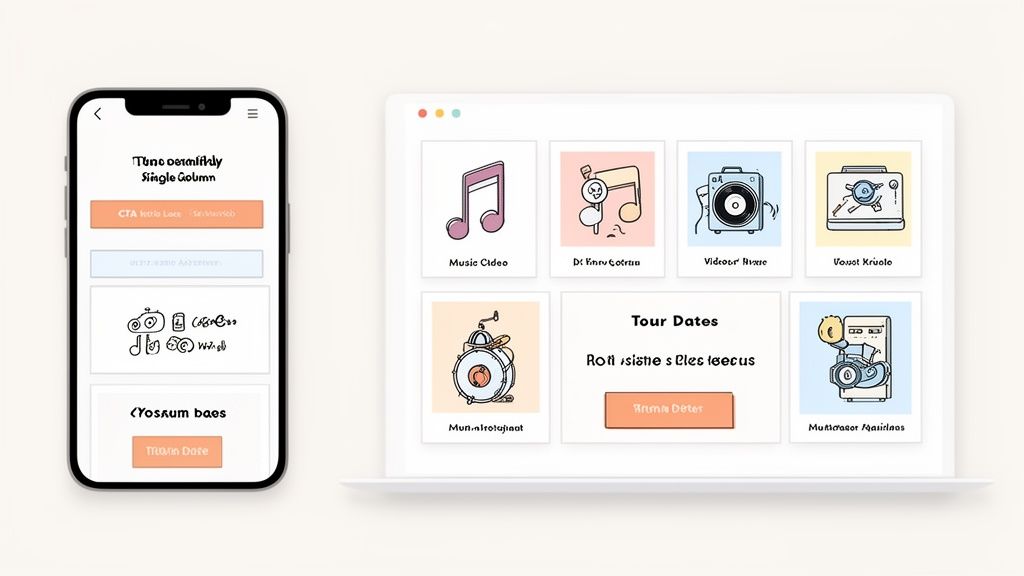
The great news is, you don't have to choose. Inside Taap.bio, you can actually edit your mobile and desktop layouts independently. This gives you surgical control over how your page looks, feels, and performs on any device—a massive advantage for anyone who's serious about getting results.
Design for the Thumb on Mobile
On mobile, it's all about speed and simplicity. Your visitor is probably on the go, maybe multitasking, and definitely scrolling with their thumb. Your layout has to respect that reality.
The best move is a clean, single-column flow that's dead simple to navigate. Put your single most important call-to-action right at the very top, instantly visible without any scrolling. This is prime "above the fold" real estate, and it guarantees every single visitor sees it.
Here’s a quick checklist for a thumb-friendly mobile design:
- Primary CTA First: Place your hero widget—like a "Listen on Spotify" or "Book a Call" block—front and center at the top.
- Vertical Flow: Stack your other widgets logically underneath. Think of it as telling a short story from top to bottom.
- Large Tap Targets: Make sure every button and link is big enough to be easily tapped without frustrating "fat finger" mistakes.
This focused, linear approach cuts through the noise and guides your mobile visitor straight to the action you want them to take.
Take Advantage of the Extra Space on Desktop
While mobile design is about constraint, the extra real estate on a desktop screen is your chance to build a more immersive, visually engaging experience. This is where you can let your bento grid truly shine by arranging multiple content blocks in a more dynamic layout.
With a desktop view, visitors can see more of your world at a single glance. They aren't just scrolling down a list; they're looking at a complete dashboard of your brand. You can showcase a big YouTube video embed right next to a grid of your latest Instagram posts and a can't-miss newsletter signup form.
Think of your mobile page as the concise, powerful elevator pitch. Your desktop page is the full, detailed presentation with all the supporting visuals. Each version serves a different purpose but drives toward the same conversion goal.
A Tale of Two Experiences
Let’s look at a musician using Taap.bio. Their goal is to drive listens for their new album and sell tickets for their upcoming tour.
On Mobile: The page opens with a large, unmissable Spotify widget for the new album. Right below that, a simple link block for "Tour Dates," followed by a feed of their latest TikToks. It’s clean, direct, and perfect for a fan pulling it up on their phone.
On Desktop: That Spotify widget is still prominent, but now it’s part of a larger grid. To its right, there's an embedded YouTube music video gallery. Below that, the tour dates block sits next to a grid of Instagram posts and a clear link to their merch store. It’s a much richer, more exploratory experience for someone sitting at their computer.
This tailored approach ensures every visitor gets an experience that feels completely native to their device. The numbers don't lie. One report that analyzed over 41,000 pages found the median conversion rate was 6.6%, but pages optimized with responsive design converted a staggering 25.2% higher.
With mobile devices now driving more than half of all web traffic, creating distinct views isn't just a good idea—it's essential. You can see more landing page conversion stats to dig into the data yourself. For more tactical advice, our guide on responsive web design best practices is a perfect next read.
How to Measure and Test Your Way to Higher Conversions
A brilliant layout is your starting point, but data is what turns good guesses into guaranteed wins. You can't improve what you don't measure. This is where many creators drop off, but it’s where the real growth begins—by systematically testing your way to a higher conversion rate.
The whole process kicks off with understanding what’s happening on your page right now. Integrating analytics into your Taap.bio page is the first step. This isn't about getting lost in complex spreadsheets; it's about answering simple, powerful questions. Which of your blocks gets the most clicks? Where do people stop scrolling? The answers tell a story about what your visitors actually care about.
For instance, you might discover that your "Latest YouTube Video" widget is getting clicked 3x more than your newsletter signup link. That’s not a failure; it’s a crucial insight. It tells you exactly what your audience values and where you should focus your energy.
The A/B Testing Framework
A/B testing, or split testing, is your secret weapon for improving conversion rates. The idea is simple: you create two versions of your page (Version A and Version B), show each to a different slice of your audience, and see which one performs better.
The key is to change only one element at a time. Seriously, just one. If you change the headline, the button color, and the main image all at once, you’ll have no idea which change actually made the difference.
Let's walk through a real-world scenario for a Taap.bio user. Let's say you want more people to subscribe to your newsletter.
- Version A (The Control): A simple, compact text link that says "Subscribe to My Newsletter."
- Version B (The Variation): A big, eye-catching link block with a custom image and a more compelling headline like "Get My Weekly Growth Hacks."
You'd then run the test for a week and track which version gets more clicks. The winner becomes your new baseline, and you move on to testing the next element. This rinse-and-repeat process is how you find what truly works.
Your Practical Testing Checklist
So, what should you actually test on your Taap.bio page? The possibilities are endless, but you need a place to start. Don't get overwhelmed. Just pick one thing from this list and test it for a week.
Here are a few high-impact elements to experiment with:
- Your Call-to-Action (CTA) Copy: The words on your buttons matter. A lot. Test a generic CTA like "Learn More" against something more action-oriented like "Get Started Today" or "Download the Free Guide." Tiny text changes can lead to huge performance shifts.
- Widget Placement and Size: Does your main link convert better as a massive hero block at the top? Or does it get more engagement when placed right next to your social proof widget? Play around with your grid layout to find the most effective visual flow.
- Visuals and Media: Try testing a custom background image against a solid brand color. For a link block, does an auto-generated preview image work better than a custom graphic you designed? Visuals grab attention first, so getting them right is critical.
The goal of testing isn’t to find one “perfect” page. It’s to build a continuous cycle of learning and improvement. Every test—win or lose—teaches you something valuable about what makes your audience tick.
By embracing a testing mindset, you move from hoping your page works to knowing why it works. You replace assumptions with hard data, which is always the most reliable path to growth.
For those looking to dive even deeper, check out this practical playbook to increase website conversion rate for more advanced strategies. And to brush up on the fundamentals, you can explore our guide on what is a landing page and its core purpose.
Got Questions? We’ve Got Answers.
When you're deep in the trenches trying to get your landing page to perform better, questions are bound to pop up. It happens to everyone. Below, I’ve tackled some of the most common questions and roadblocks I see creators run into, especially when they're getting serious about optimizing their Taap.bio page.
Think of this as your go-to cheat sheet for breaking through those frustrating conversion plateaus.
What’s a Good Landing Page Conversion Rate, Anyway?
This is probably the number one question I get, and the honest answer is… it depends. It's not a cop-out, I promise. While you might see industry-wide studies quoting an average of around 6.6%, that number is almost meaningless without context.
A "good" rate for a freebie download is going to look completely different from a high-ticket coaching application. Trying to compare the two is like comparing apples and oranges.
So, instead of getting hung up on some universal number, focus on your own numbers. For a low-commitment action like a newsletter sign-up, aiming for 10% or higher is a great goal. If you're selling something, even a 2-5% conversion rate could be a huge win for your business. The real key is to establish your baseline and then work on improving it, month after month.
Don't chase a magic number. The best conversion rate is one that’s better than it was last month. That's the only metric that truly matters—your own progress.
How Long Should I Actually Run an A/B Test?
I know how tempting it is. You set up a test, and after 24 hours, version B is crushing it. You want to call it and move on, right? Don't do it. Ending a test too early is one of the biggest mistakes you can make, as you're likely making a decision based on a random fluke, not a real trend.
To get data you can actually trust, you need two things: enough time and enough conversions.
Here's my rule of thumb:
- Run it for at least a full week. This helps smooth out any weird fluctuations between weekday and weekend traffic. User behavior on a Tuesday morning is often very different from a Saturday night.
- Wait for at least 100 conversions on each version. If your traffic is a bit lower, you might need to let the test run for two or even three weeks to hit this number. It's worth the wait.
Patience is your best friend here. Let the data tell the full story before you crown a winner.
Will Adding More Widgets Kill My Conversion Rate?
Not if you do it right. The real enemy isn't the number of widgets; it's clutter. Your page doesn't need to be empty, it just needs a clear focus. A single, can't-miss call-to-action is non-negotiable, but other widgets can actually boost conversions by building trust and answering questions before they're even asked.
Here’s how to think about it strategically:
- Your Hero Widget: This is your main goal—your Calendly booking form or your product link. It should be the biggest, boldest thing on the page.
- Your Supporting Cast: These are things like client testimonials, a link to your portfolio, or a live feed from your Instagram. They act as social proof and give visitors the confidence they need to take that next step.
The problem starts when five different widgets are all screaming for attention at the same volume. Use the Taap.bio grid to give your main CTA the spotlight and let the other elements play their supporting roles. A well-organized page with several thoughtful widgets will almost always outperform a barren page that offers no context.
Ready to stop guessing and start building a landing page that truly converts? Taap.bio gives you the visual grid, smart widgets, and A/B testing capabilities you need to turn your link in bio into your most powerful conversion tool. Start building your high-converting page for free today!