
Most email list building advice still worships the wrong metric. It celebrates subscriber count, even when those subscribers never open, never click, and never buy. If you're a creator, consultant, or solo operator, a smaller list that pays attention beats a bigger list that ignores you.
That's not theory, it's the reality of list decay. Modern benchmarks say lists can lose a meaningful share of usable contacts every year if you're not actively growing and cleaning them, and inactivity piles up fast when you treat acquisition as a one-time task rather than an ongoing system (email list growth benchmarks). The better goal is an owned audience that keeps moving from signup to trust to purchase, not a vanity number you can screenshot.
Table of contents
Why a Smaller List That Buys Beats a Bigger List That Ignores You
A list that sits still does not stay healthy for long. Subscribers drift, inboxes go stale, and usable reach shrinks unless fresh, relevant signups keep replacing the loss. That is why “just grow the list” is the wrong target.
For creators, consultants, and solo operators, the actual job is building an audience that behaves like a customer base. A few hundred people who open, click, and book are more valuable than a few thousand who barely register your name, which is why increasing customer lifetime value matters more than raw list size (how to increase customer lifetime value). The channel's commercial roots go back to 1978, and it became strategically useful when marketers started focusing on permission, segmentation, and measurable conversions (email marketing's commercial history).
A single-page funnel makes that trade-off sharper. If the page brings in the right people, you do not need a sprawling stack of popups, blogs, and disconnected landing pages to make the list grow. You need one page that captures attention, one incentive that matches the offer, and one path that turns a visitor into a subscriber or buyer.
Practical rule: If a signup does not move someone closer to a purchase, a booking, or a clear next step, it is probably not doing enough work.
That is the standard I use. A smaller, cleaner list is easier to segment, easier to nurture, and easier to monetize. It also gives a truer read on demand, because the people who join are closer to what you sell.
Designing an Incentive People Actually Want
The quickest way to attract the wrong subscribers is to offer something vague and broad. A generic “free guide” gets signups, sure, but it also pulls in people who wanted the download, not the relationship. The incentive should feel like an early, lower-risk version of the paid thing you sell.
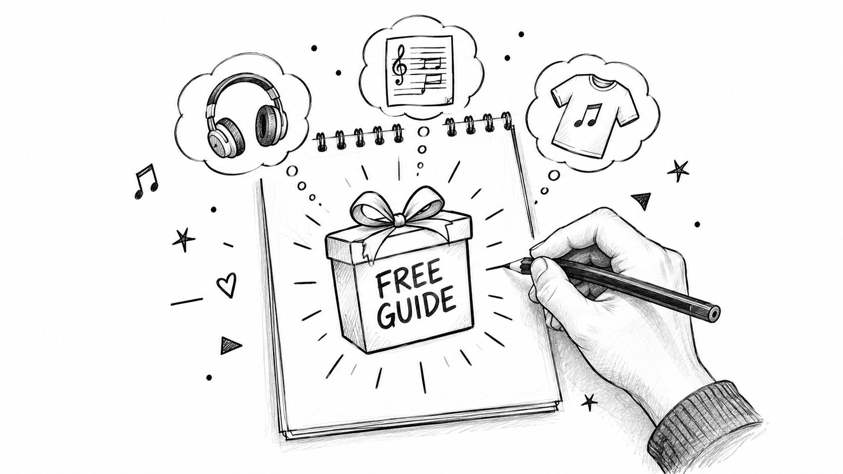
A musician can offer an unreleased track, not a random wallpaper pack. A coach can give away a mini audit template, not a bloated ebook. A course creator can share one sharp lesson from the paid product, because that preview tells the right buyer, “this is the kind of thinking you'll get from me if you stick around.”
Match the free offer to the paid offer
The best incentive does three things at once. It solves a real problem, hints at the paid offer, and filters out people who only want freebies. That makes the email list smaller at the top, but stronger everywhere else.
A simple checklist helps:
- Does it mirror the paid offer? A sample, template, clip, or audit works better than a random giveaway when the goal is conversion.
- Does it create a next step? The free item should naturally lead to a booking, download, product page, or reply.
- Does it reduce fluff signups? If everyone wants it, the offer may be too generic.
- Is it easy to deliver fast? The shorter the path from signup to value, the better your trust signal.
A writer selling consulting can offer a teardown worksheet. A designer selling templates can offer one usable section of the pack. A fitness creator can share a short program extract instead of a generic “motivation guide.” Each one pre-qualifies the subscriber before they ever reach the inbox.
If you want a tighter way to think about offers, this breakdown on email sign-up offers is useful because it frames incentives around fit, not just volume. That's the shift that matters.
The highest-converting incentives usually look specific, not impressive. They sound like something a serious buyer would ask for, not something a bargain hunter would hoard.
Choosing the Right Capture Surface for One-Tap Signup
Where you ask for the email matters almost as much as what you offer. Benchmarks show that different capture surfaces convert at different rates because they meet visitors at different intent levels, with dedicated landing pages often converting more strongly than embedded forms or timed popups (signup form benchmarks). That is not a reason to scatter forms everywhere. It is a reason to match the surface to the level of intent.
Intent beats placement volume
A landing page works when someone is already warm and looking for a specific outcome. An embedded form works when the visitor is reading and can make a low-friction decision in context. A checkout capture works when someone has already decided to buy, which is why it is often the cleanest place to ask for consent and subscription at the same time.
| Capture Surface Comparison by Intent and Yield | |
|---|---|
| Capture Surface | Typical Conversion, Best Fit |
| Dedicated landing page | 5% to 15%, for high-intent campaigns and focused offers |
| Embedded form | 1% to 3%, for blog posts, bios, and context-driven pages |
| Timed popup | 1.5% to 3%, for warm visitors who need a prompt |
| Checkout capture | 3% to 8%, for buyers already committed to a purchase |
| Site-wide opt-in average | General benchmarking only, useful for context rather than a target |
That is why the mobile-first creator funnel often works better as one page, not five. A link-in-bio page can hold the offer, the email block, the product, and the booking action in one place. With a one-tap email signup widget, the visitor does not have to open another tab just to join the list.
A useful reference on broader capture tactics, including email and SMS subscription strategies, points to the same trade-off. The closer the ask sits to the moment of intent, the less friction you create. For creator funnels, that usually means keeping the signup surface inside the same page as the content or offer.
I also use the guide on how to collect emails from Instagram as a reminder that social traffic should land on one clear action, not a maze of choices. That matters even more on a single-page funnel, where every extra click gives people a reason to leave before they subscribe.
taap.bio is one example of a page-based tool that combines email capture, checkout, paid bookings, and analytics in one creator page. The point is not more surfaces. It is choosing the one that matches the visitor's intent and still leaves room for revenue.
Keep the capture surface close to the decision. The user should feel like they are finishing something, not starting a new chore.
Turning Your Page Into a Paid Signup Funnel
A creator page gets much stronger when the first purchase or booking also becomes the email capture moment. That's the logic behind a single-page funnel. Instead of sending someone from a social profile to a separate form, then to a checkout, then to a scheduling tool, you keep the whole interaction in one place.
One page, fewer exits
A consultant who gets hit with constant “quick question” messages can turn that attention into a paid booking. The user sees the service, books a slot, pays upfront, and gets added to the list without leaving the page. That changes the conversation from informal DMs to a real transaction.
An artist selling digital downloads can do the same thing with instant file delivery after payment. The buyer gets the asset immediately, and the creator earns an email subscriber who already proved intent by paying. A coach filling limited slots can use the same structure for paid sessions, where the booking itself acts as the permission-based entry point.
taap.bio is one example of a page-based tool that combines email capture, checkout, paid bookings, and analytics in one creator page. It's relevant here because the flow stays on the page, which cuts the number of places a user can drop off.
The simplest funnel looks like this:
- Visitor lands on a focused page with one clear promise.
- Email capture or purchase happens in place, without a redirect-heavy detour.
- Value is delivered immediately through access, files, or scheduling.
- The subscriber enters a follow-up sequence tied to what they did.
That sequence matters because paid behavior is a stronger signal than casual signup. Someone who buys a low-cost asset or books a service gives you a cleaner audience than someone who dropped an email for a vague freebie.
A useful companion read on link-in-bio newsletter flows reinforces the same point, the page should do the selling and the subscribing in one motion. When the funnel feels cohesive, the buyer doesn't need to wonder what happens next.
Nurturing Subscribers Without Losing Their Trust
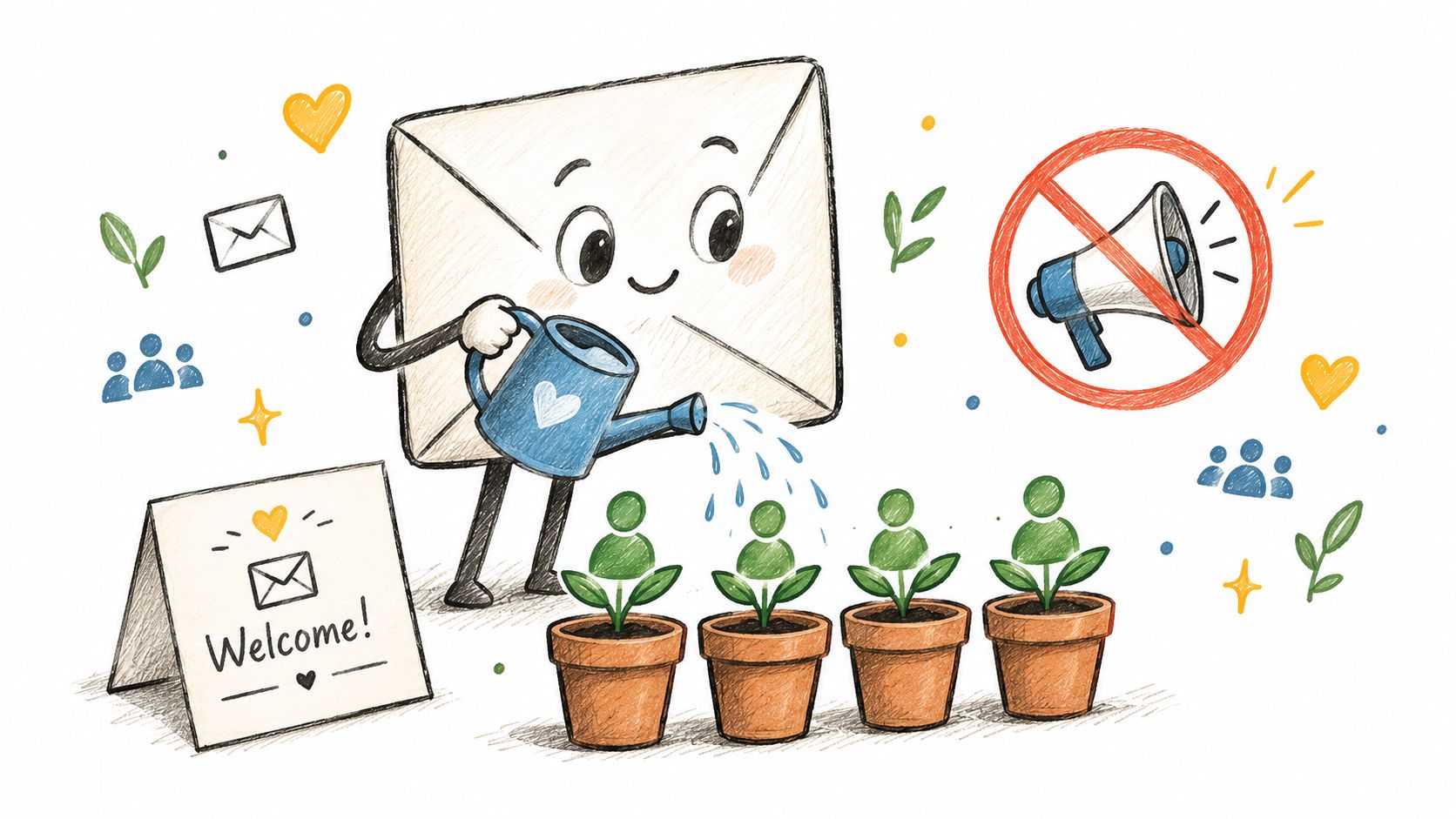
The inbox is a trust test. Once someone subscribes, the fastest way to lose them is to treat every contact like the same contact. A good welcome sequence and a simple segmentation rule set solve most of that problem before it starts.
A welcome sequence that doesn't waste the first three emails
The first email should deliver the thing they asked for and confirm what kind of value they'll get from you. The second should show how you think, usually with a short story, a useful breakdown, or a practical example. The third should move the subscriber toward a clear next step, like a booking, product, or reply.
That structure works because it matches attention to intent. You don't need to flood the inbox to prove you're serious. You need to stay relevant long enough for the subscriber to understand why your emails belong there.
Segmentation matters just as much. Buyers shouldn't get the same sequence as browsers, and someone who downloaded a template shouldn't get the same pitch as someone who already paid. Even basic splits by interest or purchase history make the list more usable, because the message can track with the person instead of the average subscriber.
Consent and portability are part of the growth strategy
Trust also comes from how you handle data. GDPR-friendly hosting, clear opt-ins, and exportable contacts aren't admin chores, they're proof that the list is owned. If the subscriber can be exported and moved, the relationship is less dependent on any one platform.
For a practical look at the email side of a launch, crafting a product launch email is a good complement because it shows how sequence and timing affect response once someone is already on the list. The key is to respect the promise that got them there in the first place.
A clean rule set keeps the whole system healthy:
- Send the first email fast. Deliver the promised asset or confirmation immediately.
- Keep offers contextual. Tie each follow-up to the action that brought them in.
- Separate buyers from browsers. Treat paid intent differently from casual interest.
- Make the list portable. If you own the audience, you should be able to export it.
That's how you keep trust from leaking out of the funnel after signup.
Tracking What Matters and Optimizing for Revenue
A bigger list means very little if the audience stops paying attention. The useful monthly habit is to track net list growth, churn, click-to-open rate, and unsubscribe rate. Opens alone are less dependable after inbox privacy changes, so downstream engagement gives a clearer read on list health (monthly tracking guidance).
The four numbers to review every month
Net list growth shows whether the list is still expanding after unsubscribes and bounces. Churn shows how quickly subscribers are drifting away, and benchmark guidance treats annual churn in the low twenties to high twenties as a warning zone (churn and inactive-address benchmarks). Click-to-open rate is the cleaner engagement signal because it reflects what readers do, not whether an inbox image loaded.
Unsubscribe rate deserves its own review because it often points to a mismatch between promise and delivery. Rates above 0.3% per send are a warning, and rates above 0.5% usually mean the list is being mailed too often or too broadly. That is a content and frequency problem, not just a metrics problem.
A list can look healthy on paper and still waste your time if clicks and purchases stay flat.
Revenue closes the loop. A 2% to 5% email-to-purchase conversion rate is considered solid in the benchmark data, which means acquisition should be judged by what subscribers buy, not by how many names sit in your ESP. That is the same standard I use when reviewing a single-page creator funnel, because a page that attracts buyers is doing more work than one that only collects addresses.
If you are warming a new sending domain or cleaning up deliverability, the best email warmup tools round-up can help you separate inbox readiness from list quality. Warmup is support work. It does not replace a good offer, a good page, or a good sequence.
For practical review, I would use this checklist each month:
- Net list growth tells you whether acquisition is outpacing losses.
- Churn shows whether the audience is decaying too fast.
- Click-to-open rate shows whether the content is earning attention.
- Unsubscribe rate shows whether the promise still matches the mail.
To tie those numbers back to revenue, the internal guide on tracking conversions belongs in your operating checklist. The point is not to accumulate subscribers. The point is to build an owned audience that keeps paying attention, keeps buying, and stays portable when your business changes.


