
Your newsletter is your direct line to your audience, a powerful tool for building community and driving growth. But before you can nurture those relationships, you have to convince them to subscribe. That pivotal moment happens on your newsletter landing page, a single-purpose page designed to do one thing exceptionally well: convert visitors into subscribers. A weak landing page means leaving growth on the table, while a powerful one can become your most effective marketing asset.
This is where the right inspiration makes all the difference. We've compiled a definitive collection of the best newsletter landing page examples to show you exactly what works. Forget generic advice; we are diving deep into the anatomy of high-converting pages from top creators and brands. You'll see precisely how they use compelling copy, strategic social proof, and irresistible calls-to-action to maximize signups.
For each example, we'll provide annotated screenshots and direct links, breaking down the specific tactics you can steal. We'll analyze their layout, messaging, and visual hierarchy, giving you actionable takeaways and replicable strategies. By the end of this list, you'll have a clear blueprint for creating a landing page that doesn't just ask for an email, but earns it.
Table of contents
1. Landingfolio
Landingfolio isn't a single landing page but a treasure trove of inspiration for anyone building one. It's a meticulously curated gallery of high-converting landing pages, offering a bird's-eye view of what the most successful brands are doing. This platform excels at helping you deconstruct winning designs to find actionable ideas for your own projects.
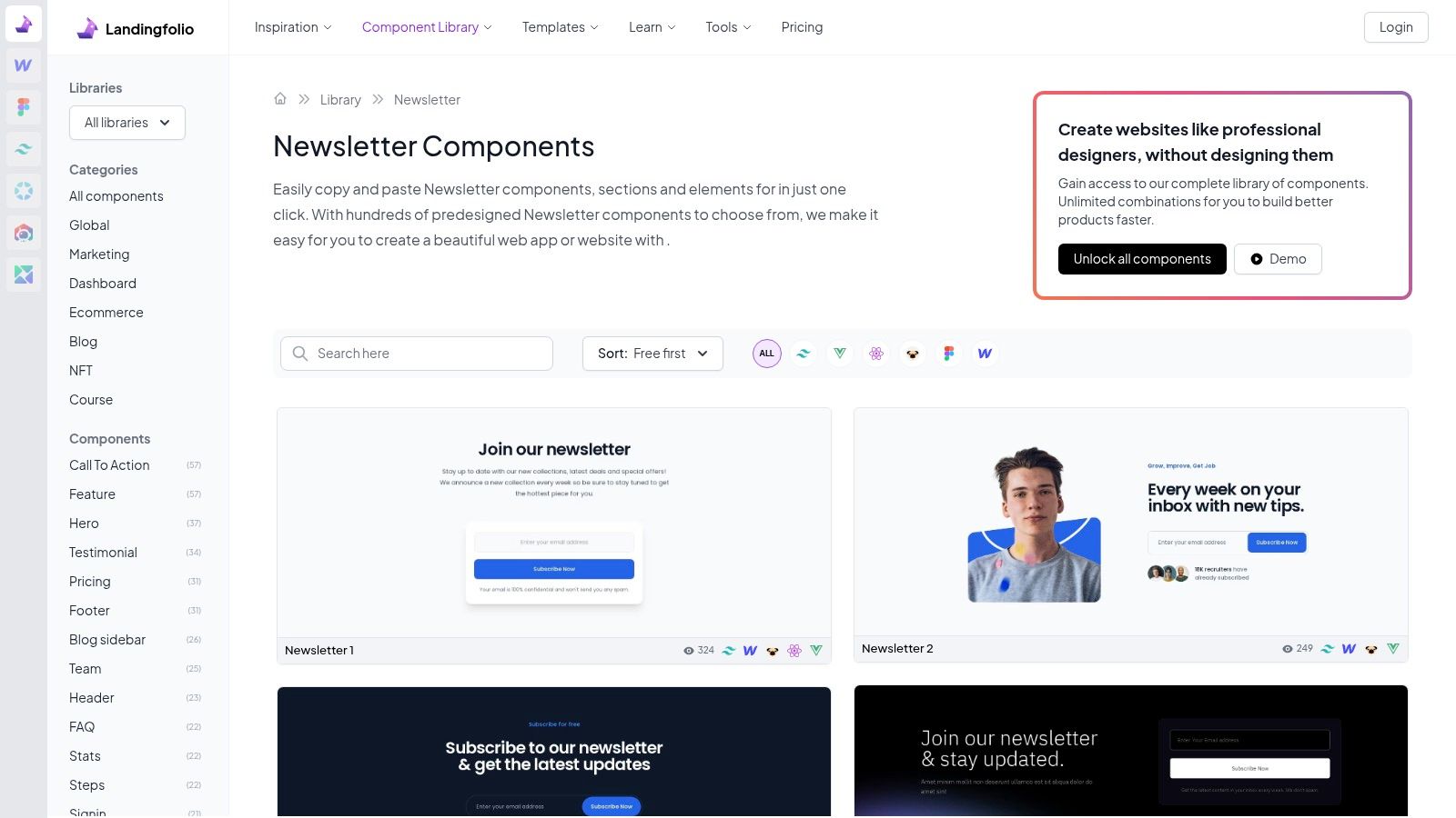
What makes Landingfolio so powerful for creators is its specific focus. You can filter the gallery to see only newsletter landing page examples, instantly cutting through the noise. Instead of sifting through thousands of general designs, you get a concentrated dose of relevant, effective sign-up forms, hero sections, and value propositions that are proven to convert.
Why It Stands Out
Landingfolio’s biggest advantage is its component-based approach. It breaks down entire pages into individual UI blocks, like "Newsletter" or "Blog Newsletter" sections. This modular view lets you analyze the specific elements that drive subscriptions, from the headline copy and call-to-action (CTA) button design to the use of social proof.
The platform offers a clean, intuitive user interface that makes browsing for inspiration fast and efficient. While many examples are available for free, a Pro membership ($149/year) unlocks access to all 4,000+ components and advanced filtering, making it an invaluable resource for serious designers and marketers. Their editorial curation ensures you’re only seeing high-quality, modern examples, not outdated designs. This focus on individual components is a similar strategy used by top creators building their brand hubs, which you can see in these podcast landing page examples on Taap.bio.
Practical Tips for Using Landingfolio
To get the most out of the platform, don't just look at the full pages. Use the dedicated component libraries to zoom in on what works for newsletter sign-ups.
- Filter by "Newsletter": Go directly to the newsletter section to see hundreds of real-world sign-up forms.
- Analyze the Copy: Pay close attention to the headlines and subheadings. What promises are they making? How do they communicate value?
- Study the CTAs: Note the button text, color, and placement. Is it "Subscribe," "Join," or something more creative?
- Look for Social Proof: How are brands using testimonials, subscriber counts, or logos to build trust right at the point of sign-up?
2. Lapa Ninja
Lapa Ninja is an expansive digital library dedicated to landing page design, boasting a collection of over 7,300 real-world examples. Unlike platforms focused solely on components, Lapa Ninja provides full-page screenshots, offering a holistic view of how a newsletter sign-up fits into a larger design narrative. This makes it an invaluable resource for understanding context, flow, and overall page structure.
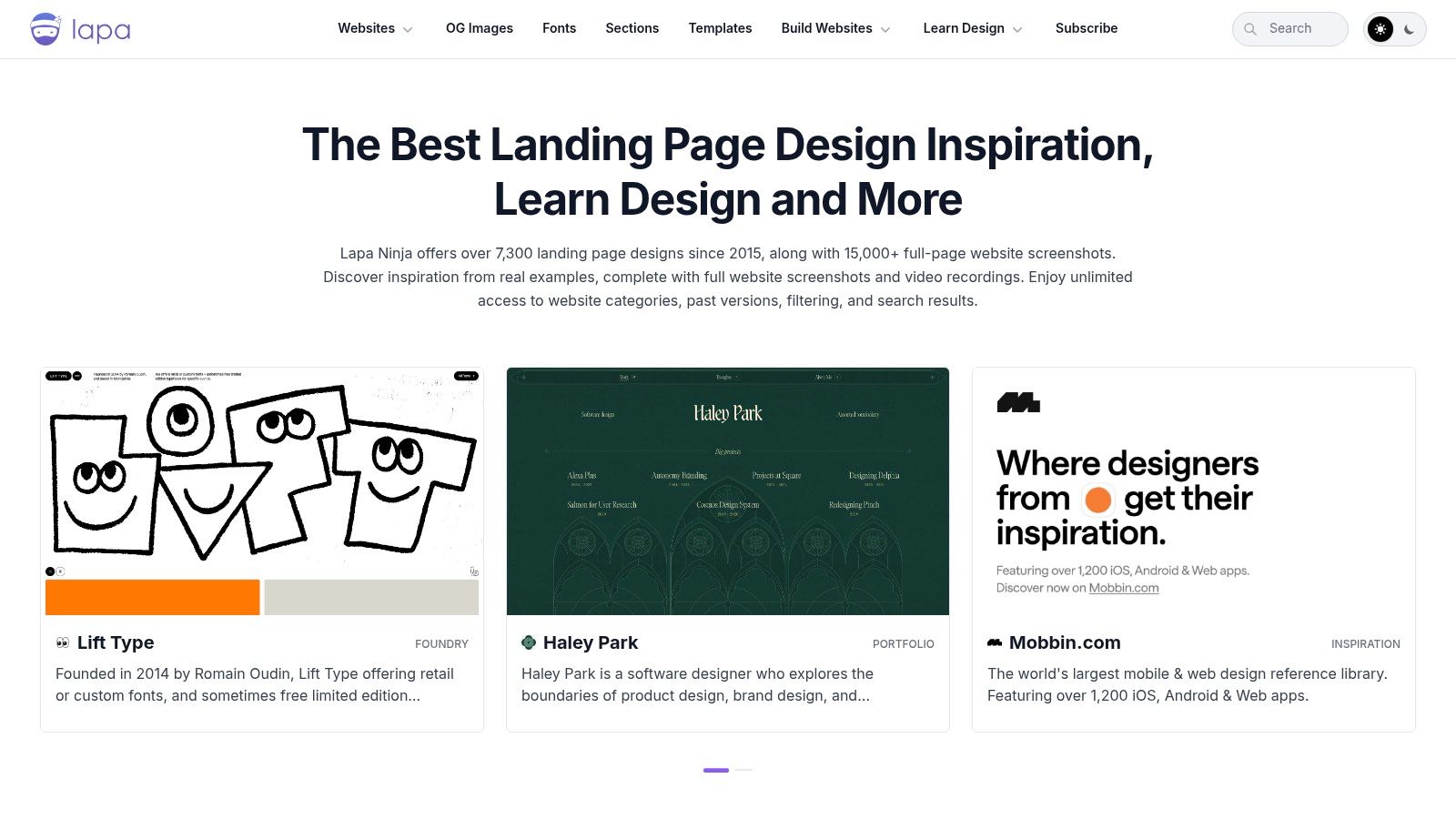
What makes Lapa Ninja a go-to for creators is its sheer volume and variety. You can easily search or filter by categories like "Newsletter" to see countless newsletter landing page examples from diverse industries. This cross-industry exposure helps you break out of echo chambers and discover unique approaches to copy, layout, and user engagement that you might not find elsewhere.
Why It Stands Out
Lapa Ninja’s primary strength is its comprehensive, full-page approach. Seeing the entire user journey, from the hero section to the footer, helps you understand how the best brands strategically place their newsletter forms for maximum impact. You can analyze how they build trust and communicate value before ever asking for an email address.
The platform is completely free to use, making it accessible to everyone from solo creators to agency teams. Its clean, grid-based interface is straightforward, allowing for quick browsing and discovery. While it doesn't offer downloadable templates, its purpose is pure inspiration and strategic analysis. By studying the full layout, you can better grasp core principles like creating an effective visual hierarchy in your web design on Taap.bio, ensuring your most important elements capture attention.
Practical Tips for Using Lapa Ninja
To leverage Lapa Ninja effectively, think like a strategist, not just a designer. Look beyond aesthetics to understand the functional choices behind each design.
- Study the Entire Page: Don't just focus on the sign-up form. Analyze how the page's narrative leads the user to subscribe.
- Filter by Industry: Check out newsletter pages from SaaS, e-commerce, and personal brands to see how the value proposition changes.
- Observe Form Placement: Is the newsletter CTA in the hero, a dedicated mid-page section, or the footer? Why do you think that choice was made?
- Analyze Visual Cues: Look for arrows, contrasting colors, or container boxes that draw the eye toward the sign-up form.
3. One Page Love
One Page Love is a highly curated gallery celebrating the art of the single-page website. Rather than overwhelming you with complex, multi-page designs, it focuses exclusively on streamlined, conversion-oriented layouts. This makes it a goldmine for creators who want to build a focused funnel for their newsletter sign-ups without unnecessary distractions.
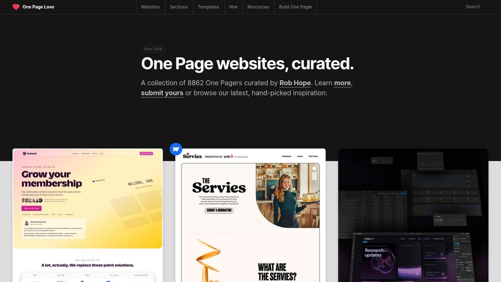
What makes One Page Love especially valuable for building a newsletter audience is its emphasis on clarity and action. The showcased designs are masterclasses in guiding a visitor toward a single goal, like an email opt-in. By exploring its examples, you can find inspiration for compelling, single-screen funnels that capture attention and drive subscriptions effectively.
Why It Stands Out
One Page Love’s core strength is its laser focus on single-page design, which aligns perfectly with the goal of a high-converting newsletter landing page. Instead of just showing designs, the platform offers actionable tutorials and guides on how to improve sign-up rates, covering topics like effective copy, social proof, and testimonial placement. Its strict submission and review process ensures that every example is high-quality and modern.
This approach is ideal for creators who appreciate minimalist, efficient design. While it is not a template marketplace and requires you to rebuild the designs you like, the inspiration is top-tier. Its focus on single-page layouts offers a powerful alternative to complex sites, a concept that is central to many of the best one-page website builders available today. All examples and resources on the site are available completely for free, making it an accessible tool for everyone.
Practical Tips for Using One Page Love
To leverage this platform effectively, think like a conversion specialist and focus on the elements that drive sign-ups.
- Study the Flow: Analyze how each one-page site guides the user's eye from the headline down to the sign-up form.
- Deconstruct the Value Proposition: How do these pages communicate the benefit of subscribing in just a few words? Look for powerful, concise headlines.
- Analyze Form Placement: Note where the newsletter sign-up form is placed. Is it above the fold, at the end of the page, or in a sticky footer?
- Look for Creative CTAs: Move beyond "Subscribe" and find examples of calls to action that create intrigue or urgency.
4. Webflow Templates
Webflow's template marketplace offers a launchpad for creators who want more design control without starting from scratch. Instead of just providing inspiration, it delivers professionally designed, fully functional landing pages that are ready to be customized and published. This makes it an excellent resource for building a polished newsletter landing page with a premium feel.
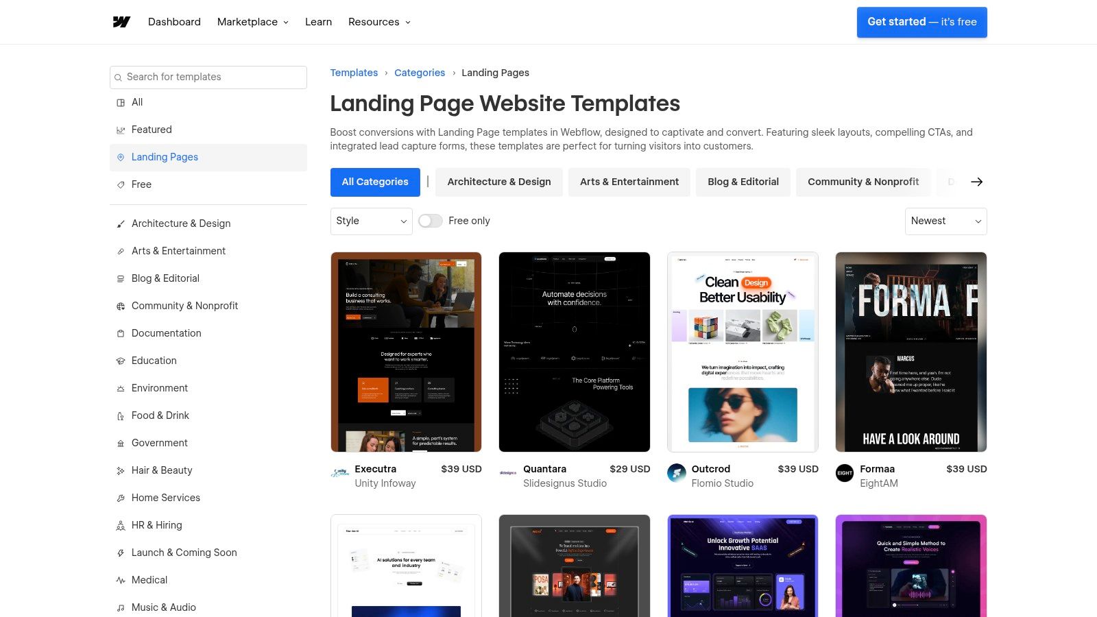
What makes Webflow Templates particularly useful is the sheer quality and variety available. You can find templates specifically built for lead generation, many of which feature prominent email capture blocks perfect for newsletters. The marketplace includes both paid templates and free "cloneables" shared by the community, providing a pathway for any budget.
Why It Stands Out
Webflow's biggest advantage is combining high-end design with a powerful visual editor. You aren’t just getting a static image; you're getting a complete project file you can adapt with granular control. This allows for deep customization of every element, from fonts and colors to animations and integrations, without writing code. This approach bridges the gap between simple builders and custom development, a key reason it’s a powerful tool mentioned in this guide to drag-and-drop website builders on Taap.bio.
While there can be a learning curve with the editor, the platform’s ecosystem is mature and well-supported. Many templates require a Webflow hosting plan (starting around $14/month) for full functionality, but the investment provides a professional, conversion-ready asset. The focus is on empowering you to create a unique and effective page, rather than just copying a design.
Practical Tips for Using Webflow Templates
To maximize the value of Webflow for your newsletter, focus on finding a template that aligns with your core goal: conversions.
- Filter for "Landing Page": Start by browsing the dedicated landing page category to find layouts optimized for a single call-to-action.
- Look for Built-In Forms: Prioritize templates that already include well-designed newsletter sign-up sections to minimize your setup time.
- Adapt, Don't Just Adopt: Use the visual editor to change the headline, value proposition, and CTA to match your newsletter's unique voice and offer.
- Explore Free Cloneables: Check the "Made in Webflow" section for free cloneable projects. They are a great way to get a professionally designed base without any cost.
5. Kit (formerly ConvertKit)
Kit, the platform formerly known as ConvertKit, offers a powerful, all-in-one solution for creators who want their landing page builder and email service provider under the same roof. It's designed specifically for creators, providing a library of templates optimized for newsletters, products, and events. This integration simplifies the entire process of capturing and nurturing leads.
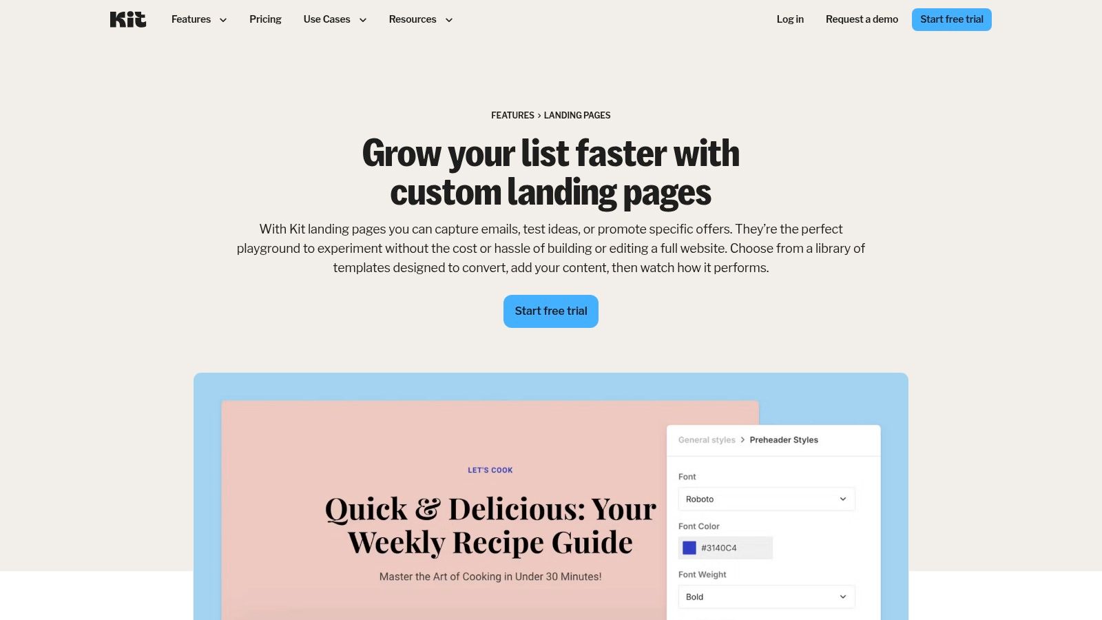
What makes Kit a go-to choice is its seamless workflow. You can build a beautiful, high-converting newsletter landing page in minutes using its no-code editor, and every new subscriber is automatically added to your email list. This eliminates the need to connect third-party tools, ensuring your entire audience growth engine runs smoothly from a single dashboard.
Why It Stands Out
Kit's primary advantage is its creator-centric focus. The templates are designed with newsletter growth in mind, featuring clean layouts, clear value propositions, and prominent sign-up forms. The platform also includes built-in SEO fields, real-time conversion metrics, and easy integrations with Google Analytics and Facebook, giving you the data needed to optimize performance.
While the template customization is simpler than a dedicated site builder, this is also its strength. You can launch a professional, hosted landing page quickly without getting bogged down in complex design settings. A generous free plan is available for up to 1,000 subscribers, with paid tiers offering advanced automations and features as your list grows. As one of the best platforms for content creators, Kit excels at keeping your core marketing tools unified.
Practical Tips for Using Kit
To maximize your results on Kit, focus on leveraging its integrated features to create a frictionless subscriber experience.
- Choose a Simple Template: Start with a clean, minimalist template that puts the focus entirely on your newsletter's value proposition.
- Create an Incentive: Use the platform to automatically deliver a lead magnet (like an ebook or checklist) to new subscribers as an incentive.
- Tag New Subscribers: Set up an automation rule to tag subscribers based on which landing page they signed up from.
- Track Your Metrics: Regularly check the built-in analytics to monitor your conversion rate and A/B test your headlines and CTAs.
6. beehiiv
beehiiv is a comprehensive, newsletter-first platform designed for serious creators focused on growth and monetization. It goes beyond simple email sending by bundling a powerful suite of tools, including a built-in website, custom subscribe pages, and a dedicated landing page builder. This integrated approach allows you to create high-converting sign-up experiences that are directly tied to your audience growth features.
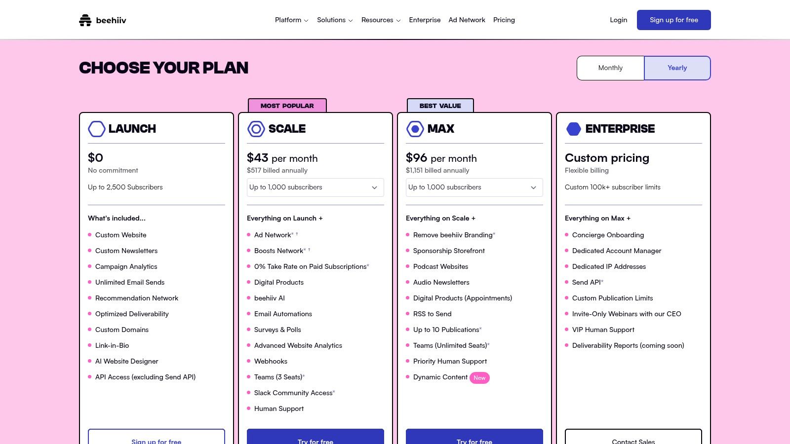
What makes beehiiv a compelling choice is its native integration of growth loops. You're not just building a static page; you're creating an entry point into a sophisticated ecosystem that includes referrals, an ad network, and premium subscription options. This makes it one of the best newsletter landing page examples for creators who want an all-in-one solution to manage, grow, and monetize their audience from day one.
Why It Stands Out
beehiiv’s biggest advantage is connecting its landing page experience directly to powerful growth levers. You can launch a branded subscribe page on your own domain almost instantly, even on the free plan. As you scale, the platform’s advanced features become invaluable, allowing you to build custom landing pages that align with specific campaigns or automations.
The platform offers a clean user interface and provides official guidance on building effective landing pages. While the free plan is generous, access to the full Landing Page Builder and Design Lab is reserved for paid tiers, starting with the Grow plan at $42/month. The tight coupling of design, analytics, and monetization tools gives creators a seamless workflow to optimize their sign-up process without relying on third-party integrations.
Practical Tips for Using beehiiv
To leverage beehiiv effectively, think of your subscribe page as the start of a growth engine, not just a sign-up form.
- Start with the Free Subscribe Page: Use the free plan to launch a clean, branded sign-up page on your custom domain immediately.
- Highlight Your Value Proposition: Use the built-in editor to clearly state what subscribers will get, who the newsletter is for, and how often they'll hear from you.
- Integrate a Welcome Automation: On a paid plan, create an automated welcome email to immediately engage new subscribers and deliver on your promise.
- Test Different Headlines: Once you have traffic, experiment with different headlines and calls-to-action to see what drives the highest conversion rate.
7. Carrd
Carrd is an ultra-light, single-page website builder that is perfect for creators who need a simple, fast, and professional-looking home for their newsletter sign-up form. It strips away the complexity of traditional website builders, allowing you to launch a focused, high-converting landing page in minutes, not days. Its core strength is its simplicity and affordability for getting a custom domain live.
What makes Carrd an ideal choice for newsletter creators is its direct integration with popular email marketing services. Instead of just linking out to a generic sign-up page, you can embed your ConvertKit, Mailchimp, or Revue forms directly onto the page. This creates a seamless, branded experience that significantly boosts conversion rates by reducing friction for potential subscribers.
Why It Stands Out
Carrd’s biggest advantage is its unmatched combination of simplicity and affordability. It is one of the most cost-effective ways to build a polished newsletter landing page example on your own custom domain. The drag-and-drop editor is incredibly intuitive, making it accessible even for those with zero design or coding experience.
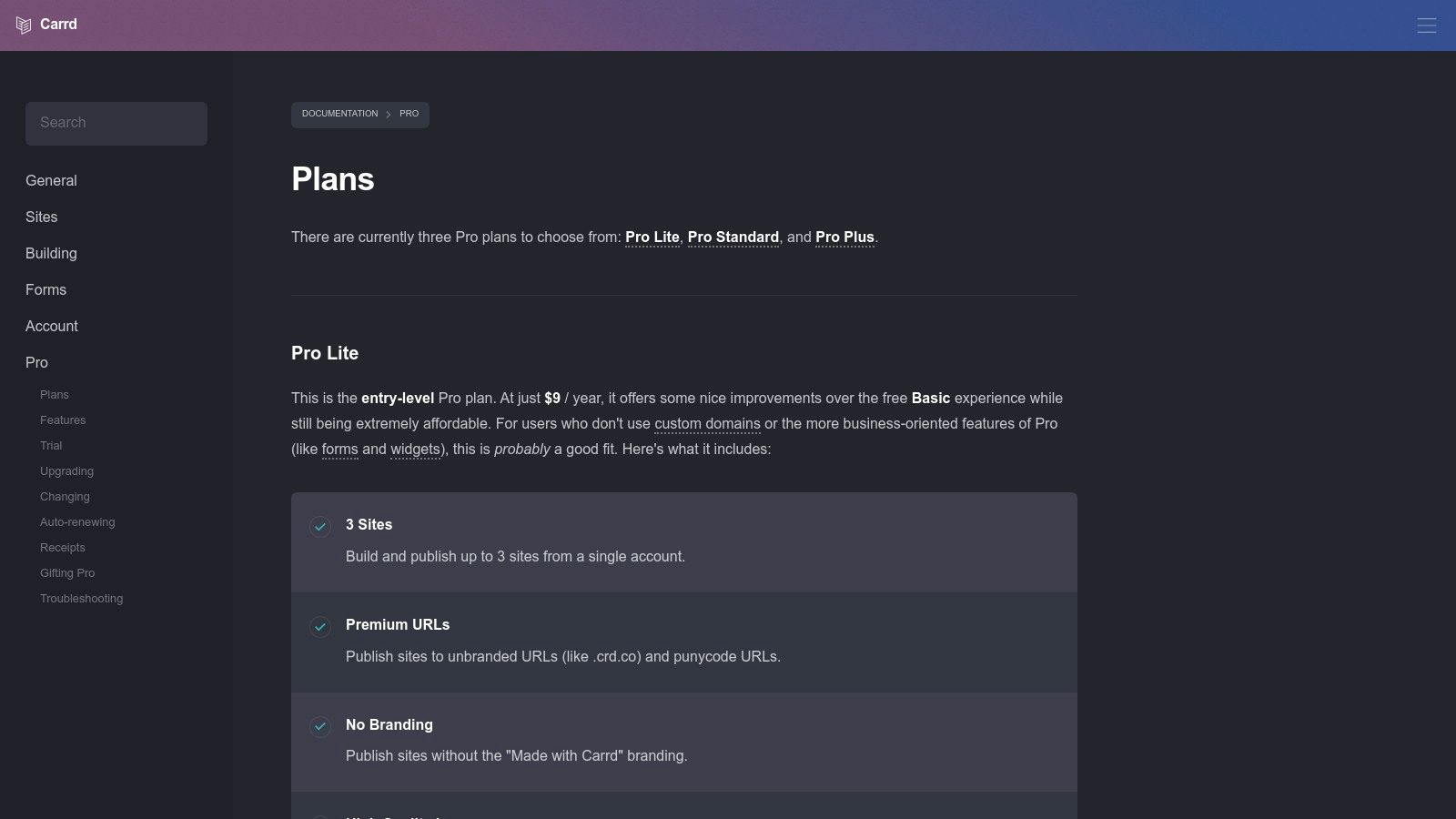
While the free plan is useful for basic link-in-bio pages, a Pro Lite plan (starting at just $9/year) is essential for newsletter creators. This incredibly low price unlocks custom domains and the ability to use the "Embed" element for your sign-up forms. This makes Carrd an unbeatable tool for validating a newsletter idea or launching a minimum viable product (MVP) without a significant financial investment.
Practical Tips for Using Carrd
To get the most out of Carrd for your newsletter, focus on its core strength: simplicity. Don't try to overload your single page with unnecessary information.
- Upgrade to Pro: Immediately upgrade to at least the Pro Lite plan to embed your sign-up form and use a custom domain.
- Focus the Design: Use a clean, single-column template. Your headline, value proposition, and the embedded sign-up form should be the primary focus.
- Use the Embed Element: Copy the raw HTML form code from your email service provider (like ConvertKit) and paste it into Carrd’s Embed element for a native look.
- Keep Copy Concise: With only one page, every word matters. Clearly state what the newsletter is, who it's for, and why someone should subscribe.
Newsletter Landing Pages — 7-Site Comparison
| Service | Implementation Complexity 🔄 | Resources & Cost ⚡ | Expected Outcomes & Impact 📊⭐ | Ideal Use Cases 💡 | Key Advantages ⭐ |
|---|---|---|---|---|---|
| Landingfolio | Low — browse & copy components (🔄) | Low–Medium — mostly free, some paid assets (⚡) | High — improves newsletter UI/copy; quick pattern adoption (📊⭐) | Rapid design inspiration for newsletter signups and hero blocks | Curated, newsletter-specific examples; reusable copy-paste components |
| Lapa Ninja | Low — large archive to browse (🔄) | Low — free archive; no built-in templates (⚡) | Medium–High — broad structural insights across industries (📊) | Survey full-page patterns and industry variations | Massive variety and full-page screenshots for structure analysis |
| One Page Love | Low — curated one-page examples (🔄) | Low — mostly free; smaller catalog (⚡) | High — targeted conversion tips for single-page funnels (📊⭐) | Creators preferring single-screen funnels and focused opt-ins | Actionable tutorials and quality-reviewed one-page designs |
| Webflow Templates | Medium — visual editor with learning curve (🔄) | Medium–High — paid templates and often hosting/plan required (⚡) | High — production-ready, highly customizable pages (📊⭐) | Launch polished newsletter landing pages with visual control | Professional templates, free cloneables, granular design control |
| Kit (formerly ConvertKit) | Low — no-code template builder (🔄) | Medium — free tier; costs scale with subscribers (⚡) | High — fast publish and direct subscriber capture (📊⭐) | Creators who want email platform + landing pages in one place | Hosted pages, integrations, real-time conversion metrics |
| beehiiv | Low–Medium — hosted builder; advanced features gated (🔄) | Medium — free with limits; paid for advanced features (⚡) | High — growth & monetization features tied to pages (📊⭐) | Creators focused on audience growth, referrals and monetization | Built-in referrals, monetization, analytics tied to landing pages |
| Carrd | Very Low — ultra-simple single-page builder (🔄) | Very Low — inexpensive Pro plans; free limited (⚡) | Medium — fast MVPs and validation; simple publish (📊) | Quick validation, low-cost newsletter signup pages on custom domain | Extremely affordable, very fast to build and publish |
From Inspiration to Implementation: Build Your Ultimate Signup Page Today
We’ve journeyed through a curated gallery of exceptional newsletter landing page examples, dissecting what makes them so effective at converting visitors into subscribers. From the pixel-perfect designs showcased on Land-book and Lapa Ninja to the functional, purpose-built templates offered by Beehiiv and Carrd, a clear pattern emerges. The most successful signup pages aren’t just pretty; they are strategic conversion machines.
They masterfully blend persuasive copy with compelling visuals, establish trust through powerful social proof, and eliminate friction with a single, clear call to action. The key isn't to simply copy these designs, but to understand the underlying principles of persuasion and user experience they employ. Your goal is to borrow these proven strategies and adapt them to your unique brand voice and audience.
Key Takeaways for Your Conversion Strategy
Before you start building, let's distill the most critical lessons from the examples we've analyzed:
- Clarity Over Cleverness: Your value proposition must be instantly understood. A visitor should know exactly what they’re signing up for and why it benefits them within seconds. Use a powerful, benefit-driven headline to capture attention immediately.
- Social Proof is Non-Negotiable: Whether it's subscriber counts, glowing testimonials, or logos of well-known readers, social proof is the fastest way to build credibility. It tells new visitors, "You're in the right place; others like you trust us."
- Simplicity Drives Action: A single input field (email address) and a prominent CTA button are often all you need. Every additional field or distracting link is a potential exit point. Remember the core objective: get the signup.
Your Actionable Next Steps
Feeling inspired? Good. Now it's time to turn that inspiration into a high-converting reality. Don't let analysis paralysis hold you back. Start small and build momentum.
- Define Your Core Promise: What is the single biggest benefit someone gets from your newsletter? Write it down in one sentence. This will become the foundation of your headline and copy.
- Gather Your Assets: Collect your best testimonials or any logos you can use for social proof. If you're just starting, consider offering a valuable lead magnet (like a checklist or guide) to add immediate value.
- Choose Your Tool & Build v1: Select a tool that matches your technical comfort and design needs. Don't aim for perfection on the first try. Use the insights from the newsletter landing page examples we've covered to build a solid first version and get it live. You can iterate and improve over time based on real data.
Ultimately, the best landing page is the one that gets published and starts collecting subscribers. You now have the blueprint and the strategic insights from some of the best in the business. It's time to stop just admiring great examples and start creating one of your own.
Ready to build a stunning, high-converting landing page without the complexity? taap.bio gives you the modular blocks and beautiful templates you need to apply these lessons and launch your newsletter page in minutes. Start building your subscriber list today at taap.bio.


