Your link in bio often acts like a weak landing page. A visitor taps through from Instagram, TikTok, or email with interest, then hits a generic list of links and has to decide what matters. That extra work slows people down at the exact moment you need clarity.
Effective landing pages reduce that friction. They set the context, present one primary offer, and make the next step obvious. That matters whether the goal is selling a product, booking a call, growing an email list, or sending people to a key piece of content.
This article treats landing pages as systems, not screenshots.
You'll see seven examples through a conversion lens. The point is to examine what each page is doing, where the trade-offs show up, and how to rebuild the useful parts inside Taap.bio with modular blocks built for commerce, lead capture, media, and trust signals. If you want a practical starting point, this guide on creating a landing page without a website lays out the foundation.
The same principles also show up in adjacent use cases like B2B SaaS landing page automation. Message match, clear hierarchy, and low-friction actions work across channels. The difference is execution. The pages that convert usually make one strong offer feel easy to act on.
Table of contents
1. taap.bio
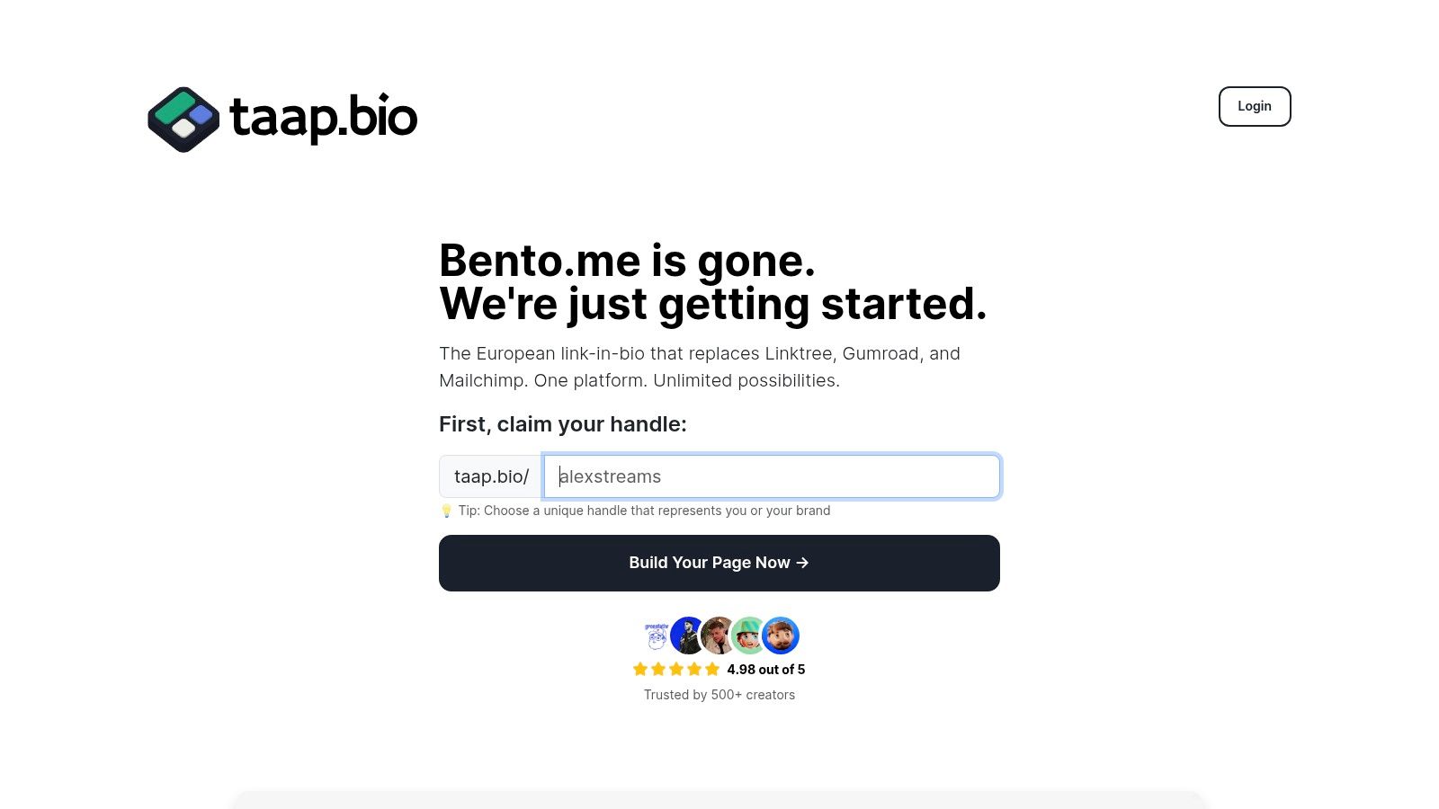
A creator posts a product on Instagram, sends an email about a workshop, then points both audiences to the same bio page. If that page gives every link equal weight, the visitor has to sort the priorities out alone. Conversion drops there.
Taap.bio is useful because it solves that prioritization problem at the layout level. The page builder uses a modular grid, so the primary offer can take the biggest visual position while supporting proof, content, and secondary actions stay in the background. That sounds simple, but it fixes one of the most common landing page failures I see in creator funnels. The page does not tell the visitor what matters first.
Why this example works
The strongest landing pages control attention. Taap.bio gives you blocks for products, bookings, email capture, media, and trust elements in one page, so the selling happens before the click out. That is a practical advantage for creators and solo operators who do not want to stitch together a store, scheduler, lead form, and portfolio across separate tools.
Its embedded content blocks also do real conversion work. A musician can add playable tracks. A designer can show recent work. A coach can place interview clips or educational content directly under the main CTA. Visitors get proof in context, which is usually more persuasive than sending them off to five different platforms and hoping they return.
Use size and placement with intent. The revenue action should sit highest and appear largest. Everything under it should answer one question: why act now?
That approach lines up with standard landing page mechanics covered in these landing page best practices. Clear hierarchy, one dominant action, visible proof, and low-friction capture tend to outperform pages that try to do everything at once. Taap.bio's editor makes those choices visible on the canvas instead of hiding them in a long settings panel.
How to replicate the strategy in Taap.bio
Start narrower than you think. Build the page for one traffic source and one outcome.
If traffic is coming from a podcast interview, lead with the resource mentioned in that interview. If traffic is coming from a product reel, lead with the product block and keep the purchase path short. If the goal is booked calls, put the scheduler first and move social links lower. Good landing pages remove decisions. They do not present a menu.
A simple structure works well for many creator offers:
- Hero block: one promise, one CTA
- Proof block: testimonial, client logos, or embedded content
- Offer block: product, booking, or lead capture
- Support block: FAQ, media, or social proof
- Low-priority links: social profiles and general destinations at the bottom
Taap.bio is especially strong when the business model mixes content and commerce. A generic link list struggles with that because every item looks the same. A modular landing page lets you separate high-intent actions from low-intent browsing. Paid offers can sit at the top. Newsletter signup can support the middle. Follow buttons can stay lower where they belong.
There are trade-offs. Public pricing detail is limited, and the platform is newer than larger page builders. Teams that need deep enterprise controls or a long list of native integrations may prefer a more established tool. For creators who care more about speed, mobile-first layout control, and built-in monetization, Taap.bio fits the job well.
If you want the setup process spelled out step by step, the guide on how to create a landing page without a website is a useful starting point.
2. Unbounce
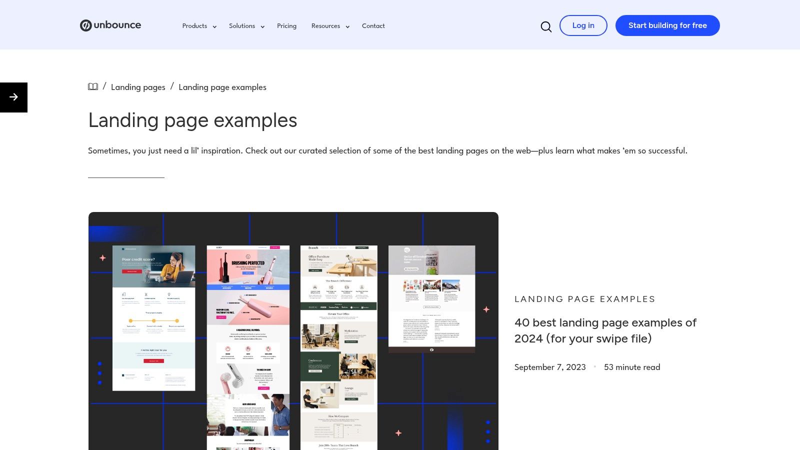
A visitor clicks an ad for a free trial and lands on a page that talks like a brand manifesto. That click is usually lost. Unbounce is useful because its example library keeps bringing the focus back to conversion intent, campaign fit, and the mechanics of getting someone to act.
Unbounce landing page examples are stronger than a typical inspiration gallery for that reason. You see pages built for signups, demos, downloads, and purchases, not just polished layouts. That makes the collection more useful when the goal is to study decisions you can reuse, not just aesthetics you can admire.
The pattern to watch closely is message match. A strong landing page continues the conversation started by the ad, email, or social post that sent the click. If the visitor came for a webinar, the hero should sell the webinar. If they came for a product bundle, the page should get to the bundle fast. Clever copy often loses to clear continuity.
That lesson transfers well to Taap.bio because the blocks are modular. A creator can build one version of a page around a lead magnet, another around bookings, and another around a paid product without rebuilding the whole site. Swap the headline, CTA verb, and first block based on traffic source. The structure stays efficient. The intent changes.
One practical rule helps here. Match the click with the first screen.
Unbounce also gives a useful view of proportional friction. Pages asking for an email can use a short form. Pages selling a higher-ticket service often need stronger proof before the CTA does any work. That trade-off matters. Asking for too much information too early drags down response. Asking for too little on a complex offer can produce low-quality leads that waste follow-up time.
If you need a clearer primer on the fundamentals, Taap.bio's guide on what a landing page is and how it works sets up the basics well, and its article on landing page best practices is a useful companion when you start translating swipe-file ideas into your own page.
The limitation is also obvious. Unbounce is still a software company showing work that supports its product narrative. You will see templates, trial prompts, and selective commentary. Use it as a pattern library, not as final proof that a given design will work for your offer.
3. HubSpot
A common review mistake goes like this. Someone saves a page because it looks polished, then misses the reason it converts. HubSpot is useful because the commentary usually explains the mechanism, not just the aesthetics.
HubSpot's landing page examples article is strongest when you want guided analysis. It calls out the parts that shape response: the promise in the headline, the relevance of the offer, the placement of proof, the CTA language, and the amount of friction before conversion. That makes it a practical training tool for founders, creators, and marketers who need to build judgment before they start copying layouts.
Best use case for this resource
Use HubSpot to study decision-making. The value is not the screenshot collection itself. The value is seeing why one page creates forward motion while another stalls, even if both are well designed.
That distinction matters on a bio page or campaign page. A polished layout can still underperform if the offer appears too late, the CTA asks for the wrong commitment, or the page gives visitors three competing paths instead of one clear next step. HubSpot is good at surfacing those failures.
It also helps shift how you treat a landing page in the first place. This is not filler between the click and the checkout. It is the page where interest either sharpens into action or drops off. If you want a clearer framework before studying examples, Taap.bio's guide to what a landing page is and how it works is a useful starting point.
For Taap.bio users, the practical takeaway is straightforward. Treat each block as a job, not decoration. One block establishes the offer. The next reduces doubt. The next gives the click a reason to happen now. HubSpot's examples help you see that sequence, then Taap.bio's modular setup makes it easier to build it without creating a full custom page from scratch.
Where it falls short
HubSpot is still an editorial roundup. It is less useful when you need a sortable reference set by funnel stage, traffic source, or business model. You are getting explanation, but not much operational filtering.
Performance context is also thin. You can learn strong patterns here, but you usually cannot verify how much of the result came from the page itself versus the brand, audience quality, or traffic source.
Still, this is one of the better resources for building taste that connects design choices to conversion mechanics. That is the skill that turns inspiration into a page you can use.
4. Instapage
A visitor clicks an ad expecting one thing and lands on a page that talks about three others. That click is usually lost. Instapage's landing page examples are useful because they keep bringing the same lesson into focus. Message match is not a nice extra on paid traffic pages. It is the job.
That makes this collection especially useful for campaign pages, product launches, and direct-response offers tied to a specific traffic source. The better examples show a tight chain from ad promise to headline to proof to CTA. You can see what the page is asking the visitor to do, why that action makes sense now, and what friction has been removed.
What it teaches well
Instapage is strongest on specificity. Good examples in this library do not hide behind broad copy. They name the audience, define the offer, and keep the CTA aligned with buyer awareness. A cold prospect gets a lower-commitment action. A warmer prospect gets a stronger ask.
That matters if you're sending traffic from paid social, creator partnerships, podcast ads, or a time-limited promotion. In those cases, the page has to continue the conversation the click started.
Another pattern worth copying is segmentation. The practical takeaway is simple. Do not force one generic page to sell coaching, digital products, newsletter signup, and press inquiries at the same time. Build separate paths. If you want a faster way to structure those variations, these simple landing page templates for distinct offers are a useful starting point.
A page for everyone usually persuades no one.
Instapage also helps sharpen your eye for page discipline. The strongest examples cut anything that does not support the conversion goal. Fewer navigation options. Fewer competing CTAs. Clearer proof placed near the decision point. That restraint is what many landing pages miss.
The trade-off is that Instapage presents examples inside a product-led article, so browsing can feel slower than using a true gallery. The set also skews toward polished, ad-driven pages, which means it is better for studying conversion structure than for seeing scrappy real-world variety. Even with that limitation, it is a strong reference if you want to reverse-engineer how focused campaign pages turn paid clicks into action.
5. Leadpages
A solo consultant launches a webinar page on Tuesday, tweaks the headline on Wednesday, and needs appointments booked by Friday. Leadpages is useful because many of its examples come from that kind of operating reality. The Leadpages gallery shows pages built by small businesses, creators, coaches, and local service brands working with tighter budgets, simpler tools, and less design support.
That makes it a better study source for execution than for visual inspiration.
You can inspect how real operators handle common conversion jobs: webinar signups, lead magnets, consultation requests, event registration, and email capture. The strongest lesson is page specificity. The better examples pick one audience, one offer, and one action, then support that choice with clear copy, a short form, and proof placed close to the CTA.
That discipline matters more than polish. A local fitness studio with a direct headline, class schedule, and one signup form will often teach more than a glossy campaign page built for awards.
For Taap.bio users, this is the practical takeaway. Build separate pages for separate intents. Speaking inquiries, digital products, newsletter signup, and community access should not compete inside one crowded layout. If you want a stronger benchmark for structuring those focused pages, this collection of landing page examples for different offer types is a useful companion.
The trade-off
Leadpages gives you the raw material, not much interpretation. You have to study the page, infer the strategy, and decide which parts are worth copying. That is a real advantage if you already know how to spot friction, weak hierarchy, or a buried CTA. It is less helpful if you want expert commentary beside every example.
Still, this gallery earns its place because it stays close to the conditions many businesses face. If the goal is to build a page that converts with limited time, limited resources, and one clear offer, Leadpages is one of the more honest references in the list.
6. Lapa Ninja
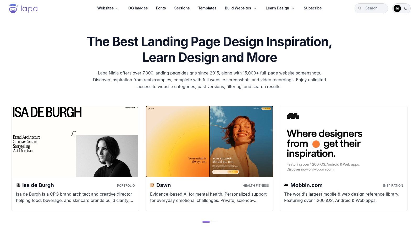
Lapa Ninja is a design library first. That means it can sharpen your eye fast, but it can also send you in the wrong direction if you confuse novelty with conversion. Use it for visual pattern mining, not for copy strategy.
Where it shines is above the fold. Hero sections, typography systems, block spacing, image treatment, card layouts, and interaction patterns are all easy to compare quickly. If your Taap.bio page looks flat, generic, or visually unbalanced, Lapa Ninja can help you fix that.
How to use it without getting distracted
Look for recurring structure, not just style. Which pages establish value in one line? Which ones use one dominant action? Which ones create contrast between the CTA and surrounding content? Those are the parts worth stealing.
Its role is especially strong when you're shaping modules inside a grid layout. If you're experimenting with asymmetry, stacked proof, thumbnail-led sections, or cleaner hero composition, Lapa gives you plenty of raw material. Taap.bio's roundup of landing page examples is a good companion because it keeps the inspiration tied to actual use cases.
One caution. Lapa often includes pages that are visually excellent but strategically loose. Full websites appear alongside single-purpose landing pages, and commentary is minimal. So don't copy a page because it looks expensive. Copy the parts that clarify, focus, and guide.
7. Land-book
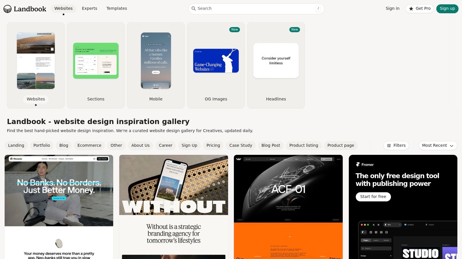
Land-book helps at the stage where the offer is clear but the page still feels off. The copy may be solid. The CTA may be in the right place. Yet the page still looks uneven, cautious, or lower trust than the product deserves. That gap is usually a design systems problem, not a messaging problem.
Its value is in pattern quality. Land-book gives you strong references for visual tone, spacing, type hierarchy, image cropping, and section pacing. Those choices shape first impression fast, and first impression changes whether someone keeps reading long enough to evaluate the offer.
Best for visual polish you can actually apply
Use Land-book to diagnose why a page feels less credible than competitors. Look at how stronger pages control width, create whitespace around key claims, and keep one visual priority per section. Good landing pages rarely feel crowded, even when they carry a lot of information.
This is especially useful if you're building in Taap.bio and working with modular blocks. Instead of copying a full page, borrow a few repeatable decisions. Tighten your hero width. Increase contrast around the primary CTA. Pair product proof with simpler backgrounds. Group related modules so the page reads in clean beats instead of one long stack.
Use it as a reference library, not a strategy guide
Land-book shows what polished pages look like. It usually does not explain why they convert, what traffic source they were built for, or which trade-offs the team made between brand expression and response rate.
That distinction matters. A page can look expensive and still ask for too much attention, bury the action, or delay proof until the visitor is already gone.
The practical way to use Land-book is simple. Save examples by layout pattern, not by industry. Then rebuild the parts that support conversion on your own page: stronger hierarchy, cleaner grouping, better image discipline, and a clearer path to the click.
7 Effective Landing Page Examples: Comparison
| Product | 🔄 Implementation complexity | ⚡ Resource requirements | 📊 Expected outcomes | 💡 Ideal use cases | ⭐ Key advantages |
|---|---|---|---|---|---|
| taap.bio | Low, drag‑and‑drop editor, no developer needed | Minimal, free tier; content/products to upload | High, commerce-ready storefront, bookings, email capture | Creators, coaches, musicians, solopreneurs selling digital goods or bookings | All‑in‑one monetization + booking, modular visual editor, live widgets |
| Unbounce | Medium, browse examples and adapt; builder available | Moderate, time to adapt; subscription for full features | Good, conversion-focused patterns and implementable toolkits | Marketers, agencies, conversion-focused designers | Curated, category filters, real customer pages, conversion emphasis |
| HubSpot | Low, editorial article, easy to read and apply | Low, mostly research time; implementation requires resources | High (qualitative), strong strategic rationale for copy/layout | Strategists, content marketers, teams needing reasoning behind patterns | Annotated screenshots, practitioner tips, balanced critique |
| Instapage | Medium, skimmable breakdowns with actionable takeaways | Moderate, ad/traffic management and possible subscription | High for paid funnels, tactics for direct-response and launches | Paid acquisition managers, growth teams, launch campaigns | Brand-focused galleries, direct-response takeaways, tactical guidance |
| Leadpages | Low–Medium, browse live pages and deconstruct | Moderate, time to test and replicate; builder optional | Good, practical examples for list growth, bookings, sales | Small businesses, creators, local service providers | Live real‑world pages, wide vertical breadth, actionable layouts |
| Lapa Ninja | Low, fast visual discovery with filters | Low, quick ideation; minimal tooling needed | High for ideation, spot visual/interaction trends quickly | Designers, creatives, teams seeking visual inspiration | High volume, daily curation, strong search & filter tools |
| Land-book | Low, curated, polished visual gallery | Low, time to curate swipe file | High for brand direction, polished layouts and typography guidance | Brand designers, startups, product teams planning visuals | High-quality captures, reliable curation, category/tag navigation |
From Inspiration to Action Build Your Storefront
A creator gets a click from Instagram, sends that traffic to a link-in-bio page, and loses the sale in five seconds. The page is not ugly. It is just unfocused. Six links compete for attention, the offer is buried, and the visitor has to figure out what to do next.
That is the gap between inspiration and execution.
The strongest effective landing page examples in this roundup work because they reduce decision-making. They present one clear offer, support it with proof, and move the visitor toward one primary action. Design matters, but structure does the conversion work. A polished page with weak hierarchy still underperforms a simpler page that makes the next step obvious.
Use the examples above as patterns, not templates. Copying a hero section rarely transfers the result, because the result came from message match, offer clarity, and the order of information on the page. A good swipe file shows what to study: headline first, CTA placement, proof timing, friction points, and whether the page asks for too much too early.
Here is a practical build order inside Taap.bio:
- Choose one primary conversion goal: product sale, booking, email capture, or content click-through.
- Match the headline to traffic source: paid traffic, Instagram followers, podcast listeners, and email subscribers arrive with different levels of intent.
- Build hierarchy with blocks: lead with the main CTA, follow with proof, then add supporting details.
- Reduce form friction: ask only for the information needed to complete the next step.
- Split pages by intent: someone buying a digital product should not land on the same page as someone considering a high-ticket service.
This is the part many creators skip. They collect examples, then build one page that tries to do everything. That usually produces a page that does nothing particularly well.
Taap.bio is useful here because the build process is modular and commerce-focused. You can assemble a storefront around the action that matters most, whether that is checkout, booking, lead capture, or content distribution, then adjust the page as real visitor behavior comes in. That makes it easier to apply what these examples teach instead of stopping at visual inspiration.
If you are also refining campaign traffic from a main site, this guide offers useful advice on A/B testing WordPress landing pages.
If your current bio link is still a list of equal-weight options, rebuild it as a storefront with a clear job. Start with the offer, support it with proof, and give the visitor one strong next step.