Let's be honest, the whole idea of a "website" is changing. For a lot of creators and small businesses, a sprawling, multi-page site is just overkill. The real move is toward the simple landing page builder—not just as a "link-in-bio" tool, but as a full-blown replacement for a traditional website. It’s a faster, more focused way to build a digital presence without the usual cost and complexity.
Table of contents
Why Simple Landing Page Builders Are Taking Over
Building an online presence used to mean one thing: a big website. But that's not the world we live in anymore. Attention is the only currency that matters, and people want you to get straight to the point. This is why we're seeing a massive shift toward sleek, single-page solutions that cut through the noise.
This isn't just a hunch; the numbers back it up. The global landing page builder market is on track to hit USD 2.83 billion by 2035, growing at a steady 14.6% each year. This boom is all thanks to creators, freelancers, and entrepreneurs who need something powerful that doesn't require a web developer on speed dial. You can dive deeper into this growth in a detailed market report from Research Nester.
From Boring Link Lists to Dynamic Hubs
Remember the first link-in-bio tools? They were basically just digital business cards—a straight line of links. Functional? Sure. But they had zero personality and couldn't tell a story to save their lives. Thankfully, modern platforms have completely flipped that script, turning a basic link list into a dynamic, visually engaging hub.
Instead of just pointing people elsewhere, a modern simple landing page builder like Taap.bio is a destination in itself. It uses a flexible grid system to present your content—videos, music, articles, social feeds—in a clean, magazine-style layout that's actually enjoyable to explore.
Here’s a quick look at how a modern, grid-based page comes to life on Taap.bio.
This visual-first approach immediately creates a clear hierarchy, pulling your visitor’s eye directly to what matters most.
The Magic of Modular Design
What makes this all possible is modular design. Think of it like building with LEGOs. Your page is constructed from independent, swappable blocks or "widgets." This gives you incredible freedom to arrange your content in a way that feels authentic to your brand. To really get a grip on this, take a look at our guide on what is modular design.
The core idea is simple: your landing page should be a destination, not just a directory. By bringing your content directly to the user with interactive widgets and a strong visual layout, you create an experience that holds attention and encourages deeper exploration.
At the end of the day, picking the right builder is a huge step in shaping your online identity. You're not just choosing a tool to list your links; you're choosing a platform to truly showcase your brand.
What Really Matters in a Landing Page Builder?
Before we dive into a side-by-side comparison, we need to establish a clear framework. What actually makes a simple landing page builder great? It's a crowded market out there—with over 206 different tools to choose from, according to Backlinko. It's no wonder so many creators feel overwhelmed.
This isn't just about picking a tool with the longest feature list. The best builders, like ClickFunnels and Unbounce, rose to the top by understanding that creators need more than a clunky, old-school website. They need speed, flexibility, and real impact.
To help you cut through the noise, I've broken down the five core pillars that separate a genuinely effective builder from a basic one. These are the things that will actually make a difference to your page's performance and your sanity.
Landing pages have come a long way from being simple link dumps. They’ve evolved into dynamic, organized hubs designed to hold a visitor's attention.
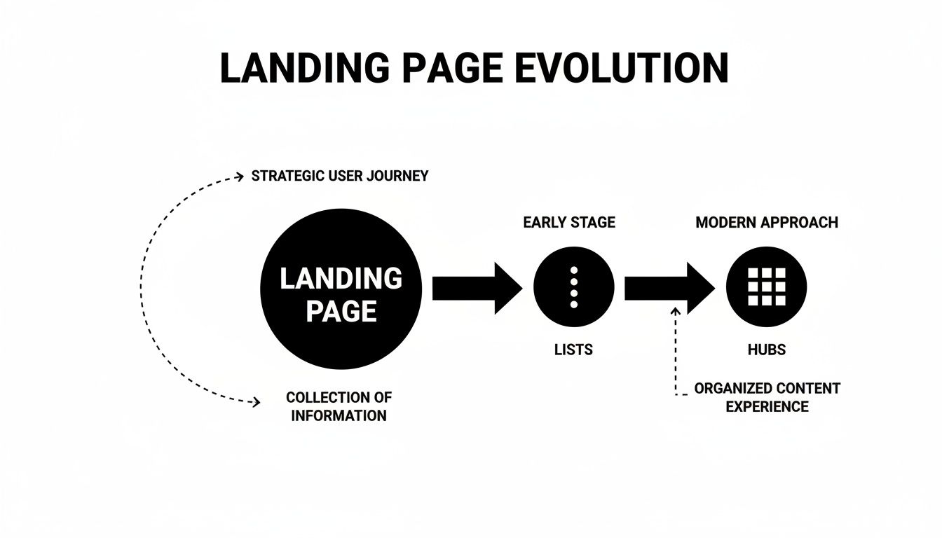
As you can see, the shift is toward creating a much more immersive and curated digital storefront for your brand.
To help you get started, I've put together a quick reference table. Think of this as your cheat sheet for evaluating any landing page builder you come across.
Core Feature Comparison Framework
| Feature Pillar | What to Look For | Impact on Your Page |
|---|---|---|
| Visual Layout | Flexible grid systems (like bento-grids) vs. rigid, single-column lists. | Lets you create a unique, magazine-style layout that guides visitor attention. |
| Integrations | "Smart widgets" that embed live content vs. basic redirect links. | Keeps visitors engaged on your page instead of sending them away to other sites. |
| Media Support | Native support for images, looping videos, GIFs, and styled text. | Helps you tell a compelling story and show off your brand's personality. |
| Device Control | Separate customization options for mobile and desktop views. | Ensures a flawless experience for everyone, no matter how they find you. |
| Pricing | Clear, all-inclusive tiers vs. complex plans with hidden fees for essentials. | Gives you predictable costs and access to the features you need to grow. |
Now that you have the framework, let’s dig into what each of these pillars means in practice.
H3: Visual Layout and Customization
Let's be honest: the classic "list of links" is dead. It's boring and it doesn't do your brand justice. The first thing you should look for is a flexible layout system that gives you genuine creative control.
A modern builder should offer something like a bento-grid, which lets you freely arrange content blocks of different sizes and shapes on a canvas. This small feature has a huge impact. It turns your page from a static directory into a dynamic, visually interesting dashboard where you control what your visitors see first. You can learn more about how this works by checking out our guide on using a drag-and-drop website builder for free.
H3: Smart Integrations and Widgets
A simple link that just sends someone away from your page is a missed opportunity. The best builders have moved beyond that with "smart widgets"—interactive blocks that pull live content directly onto your page.
A smart widget turns your landing page into a self-contained ecosystem. It provides immediate value by allowing visitors to consume your content—like listening to a Spotify track or watching a YouTube video—without ever leaving your page.
Think about it. Instead of just linking to your latest podcast episode, you can let people play it right there. This is a game-changer for engagement because it reduces friction and keeps your audience right where you want them.
H3: Multimedia Content Blocks
Your brand is more than just text and links. A top-tier simple landing page builder needs to handle a variety of media types so you can paint a complete picture of who you are and what you do.
Look for a builder that natively supports:
- Image Blocks: Not just one size, but different formats (square, vertical, wide) and animated GIFs to add some life to the page.
- Video Blocks: The ability to embed videos that can autoplay and loop is perfect for creating a dynamic background or a featured highlight.
- Rich Text Blocks: You need more than plain text. Look for customizable titles, pull-quotes, and testimonials to add structure and context.
Without these options, your page will feel flat and generic, failing to truly capture your brand's unique energy.
H3: Independent Mobile and Desktop Controls
This one is non-negotiable. With over 50% of all web traffic now coming from mobile devices, a page that looks perfect on your laptop can be a complete mess on a phone.
The ability to tweak your mobile and desktop layouts independently is crucial. This means you can resize certain blocks, reorder your content, or even hide elements on the mobile version to keep things clean and fast. A great user experience has to work everywhere.
H3: Transparent Pricing Models
Finally, let's talk about money. A builder's true value is tied directly to its pricing structure. Be very cautious of platforms with confusing tiers that hide essential features like custom domains or analytics behind expensive paywalls.
The goal is to find a tool with clear, straightforward plans. A good builder grows with you, offering more value as you need it without springing hidden fees on you for the basics. You want maximum impact, not a surprise bill.
The Power of Bento Grid Layouts
When you’re picking a simple landing page builder, the most critical decision you'll make has nothing to do with colors or fonts. It's all about the layout. For too long, link-in-bio tools have locked creators into a single, rigid column of links. Sure, it's functional, but it's also incredibly boring. This approach turns your dynamic online world into a flat, lifeless directory where every piece of content—from a huge product launch to a random thought on X—carries the exact same visual weight.
This is where the bento grid completely changes the game. Drawing inspiration from the clever, compartmentalized Japanese lunchbox, this system lets you treat your page like a canvas instead of a to-do list. You get a flexible grid where you can place content blocks of all different shapes and sizes. It’s a simple concept, but it gives you an immense amount of control over the story you’re trying to tell.
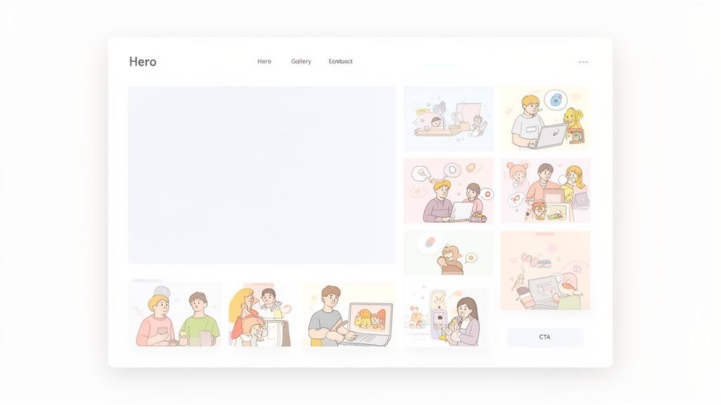
A grid lets you build a real visual hierarchy, which is a cornerstone of great design. Your most important call to action—maybe a new YouTube video or an email sign-up form—can take center stage in a large, prominent block. Then, you can arrange secondary content, like social media profiles, in smaller, supporting blocks around it. This layout naturally guides your visitor's eye, making sure they see what you want them to see, in the order you want them to see it.
From Directory to Destination
The difference in user experience is night and day. A list of links is just a navigation tool; its only purpose is to send people somewhere else. A bento grid, on the other hand, transforms your page into a destination in its own right—a curated digital hub that feels personal and engaging. Think of it as the difference between a table of contents and a beautifully designed magazine spread.
Platforms like Taap.bio have really nailed this system, giving you the freedom to drag, drop, resize, and arrange blocks to create a layout that is 100% you. This kind of creative control is essential for building a brand that actually stands out from the sea of look-alike profiles.
A bento grid layout isn't just an aesthetic choice; it's a strategic one. It puts you in control of the narrative, helps you prioritize content, and creates an immersive experience that invites people to explore, not just click away.
This level of control elevates your page from a passive list of links to an active, engaging extension of your brand. You can see what’s possible by checking out these inspiring grid layout design examples.
Practical Benefits of a Grid System
Let's get down to the brass tacks. What are the real-world advantages of choosing a builder with a bento grid?
Visual Storytelling: You can arrange your content to tell a cohesive story. A musician, for example, could place their latest single from Spotify right next to a block with upcoming tour dates, with a link to buy merch just below. It creates a seamless promotional flow.
Improved User Focus: By varying the size and placement of your content, you cut through the noise of a long, monotonous list. Visitors can instantly scan the page and grasp what’s most important without feeling overwhelmed.
Dynamic and Modern Feel: Grid layouts just look clean, organized, and modern. This signals to visitors that your brand is current and cares about the details, which goes a long way in building trust and credibility.
The ability to create asymmetrical, visually interesting compositions is what turns a simple page into a genuine micro-website. Your layout becomes part of your brand's personality, whether that’s clean and minimalist or bold and eclectic.
Ultimately, it all comes down to one question: do you want your page to be a simple signpost or a memorable experience? A traditional list will always be a signpost. But a well-designed bento grid transforms your page into a powerful, self-contained showcase that grabs attention and truly represents who you are.
How Smart Widgets Change the Game
A beautiful layout will grab someone's attention, but it won't necessarily hold it. After you've wowed a visitor with a slick bento grid, you need to give them something genuinely useful to do. This is where a top-tier simple landing page builder really separates itself from the pack, and it all comes down to one brilliant innovation: the smart widget.
Think about a traditional hyperlink for a second. It’s a one-way ticket off your page. While you obviously need links, every time someone clicks away, you risk losing them for good. A smart widget flips that entire dynamic on its head.
Instead of just being a signpost pointing elsewhere, a smart widget is a live, interactive block that pulls your content from other platforms directly onto your page. It's a subtle distinction with a massive impact on the user experience.
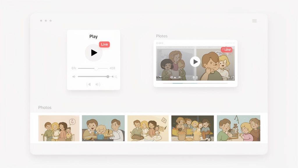
This simple shift turns your landing page from a list of doors into a self-contained hub. It’s a place where people can actually experience your world without ever needing to leave the room.
Turning Passive Links Into Live Experiences
The difference is night and day once you see it in action. Let's dig into how a platform like Taap.bio uses these deep integrations to create an experience that’s just plain better for your visitors.
Smart widgets are all about removing friction. When someone can listen to your podcast, watch your latest video, or browse your new designs right there on your page, you’ve created a stickier, more engaging destination that makes them want to stick around.
Keeping people on your page is a huge win. You maintain control of the experience and can guide them toward your most important goals. To get a better handle on how content layout influences this flow, take a look at our guide on applying visual hierarchy in web design.
Integration Showdown: Static Link vs. Smart Widget
The best way to grasp the power of widgets is to put them head-to-head with a basic link. It quickly becomes obvious which one offers a superior experience for your audience.
| Platform | Traditional Link Experience | Taap.bio Smart Widget Experience |
|---|---|---|
| Spotify | A plain link boots the user over to the Spotify app or website, completely breaking their flow. | An embedded player lets visitors listen to a full track, album, or podcast episode without ever leaving your page. |
| YouTube | A link redirects to YouTube, where your video is surrounded by distracting "up next" suggestions from other creators. | A dynamic grid showcases your latest videos with live thumbnails, giving people a real preview of your content before they click. |
| A simple link forces visitors to open a new tab or app just to see your profile and latest posts. | A live photo feed displays your most recent grid, follower count, and a follow button, delivering instant social proof. | |
| TikTok | A link to your TikTok profile sends people away from your site to see your videos. | An embedded block shows your three latest videos, offering an engaging live preview that encourages interaction. |
This isn't just a cosmetic upgrade; it's a fundamental change in philosophy. A static link says, "Go check out my stuff over there." A smart widget says, "Here's my stuff. Enjoy it right here, right now." It's an approach that shows you respect your visitor's time and attention.
How Widgets Actually Drive Deeper Engagement
Using smart widgets isn't just about making things look cool—it has a real, measurable impact on how your page performs. By letting visitors interact with your content in one place, you're building a far more effective marketing tool.
- Sky-High Dwell Time: When people can play music or watch videos without leaving, they naturally spend more time on your page. This is a powerful signal to search engines that your page is a quality destination.
- Better Conversion Rates: Embedding a Calendly widget or a newsletter form right on the page removes that one extra click—the one where most people drop off. It's a simple way to capture more leads.
- A Truly Cohesive Brand Story: Widgets let you pull together every facet of your brand into one spot. Your portfolio, social feeds, and latest projects all live side-by-side, telling a much richer and more compelling story.
For any creative, this is an absolute game-changer. A designer can show off their latest work with a live Dribbble grid. A musician can feature their new single with an in-page Spotify player. A developer can even display their GitHub contribution graph to showcase their recent activity.
At the end of the day, a simple landing page builder armed with smart widgets does more than just organize your links. It pulls your entire digital identity into one interactive, dynamic, and genuinely impressive destination that truly works for you.
Finding the Right Builder for Your Use Case
The best tool isn't the one with the most bells and whistles; it's the one that actually solves your problems. Theory is one thing, but seeing a simple landing page builder in action is what makes its value click. Let's move past the abstract and get into how real professionals can build a page that serves their specific goals.
I'll walk you through some tangible examples for a few different careers, showing how a flexible builder like Taap.bio lets you snap together the right widgets to create a powerful digital hub. Thinking in terms of personas helps you imagine exactly how to build a page that truly works for you—transforming a simple list of links into a high-performing asset. The idea is to build something that feels less like a directory and more like your personal digital storefront.
The Musician: From Tour Dates to Tracks
If you’re an independent musician or in a band, your goal is to turn casual listeners into loyal fans. That means making your music easy to find, pushing live shows, and building a community. A classic link list just doesn't cut it because it makes people jump between five different apps to get the full picture.
A modern landing page brings that entire fan experience into one place. Picture this: a big, central block featuring an embedded Spotify widget with your latest album. Visitors can hit play and listen right there on the page. You've just removed the friction of app-switching, which is exactly where you lose most people.
Next to the album, you could pop in a smaller block with a "Tour Dates" list, using a rich text widget you can update in seconds. Below that, drop in your latest music video with a YouTube smart widget that shows a live thumbnail, begging to be clicked. All of a sudden, you have a powerful, self-contained promo hub.
This kind of setup accomplishes a few critical things at once:
- Drives Streams: The on-page Spotify player makes it dead simple for people to listen, which can directly boost your streaming numbers.
- Promotes Shows: Putting tour dates front and center ensures your most dedicated followers know where to see you live.
- Boosts Video Views: A dynamic YouTube block is way more interesting than a plain text link, dramatically increasing the odds of a view.
It’s a perfect example of how combining the right smart widgets tells a story, guiding a visitor from discovery to conversion—whether that’s a stream, a ticket sale, or a new subscriber.
The Designer: From Portfolio to Client Booking
For freelance designers, a landing page has to be a dynamic portfolio and a client-getting tool. The mission is simple: show off your skills and make it incredibly easy for potential clients to book a consultation. Your page needs to build trust and telegraph your design taste from the moment it loads.
A bento grid layout is absolutely perfect for this. You can create a visually striking composition that mirrors your own design style. The centerpiece could be a Dribbble smart widget pulling in a live grid of your most recent shots, complete with like counts for that sweet social proof. It instantly tells visitors that you’re an active, respected designer.
Around this main portfolio block, you can add smaller, supporting pieces. Place a "Client Testimonials" block using a styled quote widget to build credibility. Then, below your work, embed a Calendly widget. This is a total game-changer. It lets a potential client see your availability and book a meeting right there, eliminating the endless email chains that so often kill a lead's momentum.
By integrating a live portfolio with direct booking functionality, your landing page transforms from a passive gallery into an active lead generation machine. It showcases your work and streamlines the hiring process in one elegant flow.
This approach doesn't just look professional; it's ruthlessly efficient. It answers a client’s two biggest questions—"Can you do the work?" and "How can I hire you?"—in a single, seamless experience. If you want more ideas on what’s possible, our guide to the best one-page website builders gives you a broader look at different platforms and what they can do.
The Coach: From Reviews to Lead Magnet
Coaches and consultants live and die by their credibility and ability to generate leads. Your landing page has to establish you as an expert and be an effective machine for capturing contact info. The goal is to build an audience you can nurture through email, eventually turning them into paying clients.
Your layout should be structured to build trust step-by-step. At the top, you could feature a video block with a personal introduction to create an immediate, human connection. Right below that, add a carousel of customer reviews or testimonials to provide undeniable social proof.
But the most critical piece is your call to action. Instead of a boring "Contact Me" link, offer a valuable lead magnet—a free eBook, a worksheet, or a webinar sign-up. You can create a visually distinct section for this, maybe with a different background color, featuring a big, clear email sign-up form. This direct integration is far more effective than shipping people off to another page to sign up.
By combining these elements, you create a clear funnel. Visitors arrive, learn about you, see proof that you get results, and are then presented with a valuable, no-risk offer in exchange for their email. This strategy turns your page into a reliable engine for growing your email list with qualified leads, which is the foundation of any successful coaching business.
Got Questions? We've Got Answers
As you narrow down your search for the right landing page builder, a few key questions always seem to surface. It's totally normal. Getting these last few details sorted is what helps you make a choice you feel great about. Let's tackle the big ones head-on so you can move forward with confidence.
Think of this as clearing the fog. Once you understand the core differences between the tools and what features really matter, the best path for you becomes much clearer.
What’s the Real Difference Between a Link-in-Bio Tool and a Landing Page Builder?
On the surface, they can look similar, but honestly, they’re worlds apart in what they can do. A classic link-in-bio tool is basically just a digital phonebook—a simple, vertical list of links designed to send people somewhere else. It does one job, but there's not much room for personality or getting people to stick around.
A modern landing page builder, however, is your personal canvas. Instead of just a list, a platform like Taap.bio lets you build a genuine micro-website. You get to control the whole look and feel, creating a dynamic grid that draws the eye where you want it to go. You can drop in playable videos, show off your live social feeds, and add rich text to actually tell your story.
Here’s the bottom line: a link-in-bio tool is a signpost pointing away, while a modern landing page builder is the destination itself. One is a pit stop; the other invites people to hang out, explore, and engage with your content right then and there.
This one shift turns a basic utility into a real brand experience, making your page something people actually remember.
Can a Simple Landing Page Builder Actually Replace My Full Website?
For a ton of creators, freelancers, and small businesses? Absolutely, yes. If your main goal is to guide your audience, show off your work, plug your latest song or video, and give people a clear way to get in touch, a powerful landing page is often a much saner choice than a traditional website.
Just think about the headaches of a full-blown website: the costs, the endless maintenance, the pain of making even a small update. A simple landing page builder gets rid of all that. It’s way more affordable, requires practically zero upkeep, and you can get something amazing live in hours, not weeks.
It's the perfect solution for anyone who needs a polished, professional hub online without getting bogged down by a complicated Content Management System (CMS).
Why Is Independent Mobile and Desktop Control Such a Big Deal?
In a world where people are constantly switching between their phones and laptops, this feature is a must-have. It’s not just a nice-to-have, it’s essential. A layout that looks gorgeous on a big desktop screen will almost always be a jumbled, confusing mess on a phone. How people interact with your page changes completely based on the device they're using.
Being able to customize the mobile and desktop views separately—a core part of how Taap.bio works—means you can guarantee a perfect experience for everyone. This isn't just about tweaking a few things; it's fundamental to good design.
Here’s what that separate control lets you do:
- Reorder Your Priorities: Maybe you want a big video front-and-center on desktop, but on mobile, a "Contact Me" button at the very top makes more sense for people on the move.
- Resize for Readability: You can make text blocks and buttons larger and more thumb-friendly on mobile without messing up your desktop design.
- Craft a Flawless User Journey: It ensures your page is always easy to navigate and looks fantastic, which has a direct impact on how long people stay and whether they take action.
Without this level of control, you're essentially taking a gamble with over half of your audience. A "responsive" design is the bare minimum, but true independent control is what makes the experience feel truly professional on every platform.
Ready to build a page that’s as unique as your brand? Taap.bio gives you the creative freedom of a bento grid layout and the power of smart widgets to create a stunning, interactive hub in minutes. Stop just listing links—start telling your story. Build your free page on Taap.bio today!