At its core, the idea behind mobile-first design is refreshingly simple: start by designing for the smallest screen, and then expand your design for larger ones. This isn't just a technical detail; it's a strategic shift that forces you to build a better experience for the vast majority of people who will find you on their phones.
Table of contents
Why Your Online Presence Must Be Mobile First
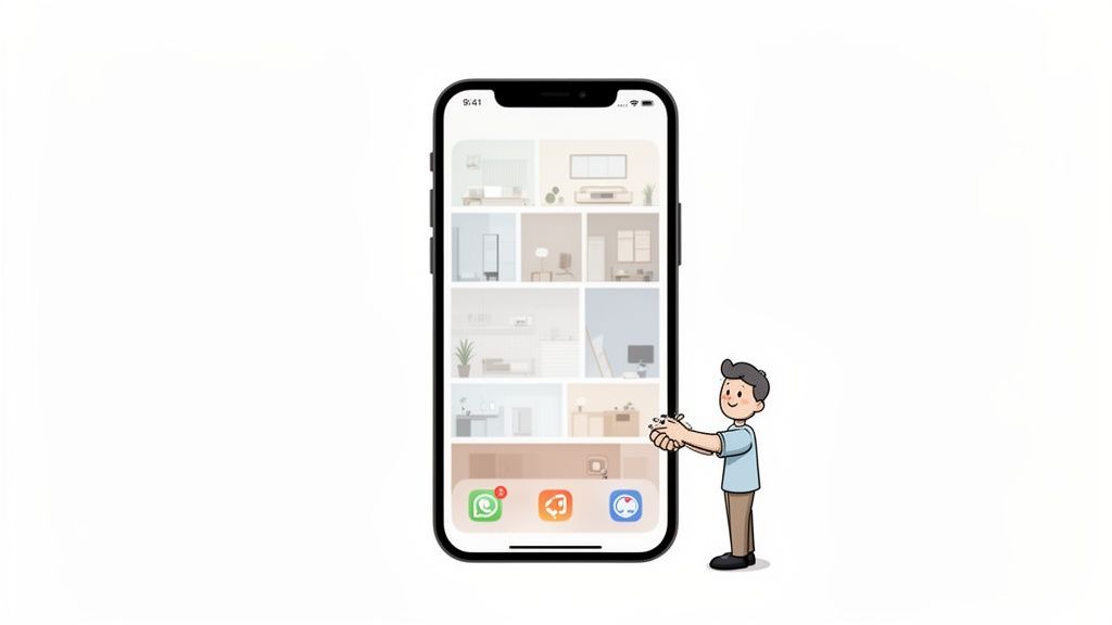
Think of your link-in-bio page as your digital handshake. These days, that first impression almost always happens on a smartphone. Going mobile-first isn’t just a nice-to-have; it's the only way to make that handshake firm, confident, and memorable.
To really get it, let's use a construction analogy. The old way of designing websites, called graceful degradation, was like building a giant mansion and then trying to cram it onto the foundation of a tiny studio apartment. Things would inevitably break, the layout would feel cramped, and the whole experience would fall apart.
The Shift to Progressive Enhancement
The mobile-first approach completely flips that around. It’s a strategy we call progressive enhancement, and it’s much smarter. Think of it like designing a sleek, highly functional studio apartment first. Every essential—the kitchen, the bed, the bathroom—is perfectly placed and works flawlessly. Only after you’ve perfected that core experience do you start adding on extra rooms, balconies, and other luxuries for those with more space (or in our case, a bigger screen).
This forces you to be disciplined. With limited screen real estate, you have to be ruthless about what stays and what goes. You’re compelled to focus on what your users really need, cutting away all the noise and clutter. The result is a cleaner, faster, and far more intuitive experience for everyone, no matter what device they're using.
This isn’t a new fad. The shift towards mobile-first design has been gaining steam for over a decade, kicking off around 2009 when visionary designers saw the smartphone boom for what it was: a fundamental change in how we live and connect online. Fast forward to August 2022, and a massive 62.06% of all internet traffic came from mobile devices. With over 83% of the global population owning a smartphone, the mobile audience isn't just a segment; it's the audience. You can dive deeper into this user experience transformation on Visual Marketing's blog.
Key Advantages of a Mobile First Strategy
When you embrace the constraints of a small screen from the start, you unlock some powerful benefits that ripple across every version of your site:
- Improved Performance: Mobile-first sites are inherently lean. By loading only the essential elements first, your pages load much faster on cellular networks, which is crucial for keeping impatient users from bouncing.
- Enhanced Accessibility: Designing for small screens naturally leads to simpler navigation and bigger, easier-to-tap buttons. This makes your page more user-friendly for everyone, including people with disabilities.
- Future-Proof Foundation: New devices and screen sizes are coming out all the time. A site built on a flexible, mobile-first foundation can adapt to whatever comes next far more easily than a rigid, desktop-centric design.
The core philosophy is simple: by solving for the user with the most constraints, you create a better experience for all users. It’s a discipline that breeds clarity and purpose in your design.
Ultimately, mobile-first isn't just about screen sizes—it's about empathy for your user. It’s about understanding that your audience is on the move, short on time, and expects things to just work. Building with their needs in mind from the very beginning is the only way to create a digital presence that truly connects.
The Three Pillars of Mobile-First Design
Turning a design philosophy into something you can actually use requires a solid framework. When it comes to mobile-first, I’ve found it boils down to three core pillars. Think of these as your guiding principles, the checklist you run through to make sure every decision you make puts the mobile user front and center.
Getting these right creates a rock-solid foundation that scales up to any device, not the other way around. This isn't just theory; it’s a practical roadmap for building experiences that are a pleasure to use, not just functional. Each pillar tackles a specific challenge of designing for a small screen, from cramped space to a user's fleeting attention span.
Pillar 1: Ruthless Content Prioritization
Picture this: you’re packing for a weekend getaway, but you can only bring a small backpack. You can't just throw in your entire closet; you have to pick the absolute essentials. That’s content prioritization in a nutshell. The tight constraints of a mobile screen force you to get laser-focused on what really matters to your audience and your business.
It’s all about cutting through the noise. You have to identify and showcase your most important content first. This isn't about deleting information, but about creating a crystal-clear hierarchy. A great way to start is by asking yourself: what is the single most important thing I want someone to do on this page? That becomes your North Star.
Everything else on the page should support that one primary goal without adding clutter. This kind of discipline leads to a cleaner, more powerful message that connects with people instantly.
It's a stark reality: by 2022, a staggering 57% of users said they would abandon a site with a poor mobile experience. That’s more than half your potential audience gone in a flash.
The core ideas that emerged back in the early 2010s—focusing on essential content, creating touch-friendly navigation, and simplifying layouts—are no longer optional. With 62.06% of all web traffic now coming from mobile, you simply can't afford to treat it as an afterthought. Starting with mobile constraints forces you to build an intuitive experience that respects a user's time and attention. You can explore how these foundational concepts have evolved over on Maxiom Tech's blog.
To really grasp the shift in thinking, it helps to see the two approaches side-by-side.
Mobile First Vs Desktop First Approach
This table breaks down the fundamental differences in philosophy and outcome when you start with mobile versus starting with a sprawling desktop canvas.
| Aspect | Mobile First Design (Progressive Enhancement) | Desktop First Design (Graceful Degradation) |
|---|---|---|
| Philosophy | Start with the essential core features for mobile, then add enhancements for larger screens. | Start with a full-featured desktop site, then strip away elements for smaller screens. |
| Content Strategy | Forces you to prioritize and focus on the most critical content from the beginning. | Often leads to cluttered mobile views as you try to cram everything in or hide content. |
| Performance | Naturally faster and leaner, as you only load what's necessary for the mobile experience. | Tends to be slower on mobile, as devices have to load complex desktop assets and then hide them. |
| User Experience | Creates a focused, goal-oriented experience tailored to on-the-go users. | Can feel clunky and compromised on mobile, with awkward navigation and hidden features. |
| Outcome | A consistent and optimized experience across all devices, built on a solid foundation. | An inconsistent experience where the mobile version often feels like an afterthought. |
As you can see, starting with mobile isn't just a trend; it’s a strategy that leads to a fundamentally better, more performant product for everyone.
Pillar 2: Adaptive and Fluid Layouts
Okay, so you’ve figured out what content to show. The next piece of the puzzle is how to show it. This is where the second pillar comes in: adaptive and fluid layouts. The days of designing for one specific screen size are long over. Your page has to look and feel great on a tiny smartphone, a big tablet, and every device in between.
This means you have to stop thinking in terms of rigid, fixed-width boxes. Instead, embrace flexible systems that can adapt on the fly. A great analogy is to think of your layout like water—it flows and takes the shape of whatever container it’s in. We make this happen with fluid grids and flexible images that automatically resize and reflow based on the screen’s dimensions.
On a platform like Taap.bio, you can see this concept in action with the "bento box" grid. This modular layout lets you build compelling, asymmetrical designs that feel both organized and visually dynamic. Each content block can be resized and rearranged, creating a unique experience that scales beautifully from a narrow phone screen to a wide desktop monitor. For a deeper dive into these techniques, check out our guide on responsive web design best practices.
Pillar 3: Optimized Performance and Interaction
Our final pillar gets to the heart of how people actually use their phones: they’re often in a hurry, and they’re using their thumbs. Optimized performance and interaction is all about making your site fast and easy to use, heading off frustration before it even starts.
Speed is everything. A mobile user on a spotty data connection isn't going to wait around. Every oversized image, clunky script, or unnecessary font you load adds precious seconds to the load time, increasing the odds they’ll leave before they even see what you have to offer. A mobile-first approach forces you to build a lean, fast foundation by loading only the absolute essentials first.
At the same time, the design has to feel natural to touch. This goes beyond just looks and gets into the ergonomics of the experience. You have to consider things like:
- Thumb-Friendly Tap Targets: Are your buttons and links big enough to be tapped easily without hitting the wrong thing?
- Intuitive Gestures: Does the page respond to common gestures like swiping and scrolling in a way that feels natural and predictable?
- Ergonomic Layouts: Are the most important navigation items and buttons placed where a thumb can easily reach them, usually near the bottom or sides of the screen?
By focusing on these three pillars—content, layout, and performance—you're not just designing a page. You're building a complete framework that ensures your link-in-bio is fast, intuitive, and effective for the audience that matters most.
Building Your Page with a Visual Grid
Theory is one thing, but actually putting mobile-first principles to work is where the fun begins. Let's walk through the process of building a link-in-bio page using a visual grid. We're going to turn those abstract concepts into a functional, eye-catching layout that stops the scroll. This is how you get results.
The key to a killer visual grid on mobile is hierarchy. You simply don't have the real estate to be subtle. You have to tell the user's eye exactly where to look first. That means your most important content—your "hero" element—needs to be the biggest, boldest block on the page.
Establishing a Clear Visual Hierarchy
Think of your page like a puzzle. You always start with the most important piece, right? For a musician, that's probably a Spotify widget showcasing their latest single. For a YouTuber, it might be a big, auto-playing video of their newest upload. By making this element physically larger than everything else, you’re sending a clear signal: "Start here. This is the main event."
Once your hero is locked in, you can start arranging your other links and content in smaller blocks around it. This creates a natural visual path, guiding the user's eye down the screen exactly how you want them to go. The whole point is to ditch the boring, single-file list and create something dynamic that pulls people in.
This flowchart really brings it home, showing how content, layout, and performance are all intertwined in a great mobile-first design.
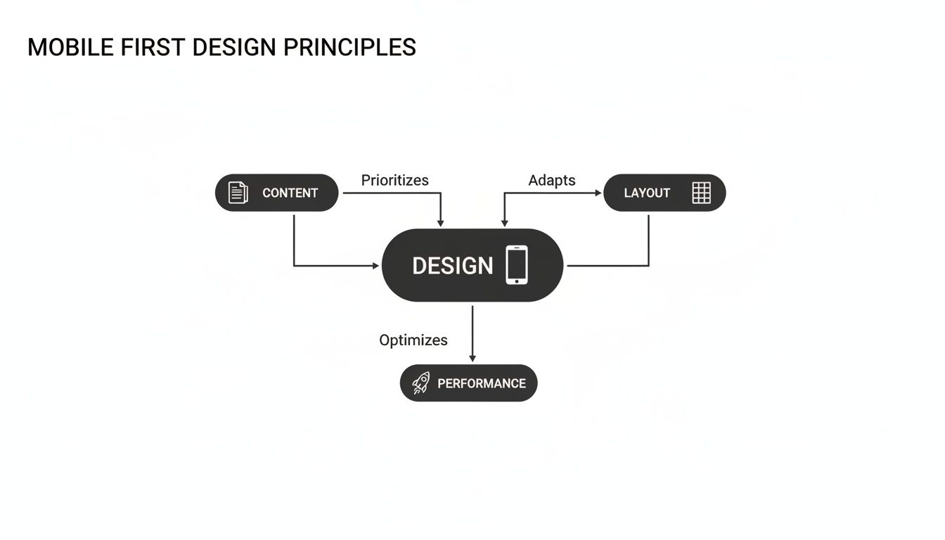
As you can see, a successful layout isn't just about looks. It’s deeply connected to the content you choose to feature and how fast you can get it in front of your audience.
Designing a Dynamic and Scannable Layout
The Nielsen Norman Group famously found that a whopping 79% of users scan new web pages instead of reading every word. A modular grid is built for this exact behavior. By using different block sizes, you break up the visual monotony and make the entire page a breeze to scan.
A good grid just feels right on a phone. It makes you want to scroll and tap. To get that visual rhythm just right, try a few of these strategies:
- Asymmetrical Balance: Don't try to make everything perfectly symmetrical. Placing a large block on the left with two smaller ones on the right creates a bit of visual tension that keeps things interesting.
- Variable Sizing: Mix it up! Use a combination of square, horizontal, and vertical blocks. This not only looks better but also lets you give more visual weight to your most important links.
- Negative Space: Resist the urge to fill every single pixel. Leaving a little "breathing room" around your blocks makes the whole design feel less cluttered and more professional.
By thinking like a visual storyteller, you can use the grid to guide your audience through your content in a way that feels natural and compelling, not forced. It’s about creating a journey, not just a list.
Understanding how to make visuals work in different contexts is a huge advantage. For example, knowing the ideal size for Facebook ads gives you a solid foundation for creating adaptive visuals that fit perfectly within a modular, mobile-first page. The same logic of optimizing asset sizes applies directly to building a powerful grid.
From Static Blocks to an Interactive Experience
At the end of the day, a visual grid does more than just organize your links—it transforms your page into an interactive dashboard. Each block becomes a piece of a larger mosaic representing you or your brand. When done right on a platform like Taap.bio, this approach creates an experience that’s as functional as it is beautiful.
This method respects your audience's time by giving them information in a clear, digestible, and engaging way. It’s the difference between handing someone a bland business card and giving them an interactive portfolio.
If you want to see what's possible, check out these fantastic grid layout design examples for a dose of inspiration. This is how you turn a simple link-in-bio into a powerful tool for your brand.
Think Beyond Static Links: Embrace Smart Widgets
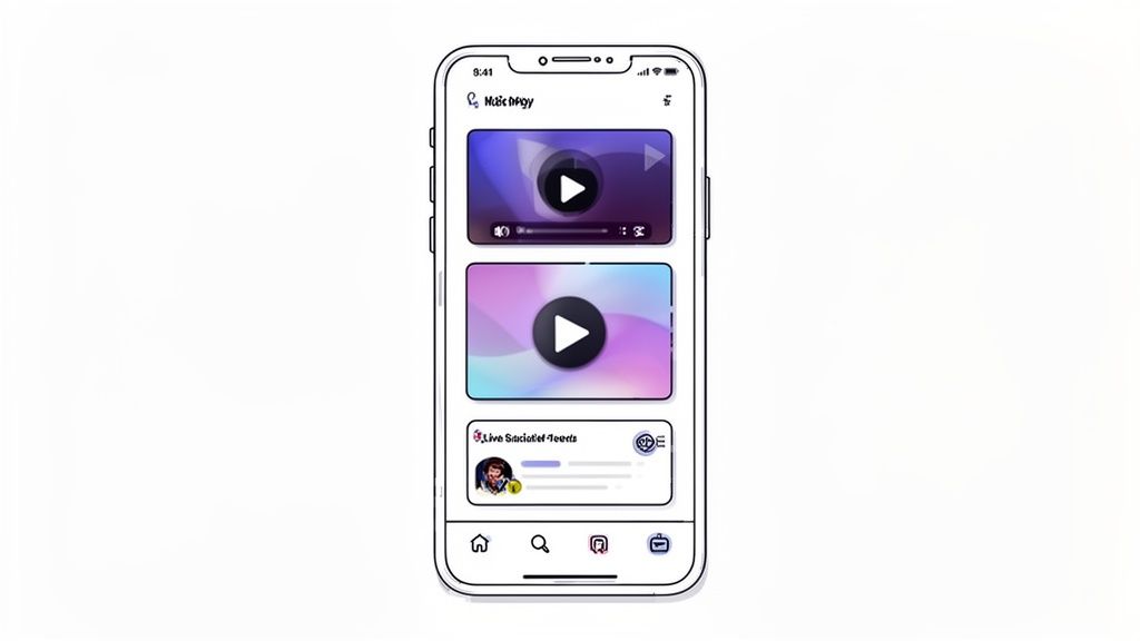
Truly designing for mobile isn't just about making things fit on a smaller screen. It's about delivering real, immediate value right in the palm of your user's hand. The mission is to transform your link-in-bio page from a boring menu of outbound links into a vibrant, interactive hub that gives people what they want right now.
This is where smart widgets come in and completely change the game.
Think about it: a traditional link-in-bio is just a list of detours. A plain text link that says "Spotify" is a dead end on your page. Its only job is to kick your audience over to another app. That approach forces people to leave your world to get the content you promised them, creating unnecessary friction.
From Simple Redirection to Instant Gratification
Smart widgets flip that old model on its head. Instead of just linking to your Spotify, a smart widget can embed your latest song or podcast episode directly onto your Taap.bio page. Visitors can hit play and start listening immediately, without ever leaving your space. It’s a small change that makes a huge difference in keeping people engaged.
This logic works everywhere. A generic "YouTube" link is a total gamble—will they click? Will they get distracted and forget why they went there? A smart widget, on the other hand, can showcase a grid of your latest video thumbnails, grabbing their attention with compelling visuals. You’re not just telling them about your content; you’re showing them.
Mobile‑first design principles demand that we respect the user's time and minimize their effort. Smart widgets achieve this by transforming passive links into active, engaging experiences that deliver value without requiring a context switch.
This strategy of instant gratification is a perfect match for the mobile mindset. Your audience is likely multitasking with a short attention span. By serving them rich, interactive content on the spot, you capture their interest the moment it peaks.
Real-World Examples of Smart Widgets in Action
Let’s get practical. The goal here is to cut down on clicks and bring the best of your online presence into one central place.
- For Musicians: An embedded Spotify player lets fans stream your new single instantly. That frictionless experience is far more likely to turn a casual listener into a dedicated follower.
- For YouTubers: A dynamic YouTube widget displays your latest videos as clickable thumbnails. It pulls visitors in with a visual hook, making them way more likely to watch. Our guide on using a full video link in bio dives deep into how this can skyrocket your views.
- For Developers: A GitHub widget can display your contribution graph, showcasing your activity and expertise in real-time. It’s a living resume, not just a static link to a profile.
- For Instagrammers: Instead of a simple link, a smart widget can display your six most recent photos. This gives visitors a current, dynamic preview of your feed that actually encourages them to follow.
Boost Engagement by Cutting Out the Friction
Every single time a user has to leave your page, you risk losing them for good. A notification from another app or a momentary distraction is all it takes. Smart widgets plug these leaks by making your page a destination in itself, not just a signpost pointing elsewhere.
Platforms like TikTok, Dribbble, and Behance all become more powerful with this approach. By displaying a creator’s latest work right on their Taap.bio page, the entire experience becomes richer and more satisfying. You’re meeting your audience's needs immediately, which is the heart of effective design. This focus on a seamless journey is mobile-first thinking in practice, proving that the best user experience is often the one with the fewest steps.
How Mobile-First Design Drives Conversions
Great design is more than just aesthetics; it's a powerful engine for growth. The principles of mobile-first design directly translate into tangible business results—more followers, higher sales, and a fiercely loyal audience.
The core idea is simple. By systematically removing friction from the user's journey, you create a smooth, clear path for them to become a customer or a fan.
Think about it from your visitor's perspective. Friction is anything that slows them down or causes frustration. We're talking slow load times, confusing navigation, tiny buttons that are impossible to tap, and extra clicks that feel completely pointless. Each of these friction points is an open door for them to leave and never come back.
Turning Seamless Experiences into Tangible Growth
A mobile-first approach is all about anticipating and eliminating these frustrations before they happen.
For a freelancer using a Taap.bio page, this means a potential client can land on their profile, browse their portfolio, and get in touch within seconds—all from their phone. No pinching and zooming on a clunky desktop site. Just a clean, direct experience.
It’s the same for a podcaster. A visitor can hit their page, see the latest episode featured in a smart widget, and immediately press play. If they like what they hear, they can subscribe right then and there. This flawless, instant gratification is what converts a casual browser into a dedicated subscriber. These small wins in user experience compound into massive gains in audience retention.
The Financial Impact of Prioritizing Mobile Users
The link between a smooth mobile experience and your bottom line is crystal clear. One of the biggest payoffs from applying mobile-first design principles is a serious boost in conversion rates.
In fact, sites built with a mobile-first strategy see 15-30% higher conversion rates than their desktop-first counterparts. Mobile devices have also seen their conversion rates grow by a whopping 64% compared to desktop averages.
With over 50% of all web traffic now coming from mobile devices, this isn't some niche market—it's your primary audience. Google even prioritizes mobile versions for search rankings. Mobile-first isn't just a good idea anymore; it's a business imperative. Discover more insights about these mobile-first statistics on Sanity.io.
The data doesn't lie. A clean, fast, and intuitive mobile site doesn't just feel better—it performs better financially. Every second you shave off load times and every click you remove from the user journey directly adds to your success. To truly nail this, taking a data-driven design approach helps turn guesswork into measurable growth.
These frictionless experiences do more than just lock in a one-time sale or a follow. They build trust. When someone has a great experience, they're far more likely to return. This creates a positive feedback loop where great design encourages repeat visits, turning casual browsers into a loyal community.
If you're ready to dig deeper, our guide on improving conversion rates on landing pages is packed with more actionable strategies. At the end of the day, smart, user-centric design is the most reliable engine for sustainable growth.
Your Questions About Mobile-First Design, Answered
Jumping into a new design philosophy always brings up a few questions. That's perfectly normal. Getting these common sticking points cleared up is the key to confidently using mobile-first principles in your own work.
Think of this as your go-to reference. We'll cut through the confusion and tackle the most frequent "what ifs" and "hows," giving you a rock-solid understanding of this powerful approach.
What’s the Real Difference Between Mobile-First and Responsive Design?
This is, without a doubt, the most common question, and the distinction is everything. Here’s the simplest way to think about it: mobile-first is the strategy, and responsive design is the technique you use to pull it off. They aren’t competing ideas; they’re partners.
A mobile-first strategy means you start the entire design process from the smallest screen. All your big decisions about content, layout, and functionality are made within the tight constraints of a smartphone. This forces a kind of ruthless focus right from the get-go.
Responsive design, on the other hand, is the technical magic—the fluid grids, flexible images, and media queries—that lets a website gracefully adapt to any screen size. A site built with a mobile-first approach is always responsive, but not every responsive site was built mobile-first. Many older sites were designed for the desktop and then crammed down to fit a phone, which is a completely different (and often messier) process.
Will a Mobile-First Design Look Awful on a Desktop?
Not at all—in fact, when done right, it should look and perform even better. A huge misconception is that a mobile-first site is just the mobile version stretched out. That couldn't be further from the truth.
The secret is a concept called progressive enhancement. You begin with a clean, perfectly functional foundation for mobile and then thoughtfully add features, detail, and complexity as the screen gets bigger. This guarantees the core experience is solid for every single user.
For example, a simple, elegant single-column layout on a phone can intelligently expand into a sophisticated multi-column grid on a desktop. You might introduce higher-resolution images, more detailed navigation, or interactive elements that would have just been clutter on the mobile view. The core content doesn't change, but its presentation is perfectly tailored for the best possible experience on that device.
How Does Mobile-First Design Affect SEO?
It has an enormous—and overwhelmingly positive—impact. This isn't just a theory anymore; it's a technical reality. Google now uses what it calls mobile-first indexing, meaning it primarily looks at the mobile version of your site to decide how to rank you.
In other words, Google’s search bots now see your website just like a mobile user does.
A fast, well-structured, and complete mobile site directly aligns with Google's most important ranking factors. If your mobile site is slow, difficult to navigate, or missing content that’s on your desktop version, your search rankings will suffer.
Adopting mobile-first principles naturally leads to better visibility in search results, which means more organic traffic for you. It also tends to lower bounce rates because people have a better experience, sending powerful signals to search engines that your site is high-quality and worth showing to more people.
Is Mobile-First Design Harder to Implement?
It definitely requires a shift in thinking, which can feel like a hurdle at first. The strict limits of a small screen force you to make tough, focused decisions about your content from day one. You can't just throw everything in and hope for the best.
But here's the thing: that initial discipline almost always leads to a cleaner, more efficient, and far more effective final product.
Here’s why it often saves you headaches in the long run:
- A Simpler Foundation: It’s much easier to start with a simple mobile base and progressively add complexity than it is to build a heavy desktop site and then try to painfully strip it down for mobile without breaking everything.
- Fewer Headaches: The old desktop-down approach (often called "graceful degradation") usually means hiding elements, writing messy code overrides, and fighting performance issues from loading huge assets on small devices. Mobile-first avoids all that.
- A Clearer Focus: The constraints force you to build a product that is truly centered on what users need most, resulting in a more intuitive and successful design.
Once your team gets into the mobile-first mindset, the whole workflow becomes smoother and the results are consistently better. For anyone juggling multiple streams of information, this organized approach is similar to what makes a good content aggregator so useful. You can learn more by reading about what is a content aggregator on our blog.
Ready to create a link-in-bio page that’s truly designed for today’s audience? With Taap.bio, you can use our intuitive visual grid and smart widgets to apply mobile first design principles effortlessly. Build a stunning, interactive page that looks amazing on every device. Get started for free at Taap.bio