Let’s be real for a moment. A simple list of links just doesn't cut it anymore. When you’re trying to build a brand, that first impression is everything, and a plain, static page feels more like a phone book than a storefront. Your audience craves a connection, a story, not just a directory of URLs.
This is where building a true digital hub comes into play. We're talking about creating a single, visually striking destination that pulls together every part of your brand and invites people to stick around and explore.
Table of contents
Why Your Business Page Needs a Modern Makeover
If your "link-in-bio" is just a list of buttons, you're missing a massive opportunity. In a world saturated with content, you have seconds to capture someone's attention. A dynamic, interactive page is your chance to do exactly that.
Moving Beyond Static Link Lists
The old way of doing things isn't working. Think about it: organic reach for a typical business page on a platform like Facebook is often a dismal 2.2% of your followers. Worse, the average engagement rate is just 0.15%. Those numbers are a clear signal that we need a better way to connect with our audience.
Instead of a passive menu that just sends people away, your page should be an interactive experience. This is the whole idea behind a modular, bento-box-style layout.
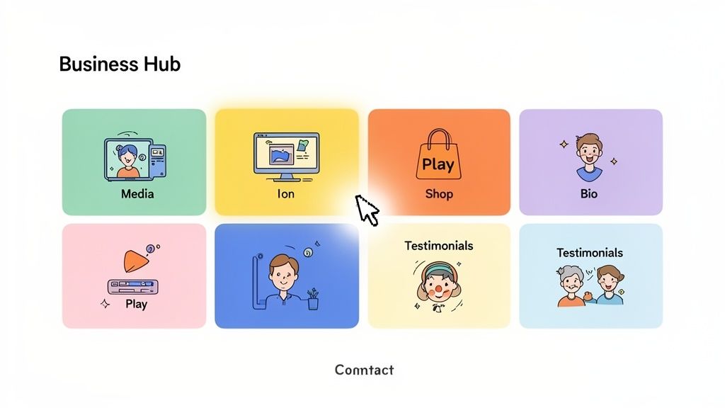
This approach turns a boring list into a vibrant, engaging snapshot of your brand, showcasing all the different things you do in one cohesive place.
The Power of an Interactive Hub
Picture this: someone lands on your page and can watch your latest YouTube video or listen to your new podcast episode right there, without ever leaving. That’s the difference between passive scrolling and genuine engagement.
The best business pages today aren't just gateways; they're destinations. They bring your entire online world into one immersive experience that tells your story at a glance.
A side-by-side comparison really highlights the difference in what's possible.
Traditional Link List vs. Dynamic Business Page
| Feature | Traditional Page (e.g., Linktree) | Dynamic Taap.bio Page |
|---|---|---|
| Layout | Single column of links | Modular, bento-box grid |
| Content | Static links only | Embedded media, live feeds, interactive widgets |
| Engagement | Sends users away (high bounce rate) | Keeps users on-page, encourages interaction |
| Branding | Limited customization | Full visual and brand control |
| Impression | Functional but forgettable | Professional, modern, and memorable |
It’s clear that a dynamic page offers a richer, more compelling experience for your audience.
By pulling in real-time content, like your latest Instagram posts or TikToks, your page feels alive and constantly updated. You're respecting your audience's time by giving them a meaningful preview of your work, making them far more likely to click, follow, and connect. It's a fundamental shift, and you can learn more about creating a content hub that truly brings people into your world instead of just linking them out.
Crafting Your Page's Narrative Before You Build
It’s so tempting to jump straight into the fun stuff—picking colors, arranging blocks, and making things look pretty. But trust me, that’s one of the biggest mistakes you can make when putting together a new business page. The real magic, the work that actually gets results, happens before you even log in to the editor.
A great page isn't just a random collection of links. It tells a story. It guides a visitor on a specific journey with a clear destination. This initial planning phase is your blueprint, and it's what separates a page that just exists from a page that actually works.
First things first: who is this page for? Don't just say "everyone." Get specific. Are you trying to capture the attention of busy event planners who need to see your portfolio now? Or are you talking to casual fans you want to nudge onto your email list? The answer to that question will shape every single decision you make from here on out.
Once you know your audience, you need to define one primary goal. Yes, just one. You might have five things you want people to do, but you have to pick the one action that matters most. Is it booking a consultation? Buying your new ebook? Subscribing to your podcast? This clarity is the bedrock of an effective page.
Defining Your Core Content Pillars
Okay, with your audience and main goal locked in, it's time to map out your content. Think of these as the essential chapters in your brand's story. Don't just make a list of links; think about what each piece of content communicates.
Your pillars might look something like this:
- Fresh Content: A block that automatically pulls in your latest YouTube video or blog post.
- Trust Builders: A spot for those glowing client testimonials that prove you’re the real deal.
- Your Main Offerings: Clear, simple links to your key services or flagship products.
- Community Vibe: An embedded feed of your latest Instagram posts to show you’re active and engaged.
This exercise forces you to be ruthless. If a link or a piece of content doesn't directly support the main action you want visitors to take, it probably doesn't belong here. Cut the clutter.
Sketching a Visual Hierarchy
Now for the fun part. Grab a notebook and a pen—no, seriously—and start sketching a rough layout. This isn't about being an artist; it's about organizing your content pillars by importance. You’re creating a visual hierarchy.
What’s the first thing you want people to see? If your goal is to get more newsletter sign-ups, that sign-up form should be front and center, maybe with a pop of color that draws the eye. If you're a photographer, your portfolio gallery should dominate the screen.
A well-planned page uses size, color, and placement to create an intentional journey for the user. It subtly tells them, "Start here, look at this next, and click this when you're ready."
The best practices for building a compelling page are universal, often covered in guides on how to create a landing page that converts by focusing on a single, clear user journey. This prep work ensures your final design isn't just a pretty face but a powerful tool for your business. When you learn how to build an online presence with this kind of intention, you stop just listing links and start creating an experience—and that’s what gets results.
Building Your Page, Piece by Piece
Alright, you've done the hard work of planning. Now for the fun part: bringing that vision to life. This is where you get to roll up your sleeves and use the drag-and-drop canvas to build a page that feels like you. Forget cookie-cutter templates that cram your brand into a box. We're going to assemble a custom, modular layout that tells your story, your way.
Building a page that actually connects with people starts with getting the basics right. Think of these as the anchor points for everything else you'll add.
Laying the Foundation
First things first, let's establish your identity. Start by adding your core blocks: your profile picture and a killer bio. Your profile picture is more than just a photo; it’s the face of your brand. Go for a high-quality headshot or a sharp, clean logo that people will instantly recognize.
Your bio has to be short but mighty. You’ve got about one or two sentences to nail who you are, what you do, and who you help. Treat it like your digital elevator pitch—it sets the tone for the entire page.
Next up, add your most important links. These are the high-priority actions you mapped out in your plan. Whether it’s a link to your portfolio, a “Book a Call” button, or your online shop, make sure they’re front and center.
The goal here is simple. Within three seconds, a new visitor should know: Who are you? What do you offer? And what’s the next step?
With these core pieces in place, you’ve got a solid foundation. Now, we can start adding the dynamic, automated content that will keep your page feeling fresh without you having to lift a finger.
This visual guide breaks down the flow from understanding your audience to choosing the right content for your page.
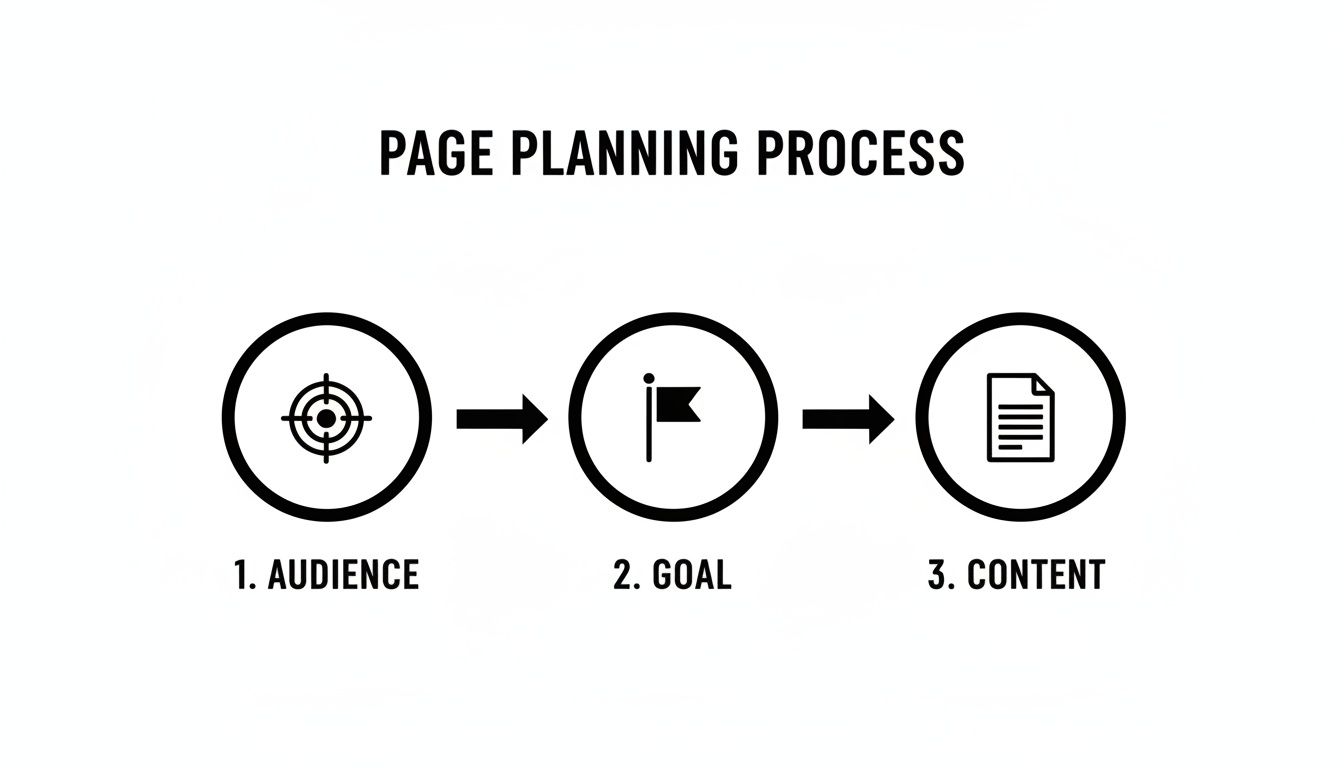
Following this process ensures every single block has a purpose, guiding your visitors exactly where you want them to go.
Let Smart Widgets Do the Heavy Lifting
This is where the magic really happens. Smart widgets are automated blocks that pull your latest content directly from other platforms. They turn your page from a static list of links into a living, breathing hub that’s always up to date.
Let's say you're a musician. Instead of just dropping a link to your Spotify profile, you can embed a widget that lets visitors play your newest track right on your page. They get an immediate taste of your music without leaving. That’s infinitely more powerful than a simple outbound link.
Here are a few ways different pros can put smart widgets to work:
- Developers: A GitHub widget showing your contribution graph offers instant social proof of your coding activity and expertise.
- YouTubers: Drop in a YouTube widget to display thumbnails of your four most recent videos. It’s a visual teaser that practically begs to be clicked.
- Designers: A Dribbble or Behance widget can create a beautiful grid of your latest work, complete with like counts.
These widgets work for you 24/7, making sure your page always showcases your freshest content. It's a huge time-saver that keeps your audience engaged. If you want to dive deeper into this philosophy, check out our guide on the principles of modular design—it’s the thinking behind these powerful layouts.
In a world where grabbing attention is everything, this matters. With over 5.66 billion global social media users and 67% of 18-to-24-year-olds using Instagram to find local businesses, your page needs to be visually compelling. Integrating a resizable Instagram grid, complete with your follower count and a follow button, is a proven way to convert visitors without making them jump through hoops.
Driving Action with Links and Media
While widgets handle the automation, you still need blocks that guide people toward specific actions. This is where well-designed links and media blocks come in. A boring, plain link can be transformed into an eye-catching call-to-action with a custom title and a sharp preview image.
For example, instead of a simple URL, you could have a link block with a big, bold image that says, "Download My Free Ebook Now." It’s far more persuasive and visually interesting.
Media blocks add another layer of engagement. You can drop in images, looping GIFs, or even autoplaying videos. A fitness coach could use a quick GIF to demonstrate an exercise, or a brand could use a short video to show off a new product.
A few quick tips for your media blocks:
- Use GIFs for Quick Demos: A silent, looping GIF is perfect for showing a process or feature without making someone hit play.
- Embed Testimonials: A simple text block, styled as a quote, can highlight a rave review from a client and build instant trust.
- Showcase Your Location: If you run a brick-and-mortar business, the Google Maps widget makes it incredibly easy for customers to find you.
The real power isn't in any single block, but in how you arrange them. You’re not just adding content; you’re designing an experience. A developer might pair their GitHub graph with a link to their resume. A podcaster could place their latest Spotify episode right next to a link to their Patreon. The combinations are endless, giving you the freedom to tell your story in a way that truly connects.
Perfecting the User Experience on Any Device
Ever see a gorgeous website on your desktop, only to find it's a jumbled, unusable mess when you pull it up on your phone? It’s a common pitfall and where so many otherwise great business pages fall completely flat. A one-size-fits-all design just doesn’t work anymore.
Your audience isn't sitting in one place. They’re finding you everywhere—clicking a link from an Instagram Story on their phone, then maybe from a newsletter on their laptop later. Your page absolutely has to deliver a flawless experience on both. That’s why having separate editors for mobile and desktop is such a game-changer; it lets you optimize for each context without having to compromise.
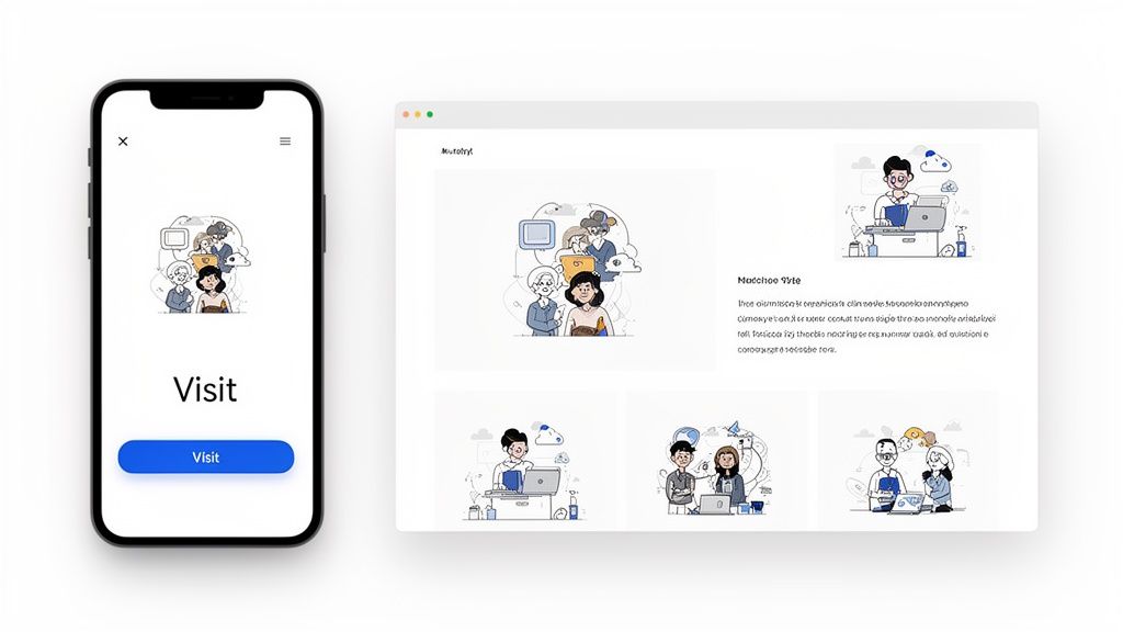
This dual focus means your page won't just be functional—it will be genuinely enjoyable to use, no matter how someone finds you. You get to control the narrative for every single visitor.
Optimizing for the Mobile View
Let's be real: mobile isn't just a smaller screen. It's a totally different mindset. Your visitors are on the go, scrolling with their thumbs, and have zero patience for clutter. Your mobile layout has to be clean, direct, and ridiculously easy to navigate.
Think thumb-friendly. Your most important calls-to-action—like a "Book Now" or "Shop Here" button—need to be big, bold, and right where their thumb naturally falls. Forget long paragraphs; keep text short and scannable.
A simple, single-column layout is almost always the way to go. It guides the eye straight down in a logical flow. Here are a few things I always prioritize for mobile:
- Lead with Your Goal: Whatever you want them to do most, put that block right at the very top. No scrolling required.
- Go Vertical: Use vertically oriented blocks for videos and images. It just makes better use of the limited screen space.
- Cut the Clutter: Hide less critical links or extra content on the mobile view. You can always show them off on desktop, but on mobile, they're just a distraction.
Your mobile page should feel like a direct conversation with a clear next step. If a visitor has to pinch, zoom, or hunt for a link, you've already lost them.
If you really want to get this right, I'd suggest digging into the core mobile-first design principles. It'll give you a serious edge in crafting a page that actually converts on smaller screens.
Designing for the Desktop Experience
Alright, now for the desktop. With all that extra screen real estate, you finally have room to breathe and tell a more immersive story. While mobile is all about speed and clarity, desktop lets you add layers, exploration, and a bit of visual flair. This is your chance to create something that feels more like a rich, magazine-style layout.
Don't be afraid to get creative here. You can build more complex, asymmetrical arrangements with your content blocks. Imagine a big, autoplaying video block sitting right next to a live grid of your latest Instagram posts and a glowing customer testimonial. That’s the kind of engaging experience desktop was made for.
Here’s how I approach making the most of the desktop canvas:
- Create Visual Zones: Group related blocks together to form distinct sections. Think of it like creating a "Portfolio" zone or a "Latest from the Blog" area.
- Play with Scale: Mix up large, medium, and small blocks. This creates a natural visual hierarchy that guides the visitor's eye exactly where you want it to go.
- Show Off Richer Media: Desktop is the perfect stage for your high-resolution images, detailed portfolio pieces, or even embedded widgets like a GitHub contribution graph that just wouldn’t work on a small screen.
When you thoughtfully design for both mobile and desktop, you create a cohesive brand experience that feels custom-built for every single person who lands on your page. That attention to detail is what separates a pretty good page from a truly great one.
Making Every Detail an Extension of Your Brand
A solid layout will get people’s attention, but the small details are what make your page stick in their minds. This is where you go beyond just arranging blocks and start weaving your brand’s unique personality into every corner of the design. It's the crucial step that turns a functional page into one that genuinely connects with your audience.
Every choice from here on out needs to be intentional. The colors you pick, the words you write—it all has to work together to tell your story. You’re not just filling in a template; you're building a digital home for your brand.
Nailing Your Visual Identity
Think of your page's visual theme as its first handshake. A custom color palette is where it all begins. Don't just pick colors you like; choose ones that evoke the feeling of your brand. Are you a sleek tech creator who lives in a world of monochrome, or are you a vibrant artist whose brand screams bold, saturated color? Your background and block colors need to echo that vibe.
Next up is typography. The right font can make your page feel professional, playful, or elegant. Readability comes first—nobody should have to squint to figure out who you are. Once that's covered, find a typeface that adds a bit of character without cluttering the design.
- Color Palette: Pull a primary and secondary color straight from your logo or existing brand assets. Consistency is key.
- Backgrounds: A subtle gradient, a clean solid color, or a high-quality photo can work beautifully. Just make sure it complements your content, not competes with it.
- Typography: I always recommend picking one font for your headings and another for the body text. It creates an instant, clean hierarchy.
The best-designed pages use color and fonts to subtly guide your eyes. They create a visual flow that makes the page feel intuitive, effortlessly highlighting what matters most.
These details might feel minor, but they add up to a polished, professional look that builds trust the second someone lands on your page.
Writing Copy That Actually Connects
Your words are just as powerful as your visuals. Let's be honest, generic copy is forgettable. Instead of a link that just says "My Website," why not try something that sparks curiosity, like "Explore My Full Portfolio" or "See What I'm Building"? That small tweak turns a passive label into an active invitation.
Every text block is a chance to let your brand's voice shine. A testimonial isn't just a quote; it’s proof that you deliver. A short note isn't just text; it's a direct conversation with your ideal client.
With U.S. social ad spending soaring to $88.3 billion, your business page has to work harder than ever. As engagement on major platforms dips, smart integrations are your secret weapon for turning a simple link page into a dynamic hub. Think about embedding a Spotify widget with inline play or a GitHub contribution graph. Suddenly, you're building a layout that captivates visitors during the 17+ hours they spend on platforms like Facebook each month. You can find more social media engagement insights on Agorapulse's blog.
Fine-Tuning for Real Impact
Alright, let's get into the nitty-gritty settings that truly elevate the user experience. These are the small dials you can turn to control how visitors interact with your content, and getting them right can make a huge difference in engagement.
Take your media blocks, for instance. Setting a key GIF or video to autoplay can instantly grab attention, showing off a product or a behind-the-scenes look the moment your page loads. It’s an incredible way to inject motion and life into an otherwise static design.
Don't sleep on the settings within your smart widgets, either. For example, configuring your YouTube widget to display your subscriber count is instant social proof that encourages new visitors to check you out. An artist could use a Spotify widget to show their monthly listener count, adding a layer of professional credibility.
Here’s a quick checklist I run through:
- Customize Link Previews: Ditch the default titles. Write something compelling and action-oriented.
- Enable Autoplay: Use it sparingly on one or two key media blocks to create a dynamic focal point without being annoying.
- Display Key Stats: If you have impressive metrics like follower counts or monthly listeners, turn on those display options in your widgets.
By obsessing over every element—from the exact hex code of your background to the call-to-action on your links—you transform your page from a simple list of content into a carefully crafted brand experience. This is how you create a business page that doesn't just list what you do, but truly shows who you are.
Getting Your New Page Out There (and Seeing What Works)
Alright, you’ve built your page and hit publish. Great job! But the work isn't over just yet—in fact, the fun part is just beginning. A stunning page doesn't do much good without visitors, so it's time to get your link in front of as many people as possible.
Think of your new Taap.bio link as your central digital hub. The goal is to make it the one link people need to find everything important about you. Start by swapping out old links everywhere you have an online presence.
This means updating your Instagram bio, your Twitter/X profile, your TikTok page—all the usual suspects. But don't stop there. Pop it into your email signature. Add it to your digital business cards. You can even generate a QR code for your link and put it on flyers, posters, or product packaging. The more places your link exists, the more doors you open for potential traffic.
Turning Clicks into Clues
Once the traffic starts rolling in, you get access to the best part: the data. This isn’t just about watching the view count go up. Your Taap.bio analytics dashboard is where you can genuinely understand what your audience is interested in.
You get a direct look at which of your blocks and links are getting the most attention. For example, you might see that your latest YouTube video is getting 50% more clicks than the link to your online store. That's not a failure—it's a massive clue! It tells you that your audience is hungry for video content, and you can lean into that.
Learning how to measure content performance is a game-changer. It takes the guesswork out of your content strategy and lets you give your audience more of what they actually want.
Your Page Is Alive—Treat It That Way
Your Taap.bio page shouldn't be a static, "set it and forget it" asset. Think of it as a living document that evolves with your business and your audience's interests. Your analytics are the key to this evolution. I recommend setting a simple reminder to check in on your stats once a month.
Your analytics tell a story about what your audience wants. Listen to it. If a link isn't getting clicks, don't be afraid to move it, change it, or remove it entirely.
Here's a quick framework I use for my own monthly review:
- What's Working? Identify your top-performing blocks. Can you move them higher up the page to make them even more visible?
- What's Not? Find the links that are getting ignored. Try changing the text to be more compelling, or maybe that link just isn't what your audience is looking for right now. Swap it out for something new.
- See Any Patterns? Did you get a huge traffic spike after mentioning your page in an email newsletter? That's a sign to do it more often!
This simple feedback loop is how you turn a good page into a great one. It’s a continuous cycle of listening and refining.
For anyone serious about turning those visitors into loyal customers or clients, digging into the data is non-negotiable. If you want to go deeper on this, we've got a whole guide on improving conversion rates on landing pages. By making small, regular adjustments based on real data, you’ll ensure your page remains one of the most powerful tools in your brand’s arsenal.
Got Questions? We've Got Answers
Jumping into a new tool always brings up a few questions. Let's tackle some of the most common ones we hear from creators and businesses building their first page.
How Much Customization Is Overkill?
It’s easy to get carried away with all the design freedom, but a little restraint goes a long way. My best advice? Stick to your established brand guidelines.
Think of it this way: your brand likely has a core color palette of two or three main colors. Use those. You probably also have one or two primary fonts. Stick to them. The goal is a page that looks intentionally designed and guides your visitor's eye, not a digital collage that causes confusion. A cluttered page will just send people bouncing away.
Can This Actually Replace My Website?
For a huge number of creators, freelancers, and small businesses, the answer is a big, enthusiastic yes. If you're looking for a central hub to show off your work, link to your services, and pull in all your latest content automatically, a page like this is perfect.
Think of it as your digital command center. If you want a single, easy-to-manage spot to tell your story and direct your audience, this is often a smarter, lower-maintenance choice than a traditional website.
Now, if your business relies on a complex e-commerce store with hundreds of products or needs a deep, multi-page resource library, then a full website is probably still the right tool for that job.
How Often Should I Be Updating This Thing?
Here's the great part: the smart widgets do most of the heavy lifting for you. Your newest YouTube video or Instagram post will pop up on your page automatically. You don't have to do a thing.
Beyond the automated content, I recommend a quick health check once a month. Just pop in, look at your analytics to see what people are actually clicking on, and swap out any links or announcements that feel stale. Keeping it fresh keeps it effective.
Ready to build a page that finally brings all the pieces of your brand together? With Taap.bio, you can create an interactive hub that truly represents you. Start building your free page today!