When we talk about improving conversion rates, we're really talking about turning more of the people who already visit your page into actual customers, subscribers, or loyal followers. For your link-in-bio page, this means ditching the boring list of links and creating an interactive dashboard that guides people exactly where you want them to go. It’s all about making the most of the traffic you’ve worked so hard to get.
Table of contents
Your Link-in-Bio Is a Powerful Conversion Engine
So many creators and brands treat their link-in-bio as an afterthought—just a simple directory to shuttle traffic somewhere else. This is a huge missed opportunity. Think about it: that single link is one of the most valuable pieces of digital real estate you own. It's the central hub where your most engaged followers from every platform come together.
The secret to increase website conversion rate on this page is to stop thinking of it as a passive list and start treating it like a dynamic conversion machine.
The old-school, endlessly scrolling list of links just doesn't cut it anymore. It overwhelms visitors with too many choices, causing decision fatigue and doing little to keep them around. This is where a solid Conversion Rate Optimization (CRO) strategy completely changes the game.
Adopting a Conversion-First Mindset
A conversion-first mindset means every element on your page has a purpose. Instead of just dumping links, you're crafting an experience that actively steers visitors toward a specific action.
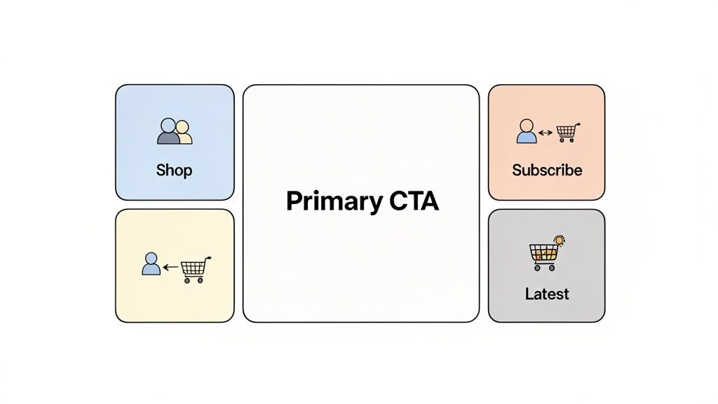
The best way I've seen to do this is by moving away from those linear lists and embracing a modular, bento-box-style layout. This modern design approach creates a visually appealing dashboard that pulls people in, inviting them to explore rather than just click away.
By arranging your content in an interactive grid, you instantly create a clear visual hierarchy. You can make your main call-to-action—like signing up for your newsletter or shopping a new collection—the biggest, boldest element on the page. This tells visitors exactly what to do next. You can then surround it with smaller, complementary widgets that add value without creating a cluttered mess.
The goal here is simple: turn passive scrollers into active customers. When you present your brand’s entire world in one interactive space, you eliminate friction and make it dead simple for people to engage with your most important content.
And the data backs this up. I've seen optimized link-in-bio pages with these modular grids and smart widgets deliver 25-40% higher conversion rates than the basic link-in-a-list setups. That's a massive difference, turning social media traffic into real, tangible business results just by keeping visitors engaged for a few more seconds.
This guide will walk you through the practical, no-fluff steps to apply CRO to your own link-in-bio, a topic we touch on in our article about what a link-in-bio really means. We'll start by digging into your current setup to find those hidden gaps where you're likely losing conversions right now.
Finding the Conversion Gaps in Your Current Link-in-Bio
Alright, let's get real about what’s working—and what’s not—on your current link-in-bio page. Before you can even think about improving conversions, you have to take a clear-eyed look at the current state of affairs. I know it's easy to get attached to a design you've put time into, but an honest audit is the single most important first step. This isn't about tearing everything down; it’s about spotting the small points of friction that are quietly killing your engagement.
So, go ahead and pull up your link-in-bio page. It doesn't matter if it's a basic list of links or something more complex. The goal here is to see it through the eyes of a first-time visitor. They don't know you, they don't have your context, and they have about three seconds to decide if your page is worth their time.
Conducting Your Conversion Audit
Let's start by asking some tough questions. You have to be ruthless here—every "maybe" or "sort of" is a sign that people are probably dropping off.
- Is Your Most Valuable Link Obvious? Seriously, if you want people to book a call, is that link buried under five others? Your primary call-to-action should be the first thing they see, impossible to miss.
- Is the Page Visually Inspiring? Does it look generic, cluttered, or totally disconnected from your brand? A bland, unappealing page instantly erodes trust and can make you look unprofessional.
- Is Your Link Text Vague? Links that just say "Website" or "Blog" are absolute conversion killers. They create zero urgency and don't tell a visitor why they should bother clicking. Switch to action-oriented text like "Read My Latest Article" or "Shop the New Collection" and watch what happens.
- Does It Load Instantly? A delay of even two seconds is enough to make someone bounce. If your page is sluggish, especially on a phone, you’re losing people before they've even had a chance to see what you offer.
Take a look at this Taap.bio page. It’s a perfect example of a clear visual hierarchy, with the main CTA right at the top where it belongs.
See how the modular layout naturally guides your eye to the most important elements? A simple vertical list just treats every link the same, which is a huge missed opportunity.
Digging into Your Analytics
Once you've done a gut check on the visuals, it's time to get into the numbers. Your analytics—whether they're built into your tool or you're using something like Google Analytics—are holding all the clues to how people are actually behaving. Don't get lost in a sea of data; just focus on a few key metrics that tell the real story.
The whole point of this is to set a clear baseline. You need to know where your traffic is coming from and what people do—or fail to do—once they land on your page. This audit becomes the foundation for every single improvement you'll make from here on out.
Look for patterns in these three areas:
Click-Through Rates (CTR) on Individual Links: This is your holy grail metric. Which links are getting all the love? Which ones are being completely ignored? A low CTR on a link you think is important is a massive red flag. It’s telling you there’s a major disconnect between what you value and what your audience is actually drawn to. For more on this, check out our guide on improving conversion rates on landing pages.
Traffic Sources: Where are your visitors actually coming from? Is it Instagram, TikTok, an email newsletter? Knowing the source helps you tailor the page's content to meet their expectations. For instance, traffic from a professional network like LinkedIn is probably looking for your portfolio, while your Instagram followers likely want to see your latest products.
Device Breakdown (Mobile vs. Desktop): This one is non-negotiable. The vast majority of link-in-bio traffic comes from mobile, so your page absolutely must be flawless on a small screen. If you see a high drop-off rate from mobile users, you can bet your mobile experience is broken.
This initial audit gives you the "before" picture. It’s your data-backed starting point that shines a spotlight on the exact opportunities you can tackle to build a page that actually converts.
Designing a Layout That Drives Action
Alright, you've audited your page. Now for the fun part: actually building a layout that pulls its weight and improves your conversion rates. It's one thing to talk theory, but getting your hands dirty with strategic design is what transforms a passive link list into an action-driving machine.
The idea is to create a visual experience that intentionally guides your visitor’s attention right where you want it.
Your most powerful tool for this is visual hierarchy. It sounds complex, but it's simple: make your most important stuff the most prominent. With a modular system like Taap.bio, you do this by resizing your content blocks. Your main call-to-action—the one thing you absolutely want every visitor to do—should be the biggest, boldest block on the page.
Think about it. If you’re a podcaster who just dropped a new episode, you wouldn't let it get lost in a sea of links. You’d make the Spotify widget a large, central block. That immediately screams, "This is the most important thing to check out right now." Everything else becomes secondary, arranged in smaller blocks to support that primary goal.
Creating a Natural Visual Flow
A grid layout doesn't have to be a boring, symmetrical checkerboard. In fact, asymmetric designs often feel more dynamic and create a natural path for the eye to follow. Picture your page as a well-designed magazine spread where different elements carry different visual weight.
- Lead with Your Star Player: Put your main CTA where people look first—usually the top-left or center. A brand launching a new product could drop a large, autoplaying video right at the top to grab immediate attention.
- Use Supporting Blocks: Surround that primary block with smaller, related content. A freelancer, for example, could place a powerful testimonial right next to their portfolio link. It's a compelling one-two punch of social proof and concrete examples.
- Organize with Text: Use text blocks to create clear sections. You could have a "Work With Me" group that neatly bundles your portfolio, services, and booking links under one simple heading.
Every block's size and placement should be intentional. It all needs to serve the purpose of nudging the user toward that conversion goal. If you're new to this, we've got a great resource that breaks down the core principles. You can learn more about mastering visual hierarchy in web design in our article.
This diagram breaks down the core areas to focus on when auditing your link-in-bio page before you even think about redesigning.
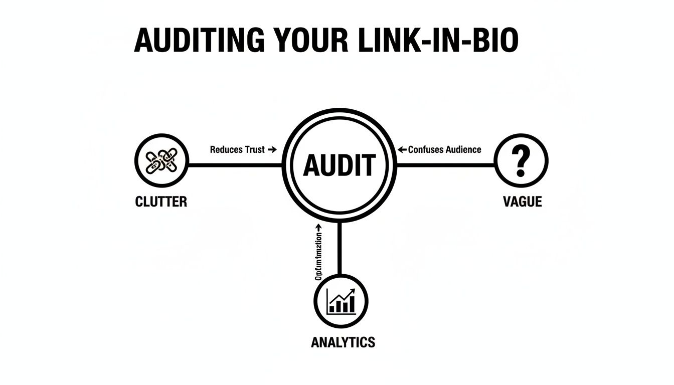
As you can see, a successful redesign starts with fixing the basics: a cluttered page, vague messaging, and a total lack of analytical insight.
Strategic Widget Selection for Different Creator Goals
The best layout depends entirely on your specific goal. There’s no magic template, and that's the beauty of a modular grid. You can tailor the design to perfectly match what you want to achieve. A strategic widget choice is half the battle.
| Creator Type | Primary Goal | Recommended Taap.bio Widgets | Conversion Impact |
|---|---|---|---|
| E-commerce Brand | Drive product sales | Product/Shopify Block, Video, Image Carousel | Showcases products visually, reduces clicks to purchase. |
| Musician / Artist | Increase streams & engagement | Spotify/Apple Music Embed, YouTube Video, Tour Dates | Allows instant listening and direct access to content. |
| Consultant / Coach | Book discovery calls | Calendly/Booking Widget, Testimonial Block, Lead Form | Streamlines the booking process and builds immediate trust. |
| Author / Speaker | Sell books or event tickets | Link Blocks (to retailers), Countdown Timer, Video | Creates urgency and provides direct purchase paths. |
| YouTuber / Streamer | Grow subscribers & views | YouTube/Twitch Embed, Social Links, Lead Form (for newsletters) | Encourages on-page viewing and cross-platform follows. |
Choosing the right widgets is about more than just adding links; it’s about providing interactive, high-value experiences directly on your page that align with your audience's intent.
Let's look at how this plays out in a few real-world scenarios:
The E-commerce Brand: Your goal is to move product. Your layout should feature a large, visually striking block showcasing your latest collection—maybe a high-quality GIF. Around it, you’d have smaller blocks for "Shop All," your return policy (a huge trust signal!), and perhaps a feed of your latest Instagram posts featuring the products.
The Musician: You want more streams and followers. The centerpiece is a large Spotify widget with your new single, letting visitors play it right on the page. Smaller, supporting blocks would link to your Apple Music profile, tour dates, and merch store.
The Consultant: You need to book discovery calls. Your main block should be a prominent link to your Calendly with a clear CTA like "Book Your Free Strategy Session." You’d back this up with a text block featuring a glowing client testimonial and a link to a detailed case study.
In each of these examples, the layout isn't just a random assortment of links. It’s a carefully constructed narrative. It tells a story and guides the visitor on a specific journey, eliminating guesswork and making the desired action the easiest, most obvious choice.
This strategic arrangement is fundamental to improving your conversion rates. It respects the user's time by presenting a clear, focused path forward. When you move away from cluttered lists and embrace a thoughtful, visually hierarchical design, you transform your page from a simple directory into a powerful conversion tool.
2. Weave in Smart Widgets to Make Your Page Come Alive
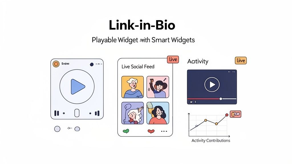
Let's be honest, a page full of static links is a dead end. It’s just a list of doors waiting to be opened, and you're essentially asking people to leave. Smart widgets completely flip that script. They turn your link-in-bio from a boring directory into a living, breathing destination that actually grabs and holds attention.
The core idea is to stop sending people away and start giving them reasons to stay.
When you use live integrations, your visitors don't need to leave your page to experience your best content. This simple shift is a massive win for improving website conversion rates because it slashes the friction between them and the action you want them to take. Every extra click is a chance for someone to get distracted and drop off. But when they can engage right there on your page, you keep them in your world longer, build a real connection, and make it far more likely they'll convert.
Showcase Your Work in Real-Time
This is where the magic really happens. Smart widgets pull in your latest content automatically, so your page always feels fresh without you constantly having to update it. It’s an authentic, dynamic experience for your audience.
- Musicians and Podcasters: Don't just link to your new song—let them play it. A Spotify widget lets a visitor listen to your entire episode or track right there. You'll see your stream counts climb and gain subscribers who might have otherwise clicked away.
- Creators and Photographers: An Instagram widget that displays your live grid keeps your page visually current. It gives people an immediate, compelling reason to follow you without ever leaving your Taap.bio.
- Developers and Coders: A live GitHub contribution graph is a dynamic portfolio. It's powerful, data-driven proof of your skills and activity that a simple link could never hope to match.
It’s not just about convenience; it’s about immersion. You’re showing people what you do, not just telling them about it.
This strategy of turning a link-in-bio into an all-in-one destination is delivering real results. Data from Parse.ly shows that modern link-in-bio pages have boosted Instagram referral traffic by 10-15%. That surge is coming from pages that act like true micro-sites, where smart widgets create a much richer user experience. You can see more details on these traffic trends on Parse.ly.
Practical Tips for Maximum Impact
Just dropping widgets onto your page won't cut it. You have to be strategic about how you set them up. Your goal is to create a seamless, engaging journey for every visitor.
For Your YouTube Videos Setting a key video to autoplay (always muted!) is a fantastic way to grab attention the second someone lands on your page. If you have a lot of great video content, try a grid of your latest four uploads. This gives visitors a choice and encourages them to browse your channel. Even better, you can feature a full video directly in your link-in-bio, which is a killer tactic for boosting watch time.
For Your Social Feeds The format you choose matters. For Instagram, a compact profile view might work perfectly as a small, supporting element. But if your visuals are your main focus, a large, vertical feed could be the star of your page. Play around with different sizes and layouts to see what complements your design and guides the eye best.
For Music and Podcasts Think about the next step. When you embed a Spotify track, do you want them to hear just that one song, or discover your whole album? A single, prominent "Play" button focuses all their attention, while displaying a full album with the tracklist invites them to dig deeper.
By thoughtfully choosing and configuring your widgets, you transform your page into an interactive hub that actively works to keep people around. This is what modern CRO for your link-in-bio is all about: turning passive clicks into meaningful interactions that drive real results.
Nailing the Experience on Both Mobile and Desktop
Let's get one thing straight: your audience isn't just looking at your page on one device. They're jumping between their phone and their laptop, and your link-in-bio page has to shine on both. The way someone interacts with a page on their phone is worlds apart from how they use a desktop, and this is a make-or-break moment for your conversions. So many pages get this wrong.
This is where the real power of a tool like Taap.bio comes into play. We're not just talking about a clunky "responsive" design that squishes things to fit a smaller screen. I'm talking about building two completely separate, intentional layouts for mobile and desktop. You get to control the story and make sure your message hits home, regardless of the screen size.
Think Mobile First, Always
The hard truth is most of your traffic, especially from social media, is going to come from a phone. On a small screen, every pixel counts. Your mobile layout needs to be ruthlessly efficient and focused. A clean, single-column design is your absolute best friend here.
The entire game on mobile is about cutting through the noise and making it dead simple for someone to tap your most important link.
- Be Brutal with Priorities: What's the #1 action you want someone to take? Put that block right at the very top. No scrolling required.
- Make Scrolling Intuitive: People naturally scroll vertically on their phones. Design your page like a story, guiding them from one point to the next in a logical flow.
- Design for Thumbs: Buttons need to be big and tappable. Widgets, like an Instagram feed, should be set to a vertical view that feels native to the phone.
Imagine you're a photographer. On mobile, you’d showcase a tall, scrollable gallery of your best portrait work—it just fits the format perfectly. This direct approach gets right to the point and shows visitors exactly what they came for. To really get this right, you should check out our guide on essential mobile-first design principles.
Unleash Your Creativity on the Desktop Canvas
While mobile is the priority, don't sleep on the desktop experience. The extra screen real estate is a golden opportunity to create something more like a rich, immersive dashboard for your brand. You have the space to show off more content without it ever feeling cluttered. Think of it as your brand's central hub.
On a desktop, you can break free from the single-column list and build a dynamic grid that tells a much richer story.
Your desktop layout is where you can truly build a bento-box experience. It allows you to display multiple facets of your brand simultaneously, giving visitors a comprehensive overview at a single glance.
Let's go back to our photographer. On a desktop, they can completely transform their page. That vertical gallery can become a stunning, wide-screen showcase of their landscape photography. Right next to that, they can place a glowing client testimonial, and alongside that, a bold "Book a Shoot" button. This multi-column layout presents a full, professional portfolio in a way that’s simply not possible on a phone.
At the end of the day, optimizing for both isn't a "nice-to-have"—it's non-negotiable. You have to test both versions of your page. Make sure they load fast and feel intuitive. By tailoring the experience to the device, you eliminate the friction that causes people to leave and create a seamless journey for every single visitor. That's how you seriously boost your conversion rates.
Measuring Your Success and Making Smart Adjustments
Building your link-in-bio page is just the beginning. The real magic happens when you start paying attention to how people are actually using it. Think of it as a living page—it needs to evolve. This is all about getting into a rhythm of testing, learning, and tweaking to make sure your page is always working its hardest for you.
You can't fix what you don't understand. And to understand, you need to look past flashy numbers like total page views and dig into the metrics that really matter for engagement and conversions.
Finding the Data That Actually Matters
To get a true feel for your page's performance, you need to focus on a few key data points. These are the numbers that tell you the story of what your visitors are doing.
- Click-Through Rate (CTR) on Specific Blocks: This is your north star. A high CTR on your main call-to-action tells you your design is working and your message is clear. On the flip side, if a crucial link is getting ignored, that’s your cue to rethink its design or placement.
- Average Session Duration: How long are people sticking around? If you see longer session times, it's a good sign that your interactive elements—like an embedded video or a playable Spotify track—are doing their job and keeping people engaged.
- Top-Performing Links: Your analytics will spell out exactly which links get the most love. This is gold. It shows you precisely what your audience wants from you. Once you know, you can make those popular links even more prominent.
Stop Guessing and Start Testing
Guesswork is the enemy of optimization. The best way to make changes that actually move the needle is through A/B testing. It sounds technical, but it’s really just about creating two versions of your page to see which one your audience responds to better.
A/B testing takes your ego out of the decision-making process. Instead of thinking you know what your audience wants, you let their clicks give you the real answer. It’s the single most powerful way to make sure your changes are genuine improvements.
Here’s a simple experiment you could run:
- Version A: Place a big, eye-catching YouTube video right at the top.
- Version B: Swap that video for a simple lead capture form to grow your newsletter.
Let the test run for a week or two and then check the numbers. Did Version A lead to a jump in YouTube subscribers? Did Version B crush it with new email sign-ups? The data gives you a clear winner, showing you which goal connects best with your visitors right now.
As you dive into optimizing your link-in-bio page, don't forget how other on-site tools can play a part. For example, exploring different ways to increase your chatbot conversion rate can provide fresh ideas you can apply to other interactive elements.
When you get into this cycle of measuring, testing, and adjusting, you start making smart, informed decisions that build on each other. It’s this steady, iterative process that will transform your link-in-bio page from a simple directory into a powerful conversion engine.
Got Questions? We've Got Answers
Optimizing your link-in-bio page always sparks a few questions. I've heard them all over the years. Let's dig into some of the most common ones that creators and brands run into when trying to get more out of their link-in-bio.
So, How Many Links Is Too Many?
Honestly, there’s no magic number. The real enemy here is clutter, not the link count itself. Stop thinking about how many links you have and start focusing on your top 3-5 conversion goals. What are the absolute most important actions you want someone to take?
Think of your page like a storefront window. You put the best stuff right up front. Use a modular layout to give your main goals the spotlight—bigger blocks, top-of-the-page placement. Then, you can fill in the space around them with 4-6 secondary links or widgets that provide more context, like your latest YouTube video or a feed of your recent posts.
If a visitor has to scroll and hunt for what you want them to do, your page is too crowded. It’s that simple.
What's the One Metric I Absolutely Must Track?
Page views are a nice vanity metric, but they don't pay the bills. The single most important number to obsess over is the Click-Through Rate (CTR) on your main Call-to-Action (CTA).
This is the big one. It's the "Book a Call," "Shop Now," or "Join the Newsletter" button that directly supports your business. A high CTR on that specific block tells you you've nailed it—your page is effectively funneling people to the most valuable action. Watch that one like a hawk; it's the truest measure of your page's success.
How Often Should I Be Changing Things Up?
The best part about using smart widgets is that your page stays fresh automatically. Your latest videos, photos, and posts get pulled in without you lifting a finger.
For the core structure—your main links and layout—a quarterly check-in is a fantastic rhythm to get into. Every three months, pour a cup of coffee and dive into your analytics.
- See which links are getting all the love.
- Identify the ones that are being ignored.
- Ask yourself if your page still reflects your current goals.
Of course, this doesn't apply to timely campaigns. If you're launching a new product, running a flash sale, or promoting an event, get in there and swap that link into a prime spot immediately. The goal is to stay relevant, not to constantly make your followers relearn where everything is.
Ready to stop treating your link-in-bio like a simple list and start using it as a real conversion tool? With Taap.bio, you can build a beautiful, interactive page with smart widgets and a layout you control completely. It’s time to turn those followers into loyal customers.