You’re probably in one of two bad situations right now.
Either you’ve opened Wix, Squarespace, or WordPress and felt buried under themes, plugins, pages, settings, and design choices. Or you went the other direction and used a link-in-bio tool that gave you a fast setup but left you with a page that looks thin, generic, and hard to monetize.
That’s the trap most small business owners fall into. They think the choice is between a full website that takes too long to build and a simple link page that can’t do much. It isn’t.
A simple website for small business should do one job well. It should help a stranger understand what you offer, trust you fast, and take the next step without confusion. For most creators, coaches, freelancers, and solo operators, that doesn’t require a sprawling five-page site. It requires a focused micro-website built around conversion.
Table of contents
Why Your Simple Website Needs to Be a Smart Website
Businesses often don’t have a website problem. They have a monetization problem.
A lot of “simple website” advice focuses on getting a page live. That’s fine if your only goal is to exist online. But if you want bookings, product sales, email signups, or inquiries, a page that merely looks decent isn’t enough. Research shows 60-70% of small business owners struggle with conversion optimization, not initial website creation, which is why so many basic sites underperform (Sloan’s Websites).
The false choice that wastes time
The usual options are flawed in opposite ways.
Traditional website builders give you control, but they also give you too many decisions. You start with good intentions and end up spending hours adjusting fonts, comparing templates, and trying to stitch together forms, payments, and scheduling.
Basic link-in-bio tools solve the speed problem, but they often create a different one. You get a stack of buttons and not much else. That setup can list your links, but it rarely sells your offer well.
If you’re still comparing your broader options, this guide to compare website builders for Fort Myers companies is useful because it shows how different tools fit different business types.
A simple page that can’t convert is just a prettier version of a business card.
What a smart simple website actually does
A smart page works like a storefront, not a directory. It brings your offer, proof, content, and call to action into one place.
That’s the inherent value of a micro-website. It’s one page, but it behaves like a proper business asset. It can show your brand, collect leads, answer objections, and close the loop between attention and action.
Here’s the standard I recommend:
- One clear main action. Book, buy, subscribe, or inquire.
- One brand home. Not five platforms pulling people in different directions.
- One page with business logic. Each section should move the visitor closer to action.
That’s why I push creators and small operators toward a link-in-bio page built like a website, not a list. It gives you speed without sacrificing structure, and it gives you a way to monetize from day one instead of bolting that on later.
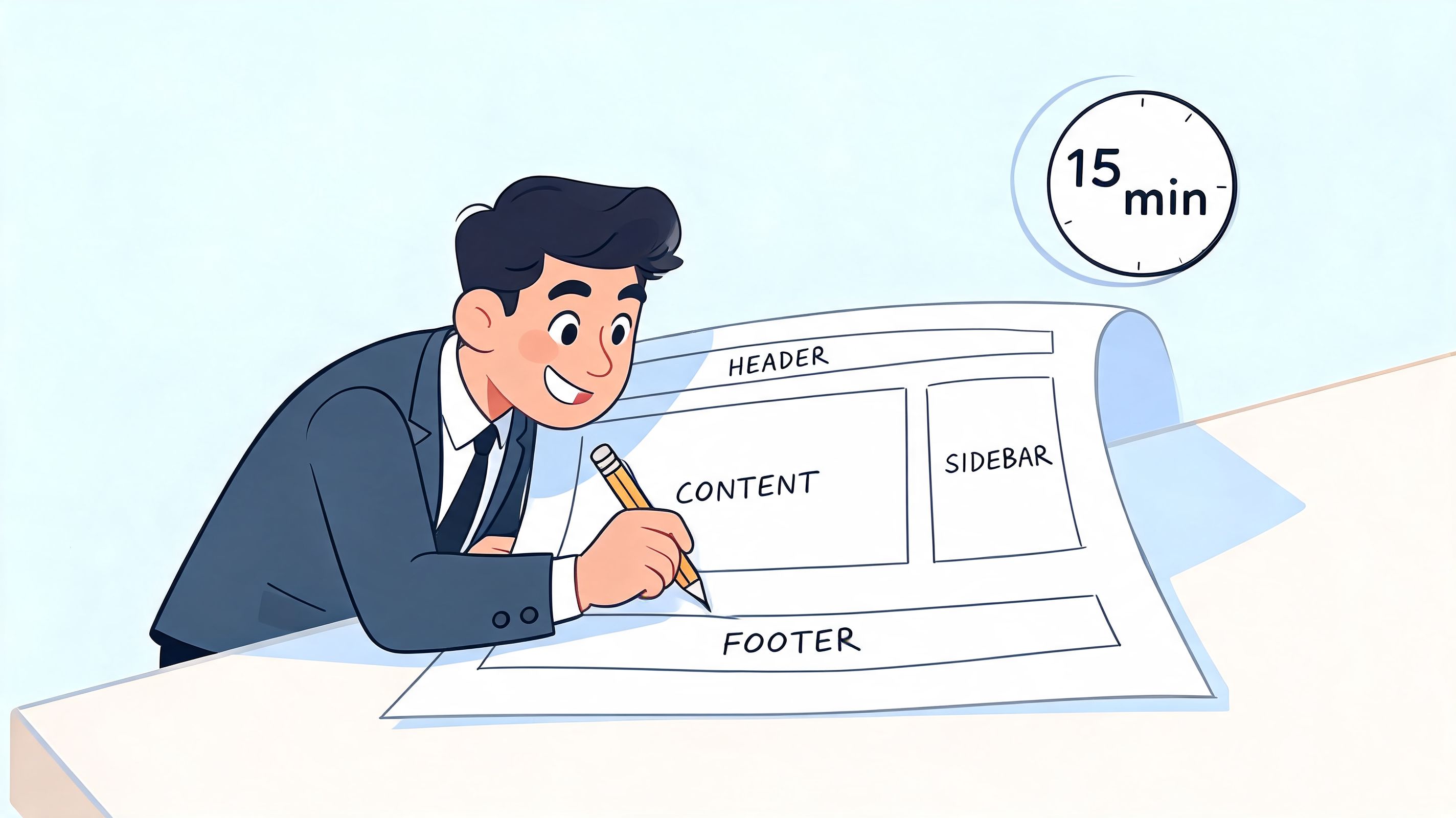
Planning Your One-Page Powerhouse in 15 Minutes
Most small business websites get messy before they even launch. Not because the owner lacks ambition, but because they try to make one page do ten jobs at once.
The fix is simple. Decide what the page is mainly for.
For solopreneurs and creators, the challenge isn’t just building a website. It’s building a unified presence that works as a portfolio, storefront, and community hub. Splitting that experience across disconnected platforms creates friction, while a single integrated page solves it (The Story).
Start with one primary conversion goal
Don’t begin with colors or layouts. Begin with the action.
Ask yourself this: when someone lands on your page, what’s the single most valuable next step?
Your answer is usually one of these:
- Book a call if you sell coaching, consulting, or freelance services.
- Buy a digital product if you sell templates, guides, courses, or downloads.
- Join your email list if you’re still warming up your audience.
- View your work and inquire if you need a portfolio-led page.
If you try to treat all four as equal, the page weakens immediately. Pick one primary goal. Everything else becomes secondary support.
Build around blocks, not pages
Things often become overcomplicated at this point. You do not need a full sitemap. You need a small set of content blocks arranged in the right order.
Use this quick planning model:
| Block | Purpose | What to include |
|---|---|---|
| Intro block | Immediate clarity | Name, offer, who it’s for |
| Proof block | Fast trust | Testimonials, client logos, results examples |
| Offer block | Main pitch | Service, product, package, or booking option |
| Content block | Warm the visitor | Videos, posts, samples, portfolio |
| CTA block | Close the action | Button, form, scheduler, checkout |
That’s your micro-website.
If you want inspiration for how a one-page layout can look polished without turning into a generic bio page, these one-page website examples are worth studying.
Practical rule: if a block doesn’t help a visitor trust you or act, cut it.
Write the page before you design it
Before you drag anything into place, write five short lines:
- Who you help
- What you help them do
- What you want them to click
- Why they should trust you
- What they should do if they’re not ready yet
That gives you a clean blueprint. Your page stops being a pile of links and starts acting like a sales path.
Assembling Your High-Converting Page with Essential Blocks
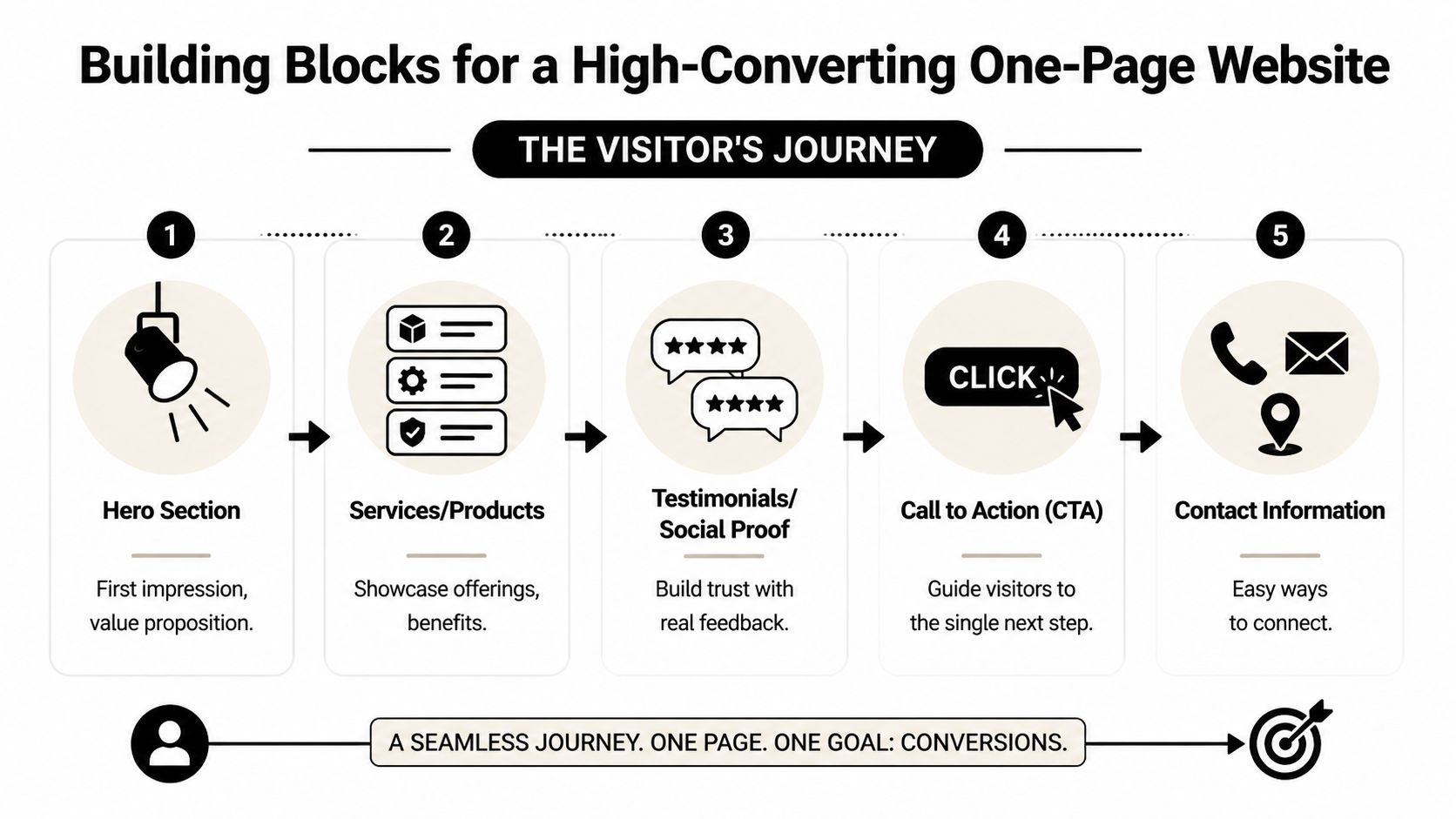
A high-converting one-page site doesn’t feel like a page. It feels like a conversation that keeps moving.
The visitor lands. They understand what you do. They see proof. They sample your work. Then they take action. That’s the sequence you want.
Start with the structure below.
Above the fold needs clarity, not cleverness
The top section does the heavy lifting. If it’s vague, the rest of the page won’t save you.
Your opening area should include:
- A plain-English headline that says what you do
- A short supporting line that tells people who it’s for
- A primary button tied to your main goal
- A visual cue like a profile image, product mockup, or brand graphic
Bad example: “Helping visionaries achieve alignment.”
Good example: “Career coach helping designers land better remote roles.”
That’s what a stranger can understand in seconds.
Trust builders remove hesitation
Once people know what you offer, they look for reassurance. Frequently, small businesses underdeliver in this regard.
Use a proof layer that feels human:
- Testimonials that sound specific, not polished to death
- Short credibility notes such as where you’ve been featured or what kind of clients you serve
- Simple FAQs that answer the obvious objections
- Portfolio snapshots if your work is visual
You don’t need a giant testimonial wall. You need enough proof to reduce doubt.
If you collect leads through a custom contact form and want to understand the mechanics behind sending submissions without building backend infrastructure, this guide on how to send email from HTML forms is a practical reference.
Content showcases keep people engaged
It is here that a micro-website becomes stronger than a static brochure.
Live widgets let visitors experience your work inside the page instead of bouncing off to ten different platforms. Embedded Instagram posts, YouTube videos, music players, and portfolio feeds create momentum. According to the referenced guide, live widgets such as embedded Instagram or YouTube content can increase visitor time-on-site by up to 40%, but you should limit them so the page stays fast (YouTube guide).
Here’s a walkthrough that reinforces the same landing-page logic in a visual format:
Don’t send people away to prove you’re worth following. Bring the proof onto the page.
A creator page built in Taap.bio can do this with a modular grid and live platform widgets, which is why it works well for a simple website for small business when you need content, offers, and contact points on one screen.
For more conversion-focused layout ideas, review these landing page best practices.
Monetization blocks should sit before the visitor gets distracted
A lot of pages bury the money-making section too low. That’s a mistake.
If you sell something, put the path to purchase before the page turns into a content archive. Your monetization block might be:
- A digital product card with a direct buy button
- A scheduler for free or paid calls
- A lead form with a clear promise
- A service package block with scope and next step
The rule is simple. Let visitors act as soon as they’re convinced. Don’t make them hunt.
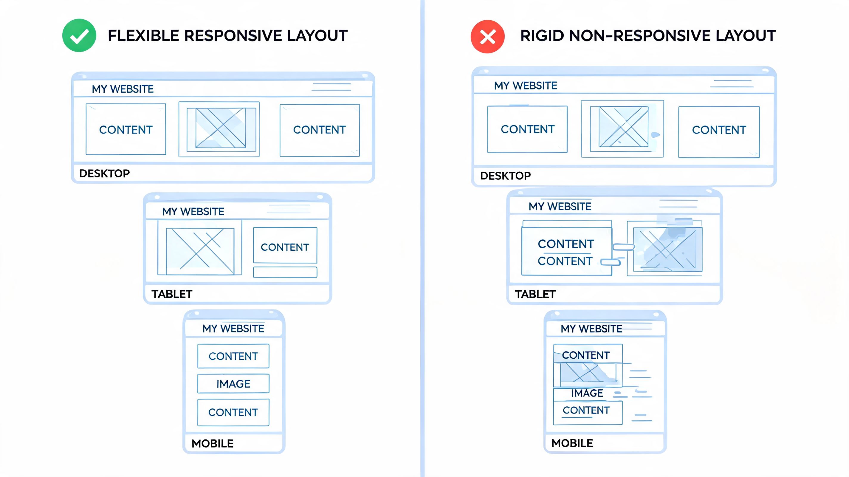
Designing a Layout That Looks Professional on Every Device
Most link pages look lazy because they force everything into the same vertical stack. That format is easy to build, but it rarely looks like a real brand.
A professional layout needs rhythm. Some sections should be larger. Some blocks should sit side by side. Some elements should breathe instead of fighting for attention.
Use hierarchy instead of stuffing everything in
Your visitor’s eye needs direction. Good design isn’t decoration. It’s prioritization.
Use this visual hierarchy:
| Priority | What belongs there | Why |
|---|---|---|
| Highest | Headline and main CTA | This drives the page goal |
| Medium | Proof and offer details | This answers trust questions |
| Lower | Extra links and secondary content | Useful, but not first |
That means your strongest call to action should be the easiest thing to find. Don’t give equal visual weight to your booking button and your Spotify link. They are not equally important.
Design mobile first because that’s where most people see you
This isn’t optional. Over 60% of website traffic now comes from mobile devices, and a non-responsive design can lead to more than 50% of visitors leaving immediately. Separate mobile customization is a core requirement, not a nice extra (Spectrum Business).
So build for the phone first.
That means:
- Keep the first screen focused so the main CTA appears fast
- Use short text blocks that don’t become walls on mobile
- Break sections clearly with spacing
- Test button placement with your thumb, not just your eyes
If you want a deeper look at how to handle separate desktop and phone experiences well, review these responsive web design best practices.
A page can look polished on desktop and still fail where it matters most, on a phone in someone’s hand.
Don’t confuse customization with clutter
People often ruin a simple website for small business by overdesigning it.
Use a restrained palette. Keep type readable. Repeat styles consistently. If every block has a different background, border, font size, and alignment, the page starts looking homemade in the worst way.
A clean grid-based layout beats a loud design every time. Professional pages feel intentional, not busy.
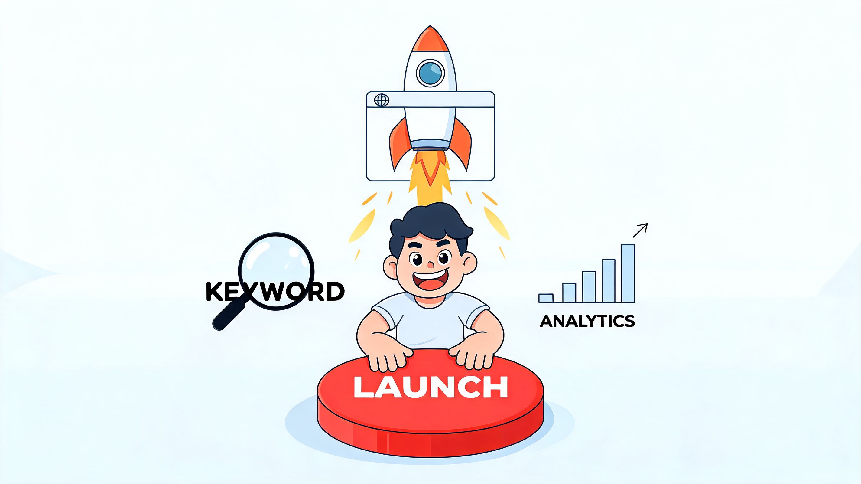
Launching with Confidence SEO and Analytics Basics
A page that looks good but can’t be found or measured is unfinished.
That sounds technical, but the basics are straightforward. You do not need a giant SEO strategy to launch a one-page site. You need a few correct decisions made early.
Handle the essentials before you publish
A website is now basic business infrastructure. As of 2025, 73% of U.S. small businesses have a website, and 96% use social media, which is why your site should function as the central hub for your digital presence (Thunderbit small business stats).
That means your launch checklist should include:
- A clear page title with your business name and main offer
- A concise meta description that explains what the visitor gets
- A custom domain so your brand looks established
- A clean URL and share image for social posts and bios
- Working buttons and forms tested on both desktop and mobile
If local discovery matters to you, this article on optimizing local search for small businesses is a useful companion to the basics above.
Track decisions, not vanity metrics
Most beginners look at the wrong numbers. They chase views and ignore actions.
For a one-page business site, the metrics that matter are simple:
- Which button gets clicked most
- Which product or offer gets attention
- Where people stop scrolling
- What traffic source brings actual inquiries or sales
That’s enough to improve the page intelligently. If a lot of people click your content but ignore your booking button, the problem isn’t traffic. It’s offer placement or CTA clarity.
These tips on improving website conversion rates can help you make those adjustments without turning your page into a science project.
Launch early, but launch with tracking. Otherwise you’re guessing.
Quick Tips for Migrating from Bento.me
If you’re using Bento.me, the move isn’t a rebuild. It’s an upgrade in structure.
Most Bento pages are fine for listing links. The limitation shows up when you want the page to feel more like a business asset and less like a social profile hub.
What to move first
Start by auditing your current page.
Keep these:
- Your strongest headline
- Your top-performing links
- Your best proof
- Any lead magnet or booking link that already gets clicks
Drop these:
- Duplicate links
- Outdated offers
- Low-value social destinations
- Anything that distracts from the main action
What to improve during the switch
A better migration doesn’t just copy. It restructures.
Use the move to:
- Replace stacked links with grouped sections
- Bring content previews onto the page
- Put your monetization block higher
- Create separate mobile and desktop layouts
If you want a clearer breakdown of where Bento fits and where it falls short, read what Bento is and how it compares.
The point isn’t to have a different page. It’s to have a page that works harder.
If you want a simple website for small business that acts like a storefront instead of a link dump, start with taap.bio. It gives you one page to showcase your brand, collect emails, sell digital products, and book calls without stitching together a dozen separate tools.