

In a world of information overload, the one-page website stands out as a masterpiece of clarity and focus. It’s not just a trend; it's a strategic choice to guide visitors through a compelling narrative without distractions. From freelancers showcasing a portfolio to creators centralizing their content, a single, well-crafted page can tell your story, showcase your work, and drive action more effectively than a complex, multi-page site.
The magic lies in strategic design. Using smart layouts, intuitive navigation, and engaging content creates a seamless user journey that feels both intentional and effortless. The success of a simple one-page site often hinges on a clear and concise user experience, emphasizing the importance of understanding UI/UX design principles. This focus on user-centric design is what separates a basic link list from a powerful conversion tool.
In this guide, we'll dissect some of the best one page website examples on the internet. You will learn not just what makes them great, but how to replicate their impact. We will explore:
- Detailed Breakdowns: Annotated screenshots and direct links to each curated example.
- Strategic Insights: Key design takeaways and the "why" behind their effective layouts.
- Actionable Advice: Practical notes on how you can recreate similar designs and functionality.
We'll also show you how tools like Taap.bio make it easier than ever to build a visually stunning and functional one-page site, turning inspiration into your own powerful online presence. Let's dive into the examples.
Table of contents
1. taap.bio
As our featured choice, taap.bio represents a significant shift in what a one-page website can be. It moves beyond the traditional, linear list of links and instead offers a dynamic, grid-based canvas that functions as a personal digital headquarters. This platform is an exceptional example for anyone seeking to consolidate their online presence into a single, visually compelling destination.
Where many link-in-bio tools offer a simple vertical stack of buttons, taap.bio provides a “bento grid” layout. Each piece of your content, from a social profile to a Spotify track, becomes a movable, resizable block. This modular approach allows for the creation of asymmetric, magazine-style compositions that feel curated and intentional, immediately setting your page apart.
Strategic Analysis: The Power of Live Content
The core strength of taap.bio lies in its smart widgets and deep integrations. Instead of just linking to your content, it brings the content directly onto your page, creating an interactive and engaging user experience. This turns a passive list of URLs into an active hub of your digital life.
Key Takeaway: The goal is to reduce clicks and keep visitors engaged on your page. By embedding playable music, watchable video previews, and live data feeds, taap.bio turns your landing page from a simple directory into a destination in itself.
This approach is especially powerful for creators. A musician can embed their latest Spotify album, allowing visitors to play tracks without leaving the page. A developer can showcase their real-time GitHub contribution graph. A designer can embed a Figma file or a live Dribbble portfolio. This functionality provides immediate, tangible proof of your work and personality.
Actionable Insights & Replicable Strategies
Here’s how you can apply taap.bio’s design philosophy to your own one-page site:
- Prioritize Interactive Elements: Don't just link to your YouTube channel; embed a widget that shows your latest video thumbnails. This visual preview is far more enticing than a line of text.
- Create a Visual Hierarchy: Use the grid layout and different block sizes to guide your visitor's attention. Make your most important link or piece of content the largest, most prominent block.
- Decouple Mobile and Desktop Layouts: taap.bio allows for independent editing of mobile and desktop views. This is a critical feature for any modern one-page website. Ensure your design is optimized for a vertical scroll on mobile while taking advantage of the wider canvas on desktop.
- Use Your Avatar as a Branding Tool: The platform allows for photo, video, or GIF avatars. A subtle animation or short video loop can add a layer of polish and personality that a static image cannot.
Key Features & Practical Notes
Taap.bio is particularly noteworthy for its focus on a smooth user experience, both for the creator and the visitor.
| Feature | Strategic Benefit |
|---|---|
| Bento Grid Layout | Creates a unique, polished visual identity that avoids the generic look of link lists. |
| Smart Widgets | Offers deep, real-time integrations (Spotify, GitHub, Instagram, etc.) for a rich, interactive page. |
| One-Click Bento.me Import | Provides a seamless migration path for users of the soon-to-be-defunct Bento.me, importing links and settings in seconds. |
| Independent Layouts | Ensures your page looks perfectly composed on both desktop and mobile devices. |
| Free to Start | You can create an account and build your page without a credit card, lowering the barrier to entry. |
While the site doesn't display a detailed public pricing grid, the ability to start for free is a major advantage. This lets you explore the interface and build your page before committing. Given its robust feature set and design-first approach, it’s a powerful contender for anyone looking for more than just a list of links. The platform is especially relevant for designers, musicians, podcasters, and other creators migrating from Bento.me. If you are exploring options for a modern single-page presence, you can learn more about how a one page website builder that's free can serve your needs.
Website: https://taap.bio
2. One Page Love
One Page Love isn't just a gallery; it's a foundational resource for anyone serious about single-page design. Since 2008, it has meticulously curated thousands of high-quality one page website examples, making it an indispensable library for inspiration. The site's longevity and tight editorial control mean you are browsing a collection that represents the best in the genre, not just a random dump of submissions.
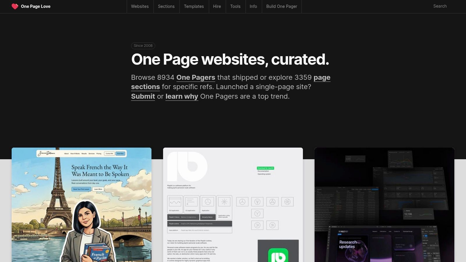
What makes One Page Love truly stand out is its practical, component-based approach. It goes beyond simple visual inspiration by breaking down websites into their core building blocks. This strategic focus is perfect for creators who want to understand why a design works and how to replicate its success.
Key Features & Strategic Insights
One Page Love’s power lies in its structured archives, which help you move from idea to execution efficiently.
- Massive, Curated Archive: With over 8,900 examples, the collection is vast yet focused. The strict curation ensures you’re seeing effective, well-executed designs that solve real-world communication problems.
- "Sections" Library: This is the site's killer feature. It's a library of common one-page components like pricing tables, team bios, FAQ grids, and testimonials. Instead of reinventing the wheel, you can browse proven layouts to structure your content. This is invaluable when planning your Taap.bio page, as you can map these sections directly to Taap's smart widgets.
- Builder-Specific Filtering: The ability to filter examples and templates by platform (like Webflow, Carrd, or Framer) is incredibly useful. It helps you find designs that are achievable with your chosen tool and understand the platform's capabilities. If you're exploring different platforms, you can find a deep-dive comparison in our guide to the best one-page website builders.
Strategic Takeaway: Use the "Sections" library to build a content wireframe before you start designing. Identify the 3-5 essential sections your one-pager needs (e.g., Intro, Services, Portfolio, Contact) and find a corresponding layout on One Page Love. This structures your narrative and simplifies the creation process in Taap.bio.
How to Use It Effectively
One Page Love is a free resource, supported by template sales and occasional affiliate links. To get the most out of it, focus your search. Use the categories and tags to narrow down examples by industry (e.g., "Portfolio," "App") or type ("Landing Page"). Pay close attention to the "Most Loved" section to see what designs are currently resonating with the community. This approach provides a clear roadmap for creating compelling one page website examples of your own.
Website: https://onepagelove.com/
3. SiteInspire
While not exclusively a single-page gallery, SiteInspire is a highly respected institution in the web design world. Think of it as a broad, curated museum of digital excellence, where you can find outstanding one page website examples by using its powerful filtering system. Its long-standing reputation means you are browsing a collection that has been vetted by discerning eyes, showcasing quality over quantity.
What makes SiteInspire a crucial resource is its cross-industry perspective. By viewing single-page designs alongside their multi-page counterparts in the same niche, you gain a deeper understanding of when and why a one-pager is the most effective strategic choice. This comparative context is perfect for creators who need to justify their design decisions with solid evidence.
Key Features & Strategic Insights
SiteInspire’s true strength lies in its meticulous organization and robust filtering, allowing you to pinpoint hyper-relevant examples quickly.
- Powerful Filtering System: This is SiteInspire's core advantage. You can filter the entire collection by type (e.g., "Corporate," "Portfolio"), style ("Minimal," "Colorful"), and most importantly, layout. Simply select "single page" from the layout filter to isolate the exact inspiration you need for your project.
- Broad, High-Quality Collection: The archive includes top-tier work from various sectors, from creative portfolios to corporate landing pages. This diversity helps you see how different industries apply one-page principles, offering a rich source of ideas that you can adapt for your own Taap.bio page.
- Contextual Comparison: Because the site includes multi-page designs, you can directly compare a one-page portfolio against a full-site portfolio in the same industry. This helps you understand the trade-offs and decide what information is truly essential, a key exercise before building any compact landing page. To better understand the function of these pages, you can read our deep-dive on what is a landing page.
Strategic Takeaway: Use SiteInspire to validate your content strategy. After filtering for single-page sites in your industry, analyze the top 5-10 results. Note the common sections they include (e.g., Hero, About, Services, CTA). This pattern recognition provides a market-tested blueprint for the essential content your Taap.bio page needs to include to meet audience expectations.
How to Use It Effectively
SiteInspire is a free resource that is simple to navigate. Your primary tool will be the "Filter" menu on the left-hand side. Start by selecting "single page" under "Layouts," then add another filter for your specific industry or desired style. Pay attention to the "Collections" tab, where the SiteInspire team groups examples by theme, which can often spark new creative directions. This methodical approach will help you discover unique and effective one page website examples that go beyond the usual trends.
Website: https://siteinspire.com/
4. Godly
Godly is where you go to see the future of web design, today. It’s a modern, highly selective inspiration feed focused on cutting-edge visual language, motion, and interactions. Unlike broader galleries, Godly curates visually ambitious sites, making it a prime source for bold, contemporary storytelling and advanced interaction patterns in one page website examples.
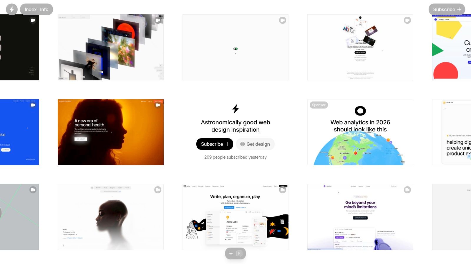
What makes Godly essential is its tight curation and focus on the "how." The sites featured here are not just pretty; they are technical marvels that push boundaries with fluid animations, inventive layouts, and memorable user experiences. This makes it an excellent resource for creators who want their one-pager to feel dynamic and alive, not just static.
Key Features & Strategic Insights
Godly’s value is in its signal-to-noise ratio. You are only seeing top-tier work that sets new standards for digital creativity.
- Elite, Focused Curation: With new sites added weekly, the feed remains fresh and relevant. The selection process is strict, ensuring every example showcases exceptional artistry and technical execution. You won’t find cookie-cutter templates here.
- Emphasis on Motion & Interaction: Godly is a masterclass in animation. You’ll discover how subtle hovers, slick page transitions, and creative scrolling effects can guide users and tell a story. This is perfect inspiration for adding a polished feel to your Taap.bio page using its built-in animation options.
- Inventive Layouts: Many sites featured on Godly break free from traditional grid structures. You'll see asymmetrical designs and unconventional content arrangements, including many that use modular, grid-like systems. To understand how to apply this to your own site, you can find a deep dive in our guide to mastering Bento Box web design.
Strategic Takeaway: Don't try to copy an entire Godly site. Instead, isolate one specific interaction or animation you admire. It could be a button hover effect, a smooth-scrolling section transition, or a unique portfolio reveal. Recreate that single element to add a high-end feel to your one-pager without overwhelming your audience or your budget.
How to Use It Effectively
Godly is a free resource that’s simple to browse. The main page is a chronological feed, making it easy to scan for recent trends in web aesthetics. There are no complex filters, which encourages discovery. Pay close attention to how these sites use typography, color, and negative space to create a strong visual hierarchy. This approach will help you design more impactful and memorable one page website examples for your own brand.
Website: https://godly.website/
5. One Page Mania
One Page Mania is a straightforward and highly focused gallery dedicated exclusively to single-page websites. Its strength lies in its simplicity and strict categorization, making it an excellent resource for finding industry-specific inspiration. By concentrating only on one-pagers and organizing them by vertical (Portfolio, Landing Page, Restaurant), it removes the noise found in broader design galleries.
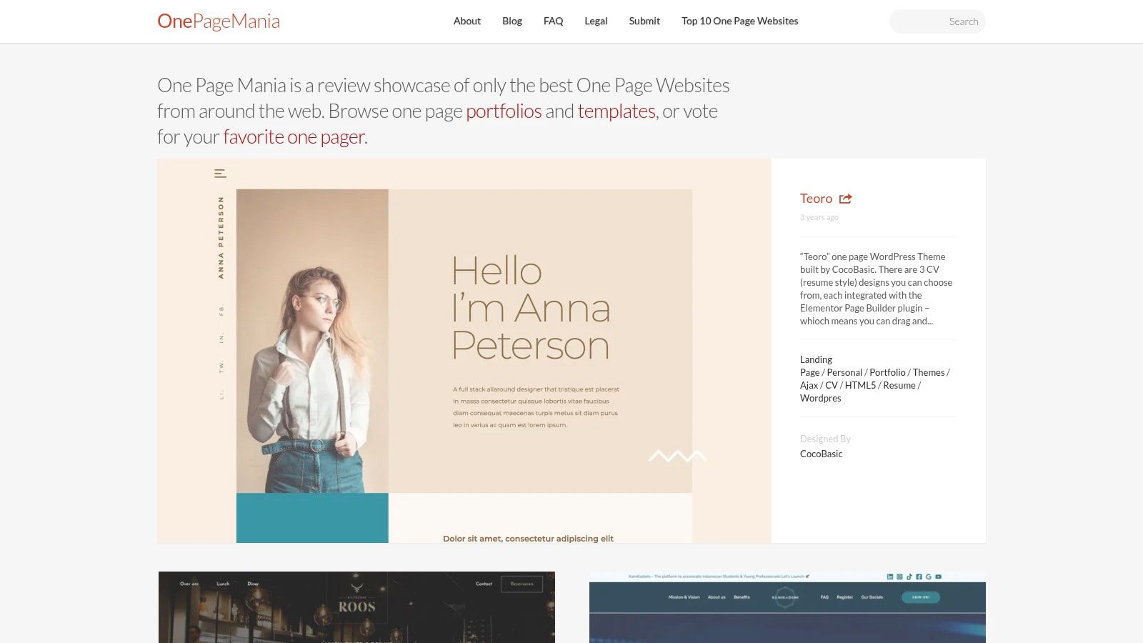
This platform operates as a community-driven archive, featuring submissions and a voting system that highlights popular designs. While its interface is more traditional than newer galleries, its deep historical archive provides a long-term view of how one-page design has evolved. This makes it particularly useful for seeing what works in specific niches over time.
Key Features & Strategic Insights
One Page Mania’s value comes from its clear, vertical-focused organization, which simplifies the research process for creators with a specific goal in mind.
- Strict Vertical Filtering: The site is neatly organized into categories like "Portfolio," "Restaurant," and "Photography." This is ideal when you need to see how others in your specific field are structuring their single-page sites.
- Community Voting & "Top 10": The ability to see which sites are most popular with the community offers a quick pulse on effective designs. The "Top 10" list is a great starting point to see well-regarded one page website examples.
- Deep Paginated Archive: With over 200 pages of submissions, the archive is extensive. While this means some examples are older, it also provides a rich library of layouts and concepts that stand the test of time, unlike trendy designs that quickly fade.
Strategic Takeaway: Use One Page Mania to conduct competitive analysis within your niche. Filter by your industry (e.g., "Portfolio") and study the top 5-10 examples. Note the common sections they include, the call-to-action they use, and their overall narrative flow. This vertical-specific research is a shortcut to creating a page that meets audience expectations.
How to Use It Effectively
One Page Mania is a free-to-use gallery. The best way to use it is to dive directly into the category that matches your project. For instance, if you are creating a landing page for a new app, the "Landing Page" category will give you dozens of relevant examples to study. Pay attention not just to aesthetics but also to the content hierarchy and how each section transitions to the next. For more targeted inspiration, check out our guide on compelling landing page ideas. While the update frequency can vary, the sheer volume of examples makes it a dependable source for foundational layout ideas.
Website: https://www.onepagemania.com/
6. Best Website Gallery
Best Website Gallery is a highly respected inspiration resource that bridges the gap between design and development. While not exclusively focused on single-page sites, its powerful and granular filtering makes its dedicated "One Pager" section a goldmine for creators who think about both aesthetics and the underlying technology. It offers a more technical perspective on what makes great one page website examples.
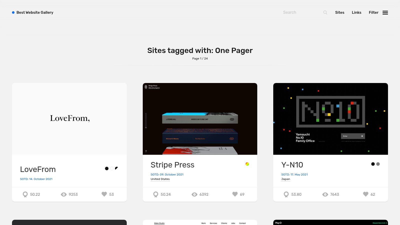
What sets this gallery apart is its appeal to a more technically-minded audience. By allowing users to filter designs by CMS, framework, or even specific JavaScript libraries, it provides a unique lens for inspiration. This is perfect for those who want to find designs that are not just beautiful but also aligned with a particular tech stack or development approach, making it an excellent resource for both designers and developers.
Key Features & Strategic Insights
Best Website Gallery’s strength is its meticulous tagging and filtering system, which allows for a highly targeted search for inspiration.
- Dedicated "One Pager" Filter: While the gallery is broad, its dedicated style filter for "One Pager" instantly narrows the collection to relevant examples. This ensures you're looking at sites that master the art of single-page storytelling.
- Tech Stack Filtering: This is the site's most distinctive feature. You can filter examples by CMS (like WordPress, Webflow, Shopify) or frameworks and libraries (like React, Next.js, Three.js). This is exceptionally useful for seeing what's possible within a specific technological ecosystem.
- Stylistic Tagging: Beyond technology, the gallery uses tags for specific design traits like "Animation," "Minimal," or "Colorful." This helps you find one page website examples that match the exact aesthetic and user experience you aim to create with your own page.
Strategic Takeaway: Use the technology filters to inform your creative direction. For example, filtering by "Three.js" will show you cutting-edge 3D and interactive one-pagers. This can inspire you to use advanced embeds or animated elements on your Taap.bio page to create a more dynamic and engaging user experience that stands out from static link pages.
How to Use It Effectively
Best Website Gallery is a free resource. To get the most from it, start by selecting the "Style" filter and choosing "One Pager." From there, layer on additional filters. If you have a specific visual style in mind, browse the "Tags." If you're curious about what a certain platform can achieve, use the "CMS" or "Framework" filters. Because the gallery has been around for a while, always check the submission date to ensure the design patterns are current and relevant.
Website: https://bestwebsite.gallery/sites/style/one-pager
7. A1 Gallery
A1 Gallery is a design-forward inspiration hub that cuts through the noise with its sharp, contemporary focus. While newer than some legacy archives, its strength lies in its modern curation and technology-first filtering. It is an excellent resource for creators who want to see what is current, especially for one page website examples built with today's most popular tools.
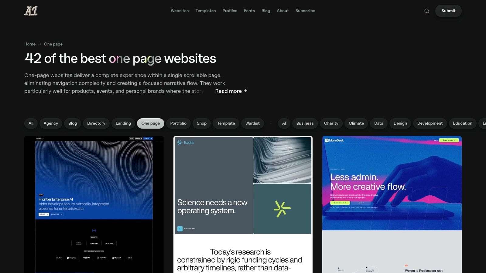
What makes A1 Gallery particularly useful is its fast, faceted filtering system. It allows you to quickly drill down into a curated collection of single-page sites by the specific style or technology you're interested in. This is ideal for designers and developers looking for modern, minimalist, or animated styles built on platforms like Framer and Webflow.
Key Features & Strategic Insights
A1 Gallery's minimalist interface belies a powerful set of tools for finding specific, relevant inspiration quickly.
- Technology-Specific Filtering: This is the gallery's standout feature. The ability to filter examples by "Technology" (like Framer, Webflow, or Next.js) is a huge advantage. It lets you see what’s realistically possible with your chosen platform and gather inspiration that directly maps to your toolset.
- Contemporary Curation: The site skews heavily toward modern aesthetics. Filters like "Minimal," "Animated," and "Big Type" help you find cutting-edge designs that feel fresh and current. This is a great place to spot emerging trends in web typography and interaction design.
- Dedicated "One page" Type: While the collection is smaller than behemoths like One Page Love, its dedicated "One page" category is tightly curated. You won't have to sift through irrelevant multi-page sites, ensuring your search for one page website examples is efficient and on-point.
Strategic Takeaway: Use A1 Gallery's technology filters to deconstruct a competitor's site or an inspirational design. If you see a one-pager you love, check A1 to see if it's been tagged with a specific framework. This helps you understand the technical foundation required to build similar functionality, which you can then adapt for your Taap.bio page using its smart widgets.
How to Use It Effectively
A1 Gallery is a free resource, though be mindful that some tiles are sponsored templates (clearly labeled). To use it best, start by selecting the "One page" type from the top navigation. From there, apply style and technology filters to narrow the results. For instance, filtering by "Framer" and "Minimal" will show you a very specific, actionable set of examples to guide the aesthetic of your own page. The weekly email roundup is also a great way to get a dose of fresh inspiration delivered to your inbox.
Website: https://www.a1.gallery/type/one-page
7 One-Page Website Examples Comparison
| Name | Implementation Complexity 🔄 | Resource Requirements ⚡ | Expected Outcomes 📊⭐ | Ideal Use Cases 💡 | Key Advantages ⭐ |
|---|---|---|---|---|---|
| taap.bio | Medium–High — visual editor + layout tuning | Low code; moderate design/time; free tier available | High visual polish & engagement ⭐⭐⭐⭐ | Creators needing a rich link-in-bio with inline media playback | Drag-resize bento layout; deep real-time widgets; responsive control |
| One Page Love | Low — browse, copy, adapt | Minimal; time to review templates | Improved planning & faster template selection ⭐⭐⭐ | Planning one-pagers and finding platform-specific templates | Huge curated archive; sections library; platform filters |
| SiteInspire | Low–Medium — requires filter setup | Minimal; time for cross-industry research | Broad design insights & high-quality references ⭐⭐⭐⭐ | Comparing patterns across industries/styles | Powerful filters by industry/style/layout; long-standing curation |
| Godly | Low — curated inspiration feed | Minimal; ideal for visual research | Strong creative inspiration for motion/interaction ⭐⭐⭐⭐ | Seeking cutting-edge interaction-heavy one-pagers | Tight curation of visually ambitious, animated sites |
| One Page Mania | Low — category-driven browsing | Minimal; time to find vertical examples | Vertical-specific references & community picks ⭐⭐⭐ | Research by vertical (Portfolio, Restaurant, Photography) | One-pager-only focus; Top 10 lists and voting/archive |
| Best Website Gallery | Low–Medium — tech/filter usage | Minimal; useful for engineer-aligned picks | Tech-aligned examples & clear tagging ⭐⭐⭐⭐ | Finding one-pagers by CMS/framework or tech stack | Granular CMS/framework filters; tags for animation/transitions |
| A1 Gallery | Low — fast faceted filters | Minimal; smaller index | Contemporary, tool-specific examples ⭐⭐⭐ | Modern toolchains (Framer/Webflow) and minimalist/animated styles | Clean modern curation; fast filtering; weekly roundups |
Your Next Step: From Inspiration to Creation
We've journeyed through a curated gallery of exceptional one page website examples, from the dedicated archives of One Page Love and SiteInspire to the aesthetic-forward collections on Godly and Awwwards. Across every category, whether for a freelancer, a content creator, or a small business, a powerful pattern emerges. The most effective single-page sites are not just digital business cards; they are focused, intentional, and story-driven experiences.
These examples prove that a single page can be more impactful than a sprawling multi-page website when executed with precision. It’s about making every scroll count, guiding the user through a narrative that builds interest and culminates in a clear call to action. You've seen how strategic layouts, compelling visuals, and smart functionality can create a memorable impression in a matter of seconds.
Key Takeaways to Guide Your Build
As you move from observation to action, keep these core principles at the forefront of your design process. They are the common denominators found in nearly every successful one-page site we analyzed:
- Narrative Flow is Everything: Your page should tell a story. Structure it with a clear beginning (who you are), middle (what you offer/do), and end (what you want them to do next). Think of it as a vertical conversation.
- Visual Hierarchy Directs Attention: Use size, color, contrast, and white space to guide your visitor's eyes. The most important element on the page, your primary call to action, should be impossible to miss.
- One Page, One Goal: While you can have multiple links or sections, your page should be built around a single, primary objective. Is it to get subscribers? Book a call? Showcase a portfolio? Every element should support that goal.
- Interactivity Creates Engagement: Elements like embedded videos, animated galleries, and direct contact forms do more than just present information. They invite the user to participate, turning a passive viewing experience into an active one.
Once you've gathered inspiration and have a clear vision, you might be wondering about the tools to bring it to life. For those looking to explore advanced options, you can explore these powerful AI tools for website design to accelerate the process.
Turning Inspiration into Your Digital Hub with Taap.bio
The gap between seeing great one page website examples and creating one yourself can feel wide, but it doesn't have to be. The key is choosing a tool built for this specific purpose. While galleries like Best Website Gallery offer endless inspiration, a platform like Taap.bio provides the building blocks.
Taap.bio was created for the exact needs of creators, freelancers, and businesses who require a beautiful, functional, and focused online presence without the complexity of a traditional website builder. Its modular grid system allows you to translate the layouts you've seen here into a tangible structure. The smart widgets for email sign-ups, contact forms, and media embeds give you the functionality to drive action.
You now have a deep well of ideas and a clear understanding of what makes a single-page design work. The next step is not to find more examples, but to start building. Take the most compelling strategies you've seen, mix them with your unique brand identity, and create a page that truly represents you. The journey from inspiration to creation is the most exciting part.
Ready to build a one-page site that captivates your audience and consolidates your online presence? taap.bio gives you the creative control and powerful widgets to transform the inspiration you've gathered into a stunning and effective reality. Start building your perfect one-page destination today at taap.bio.


