

You’re probably already doing the hard part.
You post consistently. People reply to your stories. They ask for your template, your guide, your workout split, your presets, your process, your recommendations. A few even say, “How can I buy this?” Then the mess starts. One link in your bio goes to a checkout page. Another goes to a folder. A third goes to a booking tool. The rest live in DMs, story highlights, pinned comments, and notes app replies you keep copying by hand.
That setup works for a while. Then it starts leaking buyers.
A customer who is ready to purchase shouldn’t have to hunt through your ecosystem to figure out what you sell. They need one place that makes the next step obvious.
Table of contents
Your Audience Is Ready to Buy But Where Is Your Store
Most creators don’t have a product problem. They have a storefront problem.
They’ve built attention on Instagram, TikTok, YouTube, X, or LinkedIn, but the buying experience still looks improvised. That’s where sales get lost. Not because the offer is weak, but because the path from interest to checkout feels fragmented.
The shift matters now because digital commerce is no longer a side experiment for creators. The global digital products market reached $9.8 billion in 2025 and is projected to grow to $18.3 billion by 2033, representing a 9.60% compound annual growth rate, according to digital product sales statistics from Swell. That tells you something important. Buyers are already comfortable purchasing digital value. The question isn’t whether the market exists. It’s whether your store makes buying easy.
A proper storefront does three jobs at once:
- It organizes demand. People can see what you sell without asking for the link.
- It builds trust. A clean presentation feels more credible than a pile of disconnected tools.
- It shortens decision time. Visitors understand the difference between your free, low-ticket, and premium offers fast.
Buyers rarely need more persuasion first. They usually need less friction.
If you don’t have a full website yet, a focused page can still do a lot of heavy lifting. This is why simple creator storefronts and lightweight landing pages have become such a practical bridge between social traffic and direct sales. If you need a starting point, this guide to creating a landing page without a website is a useful way to think about that first central destination.
The mistake is treating your bio link like storage. It isn’t storage. It’s retail space.
Understanding the Digital Product Advantage
Digital products give solo operators an advantage that physical businesses usually don’t get.
Once you make the thing, you’re not rebuilding inventory every time someone buys. You don’t need shelves, packing materials, or fulfillment staff just to deliver another copy of the same ebook, template pack, mini-course, or audio file.
Why the economics are so attractive
The cleanest analogy is a key.
With a physical product, every sale means making another key from raw material, packaging it, and getting it to the buyer. With a digital product, you craft the original key once, then deliver copies without the same production cycle repeating.
That difference is the whole game. Digital product stores operate on a distinct cost model compared to physical retail. Once created, digital products can be sold unlimited times with zero additional production, storage, or per-unit shipping costs. This creates what economists call “infinite scalability”, as described in Qoyod’s overview of building a successful digital product store.
That doesn’t mean digital products are effortless. It means the work moves upfront.
Where creators get this wrong
A lot of new sellers hear “passive income” and assume the file itself is enough. It isn’t. The product has to solve something specific, and the store has to frame that value clearly.
What usually works:
- Focused outcomes: A budgeting sheet for freelancers sells better than a vague “productivity pack.”
- Fast implementation: Buyers like products they can use today, not after a three-hour setup.
- Tight positioning: One audience, one pain point, one promise.
What usually doesn’t:
- Bloated bundles: Too many files can make the offer feel confusing.
- Weak packaging: Great material hidden inside a flat, unclear sales page still underperforms.
- Random catalog growth: Adding products without a system often creates clutter instead of revenue.
Practical rule: Build the first product like a tool, not a monument. Buyers want usable help more than they want your masterpiece.
If you sell downloads, templates, guides, or educational assets, it helps to think in product families. One core offer can lead to a starter version, a premium version, and a companion resource later. That’s a cleaner path than launching unrelated items every month. For a solid grounding in the format itself, this overview of digital downloads is worth reading.
Choosing Your Digital Store Model
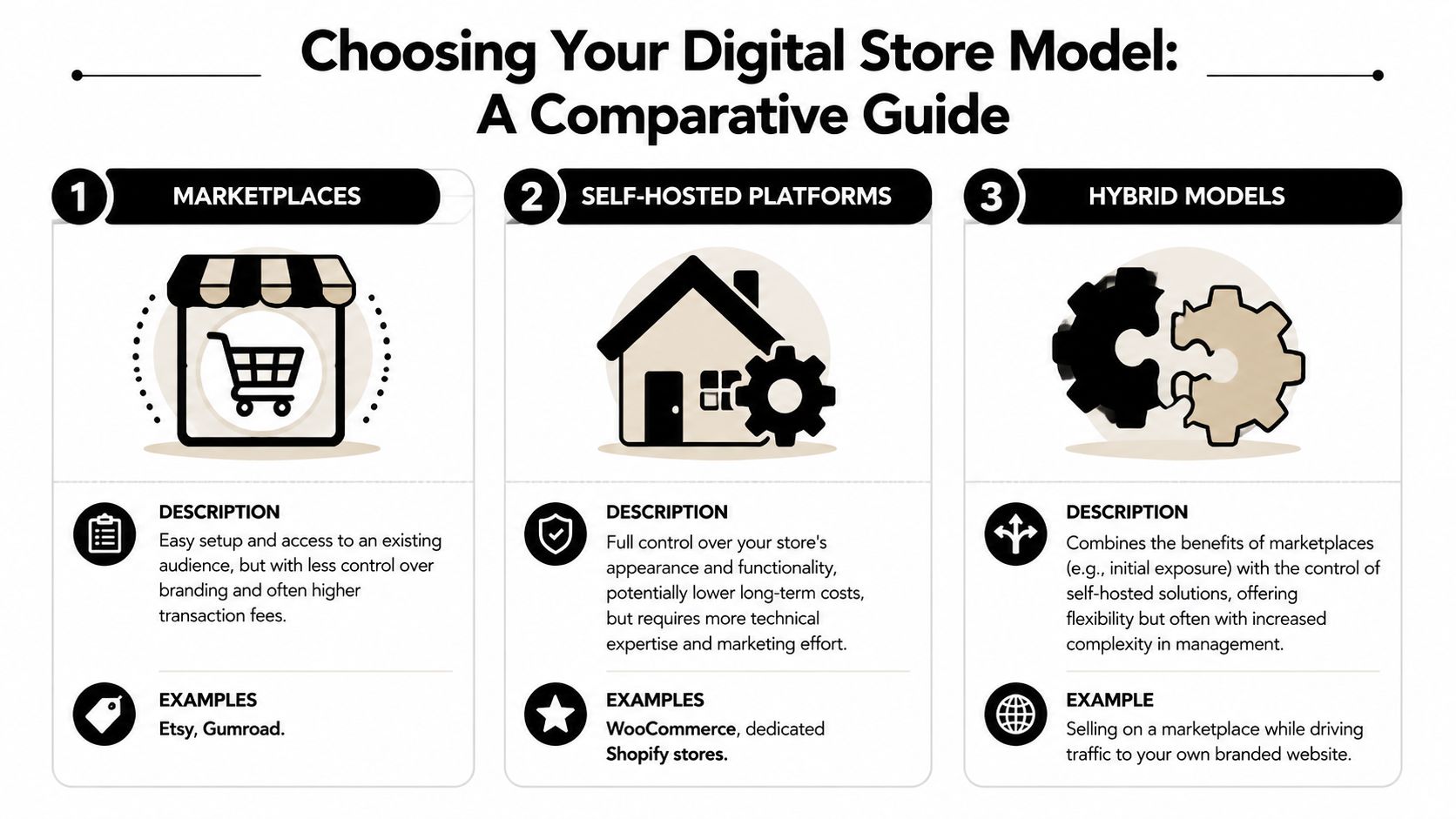
You have three common ways to sell digital products online. Each one solves a different problem, and each one creates a different kind of headache.
The biggest mistake is choosing based only on setup speed. The right question is this: which model fits the way you already attract buyers?
The three models that matter
Marketplaces like Etsy or Gumroad are the fastest to start with. They reduce setup friction. You can get a product listed quickly and begin testing demand without building much infrastructure.
The trade-off is control. Your store often looks like their platform, not your brand. You also operate inside someone else’s environment, with their layout, their discovery rules, and their customer relationship layer.
Website builders like Shopify or Squarespace give you more ownership. You get a fuller branded site, more layout options, and more room to grow into a larger catalog.
The downside is complexity. For many solo creators, a full site becomes a project of its own. Theme choices, app choices, navigation structure, page design, legal pages, and integrations can turn into weeks of setup before the first sale even happens.
Creator storefronts sit in the middle. They’re lighter than a full website, but more branded and conversion-focused than a basic marketplace listing. That makes them useful for social-first businesses where most traffic starts on mobile.
That mobile point matters. Smartphones and tablets accounted for 62.10% of digital goods market revenue in 2025, according to Mordor Intelligence’s digital goods market report. If your audience mainly arrives from social apps, your store should feel native to that behavior, not squeezed down from a desktop design.
Digital Store Models Compared
| Feature | Marketplaces (Etsy, Gumroad) | Website Builders (Shopify) | Creator Storefronts (Taap.bio) |
|---|---|---|---|
| Setup speed | Fast | Slower | Fast |
| Brand control | Limited | High | Moderate to high |
| Technical overhead | Low | Higher | Low |
| Audience ownership | Partial | Stronger | Stronger |
| Best traffic source | Marketplace search plus direct traffic | Email, SEO, ads, direct traffic | Social media and direct traffic |
| Mobile buying flow | Usually decent, but standardized | Depends on setup and theme | Usually central to the model |
| Catalog complexity | Fine for simple offers | Better for large stores | Better for focused creator offers |
How to pick without overthinking it
Choose a marketplace if you need fast validation and don’t care much about differentiated brand presentation yet.
Choose a full website builder if your store is becoming a broad ecommerce operation with deeper content, multiple categories, and long-term SEO plans.
Choose a creator storefront if your business runs on content, personal brand, coaching, or digital offers that need strong presentation without full-site overhead.
Here’s the filter I use:
- If people discover you on-platform, optimize for mobile-first buying
- If people compare multiple products, optimize for visual clarity
- If trust drives the sale, optimize for presentation and proof
- If your offers change often, optimize for easy editing
A lot of creators skip this decision and bolt tools together. That usually creates more friction than it removes. If you want a practical view of platform options before you commit, this breakdown of how to sell digital goods online is a good next step.
How to Build a Storefront That Actually Converts
The best digital product stores don’t feel like file cabinets. They feel curated.
That’s the gap most advice misses. Plenty of tutorials show you how to upload a product. Very few show you how to shape a storefront experience that turns social traffic into buyers. Existing content on digital product stores rarely addresses how to design a cohesive, multi-product storefront experience that converts social media traffic, and that’s exactly where visual layout starts doing real sales work, as noted in this discussion of storefront experience gaps.
Stop stacking links and start merchandising
A list of links is an index. A storefront is merchandising.
When someone lands on your page, they should understand three things almost immediately:
- What you sell
- Who it’s for
- What to click first
That means arranging products by buyer logic, not by the order you created them.
Here are layouts that convert better than a random feed of offers:
- By stage of buyer journey: free resource, starter product, core offer, premium support
- By problem type: planning, execution, accountability, advanced implementation
- By format: templates, workshops, downloads, calls
- By price comfort: entry-level first, then deeper offers below
If you’re using a modular grid layout, this gets easier because you can create visual hierarchy instead of relying on one endless vertical stack. A visual storefront lets you make one product larger, group related offers together, and position your core call to action where the eye naturally lands. That’s different from a generic link page where every item competes equally and nothing feels intentional.
Design for scanning, not reading
Social traffic moves fast. People don’t arrive in research mode. They arrive with partial attention.
So your page needs scan signals:
- Short product names
- Outcome-driven subtext
- Clear price display
- Distinct cover visuals
- One primary button language style
Bad storefront copy sounds like this: “Everything I use for success.”
Good storefront copy sounds like this: “Client onboarding template for freelancers.”
The page should answer the visitor’s question before they think to ask it.
One useful discipline is to review your page the way you’d review a dashboard. If you care about conversion behavior, spend some time mastering e-commerce KPIs. Not because creators need enterprise reporting, but because the habit of tracking clicks, product interest, and checkout drop-off sharpens your merchandising decisions.
Use live content as trust infrastructure
Static storefronts often feel sterile. That’s a problem when your brand is built on content, personality, and proof.
If you teach on YouTube, your videos should reinforce the store. If you’re a musician, people should be able to hear the work. If your audience follows your Instagram because your ideas feel current, the storefront shouldn’t freeze that energy into a dead page.
Embedded content changes conversion behavior. Instead of sending people away to verify that you’re legitimate, you keep the proof on-page. A storefront can include recent videos, social content, audio, portfolio samples, or other live blocks that make the page feel active.
For creators who want that visual-grid approach, Taap.bio is one example of a creator storefront that lets you arrange blocks on a modular grid and add live widgets from platforms like Instagram, YouTube, TikTok, Spotify, GitHub, and Dribbble. The practical advantage isn’t novelty. It’s that buyers can browse your offers and your proof in one environment.
A simple storefront structure that works
If you want a layout that’s hard to mess up, use this sequence:
Lead block
Start with a short headline that says what you help people do. Not your bio. Not your mission statement. Your value.
Examples:
- Build your first paid coaching offer
- Download the templates I use to onboard clients
- Learn my editing workflow and buy the presets
Core offer row
Put your highest-intent product near the top. Don’t hide the main thing under a stack of free links.
Support products cluster
Group lower-ticket items together. Buyers like seeing a ladder of options.
Proof section
Embed content that shows your expertise in action. Video clips, tutorials, music playback, portfolio work, or recent posts all help.
Conversion cleanup
End with one clear next action. That could be a product, a call booking option, or an email capture.
If you’re working on the page itself, these landing page best practices line up closely with what converts in creator storefronts too.
Setting Up Payments Delivery and Legal Essentials
A surprising number of creators delay launching because the backend feels more intimidating than the product itself.
In practice, the operational side is simpler than the visual side. The main job is making sure money, access, and expectations are handled cleanly.
Payments need to feel invisible
A good checkout doesn’t attract attention. It removes reasons to hesitate.
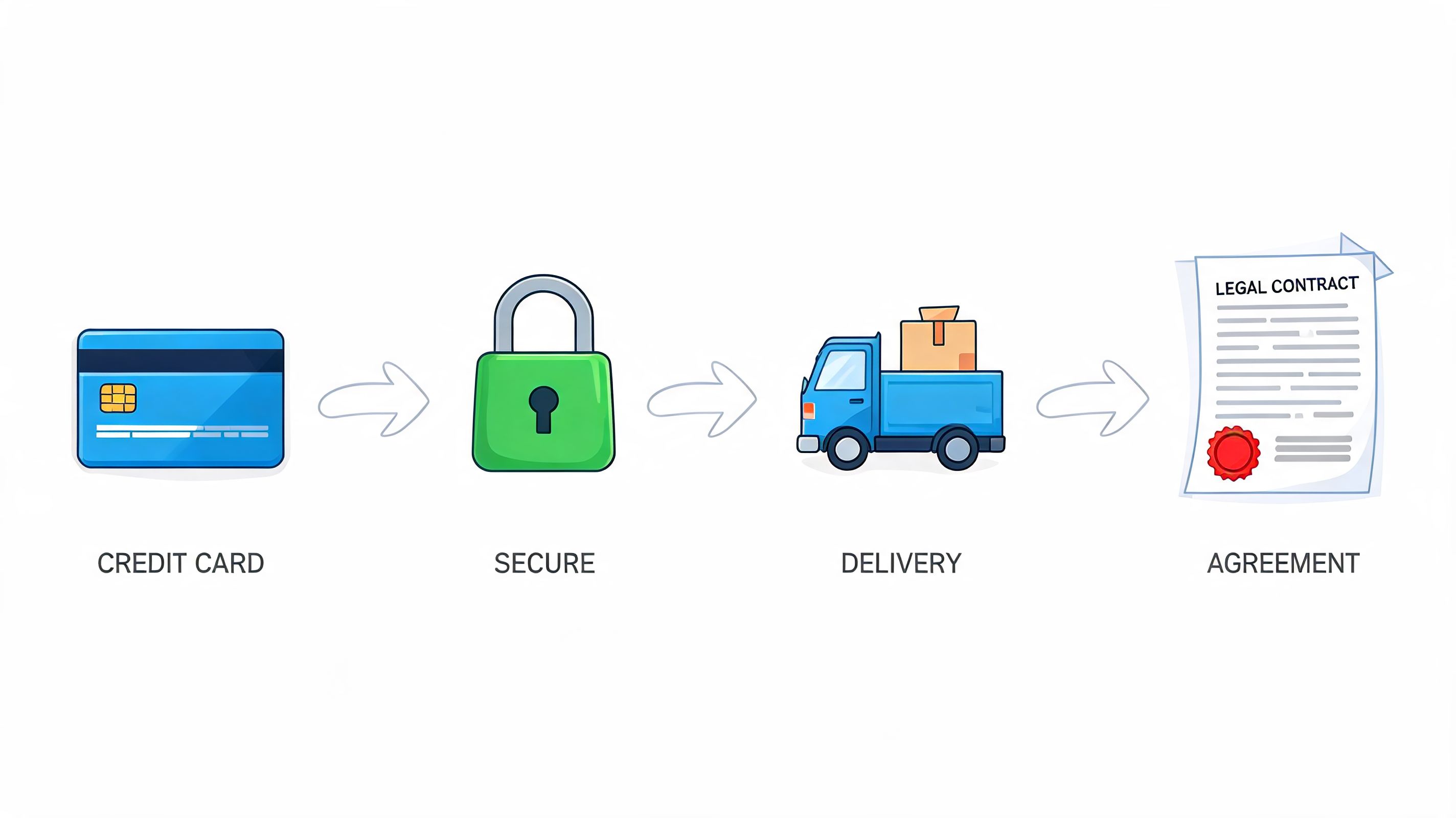
Most creator stores connect a payment processor such as Stripe or PayPal so the buyer can complete the purchase inside a familiar flow. If you already use Stripe in other parts of your business and want to understand integration possibilities more broadly, the Halo AI Stripe connector is a useful example of how Stripe-based workflows can connect across tools.
The practical checklist is short:
- Use a recognized processor: Buyers trust familiar payment flows.
- Match payout setup to your business entity: Keep accounting cleaner from day one.
- Test the checkout yourself: Buy your own product and verify every screen.
- Reduce field clutter: Extra steps create hesitation.
Delivery should be automatic
Manual fulfillment is one of the fastest ways to create support problems.
If someone buys a digital file, they should receive access immediately after payment confirmation. If they buy a course or private resource, the next step should be obvious and automatic. If they buy a call, the booking confirmation should arrive instantly and clearly.
Operational rule: Never make a paying customer wonder what happens next.
This matters even more because buyer expectations now include immediate interaction with content. Emerging data shows that audiences expect immediate access to live feeds and playback before buying, and coverage of how to integrate these into a unified product page is still sparse, as discussed in Teachable’s article on maximizing digital product sales. The practical takeaway is broader than widgets. People expect digital businesses to respond like digital businesses. Fast access is part of the product.
Legal pages aren’t optional
Creators often skip policy language because it feels corporate. It isn’t. It protects both sides.
At minimum, your store should have:
- Terms of service: Spell out what the buyer is purchasing and how they may use it.
- Refund policy: Be specific. Digital products create refund disputes when expectations are vague.
- Privacy notice: Explain what data you collect and why.
- License terms where relevant: Especially for templates, assets, code, or design files.
You should also think about tax obligations, including sales tax or VAT, based on where you operate and where your buyers are located. That part is worth professional guidance. The point isn’t to become your own lawyer or accountant. The point is to avoid building on assumptions.
If you’re still weighing the tool side of this setup, this overview of platforms for selling digital products gives a good framework for comparing what different systems handle natively.
Stop Listing Links and Start Building Your Store
A creator business gets stronger when buying feels coherent.
That’s the central shift. Not more content. Not more offers. Not another disconnected tool. A better storefront.
The old link-in-bio model was built for redirection. It sends people away in different directions and hopes they figure it out. That’s fine when your goal is traffic distribution. It’s weak when your goal is sales. Digital product stores work better when they behave like retail environments. They guide attention, frame offers, support trust, and reduce confusion.
The strongest stores I’ve seen all share the same qualities. They’re visual. They’re easy to scan. They present a small set of clear paths. They make the creator’s expertise visible, not just claim it. They also respect the way people buy from social media, which is quickly, on mobile, and with very little patience for friction.
You don’t need a huge catalog to do this well. In fact, smaller stores often convert better because they force sharper positioning. One flagship product, one lower-ticket entry point, one proof layer, and one clear action can outperform a cluttered page full of maybe-buy-later offers.
If your current setup is just a list of links, you don’t have to rebuild your whole business to fix it. You need one page that acts like a real storefront. One place where your audience can understand what you sell, trust what you make, and buy without getting bounced across the internet.
That’s the standard now. Your audience is already trained to consume and purchase digitally. They’re ready. The missing piece is usually the experience.
Build your page on taap.bio if you want a single storefront for digital products, bookings, and live content that reflects your brand instead of looking like another generic bio page.


