Creators who pre-sell before building have a 73% completion rate, compared with 23% for creators who build first and sell later. That makes demand validation the critical first step when you want to sell digital products online, not an optional marketing exercise.
You've probably seen the familiar failure pattern. A creator spends weeks recording lessons, polishing a workbook, or designing a template library, then publishes the product to a quiet checkout page and assumes the problem is a lack of traffic. Often, the bigger problem is simpler: nobody confirmed that the offer solved an urgent enough problem before production began.
The opportunity is substantial. Global digital media spending exceeded $560 billion in 2024, and digital product transactions surged 70% between 2022 and 2024, according to digital product market data from Whop. The buyers are there. Your job is to reduce the distance between their problem, your promise, and a completed purchase.
Table of contents
Start With Demand, Not a Product
The 73% versus 23% completion benchmark changes how you should approach product creation. Creators who pre-sell before building complete at a much higher rate than those who create first and sell later, as reported in launch guidance for digital product creators. The useful lesson isn't that a preorder magically guarantees sales. It's that payment intent gives you evidence before you commit your best working hours.
Start with a narrow audience and a costly problem. “A productivity course for everyone” is difficult to position. “A weekly planning system for freelance designers managing several client deadlines” gives you a defined buyer, a recognisable situation, and a clearer reason to act.
Test the offer before production
Use an email-first validation loop:
- Describe the problem. Write a short landing-page promise that names the situation your buyer wants to escape.
- Invite a response. Add a waitlist and ask subscribers what they've already tried, what remains frustrating, and what outcome they want.
- Offer a paid preorder. A real payment is stronger evidence than a like, poll response, or casual compliment.
- Set a delivery boundary. Explain what the first version includes and when buyers will receive it.
- Build from questions. Turn repeated objections and requests into the product outline.
A simple creator store can host the waitlist and preorder without forcing visitors through several unrelated pages. Use a single product page, a clear promise, and one action. If your idea needs visual storytelling, research best 2D animation tools before promising animated lessons or product demonstrations.

Choose a niche with purchase urgency
Niche selection matters more than collecting a long list of generic product ideas. A 2026 digital product trend roundup points toward AI-enhanced, niche-specific assets such as prompts, workflow guides, and specialised template systems. The practical question is not “What can I make?” It's “Which buyer has a problem urgent enough to pay to solve now?”
Use this guide to finding your niche to narrow the audience, then validate the exact offer with conversations and a preorder. Don't build a large course because the topic sounds popular. Build the smallest useful version that paid buyers have already helped define.
Set Up Your Creator Store in Under Two Minutes
A storefront should make the next action obvious. If someone arrives from Instagram, YouTube, a podcast, or a newsletter, they shouldn't have to decode a list of buttons before finding the product, booking option, or signup form.
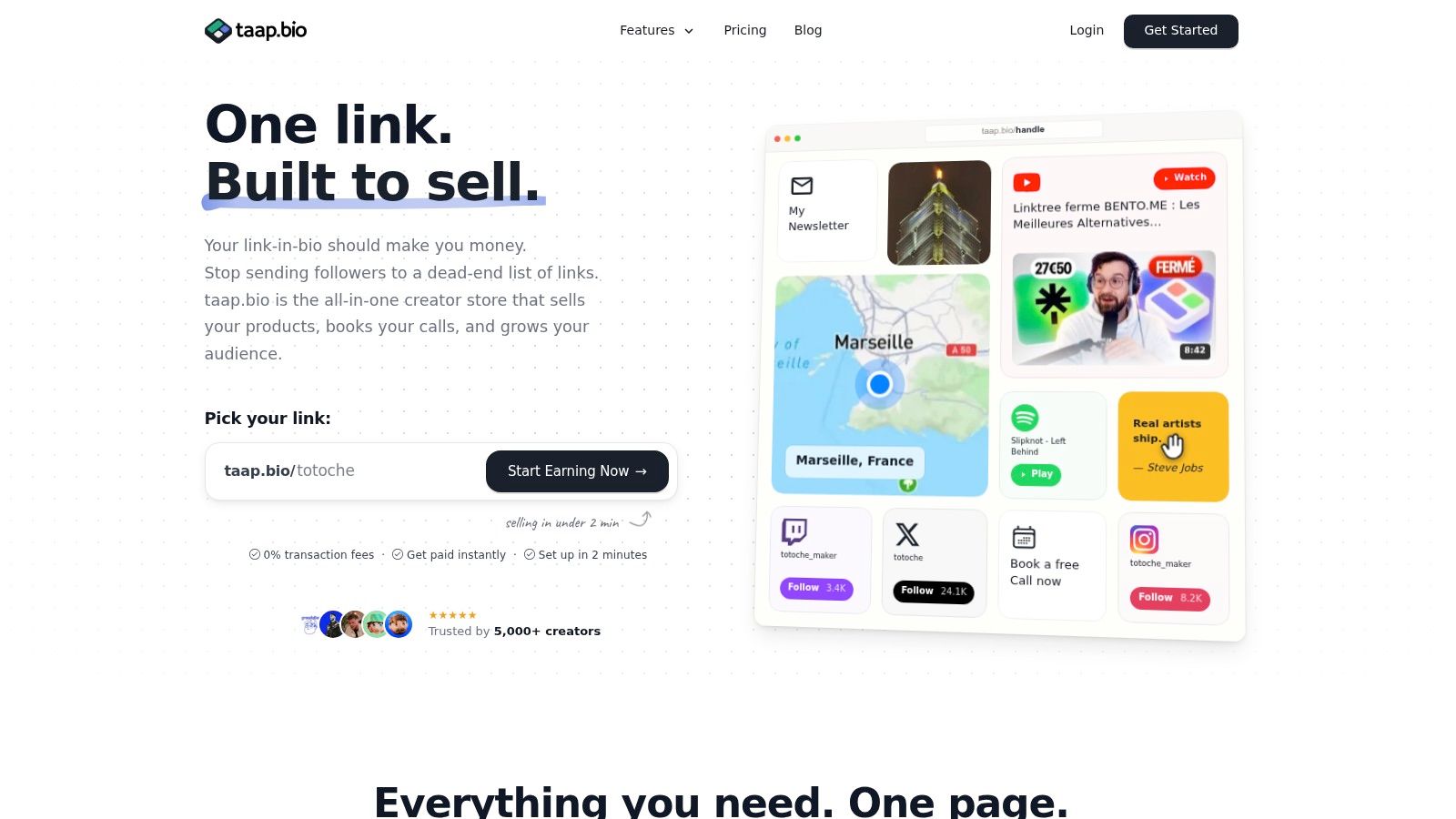
taap.bio pages can go live in under two minutes with a drag-and-drop builder, built-in checkout, instant digital file delivery, and GDPR-friendly hosting located in France. That combination is useful for an early validation page because you can publish the offer before investing in a complex website.
Build the page around one conversion path
Use the drag-and-drop layout to arrange the page in the order a buyer needs:
- Identity block: State who the product is for and the problem it addresses.
- Product block: Show the title, outcome, format, price, and purchase button.
- Preview block: Add a short video, sample page, lesson excerpt, or before-and-after example.
- Proof block: Include relevant testimonials or evidence you can substantiate.
- Email block: Capture visitors who aren't ready to buy today.
Keep the primary product near the top. Additional links, playlists, social profiles, and secondary offers can sit lower on the page. The purpose of a bento-style layout isn't to display everything you've ever created. It's to let visitors understand the offer without repeated redirects.
Configure the product with the exact file or access method the buyer will receive. Name the file professionally, write a useful confirmation message, and test the entire purchase path yourself on a mobile device. A polished page can't compensate for a broken download or an unclear post-purchase instruction.
This setup also reduces operational fragmentation. A single page can combine content, checkout, digital delivery, and email capture, while GDPR-friendly hosting in France supports a privacy-conscious setup. For a more detailed walkthrough, see this guide to building a digital product store.
Before publishing, check four details: the promise is visible without scrolling, the payment button works, the delivery email or access screen is understandable, and the signup form asks only for the information you need. Speed matters during validation, but clarity matters more.
Price for Profit, Not Competition
Digital products have a structural advantage over physical goods. They can be created once and sold repeatedly without inventory, shipping, or storage constraints. Global e-commerce sales reached $4.12 trillion in 2024, while digital goods represented 25% of e-commerce sales in 2023, according to the digital products industry summary from Gitnux.
That advantage disappears when distribution fees consume the margin. Independent guidance indicates that selling through your own website can preserve roughly 11 to 12 percentage points more of each sale by avoiding marketplace commissions on top of payment processing, as discussed in this analysis of digital products to sell. The effect is especially important for inexpensive templates, downloads, and guides, where every fee takes a larger share of the transaction.
Anchor the price to the outcome
Don't begin by copying the cheapest competitor. Start with the value of the problem you remove:
- A template can save repetitive work and reduce decision fatigue.
- An e-book can organise scattered information into an actionable path.
- A course can shorten the time between confusion and independent execution.
- A paid consultation can prevent an expensive mistake or provide custom direction.
Your product still needs to feel credible beside alternatives, but competitive research should reveal positioning gaps, not dictate a race to the bottom. Compare the promised outcome, depth, support, updates, and proof. A narrowly targeted product can justify a different price from a broad download, even when both use the same file format.
Create a simple offer ladder. Keep one focused entry product, add a bundle for buyers who need more implementation help, and reserve personalised support for a higher-value offer. Test the offer with real buyers rather than endlessly adjusting a number in isolation. If people click but hesitate at checkout, the issue may be proof or unclear scope rather than price.
For a practical framework covering packaging, tiers, and value communication, use this digital product pricing strategy. Protect the margin first, then improve the explanation of what buyers receive.
Deliver Instantly and Convert Better
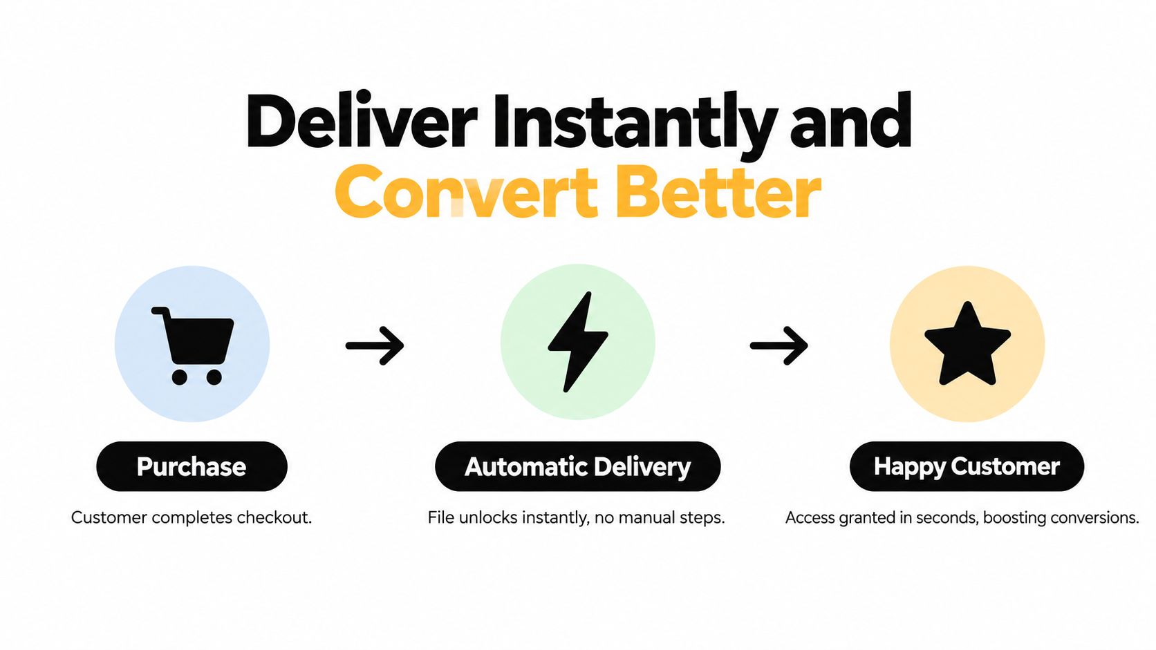
Digital delivery should be automatic. A buyer who pays for a file shouldn't wait for you to notice an email, locate the correct attachment, and send it manually. Manual delivery creates avoidable delays and makes every sale dependent on your availability.
The checkout deserves the same attention as the sales page. A competitive conversion range for digital products is 2% to 5%, with 5% or more considered top-tier performance, according to Stripe's cart abandonment guidance. The same source reports that about 70% of carts are abandoned overall, so removing shipping doesn't remove the need to optimise trust, payment, and device experience.
Remove friction at the point of payment
Use this checkout sequence:
- Keep the offer visible. Repeat the product name, outcome, format, and price near the payment controls.
- Reduce form fields. Ask only for information needed to process the order or deliver access.
- Design for mobile. Use large payment controls, readable text, and enough spacing for touch input.
- Show trust signals. Make refund terms, delivery timing, and support contact details easy to find.
- Measure the drop-off. Compare visitors, checkout starts, completed payments, and delivered orders.
Improved checkout design is reported to raise conversions by an average of 35.26%, according to the checkout research cited by LaunchMyStore. Treat that figure as a benchmark from industry analysis, not as a promise for every product. Your own funnel tells you which change matters.
Match delivery to the product
For a download, send the file immediately after successful payment and include a backup access instruction. For a booking, collect payment before the appointment, display the available calendar, and send the invitation automatically. For a course or membership, make the first access step unmistakable and tell the customer where to begin.
A completion certificate can strengthen the perceived finish of a course, but it should represent a genuine learning outcome. These verifiable course credential tips are useful when deciding what evidence to issue and how to describe it accurately.
Use this guide to delivering digital products to document the buyer journey, then test it from the customer's perspective. If the buyer must search through several emails or logins, the system isn't finished.
Build Your Owned Audience From Day One
A social profile gives you reach, but an email list gives you a portable relationship. Algorithms change, accounts get restricted, and marketplaces can alter their policies. You shouldn't let a platform you don't control become the only place where buyers can hear from you again.
Email capture belongs beside the purchase button, not buried in a footer. Someone who isn't ready to buy may still want a useful checklist, product notice, or short lesson. Give that visitor a clear reason to subscribe, then deliver the promised resource without turning the first email into a hard sell.
Turn every transaction into a relationship
Segment from the beginning, but keep the system simple. Useful groups include:
- Prospects: People who joined the list without purchasing.
- Customers: Buyers who should receive access help and relevant follow-up.
- Product interests: Subscribers who clicked or engaged with a specific topic.
- Repeat opportunities: Customers who may benefit from an advanced product or bundle.
A welcome sequence can introduce your approach, show the product in use, answer a common objection, and invite the next action. It doesn't need elaborate automation to be effective. Relevance beats volume.
Portability matters just as much as capture. Exporting contacts as a CSV gives you a usable copy of your audience if you later change email providers or restructure your business. Respect consent, explain what subscribers will receive, and make unsubscribing straightforward. A privacy-friendly setup can also reduce dependence on third-party scripts and unnecessary tracking.
Use this guide to building an email list to create the signup offer and first sequence. The best list isn't the largest one. It's the one made up of people who understand why they subscribed and have a reason to stay.
Consolidate Your Tool Stack or Pay the Price
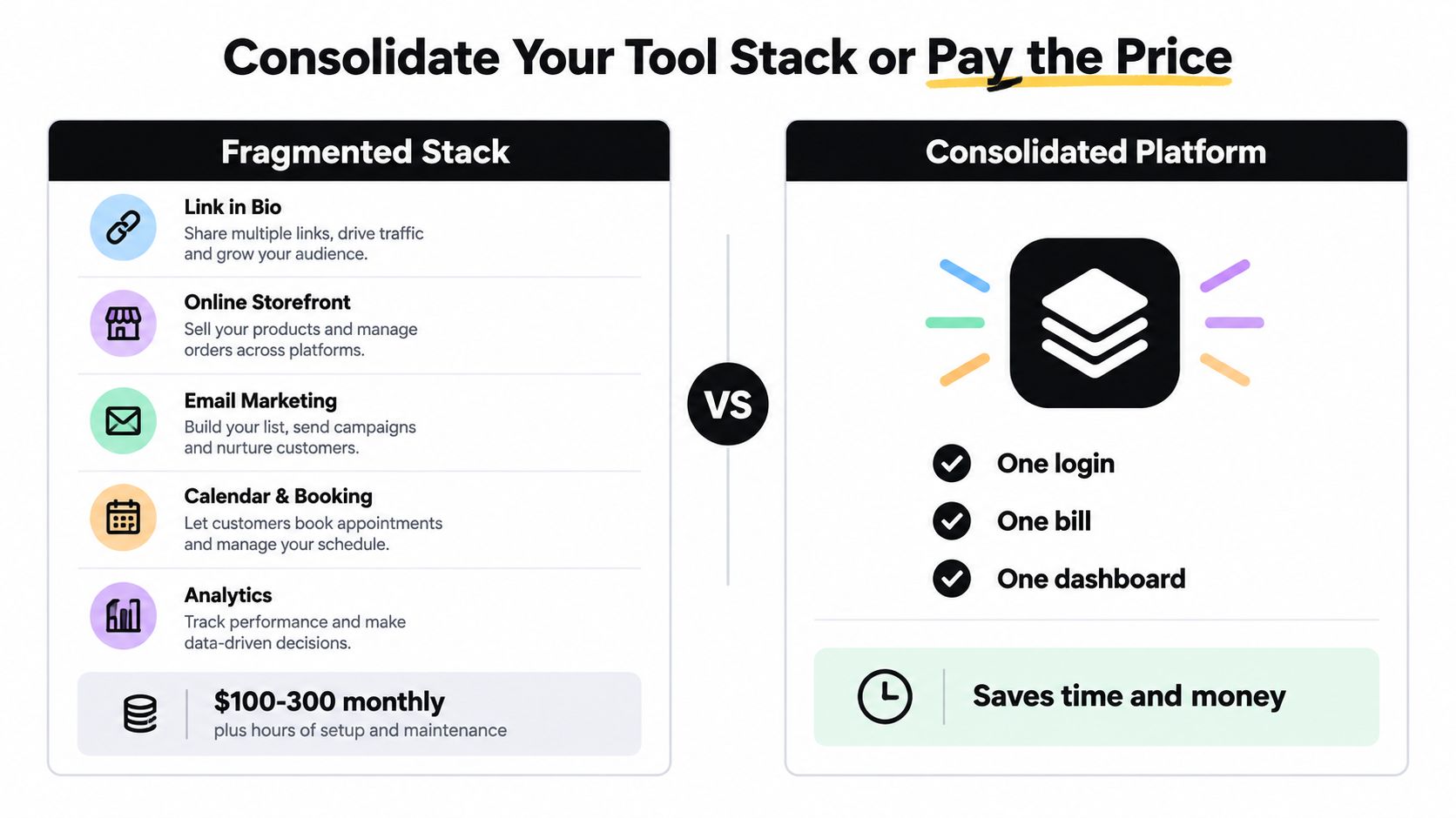
Tool sprawl creates costs that don't appear on a subscription invoice. You may pay for a link-in-bio page, storefront, email platform, booking calendar, and analytics system, then spend more time connecting them than improving the offer. Each redirect introduces another place for a buyer to hesitate, and each integration creates another failure point.
A fragmented setup also splits the customer record. Purchases live in one dashboard, signups in another, bookings somewhere else, and page performance in a fourth system. You then compare incompatible definitions of a click, session, lead, or conversion.
Compare the operating models
| Fragmented approach | Consolidated approach |
|---|---|
| Separate tools for links, checkout, email, bookings, and analytics | One creator page combining the core actions |
| Multiple logins and integration points | A single publishing and management workflow |
| Customer information spread across services | A clearer relationship between visits, signups, and purchases |
| More redirects between discovery and payment | Content and conversion actions on one page |
Consolidation doesn't mean every creator should abandon specialist software. A business with complex CRM requirements, advanced reporting, or a large team may need dedicated tools. But an independent creator validating a focused product often needs fewer moving parts, not a larger stack.
The margin argument is direct. If marketplace commissions remove roughly 11 to 12 percentage points from each sale, owning the checkout path can materially change the economics of low-priced products. Add the time spent maintaining several systems, and a platform decision becomes an operational decision, not just a design preference.
Before adding another subscription, ask what job it performs and whether an existing tool already handles that job adequately. If you need help evaluating the social publishing part of the stack, compare Scheduler.social top platform picks. The right consolidation point should reduce handoffs without forcing specialist work into an unsuitable interface.
Real Creator Success Flows
The strongest store setups are usually simple because each one starts with a defined buying action. A musician doesn't need to present every possible service before selling a beat pack. A coach shouldn't make a prospect look away from the page to request a paid consultation.
Consider a musician with a small collection of beats. The page opens with a short preview, followed by one focused product block for a downloadable beat pack. A second signup action offers production notes or release updates. The musician sends listeners from content directly to the preview and measures whether buyers reach checkout, rather than judging the launch by likes alone.
An online coach needs a different flow. The primary action is a paid booking, with a concise explanation of who the session suits, what the buyer should prepare, and what happens after payment. The calendar removes the back-and-forth email exchange. A lower-page email form serves visitors who want advice but aren't ready to book.
Match the page to the buying decision
A course creator launching a membership can lead with a short orientation video, a clear description of the recurring value, and a prominent signup action. The page should answer practical questions before purchase, including what members receive, how access works, and what the first step will be.
A freelance designer selling templates can put one specialised pack above the fold, show a sample, and offer a bundle for buyers who need several related assets. The designer can use email capture to announce updates and collect questions that inform the next pack.
These are operating blueprints, not invented case studies. No honest practitioner should promise a particular revenue result without the creator's own sales data. Track the same path in each example: source of visitor, product-page engagement, checkout creation, completed payment, delivery, and repeat interest.
The pattern is consistent. One audience, one urgent problem, one primary action, and a delivery experience that works without manual intervention. That's the foundation for a sustainable system to sell digital products online, whether the product is a file, a course, a booking, or a membership.
Use taap.bio to put your product, checkout, instant delivery, and audience capture on one focused creator page instead of stitching together disconnected tools. Visit taap.bio, publish a validation offer, and test demand before you invest in building the full product.