
Most creators don't have a traffic problem. They have a conversion problem.
Average website email opt-in rates sit at about 1.95% to 2.1% according to benchmark roundups from Stripo and BDOW. That means roughly two out of every hundred visitors subscribe on a typical site. If you've been posting harder, chasing more reels, or sending people to a messy link list and wondering why your list barely moves, that's the frame to use.
Email still matters because the economics are hard to ignore. Industry roundups compiled by Hooked Marketing report typical returns of about $36 to $42 for every $1 spent, with some analyses citing ROI in the 3,600% to 3,800% range. That's why serious creators keep moving people off rented platforms and onto an owned list they can reach directly.
The mistake is treating list building like a side form in the footer. If you want to learn how to build an email list fast, treat it like a system. One page. One clear offer. One place where people can subscribe, buy, or book without bouncing across five tools.
Table of contents
Why Most Creators Struggle to Grow an Email List
If a typical site converts only a small slice of visitors into subscribers, every extra tap in your signup path costs growth.
Creators feel this more than almost any other business because so much of their traffic comes from mobile social apps. An Instagram viewer taps your bio while half-distracted. A TikTok viewer gives you a few seconds at most. If that click opens a crowded link page, then sends them to a separate landing page, then asks them to load another form, the signup usually dies before it starts.
Social reach is not owned attention
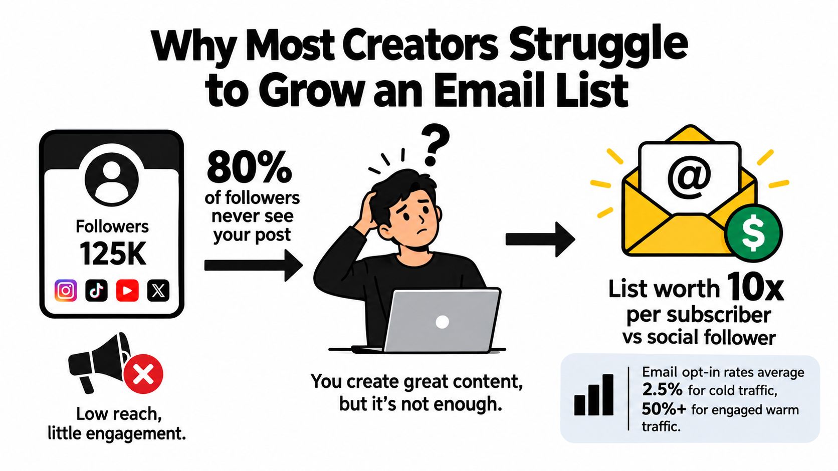
Follower count creates the illusion that list growth should be easy. It rarely works that way.
Platforms control distribution. They decide who sees your post, when it gets shown, and how long it stays visible. An email address gives you direct permission to reach someone later, whether you want to send a launch, a waitlist update, a product drop, or a booking follow-up.
That's why signup benchmarks matter. As noted earlier in BDOW's email signup benchmarks, average opt-in rates leave very little room for friction. Small conversion losses add up fast when bio traffic is already limited.
Practical rule: Treat list growth like a conversion system, not a content volume problem.
Scattered forms create weak intent
The common setup looks harmless. A footer form on the website. A newsletter page buried in a menu. A freebie linked from a story highlight. A separate waitlist tool. A different booking page. A different store page.
I've seen this pattern over and over. Traffic leaks between tools because each page asks the visitor to re-orient and decide again.
A single link-in-bio store page usually works better because it keeps signup, proof, products, and booking options in one place. One page can capture the email, sell the low-ticket offer, and book the call without sending people through a maze. That structure fits how creator traffic behaves. Fast click, fast scan, fast decision.
AccelROI's benchmark roundup reports that embedded inline forms often convert lower than dedicated lead magnet pages. That lines up with what converts in practice. The problem usually isn't lack of audience interest. It's weak context and too many steps.
More subscribers is not the same as better subscribers
List size looks good on a dashboard. Revenue comes from intent.
If your subscribers come from vague newsletter invites, giveaway traffic, or low-fit freebies, engagement drops later. Opens soften. Replies slow down. Sales from campaigns feel inconsistent. You end up paying to store contacts who never wanted the core offer in the first place.
A smaller list built from one focused page often performs better because the signup happens close to the action. Someone can join after seeing the lead magnet, the paid product, or the booking offer in the same environment. That usually produces cleaner intent than stitching together random forms across five tools.
Choosing a Lead Magnet That Earns the Signup
Most lead magnets fail for one reason. They're too broad.
“Join my newsletter” isn't a compelling trade. Neither is a generic PDF no one was already trying to get. The fastest way to build an email list is to offer something that solves one immediate problem for one specific slice of your audience.
Pick the magnet from audience intent
A creator coming from TikTok doesn't want the same thing as a consulting lead from LinkedIn. The format matters less than the fit.
Use this quick matching logic:
| Audience intent | Better magnet | Usually weak magnet |
|---|---|---|
| Wants a quick result | Checklist, template, swipe file | Long ebook |
| Wants a transformation | Mini-course, challenge, roadmap | Random worksheet |
| Wants to buy later | Buyer's guide, sample, early access | Motivational newsletter |
| Wants your style or process | Preset, prompt pack, script library | General tips PDF |
Creators usually do well with assets people can use the same day. Think caption banks, outreach scripts, Notion templates, rehearsal checklists, shoot plans, editing presets, lesson packs, or early access to a drop.
If you need inspiration before building, this list of lead magnet ideas for creators and businesses is useful because it forces you to think in formats people claim, not abstract “value.”
Write the promise in one line
Your lead magnet needs a one-line promise that answers three questions fast:
- What is it
- Who is it for
- What result does it help create
Examples:
- A 10-minute reel hook pack for coaches who want stronger first lines
- The client onboarding template I use to start freelance projects cleanly
- Early access to my next beat pack before it goes public
That line does more work than the file itself. If the promise is fuzzy, the signup rate will be fuzzy too.
The best lead magnet doesn't teach everything. It removes one painful next step.
Validate before you build too much
Creators waste time polishing freebies nobody asked for. Test demand first with lightweight signals.
Try this:
- Post the promise before the product and ask people to comment or tap through.
- Add it to your bio page first with a simple signup callout.
- Mention it in stories or short-form content using the exact wording you plan to place on the page.
- Watch for the language people repeat back. That tells you what they think they're getting.
If interest appears, then improve the asset.
Presentation matters too. If you want to create high-converting landing pages, study how the strongest pages keep the copy tight, the offer visible, and the call to action impossible to miss. A lead magnet isn't just content. It's packaging, positioning, and timing.
Turning Your Link in Bio Into a One Tap Signup Engine
The highest-impact change for most creators is simple. Stop sending bio traffic into a maze.
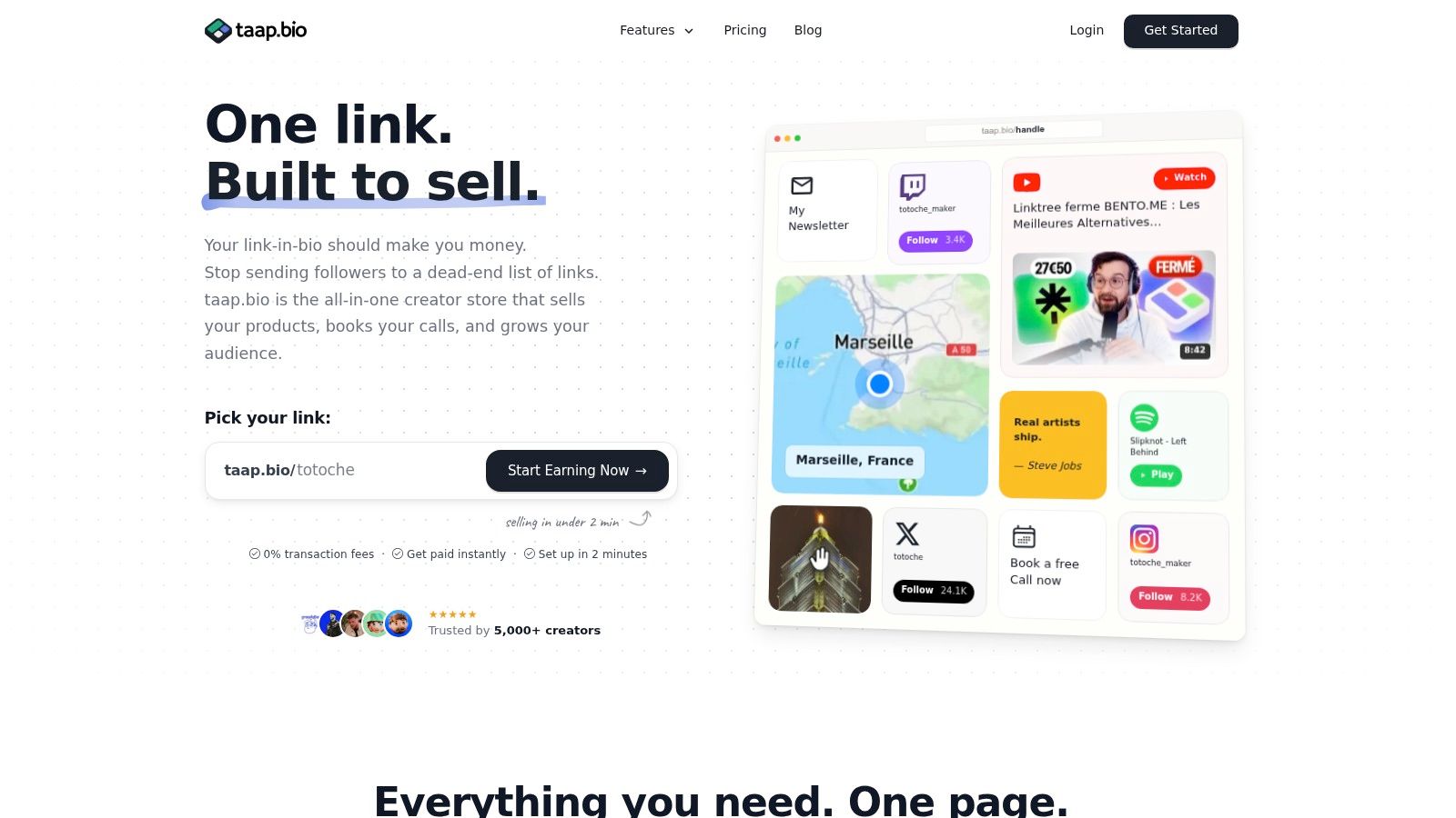
Your link in bio should work like a compact storefront. It should let someone subscribe, browse, buy, or book from the same page. No extra tabs unless absolutely necessary. No dead-end link lists. No “click here to click somewhere else.”
Put the signup where intent is highest
Most creators bury the email capture block under social icons, affiliate links, and old campaign buttons. That placement kills momentum.
A better layout looks like this:
Top block with a direct promise
One line explaining the freebie, waitlist, or insider benefit.Signup widget above the fold
Ask for the minimum data you need. Usually that's just email.Supporting content blocks nearby
A YouTube embed, Spotify player, featured post, or sample product adds context and trust.Monetization blocks below
Digital product, paid booking, featured service, or shop link.
This arrangement works because it matches intent. A new visitor can subscribe first. A warmer visitor can buy or book immediately. Both actions happen in the same environment.
Remove taps, redirects, and choice overload
People don't drop because they hate your offer. They drop because the path feels annoying.
Common friction points include:
- Redirect stacks where the user jumps from Instagram to a link page to a landing page to a checkout
- Too many equal-priority buttons competing for attention
- Long forms asking for names, phone numbers, niche details, and preferences upfront
- Weak mobile spacing that makes the page feel cramped or untrustworthy
If you want a practical benchmark mindset for this step, this guide to getting more newsletter subscribers is worth reading because it focuses on friction reduction at the point of signup, where most creators lose people.
Keep the first yes small. Asking for an email is easy. Asking for commitment, context, and a survey in the same moment isn't.
Build around one page, not five tools
Tool sprawl becomes expensive. When the signup form lives in one app, your checkout in another, your bookings in another, and analytics in another, the user experience gets patched together. So does your data.
One option is taap.bio, which combines a drag-and-drop bento page, built-in checkout, paid bookings, an email signup widget, analytics, custom domain mapping, and CSV export on a single page. That setup fits creators who want capture, selling, and booking in one public link rather than splitting traffic across separate tools.
You can build the same principle with other stacks too. The point is the architecture, not the logo. Put the highest-intent actions on one mobile-first page and make the next step obvious.
A simple wireframe that converts
Use this page order as a starting point:
| Position | Page element | Purpose |
|---|---|---|
| Top | Headline with audience-specific promise | Clarifies why the visitor should stay |
| Upper section | Email signup block | Captures the warmest traffic fast |
| Middle | Proof content like video, music, samples, or testimonials | Builds confidence without a redirect |
| Lower middle | Digital product or featured offer | Monetizes intent |
| Bottom | Booking block and secondary links | Serves higher-commitment visitors |
That's how to build an email list from social traffic without creating a separate funnel for every campaign. One page can do more when each block supports the next action.
Growing Subscribers Through Paid Products and Bookings
Free lead magnets get most of the attention. Transactions are often better list-building moments.
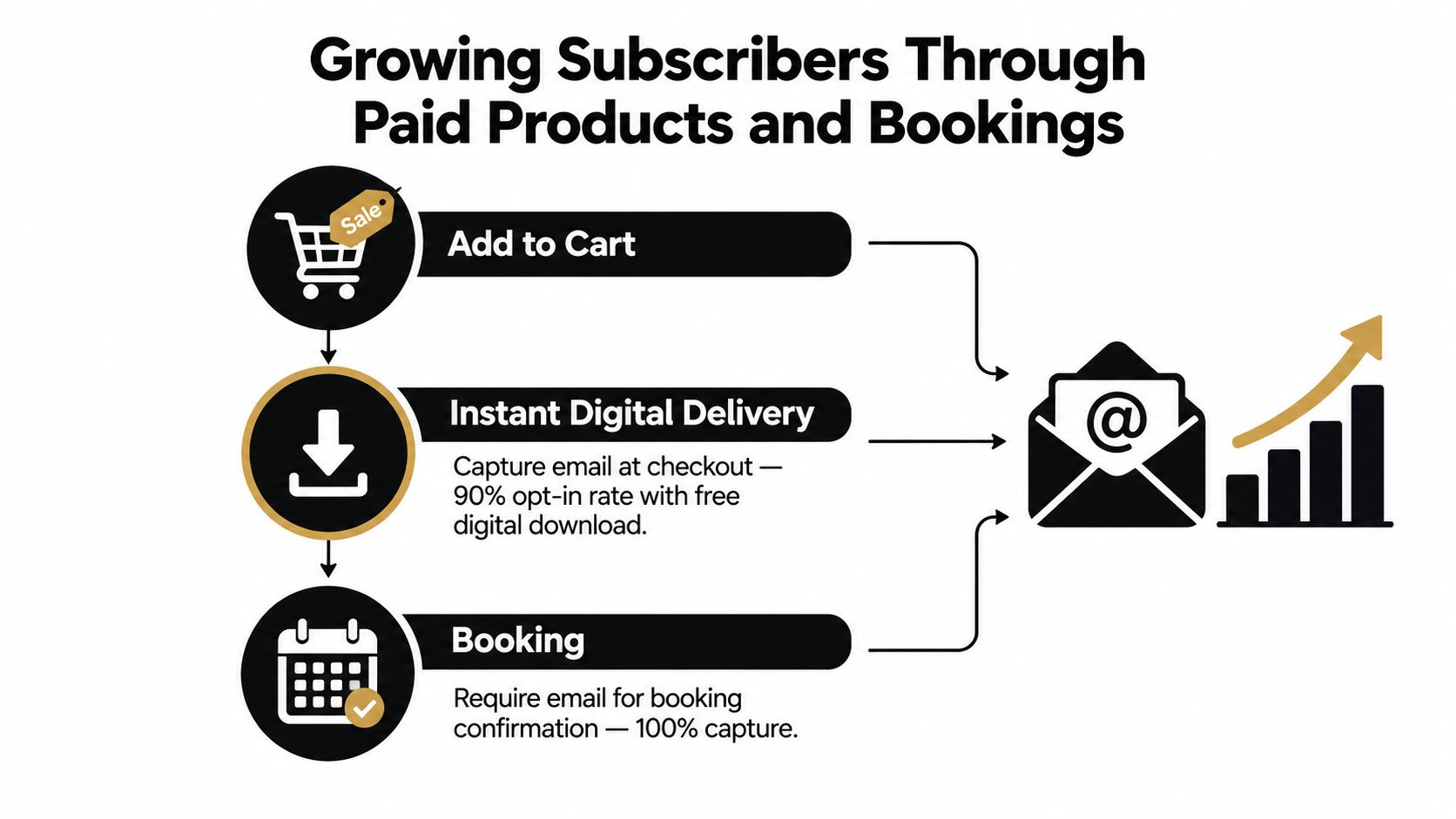
When someone buys a digital product or books time with you, they're already signaling intent. They want the thing, they trust you enough to take action, and they expect a confirmation. That's the right moment to capture permission cleanly and deepen the relationship.
Turn purchases into audience growth
A low-ticket digital product can do two jobs at once. It generates revenue and brings in subscribers who have already demonstrated stronger intent than a casual freebie claimer.
This works well for:
- Template packs that solve a recurring task
- Preset bundles tied to your content style
- Mini-guides that support a bigger service or course
- Private resources that complement your public content
The important distinction is consent. A buyer's transactional email is not the same as marketing permission. Ask clearly if they want updates, future drops, or related offers. Keep that choice explicit.
If you want examples of products that naturally support this kind of flow, browse these digital sales examples for creator stores. It helps to see how a small paid offer can sit beside a lead magnet instead of replacing it.
Use bookings as a qualification filter
Bookings produce a different kind of subscriber. These people usually have a more specific need and a shorter timeline.
Coaches, consultants, freelancers, and service creators can use booking flows to collect email at the point of scheduling, then follow with:
- Confirmation details
- Preparation instructions
- A post-call summary or next step
- A relevant offer or content path after the session
That sequence feels natural because the context is operational first. Then it becomes relational.
A paid booking isn't only revenue. It's a clean permission moment with built-in relevance.
Keep the store, checkout, and calendar connected
Most creators think of list growth and monetization as separate systems. They shouldn't be.
A better setup looks like this:
| Entry point | Primary action | Follow-up path |
|---|---|---|
| Link in bio | Free signup | Welcome email and segmented nurture |
| Product block | Purchase | Delivery email and optional marketing opt-in |
| Booking block | Schedule and pay | Confirmation, reminders, and tailored follow-up |
When the page, checkout, and calendar work together, every warm interaction can strengthen your owned audience instead of disappearing into disconnected tools.
Staying Compliant and Landing in the Inbox
A large list that doesn't trust you won't help much. Neither will a list you can't confidently prove opted in.
Privacy-safe list building has become more important because creators now collect subscribers from multiple sources, often across regions with different expectations around consent. Recent guidance summarized by The Stacc's email list building guide emphasizes double opt-in, clear privacy statements, one-click unsubscribes, and keeping records of how each subscriber opted in. The broader shift is to treat list growth as a system of consent, verification, and source tagging.
Make consent obvious
The easiest compliance mistake is blurring the line between delivery and marketing.
If someone downloads a file, books a call, or joins a waitlist, be clear about what they're agreeing to receive. Use plain wording. Don't hide permission inside checkout clutter or ambiguous checkbox copy.
Good consent practice usually includes:
- Clear purpose so subscribers know whether they're joining updates, offers, a newsletter, or a product waitlist
- Easy unsubscribe in every marketing email
- Source records showing where and how each subscriber opted in
- Double opt-in when list quality matters more than raw volume
A lot of creators resist double opt-in because they think it adds friction. Sometimes it does. It also removes bad addresses, fake signups, and casual low-intent entries. If your brand depends on deliverability and trust, that trade can be worth it.
Protect deliverability before problems appear
Inbox placement usually degrades. You don't notice it when a few disengaged people pile up. You notice it when launches feel flat.
Three habits matter more than fancy tactics:
Segment at signup
Tag people by source, magnet, product, or booking type so your follow-up matches why they joined.Send a strong welcome sequence
Teach subscribers what you send, how often you send it, and what they should click first.Prune disengaged contacts
Remove or suppress people who stopped interacting. Dead weight can drag down the whole list.
For creators sending from a branded address, this guide on setting up custom domain email for audience trust is useful because brand consistency affects how legitimate your messages feel before anyone opens them.
Clean list habits beat aggressive list growth every time.
Reduce compliance friction on the page itself
A simple page setup can also help. If your tools rely less on third-party tracking and unnecessary scripts, you often avoid extra privacy friction. For EU-based audiences in particular, cleaner data practices can reduce confusion at the point of signup.
The payoff isn't just legal comfort. It's better trust. People subscribe more readily when the page feels straightforward, transparent, and professional.
Measure What Matters and Keep Your List Growing
Most creators quit too early because they look at list size instead of system performance.
If you want to know how to build an email list that compounds, track the points where intent changes. Don't just count subscribers. Measure which page block, offer, and traffic source produced them.
Watch source quality, not just totals
A subscriber from an Instagram story mention may behave differently from one who joined after a product purchase or a consultation booking. Treat those as different channels.
Review your setup weekly and ask:
- Which source sends the warmest visitors
- Which lead magnet gets claimed but doesn't lead to engagement
- Which page block gets clicks but not signups
- Which traffic source produces buyers or replies later
For creators working from a single page, this article on email capture rate benchmarks and improvement ideas gives a good framework for interpreting page-level conversion instead of staring at total traffic.
Run small tests, not redesigns
Most improvements come from small changes made consistently. Rewrite the headline. Move the signup block higher. Change the lead magnet title. Replace a vague button label. Pair the email capture with a more relevant content widget.
Use a simple loop:
| Week | Focus | Example test |
|---|---|---|
| Week 1 | Offer | Change the freebie promise |
| Week 2 | Placement | Move signup above featured links |
| Week 3 | Message match | Align page copy with the exact social CTA |
| Week 4 | Quality | Compare engagement by signup source |
Opt-in benchmarks vary so widely by page type and mechanism. You don't need a full funnel rebuild every month. You need steady iteration on the page where people land.
Keep your audience portable
Always make sure you can export your contacts cleanly. A list only becomes an owned asset when you can move it, segment it, and use it outside the platform where it was captured.
That's the long game. Build one page that earns the click. Capture the right subscriber. Learn which blocks convert. Refine weekly. Over time, the list grows because the system improves, not because you posted more often.
If you want one page to handle email capture, digital products, and paid bookings together, taap.bio is built for that exact workflow. You can set up a mobile-first creator store, collect subscribers, and keep the flow on-page instead of stitching together separate bio links, checkout tools, and schedulers.


