

You’re probably in the same spot as most first-time sellers. You’ve built an audience on Instagram, TikTok, YouTube, or X, people keep asking for your template, guide, preset, workshop, or advice, and your current link-in-bio page feels too small for what you sell.
That’s the core problem with the old model. A static list of links works when you only need a contact card. It breaks when you need a digital product store. The moment you start selling more than one thing, or you want buyers to trust you before they click, layout starts affecting revenue.
A proper storefront does more than hold links. It shows your brand, proves your work is real, gives people context, and moves them from curiosity to checkout without making them hop across five platforms. That matters because the market is already big and still expanding. The global digital products market reached $9.8 billion in 2025 and is projected to reach $18.3 billion by 2033, a 9.60% compound annual growth rate, according to digital product sales statistics from Swell.
Table of contents
Lay the Groundwork for Your Digital Storefront
The first version of your store doesn’t need to be complicated. It needs to be clear. Buyers decide fast whether your page looks like a real business or a loose collection of links, so the setup work matters more than most creators think.
Start with your identity
Pick a username that matches the name people already know. If your audience knows you as a designer, producer, coach, or educator under one handle, keep that handle consistent. Friction starts before checkout. It starts when people wonder if they’ve landed on the right page.
Your profile image should also do one job well. It should be easy to recognize at a small size. That usually means a clean headshot, a recognizable logo, or a consistent brand mark. Tiny details disappear on mobile.
Then write a bio that answers three questions:
- Who you help: Name the audience directly.
- What you sell: Say ebook, presets, templates, coaching, workshops, or courses.
- Why trust you: Mention your discipline, portfolio, or the kind of outcome people come to you for.
If you’re still narrowing your offer, this guide to what digital downloads are and how creators package them can help you define what belongs in your store.
Practical rule: If a stranger landed on your page with no context, they should understand your niche and your offer in a few seconds.
Build the basecamp, not just the page
Inside your dashboard, treat your main page like your storefront homepage, not a storage drawer. That means setting up a few essentials before you start adding products.
Use this order:
Brand settings first
Set your colors, typography, and background early. If you leave design decisions until the end, your page turns into a patchwork.Primary call to action second Choose the action you want your audience to take. Buy a product, book a call, join your email list, or watch a demo. One primary action keeps the page focused.
Core sections third
Add the building blocks for your intro, featured offer, proof, supporting content, and contact options.Only then add extras
A cluttered first store usually comes from adding everything at once. Start lean.
Think like a buyer
A strong foundation does two things. It helps people trust you, and it helps you stay consistent as you grow. That matters because most creators don’t stay with one offer forever. They add bundles, bookings, memberships, and seasonal launches over time.
A generic link page usually looks temporary. A storefront with a clear identity looks intentional. Buyers feel that difference immediately.
Design a Store That Reflects Your Brand
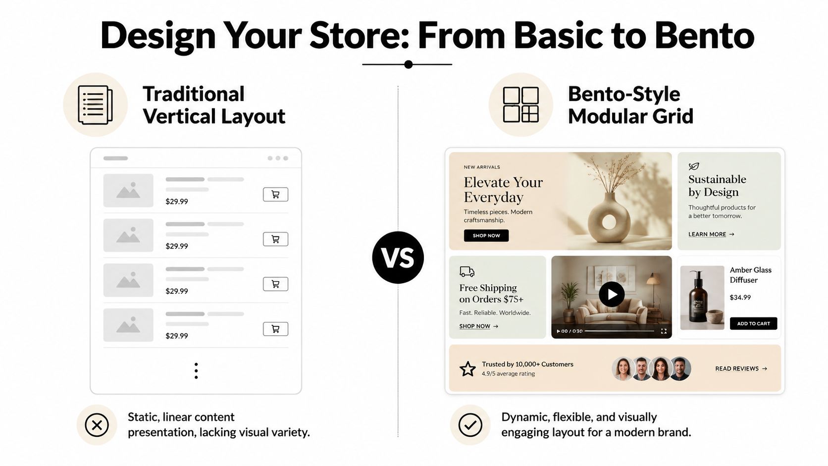
Design isn’t decoration in a digital product store. It’s how you tell visitors what matters first, what comes next, and what’s worth paying attention to. That’s why the old vertical stack feels dated. It gives every item the same weight, even when your business doesn’t.
Use layout to create hierarchy
A modular grid works because it lets you make decisions visually. A flagship course can be large. A lead magnet can be smaller. A testimonial, a portfolio sample, and a booking block can sit beside each other without competing the same way a long list does.
Here’s the practical difference:
| Layout style | What it signals | Where it breaks |
|---|---|---|
| Vertical list | Simple directory | Weak for multi-offer brands |
| Modular grid | Curated storefront | Requires deliberate arrangement |
When every block is resizable, you can shape attention instead of hoping people scroll far enough.
Match the page to your business model
Different creators need different storefront patterns. The design should reflect how you make money.
Consider these examples:
Artist or illustrator
Lead with a large visual block, then place prints, digital brushes, commissions, and process content around it. The art has to sell the product before the checkout does.Coach or consultant
Put your paid session or application block near the top, then support it with a short intro, client proof, and a smaller product like a workbook or starter guide.Course creator
Feature one main offer, then use supporting blocks for a lesson preview, student outcomes, FAQs, and a lower-ticket entry point.
A good storefront feels edited. Visitors should feel guided, not confronted by options.
Keep your visual system tight
Most pages look amateur for predictable reasons. Too many colors. Too many font styles. Mismatched image crops. Repeated calls to action that all sound different.
A tighter system usually wins:
- Use one accent color: Reserve it for buttons, prices, or featured blocks.
- Repeat one image treatment: Keep thumbnails and covers consistent.
- Write shorter block titles: Long labels make even good layouts feel crowded.
- Limit your priorities: Feature one main product, one secondary path, and one trust element.
Design for scanning, not reading
People don’t read storefronts in order. They scan. They look for clues. Your job is to make the next step obvious.
That’s where block sizing matters. Bigger blocks say “start here.” Smaller blocks say “explore this if relevant.” Horizontal blocks are useful for proof and summaries. Square blocks often work better for products, media, and visual categories.
If you’ve ever seen a creator page that looked polished but somehow still felt easy to use, that’s usually what happened. The layout was doing selling work unobtrusively.
Bring Your Page to Life with Smart Widgets
Static link pages aren’t enough anymore when your audience already knows you through content. If someone follows you for your videos, music, designs, code, or commentary, they expect to experience that work on the page itself, not just click away to find it elsewhere.
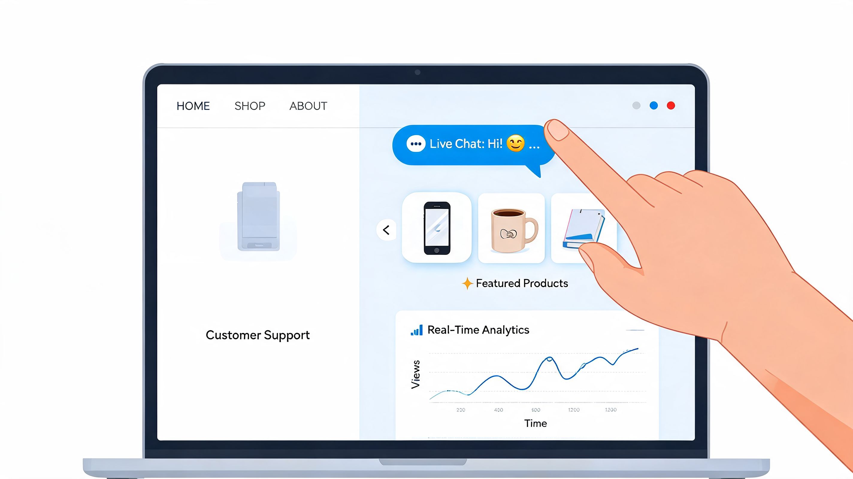
That expectation has business consequences. Buyers convert 2-3x higher when they can engage with live content without leaving the page, and searches for “live feed bio link tools” are up +150% year over year, according to the source material behind this creator storefront trend analysis.
Why live content beats static links
A static page asks for trust before giving proof. A live storefront does the opposite. It shows your latest YouTube upload, current Spotify track, recent TikTok, GitHub activity, or portfolio feed right where the buying decision happens.
That changes the feel of the page in a few ways:
- It reduces skepticism: Visitors can see that your work is active and current.
- It keeps attention on your page: They engage without bouncing to another app.
- It strengthens brand memory: Your store feels like an extension of your content, not a detached sales page.
If you want examples of how embedded elements shape behavior, this roundup of website widgets for creators and online sellers is useful.
Match the widget to the offer
Not every widget belongs on every page. The best setup depends on what you sell.
YouTube and video-led education
If you sell courses, templates, or creator resources, a video block works well near your featured product. Let people watch your teaching style before they buy. A talking-head sales page with no content proof asks for too much.
Spotify and music products
For musicians, producers, and vocal coaches, inline playback matters. If you sell stems, presets, lessons, or session bookings, your music should be part of the storefront experience, not hidden behind an external platform.
TikTok and short-form proof
If your audience discovered you through short-form content, use that energy. A live feed helps the page feel current, and it lets new visitors understand your tone quickly.
GitHub, Dribbble, or portfolio embeds
Freelancers and developers often undersell trust. Their work is the pitch. A live portfolio or activity widget can do more than a polished headline ever will.
A storefront becomes persuasive when visitors can verify your work without leaving it.
Don’t overload the page
Live content is powerful, but too much of it creates noise. Pick the media that supports the sale. A coach probably doesn’t need five social feeds. A designer might not need a booking calendar above the portfolio. Every widget should answer one question: does this help a buyer trust the offer faster?
That’s the contrast with the outdated list-of-links model. The old page says, “Go somewhere else for context.” A modern digital product store keeps context, proof, and action in one place.
Integrate Products and Payments Seamlessly
Design gets attention. Checkout gets paid, but many creators lose momentum here because they assemble a store from separate tools that don’t feel connected. The page looks fine, but the buying path feels patched together.
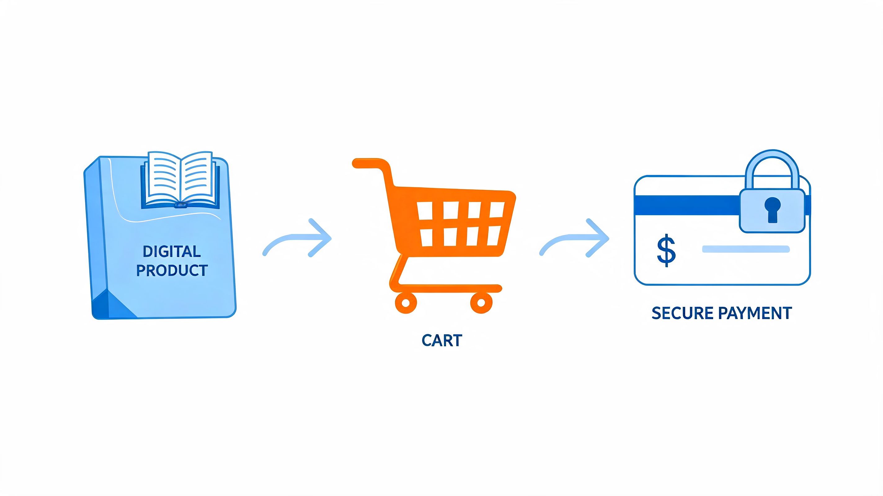
That matters because hybrid platforms that let creators stack digital products and coaching bookings on one page can boost revenue 3x by streamlining the customer experience, according to this analysis of digital product niches and hybrid selling models.
Choose the right selling path
You usually have two practical options.
Native checkout
Use native checkout when you want the shortest path from interest to purchase. This works well for ebooks, templates, guides, presets, mini-courses, downloadable packs, and other products with a straightforward transaction.
Native checkout is usually the cleaner choice when:
- You sell direct downloads
- You want fewer clicks
- You don’t need a separate external storefront
- You want the page and payment flow to feel unified
External product or course links
Use external links when your product already lives elsewhere, or when the delivery experience requires a specialized platform. That could mean an Etsy listing, a full course platform, a membership tool, or a custom client portal.
This path makes sense when:
- Your catalog already exists elsewhere
- You need platform-specific delivery
- You’re testing demand before migrating products
If you’re comparing options, this overview of platforms for selling digital products can help clarify the trade-offs.
Add one product the right way
For a first launch, keep it simple.
Create the product title
Name it for the outcome, not the file type. “Instagram Reel Hook Pack” sells better than “50-page PDF.”Write a short description
Focus on what the buyer gets, who it’s for, and when they should use it.Upload the asset or connect delivery
Make the file naming and organization clean on your side. That saves support headaches later.Set pricing and button text
The button should reflect the action. “Get the template” often reads better than a vague “Learn more.”Place the block high enough to matter
If the product is your main offer, don’t hide it beneath social links and filler content.
Combine products with bookings
A hybrid page offers greater value than a standard store because many creators don’t just sell files; they sell expertise. A producer might sell sample packs and offer mix feedback. A coach might sell a workbook and a paid call. A video creator might sell prompt packs and custom consulting.
If you create visual media products, a niche resource like cinematic AI kissing clips can also show how specialized assets are packaged and presented commercially. The lesson isn’t the category itself. It’s the clarity of the offer and the directness of the path to purchase.
Give each monetization type a distinct role:
- Digital product: Fast purchase, low friction
- Booking offer: Higher trust, higher context
- Email capture: Follow-up for visitors who aren’t ready yet
A quick walkthrough can make the flow easier to picture:
When these pieces live together well, your page stops acting like a link hub and starts functioning like a business.
Optimize for Visibility and Higher Conversions
A digital product store can look polished and still underperform. Usually the problem sits in one of three places. People can’t find it, the mobile experience is weak, or the path to purchase asks for too much work.
The upside is that these are fixable. E-commerce conversion rates average 2-3%, top performers exceed 5%, optimized checkout can reduce abandonment by up to 70%, and product videos can lift conversion rates by 20-30%, according to e-commerce conversion guidance from Zen Agency.
Tighten your search presentation
Search visibility starts with the parts most creators rush through. Your page title, meta description, and on-page wording affect whether someone clicks when your store appears in search results.
Use your primary offer and audience in the title. Keep descriptions concrete. “Templates for freelance designers” is stronger than “creative resources for success.” Specific language attracts better clicks because it filters for intent.
If your click-through from social or search feels weak, this guide on improving click-through rates for creator pages is a useful next step.
Build mobile first
A lot of creators design on desktop and only check mobile at the end. That’s backward. Product blocks that look balanced on a wide screen often become awkward, repetitive, or too long on a phone.
Audit your mobile layout separately and look for three issues:
- Top-heavy intros: A giant bio pushes products too far down.
- Crowded media: Too many visual blocks stack into noise.
- Weak button rhythm: Calls to action get buried between less important elements.
Mobile visitors are impatient. If they have to hunt for the offer, they won’t.
A strong mobile store feels shorter, sharper, and more decisive than the desktop version.
Improve conversion with simple changes
Conversion work isn’t mysterious. It usually comes down to helping the right person feel confident enough to act.
Use this checklist:
- Put your main offer near the top: Don’t make buyers scroll to discover what you sell.
- Add video where trust matters: For education, consulting, and demonstrations, moving visuals can close uncertainty faster than text.
- Cut unnecessary steps: Every extra click creates another chance to leave.
- Make block order intentional: Proof should support the offer, not sit disconnected from it.
The pages that convert well usually feel obvious in hindsight. The offer is clear, the proof is nearby, and the next click makes sense.
Track Your Growth with Analytics
Creators often look at traffic first because it’s visible. The better question is what that traffic is worth. A digital product store becomes easier to improve when you connect page behavior to business decisions instead of treating analytics like a scoreboard.
The metric that changes your thinking is Customer Lifetime Value. High-growth creators keep acquisition cost below 30% of CLV, and creators who layer in retention-focused offers like coaching or memberships can push CLV above $1,000 per customer, based on this breakdown of ROI and digital product success measurement.
Read the signals that matter
You don’t need a huge dashboard. You need a useful one.
Track these signals and tie each to an action:
| If you see this | It usually means | What to do next |
|---|---|---|
| High page views, low product clicks | Your offer placement or messaging is weak | Rewrite headlines and move the product block higher |
| Strong clicks, weak sales | The sales path has friction | Audit pricing, checkout flow, and product clarity |
| One content block gets most engagement | That topic is resonating | Build a related product, bundle, or lead magnet |
| Bookings outperform products | Buyers want context and access | Add a diagnostic offer, mini-product, or follow-up sequence |
Use source data to guide product decisions
A smart store owner doesn’t just ask where traffic came from. They ask which source brings buyers who stick. That’s the difference between vanity traffic and profitable traffic.
For creators who are still refining how they evaluate channel performance, this resource on actionable metrics for social media is helpful because it pushes beyond surface engagement.
You should also compare storefront behavior with your broader creator ecosystem. A page-level dashboard tells you what happened on the store. A cross-channel view helps explain why. Tools built for social media dashboard workflows can make that connection easier when you’re balancing content, traffic sources, and sales.
Build a feedback loop
The most useful analytics habit is simple. If a block gets attention, strengthen it. If a product gets ignored, reposition it or rewrite it. If buyers keep coming in through one content angle, make more offers around that angle.
Keep this lens: Don’t optimize for more clicks alone. Optimize for better customers, stronger retention, and clearer paths into your next offer.
That’s how a small store grows up. Not by cramming in more products, but by learning which content earns trust, which offers convert, and which buyers come back.
Your store doesn’t need to look like everyone else’s link page. If you want one page that can showcase your content, sell digital products, collect emails, and take bookings in a visual storefront format, explore taap.bio.


