You have followers, saved ideas, and a Notion page full of products you'll “launch soon.” Yet when someone asks where to buy, you send them through a bio link, a landing page, a payment screen, and a separate delivery system. By the time they reach the final form, the buying impulse has disappeared.
That's why most creators don't need another product idea. They need a shorter path from interest to payment to access. To sell digital products consistently, build the offer around a single-page storefront, validate demand before production, and treat every checkout step as part of the product.
Table of contents
Why Most Creators Stall Before Their First Sale
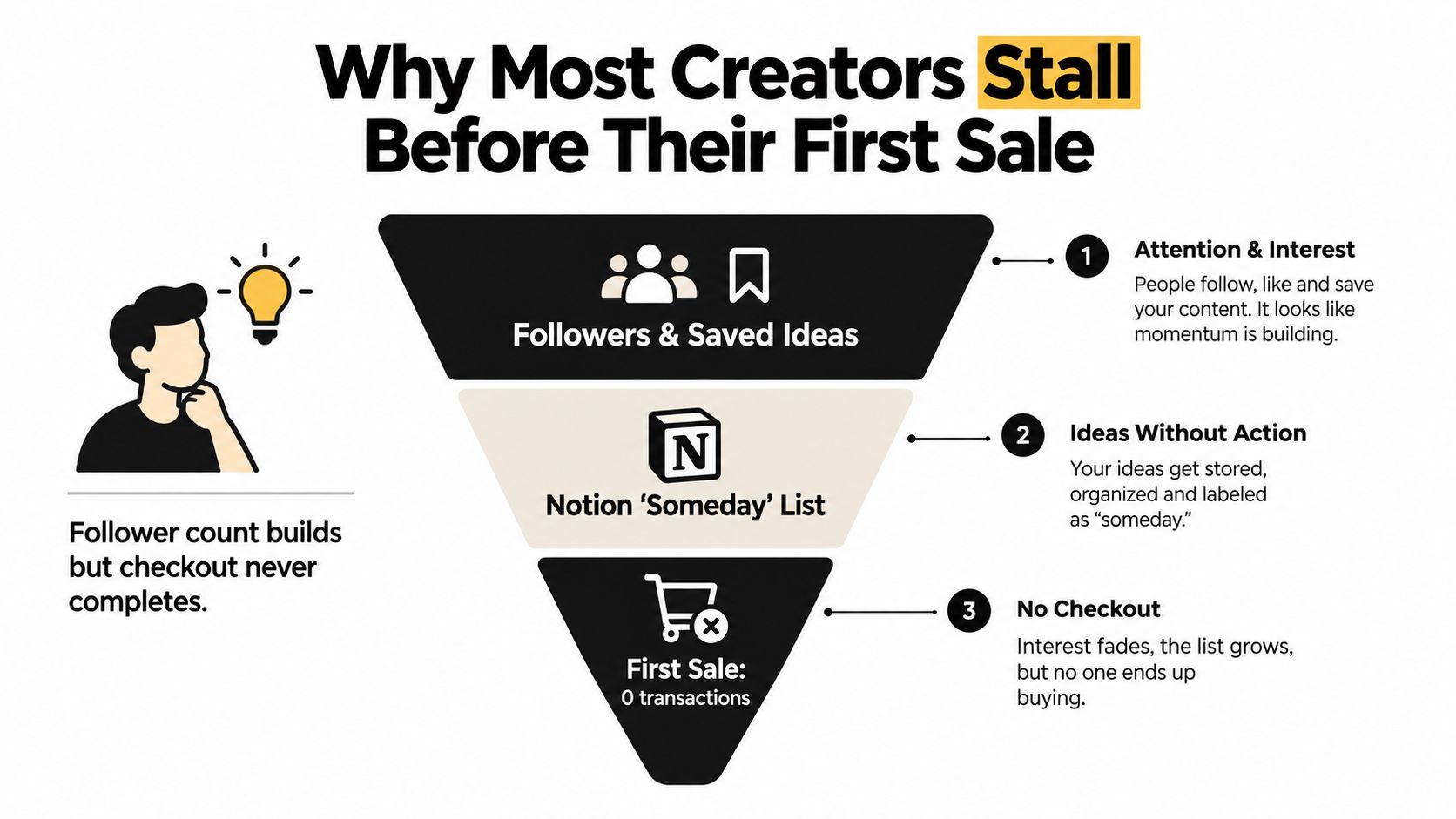
A creator can have a loyal audience and still have no buyers. Their content generates comments, saves, and direct messages, but the products remain trapped in a Notion list called “Someday.” The creator keeps refining the logo, recording bonus lessons, or comparing platforms while the audience has no simple way to purchase.
The bottleneck usually sits between the bio link and the checkout button. A visitor clicks the profile link, chooses a landing page, opens a payment link, creates an account, waits for an email, and searches for the promised download. Every extra transition creates another opportunity to leave.
Baymard's aggregate research places cart abandonment at 70.19% across 49 studies, while Stripe reports mobile abandonment at 76.98% compared with 64.78% on desktop. Those figures come from cart abandonment research and checkout benchmarks, and they point to a practical conclusion: mobile checkout deserves attention before you spend more time driving traffic.
The broken path is easy to recognize
A typical stalled funnel looks like this:
- Attention: A follower sees a tutorial and wants the template behind it.
- Intent: They visit the creator's profile and click a general link page.
- Confusion: Several buttons compete with the product, booking link, newsletter, and social profiles.
- Friction: The buyer lands on a separate sales page, then another checkout page.
- Abandonment: The customer loses context, encounters a form problem, or decides to return later.
A single-page storefront reverses that pattern. The creator's identity, flagship product, proof, checkout, delivery, booking option, and email capture live in one deliberate sequence. The buyer can understand the offer and complete the transaction without being sent across a chain of unrelated tools.
Practical rule: If a buyer needs instructions to find the purchase button, the storefront is doing too much.
You can still refine your positioning with a resource such as how to find your niche, but don't confuse niche research with launch progress. Choose a useful offer, place it in front of the people already asking for it, and make the transaction almost boringly easy.
Choosing a Product Type That Already Has Demand
Your product should begin with a buying signal, then fit a checkout flow that makes the decision easy. Review saves, repeated questions, search messages, and requests for help. Those actions show what followers already want, which gives you a stronger starting point than inventing an offer in isolation.
| Product Type | Demand Signal | Shortest Validating Offer |
|---|---|---|
| Template or preset library | Followers save tutorials and ask for the resources used | A focused pack solving one recurring task |
| Paid community or membership | People repeat the same questions in messages and comments | A small recurring group with a defined discussion theme |
| One-to-one booking or audit | Followers ask how to work directly with you | A paid session with a specific outcome |
| Mini-course or workshop | Long-form posts already teach a sequence of steps | A live or recorded lesson focused on one transformation |
A template library fits an audience that wants to copy a process. If followers save your content about content calendars, sell a usable calendar system rather than a broad “creator toolkit.” Include the assets required to complete one job. Then watch which files buyers use, ignore, and request next. Put the focused offer, proof, and checkout on one storefront page so the product choice stays connected to the purchase.
A paid community answers an ongoing need, but repeated questions alone do not justify a large membership. Give the group one job, such as feedback on weekly drafts or practical implementation support. The first offer should be the smallest environment that delivers that interaction. Keep its promise specific enough for a buyer to understand before paying.
For experts receiving “can you review this?” messages, a one-to-one audit often makes the cleanest first sale. Define the buyer's input, the session format, and the deliverable. State whether they receive a recording, written recommendations, a revised document, or a decision framework. A single booking button on the storefront should lead directly to that defined outcome.
A mini-course or workshop suits educators whose existing content already works like lesson one. Sell one focused session before recording a complete curriculum. Use participant questions to decide what deserves expansion. The creator and digital-product economy includes courses, templates, written guides, software tools, and memberships, with online courses identified as a leading category in the digital product market breakdown. Compare formats and revenue potential in our guide to the most profitable digital products before committing to one offer.
Publish the narrow offer and ask for a commitment before building the full product. A pre-sale tests the promise, urgency, and willingness to pay together. Review a breakdown of pre-selling completion rates while deciding whether your offer should be sold before production.
Choose one primary offer and one backup offer. Each launch adds a checkout decision, a support burden, and another demand on your audience's attention. Keep the storefront focused enough that a buyer knows what to buy first.
Packaging and Pricing for Real Buyers
Buyers don't purchase a file because it exists. They purchase a shorter route to an outcome. Your package should make that outcome obvious before the customer studies the contents.
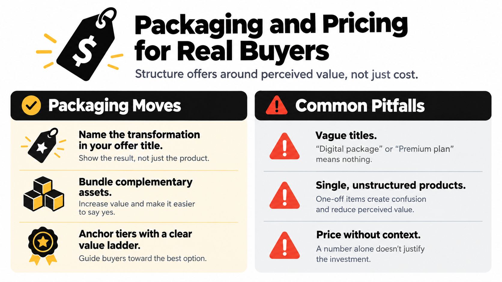
Start with the title. “Social Media Templates” describes an object. “A Weekly Content System for Solo Consultants” describes a use case and a transformation. The second title gives the buyer a reason to connect the product to a current problem.
Next, add useful continuity. A template can include an update window, implementation notes, or a follow-up Q&A. A workshop can include a replay and a worksheet. A booking can include a concise written action plan. Ongoing utility makes the purchase feel less like a static download and more like a supported solution.
Build a visible value ladder
Use a standard option and a pro option when the products genuinely serve different needs. The standard tier can provide the core asset. The pro tier can add implementation support, expanded formats, updates, or a private session. Don't create artificial differences that make the buyer decode a feature list.
A founder rate can reward early buyers while giving you a clear reason to change the offer later. A bonus stack can add visible value without changing the core product, provided each bonus helps the same buyer reach the stated outcome.
Avoid publishing arbitrary prices based on what another creator charges. A template, membership, audit, and course carry different levels of access and support, so use a low-commitment entry offer, a core offer, and a higher-touch option as your starting architecture. Let the checkout button test actual buying behavior. Polls measure opinions. Payments measure commitment.
For a deeper framework on matching offer structure to perceived value, use this guide to digital product pricing strategy. Clear pricing also reduces the mental work required before purchase, and how pricing transparency drives conversions offers useful context for making the offer and its conditions easier to understand.
Write the price beside the outcome, inclusions, access terms, and refund or replacement policy. Don't force buyers to open a separate FAQ to discover whether updates, support, or commercial usage are included.
Setting Up Instant Delivery and Paid Bookings
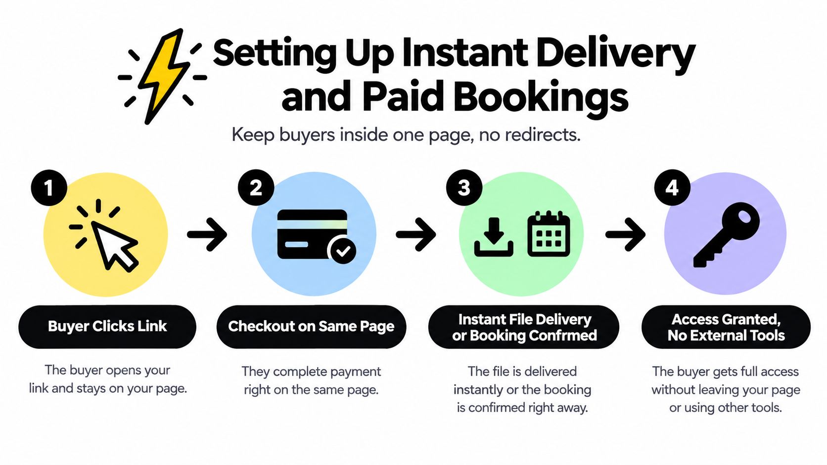
The delivery system should preserve the momentum created by the purchase. A buyer who pays for a PDF, ZIP archive, or video file should see the access path immediately, not a vague message promising that someone will follow up.
Attach the file directly to the product record and define the access rules before publishing. Use secure signed download links that can expire after a controlled number of uses, especially for files that contain paid resources or private client material. The order-confirmation email should place the download URL in the main body, where the buyer can see it without opening a buried attachment.
A paid booking needs the same continuity. Keep the scheduler on the storefront and connect the appointment to the same product record that contains the price. The calendar should use the creator's availability and the buyer's time zone, while the payment flow should support either a deposit or full payment through the processor used for digital goods.
Plan for failure before launch
Digital fulfillment fails in ordinary ways. An email gets filtered, a customer loses the receipt, a file upload becomes unavailable, or a payment succeeds while the delivery event doesn't complete. Your recovery path should be visible and simple.
- Receipt recovery: Include a resend link so buyers can retrieve their order without contacting you first.
- Automated retry: Configure the system to attempt delivery again after a failed event.
- Manual fulfillment: Keep a support process for sending access when automation can't resolve the issue.
- Booking confirmation: Send the calendar invitation and reminders with the correct time zone.
- Payment status: Don't grant continued access when the payment has failed or been reversed.
The storefront must contain the offer, price, checkout, and immediate next step. Connected tools can handle storage, calendar synchronization, or support, but they shouldn't make the buyer reconstruct the purchase journey.
Use instant digital delivery as the operating standard: payment should lead directly to access, and a booking should lead directly to a confirmed appointment.
Email Capture and Analytics That Build a Business
A checkout page shouldn't only collect money. It should also help you build an owned audience and identify where buyers lose confidence.
Place a lightweight email opt-in above the purchase button for visitors who aren't ready. The offer should explain what they'll receive rather than just say “join my newsletter.” Warm visitors can see a stronger lead magnet, while existing customers can see an order bump, waitlist, or related offer after the main purchase.
Don't cover the checkout with pop-ups. The page should answer the buyer's immediate questions first: what is included, who it's for, how access works, and what happens after payment. The email capture supports the sale, but it shouldn't compete with it.
Track events that change decisions
Solo creators rarely need a maze of dashboards. They need a small set of signals that connects traffic to revenue and support work.
| Event | What It Signals | Action to Take |
|---|---|---|
| Checkout session by source | Which channel produces buying intent | Prioritize content and promotion from productive sources |
| Form-step drop-off | Where the purchase path creates resistance | Remove fields, clarify errors, or change the payment layout |
| Refund by product | Whether the promise matches the delivered experience | Rewrite the offer, improve onboarding, or change the product |
| Repeat buyer by source | Which audience brings durable customer value | Build follow-up offers for that source |
Start with three numbers: checkout completion, refunds, and repeat purchases. The first shows whether the page converts intent. The second exposes expectation or delivery problems. The third tells you whether the product creates a reason to return.
Checkout research cited earlier notes that large ecommerce sites can have 32 checkout improvements available and may gain up to a 35% conversion-rate lift from better design alone, according to the checkout benchmark source. For a creator, that supports a simple priority order: remove unnecessary fields, improve payment choice, and fix error handling before adding another analytics tool.
If a metric doesn't change a decision this week, remove it from the dashboard. A small, readable report beats a stack of disconnected charts you never act on.
Optimizing Your Link-in-Bio Storefront for Conversions
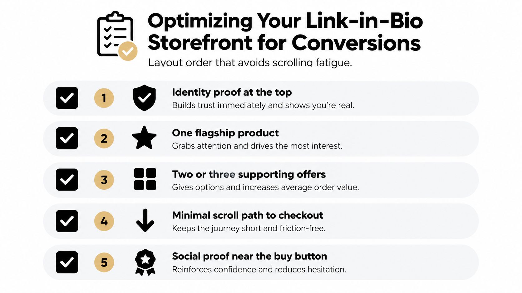
A link-in-bio storefront should feel like a short sales page, not a directory. Put the information in the order a mobile visitor needs it.
Start with identity proof. Show your name, face, role, and a concise statement of who you help. Place one flagship product next, followed by two or three supporting offers. Add a booking block for higher-touch help, then finish with email capture for visitors who need more time.
Make trust visible at the decision point
A buyer shouldn't have to hunt for reassurance. Place the refund or replacement policy near the offer. Add a recent testimonial or purchase note with a clear date where appropriate. Put the security indicator close to the payment field, not at the bottom of the page.
Your product card should answer four questions immediately:
- Who is it for: Name the audience in plain language.
- What changes: Describe the practical result, not only the file format.
- What arrives: List the files, access, support, and update terms.
- What happens next: Explain delivery or booking confirmation after payment.
Mobile friction deserves its own review. Remove fields that aren't necessary, support autofill, and display digital-wallet buttons when your processor allows them. Open the page on your own phone, tap the bio link, and complete a test order without switching applications. Any confusing pause in that path is a conversion problem, not a design detail.
Keep abandonment recovery restrained. An exit-intent email can invite a visitor to save the offer. A one-click reminder can return a buyer to the unfinished checkout. A follow-up message after a short delay can answer the specific objection that prevented purchase. Don't send a generic sequence that pretends the customer completed an order.
For creators weighing document resources or downloadable sales material, PDFWix for ecommerce can provide useful context on presenting PDF-based products in an online commerce environment. The wider storefront approach is also covered in social media storefront guidance.
Change one element per week. Test the headline, offer order, proof placement, or checkout layout separately, then compare completed orders rather than judging the page by how polished it looks.
Privacy, Fulfillment, and a Final Launch Checklist
The unglamorous details determine whether a first buyer becomes a repeat customer. Write a plain-language data notice beside the checkout that explains what you collect, such as an email address, payment metadata, and country-level location, and why you need it. Use separate opt-in language for follow-up marketing so a transaction does not inadvertently become a marketing subscription.
Fulfillment needs the same clarity. Keep redundant access paths for paid files, use signed URLs for protected downloads, and provide email-based re-delivery when a customer loses the receipt. Paid bookings should trigger a calendar confirmation and time-zone-correct reminders. If payment fails, define when access is suspended and how the customer can restore it.
Launch day checks
- Privacy: Confirm the data notice, marketing consent, refund terms, and support contact are visible.
- Delivery: Place a real test order and verify the receipt, download path, and recovery process.
- Bookings: Test availability, payment status, calendar invitations, and reminder timing.
- Analytics: Separate creator-visible metrics from buyer behavior. Don't turn visits into sales or interest into proof of demand.
- Support: Prepare a manual process for failed files, duplicate payments, and booking changes.
Run the same operating review every week. Check refund rate, delivery failure rate, list growth, and repeat-buyer share. These measures tell you whether the storefront delivers what it promises, whether the audience is becoming an owned asset, and whether buyers see enough value to return.
A digital product business becomes durable when the launch stops depending on heroic effort. Keep the page clear, the checkout short, the delivery reliable, and the reporting honest. Then improve the one point in the journey that costs you the most completed purchases.
taap.bio gives creators a single-page storefront for selling digital files, taking paid bookings, capturing email subscribers, and reviewing on-page analytics. Build your first focused offer, connect it to a simple checkout, and visit taap.bio to turn your link in bio into a working sales system.