Your bio link probably looks functional. It may even look clean. But if it's still a stack of buttons sending people away as fast as possible, it's not doing enough.
Creators, coaches, musicians, and solo brands usually hit the same wall at the same time. Their audience is growing, their offers are multiplying, and that one little profile link has to handle everything: content discovery, trust-building, email capture, bookings, and sales. A basic page can hold links. A good link in bio service should help you turn attention into action.
Table of contents
Your Link in Bio Is More Than Just a List of Links
A common scenario looks like this. Someone lands on your page from Instagram after watching a strong Reel or Story. They're interested for a moment, then they hit a bland page with five identical buttons, no context, no brand feel, and no obvious next step. They bounce, not because your offer is weak, but because the page feels generic.
That's why this matters more than many creators realize. In 2025, 31 million Instagram users utilize link-in-bio tools. Linktree powers 24.7 million of these profiles, capturing a 79.95% market share, according to Influencers Club's link-in-bio market analysis. That scale exists because Instagram's one-link restriction forced creators to treat a single URL as prime digital real estate.
If you're building a personal brand, that one page often becomes the first business touchpoint after social content. For authors, this is the same shift discussed in how authors turn followers into fans. The audience doesn't need more links. They need a clear path from interest to relationship.
A useful starting point is understanding what this page is supposed to do in the first place. This quick explainer on link in bio meaning is helpful if you've only treated it as a social media utility instead of a business asset.
A weak bio page creates friction at the exact moment your audience is most ready to act.
The practical takeaway is simple. Your bio link shouldn't behave like a directory. It should behave like a storefront. It should show who you are, what you offer, and what a visitor should do next.
The Evolution from Link Hub to Creator Hub
The first generation of link in bio tools solved one narrow problem. Instagram gave users one clickable URL, so creators used third-party pages to stack multiple destinations behind it. That was enough for a while.
It isn't enough now.
By 2022, Linktree already accounted for 15.73% of all bio links on Instagram, and later data showed that organized, visual pages achieve 34% better conversion rates than single static links, with average click-through rates reaching 4.8% for fitness creators, based on Business Insider's reporting on bio link usage and performance. That matters because it shifts the conversation from access to performance. The page design itself affects revenue.
What changed
Creators stopped needing a list of destinations and started needing one controlled environment where content, offers, and identity work together.
A modern creator page usually has to do several jobs at once:
- Show current priorities like a launch, new video, waitlist, or booking calendar
- Reflect brand taste so the page feels like an extension of the creator, not the software
- Reduce drop-off by keeping people engaged with embeds, previews, and context
- Support monetization through direct product sales, lead capture, or service bookings
That's why older list-style tools often feel cramped once a creator's business matures. They were built for traffic routing, not audience conversion.
What a modern standard looks like
The stronger tools now act more like mini creator hubs. Instead of asking visitors to choose from a pile of links, they guide the visit.
For example, a creator may want one page to include a featured offer, a lead magnet, recent content, testimonials, a booking option, and a small store. That setup behaves less like a menu and more like a landing page.
If you've seen the “bento” style layout become popular, that's part of this evolution. This overview of what is bento captures why creators moved toward more visual block-based pages instead of plain vertical lists.
Practical rule: If your page makes every destination look equally important, it isn't helping visitors decide.
The strongest shift here is strategic. A link in bio service is no longer just a workaround for social platforms. It's part of your monetization stack. That changes what you should evaluate, and what you should ignore.
Choosing a Service That Actually Grows Your Business
A lot of comparisons still judge link in bio tools by surface features. How many buttons can you add. Whether you can change the background. Whether it has icons. Those things matter a little, but they don't answer the only question that counts: does this page help you make money and build a stronger brand?
Start with monetization, not layout
If your page can't support the way you sell, it's the wrong tool. For some creators, that means direct digital product sales. For others, it means paid consults, discovery calls, applications, or email capture before a launch.
The mistake is choosing a tool because it looks attractive in a template gallery, then duct-taping the business model around it.
A more useful filter is this:
- If you sell products, the page should make products visible and easy to buy.
- If you sell time, the booking path should be obvious and low-friction.
- If you monetize attention, the page should help visitors move from content to owned channels like email.
For creators selling downloads, workshops, or templates, this guide to the best platforms for selling digital products is a practical companion because the storefront matters as much as the checkout.
Analytics should answer business questions
A strong link in bio service doesn't stop at click counts. According to Inflowave's analytics guide for link-in-bio pages, effective analytics must track revenue per visitor and conversion rates by traffic source. Purchase conversions benchmark at 2-5%, while free signups can reach 10-20%. Without that layer, you can't tell whether Instagram brings buyers, whether TikTok brings email subscribers, or whether one block on your page is wasting attention.
That's the fundamental divide between vanity metrics and useful metrics.
Ask these questions before you commit:
| What to evaluate | Why it matters |
|---|---|
| Traffic source tracking | Shows which platform sends visitors who actually convert |
| Revenue attribution | Connects page activity to sales, not just taps |
| Conversion type separation | Distinguishes clicks from signups, purchases, and bookings |
| Visitor behavior | Helps you spot where people stall or leave |
Don't optimize for the most-clicked button if the second-most-clicked block produces the sale.
If you manage campaigns across several platforms, pairing your page data with a tool for managing multiple social accounts can make your publishing workflow cleaner. The point isn't convenience alone. It's keeping content distribution and conversion tracking connected.
Brand control is not cosmetic
Most creators understate how much design affects trust. Fonts, spacing, thumbnails, embeds, hierarchy, and mobile layout all change whether a page feels credible or disposable.
A generic page tells visitors they've landed on borrowed space. A branded page tells them they've entered your business.
That doesn't mean every page should be flashy. It means every element should support a clear next action and a recognizable identity.
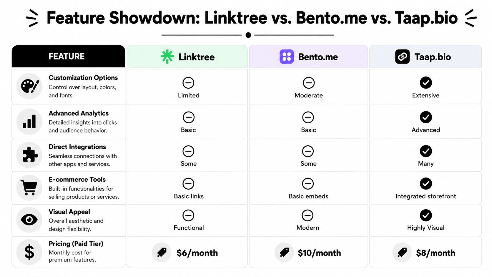
Feature Showdown Linktree vs Bento vs Taap.bio
Before getting into the detail, here's the quick view.
| Feature | Linktree | Bento.me | Taap.bio |
|---|---|---|---|
| Customization options | Limited | Moderate | Extensive |
| Advanced analytics | Basic | Basic | Advanced |
| Direct integrations | Some | Some | Many |
| E-commerce tools | Basic links | Basic embeds | Integrated storefront |
| Visual appeal | Functional | Modern | Highly visual |
| Pricing paid tier | $6/month | $10/month | $8/month |
Linktree for speed and familiarity
Linktree remains the default choice for a reason. It's easy to set up, recognizable, and good enough for creators who mainly need to route traffic fast. If you want minimal friction and don't care much about design flexibility, it does the job.
The trade-off is that many Linktree pages feel interchangeable. Once your business includes multiple offers, launches, or content formats, the basic list structure can start flattening everything into the same visual priority.
That's not a failure of the tool. It's a mismatch between a simple routing format and a more complex creator business.
Bento.me for cleaner presentation
Bento.me moved the category forward by making pages feel more editorial and modular. It appeals to creators who want a tidier, more curated visual identity than Linktree typically offers.
Its strength is aesthetic organization. Its limitation is rigidity. You can make a page that looks nice, but the layout logic still tends to steer creators toward presentation over conversion architecture.
Bento is often better for showcasing. It's less convincing when you need the page to function like a compact sales system.
Taap.bio for storefront behavior
Taap.bio takes a different angle. Instead of treating the page as a prettier collection of destinations, it treats the page as a place where visitors can browse, evaluate, and act in one session. The product details provided for this article describe a modular grid, smart widgets for live content, direct sales for digital products, booking functionality, email capture, and separate mobile and desktop layout control.
That makes it relevant for creators who've outgrown profile-link minimalism.
The trade-off is that a more flexible system asks for more decisions. You need to think about hierarchy, what deserves a large block, which media should appear first, and how offers relate to content. Some creators want that control. Others would rather stay with a simpler list.
The practical difference in use
Here's where these tools usually land in practice:
- Choose Linktree if you want fast setup and straightforward outbound linking.
- Choose Bento.me if visual polish matters more than direct monetization depth.
- Choose Taap.bio if your bio page needs to sell, book, capture leads, and showcase live content in one place.
If you're comparing from the perspective of a current Linktree user, this walkthrough on Linktree sign up alternatives and setup considerations is relevant because the biggest difference isn't account creation. It's deciding whether you need a list of links or an operational storefront.
Build Your Visual Storefront with Taap.bio
Most creator pages still break the customer journey into separate tools. One tool for links. Another for bookings. Another for products. Another for email capture. The page in the bio becomes a hallway between platforms instead of a place where business happens.
That's the gap many creators feel but can't always name.
According to Buffer's roundup and the linked industry framing, most link-in-bio guides focus on link aggregation but miss the critical need for integrated sales funnels, and 70% of creators cite fragmented tools as a sales barrier in that discussion of the category's unmet needs at Buffer's link-in-bio resource. That makes the storefront model far more useful than the old “just add more links” model.
What a storefront approach changes
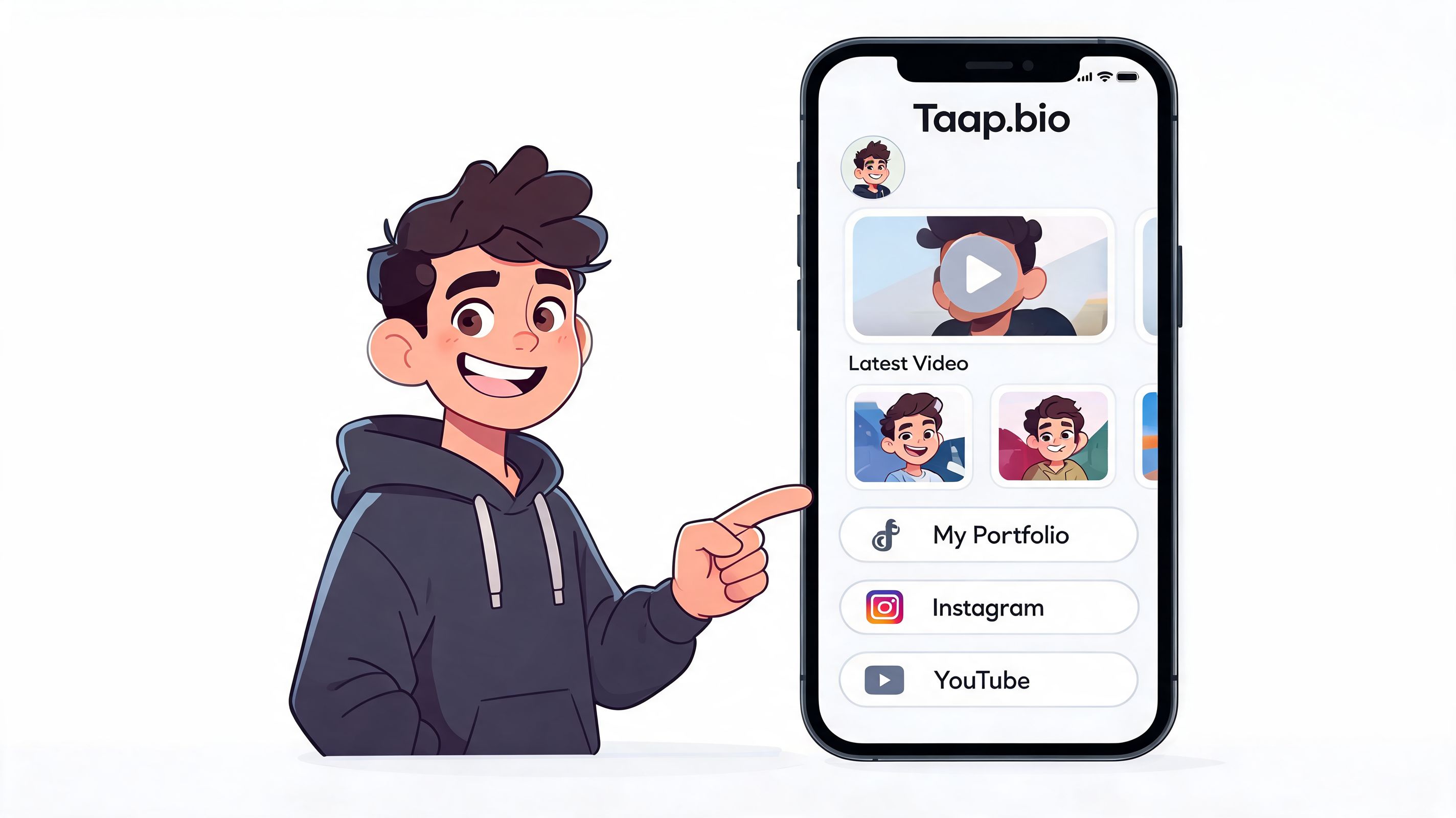
When a page uses a modular grid instead of a single-column list, the creator can assign visual importance based on business priority.
A coach can give a large top block to “Book a strategy session,” place social proof beneath it, and add a free lead magnet lower on the page. A musician can feature a current release with inline listening, then merchandise, then tour or booking details. A freelancer can lead with portfolio samples, then inquiry flow, then testimonials.
That's not decoration. That's conversion design.
Live widgets reduce needless exits
One of the smartest shifts in newer link in bio design is keeping people engaged on the page longer before asking them to leave it. If a visitor can preview your latest video, browse your visual work, or listen to a track directly on the page, they don't have to make a hard choice between exploring and bouncing.
Every forced exit creates another chance to lose intent.
A page with live content widgets works better when your audience needs proof before action. Musicians need playback. Designers need visual samples. educators need content previews. Coaches need trust signals.
The moment before a click is where most sales are won or lost. Pages that offer context before the click usually convert cleaner than pages that push visitors away immediately.
Commerce and booking belong on the page
For creators who sell directly, the strongest setup is one where the page itself can present the offer and support the transaction path. That's why built-in stores and schedulers are more valuable than they first appear. They compress the distance between discovery and purchase.
If you want to see how that model works for digital goods specifically, this look at a digital product store for creators is useful. The practical point is simple: the closer your offer lives to the moment of interest, the less energy the visitor has to spend.
A good storefront page doesn't overwhelm. It sequences. Content builds trust. Layout guides attention. Offers become visible at the right moment.
Your Migration Plan and Design Best Practices
Moving from a simpler page builder to a more visual one usually goes faster when you don't copy the old setup block for block. Migration is a chance to fix structure, not just transfer links.
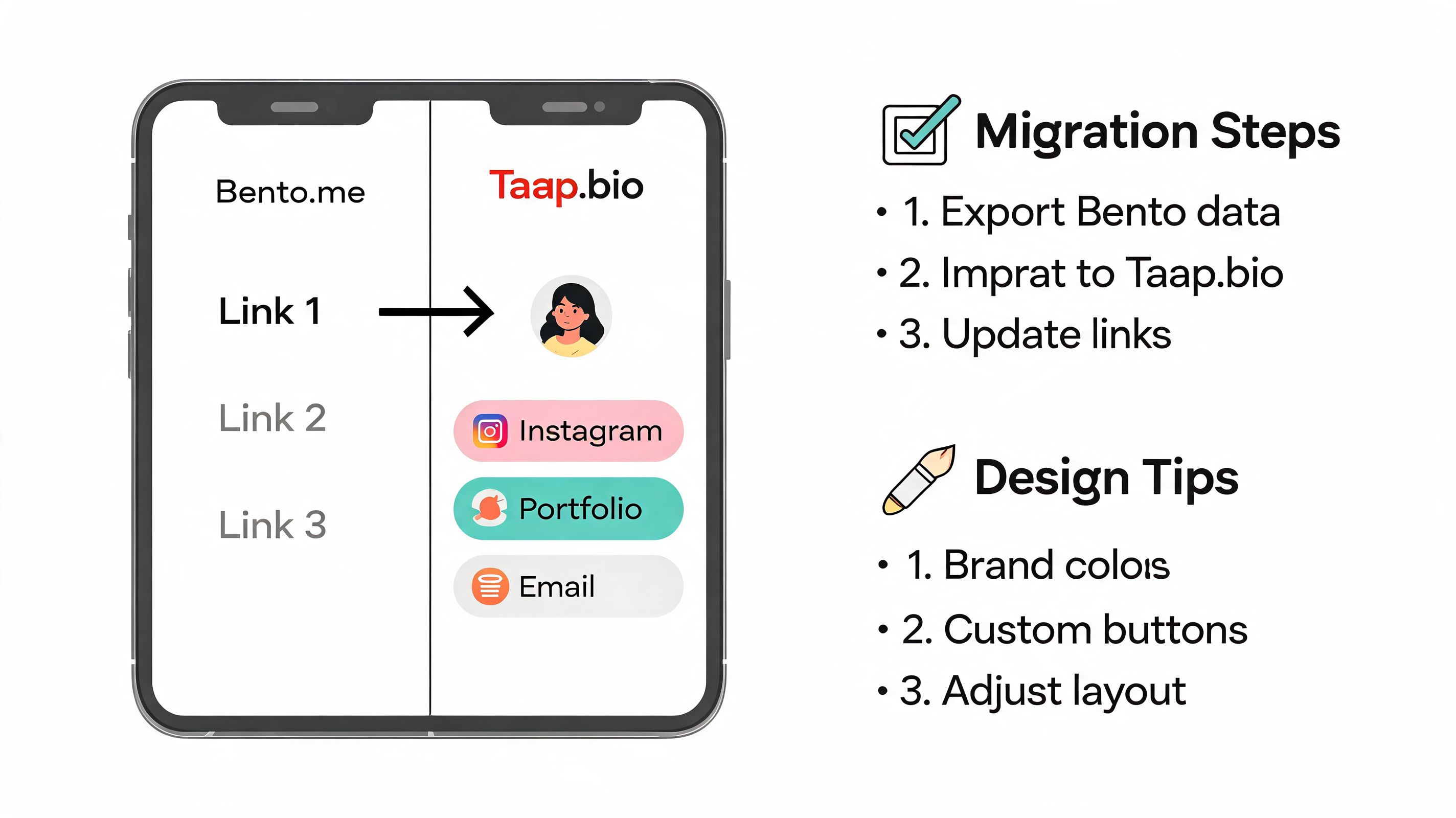
A clean migration flow
If you're coming from Bento.me or another visual tool, use this order:
- List your current assets. Pull every active link, embed, offer, and lead magnet into one document.
- Choose one primary action. Decide whether the page should push bookings, product sales, email signups, or content discovery first.
- Group by intent. Separate trust-building blocks from monetization blocks and from social proof.
- Rebuild hierarchy. Don't repeat the old order automatically. Place high-value actions where mobile visitors see them fast.
- Check every destination. Remove stale launches, expired freebies, and old campaigns before the new page goes live.
Design choices that usually work better
A strong page is easy to scan. It doesn't need every color, every platform, or every content type above the fold.
Use these rules:
- Lead with one offer. Don't ask a new visitor to choose among six equal priorities.
- Use contrast carefully. One accent color for primary actions usually works better than a rainbow palette.
- Keep text specific. “Book a consult” beats “Work with me.” “Download the guide” beats “Freebie.”
- Show proof early. Visual work samples, media embeds, or testimonials make later conversion blocks stronger.
- Design for thumbs first. Mobile spacing, tap targets, and block order matter more than desktop elegance.
The SEO angle matters too. A video discussed in this guide on bio link discoverability and SEO potential notes that a 2026 study found some creators get 15% of their organic traffic from Google indexing of these pages, while 80% of users fail to customize SEO settings. It also points to live-updating widgets as a way to improve dwell time. In practice, that means your page title, descriptions, keyword choices, and embedded content deserve real attention.
A page built only for social clicks leaves search value on the table.
Real-World Use Cases for Monetization
The fastest way to judge a link in bio service is to ask what kind of business it can support without sending visitors through a maze.
An online coach needs a page that can handle authority and scheduling in one flow. The top area might feature a paid strategy call, followed by a short credibility section, then a free resource for people who aren't ready to book yet. That structure serves both warm and cold traffic without making the page feel crowded.
A musician needs a different rhythm. The first block should let visitors hear the latest release or see current content, then move into merch, show announcements, and fan signup. Inline media matters here because discovery and purchase are closely connected. If the song lands, the merch click is easier.
A course creator usually benefits from a storefront layout instead of a simple list. Put the flagship product first, use supporting blocks for testimonials or sample lessons, and place lower-ticket downloads beneath it for visitors who want a smaller first purchase. If you're comparing formats for digital offers, this roundup of tools that compare online product catalogue builders gives useful context on how presentation affects browsing.
A freelance designer or developer needs proof before inquiry. Portfolio blocks, live project previews, and a focused contact or booking path usually outperform generic “all my links” pages because they answer the prospect's question immediately: can this person do the work I need?
The pattern is consistent across niches. The page works better when it acts like a compact business front end, not a dumping ground for URLs.
If your current bio page looks tidy but doesn't help you sell, book, or capture leads, it may be time to rebuild it as a storefront. Taap.bio is designed for that model, combining a visual page builder with digital product sales, bookings, email capture, and live content widgets in one place.