

Your audience can find you on Instagram, LinkedIn, YouTube, TikTok, X, Spotify, GitHub, Dribbble, Figma, Substack, and maybe a portfolio site you haven't updated in months. Then they tap the one link in your bio and land on a page that looks like a rushed parking lot of buttons.
That gap matters more than most creators realize. As of April 2026, the average person actively maintains presence across 6.83 different social media platforms monthly, and there are 5.79 billion social media user identities worldwide, which makes a single, clear entry point for your brand much more important than it used to be, according to DataReportal's social media users report.
A social presence isn't just a list of accounts anymore. It's a storefront. People judge the quality of your work by the way you package access to it.
Table of contents
Beyond the Link List
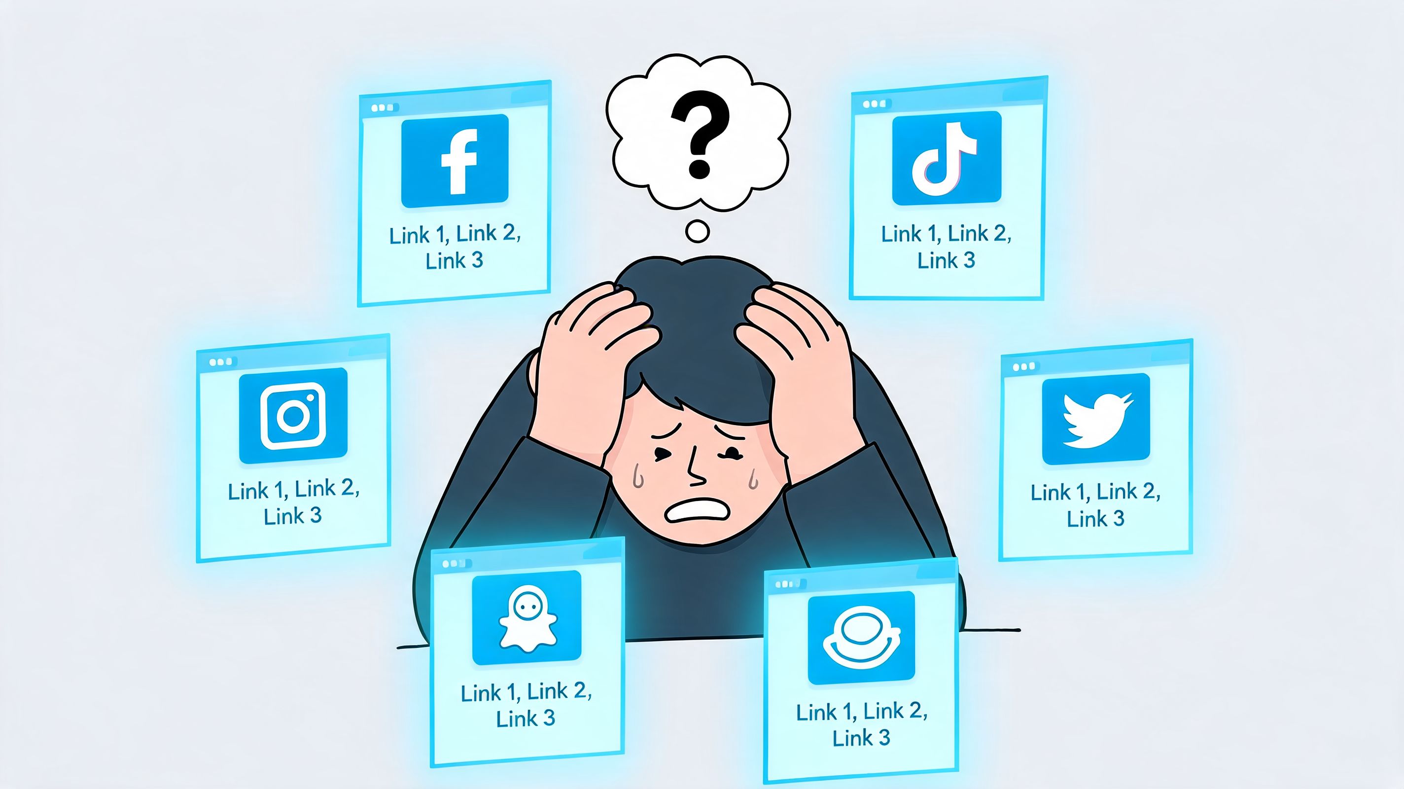
The old link-in-bio model solved one problem. It gave creators a place to stack URLs. It didn't solve the branding problem, the navigation problem, or the attention problem.
If someone clicks from your Instagram, they're not asking for a directory. They're asking, "What should I care about first?" A plain link list makes every destination look equally important, even when it isn't. Your latest video, your booking page, your top case study, and your dormant profile all get flattened into the same visual weight.
What the old model gets wrong
A vertical stack of links usually fails in three ways:
- No hierarchy: Visitors can't tell what matters now.
- No proof: You say you're active everywhere, but the page doesn't show any live activity.
- No personality: The page feels like infrastructure, not part of your brand.
That's why I don't treat a bio link as a router. I treat it as a destination. It should feel closer to a personal dashboard than a menu.
Practical rule: If a visitor can understand your work faster by opening three separate apps, your hub isn't doing its job.
This shift also changes how you think about the technical side. If you're pulling in live content from multiple platforms, it helps to understand the basics of mastering social media API integrations, because dynamic profile blocks depend on clean platform connections, not just pasted links.
A personal dashboard works better
A visual hub gives you room to show context. You can put a welcome note beside your latest content, anchor the page with one strong call to action, then surround it with proof. A musician can place a playable track next to recent visuals. A consultant can pair a booking block with recent writing and a client testimonial. A developer can put current GitHub activity beside selected work.
If you want a good primer on the broader shift from single-link thinking to experience design, this explanation of what link in bio means is useful.
People don't need more links. They need a clearer reason to care.
The Foundational Audit of Your Social Media Profiles
Most creators make the same mistake when they rebuild their social media profiles into one hub. They start dragging blocks around before they've decided what each profile is supposed to do.
That creates a prettier mess.
A proper audit fixes that. It's also where the hidden contradictions show up. In marketing operations, data centralization audits often reveal 30-50% misalignment in reported ROI across platforms when profiles and performance are siloed, according to Improvado's guide on centralizing marketing data. Even if you aren't running a large team, the same pattern shows up at creator scale. One platform says you're a designer. Another says you're a founder. Another still pushes an offer you stopped caring about six months ago.
Audit for function, not just presence
Start with a simple rule. Every profile needs one primary job.
Use this checklist:
- List every active and semi-active account. Include social platforms, newsletters, storefronts, communities, podcast pages, portfolios, and any booking or lead forms.
- Assign one role to each. Growth, proof, conversion, community, archive, or experiment.
- Mark the current status. Active, seasonal, neglected, or retired.
- Review the front door elements. Bio, avatar, header, pinned post, featured links, and recent posts.
- Decide whether the profile deserves prime placement, secondary placement, or no placement.
The questions that actually matter
Don't ask, "Should this be on my page?" Ask sharper questions:
- Would I want a new visitor to land here first?
- Does this profile still represent the work I want more of?
- Can this platform prove credibility quickly?
- Does this account convert attention into action?
- Is it active enough to show publicly?
A lot of profiles fail on the last question. If a platform looks abandoned, it weakens trust even if the work on it is good.
An empty or stale profile doesn't act like proof. It acts like doubt.
Pick your pillar platforms
It's common to have too many accounts to feature equally. Choose 3 to 5 pillar platforms that earn visual priority on your hub. These are the ones that do the heaviest lifting.
Here's a practical way to sort them:
| Profile type | What it should do | Placement |
|---|---|---|
| High-conversion profile | Drives bookings, signups, sales, or inquiries | Primary |
| High-proof profile | Shows strong work samples or public credibility | Primary |
| High-frequency profile | Demonstrates you're active now | Primary or secondary |
| Legacy profile | Still useful but not central anymore | Secondary |
| Dead-weight profile | Outdated, off-brand, or inactive | Remove |
If you want a structured worksheet for this process, this guide to auditing social media strategy is a good companion.
Look for consistency, not sameness
Your profiles don't need identical copy and visuals. They do need a coherent identity. The tone on LinkedIn shouldn't match TikTok line for line, but the core positioning should still feel like the same person.
Audit these elements side by side:
- Bio promise: What do you say you do?
- Visual signature: Colors, avatar style, cover art, typography choices.
- Pinned content: Does the first thing people see still make sense?
- Call to action: Are you asking for the same next step everywhere?
- Audience fit: Does the profile match the people you want more of?
By the end, you should have a ranking. Not every account deserves equal space. That's the blueprint for a cleaner digital storefront.
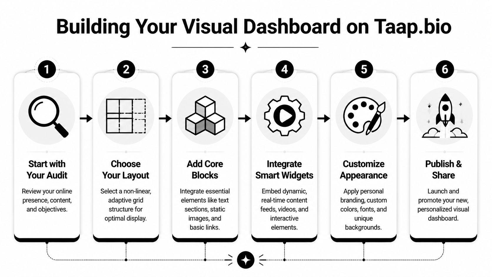
Building Your Visual Dashboard on Taap.bio
Once the audit is done, layout becomes strategy. At this point, most creators either build something magnetic or recreate the same boring list in a grid costume.
A strong dashboard has one job. It tells visitors where to look first, what to trust second, and where to click next.
Build around hierarchy
The bento-box approach works because it lets you assign different visual weight to different parts of your brand. A booking link shouldn't look identical to an old side project. A welcome video should have more presence than a footer note.
I build these pages in layers:
- Anchor block: The first thing people should notice. This might be a welcome video, featured offer, current launch, or strongest portfolio item.
- Proof blocks: Social profiles, recent content, testimonials, or portfolio previews.
- Utility blocks: Contact, newsletter signup, booking, store, media kit.
- Personality blocks: Notes, visuals, playlists, location, or behind-the-scenes content.
That structure works because people scan before they read. If the page has no focal point, they start making their own map. Most won't stay long enough to finish it.
Use asymmetry on purpose
One study found that creators using modular grids with asymmetric layouts can increase visitor dwell time by 28%, and device-specific layouts can produce up to a 40% uplift in mobile conversions, according to this PMC-linked summary on centralized profile layouts and device-specific optimization.
That doesn't mean random placement. It means controlled asymmetry.
Here's the difference:
- Bad asymmetry: Blocks feel shuffled. Nothing lines up. The eye has nowhere to rest.
- Good asymmetry: One large block leads. Smaller blocks support it. Repeated sizes create rhythm. Empty space keeps the page breathable.
Design note: Negative space isn't wasted space. It's what stops your page from feeling like a crowded app drawer.
A practical layout formula
If you're staring at a blank canvas, use this starter pattern:
- Top left or top center: Intro block with name, role, and clear promise.
- Largest block near the top: Primary CTA or featured content.
- Adjacent medium blocks: Two proof elements, such as recent videos or portfolio samples.
- Middle row: Secondary actions like booking, newsletter, or shop.
- Lower section: Supporting social media profiles and personal touches.
This is also where non-linear link-in-bio grid design becomes useful as a concept. The page shouldn't force a single vertical reading path if your work naturally spans multiple formats.
Design mobile first, then fix desktop on purpose
Most creators preview desktop, feel satisfied, and only later realize the mobile version became cramped. That's backwards. Bio traffic usually arrives from apps. The small screen has to make instant sense.
I recommend different priorities by device:
Mobile priorities
- Lead with one action
- Reduce text
- Keep high-value blocks above the fold
- Use taller blocks only when the content earns the space
Desktop priorities
- Widen the story
- Use side-by-side proof
- Let visual rhythm do more of the work
- Show breadth without overwhelming
A dashboard that works on both screens doesn't just resize. It reorders attention.
Common layout mistakes
A lot of pages break for the same reasons:
- Everything is medium-sized. If all blocks have equal weight, nothing stands out.
- Too many destinations compete. Visitors don't need ten calls to action.
- Text blocks repeat what visuals already say. Cut redundancy.
- Widgets sit beside unrelated content. Group by intent, not by platform logo.
- The top of the page is wasted on decoration. Put identity and action first.
The platform matters here because some tools only let you rearrange a stack, while others let you compose a page. Taap.bio uses a modular grid with drag-and-drop blocks, separate mobile and desktop editing, and widget-based layouts that support this dashboard approach.
Your page should feel edited. Not merely assembled.
Choosing and Configuring Smart Widgets
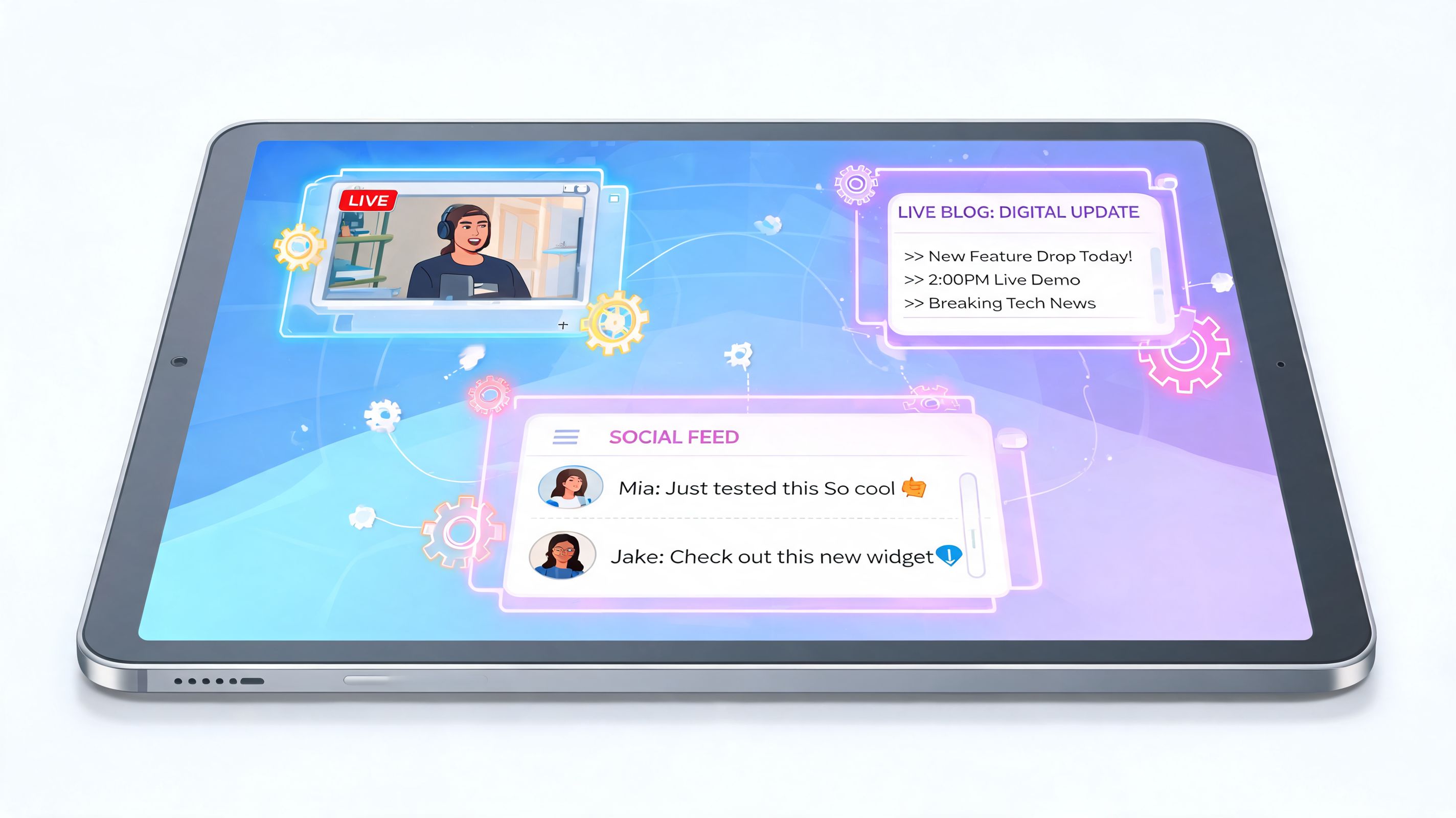
Static links are fine when the destination does all the work. Smart widgets are better when the page itself should prove you're active, current, and worth following.
That matters even more now because some creators want visibility without full exposure. The Grid Zero trend shows that 40% of Gen Z users are hiding public posts for privacy while still wanting controlled professional visibility, as covered in this report on the rise of Grid Zero. A live widget solves that neatly. You can show selected recency without turning your whole profile history into the product.
The musician setup
A musician's page shouldn't send people away the second they get curious. If someone can sample the work right on the page, you're reducing friction.
A practical build looks like this:
- Hero block: New release or featured track with album art
- Supporting widget: Artist profile showing recent music context
- Visual support: Instagram or YouTube content beside it
- Action block: Booking, mailing list, or ticket link
The key decision is whether to embed a single track or a broader artist view. Use the track when you're pushing one release. Use the artist profile when discovery matters more than a campaign.
The developer setup
Developers often make the opposite mistake. They over-index on text links and underuse visible proof.
A better setup puts the work on display:
| Persona | Widget choice | Why it works |
|---|---|---|
| Developer | GitHub contribution graph | Shows live activity at a glance |
| Open source maintainer | Repo or profile block | Highlights specific work, not just handle |
| Technical educator | YouTube plus GitHub | Pairs teaching with technical proof |
This works especially well for selective sharing. You don't need to expose every social account. You can show current contributions and link only the profiles that help your positioning.
Show evidence, not just destinations.
The designer setup
Designers should use widgets that preserve visual quality. A text link to Dribbble or Figma throws away the strongest thing you have, which is the work itself.
For designers, I like this sequence:
- A portfolio-style block with recent shots or project previews
- A Figma embed if you want product or systems credibility
- A compact bio block with one sentence on what you design
- A contact or inquiry block placed nearby
Spacing matters here. If every block contains imagery, the page can become noisy fast. Mix image-heavy widgets with simpler text or action blocks so the eye can reset.
If you're comparing which dynamic embeds are worth using across different creative workflows, this round-up of the best widgets for websites is a useful reference.
The video creator setup
For YouTubers and educators, thumbnails do a lot of conversion work. A plain "Watch my channel" link wastes that advantage.
Use a widget that shows recent uploads when your publishing cadence is active. Use a featured-video block when one asset needs concentrated attention. If your content spans Shorts, long-form, and clips, avoid putting all three equally high on the page. Choose the format that best matches the audience coming from that specific social profile.
Pick the format that matches the intent
Not every profile widget should use the largest version available.
Choose based on purpose:
- Standard profile format: Use when the platform itself is a major credibility signal.
- Compact profile format: Use when the platform is supporting proof, not the headline.
- Tall or media-heavy format: Use when recency and visuals are the draw.
- Minimal follow block: Use when you want a clean prompt without clutter.
A smart widget should add value before the click. If it only repeats what a basic button already says, it doesn't earn the space.
A Smooth Migration from Bento.me to Taap.bio
A lot of Bento.me users don't want a different philosophy. They want the same clean, modular feel without losing the aesthetic control that made their page usable in the first place.
That's the right starting point. Don't rebuild from scratch emotionally. Rebuild from scratch structurally.

Keep the parts that worked
Most Bento.me creators were attached to a few things:
- Grid-based presentation
- Cleaner visual pacing than a vertical list
- A page that felt closer to a mini-site
- Flexibility for mixed content types
Those instincts were right. The mistake would be trying to preserve the exact old arrangement without asking whether your next version should do more.
Migrate content before you migrate layout
Start by exporting the logic of your page, not the look of it.
Make a simple inventory:
- Core message you want visitors to understand first
- Highest-value destinations such as booking, shop, newsletter, featured work
- Live content sources you want embedded instead of linked
- Decorative or low-impact blocks that don't need to survive the move
Then rebuild in that order. Message first. Conversion second. Proof third. Extras last.
A migration goes smoother when you treat it like an edit, not a copy-paste job.
Map old habits to a better system
Bento users usually think in panels. Keep that mental model. Just upgrade the way each panel behaves.
A practical mapping looks like this:
| If you used Bento for | Rebuild it as |
|---|---|
| Simple profile intro | Intro text or media block |
| Link cards | Mixed CTA blocks with different sizes |
| Portfolio panels | Rich media or platform widgets |
| Music or podcast links | Inline playable audio blocks |
| Social buttons | Compact profile widgets with live context |
If you're weighing whether a link page should evolve into something closer to a lightweight site, this comparison on link tree versus website thinking helps clarify the trade-off.
The real upgrade
The biggest shift isn't cosmetic. It's control.
With a more flexible setup, you can shape separate mobile and desktop experiences, use smart widgets instead of dead links, and create pages that feel active without requiring a full website rebuild. That's a better fit for creators whose audience moves between social platforms quickly and expects fresh context each time they tap your bio.
Migration is less about replacing one tool with another. It's about replacing a static profile page with a living digital storefront.
Publishing and Promoting Your New Digital Home
A polished hub doesn't help if it lives in one forgotten bio field. Once the page is ready, make it the central address for your online presence.
Update every public touchpoint that matters. That includes your Instagram bio, TikTok bio, X profile, LinkedIn featured section, YouTube description templates, newsletter footer, email signature, speaker bio, and any PDF media kit you send manually.
Launch it like it matters
Don't just swap the link and move on. Tell people what changed.
A simple rollout works:
- Announce the page: Explain what visitors can now find in one place.
- Give them a reason to revisit: Feature a new release, updated portfolio, or current offer.
- Reference it in content: Mention the hub in videos, captions, and stories.
- Keep it current: Refresh blocks when your priorities change.
Treat it like a living portfolio
The best social media profiles aren't static. Your hub shouldn't be either. As your work shifts, the layout should shift with it. If your newsletter becomes your main engine, move it up. If your consulting offer goes quiet, demote it. If a platform stops reflecting your best work, stop featuring it.
That kind of maintenance is also how you improve engagement. If you need ideas for tightening calls to action and making profile traffic work harder, this guide on how to increase social media engagement is worth reading.
Your digital home should answer three questions fast. Who are you. What do you do. Where should I go next.
If your social media profiles are scattered across too many platforms, taap.bio gives you a way to turn them into a visual dashboard instead of another stack of links. Use it to build a cleaner digital storefront, show live activity, and give visitors one place that feels like your brand.


