
Your newsletter probably isn't stuck because your content is weak. It's usually stuck because your signup path is weak.
A lot of creators have the same setup. They post consistently, get decent engagement, and keep adding “newsletter link in bio” to captions and stories. Then they check subscriber growth and see a trickle. The issue often isn't demand. It's that the bio page behaves like a list of exits instead of a page built to convert.
I've seen this happen over and over. A standard bio link sends attention in six directions at once. A visual bio page can do the opposite. It can frame one action as the obvious next step, support it with social proof, and reduce the friction that kills signups on mobile.
Table of contents
Why Your Bio Link Is Your Biggest Missed Opportunity
A follower taps your Instagram or TikTok bio after a strong post, ready for the next step. Then they land on a page with seven equal links, no clear reason to subscribe, and three faster exits than your newsletter.
That click is warmer than cold website traffic. It comes from someone who has already seen your content, liked your point of view, and chosen to learn more. If the page they hit looks like a generic link list, you waste that intent.
A lot of newsletter growth advice focuses on popups, landing pages, and lead magnets. Those matter. But creators who rely on social traffic have a different conversion point sitting in plain sight. According to Blueprint Digital's newsletter subscriber guide, Instagram and TikTok bios can drive a meaningful share of traffic, and visual bio pages with dynamic newsletter calls to action can outperform static link lists. That matters because a bento-style page gives you more than design polish. It gives you control over attention.
The problem with the typical bio page
A plain list of links weakens newsletter growth in predictable ways:
- Everything looks equally important. Your newsletter has to compete with your latest video, store, free resource, and contact page.
- The value proposition disappears. Visitors see a link label, not a reason to subscribe now.
- Mobile momentum dies fast. Each extra choice creates hesitation, and hesitation costs signups.
A visual bio page fixes those problems because layout creates priority. On Taap.bio, a larger tile can hold the email CTA, a nearby block can show what subscribers get, and another block can add proof, such as issue previews or reader wins. That asymmetric structure matters. It turns the page from a directory into a focused signup environment.
If you're still using your bio page as a utility page, reconsider what a bio link does. Its job is to direct attention toward the next action that compounds.
Why subscriber quality matters more than follower count
A newsletter subscriber is usually worth far more than a profile visitor who clicks around and leaves. In Google's newsletter training resource, analysts note that newsletter readers engage more thoroughly than non-subscribers, and signup prompts placed near high-interest content can produce strong click-through rates. The lesson is simple. Put your ask where intent is already high, and remove friction.
That is why the bio link deserves more care than creators give it. It is one of the few places where people arrive with context, curiosity, and enough trust to tap. Use that moment well.
Clear copy helps here too. If your signup block sounds vague, study how to achieve clearer writing. Small wording fixes often improve conversion more than another round of design tweaks.
Design Your Taap Bio to Convert Followers into Subscribers
Most creators design bio pages like portfolios. That's the wrong model if your main goal is list growth. Build it like a landing page.
The best visual bio pages use layout to answer one question fast. Why should I subscribe right now? That means your page needs one dominant signup area, supporting proof around it, and fewer distractions than you think.
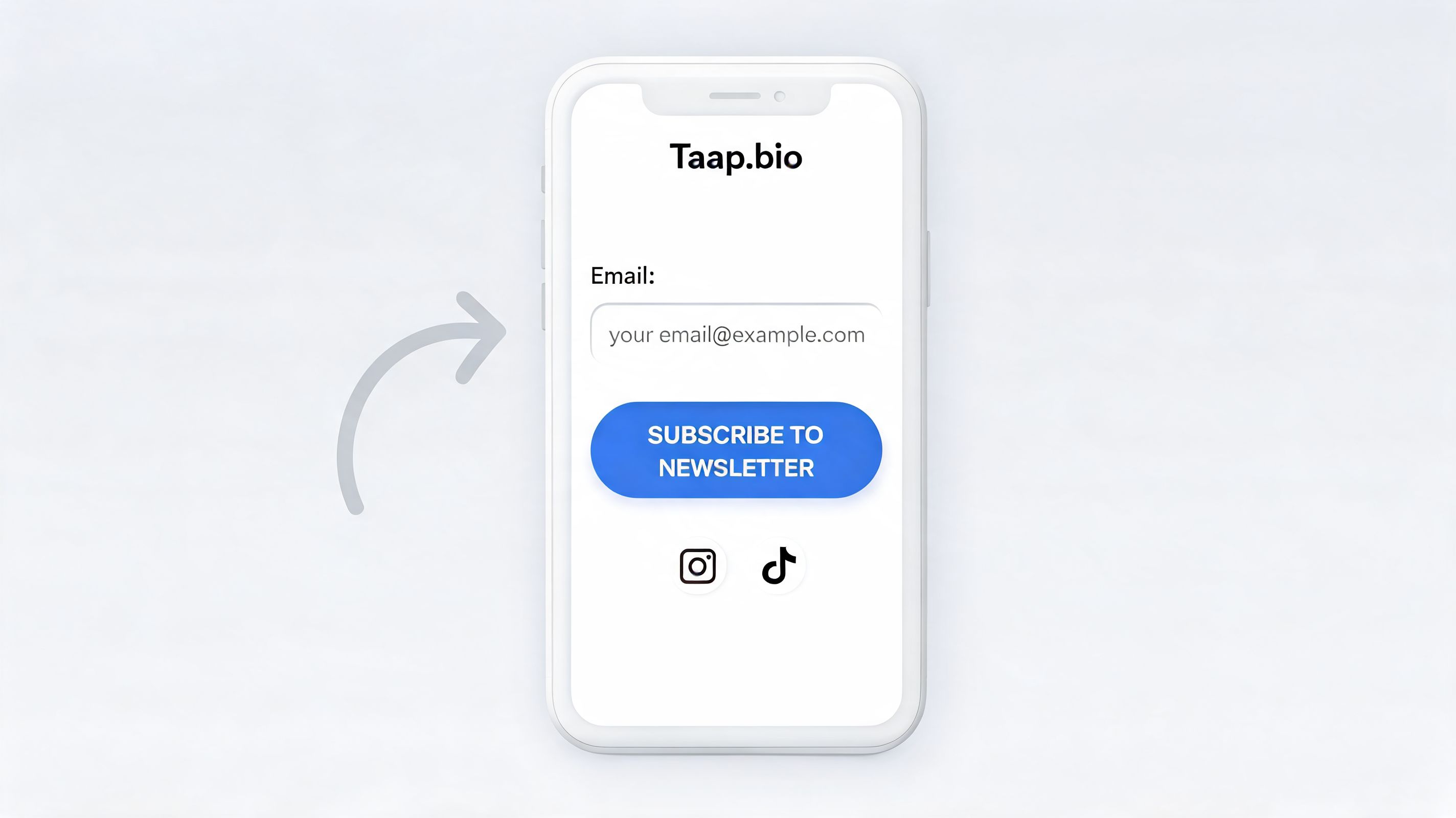
Build a visual hierarchy that favors the signup
On a bento-style page, the biggest block gets the most attention. Use that intentionally.
I recommend this structure:
A large signup block near the top
Put the email form or the newsletter CTA in the first area people scan. On mobile, that usually means the top third of the page. On desktop, give it enough width that it feels like the anchor of the layout.
A short text block beside or above it
One line is enough if it's specific. Don't write “Join my newsletter for updates.” Write what the reader gets. For example, “Weekly teardown of creator funnels,” or “Podcast growth notes and templates.”
A media block that demonstrates the outcome
Use a GIF, cover image, or issue preview. Motion can help, but only if it supports the offer instead of stealing attention from the form.
The easiest mistake here is clutter. Visual pages give you more freedom, but freedom isn't the same as discipline. If five blocks are shouting, none of them lead.
Use proof blocks to support the decision
Once the main CTA is set, use nearby blocks to answer objections.
A few that work well:
- Instagram grid block for recency and taste
- YouTube preview block if your newsletter expands on your videos
- Podcast or Spotify block if the newsletter is tied to an audio brand
- Testimonial text block with one short reader reaction
- Recent issue block showing the kind of insight subscribers receive
A visual grid outperforms a vertical list. You can create a page that feels editorial instead of transactional. If you want inspiration for arranging those modules, look at different link in bio grid layouts and study which blocks naturally pull the eye toward a central CTA.
A strong bio page doesn't ask visitors to hunt for the important action. It stages the page so the important action feels like the natural click.
Keep the copy clear enough to scan in seconds
Most newsletter signup copy fails because it's vague, not because it's too short.
Good bio-page copy has three traits:
- Specific promise
- Fast readability
- Visible payoff
If your CTA text feels muddy, it helps to study examples of how to achieve clearer writing. The same principle applies here. Tight wording converts better because mobile visitors don't read patiently. They scan, decide, and leave.
A simple comparison helps:
| Weak CTA | Stronger CTA |
|---|---|
| Subscribe for updates | Get one practical growth email each week |
| Join my list | Get my best podcast launch notes and templates |
| Weekly newsletter | Free issue breakdowns, tools, and experiments |
Embed, don't redirect if you can avoid it
Every extra step costs signups. If your email platform lets you embed a form, use that on the page instead of forcing a second click to another landing page.
If you can't embed, the fallback should still feel native:
- use a large button
- keep the landing page headline consistent with the bio CTA
- remove navigation from the destination page
- make the form short
This design trade-off is often overlooked. The prettier page isn't always the one that converts. The page that converts is the one where visual interest supports a single action.
Create an Irresistible Lead Magnet for Your Audience
Good layout gets attention. A good offer gets the email.
A lot of creators try to grow with “join my newsletter” as the entire pitch. That can work when your brand is already strong, but most pages need a more tangible reason to subscribe. The best lead magnets feel like a quick win that matches the visitor's intent from the platform they came from.
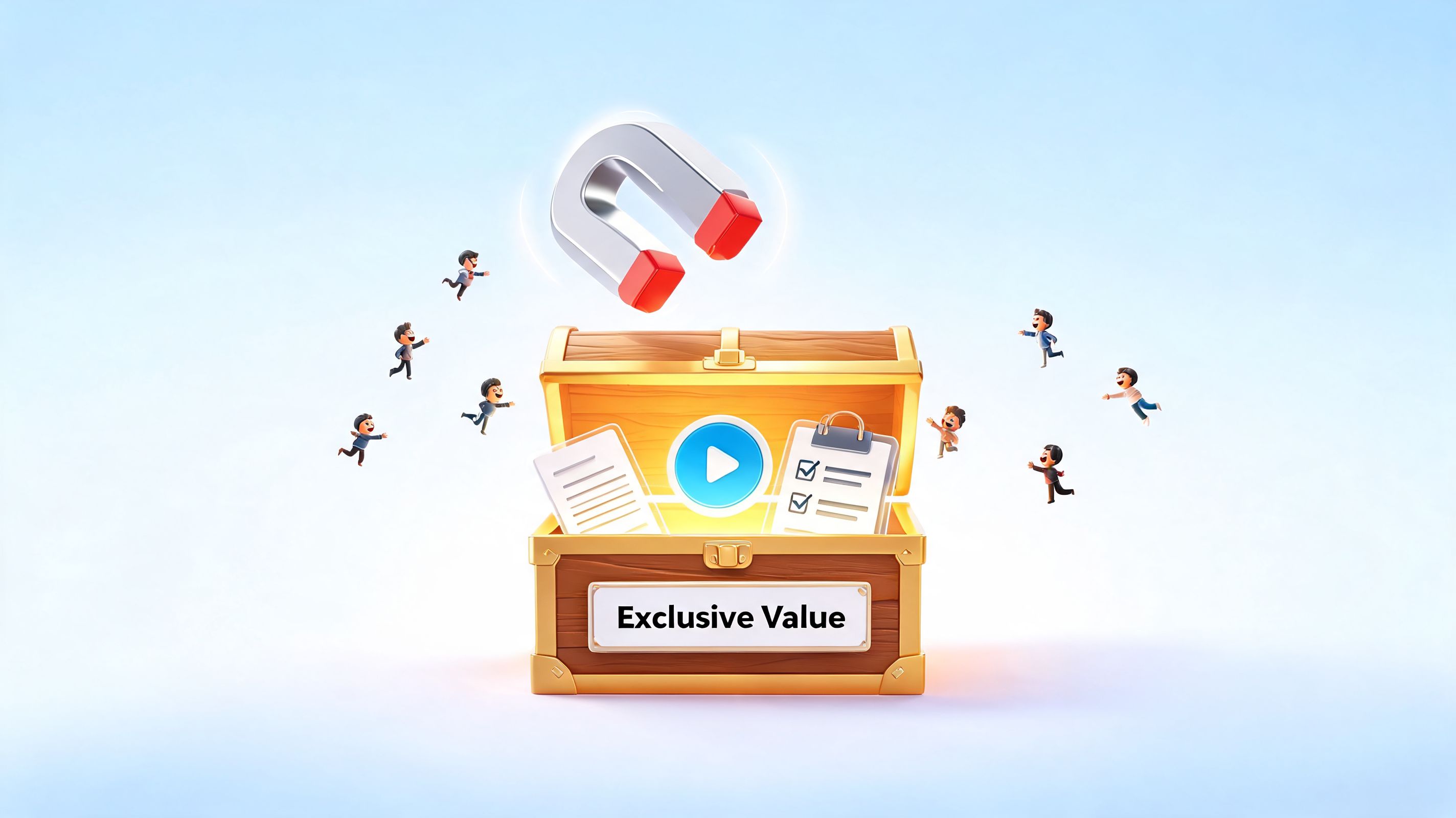
Match the free offer to the audience you already have
A designer, a podcaster, and a freelancer shouldn't see the same signup incentive.
Offers that fit this kind of bio page especially well include:
- For designers. A pack of layout ideas, Figma resources, or swipe files.
- For podcasters. A private episode, guest outreach template, or launch checklist.
- For freelancers. A proposal template, pricing sheet, or client onboarding doc.
- For musicians or audio creators. Behind-the-scenes notes, early access, or exclusive playlists.
The visual bio page helps because you can show the offer instead of only describing it. A mockup image, a cover thumbnail, or a block listing what's inside often does more work than a paragraph of copy.
Campaign Monitor recommends that your newsletter deliver 90% helpful content and only 10% promotion, and reports that segmented campaigns can increase revenue by up to 760% in its guide to increasing newsletter subscribers. That should shape the lead magnet too. If the freebie is useful and tightly matched to the subscriber's interest, it attracts the right people instead of just inflating the list.
Show what's inside, don't just name it
A lead magnet becomes stronger when the page previews the value.
Use a text block that answers:
- what it is
- who it's for
- what problem it solves
- what happens after signup
For creators selling education or templates later, there are plenty of examples in this roundup of digital products to sell online. The useful pattern isn't the product itself. It's the specificity of the transformation.
Here's a practical example. “Free guide” is weak. “Five newsletter layouts for creators switching from list-style bio tools” is much stronger because the audience can identify themselves instantly.
This kind of offer explanation also works well in video.
Personalization starts before the first email
The lead magnet should hint at segmentation before a subscriber even joins.
If you serve multiple audience types, create separate entry points on the same page. One block can speak to podcasters. Another can speak to designers. Another can speak to freelancers. You don't need a complicated funnel to start. You need distinct promises.
The fastest way to weaken a signup page is to make every visitor feel like the offer was written for someone else.
That's the trade-off with broad newsletter positioning. Broad gets more impressions. Specific gets more signups from the right people.
Amplify Your Reach with Smart Promotion and Referrals
A conversion-ready bio page still needs traffic. Promotion is where most newsletters either build a compounding loop or stall out after the initial launch.
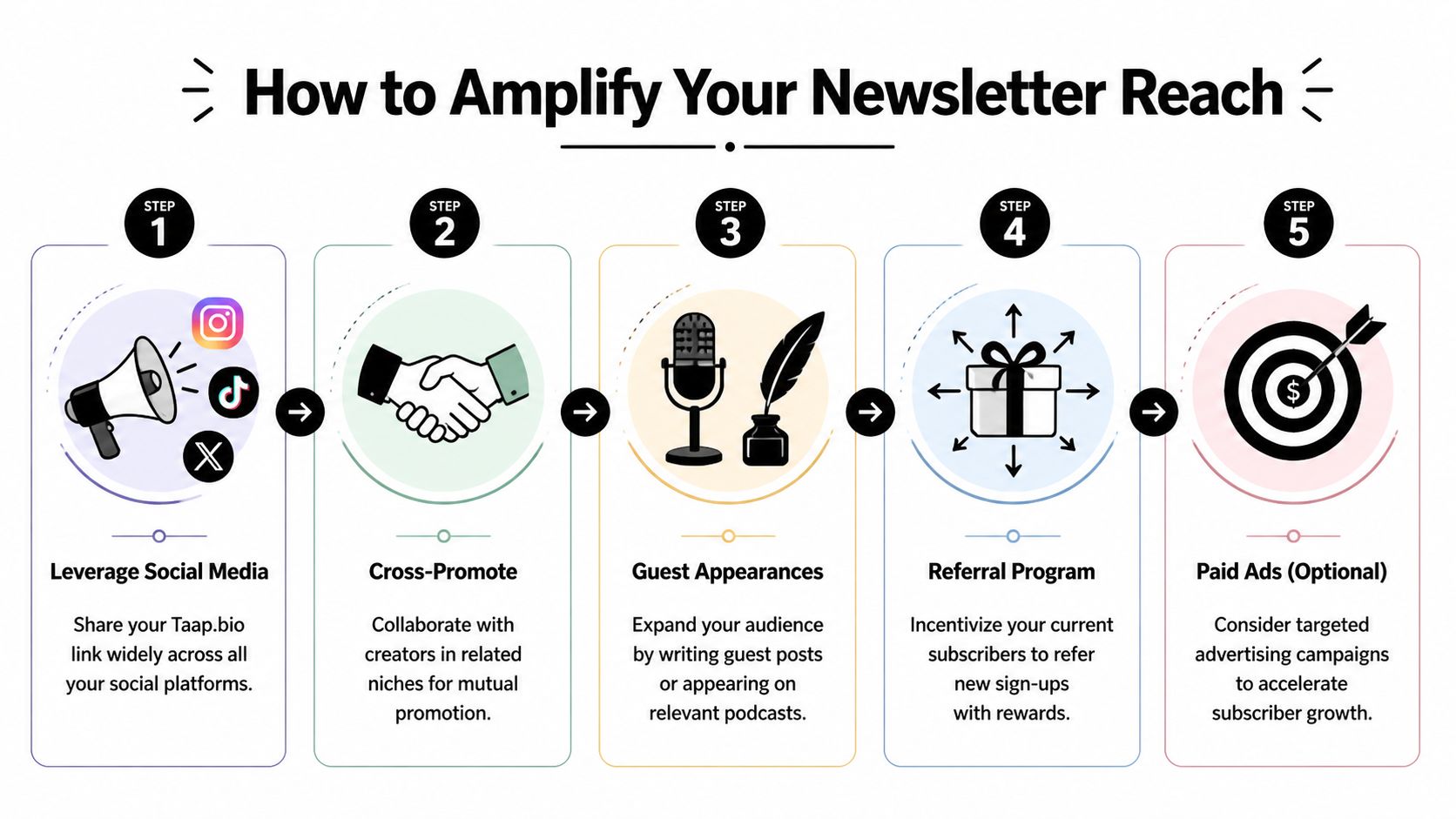
The simplest path is to treat the bio page as your default destination everywhere. Add it to your social profiles, your creator collaborations, your guest appearances, and your email signature. Don't send people to six different places depending on the day. Repetition helps.
The stronger growth engine, though, is referrals.
Why referrals produce better subscribers
The best newsletter referrals don't feel like affiliate campaigns. They feel like readers sharing something useful with people like them.
Beehiiv points out in its article on tactics for gaining more subscriber signups that Morning Brew grew to over 1 million subscribers primarily through referrals. The same source says that in an optimized referral program, 10-25% of subscribers will refer at least one person, and referred subscribers show 2-3x higher engagement than those acquired organically.
That difference matters. Referred readers usually arrive with context and trust already built.
Build a simple referral loop that people will actually use
I've found that creators often overbuild this. They create complicated milestone trees and generic rewards, then wonder why no one shares.
Keep it lean:
Pick rewards that fit your niche
Generic discounts are forgettable. Niche rewards feel worth sharing. A creator newsletter can offer templates, swipe files, early access, or bonus breakdowns.Make the referral CTA visible in the newsletter itself
The footer is a good home for it because every issue reinforces the habit.Mirror that CTA on your bio page
Add a dedicated block for “Refer a friend” or “Share this issue.” Readers who land there should be able to understand the loop immediately.Promote the reward in public
Mention it in stories, short videos, or collaboration posts. Readers won't use a referral system they never notice.
A lot of creators also benefit from tightening the rest of their email system before they push referrals hard. If you need examples of positioning and funnel structure, this guide to email marketing for creators is a useful reference point.
Use collaborations to feed the same page
Referrals aren't the only lever. Cross-promotion and guest appearances work especially well when your positioning is narrow.
If your newsletter is for one clear audience, other creators can endorse it without needing a long explanation. That's also why niche collaborations beat broad “follow-for-follow” style swaps. Relevance wins.
A practical promotion mix looks like this:
| Channel | What to send people to | Why it works |
|---|---|---|
| Instagram stories | Main newsletter signup block | High intent, low friction |
| Guest podcast appearance | Bio page with issue preview | Gives listeners context |
| Creator cross-promo | Lead magnet version of the page | Better match for cold traffic |
| Existing newsletter footer | Referral block | Turns readers into distributors |
If you do brand work or creator partnerships, it also helps to review broader influencer marketing best practices. The same principles apply here. The best promotion usually comes from audience fit, not volume.
Readers share newsletters when the reward is relevant and the recommendation makes them look helpful.
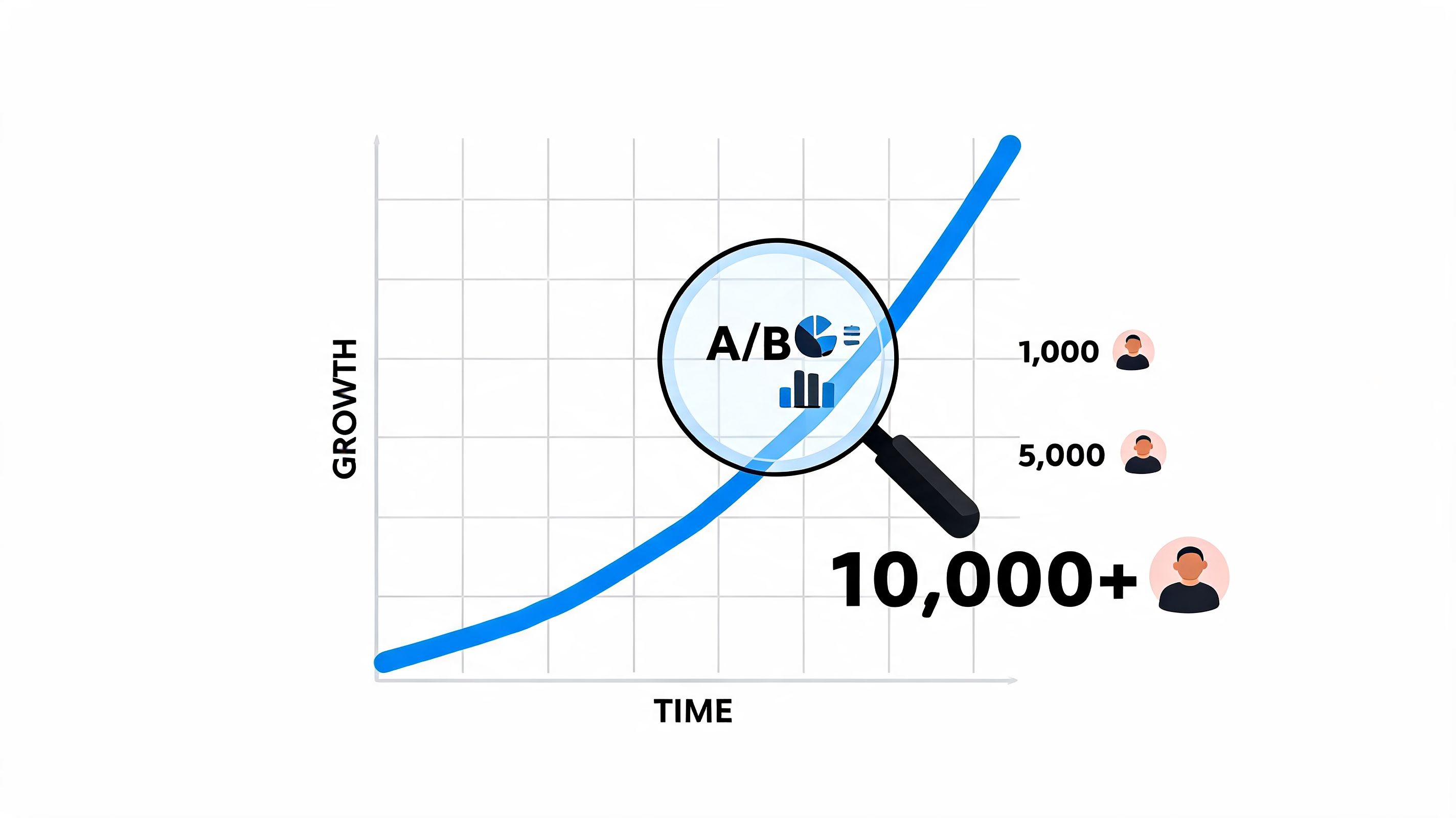
Track, Test, and Optimize Your Way to 10,000 Subscribers
Most signup pages don't fail because the first version was bad. They fail because nobody tested the second version.
Growth gets easier when you stop asking, “Is this page good?” and start asking, “Which version gets more of the right people to subscribe?” That's the shift from design thinking to growth thinking.
Segment traffic by source and intent
Not all visitors should see the same message.
Magazine Manager reports in its guide to increasing newsletter open and click rates that segmented campaigns can have 30-50% higher conversion rates, and that 95% of untested pages underperform benchmarks. The same source notes that for a visual tool like this, different layouts should be tested for mobile and desktop, where over 50% of traffic originates.
That has direct implications for a bio page.
Someone coming from Instagram often needs a faster, simpler ask:
- short headline
- short form
- one dominant CTA
Someone coming from YouTube or a podcast may tolerate more context:
- recent issue preview
- supporting proof
- deeper explanation of the newsletter angle
Test the page like a working funnel
Separate mobile and desktop layouts are especially useful because user behavior isn't the same on both. I like to test one change at a time from this shortlist:
CTA wording
“Get weekly breakdowns” versus a lead magnet offerBlock order
Form first versus proof firstVisual density
Cleaner layout versus richer layout with previewsOpt-in format
Embedded form versus button to a minimal landing page
If your stack includes automation, it's worth reading about advanced marketing automation with AI to think through follow-up logic and segmentation after the signup. The page gets the click. The backend decides what happens next.
Use a weekly review, not random tweaking
Random edits create noise. A lightweight review rhythm works better.
Track:
- source of the visit
- signup rate by page version
- lead magnet chosen
- welcome email engagement
- unsubscribe patterns by segment
Then make one informed change.
For creators focused on conversion, the point isn't to make the page more impressive. It's to make it clearer, faster, and more relevant. That's also why improving click-through rates matters beyond email itself. Better clicks usually start with better message match.
The pages that win aren't finished pages. They're tested pages.
Frequently Asked Questions About Newsletter Growth
What should I focus on if I'm trying to get the first 1,000 subscribers without ads
Start narrower than feels comfortable. Video case studies summarized in this YouTube discussion on getting more newsletter subscribers show that 100 creators hit 1,000 subscribers in 30 days by combining hyper-niche targeting, cross-promotions with creators who had similar click ratios, and sharing ungated preview issues in their bio links. Broad positioning usually sounds safer, but niche positioning gets shared faster.
Should I use a lead magnet or just ask people to subscribe
Use a lead magnet if your audience needs a concrete first win before committing. Skip it if your brand is already strong enough that people want the ongoing content itself. The wrong freebie can attract low-fit subscribers, so the offer has to match what you'll send later.
What is a good signup conversion rate for a bio link page
There's no universal number that matters across every niche, traffic source, and offer. The useful benchmark is your own trend over time. If one audience segment, layout, or CTA clearly performs better, keep iterating there.
Single opt-in or double opt-in
Choose based on list quality and workflow. If your priority is cleaner subscriber intent, double opt-in is safer. If your priority is reducing friction and your traffic is already qualified, single opt-in can make sense.
If you want a bio page that does more than stack links, taap.bio gives you a visual, drag-and-drop canvas for turning profile traffic into newsletter subscribers. You can build a page that highlights your signup, supports it with smart widgets, and adapts separately for mobile and desktop so your bio link works like a real growth asset, not a placeholder.


