So, what exactly is a link in bio grid? Think of it less like a simple list of links and more like a dynamic, visual hub for everything you do online. It’s a landing page that lets you arrange your most important links, social profiles, and even embedded content into a clean, customizable grid.
Table of contents
Beyond the List: Why Grids Are the Future of Bio Links
For a long time, the link-in-bio page was just a straightforward, vertical list. It was functional, sure, but also pretty boring. This single-file format gives every link the same weight, meaning your flagship project gets the same visual real estate as a minor social media profile. The result? A flat, uninspired experience for your audience.
But the creator economy has grown up, and the tools we use need to grow up, too.
From Simple List to Visual Story
Top creators and brands are getting smarter. They're transforming their bio link from a basic redirect page into a powerful, miniature landing page. The link in bio grid is leading this change. It’s a canvas for visual storytelling, giving you the power to prioritize content, create eye-catching focal points, and truly express your brand's personality.
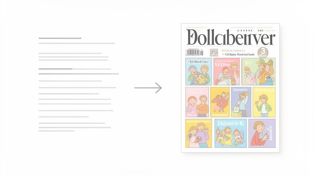
Here’s an easy way to think about it: a traditional list is a table of contents, but a grid is the magazine cover. It’s that first impression that grabs your audience’s attention and makes them want to dive deeper.
The Rise of the Bento Box Layout
This grid-style design is often called a "bento box" layout, and the comparison is perfect. Just like a Japanese bento box, each link, widget, or piece of content gets its own neat little compartment. This isn't just about looking good; it's about being intentional.
You can make your latest YouTube video the biggest block, put your newsletter signup form right where people will see it, and tuck smaller social links together. This thoughtful layout guides your audience, making it incredibly easy for them to find what you want them to find.
A well-designed grid doesn't just present links; it tells a story. It instantly communicates what your brand is about, what you're currently promoting, and where your audience should look first, turning passive visitors into engaged followers.
This whole shift is a response to an increasingly crowded digital world. The market for these tools blew up after Instagram limited users to a single profile link, forcing everyone to get creative with consolidating their online presence. While Linktree has grown to around 50 million users by May 2024, the demand for more visual and flexible alternatives is surging.
Take a look at the key differences for yourself.
Link in Bio Grid vs Traditional List at a Glance
| Feature | Traditional List (e.g., Linktree) | Link in Bio Grid (e.g., Taap.bio) |
|---|---|---|
| Layout | Single vertical column. | Flexible multi-column grid. |
| Visual Hierarchy | All links look the same. | You control the size and position of each item to guide attention. |
| Content Display | Primarily text-based links. | Embeds rich media like videos, music players, and forms. |
| User Experience | Requires scrolling through a long list. | Presents key content at a glance, reducing clicks and scrolling. |
| Customization | Limited to button styles and backgrounds. | Full control over layout, block sizing, and widget integration. |
| Brand Expression | Minimal; tends to look generic. | A unique, magazine-style layout that reflects your brand identity. |
Ultimately, the grid layout gives you the creative control to build something that feels uniquely yours.
With the recent news of Bento.me’s shutdown, over 100,000 users are now looking for a new home for their content, and they're seeking more powerful tools. To learn more about the link-in-bio market's growth, check out recent industry insights. This is exactly where modern platforms like Taap.bio come in, offering the flexible, grid-based builders needed to create a bio page that truly stands out.
How a Grid Turns Passive Clicks Into Active Engagement
Let’s be honest: a standard list of links is a bit of a gamble. You’re just lining up a bunch of options and hoping your audience picks the one that matters most to you. It's a passive experience. A link in bio grid, on the other hand, completely flips the script. It’s a strategic move from just showing links to actively guiding attention.
Think of it this way. A traditional list is like a flea market table where everything has the same small price tag. A grid is more like a curated gallery exhibit. You’re the curator, using size, placement, and visual punch to put a spotlight on your best work.
The Power of Visual Hierarchy
This is all about a core design principle called visual hierarchy. Our eyes don't see everything equally; we’re naturally pulled toward things that are bigger, brighter, or positioned in a way that demands attention. A grid lets you tap directly into that instinct.
You can make the tile for your latest YouTube video twice as large as everything else, which immediately tells people, "This is new, and you need to see it." Your newsletter signup can grab that prime real estate right at the top, while your other social links can be grouped into smaller, supporting tiles. This isn’t just about looking good—it’s about making your page incredibly intuitive.
With a grid, you remove the guesswork. You’re essentially telling your audience, "Start here. This is the most important thing I want you to see," turning a passive scroll into a guided tour of your content.
This level of control is what turns your bio page from a simple list of links into a serious conversion tool. You're not just offering options; you're telling a story and leading people to the actions that truly matter.
From Redirect Page to Interactive Destination
But the real magic kicks in when your grid becomes more than just a fancy-looking collection of outbound links. By embedding smart widgets, like the ones you can find on Taap.bio, your page transforms into a living, breathing part of your brand.
Picture a visitor landing on your page and being able to instantly:
- Watch your latest YouTube video right there in a widget, subscriber count and all.
- Listen to your new single on Spotify with an embedded player, racking up streams without them ever having to leave.
- Scroll through your recent Instagram posts in a live-updating photo grid, tempting them to follow you on the spot.
This is the game-changer. Instead of just sending people away, you're creating an interactive hub. This massively increases dwell time—how long a visitor sticks around—which is a huge signal to algorithms that your content is engaging and valuable. You're no longer just a signpost; you're a destination.
The Numbers Tell the Story
The data really drives this home. Engagement metrics show why grid-based tools are so effective. While a standard bio link might see click-through rates of around 10-15%, visually rich grids that show content previews can push that number up to 25-35%. Some platforms with bento-style layouts have even reported up to 28% higher dwell times because users are playing with widgets instead of bouncing away. When you make your bio page a place to hang out, you create a stickier, more memorable experience. You can find more data on how visuals drive engagement in these valuable social media statistics.
Ultimately, a grid gives your content a proper home where it can be seen and experienced, not just clicked on. It turns that single, lonely bio link into a rich ecosystem that shows off everything you do, building a much deeper connection with your audience.
Mastering the Art of Visual Storytelling
Building an effective link-in-bio grid is about so much more than just dropping a few blocks onto a page. It's about telling a visual story. A great grid doesn't just look good—it communicates your purpose, guides your audience, and makes your most important content impossible to miss. It's the difference between a cluttered storefront window and a beautifully curated gallery.
The secret is learning a few core design principles. Once you get the hang of concepts like composition, rhythm, and visual hierarchy, you can turn a simple page of links into a powerful experience that grabs visitors the second they land on your page.
Create a Clear Visual Hierarchy
If there’s one principle you need to master, it's visual hierarchy. This is simply the art of arranging things to show what’s most important. Without a clear hierarchy, every link on your page is screaming for attention at the same volume, leaving your visitors confused about where to look first. With it, you create a natural path for their eyes to follow.
The easiest way to do this? Play with size.
- Primary Content: Your most important link—whether it’s a new product, a key video, or a newsletter sign-up—should live in the largest block. This makes it a powerful focal point that demands attention right away.
- Secondary Content: Important but less urgent links, like your main social profiles or a popular blog post, can take up medium-sized blocks.
- Tertiary Content: Less critical links, like an archive or secondary social accounts, can be grouped together in smaller, uniform blocks.
This intentional sizing strategy isn't just about aesthetics; it’s a silent guide, telling your audience exactly what you want them to see, in the order you want them to see it.
Find Your Rhythm and Flow
A really compelling grid has a sense of rhythm—a visual beat that keeps the layout from feeling stale. You can create this by varying the size and shape of your blocks. A page filled with nothing but identical squares feels flat and monotonous.
So, mix it up. Try combining one large rectangular block with a few smaller squares and maybe a vertical tile. This asymmetry creates visual interest and encourages the eye to dance around the page instead of just scanning a list. Think of it like a puzzle where every unique piece helps form the bigger picture.
Your grid's composition is its body language. An organized, rhythmic layout feels confident and professional. A chaotic one just looks disorganized. Use variety to keep things interesting, but make sure the overall design feels balanced and intentional.
This diagram shows how a thoughtful design can shift users from just passively clicking to actually connecting with your content.
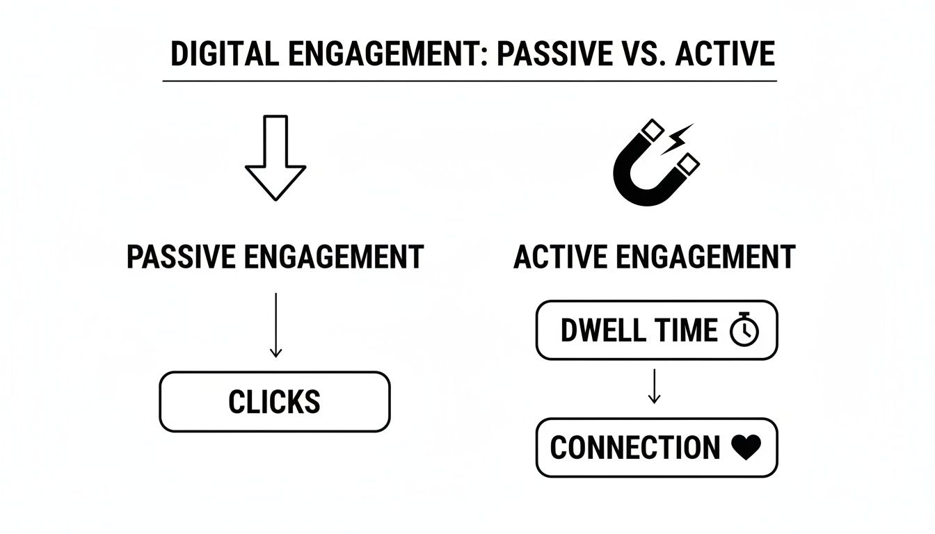
As you can see, any link can get a click. But a well-designed grid fosters the kind of active engagement that leads to longer visits and a stronger connection with your audience.
Master Responsive Design for Every Device
Let's be real: your audience is coming from everywhere. A layout that looks incredible on a big desktop monitor can feel cramped and broken on a smartphone. That’s why responsive design isn't just a nice-to-have; it's essential.
Thankfully, modern tools like Taap.bio have this baked in, letting you create and fine-tune separate layouts for both mobile and desktop. This is a game-changer. You can design a wide, expansive grid for desktop that uses all that screen real estate, while crafting a compact, vertical layout for mobile that’s perfect for scrolling.
Here are a few quick tips for getting your responsive layouts right:
- Prioritize for Mobile: On a small screen, stack your most important stuff right at the top. People will be scrolling, so make sure your main call-to-action is visible without any effort.
- Adjust Block Sizes: That big horizontal block on your desktop view might work better as a prominent square or a vertical tile on mobile. Don't be afraid to change things up to fit the screen.
- Simplify and Consolidate: The mobile view is your chance to be ruthless. You might choose to hide less important links on the mobile version to cut down on clutter and keep the focus on what truly matters.
By tailoring the experience for each device, you ensure every single visitor gets a clean, intuitive interaction with your brand. It’s that attention to detail that separates the pros from the amateurs.
Choosing the Right Widgets to Showcase Your Best Work
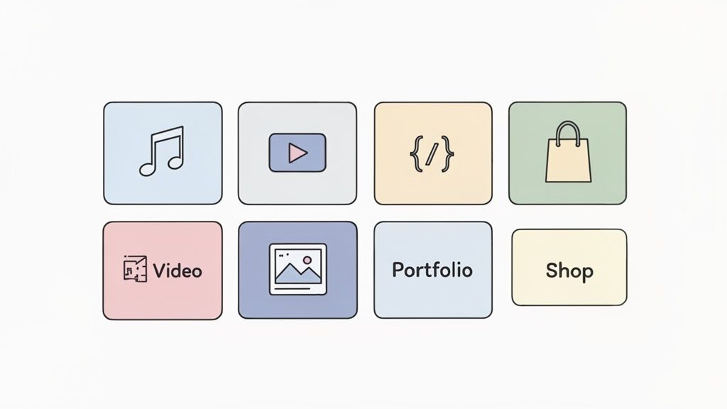
If your link-in-bio grid is the gallery, then the widgets are the masterpieces you hang on its walls. These are the dynamic, interactive blocks that do the heavy lifting, turning a simple page of links into a living, breathing showcase of who you are and what you do.
Choosing the right widgets isn't about just adding cool features for the sake of it. It’s a strategic move. Instead of just telling people you’re a musician, you let them hear your latest track right then and there. You don't just link to your portfolio; you show them your best designs on the spot. This is the real power of a well-chosen widget—it closes the gap between telling and showing, creating a far more powerful experience for anyone who visits.
For Creative Professionals
As a designer, photographer, or artist, your grid needs to act as your mini-portfolio. The goal is simple: make your talent impossible to ignore from the very first glance, pulling potential clients deeper into your work without them ever having to leave the page.
- Dribbble and Behance Widgets: These are absolute must-haves for designers. Why settle for a boring link when you can embed a live, updating grid of your latest shots and projects? Platforms like Taap.bio let you display your work with like counts and project stats, adding a layer of social proof a simple URL just can't provide.
- Figma Widget: Give people a peek behind the curtain by showcasing your design process, or share a community template directly on your page. This move instantly positions you as an expert who’s generous with their knowledge.
- Image and GIF Blocks: Weave a visual story with high-quality image blocks. A large, autoplaying GIF of a recent motion graphics project can become a stunning, unmissable centerpiece in your link in bio grid.
For Musicians and Podcasters
If you're in the audio game, your objective is crystal clear: get people to press play. You have to remove every ounce of friction between someone discovering you and actually listening. That's how you grow.
- Spotify Widget: This is your best friend. Embed a specific track, a full album, or your artist profile, complete with those all-important monthly listener counts. A tool like Taap.bio enables in-page playback, so fans can listen to your new single immediately, boosting your stream numbers without ever having to switch apps.
- YouTube Widget: Show off your latest music video or some behind-the-scenes footage. A visual grid of your four most recent uploads, along with your subscriber count, is infinitely more enticing than a plain text link.
- Podcast Embeds: Make it dead simple for new listeners to sample an episode. Embedding a player for your latest show can turn a curious visitor into a loyal subscriber in a single click.
The big idea here is to transform your bio page into a listening party. By embedding playable content, you're not just promoting your work; you're creating an immediate, immersive experience that drives real results.
For Developers and Tech Creators
For developers, a link in bio grid is a powerful tool for building credibility and showcasing your technical chops in a visually engaging way. It’s all about translating your code and contributions into a format that impresses recruiters and potential collaborators.
- GitHub Widget: Your contribution graph is the ultimate proof of work. It’s a dynamic, at-a-glance summary of your activity and commitment—so much more impactful than just linking to your profile.
- Twitter/X Widget: Share your tech insights and industry commentary by embedding your profile. You can opt for a minimal look with just your handle or a full display with your bio and banner.
- Text Blocks for Highlights: Don't be afraid to guide the narrative. Use custom text blocks to call out key projects, technical skills, or articles you’ve written. This helps you curate how people see your professional expertise.
This strategic use of widgets is part of a much bigger picture in the creator economy. Social commerce driven by bio links is on track to become a $100 billion global market by 2027. This explosion is fueled by grids that display live, dynamic metrics—like Instagram photo carousels or GitHub graphs—which have been shown to increase user trust and boost clicks by a staggering 35%.
For designers using bento-style layouts on platforms like Taap.bio, the enhanced aesthetic control has led to 45% better portfolio engagement. Meanwhile, musicians are seeing 28% subscriber growth directly from embedded Spotify widgets. You can dive deeper into these trends by checking out the state of the link in bio market.
Your 5-Step Game Plan for a Killer Grid
Alright, enough with the theory. Let's get our hands dirty and build something incredible. Creating a professional link-in-bio grid doesn’t have to be a complicated, all-day affair. With a smart tool like Taap.bio, you can go from a blank slate to a fully functional page in literally minutes.
This simple, five-step workflow will walk you through the entire process. Follow along, and you’ll build a page that not only looks stunning but actually gets results.
Step 1: Figure Out Your "Why"
Before you touch a single widget, pause and ask yourself a simple question: What’s the number one thing I want people to do here? Is it to smash that subscribe button? Watch your latest video? Book a call?
Getting crystal clear on your main goal is everything. It will become the North Star for your entire design, dictating your grid's focal point.
Once you’ve nailed down that primary call-to-action, jot down a quick list of your other must-have links—socials, portfolio, online store, whatever is essential. These are the building blocks we’ll use to flesh out your layout.
Step 2: Sketch Your Layout
Now for the fun part. Fire up a drag-and-drop editor like the one inside Taap.bio and start mapping out your grid. The first move? Place your most important link—the one you just identified—in a large, attention-grabbing block. This creates that powerful visual anchor we talked about.
Next, start arranging your secondary links in medium-sized blocks around that central point. Got a few smaller, related links? Group them together to keep things tidy. Don't be afraid to experiment, and remember to leave some white space. Let your design breathe.
The goal isn’t to cram something into every available pixel. It’s to create a balanced, intuitive layout that guides the user’s eye exactly where you want it to go. Your first draft is just a sketch, not a masterpiece.
Think of this step as creating the visual blueprint for your page.
Step 3: Power Up with Smart Widgets
This is where the magic really happens. Instead of just dropping in plain, boring links, it’s time to integrate smart widgets that pull in live, dynamic content. This is a game-changing feature on platforms like Taap.bio and what truly separates a grid from a simple list.
- For your YouTube channel: Embed a widget that automatically displays your latest video thumbnails and subscriber count.
- For your music: Drop in a Spotify player so visitors can listen to your new track without ever leaving the page.
- For your portfolio: Connect a Dribbble or Behance widget to show off your recent work in real-time.
These integrations transform your page from a static menu into a dynamic, interactive experience. They offer instant value and social proof, giving people a reason to stick around and explore.
Step 4: Make It Unmistakably You
With the structure locked in, it’s time to stamp your personality all over it. A strong, consistent brand identity builds trust and makes your page feel polished and memorable.
Start by applying your brand’s color palette to the background and individual blocks. Then, pick a font that echoes your style—whether that’s bold and edgy or clean and minimalist. Top it off by adding your logo or a professional headshot to make the page your own. This is your digital home base, so make sure it feels like it.
Step 5: Test, Launch, and Optimize
Don't hit "publish" just yet! It’s absolutely critical to preview your grid on both mobile and desktop. A layout that looks perfect on your big monitor might feel cramped and awkward on a phone. Use the separate mobile and desktop editors in Taap.bio to fine-tune each version for the best possible experience.
Once everything looks sharp, publish your page and proudly drop that new link into all your social media bios. You've officially launched your new link-in-bio grid
Fine-Tuning Your Grid for Maximum Impact
So you’ve built your grid. Looks great, right? That’s an awesome start, but the real magic happens when you start thinking beyond just the visuals. To turn that beautiful page into a genuine growth engine, you need to put on your marketer hat.
This is where we move past pretty design and dive into the nitty-gritty of optimization, performance, and what actually makes people click. It’s all about making every single block on your grid pull its weight.
Make Your Calls to Action Irresistible
Let’s be honest: every block on your grid needs a job to do. That job is guided by a powerful call-to-action, or CTA. Simply labeling a link "My New Video" is fine, but it’s not compelling. It describes what's there, but it doesn't inspire anyone to act.
You want to use language that sparks a little urgency and shows people what's in it for them.
- Instead of: "Newsletter," try "Join 1,000+ Creators & Get My Free Cheatsheet."
- Instead of: "Latest Song," try "Stream My New Single Now & Hear It First."
- Instead of: "Portfolio," try "See My Work & Let's Build Something Great."
See the difference? This small tweak turns a passive signpost into an active invitation. You’re telling visitors exactly what to do and why they should do it, which is a surefire way to boost your click-through rates.
Speed Is Everything—Keep It Snappy
We all have the attention span of a goldfish online. A stunning grid loaded with high-res images and slick widgets won't mean a thing if it takes forever to load. Even a few seconds of delay is enough to make someone give up and leave.
The fix is simple: compress your images before you upload them. You can use free tools like TinyPNG to slash file sizes without making your photos look grainy. If you’re using videos or GIFs, make them count—maybe as an eye-catching background on a key block. Just don’t overdo it, especially on mobile. While platforms like Taap.bio are built to be fast, smart media management on your end is what seals the deal.
Let Data Be Your Guide
Your grid shouldn't be a static, "set it and forget it" page. Think of it as a living, breathing part of your online presence that you can constantly improve. The best way to do that? Check your analytics. See which blocks are getting all the love and which ones are getting ignored.
Data is your best friend here. If that super important link you placed isn’t getting clicks, don’t be afraid to move it, resize it, or rewrite the CTA. Treat your grid like an ongoing experiment.
This data-first mindset lets you tweak and refine your layout over time, making sure your most valuable content is always in the spotlight.
Finally, don’t forget the basics. A little SEO goes a long way. Customize your page title and meta description with keywords people might use to find you. This helps search engines figure out what your page is all about. And while you're at it, make sure your page is accessible to everyone by using descriptive link text and adding alt text to your images. It’s a small effort that makes a huge difference.
Got Questions About Link in Bio Grids? Let's Clear Things Up
Jumping into a new way of organizing your links can feel like a big step, so it's natural to have a few questions. Let's tackle some of the most common ones we hear from creators who are considering a switch to a link in bio grid.
Is a Grid Really Better Than a Simple List?
Think of it this way: a simple list is like a grocery list—functional, but not very exciting. Each link gets the same amount of attention, whether it's your latest viral video or an old blog post.
A grid, on the other hand, is like a curated gallery. You get to be the art director, using size, placement, and interactive content to draw your audience's eye exactly where you want it to go. With smart widgets on platforms like Taap.bio, you can embed your newest YouTube video or Spotify playlist directly, turning a passive page into an active experience that keeps people clicking.
Won't a Grid Full of Images Make My Page Super Slow?
That's a totally fair question. We've all bailed on a page that took forever to load. But modern tools are built specifically to avoid that problem.
Platforms like Taap.bio are engineered for speed. They automatically optimize your images and use super-efficient code behind the scenes, so your page snaps to life almost instantly. All that technical heavy lifting is done for you, meaning you can pack your page with beautiful visuals without worrying about losing visitors to the back button.
The best link in bio tools make sure your visuals enhance the experience, not slow it down. A fast-loading page isn't a luxury; it's essential for keeping your audience hooked.
Do I Need to Be a Designer to Make a Grid Look Good?
Absolutely not. You don't need a design degree to create something amazing. The whole point of these platforms is to put powerful design tools into the hands of creators, not coders or graphic artists.
A simple drag-and-drop editor makes arranging your content feel more like a fun puzzle than a chore. You can easily resize blocks, try different layouts, and see what feels right. Plus, with the ability to set up separate mobile and desktop views, you can guarantee your page looks polished and professional no matter how someone finds you.
Ready to stop sending your followers to a boring list of links? It’s time to build a page that truly represents your brand. With Taap.bio, you can create a stunning, interactive grid in just a few minutes that will capture attention and get results. Start building your free grid today!