

You post a Reel, carousel, or photo that finally lands. Comments come in, shares pick up, DMs start, and then the next step is still awkward. Someone taps your profile, hits the one bio link, and lands on a flat page full of generic buttons that look nothing like your Instagram.
That gap is where a lot of creators lose momentum.
Getting a link to Instagram post is easy. Turning that link into a page that keeps the same visual energy as your feed is the part most guides skip. If you're sending people from a highly visual platform into a dead-end list of links, you're asking them to downgrade the experience right when they're most interested.
Table of contents
Beyond the Bio Why Your Instagram Links Need a Strategy
A lot of creators are still treating the bio link like a storage closet. One button for the latest post, one for a shop page, one for a newsletter, one for an old campaign that should've been archived months ago. It technically works, but it doesn't help visitors decide what to do next.
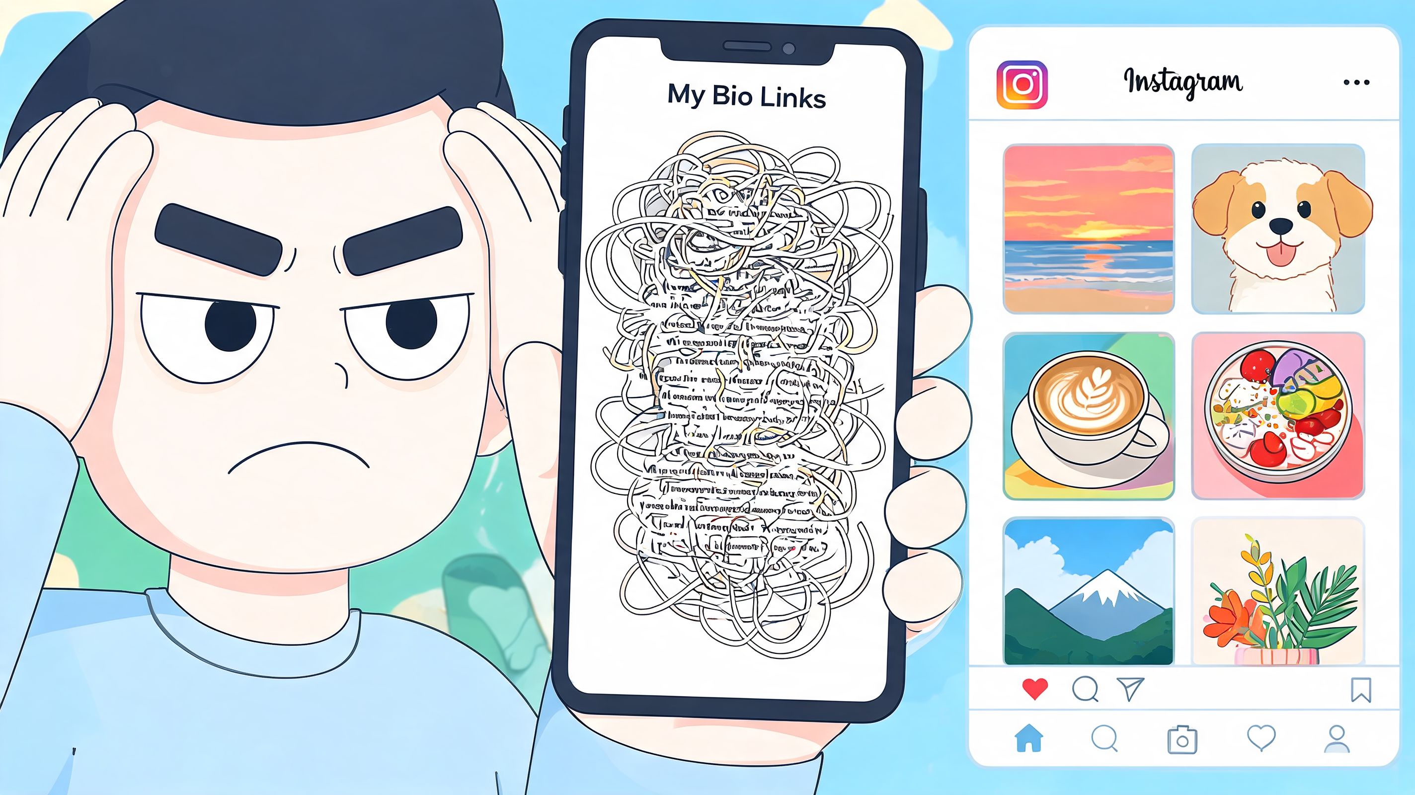
Instagram isn't a small side channel anymore. It has over 2 billion monthly active users worldwide as of early 2025, and its average engagement rate is 0.50%, which is higher than Facebook and X according to Statista's Instagram market overview. When attention is that competitive, wasting a profile click on a bland landing page is expensive.
Static lists break the visual promise
People don't come from Instagram expecting a spreadsheet. They come from carousels, Reels, cover art, color, faces, motion, and context. A plain list strips all of that away.
That's why I push creators to think of the bio link as a destination, not a directory. A bento-style grid works better because it preserves hierarchy. One block can feature the current post you want to promote. Another can display your latest visuals. A smaller block can handle bookings, products, or your newsletter without fighting for equal attention.
Practical rule: If every link looks the same, your audience has no clue what matters most.
This shift matters even more if you're reworking your stack before Bento.me phases out in February 2026. A forced migration is a good excuse to stop rebuilding the same weak setup on a new tool.
Your bio page should look curated
A good link page should feel closer to a mini homepage than a menu. That doesn't mean complicated. It means intentional layout, visual weight, and content that reflects what people just saw on your profile.
If you're reviewing new social products for founders, pay attention to whether the product gives you control over layout, content presentation, and embedded social context. Those details shape whether the page feels current or disposable.
For a deeper look at connecting profile traffic to the right destinations, the walkthrough on Instagram profile linking strategies is a useful starting point.
Securing Your Shareable Instagram Post Link
Before you build a smarter page, you need the actual post URL. This part should be fast enough that you can do it while you're publishing, replying to comments, or updating your profile after a post starts gaining traction.
Reels are often the posts worth linking quickly. They average a 2.8% engagement rate and drive 4.5 billion daily reshares, which is why grabbing the URL of a strong-performing post matters so much for profile traffic, as noted in Hootsuite's Instagram statistics roundup.
Copy a post link on the Instagram app
On iPhone and Android, the process is nearly identical.
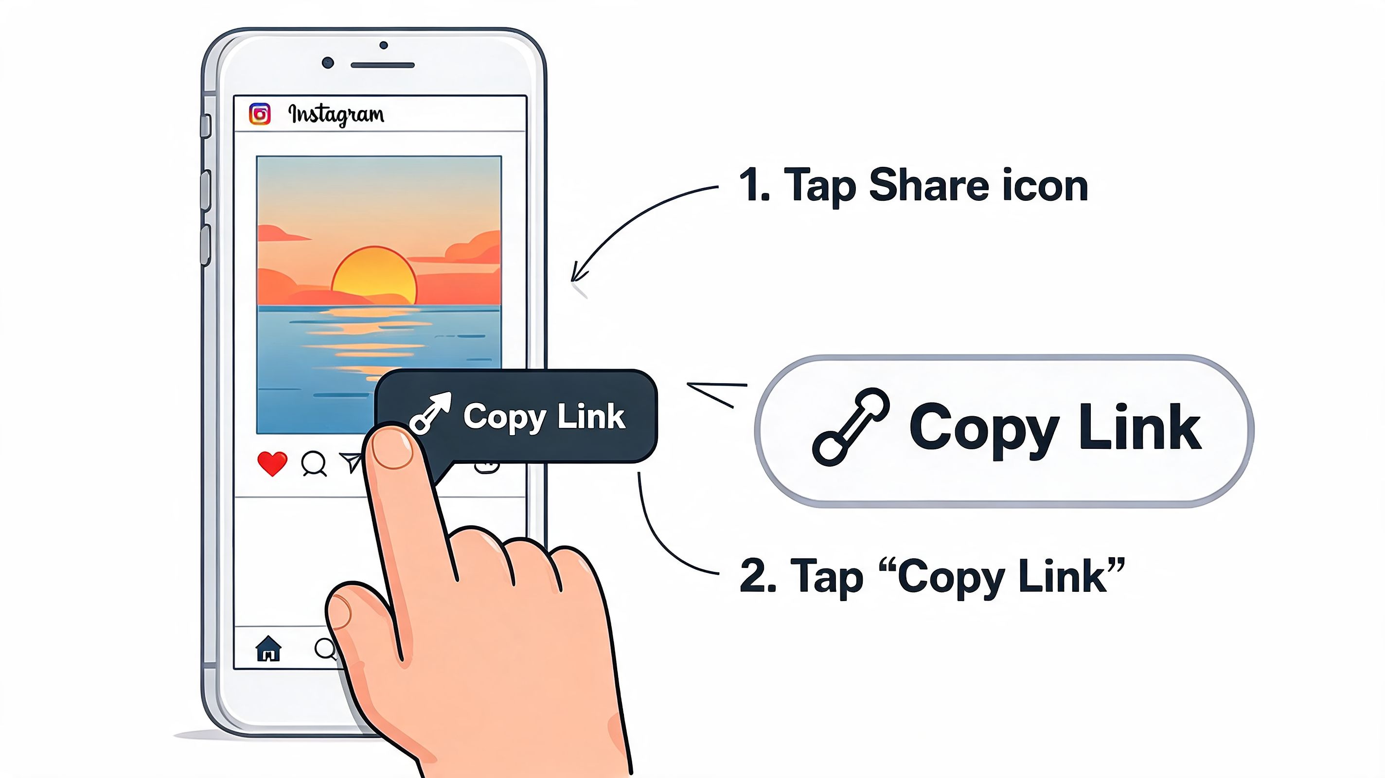
Open the post you want to share, tap the share icon or the three-dot menu, then tap Copy link.
That works for feed posts and Reels. Instagram places the full URL on your clipboard, so you can drop it into your bio tool, notes app, or scheduling workflow right away.
A few practical checks help:
- Use the original post view. Copy the link from the actual post, not from a screenshot, repost account, or saved collection.
- Double-check the target. If you're promoting a specific Reel, make sure you didn't accidentally copy your profile link instead.
- Paste it somewhere visible first. I usually paste into Notes once before adding it to a page. It's the quickest way to confirm I copied the right destination.
Copy a post link on desktop
If you're working from a browser, the process is even cleaner.
Open Instagram on the web, click the post, then either copy the URL from the browser address bar or use the post menu and choose Copy link if Instagram shows that option.
Desktop is handy when you're updating multiple blocks, writing campaign copy, or organizing links after a content batch.
If you want a visual walkthrough before doing it on your own account, this quick demo helps:
For another simple walkthrough, this guide on how to copy your Instagram link covers the same workflow clearly.
Public versus private posts
This is the part that creates avoidable confusion.
A copied Instagram URL only works as expected for people who can view the post. If the post is on a private account, visitors who aren't approved followers will hit a wall. The link itself exists, but access doesn't.
Private-post links aren't broken. They're restricted.
If you're using a link to instagram post for promotion, brand work, or creator partnerships, check visibility first. Public content gives you a clean handoff. Private content creates friction the moment someone clicks.
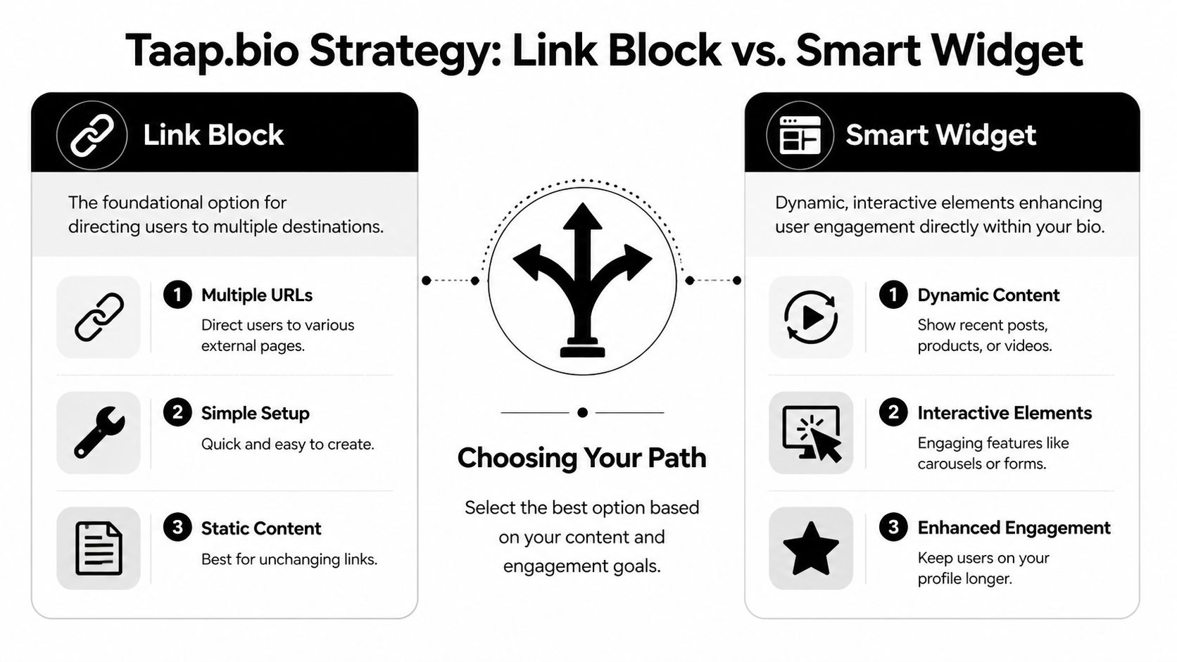
Link Block or Smart Widget Choosing Your Taap.bio Strategy
Once you have the Instagram post URL, the real decision starts. Do you add it as a direct block, or do you stop thinking in single links and build a live Instagram section instead?
Most creators need both approaches at different times. The mistake is using a single format for every job.
When a simple link block is the right move
A simple link block is the cleanest choice when one post needs the spotlight. Think campaign announcement, giveaway rules, a portfolio piece, a customer testimonial, or a Reel that explains your offer better than your homepage does.
I like direct blocks for content that has a clear shelf life or a clear business purpose. They give you editorial control. You choose the title, the visual treatment, and where the block sits in the grid.
A direct block is especially useful when:
- You need message control. Rename the block so visitors know why they should click.
- The post needs context. A title like “Start here” or “See the product demo” outperforms a generic “Instagram post.”
- You're testing one CTA. Single-destination blocks are easier to evaluate when you're checking what drove a click.
When a smart Instagram widget is the better system
A smart Instagram widget changes the game because it doesn't ask you to manually update every featured post. Instead of pushing one link at a time, you embed a live view of your current Instagram presence.
That matters because Instagram itself is visual and sequential. Visitors often don't want one isolated post. They want to inspect the recent feed, see whether your brand still looks active, and decide whether to follow.
Used well, a widget does three things at once:
- it reinforces social proof by showing current content,
- it reduces maintenance because the display stays fresh,
- and it gives the page a visual anchor that static lists usually lack.
taap.bio differs from standard list tools. Its Instagram widget can display recent photos, follower count, and a follow button in multiple profile formats, and you can place that widget inside a drag-and-drop bento grid alongside links, text, video, or music blocks.
A single link answers one question. An embedded widget answers several at once.
Head-to-head comparison
| Feature | Simple Link Block | Smart Instagram Widget |
|---|---|---|
| Primary job | Send visitors to one chosen destination | Display a live slice of your Instagram presence |
| Best use case | Campaigns, launches, featured posts, evergreen proof | Ongoing creator pages, active brands, visual portfolios |
| Setup effort | Fast and straightforward | Slightly more deliberate because layout matters |
| Freshness | Manual updates required | Updates with your current Instagram content |
| Visual impact | Depends on title and preview style | Stronger by default because visitors see recent content |
| Control | Precise control over one CTA | Broader control over profile presentation |
| Weak point | Can become stale if ignored | Can feel too broad if you need one exact action |
The trade-off most guides ignore
A direct link block is better when you need focus. A live widget is better when you need momentum.
Creators often think they need to choose one forever. They don't. The stronger setup is usually a hybrid. Put the live Instagram widget in a larger central position, then place a few smaller blocks around it for the actions that pay off, such as booking, a store page, or a featured post.
If you like the one-page site format but want more visual flexibility than a traditional card stack, this roundup on how to build stunning one-page sites fast is worth skimming for layout inspiration.
For page composition ideas specific to a visual bio page, the article on link in bio grid layouts is useful.
Best Practices for Embedding Instagram Content in Your Grid
The difference between a page that feels designed and one that feels assembled usually comes down to layout choices. Same content. Different hierarchy.
Instagram has confirmed that using phrases like link in bio in captions doesn't hurt engagement, and machine learning analysis found negligible differences, according to this review of the link in bio caption performance study. That means you can focus on the page experience itself instead of worrying that the CTA phrase is the problem.
Layout one for creators with a current launch
This is the most practical setup for creators pushing one active piece of content.
Make the Instagram widget the largest element in the upper half of the grid. Place one smaller link block next to it for the current launch, and a text block above or below that says exactly what people are looking at. Something as simple as “Latest drop,” “Watch the breakdown,” or “Start here” gives the page direction.
The result feels less like a menu and more like a campaign board. Visitors can either explore the live Instagram content or take the direct action you care about.
Put your most current visual block first, then place your highest-intent action one move away.
Layout two for freelancers and consultants
Service businesses need trust before click-through. In that case, I wouldn't let the page become all Instagram and no conversion path.
Use a medium or tall Instagram widget on one side. On the other side, add a testimonial text block, a booking link block, and one portfolio or case-study link. The Instagram section proves you're active. The service blocks give visitors a reason to act.
This structure works well because Instagram shows personality while the surrounding blocks handle business clarity. The page feels human without becoming messy.
Layout three for artists, podcasters, and musicians
Creative profiles usually have more than one media destination. You might want people to see recent Instagram visuals, but you also need a place for a track, episode, video, or shop link.
In that case, treat the Instagram widget as the visual spine of the page. Then cluster related media around it. A podcast episode can sit below it. A store link can sit to the side. A short text block can label the section so the page doesn't read like random tiles.
A few design habits help a lot here:
- Use one dominant block so the eye has a starting point.
- Group related actions instead of scattering similar links across the grid.
- Name blocks like buttons people want to press. “Book a call” is stronger than “Services.”
- Edit mobile and desktop separately when the tool allows it. Dense layouts that look smart on desktop often feel cramped on a phone.
If you're building around an embedded feed, this walkthrough on how to embed Instagram feed content shows the mechanics.
The biggest mistake I see is trying to make every block equally important. That never reflects real audience behavior. Visitors don't want ten options with identical weight. They want a clear visual path.
Tracking and Optimizing Your Instagram Link Performance
Once your page is live, guessing isn't enough. You need to know which post links people click, which blocks they ignore, and whether your caption CTA is moving profile visitors into action.
The useful benchmark here is directional, not decorative. Data shows that Instagram posts with a link in bio CTA drive an average of 5.72 users to the target profile, which is a 4.4x increase over posts without that CTA, and some A/B tests showed a 36% uplift in likes, based on Oneupweb's analysis of Instagram bio link strategy.
What to track first
Start with the basics. You don't need a giant analytics stack to learn something useful.
Watch for:
- Which block gets clicked most. A featured post may attract attention, but a booking or shop block may produce better business results.
- Which captions send people to the profile. If one caption style consistently lifts profile visits, keep refining that angle.
- Which post format deserves promotion. Sometimes the post with the strongest engagement isn't the one that drives the most useful clicks.
Use UTMs so traffic makes sense later
If you're sending profile traffic to a product page, newsletter, or landing page, add UTM parameters to the final destination URL. That way, analytics tools can tell you that the visitor came from Instagram bio traffic rather than a random direct visit.
A simple format looks like this in practice:
yoursite.com/page?utm_source=instagram&utm_medium=bio&utm_campaign=spring_launch
That one habit makes later reporting far cleaner, especially if you're comparing multiple campaigns or creators.
For ideas on testing page elements that affect click behavior, this guide on how to improve click-through rates is a practical next read.
Good A/B tests for this setup
Most creators test too many things at once. Keep it narrow.
Try one change at a time:
Change the block title
Compare “Latest Reel” against “Watch the tutorial.”Swap the layout priority
Put the Instagram area first for one period, then move a direct action block into the top position.Test the caption CTA
Keep the post format consistent and compare a plain descriptive caption against one that explicitly tells people to use the bio link.
Small naming changes often reveal bigger intent differences than visual tweaks do.
Optimization gets easier once you stop treating the bio page as fixed. It should evolve with your content, your offers, and the posts people respond to.
Your Instagram Link Questions Answered
Can I link to a post and then remove that post later
Yes, but the link will stop being useful once the post is deleted or archived in a way that prevents access. That's one reason live Instagram displays are more resilient than building your whole page around a single temporary post.
If you know a post has a short lifespan, treat it like campaign creative. Feature it while it's relevant, then replace the block instead of leaving a dead route in your page.
Can I link to someone else's Instagram post
You can copy and share a public post link, but use common sense and permission standards. If the post belongs to a collaborator, brand partner, or client, linking is usually straightforward when everyone understands the purpose.
If you're pulling attention toward someone else's content on your page, add context so visitors know why it's there. A vague external post can feel accidental. A labeled block such as “Our collab Reel” or “Client feature” feels intentional.
What's the difference between linking to a post, a Reel, and a Story
Feed posts and Reels are the easiest long-term assets because they have stable public URLs. Stories are different because they're temporary by nature, so they aren't the first thing I'd build a core link strategy around.
For a reliable link to instagram post workflow, prioritize permanent content. Use Stories for urgency and short-term pushes, but let your bio page point people toward assets that still make sense next week and next month.
If your current bio page still feels like a list of leftovers, rebuild it as a visual dashboard instead of adding one more button. taap.bio gives you a way to organize links, media, and embedded platform widgets into a page that looks closer to a real online presence than a generic link stack.


