

Tired of generic templates and uninspired layouts? A high-converting landing page is more than just a pretty design; it's a strategic tool for turning visitors into followers, clients, or customers. The main challenge isn't a lack of tools, but a shortage of fresh landing page ideas that connect with today's audiences.
In a space filled with lookalike pages, the goal is to create a destination that is both visually engaging and deeply functional. We're moving beyond simple link lists and static pages to explore dynamic, content-rich layouts that capture attention and drive real action. Ultimately, the goal of any landing page is to convert visitors. To learn more about proven strategies that can help you achieve this, explore this guide on how to improve website conversions.
This guide showcases 7 sources for cutting-edge landing page ideas and real-world examples, providing a strategic breakdown of what makes them effective. We’ll dive into replicable strategies you can use to build a powerful, personalized mini-site that truly reflects your brand. Whether you’re a creator, musician, freelancer, or small business, get ready to transform your online presence from a simple signpost into an unforgettable experience. Each example includes a direct link and screenshot for easy reference.
Table of contents
1. taap.bio
For creators, designers, and entrepreneurs seeking a visually compelling hub for their content, Taap.bio is a standout choice. It moves beyond the conventional, utilitarian "link in bio" and provides a dynamic canvas to build a true mini-site. This platform is perfect for anyone who wants to turn a simple link into a destination that reflects their brand's aesthetic and keeps visitors engaged directly on the page. If you're looking for landing page ideas that combine form and function, Taap.bio offers a powerful and elegant solution.
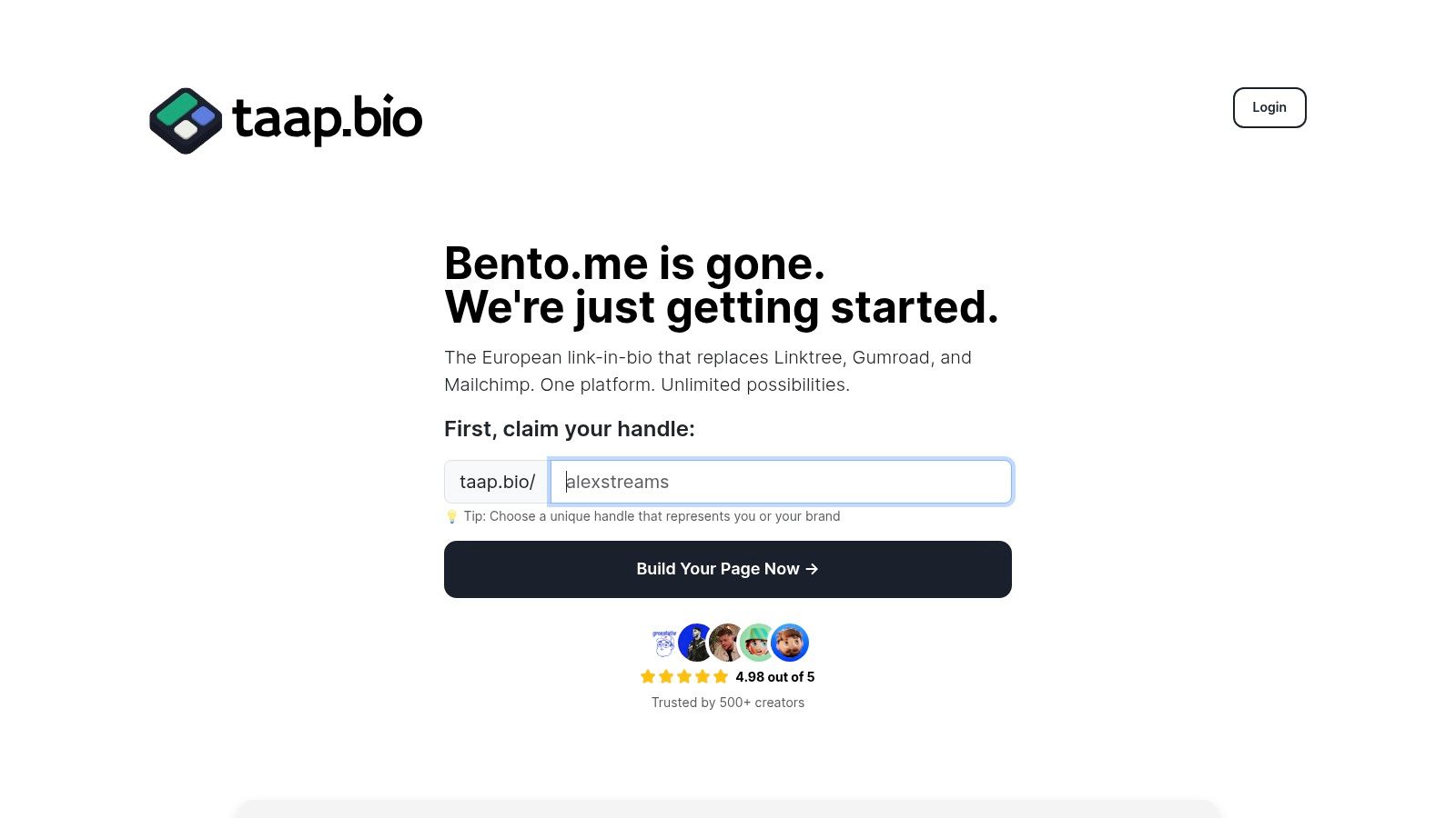
The platform’s core is its bento-style modular grid, an intuitive drag-and-drop interface where you arrange content blocks on a freeform canvas. Each element, from a link to a video, is a draggable, resizable block, giving you complete compositional control. This approach allows for the creation of asymmetric, magazine-like layouts that are far more interesting than a standard vertical list of links.
Strategic Breakdown & Key Features
Taap.bio’s strength lies in its ability to present live, interactive content instead of static links. This focus on media-rich widgets makes it an excellent source of inspiration and a practical tool for building effective landing pages.
- Smart Media Widgets: The platform offers deep integrations that pull real-time information from other services. You can embed a Spotify player for inline track or podcast playback, display live YouTube and TikTok video thumbnails, or showcase your GitHub contribution graph. This keeps your page fresh without manual updates.
- Total Visual Customization: Go beyond basic themes with full control over your page’s appearance. Customize color palettes, upload custom backgrounds, select from a wide range of fonts, and even use a GIF for your avatar. This level of detail ensures your landing page is a true extension of your brand.
- Device-Specific Layouts: Taap.bio automatically generates mobile and desktop versions of your page, but crucially, it allows you to edit each layout independently. This ensures your carefully crafted design looks polished and is perfectly optimized for every screen size, a critical detail for user experience.
Key Takeaway: The ability to craft separate mobile and desktop experiences is a significant advantage. A layout that shines on a wide desktop monitor often feels cluttered on a mobile screen. By tailoring each view, you ensure your most important calls-to-action and content are always front and center, no matter the device.
Practical Application & Getting Started
Getting started is designed to be frictionless. You can sign up with a Google account or email without needing a credit card. For those migrating from other platforms, Taap.bio offers a one-click import tool for Bento.me users, transferring links and settings in seconds, which is a major convenience for those affected by its upcoming shutdown.
The free plan is generous, making it accessible to try out the core features. Its position as a privacy-aware, European-based company also appeals to users who prioritize data protection. For a deeper dive into the fundamentals of what makes these pages work, their blog offers useful insights on what a landing page is and how to approach its design. With a strong 4.98/5 rating from its growing user base, Taap.bio has established itself as a credible and powerful tool for building beautiful, functional landing page ideas.
Website: https://taap.bio
2. Land-book
Land-book is a highly curated design gallery that focuses exclusively on the best-looking websites, making it a goldmine for anyone seeking modern and effective landing page ideas. Instead of aimlessly browsing the web, you get a concentrated feed of top-tier design patterns, saving you immense time during the inspiration phase. Its clean interface and powerful filtering system are what set it apart, allowing you to zero in on exactly what you need.
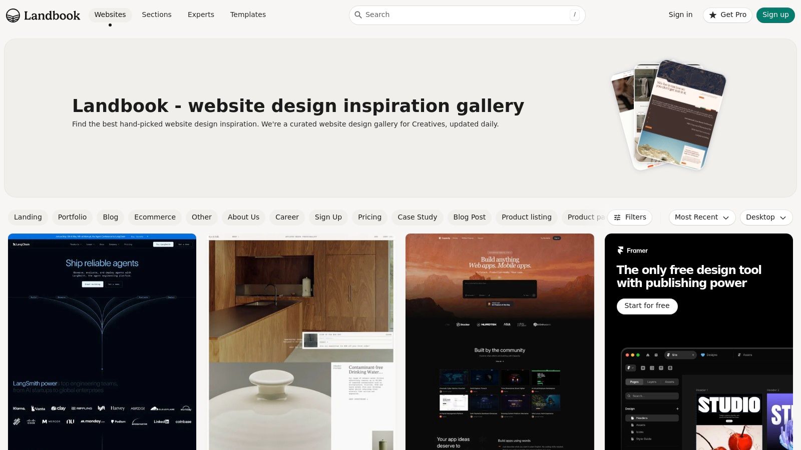
This platform is more than just a gallery; it's a strategic tool. You can deconstruct successful pages by studying individual components. The "Sections" library lets you filter for specific blocks like hero sections, pricing tables, or testimonials. This granular approach helps you understand what works for each part of your page, from the initial hook to the final call to action.
Strategic Breakdown & Takeaways
The true strength of Land-book is its filtering capability. You can search by industry, page type (like "Portfolio" or "SaaS"), style, and even the platform it was built on (Webflow, Framer, etc.). This makes it incredibly efficient to find relevant examples that align with your brand and technical setup.
Key Insight: Don't just look at whole pages. Use the "Sections" filter to collect 3-5 examples of just hero sections or just pricing blocks. This micro-focus helps you build a stronger, more coherent page, block by block, which is perfect for assembling a Taap.bio layout.
How to Apply This to Your Taap.bio Page
- Filter for Simplicity: Start by filtering for "Portfolio" or "Personal" websites. These often have clean, single-column layouts that translate perfectly to a mobile-first Taap.bio design.
- Build with Boards: Use Land-book's "Boards" feature to save examples you like. Create separate boards for "Hero Section Ideas," "Portfolio Grids," and "CTA Buttons." When you’re ready to build, you’ll have a pre-vetted visual brief.
- Analyze Layout Evolution: The Pro plan’s "old versions" feature is unique. It shows how popular sites have changed their designs over time. This can provide valuable lessons on improving conversion rates on landing pages by seeing what top brands tweaked for better performance.
Website: https://land-book.com/
| Feature | Details |
|---|---|
| Pricing | Free with basic filters. Pro plan unlocks unlimited filters, screenshot downloads, and ad-free browsing. |
| Unique Offer | "Sections" library for block-level inspiration and "old versions" to track design evolution. |
| Best For | Designers, freelancers, and small businesses needing quick, high-quality visual patterns for their projects. |
3. Lapa Ninja
Lapa Ninja is one of the largest and most frequently updated galleries dedicated to landing page design, with a massive archive of over 7,300 examples. It serves as an enormous mood board for anyone looking for fresh landing page ideas, particularly those interested in identifying current visual trends. Its strength lies in its sheer volume and consistent updates, making it a reliable source for contemporary design inspiration.
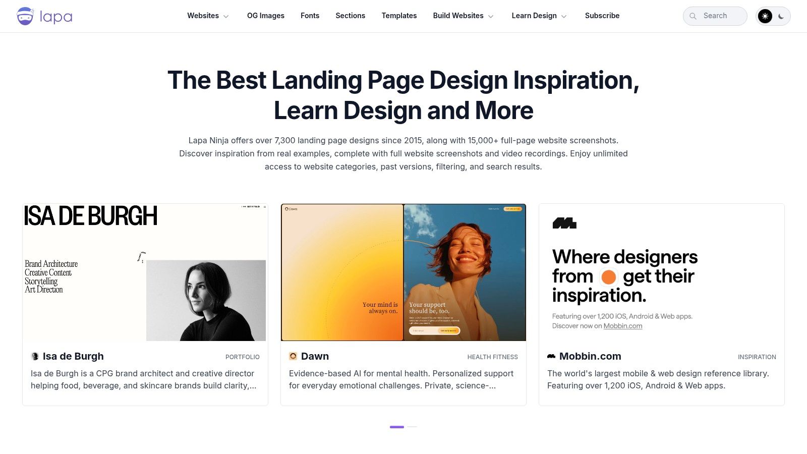
This platform provides a straightforward browsing experience, allowing you to quickly absorb a wide range of layouts, color palettes, and typographic styles. Beyond just full-page screenshots, Lapa Ninja also offers breakdowns of specific elements like fonts, sections, and even OG images. This focus on individual components helps you move from broad inspiration to specific, actionable design choices for your own project.
Strategic Breakdown & Takeaways
The true power of Lapa Ninja is its comprehensive library and granular filtering. You can search by category, color, year, and even the platform it was built on, such as Webflow, Framer, or Shopify. This is especially useful for seeing how different tools influence design trends and finding examples that are technically relevant to your own stack. The constant updates ensure you are always viewing the most current styles.
Key Insight: Pay attention to the "Year" filter. Compare designs from this year to those from two or three years ago to see how visual trends evolve. This helps you create a page that feels modern and forward-thinking, not dated.
How to Apply This to Your Taap.bio Page
- Spot Grid-Based Layouts: Many modern designs featured on Lapa Ninja use a modular or grid-based structure. These are perfect references for arranging your content, and you can explore more about this popular trend by reading up on bento box web design.
- Study Color Palettes: Use the color filter to find pages that match your brand's aesthetic. Save 3-4 examples with compelling color combinations to guide the visual theme of your Taap.bio profile.
- Deconstruct Hero Sections: Browse the "Sections" tab to find inspiration specifically for the top of your page. Look for simple, high-impact hero designs with a clear headline and a single call to action, which are ideal for a mobile-first bio link.
Website: https://www.lapa.ninja/
| Feature | Details |
|---|---|
| Pricing | Free for browsing. Pro/support options are available, though pricing isn't clearly stated on the main page. |
| Unique Offer | Massive, frequently updated library with filters for platform (Webflow, Framer) and year to track trends. |
| Best For | Designers and developers wanting a quick, high-volume source of inspiration for current web design patterns. |
4. One Page Love
One Page Love is a long-standing, curated gallery specializing in single-page websites, making it a fantastic source for focused and effective landing page ideas. Its tight curation, running since 2008, means you're seeing proven designs that get straight to the point. This is especially useful for creators and businesses who need a lean, impactful online presence without the complexity of a multi-page site.
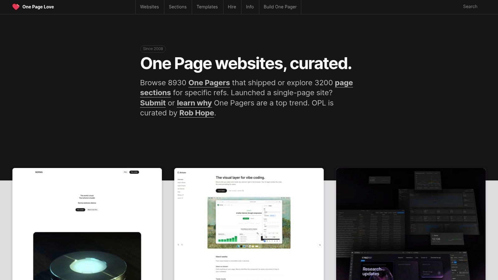
The platform’s real power comes from its dedication to the "one-page" philosophy. It provides a dedicated 'Landing Page' category and a detailed Sections library for deconstructing layouts. You can browse specific components like pricing tables, testimonials, or hero patterns to quickly gather inspiration for individual blocks. Beyond visuals, it connects you to tutorials and courses, turning inspiration into an executable plan.
Strategic Breakdown & Takeaways
One Page Love’s greatest strength is its relevance for single-destination pages like a Taap.bio profile. The filtering lets you sort by site type (like "Startup" or "Product") and even the platform it was built on, including some of the best one-page website builders on the market. This makes it easy to find layouts that are both aesthetically pleasing and technically achievable.
Key Insight: Focus on the "flow" of the single-page designs. Notice how successful pages guide the user’s eye downward with a strong visual hierarchy, from the hero section to the final call to action. This narrative journey is what you want to replicate on your Taap.bio page.
How to Apply This to Your Taap.bio Page
- Study the Sections Library: Instead of copying an entire page, visit the "Sections" area. Find a hero section you love, a client logo block that looks professional, and a testimonial layout that builds trust. Recreate these individual blocks within your Taap.bio grid.
- Filter by "Carrd": Filter the gallery to see sites built with Carrd. These designs are inherently simple and mobile-first, providing excellent, direct-fit templates for a Taap.bio layout.
- Learn from the Tutorials: Explore the linked tutorials on topics like "call to action" placement. The principles discussed are directly applicable to optimizing the buttons and links on your Taap.bio page for better engagement.
Website: https://onepagelove.com/
| Feature | Details |
|---|---|
| Pricing | Free for browsing galleries. Premium templates and courses are sold individually (à la carte). |
| Unique Offer | Deep focus on one-page design, a rich "Sections" catalog for block-level ideas, and an ecosystem of learning resources. |
| Best For | Creators, freelancers, and startups looking for lean, high-converting single-page design inspiration. |
5. Landingfolio
Landingfolio is a powerful resource that bridges the gap between inspiration and execution. It offers a vast, curated gallery of landing page ideas but goes a step further by providing a massive library of components and templates for popular development tools. This makes it ideal for anyone who wants to move quickly from a great idea to a tangible, coded reality. Its clear organization and practical resources save you from reinventing the wheel.
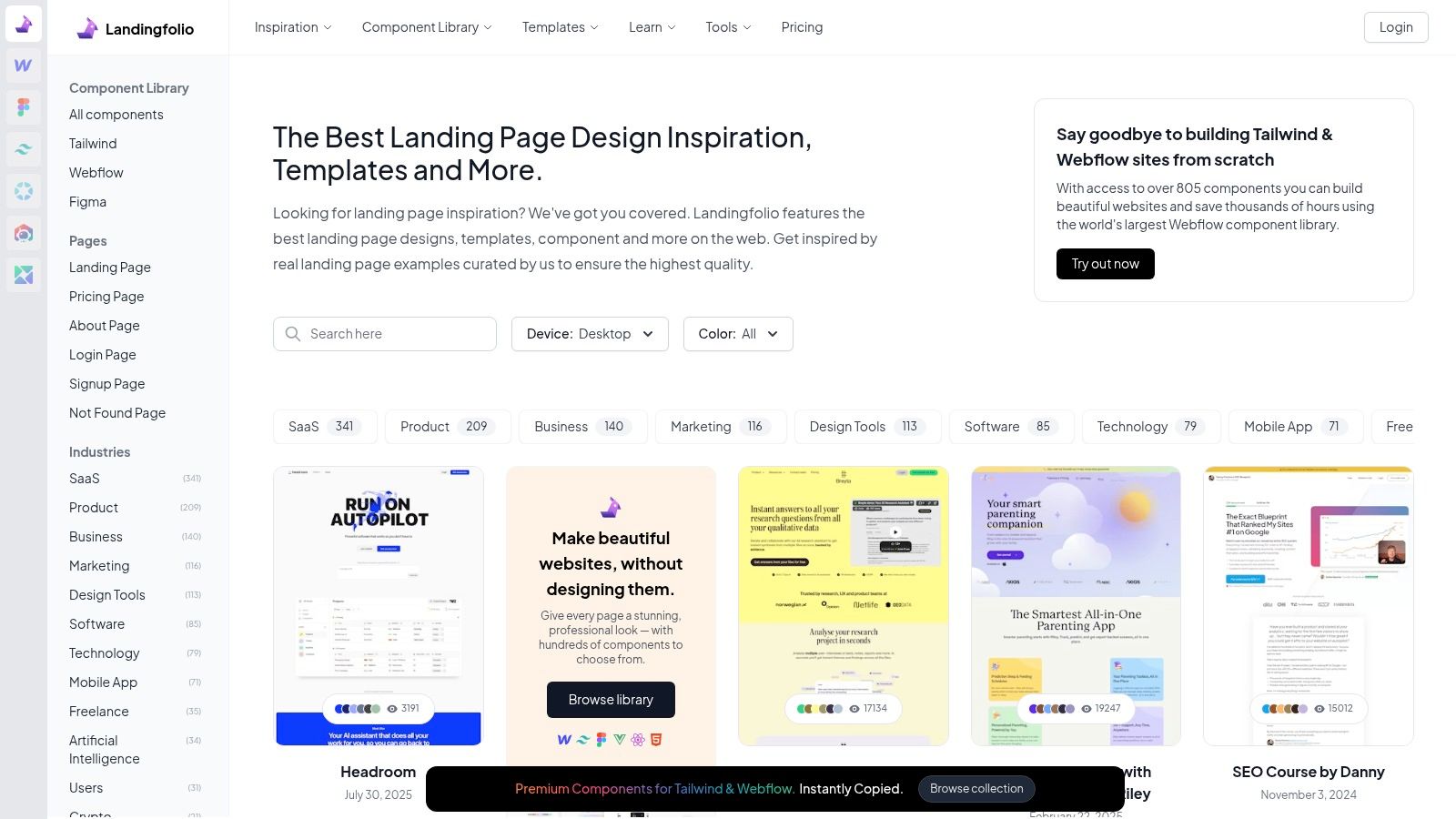
This platform isn't just about pretty pictures; it’s an actionable toolkit. The site is meticulously organized by page type, allowing you to filter for "About," "Pricing," or "Sign Up" pages with a single click. The true advantage is its component library, which contains over 800 pre-built blocks for Tailwind CSS, Webflow, and Figma. You can find a design pattern you admire and then grab the code or design file to implement it instantly.
Strategic Breakdown & Takeaways
The core strength of Landingfolio is its direct path from inspiration to implementation. Finding a design you like is only the first step; the platform gives you the building blocks to actually construct it. This is especially valuable if you are working within the Webflow or Tailwind ecosystems. The blog also offers practical guidance on conversion rate optimization, making it a well-rounded resource for both design and performance.
Key Insight: Don’t just browse for full-page inspiration. Filter by page type like "Features" or "Testimonials" to see how successful brands frame their value propositions. The copy-paste components can dramatically speed up the creation of these critical sections in your Taap.bio layout.
How to Apply This to Your Taap.bio Page
- Component-Driven Building: Browse the free components library for ideas. Find a call-to-action button or a feature list that catches your eye. You can then recreate its style, color, and copy directly within a Taap.bio smart widget.
- Study Page-Specific Flow: Look at how "SaaS" or "Agency" landing pages are structured. Notice the sequence of information: hook, social proof, features, and CTA. Mirror this logical flow in the vertical arrangement of your Taap.bio blocks to guide your visitors effectively.
- Learn from Optimization Tips: Read the Landingfolio blog for tips on improving conversion rates on landing pages. Articles on UX and CRO can give you ideas for A/B testing your Taap.bio headline, button text, or the order of your links.
Website: https://www.landingfolio.com/
| Feature | Details |
|---|---|
| Pricing | Free for browsing inspiration. The All-Access pass is required for most component downloads and templates. |
| Unique Offer | Extensive component library for Tailwind, Webflow, and Figma, directly connecting inspiration to build assets. |
| Best For | Developers, designers, and marketers who want to rapidly prototype and build high-quality pages with pre-made elements. |
6. SaaS Landing Page
For those building software products or digital services, SaaS Landing Page is a hyper-focused gallery that provides an invaluable collection of landing page ideas. This niche platform is dedicated exclusively to the Software-as-a-Service industry, curating examples across essential page types like pricing, features, testimonials, and FAQs. It eliminates the noise, letting you study patterns directly relevant to driving trials and subscriptions.
The platform’s real power comes from its categorical organization. Instead of just browsing homepages, you can jump straight to a collection of just pricing pages or just feature comparison grids. This makes it incredibly efficient for deconstructing what works for specific conversion goals, like getting a user to select a plan or understand complex features. Once you have your ideas, integrating them into a proven SaaS product launch strategy is key for successful implementation.
Strategic Breakdown & Takeaways
The most useful feature is the ability to navigate by page type. This targeted approach helps you solve specific design problems quickly. Need to build trust? Go to the "Testimonials" section. Unsure how to present subscription tiers? The "Pricing" gallery is your best resource. It also includes template listings and stack information (Framer, Webflow, etc.), so you can find examples built with the same tools you use.
Key Insight: Pay close attention to the visual hierarchy on pricing pages. Notice how successful SaaS companies use color, size, and labels like "Most Popular" to guide users toward a specific choice. This psychological nudge is a powerful conversion tool.
How to Apply This to Your Taap.bio Page
- Model Pricing Tiers: If you offer services, use the "Pricing" section for inspiration. You can replicate a tiered structure on your Taap.bio page using separate text and button blocks for each package, a strategy detailed in these landing page examples for services.
- Build a "Features" Grid: Selling a digital product or course? Browse the "Features" gallery and adapt a simple checkmark-style list for your Taap.bio. Use icon blocks and short text to clearly communicate what customers will get.
- Borrow Trust Signals: Look at how SaaS pages use logos, testimonials, and user counts to build credibility. You can add a "Trusted By" section to your Taap.bio with logos of clients or publications you've been featured in.
Website: https://saaslandingpage.com/
| Feature | Details |
|---|---|
| Pricing | Free to browse the gallery. |
| Unique Offer | Gallery organized by SaaS page types (Pricing, Features, etc.) for highly specific inspiration. |
| Best For | SaaS founders, product managers, and digital service providers needing to design high-converting pages. |
7. Awwwards – Landing Page Inspiration
Awwwards is a global showcase recognizing the talent and effort of the world's best web designers, developers, and agencies. While it covers all website types, its curated landing page ideas section is an exceptional resource for finding high-end, artistic, and often experimental designs. It's the place to go when you want to see what's possible on the frontier of web design, especially regarding motion and interaction.
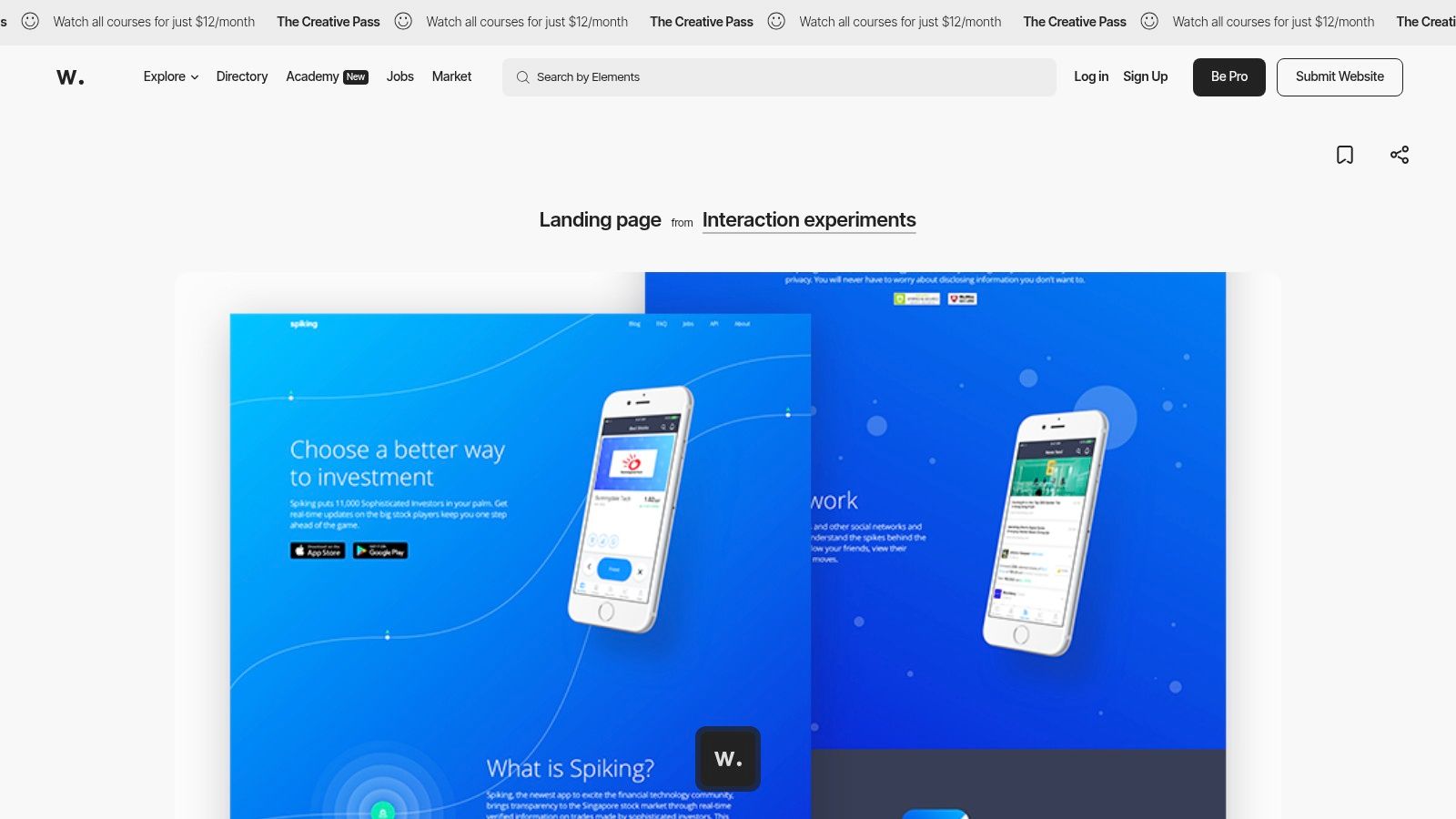
Unlike simple galleries, Awwwards provides context by scoring sites on design, usability, creativity, and content. This peer-review system means you're not just seeing pretty pages; you're seeing work that has been professionally vetted. The landing page feed is a continuous stream of inspiration, perfect for breaking out of a creative rut and discovering novel visual concepts.
Strategic Breakdown & Takeaways
The key to using Awwwards effectively is to look for concepts, not direct copies. Many of the award-winning sites are built with large budgets and complex code. Your goal is to distill their core ideas, such as a unique color combination, an interesting typographic treatment, or a captivating hero section concept, and adapt them to a simpler format.
Key Insight: Focus on the "Site of the Day" and "Honorable Mentions" for a daily dose of fresh concepts. Deconstruct one element you love, like a button's hover effect or a background video's style, and think about how you could create a simplified version for your own page.
How to Apply This to Your Taap.bio Page
- Study Micro-interactions: Pay close attention to how elements move and react to the user. While you can't replicate complex animations, you can borrow the feeling. For example, use a subtle fade-in effect on your Taap.bio blocks to mimic a more advanced site's entry animation.
- Find Hero Inspiration: Awwwards is a masterclass in creating impactful first impressions. Find a hero section with a bold headline and a compelling background. Recreate this on your Taap.bio page with a strong opening statement and a high-quality background image or video.
- Borrow Typographic Styles: Many Awwwards sites use creative font pairings and layouts. Note the combinations of serif and sans-serif fonts, or the use of oversized text as a design element, and apply these principles to your Taap.bio's text blocks.
Website: https://www.awwwards.com/inspiration/landing-page
| Feature | Details |
|---|---|
| Pricing | Free to browse inspiration. Pro plans and Academy courses for deeper learning are paid subscriptions. |
| Unique Offer | Award-based curation ensures high-quality, peer-reviewed examples with a focus on cutting-edge design. |
| Best For | Designers and creators seeking top-tier visual concepts and motion design ideas to adapt for their own use. |
Top 7 Landing Page Inspiration Sites Comparison
| Tool | 🔄 Implementation complexity | ⚡ Resource requirements | 📊 Expected outcomes | 💡 Ideal use cases | ⭐ Key advantages |
|---|---|---|---|---|---|
| taap.bio | 🔄 Moderate — flexible bento grid and layout editing has a learning curve | ⚡ Low dev; moderate design/time investment for custom layouts | 📊 Media‑rich, branded single‑link page with live embeds and higher engagement potential | 💡 Creators, musicians, podcasters, freelancers, small brands | ⭐ Deep real‑time widgets (Spotify, YouTube, GitHub), device‑specific layouts, extensive visual customization |
| Land‑book | 🔄 Low — browse, filter, collect | ⚡ Minimal (research time); Pro unlocks advanced filters/downloads | 📊 Rapid discovery of visual patterns and page sections | 💡 Designers and marketers gathering examples and briefs | ⭐ Granular filters, Sections library, user boards for collection |
| Lapa Ninja | 🔄 Low — straightforward archive browsing | ⚡ Minimal; large volume to sift through; Pro details unclear | 📊 Broad inspiration and trend spotting across years and platforms | 💡 Designers seeking many examples and platform‑specific patterns | ⭐ Very large archive, platform/year filters, screenshot references |
| One Page Love | 🔄 Low — focused on single‑page templates and sections | ⚡ Minimal; premium templates/courses sold separately | 📊 High‑quality, single‑page patterns suitable for lean landing pages | 💡 Single‑page sites, simple landing/portfolio pages | ⭐ Long‑running curation, robust Sections catalog, tutorials/courses |
| Landingfolio | 🔄 Low–Moderate — inspiration plus buildable components | ⚡ Moderate — best value with Tailwind/Webflow familiarity; paid All‑Access for some assets | 📊 Faster path from idea to implementation using templates/components | 💡 Teams/designers who want copy‑paste components and templates | ⭐ 800+ components, templates (Webflow/Tailwind/Figma), optimization resources |
| SaaS Landing Page | 🔄 Low — niche, focused gallery | ⚡ Minimal browsing; templates vary by stack | 📊 Targeted SaaS patterns for pricing, trial flows and trust elements | 💡 SaaS product teams designing pricing/features/test flows | ⭐ Curated SaaS collections, page‑type navigation, stack tagging |
| Awwwards – Landing Page Inspiration | 🔄 High — many examples are experimental and complex to reproduce | ⚡ High — advanced visuals/interactions require design/dev resources | 📊 Cutting‑edge visual and interaction ideas; may need simplification for production | 💡 Agencies, senior designers and studios seeking innovation | ⭐ Exceptional high‑end visuals and motion inspiration, Academy courses available |
From Idea to Impact: Your Next Steps
Inspiration is the first step, but execution is what brings your vision to life. The landing page ideas we've explored throughout this article, from the interactive bento grids of Taap.bio to the design-forward galleries on Awwwards, all share a common thread: they are designed with purpose. They don’t just show links; they tell a story, display real-time content, and create an immersive brand experience.
The core insight is to see your landing page as more than a digital business card. It's your personal gallery, your portfolio, your storefront, and your stage, all combined into a single, powerful link. The most effective pages are strategic, guiding visitors toward a specific action while expressing a unique point of view.
Your Action Plan: Turning Concepts into Reality
Observing great design is valuable, but building is where the real learning happens. To move from passive inspiration to active creation, follow these steps:
Define Your Primary Goal: Before you add a single element, ask yourself: What is the number one thing I want visitors to do? Is it to subscribe to your newsletter, listen to your latest track, book a consultation, or buy a product? A clear goal will inform every design choice you make.
Select Your Core Elements: Based on your goal, choose the content that best supports it. A musician might feature a Spotify widget and tour dates, while a freelance writer could prioritize a portfolio link and a contact form. Don't feel obligated to include everything; focus on what drives your main objective.
Sketch a Rough Layout: Grab a pen and paper or use a simple digital tool to map out where your core elements will go. Consider visual hierarchy. What should your audience see first? This simple exercise helps you translate abstract landing page ideas into a concrete structure.
Choosing and Implementing the Right Tool
The tool you choose will either enable your creativity or restrict it. While inspiration sites like Lapa Ninja and Landingfolio are excellent for gathering ideas, a flexible builder is essential for implementation. When selecting a platform, consider these factors:
- Customization Freedom: Can you move beyond a simple list of links? Look for tools that offer grid-based layouts, allowing you to control the size, position, and feel of each content block.
- Smart Content Integration: Your digital presence is dynamic. Your landing page should be too. A great tool will let you embed live content directly, like YouTube videos, Spotify tracks, or your latest blog posts, keeping your page fresh without manual updates.
- Device-Specific Optimization: Your audience will visit your page from phones, tablets, and desktops. The ability to create and fine-tune device-specific layouts is critical for delivering a consistently great experience everywhere.
The most powerful landing page ideas are those that feel personal and authentic. Your page is a direct reflection of your brand, so don't be afraid to break from the standard template. Experiment with asymmetry, mix static and dynamic content, and write a call to action that speaks in your unique voice. Don't just collect ideas-start building your destination today.
Ready to build a page that truly represents you? taap.bio gives you the creative control to bring these landing page ideas to life with its modular grid, smart widgets, and device-specific layouts. Start building your custom page for free and turn your inspiration into impact.


