
Trying to build a professional online hub without the headache and expense of a full-blown website? You've come to the right place. Your hunt for the perfect one page website builder free of charge is over, especially if you're after something that's both modern and visually striking. The right tool lets you craft a powerful digital presence that shows off your brand, pulls all your links together, and makes a fantastic first impression—all without costing you a thing.
Table of contents
Why Your Online Presence Needs a Single Page Hub
In a world where attention is everything, a single-page website is your digital business card, portfolio, and central hub rolled into one. It cuts straight through the clutter, giving visitors a direct, focused experience. This isn't just about keeping things simple; it's a smart way to lead your audience exactly where you want them to go, minus the friction of a clunky, multi-page site. For creators, freelancers, and small businesses, this streamlined format is the secret to turning casual visitors into loyal followers, clients, or customers.
The demand for these tools is huge. The market has blown up as people look for an online presence without the steep price of custom development, which can easily top $10,000. With 252,000 new websites popping up daily, free builders have become the go-to for getting online quickly and effectively. You can dig into more of these website builder statistics on Sitebuilder Report.
Beyond a Simple List of Links
Let's be honest, old-school "link-in-bio" tools can feel pretty bland. They often just give you a generic, uninspired list of links. But a modern one page website builder free from those old constraints lets you do so much more. The best platforms give you:
- Creative Freedom: Break free from rigid templates with modular, grid-based layouts that let you build something truly unique and beautiful.
- Dynamic Content: Add smart widgets that pull in live content from places like Spotify, YouTube, and Instagram, making your page a living, breathing hub.
- Brand Alignment: Tweak fonts, colors, and backgrounds to create a page that feels 100% like you or your business.
The goal is to build a destination, not just a directory. Your one-page site should be an engaging experience that captures your audience's interest and encourages them to explore your entire digital ecosystem.
With the recent news that Bento.me is shutting down, finding a powerful and flexible alternative is more important than ever. This guide will walk you through the top contenders, using Taap.bio's slick bento-grid system as a benchmark. We’ll help you find the perfect platform to build your new digital home, moving way beyond simple link lists to create something truly dynamic and professional, for free.
Why a One Page Website is a Strategic Advantage
Don't think of a single-page website as a compromise; it’s a smart, strategic move. In a world where you have seconds to grab someone's attention, the sheer simplicity of a one-pager is its biggest strength. You get to cut through the noise, ditching the confusing navigation and telling your whole story in one smooth, uninterrupted scroll.
This approach gives you complete control over the narrative. If you’re a freelancer, you can walk a potential client from a punchy introduction, through your best work, and straight to your contact form without them ever getting lost. It's a focused journey designed to get results.
Designed for Mobile First Engagement
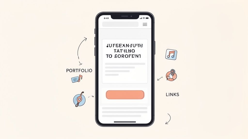
Let's be real: one-page sites were practically made for phones. With over 60% of website traffic now coming from mobile devices, a design that feels native to a small screen is no longer a "nice-to-have"—it's a necessity. The vertical scrolling format is exactly how we're all used to consuming content on our phones anyway.
This natural fit makes for a much better user experience. People can glide through your content effortlessly, soaking it all in without fumbling through tiny menus. Keeping things this simple is key to holding their attention and stopping them from bouncing away.
A single-page website forces you to be ruthless with your content. It makes you boil your message down to what truly matters, ensuring every single section has a clear purpose and pushes people toward your main goal—whether that's booking a client, getting a follow, or selling a product.
Think about a musician dropping a new single. Using a one page website builder free of charge, they can spin up an entire promotional hub in minutes. The page could have:
- An embedded Spotify player to hear the track instantly.
- The music video pulled right from YouTube.
- Direct links to Apple Music, Tidal, and other streaming platforms.
- Tour dates and a big, bold button to buy merch.
Everything a fan could possibly want is all in one spot, packed into a single, shareable link.
Boosting Conversions Through Simplicity
Ultimately, your online presence is there to get people to do something. This is where a one-page site really shines. By laying everything out in a single path, you eliminate decision fatigue and guide visitors right where you want them to go.
There’s no chance of a lead getting sidetracked on an "About" page when you really just want them to click "Book a Call." Every scroll builds momentum, leading them toward that final, all-important action. It’s a structure that’s incredibly effective for targeted goals.
For example:
- Influencers: A one-pager is the perfect link-in-bio hub. It can beautifully display their latest posts, brand collaborations, and affiliate links in a clean, visual grid.
- Freelancers: The single page becomes a living resume, portfolio, and contact sheet all in one, showcasing their skills in a cohesive story that prompts people to reach out.
By cutting out unnecessary clicks and distractions, you create the shortest possible path from casual interest to genuine conversion. This focused design doesn't just feel better for the user; it makes your site a much more effective tool for generating leads.
Choosing the right free one-page website builder isn't just about picking a tool—it's about finding the one that perfectly matches your vision. The differences between the top contenders can seem subtle, but they're critical. We're going to dive deep into what separates platforms like Carrd, Strikingly, and the Wix free tier, using Taap.bio as our benchmark for what a modern, flexible builder can do.
Forget generic feature lists. This is about real-world use: how much design freedom do you actually get? What kind of content can you integrate? And how does it feel to use? Let's find the right fit for you.
Design Freedom vs. Template Simplicity
The first big choice you'll face is between creative control and speed. Do you want a blank canvas to create something truly unique, or a polished template to get you online fast?
Carrd is the champion of simplicity. It gives you a collection of clean, professional templates that are a breeze to customize. This approach is perfect if you want a great-looking site without getting lost in design decisions. The trade-off? You’re mostly working within the lines of their pre-made layouts.
Strikingly follows a similar path, offering a library of templates you can populate with your content. It gives you a little more wiggle room than Carrd in how you arrange sections, but you're still building within a set framework. It’s a solid choice for a straightforward landing page but less so for a one-of-a-kind design.
The real choice here is between speed and personality. Templates get you launched in minutes, but a grid-based system lets you build a page that feels entirely your own—a huge plus for personal branding.
This is where Taap.bio completely changes the game. It ditches rigid templates for a flexible, bento-style grid. You can drag, drop, and resize content blocks anywhere you want, creating dynamic, asymmetrical layouts that capture attention. For any creative who wants their page to be a genuine reflection of their style, this level of control is something template builders just can't offer.
Content Capabilities and Smart Integrations
A great one-page site should be more than a static business card; it needs to be a living, breathing hub for all your online activity. The ability to pull in live content from other platforms is what elevates a basic landing page into a truly memorable experience.
Here’s how the top builders handle content:
- Wix (Free Plan): As a website-building giant, Wix lets you add almost anything—galleries, videos, forms, you name it. But the free plan comes with very noticeable Wix branding, and its complex editor can feel like using a sledgehammer to crack a nut for a simple one-pager.
- Carrd: Carrd keeps it beautifully simple. You can easily embed images, videos, and payment buttons from Stripe or PayPal. It does the basics exceptionally well but doesn't have deep, dynamic integrations with social or creative platforms.
- Strikingly: Strikingly has a neat trick up its sleeve: a "Simple Store" feature on its free plan that lets you sell one product. Beyond that, it handles basic media embeds but, like Carrd, doesn't offer a rich library of live-updating widgets.
Taap.bio was designed from the ground up for smart integrations. Its "smart widgets" aren't just links—they're live windows into your other platforms. You can drop in a playable Spotify track, a feed of your latest Instagram posts, or your newest YouTube video right onto your page. This transforms your site from a passive list of links into an active destination where people can engage with your work directly.
The massive adoption of free builders shows a clear shift toward creator-focused tools. Wix's 8 million sites highlight the demand for easy-to-use platforms, while Carrd and Strikingly appeal to those who want unlimited free builds for simple, template-driven sites. This matters because 46% of US sites get between 1,001-15,000 monthly visitors, often starting with a powerful one-pager. You can dig into more small business website statistics from Wix to see the trend.
User Experience and Ease of Use
For a busy creator, a one page website builder free of headaches is a must. You should be able to go from zero to a professional-looking page in a single afternoon, without pulling your hair out.
Carrd is probably the easiest of the bunch to master. The interface is clean and laser-focused, guiding you from template to launch in what feels like minutes. It’s a fantastic choice for anyone who values speed and simplicity above all else.
Strikingly is also incredibly user-friendly. Its section-based editor makes adding and rearranging content intuitive. The whole process is smooth, letting you build a sharp-looking page with zero prior experience.
Wix, on the other hand, presents a steeper learning curve. Its powerful editor is packed with so many options that it can be overwhelming if all you need is a single, beautiful page. The flexibility is there, but it comes at the price of simplicity.
Taap.bio hits that sweet spot between power and intuitive design. The drag-and-drop grid feels less like building a website and more like designing in a tool like Canva. The physics-based interactions are smooth and satisfying, giving you total creative freedom without the complexity of a traditional builder.
Feature Comparison of Leading Free One Page Builders
To make the differences crystal clear, let's put these builders head-to-head on the features that matter most for a free one-page website.
| Feature | Taap.bio | Carrd | Strikingly | Wix (Free Plan) |
|---|---|---|---|---|
| Design Flexibility | High (Bento-grid system) | Low (Template-based) | Medium (Section-based templates) | Very High (Full drag-and-drop editor) |
| Smart Integrations | Extensive (Spotify, IG, YouTube) | Basic (Forms, embeds) | Limited (Simple Store, basic embeds) | Extensive (App Market) |
| Ease of Use | Very High (Intuitive drag-and-drop) | Very High (Simple and fast) | High (Clear, section-based) | Medium (Steeper learning curve) |
| Provider Branding | Minimal | Subtle "Made with Carrd" footer | Prominent "This site is built with Strikingly" | Prominent ad banner at the top of the page |
| Best For | Creatives wanting a unique visual hub. | Quick, professional-looking personal sites. | Simple landing pages and small business sites. | Users needing complex features on a single page. |
So, what’s the final verdict? If speed is your top priority, Carrd is a fantastic choice. If you need to sell a single product for free, Strikingly has an edge. But for creators who refuse to be boxed in—who want true visual freedom and a dynamic, content-rich hub that actually stands out—Taap.bio’s innovative grid and smart integrations are in a class of their own.
How to Choose the Right Builder for Your Needs
Trying to pick a one page website builder free of charge can feel like you're drowning in options. The reality is, the perfect platform for a musician is probably the wrong one for a visual artist. The decision really boils down to one simple question: what do you need this page to do? Is it for showcasing creative work, pulling in new clients, or building a community?
Instead of getting lost in endless feature lists, let's think about this from the perspective of your craft. What you do for a living dictates the tools you need to make a solid first impression. The right builder doesn't just look good; it actively works to hit your unique goals.
Best for Musicians and Podcasters
If you’re a musician or podcaster, your number one goal is getting people to press play. You need a page that removes every possible obstacle between a visitor and your audio. Just dropping static links to Spotify or Apple Music doesn’t cut it anymore—you’re asking your audience to leave your page before they’ve even had a chance to engage.
The best builder for you will have killer media integrations. Look for platforms that offer inline players for the major audio services. This one feature turns your page from a simple list of links into a genuine listening experience.
The ability for a visitor to press play and hear your latest track or podcast episode directly on your page is a game-changer. It keeps them engaged and immersed in your world, dramatically increasing the chances they'll become a dedicated fan.
This is exactly where a tool like Taap.bio shines. Its smart widgets for Spotify let you embed a playable track, a whole album, or even your podcast right onto the page. Someone can listen without ever leaving your site, creating a seamless experience that most other builders simply can't offer.
This visual decision tree can help you figure out if you should prioritize creative control or streamlined simplicity.
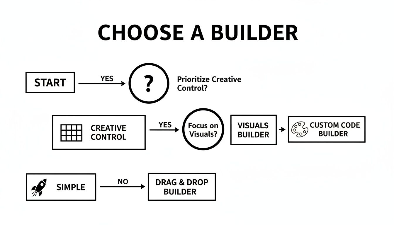
As the flowchart shows, the first choice is a big one: do you need the total visual freedom of a grid system, or do you prefer the speed of a straightforward, template-based solution?
Best for Visual Artists and Designers
For visual artists, photographers, and designers, your one-page site is your portfolio. It has to be visually stunning and give you absolute control over how your work is presented. So many rigid, template-based builders try to force your art into predefined boxes, completely crushing the creativity you’re trying to show off.
You need a builder that feels more like a canvas than a container. A flexible, grid-based layout is absolutely non-negotiable here. It lets you create those dynamic, asymmetrical compositions that guide the viewer’s eye and let your work be the hero.
Look for these essential features:
- Modular Grid System: The freedom to place, resize, and layer images to create a totally unique visual story.
- High-Quality Image Support: You need to be able to upload high-resolution images and GIFs without them turning into a pixelated mess.
- Creative Freedom: Full control over backgrounds, spacing, and fonts to make sure your page’s aesthetic actually complements your art.
Taap.bio’s bento-grid layout is built for this. It gives you the power to build a page that feels like a curated gallery wall instead of a boring list of links.
Best for Freelancers and Consultants
As a freelancer or consultant, your one-page website has one primary job: build trust and bring in leads. It needs to spell out your value, show off some social proof, and make it ridiculously easy for potential clients to get in touch.
Your ideal builder should be great at combining compelling text, glowing testimonials, and clear calls-to-action. While a nice design is important, the structure has to be strategic. The goal is to walk a visitor through a quick but convincing story: here's the problem I solve, here's how I do it, and here’s what happy clients are saying.
Platforms like Carrd are fantastic for this purpose. They offer clean, professional templates that are easy to structure for lead generation. You can quickly set up sections for your services, testimonials, and a can't-miss contact form, creating a lean, mean, client-getting machine.
Best for Former Bento.me Users
If you're looking for a new home after the Bento.me shutdown, your main concern is probably finding a builder that captures its unique creative freedom and grid-based design. You need a platform that gets why aesthetic control matters and lets you build those personality-driven layouts.
The key is to find a one page website builder free that offers a true drag-and-drop grid system, not just some templates you can tweak. Taap.bio is easily the strongest contender here, since its entire design philosophy is built around the same bento-box concept that made Bento so popular. You can get that same level of visual creativity and build a truly bespoke hub for your digital presence.
Let's Build Your Perfect Page with Taap.bio
Alright, enough with the theory. Let's get hands-on and build a professional, dynamic single-page site using Taap.bio. I’ll walk you through everything, from the first click to mastering the drag-and-drop grid, so you can launch a page that actually feels like you. It’s time to transform your digital presence.
First things first, head over to the Taap.bio homepage and grab a free account. The signup is incredibly quick—they clearly want to get you into the editor and building, not stuck filling out forms. Once you’re in, you’ll find a clean canvas waiting for your ideas.
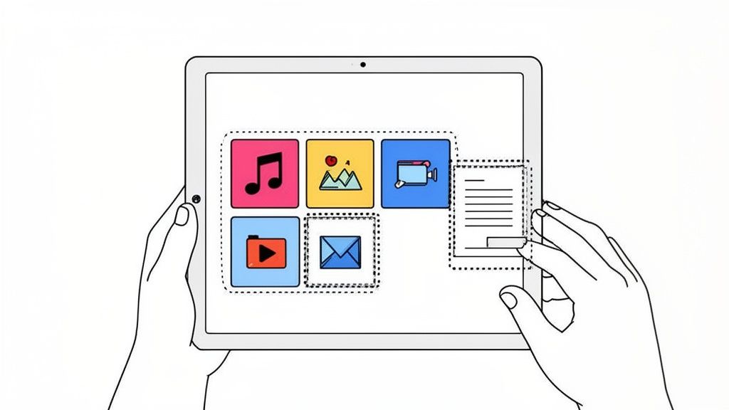
Instead of boxing you into rigid templates, Taap.bio gives you a flexible bento-style grid. This is where the real fun begins. Your entire page is built with content blocks, or "widgets," which you can place, resize, and shuffle around to create a totally custom layout. It feels less like filling in a template and more like designing a personal mood board.
Mastering the Drag-and-Drop Grid
The heart and soul of the Taap.bio experience is its intuitive grid. To get started, you just pick a widget from the menu—maybe a link, an image, or a social feed—and drag it onto your canvas. From there, you can grab the corners of any block to resize it, stretching it across multiple columns or making it taller to grab attention.
This freedom is what allows you to create a real sense of visual hierarchy and guide your visitor's eye. Want to highlight your most important call-to-action? Make it a huge, unmissable block. Need to group your social profiles? Arrange them in a neat little row. You can even create an asymmetrical, magazine-style layout that immediately breaks the mold.
Your layout is your story. Use size and placement to emphasize what's most important. A large, autoplaying video block will naturally draw more attention than a small text link, so design your page with intention.
Don't forget that performance is crucial for keeping people around. It's a well-known fact that 47% of users expect a page to load in less than two seconds. And if that load time stretches to just ten seconds? Bounce rates can jump by a staggering 123%. A lightweight one page website builder free from bloat, like Taap.bio, is engineered for speed, ensuring you don’t lose visitors before they even see your content. You can dig into more data on website performance stats over at Digital Silk.
Configuring Powerful Smart Widgets
This is where Taap.bio really pulls away from the pack. Its "smart widgets" aren't just static links; they pull live, real-time content from your favorite platforms. Your page instantly becomes a dynamic, always-current hub for your audience.
Here are a few ways I’ve seen them used brilliantly:
- For Musicians: Drag a Spotify widget onto your grid. You can set it to feature a specific track, a full album, or your latest podcast. Visitors can listen right there on the page without leaving, which is a massive win for engagement.
- For Visual Creators: The Instagram and YouTube widgets are fantastic. The Instagram one can showcase your six most recent posts, while the YouTube widget pulls in your latest videos as clickable thumbnails. Your page stays fresh automatically.
- For Professionals: Use a simple text block for a punchy bio or a few glowing client testimonials. You can also add standard link blocks that automatically pull in preview images, directing people to your portfolio or services page in a visually appealing way.
Customizing Your Theme and Layout
With your content blocks in place, it’s time to nail the aesthetics. Taap.bio gives you a surprising amount of control over the final look and feel.
- Backgrounds: You can go with a solid color, a nice gradient, or even upload a custom image or animated GIF to make your page pop.
- Fonts and Colors: There's a well-curated list of fonts to choose from, and you can tweak the color palette for your text, buttons, and widgets to perfectly match your brand.
- Mobile and Desktop Layouts: This is a key feature. Taap.bio automatically creates both mobile and desktop versions of your page, but crucially, it lets you edit each one independently. This means you can ensure your carefully crafted design looks just as impressive on a wide monitor as it does on a phone.
Follow these steps, and you'll have a one-page site that's not just functional but also visually striking and completely unique to you. The blend of a flexible grid, powerful integrations, and deep customization makes it a fantastic tool for almost any creator.
Your Questions Answered
Jumping into the world of free one-page website builders always raises a few good questions. It's smart to get the full picture before you pick a tool and start creating. Let's tackle the most common ones so you can move forward feeling totally confident.
We’ll clear up any last-minute doubts you might have, from what "professional" really looks like on a free plan to the actual limitations you'll run into.
Can a Free Website Actually Look Professional?
Absolutely, yes. The old idea that "free" automatically means "cheap-looking" is long gone. Today's best builders give you access to sophisticated design tools, beautiful fonts, and sleek templates that let you build something truly impressive without opening your wallet. The top one page website builder free of charge is all about creating a clean, focused experience that gets your message across fast.
Sure, free plans usually come with the platform's branding and a subdomain (like yourname.taap.bio), but the core tools you need to build a polished, credible online hub are all there. You get everything necessary to establish a solid first impression.
What Are the Real Limitations of Free Builders?
When you’re not paying, you can usually expect a few trade-offs, mostly around branding, domains, and the really advanced stuff. Here's what that typically looks like:
- Provider Branding: Most free plans will have a small "Made with..." badge somewhere on your page. Honestly, for most creators and personal brands, this is a tiny price to pay for a powerful free tool.
- Subdomains: You'll almost always get a branded subdomain instead of a custom one (
yourname.com). This is standard practice and works perfectly fine for link-in-bio pages or online portfolios. - Feature Gaps: The heavy-hitting features like e-commerce, custom code injection, or deep analytics are almost always reserved for paid tiers.
For what most people use these for—a portfolio, a simple landing page, or a link-in-bio hub—these limitations barely register. The essentials for building and launching a great-looking, functional page are always included.
The key is to match the tool to the task. If your goal is to create a central hub for your links and showcase your work, a free builder has everything you need. You're not building a complex e-commerce empire, you're crafting a focused first impression.
I'm Coming From Bento.me. What's the Best Alternative?
If you're moving on from Bento.me, your biggest priority is finding a builder that respects the creative freedom you're used to. You don't want a platform that shoves you into a rigid, cookie-cutter template; you need one that gives you exceptional visual flexibility and control over your layout.
The single most important feature to look for is a modular, grid-based system. That’s what will allow you to recreate—and maybe even improve upon—the unique, personality-driven design you had on Bento.
Taap.bio is such a great alternative because its entire platform is built around that bento-style grid. It gives you that same fine-grained control over where your content blocks go and how big they are. But beyond the layout, you should also look at the quality of the integrations. You'll want a builder that offers dynamic "smart widgets" for services like Spotify, Instagram, and YouTube, which display live content, not just static links. It’s what makes your page feel like a living hub instead of a boring list.
Can a Free Builder Handle a Ton of Traffic?
For the most part, yes. Reputable free builders are built to handle big traffic spikes without breaking a sweat. Platforms like Carrd and Taap.bio run on robust cloud infrastructure that can manage going viral. Because one-page sites are so lightweight—mostly just text, images, and embeds—they put way less strain on servers than a big, clunky multi-page website.
If there's ever a bottleneck, it's rarely the builder's fault. It's usually the content on your page. Huge, unoptimized images or too many heavy media embeds can slow things down, which is exactly why picking a builder that prioritizes speed is so crucial.
Ready to build a page that truly reflects your brand's creativity and style? Taap.bio offers the ultimate bento-grid builder with powerful smart widgets and unmatched design freedom. Create your free, dynamic one-page website in minutes and give your audience an experience they'll remember. Start building with Taap.bio today!


