

In a world of constant change, modular design isn't just a trend-it's a survival strategy. It’s the art and science of creating complex systems from simple, interchangeable parts. Think of it as building with LEGOs instead of carving from stone; this approach gives you speed, consistency, and the ability to scale your ideas quickly.
This method is behind everything from the iPhone in your pocket to the architecture of Netflix's global streaming empire. By breaking down products and websites into reusable modules, the world's top creators build better, faster, and smarter. This guide will dissect 10 game-changing modular design examples from a range of industries, exposing the strategic thinking that makes them so effective.
For each example, we'll provide actionable takeaways and specific tips you can apply directly to your own projects. You'll learn how to adapt these principles to a Taap.bio modular canvas, helping you create a stunning, personalized 'link in bio' experience that stands out. Prepare to see how the best innovators use modularity as their secret weapon.
Table of contents
1. Figma's Design System with Component Variants
Figma's component system is one of the most powerful digital modular design examples in practice today. It allows designers to build a single master element, like a button, and then create predefined variations for properties like state (default, hover, disabled), size (small, medium, large), or style (primary, secondary). This isn't just about saving time; it's a strategic approach to enforcing brand consistency and accelerating development across large teams and complex products.
Instead of creating dozens of separate buttons, a team can manage a single component with multiple toggles. This modularity is the backbone of mature design systems used by companies like Uber, Microsoft, and Shopify (with their Polaris system). They build entire user interfaces from these tested, reusable blocks, ensuring every part of the user experience is coherent.
Strategic Breakdown & Takeaways
- Grid & Rhythm: Variants create a predictable visual rhythm. A "large" button will always have the same padding and font size, establishing a consistent vertical and horizontal spacing pattern wherever it appears.
- What Makes It Modular: The core component is the module. The properties (size, color, state) are the interchangeable parts that create variations without breaking the fundamental design. This is the essence of what modular design is.
Key Insight: Treat your core UI elements like atoms. Define their properties meticulously before combining them into more complex "molecule" components. Clear naming conventions are crucial here (e.g.,
Button/Primary/Hover).
Adapting This for Your Taap.bio Canvas
You can apply this thinking to your Taap.bio page by creating consistent "component" styles for your blocks. For example, decide on a single style for all your primary links (e.g., solid color background, bold white text) and a secondary style for less important links (e.g., outlined background, colored text). This creates a clear visual hierarchy and makes your page feel professionally designed, not randomly assembled. Use this system for blocks showcasing projects, social links, and contact information to build a cohesive, modular profile.
2. Apple's iPhone Modular Hardware Architecture
Apple's iPhone design represents one of the most successful physical modular design examples, where internal components are engineered as independent, swappable units. Core elements like processors, camera systems, batteries, and sensors are developed as self-contained modules. This approach allows Apple to upgrade specific parts across generations, such as introducing a new camera module in the iPhone 15, without redesigning the entire device from scratch.
This modularity is a masterclass in manufacturing efficiency and product evolution. It enables rapid iteration while maintaining a cohesive user experience and a consistent physical form factor. By standardizing the interfaces and connectors between these modules, Apple can streamline its supply chain and assembly process, a strategy evident across its product lines, including iPads and MacBooks, where component architecture is shared and scaled.
Strategic Breakdown & Takeaways
- Grid & Rhythm: The physical "grid" is the iPhone's chassis. Each module, like the Taptic Engine or the camera array, is designed to fit a specific, predetermined space. This creates a predictable internal layout that optimizes for space, thermal management, and repairability.
- What Makes It Modular: The individual hardware components (camera, battery, logic board) are the modules. They connect to the main chassis via standardized interfaces and protocols. This allows for upgrades or replacements, demonstrating modularity in a high-stakes hardware environment.
Key Insight: Define the interfaces first. Apple's success comes from designing the connections between modules before perfecting the modules themselves. This ensures future components will integrate seamlessly, planning for long-term evolution.
Adapting This for Your Taap.bio Canvas
Apply this hardware thinking to your content strategy. Treat each block on your Taap.bio canvas as a distinct "module" with a specific job: one for your main service, another for your latest YouTube video, and a third for your newsletter signup. Just as Apple can swap a camera, you can easily swap your "latest video" block weekly without disrupting the page's overall structure or design. This modular approach keeps your content fresh and your layout stable, creating a reliable experience for visitors.
3. LEGO's Brick System: The Gold Standard of Physical Modularity
LEGO's brick system is the most famous physical modular design example in history. Every single brick adheres to strict, standardized dimensions and interlocking specifications, allowing for infinite combinations while ensuring structural integrity. This foundational modularity built a multi-billion dollar company spanning toys, architecture with its LEGO Architecture line, and robotics with the MINDSTORMS platform.
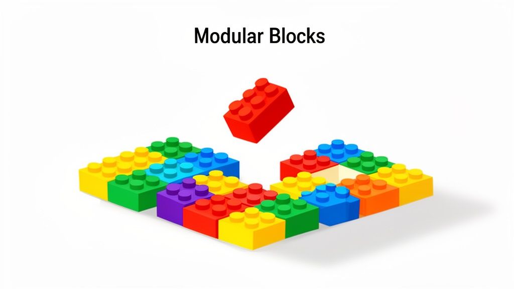
The brilliance lies in its simplicity and universal compatibility. A brick made today connects perfectly with one made decades ago, a testament to the power of a well-maintained standard. This system encourages creativity within a defined framework, making it accessible to a child building a simple house or an engineer prototyping with LEGO Technic. The system’s success proves that a strong modular foundation can support incredible complexity and user-generated innovation.
Strategic Breakdown & Takeaways
- Grid & Rhythm: The LEGO grid is based on the "stud," the iconic cylindrical bump. All dimensions, from brick height to stud spacing, are multiples of this base unit. This creates a predictable three-dimensional rhythm that guarantees any two pieces will align and connect perfectly.
- What Makes It Modular: Each brick is a module with a standardized interface (studs and tubes). The system's genius is that these modules are both the structure and the content, allowing users to build anything they can imagine from a finite set of universally compatible parts.
Key Insight: A rigidly enforced standard is not a creative limitation; it’s an enabler. By defining the connection points and dimensions, you give users the freedom to create anything within that system, confident that all the pieces will work together.
Adapting This for Your Taap.bio Canvas
Think of your Taap.bio blocks as individual LEGO bricks. To apply this principle, create a consistent "stud" or unit of spacing around each block. Use the canvas settings to ensure every block has the same margin, establishing a clean, grid-like structure. Just as LEGO uses color to categorize pieces, you can use block colors to group similar content, like using one color for all social media links and another for your professional projects. This visual system guides visitors through your page logically and beautifully.
4. WordPress Plugin Ecosystem: Modular Web Development
The WordPress plugin architecture stands as a monumental example of software modularity. It empowers users to extend a website's core functionality with self-contained "plugins" without ever touching the underlying code. This approach transformed web development, allowing anyone to add features like e-commerce (WooCommerce), SEO analysis (Yoast SEO), or advanced contact forms by simply installing a module. This is one of the most accessible and widely-used modular design examples on the web.
Instead of building every feature from scratch, developers and site owners can plug in pre-built, tested solutions. This ecosystem, with over 58,000 plugins, means a website is no longer a single, monolithic entity. It becomes a flexible platform assembled from interchangeable parts, allowing for rapid customization and evolution. This modularity is what enables a simple blog to become a full-fledged online store or a membership site overnight.
Strategic Breakdown & Takeaways
- Grid & Rhythm: While not a visual grid, plugins create a functional rhythm. Each plugin operates within WordPress's "hook" system, a set of predefined points where they can add or modify content and behavior. This ensures that even with dozens of plugins, the site loads and functions in a predictable, sequential order.
- What Makes It Modular: The WordPress core is the base platform. Each plugin is an independent module with a specific job. You can add, remove, or swap these modules without breaking the core system, much like adding or removing apps on a smartphone.
Key Insight: Treat plugins as specialized tools, not permanent fixtures. Your goal is to assemble the minimum set of high-quality modules needed to achieve your goals, preventing performance bloat and security risks.
Adapting This for Your Taap.bio Canvas
Adopt a plugin mindset for your Taap.bio page. Start with a core set of essential blocks (e.g., profile header, key links). Then, treat other features like a music player, a contact form, or a project gallery as optional "plugins" you add only when necessary. This keeps your page clean and focused. Just as you'd use a page builder plugin like Elementor to visually design a WordPress site, you can use Taap.bio's interface as your own drag-and-drop page builder to arrange and style these modular blocks for maximum impact.
5. Tesla's Vertical Integration with Modular Battery Architecture
Tesla’s approach to battery technology is a masterclass in physical modular design examples. The company architected its energy systems around a fundamental module: a battery pack composed of thousands of individual cylindrical cells. This design allows Tesla to scale production, control its supply chain, and adapt the same core technology for different applications, from a Model 3 vehicle to a massive Megapack grid storage unit.
This modularity is not just for manufacturing efficiency; it's a profound competitive advantage. By standardizing the cell-to-pack architecture, Tesla can rapidly iterate on energy density and chemistry while maintaining the same pack form factor. The design enables them to build a robust ecosystem, including the Supercharger network, which is also built on modular power electronics. A similar principle of breaking down a large system into manageable, independent parts can be seen in the Ecommerce Microservices Architecture, where individual services operate independently to create a flexible and scalable online store.

Strategic Breakdown & Takeaways
- Grid & Rhythm: The physical grid is the battery pack's housing, with each cell occupying a predictable slot. This creates an electrical and thermal rhythm, allowing for standardized cooling and power management systems that work consistently across millions of units.
- What Makes It Modular: The individual battery cell is the base module. These cells are grouped into "bricks," which are then assembled into larger packs. The interfaces between these modules are standardized for power, data, and cooling, allowing packs to be swapped or upgraded.
Key Insight: Design your core module around its most critical constraints-in Tesla's case, thermal management and energy density. Abstracting the hardware with a software layer allows you to improve the physical components over time without rebuilding the entire system.
Adapting This for Your Taap.bio Canvas
Think of your Taap.bio page as an energy system where each block is a battery cell. Group related "cells" into functional "packs." For example, create a "Social Media Pack" by grouping all your social link blocks together with a consistent style. Create a "Portfolio Pack" by grouping project showcase blocks. This modular grouping makes your page scannable and establishes clear zones of information. By standardizing the design of each block type, you can easily add, remove, or rearrange them without disrupting the page's overall structure, just as Tesla scales its battery systems.
6. Netflix's Microservices Architecture: Backend Modularity at Scale
While many modular design examples focus on the front-end, Netflix’s microservices architecture shows how this concept is critical for backend infrastructure. Instead of one massive, monolithic application, Netflix breaks its entire system into hundreds of small, independent services. Each service handles a single business function, such as billing, user authentication, or the recommendation engine, and communicates with others through well-defined APIs.
This approach is what allows Netflix to serve over 250 million subscribers while constantly deploying new features and remaining resilient to failure. If the service that generates poster images temporarily fails, it doesn't bring down the entire streaming platform. This backend modularity enables massive scale and development agility, proving that modular thinking is a full-stack discipline.
Strategic Breakdown & Takeaways
- Grid & Rhythm: There is no visual grid here, but there is a logical one. Services are organized by "bounded contexts," meaning each module has a clear, non-overlapping responsibility. This creates a predictable and maintainable system architecture instead of a chaotic "spaghetti code" monolith.
- What Makes It Modular: Each microservice is a self-contained module. It has its own database, logic, and deployment cycle. You can update, replace, or scale the "billing" module without touching the "recommendation" module, just like swapping out a Lego brick.
Key Insight: True modularity requires independence. For a system to be modular, its components must be able to fail, be updated, and operate without causing a system-wide collapse. Clear API contracts are the glue that holds it all together.
Adapting This for Your Taap.bio Canvas
You can't build a microservices backend for your Taap.bio page, but you can adopt the "single responsibility" principle. Instead of one massive "About Me" block with links, projects, and a contact form, break it down. Create one block exclusively for your key services, another dedicated to your portfolio gallery, and a third just for social media links. This modular separation makes your page easier for visitors to navigate and simpler for you to update. Each block serves one clear purpose, creating a more organized and effective profile.
7. Airbnb's Design System (DLS): Scaling Design Modularity
Airbnb's Design Language System (DLS) is a masterclass in how to apply modular design examples at an enterprise scale. It codifies everything from colors and spacing to complex interaction patterns into a shared library of reusable components. This system was created to solve a critical problem: how to empower hundreds of designers and engineers to build a cohesive product experience without constant oversight.
By defining every element as a module, Airbnb ensures that a "Card" component looks and functions identically whether it appears on their main booking site, mobile app, or internal admin tools. This modular approach allows teams to assemble interfaces quickly and confidently, knowing each piece is pre-vetted for brand compliance, accessibility, and functionality. It turns the design process from creation into composition.
Strategic Breakdown & Takeaways
- Grid & Rhythm: DLS enforces a strict spacing and typography system. Components are built with inherent margins that align to a baseline grid, creating a predictable visual rhythm across every screen. This makes layouts feel balanced and intentional, a key aspect of responsive web design best practices.
- What Makes It Modular: The system is built on "atoms" (like icons, colors) that form "molecules" (like search input fields) and "organisms" (like a full search bar with dates and guest counts). Each level is an independent, reusable module that can be combined with others.
Key Insight: A successful design system isn't just a component library; it's a documented set of principles and guidelines. Document why and when to use a component, not just what it is.
Adapting This for Your Taap.bio Canvas
You can create your own mini-DLS for your Taap.bio page. Start by defining your core styles: one primary color, one secondary color, and one or two font styles. Apply these consistently across all blocks. For example, all your "Project Showcase" blocks could use a card-like design with a specific border radius and shadow, while all "Social Link" blocks use a simpler, flat design. This structured approach makes your page look professional and unified, reflecting a deliberate design strategy rather than a random collection of links.
8. GitHub's Modular Repository and Workspace System
GitHub brought modularity to software development by treating each repository as a self-contained unit. This approach is one of the most impactful modular design examples in technology, allowing complex systems to be built from independent, interconnectable parts. Each repository is a module with its own code, history, and issues, but can be integrated with others through dependencies, APIs, and automated workflows like GitHub Actions.
This system is the foundation of modern open-source collaboration. The entire React ecosystem, for instance, is a network of thousands of modular libraries that work together. Developers can pull in specific functionality without having to manage the entire codebase, accelerating innovation and making it possible to build massive applications like those at Google and Microsoft, which often use a similar modular philosophy in their monorepos.
Strategic Breakdown & Takeaways
- Grid & Rhythm: While not visual, GitHub creates a structural rhythm. Each repository follows a standard format (main branch, pull requests, issues), creating a predictable structure for developers navigating different projects. GitHub Actions adds a temporal rhythm, running automated checks at consistent intervals.
- What Makes It Modular: The repository is the core module. Dependencies and APIs are the interfaces that connect these modules. This allows for parts of a software project to be updated, replaced, or maintained independently without destabilizing the entire system.
Key Insight: Apply the single responsibility principle to your projects. A module should do one thing and do it well. Clear documentation and semantic versioning are the glue that holds these independent modules together into a functional whole.
Adapting This for Your Taap.bio Canvas
Think of each block on your Taap.bio canvas as a "repository." Give each one a single, clear purpose. One block is for your main project portfolio, another is exclusively for your social media links, and a third is dedicated to your newsletter signup. This modular separation makes it easier for visitors to find exactly what they're looking for. Use consistent styling for similar block types (e.g., all "contact" blocks have a specific icon and color) to create a clear system that guides your audience.
9. Notion's Block-Based Page Building System
Notion's interface is one of the most flexible and empowering modular design examples available, giving users a blank canvas and a set of "blocks" to build with. Every piece of content, from a line of text to a complex database, is a self-contained module. These blocks can be arranged, nested, and linked, allowing non-technical users to construct everything from simple notes and to-do lists to full-blown project management dashboards and company wikis without writing a single line of code.
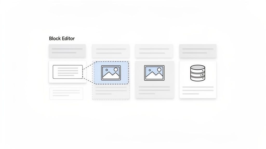
This approach turns page creation into a process of assembly rather than just writing. A user can drag and drop a to-do block next to an image, then place a database of tasks underneath. This system's power comes from its nearly infinite combinability, where simple, independent parts are used to build deeply interconnected and functional documents.
Strategic Breakdown & Takeaways
- Grid & Rhythm: Notion uses a fluid, column-based grid. Users create visual rhythm by arranging blocks into columns and controlling vertical spacing with line breaks and block types, much like arranging elements in a bento box layout.
- What Makes It Modular: Each "block" (text, heading, image, database) is a discrete module. The system is built on the principle of combination; you don’t change a block’s core function, you just arrange it alongside other blocks to create a custom layout and workflow.
Key Insight: The ultimate modularity is achieved when the end-user becomes the designer. By providing a system of simple, reliable parts, you empower people to build solutions for their specific needs.
Adapting This for Your Taap.bio Canvas
Embrace the "block" mentality on your Taap.bio page. Think of each link, embed, and text block as a distinct module in your personal dashboard. Group related items together to create functional "stacks." For instance, create a "Projects" stack with gallery blocks and links, a "Socials" stack for all your profiles, and a "Contact" stack with your email and calendar links. This mirrors Notion's organizational logic and is a core principle of good bento box web design. Using synced blocks in Notion is like setting a consistent style for your Taap.bio blocks; apply this by creating a uniform design for all your primary call-to-action buttons.
10. Linktree's Vertical Link Modularity: The Original Link-in-Bio Pioneer
Linktree’s system is one of the most widespread and simple modular design examples on the internet. It introduced a straightforward solution to a common social media problem: each link is an independent, clickable module arranged in a single vertical column. This approach allowed influencers, musicians, and small businesses to direct followers to multiple destinations from one URL, transforming the "link-in-bio" space.
While basic compared to modern grid-based tools, its power was in its simplicity. Each button-like link is a self-contained unit that can be added, removed, or reordered without affecting the others. This core modularity made it the go-to choice for years, serving as a functional, no-frills digital hub for content creators consolidating their social profiles or artists directing fans to various streaming services.
Strategic Breakdown & Takeaways
- Grid & Rhythm: The system uses a simple, single-column grid. The visual rhythm comes from the consistent height and spacing of each link module, creating a predictable, scannable list that users can navigate quickly.
- What Makes It Modular: Each link is a discrete module. The title, URL, and position are the interchangeable parts. You can swap one link for another or change its order, treating your list of links like a stack of building blocks.
Key Insight: Prioritize function over form when the core problem is simple. Linktree’s success came from solving one specific need-sharing multiple links-with an incredibly easy-to-manage modular system.
Adapting This for Your Taap.bio Canvas
You can apply this vertical modularity on your Taap.bio canvas for a specific, focused section. For instance, create a "Recent Content" group of blocks stacked vertically. Each block could be a simple link to a new blog post, YouTube video, or podcast episode. This creates a Linktree-style feed within your more dynamic bento grid, giving visitors a clear, chronological path to your latest work. This method is far more flexible than what you get from many of the best no-code website builders, which often lack this micro-level modular control.
10 Modular Design Examples Comparison
| Approach | Complexity 🔄 | Resources & Speed ⚡ | Expected Outcomes ⭐📊 | Ideal Use Cases 💡 | Key Advantages ⭐ |
|---|---|---|---|---|---|
| Figma's Design System with Component Variants | High — sophisticated component logic and governance | Moderate tooling + skilled designers; accelerates iteration once established | High consistency, reuse, faster design-to-dev handoff | Multi-product UI teams, scalable component libraries | Reusable variants, real-time collaboration, consistent updates |
| Apple's iPhone Modular Hardware Architecture | Very high — precision engineering and integration testing | Very high R&D and tooling; slower initial cycles, faster upgrades | Product differentiation, easier repairs/iterate hardware across generations | Consumer hardware requiring upgrades and reliability | Interchangeable modules, standardized interfaces, repairability |
| LEGO's Brick System | Low to moderate — strict standards but simple usage | High manufacturing quality cost; user assembly is fast | Universal compatibility, extreme scalability, creative reuse | Toys, education, prototyping, modular physical systems | Long-term standardization, ecosystem compatibility, durability |
| WordPress Plugin Ecosystem | Moderate — simple extension model but complex at scale | Low barrier to extend; many third‑party plugins speed rollout | Rapid feature expansion; variable quality and performance risks | Small-to-medium websites, rapid MVPs, non-technical users | Massive ecosystem, low cost to add features, extensibility |
| Tesla's Modular Battery Architecture | Very high — complex manufacturing and thermal/electrical design | Very high capital and production resources; software enables quick optimizations | Cost reductions at scale, cross-product scalability, energy performance gains | EVs, grid storage, organizations seeking vertically integrated energy systems | Standardized cells, scalable packs, software-defined improvements |
| Netflix's Microservices Architecture | Very high — distributed system complexity and ops needs | High DevOps and monitoring investment; enables rapid independent deploys | High scalability, resilience, and team autonomy | Large-scale streaming or high-traffic services | Independent deployments, fault isolation, tech heterogeneity |
| Airbnb's Design System (DLS) | High — initial setup and governance overhead | Moderate-to-high cross-team investment; speeds product launches later | Consistent cross-platform UX, faster onboarding for designers | Growing design organizations, cross-platform products | Living docs, tokenization, atomic components for cohesion |
| GitHub's Modular Repository & Workspace System | Moderate — repo boundaries and dependency management | Tooling (CI/CD, package managers) required; improves developer velocity | Clear ownership, scalable collaboration, reproducible builds | Open-source projects, multi-repo enterprises, CI-driven teams | Repository isolation, versioning, integrated workflows (Actions) |
| Notion's Block-Based Page Building System | Low — intuitive for end users, higher complexity for advanced pages | Low resource barrier; fast content assembly, some performance limits | Highly flexible pages, rapid prototyping for non-technical users | Knowledge bases, docs, lightweight apps, personal/teams productivity | Drag-and-drop blocks, nested structures, broad template library |
| Linktree's Vertical Link Modularity | Very low — minimal setup and configuration | Very low resources; immediate setup and fast publishing | Simple link aggregation and basic analytics; limited visual flexibility | Creators needing a single-url landing page, quick link sharing | Extreme simplicity, low cost, analytics for link performance |
From Theory to Practice: Building Your Own Modular Masterpiece
We've explored a powerful gallery of modular design examples, from the interlocking precision of LEGO bricks and Figma's component variants to the backend architecture of Netflix and Tesla. Across these diverse fields, a clear pattern emerges. The most adaptable, resilient, and user-centric systems are built not as rigid monoliths, but as a collection of independent, interchangeable parts. This isn't just a design trend; it's a fundamental strategy for building things that last and evolve.
The core lesson from these examples is the power of constraints. By defining a standard for each module-whether it's the physical dimensions of a LEGO brick, the API of a microservice, or the component properties in a design system-creators unlock immense freedom. This structured approach prevents chaos and gives you a reliable foundation to build upon, allowing you to focus on the creative arrangement of the blocks rather than reinventing the blocks themselves.
Key Principles for Your Own Modular Projects
The journey from observing these systems to creating your own is about adopting this mindset. Think of your projects not as a single, static final product, but as a system of components. Here are the core takeaways to apply immediately:
- Standardize Your Blocks: Define the rules for your modules. Whether it's image sizes, text styles, or color palettes, creating a consistent standard is the first step. This was evident in Airbnb's DLS, where consistent components ensure a uniform user experience across a massive platform.
- Define Clear Interfaces: How do your modules connect? For a physical product like the iPhone, it's ports and connectors. For a digital presence, it's how one piece of content links to or complements another. Make these connections intentional and predictable.
- Embrace the Grid: A grid is the invisible skeleton that gives your modular layout structure and rhythm. As we saw with Notion’s block system, a flexible grid allows for both simple linear layouts and complex, multi-column dashboards, all while maintaining a sense of order.
- Empower Creative Assembly: The ultimate goal is flexibility. The success of WordPress and its plugin ecosystem lies in giving users a simple core product and a universe of modules to customize it with. Your modular system should enable, not restrict, creative expression.
Mastering these principles gives you a significant advantage. It allows you to build faster, adapt to change with less effort, and create more coherent experiences for your audience. For creators, freelancers, and small businesses, this approach is invaluable. It means your personal brand page, portfolio, or online hub can grow with you, block by block, without needing a complete overhaul every time you add a new service, project, or piece of content. This is how you build a digital presence that is both professional and authentically yours.
Ready to stop listing and start building? The principles we've explored are the very foundation of taap.bio. It gives you a dynamic bento canvas to arrange your content, projects, and social links as a beautiful, modular masterpiece. Start creating your free page on taap.bio today and feel the difference.


