When you hear "milkshake website," you might not be thinking of a single app. Instead, it’s a whole new way of thinking about your 'link in bio' page—a category of tools designed to create stunning, card-based websites that feel more like an interactive experience than a boring old menu.
Table of contents
What Is a Milkshake Website Builder Anyway?
Let's be honest, that single link in your social media bio has a lot of heavy lifting to do. It’s supposed to be the grand entrance to your entire online world, but too often it’s just a plain list of URLs. Your digital presence deserves a better front door, and that’s exactly where the "milkshake" style of website builder comes in. This isn't about one specific brand, but a new wave of tools that let you build slick, swipeable micro-sites that perfectly capture who you are.
Think of it this way: instead of just giving visitors a list of places to go, you're giving them a taste of everything right there. They can swipe through your content just like they do with Instagram Stories. One card might feature your latest YouTube video, the next your online shop, and another your contact form. It’s all about creating a living, breathing hub that feels dynamic and engaging from the first tap.
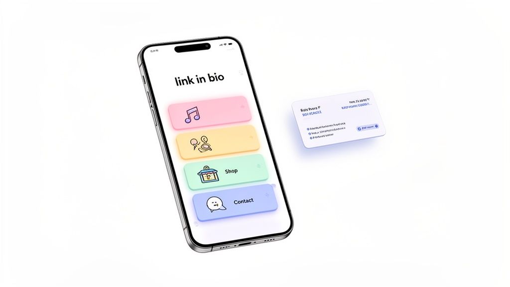
The image above is a perfect snapshot of this concept in action. Each colorful card is an invitation, turning a simple link into a beautiful, easy-to-navigate dashboard for your brand.
To better understand this shift, it helps to see how these focused builders stack up against their more traditional counterparts.
Milkshake-Style Builders vs Traditional Websites
| Attribute | Milkshake-Style Builder | Traditional Website Builder |
|---|---|---|
| Primary Goal | Convert social media traffic into action | Serve as a comprehensive digital headquarters |
| Complexity | Extremely simple, mobile-first design | More complex, requires desktop setup & design |
| Best For | Creators, influencers, artists, small businesses | Established businesses, e-commerce, portfolios |
| Typical Use | 'Link in bio' pages, quick promos, contact hubs | Company websites, blogs, extensive online stores |
While traditional builders like Wix or Squarespace are fantastic for building a full-fledged company website, they can be overkill for a bio link. Milkshake-style builders fill that gap perfectly, offering just the right tools for the job without the steep learning curve.
The Real Reason We’ve Moved Beyond Link Lists
So, why are creators and brands ditching simple link lists? Because a single, static page just can't tell your story or guide your followers where you want them to go. This gap in the market has sparked a massive boom, with the website builder industry projected to soar to $6.38 billion by 2026 on the back of a 10.1% growth rate. The driving force is a huge demand for no-code tools that anyone can use.
This explosive growth really boils down to a few core needs:
- Telling a Visual Story: We're visual creatures. A beautifully designed page communicates your vibe and value far more effectively than a wall of text.
- Creating a Central Hub: It gives you one link to rule them all, elegantly organizing your scattered digital footprint.
- Crafting a Better Experience: An interactive, swipeable site is just more fun to use, keeping visitors around longer and encouraging them to explore.
These platforms have become indispensable social media bio page tools, representing a major evolution in the modern bio link meaning.
The move away from simple link hubs to dynamic micro-sites is more than a trend; it's a response to audience expectations. People want to see your whole story at a glance, not just a list of destinations.
Recent events, like the announced shutdown of Bento.me, are only pushing this change forward faster. It’s forcing thousands of people to look for more stable, powerful alternatives. This really highlights why having a more advanced solution isn't just a nice-to-have anymore—it’s crucial for anyone serious about building their brand online.
What Works with the Milkshake App—And What Doesn't
The Milkshake app initially turned heads with a pretty slick idea: what if your link-in-bio page felt more like swiping through a set of Instagram Stories? This concept, built around "Cards" that you swipe through, made it an immediate favorite for creators. It felt visual, dynamic, and perfectly at home on a smartphone.
The biggest win for Milkshake is its mobile-first design. You can literally build and tweak your entire site from your phone, which is a massive advantage if you're running your brand from anywhere but a desk. This makes it a fantastic milkshake website builder for true beginners. No code, no design degree needed. You just pick a Card for what you want to do—like an 'About' or 'Links' page—pop in your content, and you’re off. For a quick, stylish start, it’s hard to beat that simplicity.
But that simplicity? It’s a double-edged sword. In fact, it's the very thing that holds you back.

Where the Simplicity Falls Apart
The swipe-through navigation forces your audience down a single, fixed path. To see what's on your third Card, they must swipe past the first and second. This is a huge problem. Your most important call-to-action or affiliate link might be buried on Card #3, and a good chunk of your visitors will simply never get there.
This weak spot becomes a glaring issue when you look at what a growing creator actually needs.
- No "Home Base": Your visitors can't get a quick overview of everything you offer. Instead, they're forced to go on a treasure hunt, swiping one Card at a time to find what they're looking for.
- Cookie-Cutter Customization: Sure, you can swap out colors, fonts, and images. But that's where your creative freedom ends. You're stuck in their templates, with no way to resize elements or create a truly unique layout that feels like your brand.
- Very Basic Content: Milkshake handles the basics: text, links, images, and YouTube videos. But that’s it. There’s no way to embed a playable Spotify track, pull in your latest Instagram posts automatically, or add other dynamic content.
- Invisible to Google: This one is a deal-breaker for anyone serious about growth. Milkshake pages are not indexed by search engines. Your page simply won't show up in Google search results, cutting you off from a massive source of discovery.
The fundamental problem with Milkshake’s card system is that it chooses a cute interaction (swiping) over clear communication. It ends up hiding your content instead of showcasing it.
Why You’ll Hit a Wall with Milkshake
Eventually, your brand will grow up. You’ll want to do more than just point people to other sites. You'll want to sell a digital download, embed your latest podcast episode, or show off a portfolio of your work. Milkshake offers zero built-in monetization tools, meaning you can't sell products or take payments directly on your page.
This is a major roadblock. The tool that felt so perfect at the beginning soon becomes a creative cage. You’re trapped inside their pre-set boxes, unable to build the kind of central, interactive hub your audience deserves. While the swipeable format is a neat party trick, it just doesn't have the functional depth or design flexibility needed for building a real digital presence. And that's exactly why so many creators are now looking for something more powerful.
So, What's Next? Enter the Bento Grid
While swiping through cards was a neat trick for a while, the “link in bio” space is already evolving. Frankly, the one-by-one, linear feel of tools like Milkshake just feels limiting when you’re trying to show off everything you do. Creators today are building entire digital ecosystems, and they need a way to present it all at once. That's where a new design philosophy comes in: the bento grid.
Think of a Japanese bento box. It's one container, but inside you have these perfect little compartments for rice, fish, and vegetables. Everything is arranged beautifully, looks incredible, and gives you a complete picture of the meal in a single glance. A bento grid applies that exact same idea to your personal landing page.
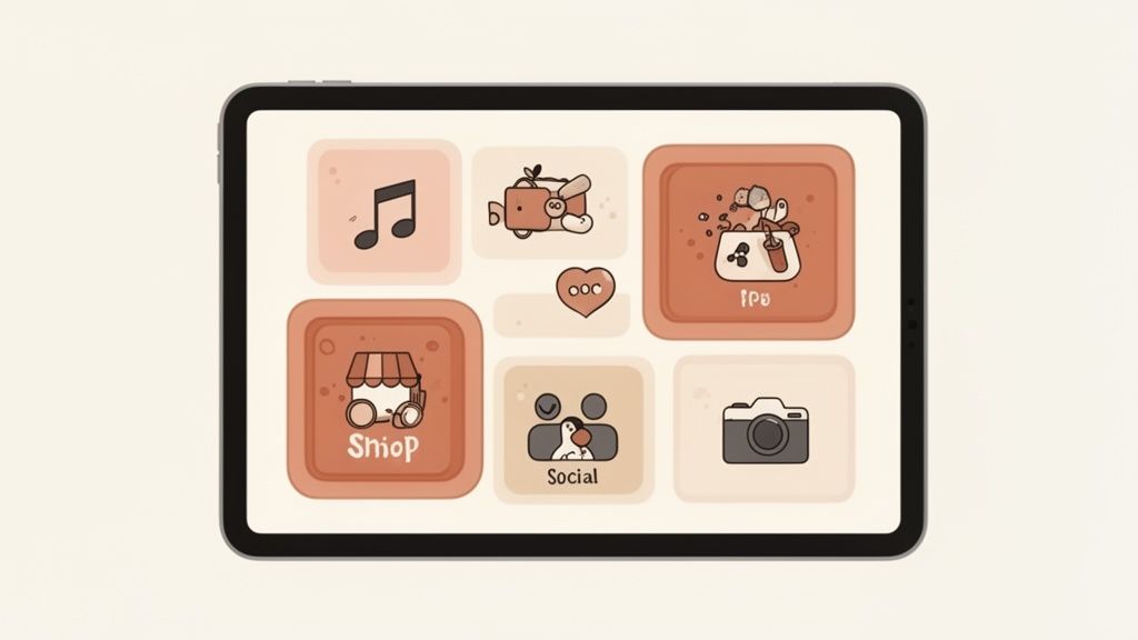
From Swiping Endlessly to Seeing Everything Instantly
Instead of making visitors swipe through card after card, a bento grid lets you build a stunning, modular dashboard. Right away, people see all the important parts of your brand laid out in one view. This isn't just some fleeting design trend; it's a direct answer to the frustrations of older platforms.
The search for a better way to organize our online lives has become even more pressing with the news that Bento.me is shutting down in 2026. This has sent thousands of users scrambling for a new home for their digital identity, pushing grid-based builders into the spotlight.
The big idea behind a bento grid is to give every piece of your content—your latest video, your portfolio, your shop, your newsletter—its own dedicated spot on a single, clean canvas. It’s all about respecting your audience's time by putting your best stuff right upfront.
This approach turns your page from a simple list of links into a genuine destination. If you want to go deeper on this concept, you can learn more about the art of bento box web design and see how it’s creating more compelling experiences.
Why Top Creators Are All-In on the Grid
The most influential creators and designers get it. They're moving to platforms that give them total control over their layout because they know a top-tier online presence is about more than just changing colors and fonts. A bento-style builder offers powerful features that a basic milkshake website builder simply can't compete with.
Here are a few reasons why the grid is winning:
- Visual Hierarchy: You get to decide the size and position of every block. This means you can make your most important link (like a “Book a Call” button) bigger and more eye-catching than everything else.
- Dynamic Content: Many of these builders support "smart" blocks that pull in live information. Imagine showing your latest TikToks, a GitHub contribution chart, or a playable Spotify track right on your page without lifting a finger.
- Asymmetric Layouts: You can finally break free from those rigid, cookie-cutter templates. This freedom allows you to create a unique, artistic page that truly reflects your brand and helps you stand out.
The market for these more advanced tools is exploding. PC-focused drag-and-drop platforms, which often use the modular systems that power these layouts, were valued at $10.56 billion in 2025 and are projected to grow at a 12.05% CAGR through 2033. This isn't a coincidence—it shows a massive shift toward builders that offer resizable blocks and rich integrations. The move to bento grids isn't just about aesthetics; it's about building a smarter, more effective hub for your entire online world.
Meet Taap.bio: The Bio Page Builder You’ve Been Waiting For
If you've felt creatively boxed in by those linear, swipe-only bio pages, you're not alone. You see the power and appeal of a bento grid, but you need a tool that’s actually easy to use. This is exactly why we built Taap.bio. It’s the perfect middle ground, blending the simplicity of a mobile-first builder with the visual punch of a true bento grid.
Taap.bio is the natural next step for creators who have outgrown the Milkshake app and an ideal new home for the thousands of users moving over from the now-retired Bento.me. We built it on a core belief: you shouldn't have to sacrifice control for the sake of simplicity.
One look at the Taap.bio builder shows you it's a completely different game. This isn't just a list of links. It's a dynamic, grid-based canvas where you can arrange your entire brand story in a way that’s both visually stunning and incredibly clear.
A True Drag-and-Drop Experience
What really makes Taap.bio feel different is its genuine drag-and-drop grid. Forget being locked into rigid templates or boring vertical stacks. We give you a wide-open canvas. It’s like playing with digital LEGOs—you get to decide where every single piece goes.
You can freely move, resize, and layer every block to build a layout that is completely, uniquely you. This is about more than just picking colors. It’s about creating a visual story that pulls your audience’s eyes exactly where you want them. Make your most important link a huge, can't-miss-it block, then tuck your social icons neatly into a corner. You’re the designer.
Separate Layouts for Mobile and Desktop
Let’s be honest: a layout that looks amazing on a desktop often looks cluttered or awkward on a phone, and a clean mobile design can feel empty on a big screen. Taap.bio has a smart solution. You can create and fine-tune two completely separate layouts—one for mobile and one for desktop.
This means you can perfect the experience for every single visitor. Maybe you want a tight, single-column grid for people on the go, but a more expansive, detailed dashboard for your desktop audience. It gives you total command over your presentation, ensuring your page looks exactly right on any screen.
This kind of flexibility is quickly becoming the new standard. By 2021, there were already 1.88 billion websites in the world, and the market for no-code platforms is on track to hit $61.23 billion by 2025. This explosive growth is pushing creators towards modular grids inspired by bento layouts, demanding unique canvases for both desktop and mobile. If you're curious about this shift, you can read more about the latest website builder trends.
Say Hello to Smart Widgets
Here’s where your page goes from being a simple link hub to a living, breathing part of your online identity. Taap.bio is packed with "smart widgets" that are way more than just links—they’re live integrations that pull real-time content directly onto your page.
Imagine your audience being able to:
- Listen to your music: Embed a playable Spotify track or a full podcast episode right on your page. No need for them to click away.
- See your latest work: Automatically display a live grid of your newest Instagram photos, YouTube videos, or Dribbble shots, complete with up-to-date follower counts.
- Engage with your professional side: Showcase your GitHub activity graph or a Behance portfolio that updates itself.
These smart widgets transform your page from a static list of links into an interactive destination. Your content is always fresh, pulling in your latest work automatically and giving your audience a reason to keep coming back.
Taap.bio isn’t just another link tool or a simple milkshake website builder. It’s a dynamic platform for building a professional and captivating home for everything you do online. By giving you the creative freedom of a custom grid and the power of live content, it’s the ultimate toolkit for making a real impression.
Ready to build something better? You can start by exploring all the features of Taap.bio today.
How to Easily Migrate Your Page to Taap.bio
So, your milkshake website builder is feeling a bit cramped? Or maybe you're one of the many creators left looking for a new home after the Bento.me shutdown. Whatever your reason, the idea of moving your link-in-bio page can feel like a huge headache. But trust me, it’s not.
Upgrading to a more flexible platform like Taap.bio is actually a chance to give your online presence a serious boost. Think of it less as a complicated move and more like swapping out a small, one-room studio for a spacious loft. You get to keep all your best stuff—your links, your content, your style—but now you have the freedom to arrange it all in a way that truly shows off who you are.
Let’s walk through just how simple it is to make the switch.
Step 1: Take a Quick Inventory of Your Current Page
First things first. Before you dive in, open up your old Milkshake or Bento page in one tab and a blank notepad in another. You’re just going to do a quick visual audit to make sure nothing gets left behind.
It’s a simple checklist:
- Your Core Links: Grab every single URL. We're talking socials, your shop, your portfolio, your latest video—everything.
- Text and Bio: Copy and paste your main bio or any "About Me" text you want to keep.
- Key Media: Make a note of the profile picture, background images, or key visuals you’re currently using.
- Overall Vibe: What are your brand colors? What kind of font do you use? A quick note on your style will help you recreate it in minutes.
This literally takes five minutes but gives you a clear, simple blueprint for building your new page. No guesswork needed.
Step 2: Sign Up and Choose a Starting Point
Got your list? Great. Now head over to Taap.bio and get signed up. The process is fast, so you’ll be ready to start building in no time.
Once you’re in, you’ll see a gallery of templates. My advice? Don’t get stuck here. You aren’t locked into any design forever. Just pick one that catches your eye or feels close to the layout you have in mind. Starting with a template just means you have a few blocks already on the page, which is way easier than facing a totally blank screen.
The whole point is to move from a rigid, single-column page to something much more dynamic and engaging, just like this:
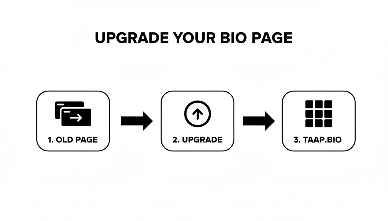
As you can see, it’s a simple evolution—from an old, restrictive format to the beautiful and flexible grid you get with Taap.bio.
Step 3: Build and Customize Your Grid
Now for the fun part. It’s time to take your content inventory from Step 1 and bring your new page to life. This is where you’ll really feel the difference.
Start clicking on the template blocks to replace the placeholder content with your own. Paste in your links, upload your images, and drop in your bio text. Want to move things around? Just drag and drop. It’s that simple.
Pro-Tip: Make your most important link—like your online store or your Calendly booking page—a larger block. This creates an instant focal point and tells visitors exactly where to click first.
While you're at it, explore the smart widgets. Instead of a boring text link to your Spotify, why not embed a playable song? Instead of just linking to your Instagram, add a widget that displays your latest posts automatically. These little touches make your page feel alive and keep people engaged.
Step 4: Finalize Your Style and Update Your Bio
Alright, your content is in place and everything is where it should be. The last piece of the puzzle is dialing in the aesthetics.
Jump into the design settings. This is your creative playground.
- Set a custom background with a solid color, a gradient, or a full-size image.
- Browse the font library to find one that perfectly matches your brand.
- Fine-tune the colors of your buttons and blocks to create a cohesive look.
Once your page looks exactly how you want it, there’s only one thing left to do. Copy your new Taap.bio URL and paste it into the bio section of your Instagram, TikTok, Twitter, or anywhere else you have a link. If you need a quick reminder on where that is, our guide on how to copy my Instagram link has you covered.
And that’s it! You’ve officially upgraded to a page that not only looks better but also works harder for you and your brand.
So, Why Is Taap.bio the Next Step for Your Personal Landing Page?
The idea of a "link in bio" page has grown up. A few years ago, a simple, swipeable page like the ones from the original Milkshake app was enough. It got the job done. But let's be honest, that model feels dated now. The real goal today isn't just to list links; it's to build a central, interactive hub for your brand, and that’s where Taap.bio comes in.
It’s all about bringing your entire digital world together in one place that looks and feels professional. Taap.bio ditches the restrictive, one-thing-at-a-time model that forces people to swipe to find your content. Instead, you get a dynamic grid where everything gets a front-row seat. No more hiding your best stuff.
Full Creative Control Meets Smart, Hands-Off Automation
The real magic of Taap.bio is how it blends total design freedom with smart automation. You have the power to drag, drop, and resize every single element on your page. We're not just talking about changing a background color; we're talking about crafting a genuine visual experience that guides your visitors' eyes exactly where you want them to go.
But here’s the part that changes the game: the live integrations. This is what keeps your page fresh and relevant without you having to constantly update it.
- Live Content Feeds: Your latest Instagram posts, YouTube videos, and even your newest TikToks can appear on your page automatically.
- Direct Engagement: Visitors can listen to your Spotify tracks or podcast episodes right there, without ever leaving your page. That removes a huge point of friction.
- Professional Showcase: Your GitHub activity graph or your Behance portfolio can update in real time, giving potential clients or collaborators an up-to-the-minute look at your work.
This mix of hands-on customization and hands-off automation means your page is always working for you, building stronger connections while you focus on creating.
It's Not Just a Bio Link—It's Your Digital HQ
When you boil it down, the choice is clear. While a basic milkshake website builder can be a good starting point, Taap.bio is the destination. It’s not just another tool to manage; it's a core piece of the modern creator’s toolkit, built for growth and real engagement.
Taap.bio turns your bio link from a static list into a living, breathing destination that actually holds your audience's attention and encourages them to take action.
By giving you the tools to create a truly professional hub, you’re not just keeping up with a trend—you’re setting yourself up as a leader in your space. For anyone serious about making their online presence work harder, our guide on improving website conversion rates is the perfect next read. It’s all about connecting with your audience on a deeper level and building a brand that truly lasts.
Common Questions About Bio Page Builders
Thinking about switching up your bio page tool? It's totally normal to have a few last-minute questions. You're not just picking a piece of software; you're deciding on the future home for your brand online. Let's tackle some of the biggest concerns I hear from people just like you.
Is It Hard for a Non-Designer to Use a Grid Builder?
This is a big one. You see these stunning, magazine-style bento grids and immediately think, "There's no way I can build that myself." But here's the secret: modern builders like Taap.bio were made specifically for people who aren't designers.
Forget wrestling with code or confusing design software. Using a drag-and-drop grid feels more like playing with digital LEGOs. You just grab the block you want—a link, a video, an image—and place it on the canvas. You can stretch it, shrink it, and move it around, watching your page come to life in real-time. It’s all the power of a professional designer, without the years of training.
Will It Be Expensive to Upgrade to a Better Tool?
Cost is always a valid concern, but you might be surprised by the answer. Upgrading to a more powerful tool doesn't automatically mean a bigger bill. In fact, it's often the opposite.
Many older apps, like Milkshake, can run you up to $10 per month just to unlock all their features. The ironic part is that you can get a far more advanced and flexible platform for a similar price, or sometimes even less. For instance, Taap.bio has a generous free plan to get you started, and its premium plans deliver a huge upgrade in creative power without a huge jump in cost.
The real cost isn't the monthly fee; it's the missed opportunity. A static, uninspired bio page costs you engagement and conversions every single day.
How Does Taap.bio Solve the Problems of Older Builders?
So, what’s the actual difference? It really boils down to two things: rigid layouts and boring, static content. First-generation tools have been stuck with these problems for years, and Taap.bio was built to solve them directly.
The "Swipe-Through" Problem: Older builders hide your best content behind swipes, forcing your audience to hunt for what they need. Taap.bio’s bento grid fixes this by putting everything on a single, dynamic page. You control the visual story, making sure your most important links are seen first.
The "Static Content" Problem: When all you can add are basic links and text, your page feels dead. Taap.bio’s smart widgets bring it to life. You can embed playable Spotify songs, your live Instagram feed, or a gallery of your latest YouTube videos that updates automatically. Your page becomes an interactive destination, not just a list of links.
And as you're designing this standout page, don't let blurry images hold you back. To really make your design pop and ensure it looks professional on any screen, high-resolution visuals are a must. Finding the perfect tool for this is simple with guides on the best AI upscaler tools.
Ready to build a page that finally feels like you? With Taap.bio, you get the creative freedom of a bento grid and the power of smart widgets, all wrapped in a platform anyone can master. Start building your future-proof bio page today!