You've got the file finished. The template looks clean, the mini-course is recorded, and now the question hits, where do you sell it so people buy without eating your margin alive? One creator says Etsy, another says Shopify, someone else pushes Gumroad, and a fourth tells you to just use a link-in-bio page. The advice sounds confident because each option solves a different problem, but most sellers don't need more opinions, they need a clearer way to compare traffic, fees, checkout friction, and audience ownership.
That's the frame I use with new sellers. The “right” place to sell digital products isn't just the place with the loudest promise of traffic, it's the place where the math works and the buyer path stays simple. If you're selling low-ticket downloads, templates, printables, or bundles, a few extra fees and a clunky checkout can erase the profit you thought you had.
A consolidated store can change that equation, especially when you want one public page that sells, books, and captures email without sending people through five tools. If you want a quick overview of that model, this social media storefront guide shows how a creator page can act as a real sales surface instead of just a profile add-on.
Table of contents
Introduction Where Your Digital Product Actually Sells Best
A creator with a finished product usually isn't stuck on the product itself. They're stuck on the last ten feet, the place where someone has to discover it, trust it, check out, and finish the purchase. That's where platforms start to feel confusing, because every option sounds useful for a different reason.
Etsy promises discovery. Shopify promises control. Gumroad promises simplicity. Link-in-bio tools promise speed. All of them can work, but they don't work the same way for the same kind of offer. A printable doesn't behave like a coaching package, and a mini-course doesn't sell like a fan bundle.
The smarter question is not “Which platform is popular?” It's “Which platform lets the right buyer move from interest to purchase with the least friction and the least fee drag?” That question matters more once you realize how much digital buying already happens across mainstream consumer platforms, and how quickly small fee differences can change your actual take-home.
That's why the choice deserves a practical framework, not a list of platform names. The best place to sell digital products depends on where demand already lives, how your audience prefers to buy, and how much process you're willing to force on them. Some creators need built-in discovery. Others need a clean owned audience and a short checkout. Many need both, but not in equal measure.
Understanding Where Digital Product Demand Lives Today
A creator with a finished offer is usually not missing demand. The question is where buyers already feel comfortable paying, and how much friction they tolerate before they leave. That matters because a marketplace, a link-in-bio store, and a self-hosted checkout do not create the same buying conditions.
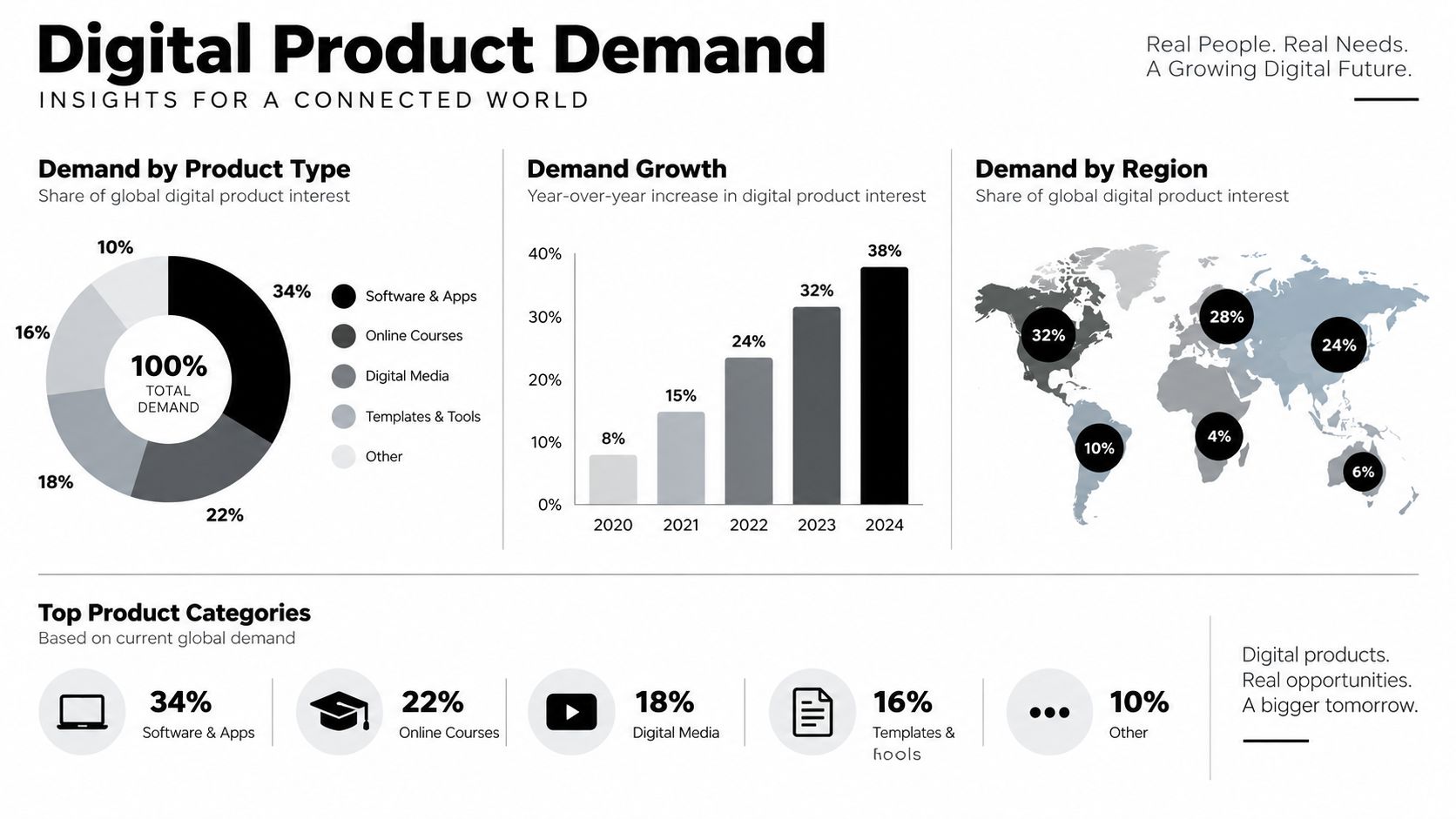
Digital buying is already part of normal consumer behavior. Analysts behind digital product spending trends reported that digital media spending had already reached more than $560 billion in annual consumer spending, and that 68% of internet users aged 16+ paid for some kind of digital content each month. Buyers already trust downloads, subscriptions, access passes, and streaming-style delivery. The question is not whether digital products can sell. It is where the buying habit is strongest.
Where the fish already gather
Fishing works better where the schools already are. The same idea applies here. Marketplaces, course platforms, and social storefronts each gather a different kind of buyer, and the right choice depends on how people already discover and buy products like yours.
The bigger market also points in the same direction. Independent research cited in the brief places the global digital goods market at $157.39 billion in 2026 and forecasts $511.43 billion by 2031, with a 26.60% CAGR, digital goods market forecast. Those are projections, not promises, but they show that digital commerce is not a fringe behavior. It is a growing buying pattern built around quick delivery and low checkout effort.
For creators, the useful lens is behavioral. A buyer who has already paid for digital content is easier to convert than someone who still needs to be convinced that digital purchases are normal. That is why the best place to sell is often the place with the shortest path from interest to payment, the cleanest checkout, and the highest chance of capturing an email before the visitor disappears.
The Five Main Places to Sell Digital Products Compared
A lot of comparison guides reduce this choice to “marketplace versus own store.” That's too blunt. It misses the middle layer, which is where many creators win, especially when they want a low-friction page that also grows an audience.
The five channel types in plain language
Marketplaces like Etsy put your product in a crowded, search-driven environment. They're useful when you need discovery and can compete on searchable intent, especially for templates, printables, and simple downloads. Self-hosted stores like Shopify or WooCommerce give you more control over branding, checkout, and data, but you carry more of the setup and maintenance burden.
Link-in-bio storefronts sit between those extremes. They're built for creators who want one public page to sell products, take bookings, and capture email without sending people across multiple tabs. Social commerce and profile-based selling works when your audience buys directly from content, DMs, or platform-native actions. Course and email platforms are best when the product is experience-led, like lessons, memberships, or sequences that need guided delivery.
If you want a broader overview of platform categories, this online selling platform guide is a useful companion read.
Channel Comparison for Selling Digital Products
| Channel Type | Best For | Traffic Source | Fee Model | Control Level |
|---|---|---|---|---|
| Marketplace | Printables, templates, downloadable goods | Marketplace search and browsing | Listing and transaction fees | Low to medium |
| Self-hosted store | Brands that want full ownership | Your own traffic and marketing | Platform subscription plus payment fees | High |
| Link-in-bio storefront | Creators with social audiences | Social profiles and content | Platform pricing varies | Medium to high |
| Social commerce | Fast-moving offers and impulse buys | In-platform discovery | Platform-dependent | Low to medium |
| Course or email platform | Lessons, memberships, coaching | Audience and email list | Subscription or platform fees | Medium to high |
Practical rule: If a buyer already knows your name, reduce clicks. If they don't, use a channel that gives them discovery without making the checkout feel like a maze.
The choice also changes depending on whether you're protecting your revenue or your process. A creator who handles paid bookings often cares less about search traffic and more about preventing missed calls and no-shows. For that use case, a guide like chargeback alerts for Shopify can be useful context, because payment risk and support overhead become part of the platform decision.
How Fees and Checkout Friction Quietly Eat Your Profit
A platform can look cheap on the surface and still cost you more in the end. That's because fees stack, and low-ticket products feel that stacking more sharply than premium offers. If you sell a small template, a printable bundle, or a mini-course, the difference between “simple fee” and “stacked fee” can decide whether the sale is worth it.
Why fee math matters more for low-ticket offers
The brief's comparison notes make this concrete. Etsy's published model combines a $0.20 listing fee, a 6.5% transaction fee, and payment processing, while Gumroad's direct-sale fee is 10% + $0.50, and some storefront tools charge $0 platform fee but use monthly subscriptions instead, platform fee comparison. For low-ticket digital products, that structure matters because a few dollars in fees can wipe out most of the margin.
That doesn't make marketplaces bad. It makes them expensive in a specific context. If your product is cheap, your buyer doesn't want a long funnel, and your margin is thin, fee structure becomes a product decision, not just an accounting detail.
Every extra field is a place where a buyer can hesitate, get distracted, or leave.
Checkout friction is conversion friction
The checkout research in the brief shows a 70.19% cart abandonment rate in a cited meta-analysis, and it also notes that reducing checkout fields from 15 to 9 can lift completion by 35%, checkout conversion research. That's a huge reminder that process friction is often more damaging than product friction. People don't always abandon because they dislike the offer. They abandon because the path feels too long, too demanding, or too uncertain.
That's why a single-screen checkout matters. If the page can keep the user inside one flow, with clear pricing and no forced account creation, you usually remove more friction than you can buy back with clever copy. The strongest economics usually come from the fewest steps, not the fanciest interface.
If you want a practical breakdown of smoother buyer paths, this checkout process optimization guide fits the same logic. The bigger lesson is simple. For low-ticket digital products, fewer clicks and fewer fees often beat “more exposure” on paper.
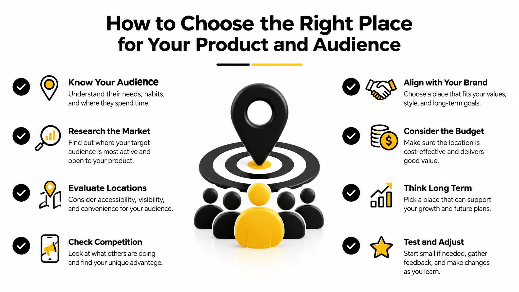
How to Choose the Right Place for Your Product and Audience
The cleanest way to decide is to match the product to the buyer's habits. A template buyer often wants speed and certainty. A coaching buyer wants trust and scheduling. A fan buying a music bundle may respond to personality and convenience more than category search.
A simple decision matrix
Use three questions. First, where does your audience already spend time? Second, do they need discovery or already know you? Third, is the product cheap and impulse-friendly, or does it need explanation and trust?
If your audience is cold and your product is easy to compare, a marketplace can still make sense because people browse with intent there. If your audience already follows you, a link-in-bio storefront or a clean owned page often works better because the buyer doesn't need to “discover” you again. If your offer is a coaching call, a booking flow matters more than a product grid.
Three creator profiles, three different homes
A template seller usually benefits from a marketplace plus a simple owned page. The marketplace gives discovery, while the owned page gives a place to capture email and resell to people who don't buy on the first visit.
A coach selling bookings often needs a page that combines booking and payment in one motion. Sending a warm lead from Instagram to a separate calendar, then to a separate checkout, adds avoidable drop-off.
A musician selling bundles may want a social-first storefront that lets fans buy immediately after seeing a clip or announcement. The product is already emotionally framed, so the job is to shorten the path.
If you're trying to reduce tool sprawl while keeping the offer visible, a single creator page can do the job of several disconnected tools. taap.bio is one example of that type of setup, since it combines a creator storefront, paid bookings, email capture, and analytics on one page.
The decision isn't “Which tool is best?” It's “Which setup gives this audience the least resistance and gives me the most control over the relationship afterward?” For many creators, that means one primary home base and a few supporting channels, not six separate tabs fighting for attention.
Launching Your Store and Turning Visitors Into Buyers
A lean launch starts with the file, not the platform drama. Upload the product, set the price, and make sure the buyer gets instant delivery the moment payment clears. That delivery promise matters because it removes uncertainty right after purchase, which is when people are most likely to second-guess themselves.
Build the shortest possible first version
A consolidated page works well when it keeps the buyer in one place. A link-in-bio store can hold a digital product block, a booking widget, and an email signup without forcing visitors to bounce between separate tools. That matters because every redirect creates another chance to lose the sale.
The conversion benchmarks in the brief make the email side of this especially important. Median lead-gen landing pages convert around 6.6%, email-only forms commonly sit in the 5 to 20% range, and product landing pages are closer to 3.92% in one benchmark set, landing page conversion benchmarks. The point isn't to chase a single number. The point is that email capture often gives you a reusable asset that converts differently from a direct sale page, so it deserves a place beside checkout.
A simple launch workflow
- Upload the product file. PDFs, ZIPs, MP4s, and similar files can be attached to a product card so the buyer sees the offer and the delivery path together.
- Add the payment step on the same page. A one-page flow keeps the offer, pricing, and checkout in one view.
- Collect email at the same time. Even a one-tap signup can turn a one-time visit into a list you can resell to later.
- Watch what gets clicked. Real-time analytics and live visitor data help you see whether the problem is traffic, price, or page clarity.
For creators who want a more detailed walk-through of the page itself, this digital product landing page guide is a helpful companion. The simple principle is the same across formats. Shorter paths usually win.
Your Next Step to Selling Digital Products With Less Tool Sprawl
The best place to sell digital products is the place where fees stay low, checkout stays short, and audience ownership stays with you. For low-ticket creators especially, that usually favors a consolidated page over a scattered stack of tools, because the stack creates more chances for drop-off and more hidden cost on each sale.
A bento-style page that combines checkout, bookings, email capture, and analytics solves more than one problem at once. It removes extra redirects, keeps the buyer focused, and gives you one home base instead of a patchwork of apps. If your current setup feels like a mess of links, tabs, and disconnected tools, that's usually a sign the system is working against the sale.
Pick one anchor channel, launch one simple store, and start capturing emails from day one. If you want to see what that looks like in practice, the all-in-one approach is laid out in this all-in-one business platform guide. The goal isn't to build a bigger stack. It's to keep more of what you earn and make it easier for buyers to say yes.
If you want a single page that can sell products, take bookings, and grow your list without making your setup more complicated, visit taap.bio. It's built for creators who want a storefront, checkout, and email capture in one place, so the path from viewer to buyer stays short.