You've got the idea, the blank doc open, and a half-built storefront in your head. Maybe you've already spent an evening comparing platforms, tweaking colors, and telling yourself you're “getting set up,” while no one has bought a single thing. That's the trap: beginners often try to look ready before they find out whether the offer is even wanted.
Selling digital products for beginners gets a lot easier when you stop treating platform choice like the first decision. The first decision is whether anyone wants your offer badly enough to pay for it now. Everything else, the page, the checkout, the polish, works better after that answer is yes.
The creator economy reached an estimated $254 billion in 2025 and was projected to hit $480 billion by 2027, with digital products estimated around $32 billion in 2026 in one market view, which is a strong signal that this isn't a tiny side hustle category anymore (market overview). Consumer demand is already broad too, with 68% of internet users aged 16+ paying for some kind of digital content each month in 2025, and internet users spending more than $560 billion on digital media in 2024 in one industry summary (demand data). The category is real, but beginners still waste time on the wrong first move.
Table of contents
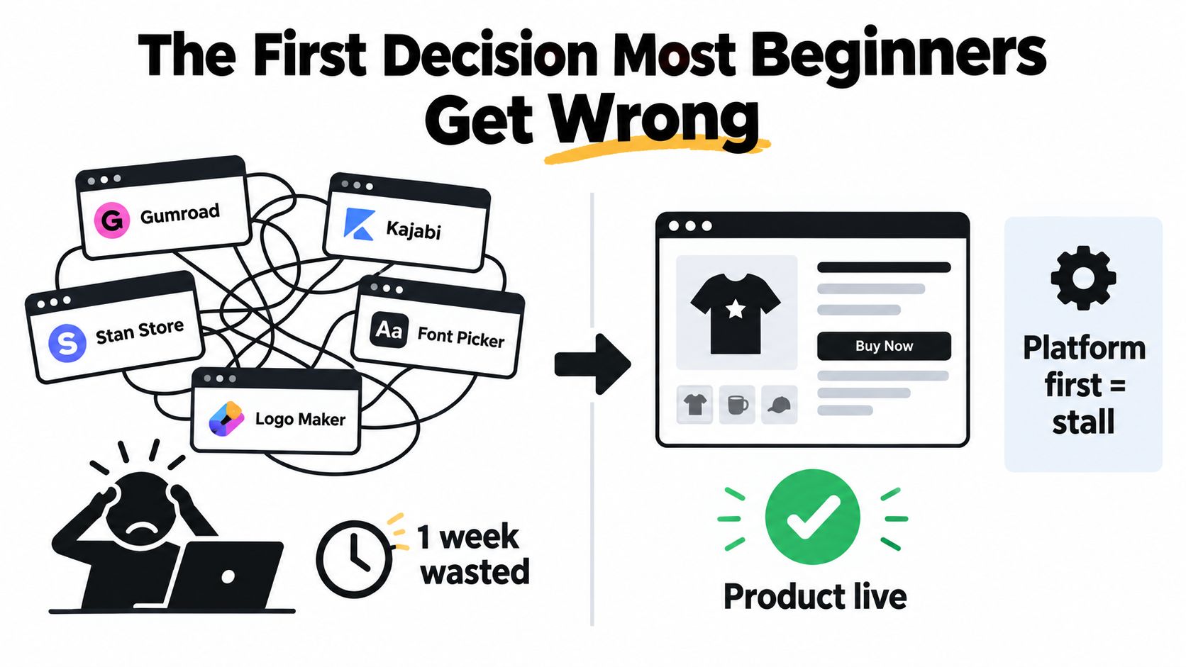
The First Decision Most Beginners Get Wrong
The classic beginner spiral is simple. They get an idea for a template, ebook, mini course, or Notion system, then open five tabs to compare Gumroad, Kajabi, Stan Store, fonts, logos, and page layouts. A week later, they've got a polished shell and zero evidence that anyone wants the thing inside it.
That order is backwards. If you spend your first burst of energy on design and tooling, you've already lost the most valuable part of being new, which is focus. Beginner energy is finite, and it should go into proof, not production.
Proof beats polish
A beginner who tests demand first builds with confidence. They can ship in days because the offer already passed a market check, even if that check was messy and small. A beginner who designs first is usually chasing certainty in the only place it doesn't exist, the visual layer.
Practical rule: If you don't know who will buy it and why, you don't need a nicer page, you need a clearer offer.
That's why I tell people to treat the page as a vote-catcher, not a brand museum. The point is to find out whether the problem is urgent enough and the price is fair enough. Once money is on the table, the rest of the build gets simpler, not harder.
If you're tempted to turn this into a “pick the perfect platform” exercise, read this practical take on social media storefronts and then come back to the essential question, which is whether the thing is worth selling at all.
Why Pre-Selling Beats Building First
Pre-selling strips out the guesswork. Write a simple offer, put a price on it, and ask the market to vote with money before you spend time building something nobody asked for. That is the cleanest way to avoid making a product in a vacuum.
A simple pre-sell flow
Start with one paragraph. Say who it is for, what problem it solves, and what outcome it delivers. Add a price, then build one landing page with a checkout link even if the product does not exist yet.
The goal is not to look finished. The goal is to learn whether people will buy the promise.
Send that page to a small group that matches the buyer profile. Use DMs, a community post, or your email list, and ask for payment or a deposit. If someone hesitates, listen to the objection, tighten the promise, and keep the offer narrow.
Only after you have real interest should you build the deliverable. Define one narrow problem, pre-sell the outcome, collect feedback, and then create the minimum viable version. That flips the risk. You are no longer betting weeks of work on a guess.
The ConvertKit 2024 Creator Report found that creators who pre-sold digital products before making them completed the product 73% of the time, versus 23% for creators who built first and sold later. That gap is why I push beginners toward pre-selling. It rewards validation before production.
If you want a tighter launch sequence later, this launch guide is a useful companion. The rule stays the same. Do not spend more than two days on production before somebody has paid.
The full workflow for testing an offer, collecting payment, and shipping from one page is also covered in the launchmystore.io overview.
Picking Your First Digital Product Type
The right first product is the one you can ship quickly, explain clearly, and improve after the first sales. Beginners waste months chasing the “most profitable” format in theory, but the better move is to pick the format that fits your speed, your audience, and your ability to deliver on the promise without burning out.
Match effort to demand
Start with low-effort products. A single PDF template, a Notion system, a prompt pack, a swipe file, or a 30-minute recorded workshop can usually ship fast and keep fulfillment simple, because there is no inventory, packing, or shipping to manage. Medium-effort products like an ebook, a short course, or a bundle need sharper packaging and a clearer promise. Higher-effort products like full courses, memberships, and software bring more support work and more expectations.
Here's the filter I use.
| Digital Product Type | Effort to Build | Margin | Demand Risk | Best For |
|---|---|---|---|---|
| PDF template, Notion system, prompt pack, swipe file | Low | High | Lower if the problem is specific | Fast validation, first-time sellers |
| Ebook, short course, template bundle | Medium | High | Moderate if the topic is broad | Sellers who can explain one clear outcome |
| Full course, membership, software | High | High on paper, but more support-heavy | Higher, because expectations rise | Experienced creators with repeat demand |
Choose the simplest version first
The market is crowded with generic planners and vague course ideas. Beginners do not win by adding complexity. Newer coverage keeps pointing toward templates, swipe files, workflow systems, and AI-related products as strong options, while also noting that lower-effort products are usually faster to create and higher-effort products can make sense later (product type trends). That does not mean you should start with the hardest format.
Start with the simplest version of the strongest offer you can credibly make. Then watch the first 10 sales before you add a bundle, a course layer, or a membership tier. If the plain version does not move, a fancier version will not fix it.
For a useful comparison of platform and format options, I'd also skim this comparison of the most profitable digital products and then come back to the product itself. The product comes first, the container comes second.
Building Your Storefront on a Single Page
A first launch doesn't need a full website. It needs one page that can explain the offer, collect attention, take payment, and send the file without making people bounce between tabs. A bento-style page does that job better than a multi-page setup because the whole flow stays visible and simple on mobile.
The page should stack in this order on a phone. Header first, then social proof or trust signals, then the product block, then booking if you're selling a service add-on, and then email capture. If the page takes longer than 90 seconds to scan, the offer above the fold isn't clear enough, no matter how nice the design looks.
What to put on the page
The Header block should say exactly what the product does and who it's for. The Social Links block borrows trust from your existing audience channels. The Product block lists one to three offers, not twenty, because beginners need clarity more than choice.
The Booking block makes sense if you want to sell a paid 30-minute setup call alongside the product. The Email Capture block should offer a free mini-resource in exchange for an address, because not every visitor is ready to buy right away. If you're choosing a tool stack for courses or memberships, Coachful's platform comparison is a useful reference point, but for a first launch, a single page is simpler and faster.
Keep the page stupidly easy to scan. One offer, one action, one path.
If you do use taap.bio, the flow is straightforward. Pick a template, swap in your handle, connect a custom domain if you have one, and preview the page on your phone before publishing. That's enough to get live without stitching together a storefront, a scheduler, and a separate email capture tool. For a tighter layout example, this one-page store guide is the right next read.
Pricing, Checkout, and Instant Delivery
Pricing is where beginners either get timid or get sloppy. The clean approach is to anchor with one higher-priced tier, offer one low-ticket entry under $25, and test a single price change only after you have some sales data. Anchors make the value feel more grounded, low-ticket offers lower the commitment barrier, and tiny tests beat opinion battles every time.
Set the checkout up for speed
Inside the checkout, keep the path short. Enable the built-in checkout, choose Stripe or PayPal, set the currency, and write one clear refund line that buyers can understand before they buy. Then turn on instant file delivery so the buyer gets the PDF, ZIP, Notion link, or other digital asset seconds after payment.
That matters because digital delivery removes the mess that physical sellers deal with. No shipping, no packing, no lost parcel, no waiting for a mailbox. The business becomes much simpler after creation, which is why the margin profile stays strong when the product is good and the checkout friction is low.
Don't guess on price forever
Use a tiered pricing framework for creators as a mental model if you want one higher-end option above your entry offer, but keep the first launch simple. A beginner doesn't need five prices. A beginner needs one believable entry point, one stronger anchor, and a clean checkout path.
If you want the simplest setup flow, this delivery-focused guide is worth a look. After that, run this checklist before launch: the download link works, the receipt email fires, and a fallback contact address is visible on the receipt. If any one of those is broken, fix it before you send traffic.
Analytics, Email Capture, and Trust Basics
A lot of beginners skip the boring operational layer and then wonder why nothing is happening. You need a small set of signals before you spend real energy on traffic. Track page visits, product block clicks, checkout starts, and completed purchases, because those four numbers tell you where the page leaks.
Keep the trust pieces visible
Put a refund policy where people can find it. Add a real contact address. Include a short About line that says who made the product and why it exists. Buyers don't need a dramatic brand story, they need to know there's an actual person behind the file.
Email capture should sit beside sales, not replace them. Offer a small free resource in exchange for an email, then follow up with one short sequence that points people back to the offer. That gives you a second chance without asking every visitor to buy on the first click.
Handle consent the plain way
For GDPR basics, the move is simple. Collect consent at signup, store consent timestamps, and don't import contacts scraped from social platforms. You don't need to turn day one into a legal project, you need five settings clicked correctly and a written policy the buyer can find.
If you're using taap.bio, the built-in analytics and email capture live on the page instead of being bolted on later. That makes it easier to see what people do, not just what they say they'll do. It also keeps the whole setup lean, which matters when you're still figuring out which product deserves your next hour.
Your First Week Launch Checklist
Monday is for commitment, not tinkering. Lock the offer, set the price from whatever pre-sell signal you've got, and write the one-sentence promise in plain English. If you can't say what changes for the buyer, don't publish yet.
Tuesday is for the page. Build the bento layout, add the product block, connect checkout, and attach the delivery file or link. Wednesday, write three short posts for the channel you already use most, because one channel you can sustain beats three channels you'll neglect.
Thursday, wire the email capture and welcome sequence. Friday, soft-launch to ten warm contacts and ask for blunt reactions. Saturday, turn the best reactions into testimonial-style lines and tighten the headline. Sunday, publish publicly and commit to two weeks of promotion instead of pretending the launch ended at publish.
The mistake that derails most beginners is not bad product quality. It's refund anxiety, which leads to undercharging and under-promoting. Treat price as a hypothesis, every sale as a test, and week one as a signal-gathering sprint, not a profit report.
If you want a single page that can sell a file, take bookings, and grow an email list without duct-taping six tools together, taap.bio is built for that workflow. It's a link-in-bio creator store with checkout, delivery, bookings, analytics, and email capture in one page. If you're ready to stop guessing and start testing, build the offer, publish the page, and get the first real buyer to decide.