Online shopping is already a global habit, but the most important opportunity for digital creators isn't just reaching more people. It's removing the delay between discovery and payment. Global retail ecommerce sales reached about $6.42 trillion in 2025, and mobile devices generated roughly 46.7% of ecommerce sales that year, according to compiled ecommerce market data. If your product page sends a mobile visitor through several redirects, account registrations, or unclear checkout steps, your offer can lose buyers before they understand its value.
The practical answer to how to sell digital products online is to treat the entire path as one product experience. Validate a narrow problem, package the fastest useful solution, put it on a focused page, capture the visitor's email, and measure every step from product interest to completed order. A polished file won't compensate for a slow or confusing buying process.
Table of contents
From Idea to First Sale in Record Time
The fastest route to a first sale is a narrow problem, a small useful product, and a short path from discovery to checkout. Passion sustains commitment, while buyer demand requires evidence beyond enthusiasm. Buyers respond to the time they can save, mistakes they can avoid, or task they can complete with less uncertainty.
Templates, presets, mini-courses, practical guides, spreadsheets, prompt packs, and downloadable systems work because they convert knowledge or creative skill into an outcome someone can use immediately. Digital goods can be delivered instantly and sold globally without shipping or inventory constraints, which helps explain the category's place in ecommerce. One estimate puts digital products at about 25% of ecommerce sales in 2023. Another values the digital goods market at $124.32 billion in 2025 and projects $511.43 billion by 2031. These estimates appear in digital products market research, pointing to a durable market with heavy competition.

Find the smallest valuable problem
Start with conversations, not design software. Review questions in comments, customer emails, community discussions, and sales calls. Repeated wording such as “I keep wasting time on,” “I don't know how to,” or “I wish I had a simple way to” reveals problems people already recognize.
Define the offer in one sentence:
I help [specific audience] achieve [specific result] with [specific format].
“An ebook for freelancers” leaves too much unsaid. “A client onboarding template for freelance designers who lose time chasing project details” identifies the buyer, the friction, and the format.
Use social polls to compare which pain point feels most urgent. A poll cannot confirm a purchase, yet it can narrow your options quickly. A waitlist provides stronger evidence because people actively request the resource. A preorder creates an even clearer test when you state exactly what buyers will receive and when delivery will happen.
Keep discovery and checkout close together. A focused landing page should explain the problem, show a useful preview, capture an email address, and give the visitor one clear purchase action. A consolidated stack reduces handoffs between forms, payment, delivery, and audience records, so you can learn where interest turns into payment instead of stitching reports together later.
Build the minimum useful version
Your first version should solve one job rather than contain every idea you have collected. A template needs clear instructions and a usable starting point. A guide needs a logical path and examples. A mini-course needs a defined transformation, not a large video library.
Use this validation sequence:
- Collect language: Save the exact phrases people use to describe the problem.
- Offer a promise: Describe the result without exaggerating what the product can do.
- Show a sample: Publish a page, preview, short lesson, or partial template.
- Ask for commitment: Invite email signups, preorders, or a paid pilot.
- Improve from objections: Treat questions about format, access, and use cases as product research.
The creation process matters too. This guide to creating digital products to sell can help turn an existing skill into a structured offer before you build a complicated catalog.
Create the sales page and payment path while the product is still small. Early checkout tests expose weak positioning, unclear delivery details, and missing proof before weeks of production make those problems expensive. They also give you a direct route to collect buyer emails and improve the offer from real objections.
Packaging and Pricing Your Digital Assets
Price the transformation, not the file size. A ten-page workbook can be more valuable than a long ebook if it helps a buyer make a decision or complete a task immediately. Conversely, a large download won't feel valuable if the buyer can't tell where to begin.
Package each offer around one job. The product name, preview, description, delivery format, and call to action should all reinforce that job. Avoid presenting a random collection of files as a bundle. Buyers need to understand what changes after they purchase.
Choose the right offer architecture
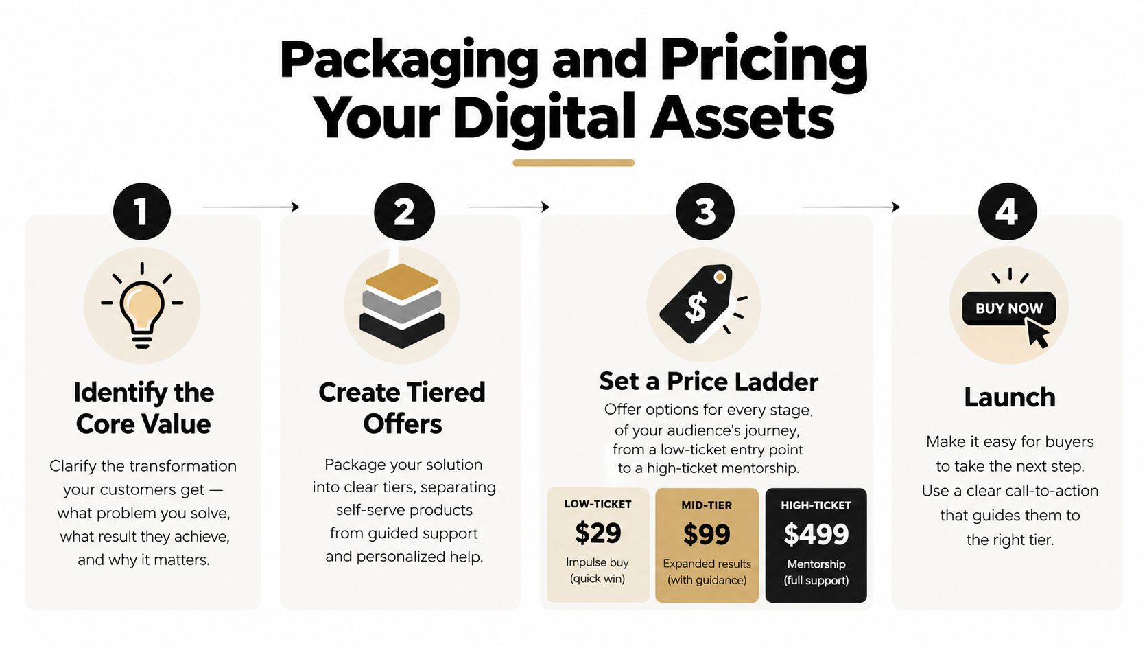
A simple product ladder gives people more than one way to buy without forcing you to build several unrelated products.
- Self-serve entry offer: Give a buyer a focused template, checklist, preset, or guide that produces a quick win.
- Expanded bundle: Combine related assets that remove several connected steps, such as a template, tutorial, examples, and update access.
- Guided offer: Add feedback, implementation help, a workshop, or a paid consultation for buyers who value support more than a lower price.
This structure separates access from attention. Your downloadable product can serve many customers without consuming your calendar, while guided support creates a higher-value path for buyers with more complex needs.
Anchoring works when the comparison is honest. Show what the buyer gets at each level and explain the additional outcome, access, or support. Don't display an inflated “before” price that has no genuine relationship to the offer. False urgency and artificial discounts may create a short-term click, but they weaken trust and make future launches harder.
Price for a sustainable delivery model
Start with the value of the problem and then check the alternatives your audience already uses. A product that saves repeated manual work can justify more than a decorative download, while an unfamiliar offer may need a lower-friction starting point until buyers can see its usefulness.
Your costs still matter. Account for payment processing, refunds, customer support, updates, taxes, and the time required to maintain access. A platform that keeps 100% of sale proceeds, such as the model described by the publisher of LiveDocument's pricing information, can change the economics of low-priced products, but you should still review the full feature and payment terms before choosing a tool.
Instant delivery should be part of the package. Tell buyers whether they receive a PDF, editable file, video access, software download, or future updates. Put the access instructions on the confirmation screen and in the receipt. A buyer shouldn't need to email you to ask where the product is.
For limited-time launches, define the reason for the deadline. A founding-buyer price, live review period, or bonus support window gives urgency a credible basis. Keep the offer simple enough that a visitor can choose a tier without opening multiple pages. More options don't automatically create more conversions. They often create more hesitation.
For a deeper look at offer structure, use this digital product pricing strategy as a planning reference, then test your own positioning with real buyer questions rather than copying another creator's price.
Building a High-Converting Creator Storefront
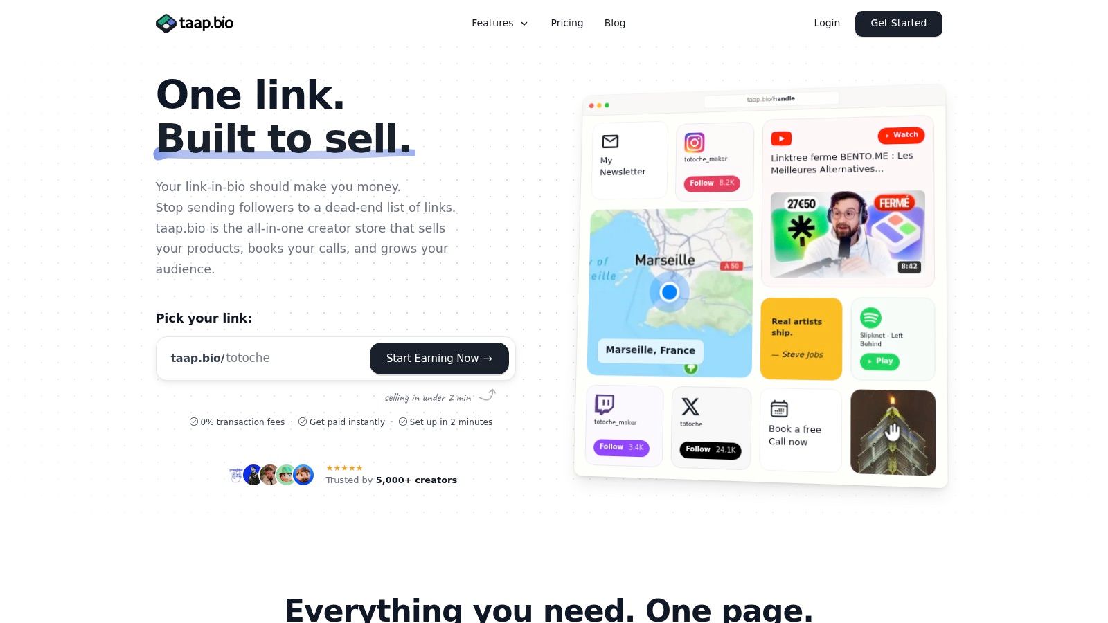
The fastest route from discovery to payment is a storefront that answers four questions immediately: what is this, who is it for, what happens after payment, and how can I buy it now? A single-page layout can handle those questions while combining the product, proof, checkout, email option, and supporting media in a deliberate order. That consolidation shortens the path between attention and revenue.
The page does not need to feel empty. It needs one obvious primary action. Place the product block near the top, describe the result in one clear sentence, and follow with a preview that shows the asset in use. Keep secondary actions, such as bookings, playlists, or social profiles, in separate sections so they do not compete with the purchase.
Assemble the page around buyer intent
A drag-and-drop bento builder helps combine several actions without maintaining separate tools. Arrange the page in this order:
- Promise block: State the audience, problem, and outcome.
- Product block: Show the offer, price, format, and purchase button.
- Proof or preview: Add a sample page, short demonstration, testimonial, or use-case explanation.
- Trust block: Explain delivery, refund terms, licensing, and support.
- Audience block: Give visitors who are not ready to buy a useful reason to subscribe.
- Service block: Offer a paid booking for visitors who need personal help.
Built-in checkout reduces confusion because every redirect creates another chance for a visitor to abandon the purchase. Keep the product description near the button, show accepted payment methods, and make the delivery promise visible before payment. Mobile shoppers need the same clarity as desktop visitors, especially as mobile shopping app use continues to grow. Build the page around a simple device-first path, then test the actual checkout on the phones your audience uses.
A creator selling music can place Spotify or YouTube content beside an album or sound pack. A coach can add a short lesson beside a workbook and a paid calendar slot. A designer can show a live example beside a template. Each piece of media should reduce uncertainty by showing the product's practical result.
This digital product storefront guide offers another way to plan the page architecture. The central principle is consolidation. If a visitor moves from a link page to a sales page, then to a separate scheduler and another email form, the buyer has to manage your software before completing the purchase. A consolidated storefront keeps discovery, decision-making, payment, and the next relationship step in one controlled path.
Use a custom domain when the page represents a serious business, and check every element on a phone before publishing. Test the purchase yourself, download the file, open the confirmation email, and verify that the calendar or signup action works as expected.
Social content should demonstrate the problem your product solves and direct viewers to the relevant storefront block. For short-form creators, this TikTok product promotion 2026 playbook provides useful context for connecting promotional content with a clear destination.
Capturing Emails and Automating Growth
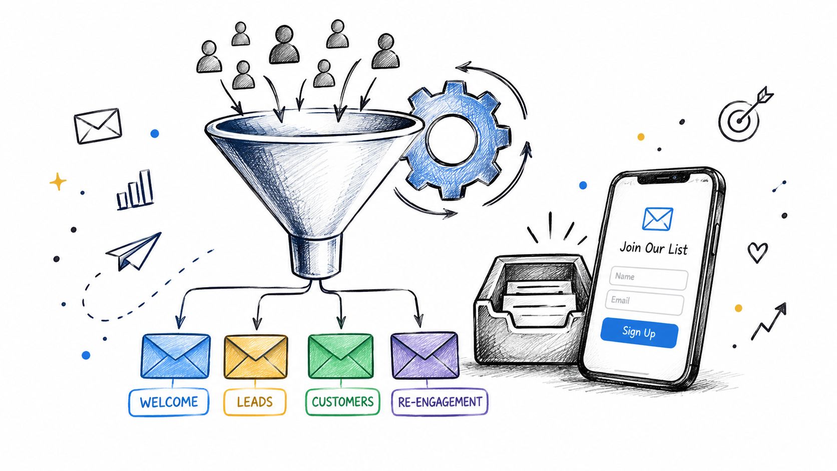
A completed order is useful, but it shouldn't be the end of the relationship. A visitor who isn't ready to buy today may still become a customer later if you give them a relevant reason to stay connected. Social followers are rented attention. An email address, collected with clear permission, gives you a more direct channel for future education and offers.
Email capture works best when it matches the product. A general newsletter signup asks the visitor to make a vague commitment. A useful lead magnet solves a smaller version of the same problem as the paid offer. A photographer might offer a shot-planning checklist before selling presets. A consultant might offer an intake worksheet before selling a strategy kit.
Build a useful sequence, not a noisy list
The first email should deliver the promised resource immediately. The next messages can show how to use it, address a common mistake, and introduce the paid product as the logical next step. Keep the writing specific. A short example from the buyer's situation is more persuasive than a broad statement about your expertise.
Segment subscribers by action where your tools allow it:
- New subscribers: Send the promised resource and clarify what they can expect from you.
- Product viewers: Answer objections about format, access, or suitability.
- Buyers: Deliver the product, explain the first step, and invite a reply with one focused question.
- Repeat customers: Recommend a related asset based on the problem they already paid to solve.
- Booking leads: Explain the service outcome and make the scheduling step straightforward.
A one-tap form reduces the work required to subscribe. Keep the fields minimal unless you have a clear reason to ask for more information. Don't hide the consent language, and don't add people to unrelated campaigns without permission.
The guide to building an email list can help you plan the relationship between your free resource and paid offer. The best lead magnet isn't the one that attracts the most addresses. It's the one that attracts people who are likely to need the next solution.
Turn expertise into a second revenue path
Paid bookings fit naturally beside digital products when some customers need adaptation or accountability. A buyer may purchase a template and then book a review session to tailor it to their business. A visitor who can't justify a course may still pay for a focused consultation that resolves a specific issue.
Put the booking offer on the same page, but don't let it compete with the primary product. Explain who the session is for, what the buyer should bring, how long the session lasts, and what they receive afterward. Upfront payment and automatic calendar invitations remove the back-and-forth that makes small service offers unprofitable.
A consolidated workflow also reduces maintenance. One page can connect product delivery, email capture, media, scheduling, and analytics, rather than making you repair several disconnected integrations after every launch. That doesn't replace thoughtful messaging, but it keeps operational friction from becoming the reason a good offer stalls.
Analytics, Legal Basics, and Troubleshooting
Sales totals tell you what happened. They don't tell you why. To improve a digital product business, track the path from the first meaningful interaction to the confirmed order. At minimum, distinguish product views, add-to-cart actions, checkout initiation, payment completion, and delivery success.
Stripe defines checkout abandonment as (checkout sessions started minus completed orders) divided by checkout sessions, and reports that abandonment across major ecommerce categories ranges from about 50% to nearly 90% in its checkout abandonment guidance. The useful lesson isn't to compare your business with a broad category average. It's to locate the exact point where your visitors stop.
Diagnose the step, then change one thing
If visitors view the product but don't start checkout, your offer or call to action may be unclear. If they start checkout but don't finish, inspect payment options, form length, page speed, trust language, and mobile layout. If payment succeeds but delivery fails, the problem is operational rather than promotional.
Research on checkout behavior identifies unexpected costs, complicated forms, mandatory accounts, security concerns, limited payment methods, slow pages, and weak mobile optimization as common abandonment triggers. A UK checkout study reported roughly three-quarters of baskets were left unpurchased in late 2024, with mobile abandonment at 76% compared with 67% on desktop, as detailed in the Retail Institute checkout abandonment study. Treat those figures as external context, not a target or prediction for your store.
Run a controlled troubleshooting pass:
- Test the purchase: Use a real device, payment method, and email address.
- Check delivery: Confirm the download link works, permissions are correct, and the file opens.
- Review mobile layout: Look for clipped buttons, slow media, and fields hidden below the fold.
- Inspect every link: Check product buttons, confirmation pages, calendar actions, and unsubscribe links.
- Change one variable: Rewrite one headline or simplify one step before making a full redesign.
Protect the transaction and the customer
Publish a privacy notice, terms of use, refund rules, and product license that match your business. If you sell internationally, review the obligations that apply to your customers and business location, especially around personal data, digital sales taxes, and consumer rights. Don't assume a platform's defaults answer every legal question.
Use a payment processor and hosting setup that handles sensitive payment information appropriately, but still explain security in plain language. You shouldn't collect unnecessary card data yourself. For email forms, validate addresses before they enter an automation sequence. A service such as the Email Validation API from BillionVerify can be evaluated when poor-quality addresses are creating delivery or list-management problems.
Your analytics should respect privacy as well as support decisions. Collect the information you need, document why you collect it, and give subscribers a clear way to withdraw consent. Legal compliance isn't separate from conversion work. Clear policies reduce uncertainty, while clean event data shows which customer experience needs attention.
Scaling Your First Sales into a Sustainable Business
The first sales usually reveal a different product from the one you imagined. Buyers ask questions you didn't anticipate, skip instructions you thought were obvious, and request features that point toward the next offer. Treat that feedback as a roadmap rather than as criticism.
One creator might launch a content calendar template and discover that buyers struggle more with the planning process than with the file itself. The next product could become a short implementation workshop. Another creator might sell presets and learn that customers want a matching editing guide. The strongest expansion follows observed use, not an urge to add unrelated products.
Build a feedback flywheel
After each launch, review three kinds of evidence:
- Purchase behavior: Identify which offer, page block, and traffic message attracted action.
- Customer language: Save support questions, replies, reviews, and refund reasons.
- Usage friction: Note where customers need help opening, editing, applying, or adapting the product.
Repurpose a successful core asset carefully. A guide can become a workshop, a checklist, a paid review, or a focused bundle. Reuse the underlying expertise, but give each format a distinct job. A buyer shouldn't feel that you've just renamed the same download.
Keep your audience involved after purchase. Ask for a specific result or implementation note, then request permission before using feedback publicly. Social proof works best when it explains the buyer's starting point, the action they took, and what they found useful. Avoid vague praise that gives future customers no information.
A sustainable catalog also needs maintenance. Update broken links, revise outdated examples, and make version changes visible. Use the digital product roadmap to connect customer questions with future releases instead of reacting to every new idea.
The common failure pattern is not a lack of creativity. It's a creator spending more time rebuilding checkout, scheduling, email, and delivery tools than improving the offer. Keep the stack consolidated, review the funnel after every meaningful launch, and let evidence decide what you build next.
taap.bio gives creators a drag-and-drop storefront with built-in checkout, instant digital delivery, paid bookings, email capture, rich media widgets, and page-level analytics in one link-in-bio experience. If you're ready to replace scattered tools with a focused page for selling your first product, visit taap.bio and start building your customer path.