Internet users spent over $560 billion on digital media in 2024, and 68% of users aged 16+ paid for some kind of digital content each month in 2025, which makes digital buying feel less like an exception and more like a habit as reported in this market overview. If you want to sell digital products online, that matters more than hype. Buyers already trust instant access, repeated purchases, and low-friction checkout, so the job is not inventing demand. It's removing everything that slows a purchase down.
That's why a single-page revenue system works better than a scattered stack of tools. A bento-style storefront can hold the product, the checkout, the booking calendar, and the email capture in one place, so people don't bounce between a link page, a cart, a calendar app, and an email form. For creators who sell templates, presets, files, or paid calls, the cleanest setup is often the simplest one.
Table of contents
Why Selling Digital Products Online Works Right Now
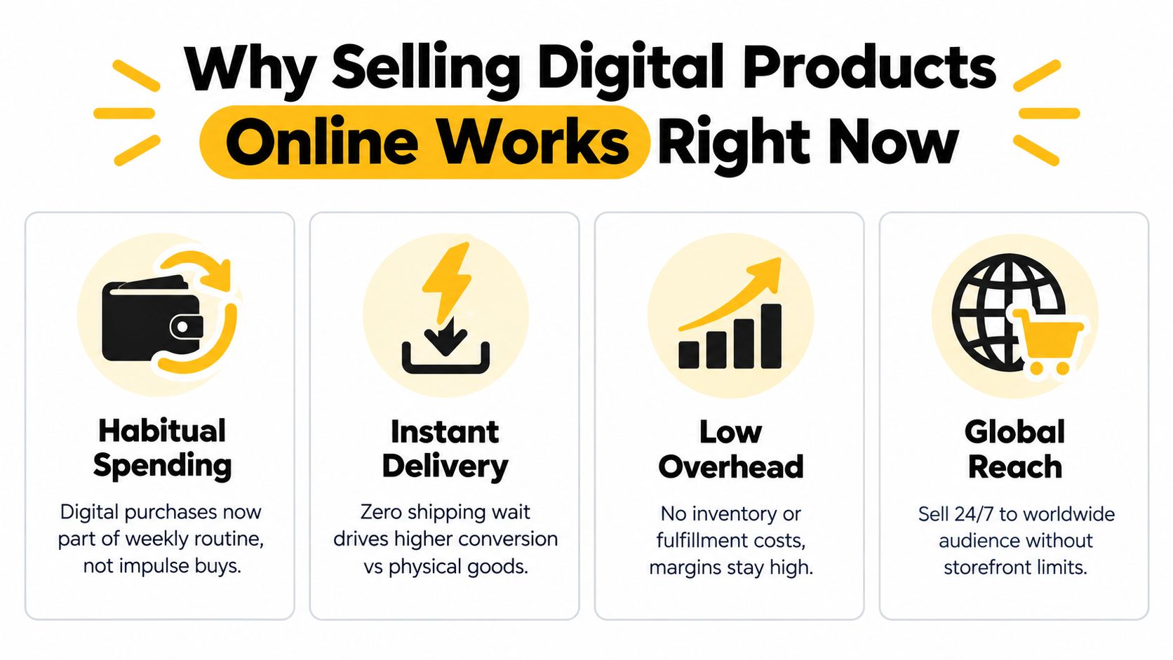
The market is already large enough to support serious businesses, not just side projects. One market overview estimates the global digital products economy at more than $2.5 trillion in annual value as of 2025 Whop digital product statistics 2025. That matters because the buyer base is already spending, already used to instant access, and already comfortable paying for convenience. The opportunity is less about creating demand and more about removing friction from the purchase path.
Habit has replaced novelty
Digital buying now behaves like a routine, not a one-time experiment. The same research says 68% of internet users aged 16+ paid for digital content each month in 2025, which means buyers do not need a new shopping model explained to them. They need a clear outcome, a fast checkout, and delivery that starts the moment payment clears.
Practical rule: If the product delivers immediately and solves a narrow need, the buyer does not need a long pitch. They need a clear outcome and a short path to payment.
The opening is in positioning. When buyers already spend on digital content, the offer that wins is usually the one tied to a specific job, a specific audience, and a specific result. Broad products ask people to figure out how to use them. Narrow products reduce that work and convert faster.
One page can do the work of five tools
That shift changes the setup. A single-page revenue system can hold the product, checkout, booking calendar, and email capture in one place, so buyers do not bounce between a link page, cart, scheduler, and separate form. A bento-style storefront works well here because it keeps the full path in one screen and cuts out the handoffs that slow sales.
A creator selling templates, presets, files, or paid calls usually does not need a five-tool stack. The useful setup is the one that gets the offer live, delivers access instantly, and keeps contact with the buyer after the sale. Paid bookings and owned email matter here because they turn one visit into a repeat relationship, not just a single transaction.
One source also notes that digital product transactions rose sharply in recent years source/15.%20Chapter%2010%20-%20ECommerce%20Digital%20Markets-Digital%20Goods.pdf). The takeaway is not that every digital product performs the same. It is that utility-driven offers, such as niche templates, creator kits, and focused bundles, fit the way people already buy.
Choosing What to Sell and Who It Helps
The best digital products usually solve a narrow problem for a specific type of buyer. Generic ideas sound safer, but they're harder to position and easier to ignore. A “productivity guide” gets lost. A “Notion client dashboard for freelance designers” has a buyer in mind from the first glance.
Match format to the job
Different formats fit different buyer intents. Templates are strong when speed matters. Presets and creative assets work when the buyer wants a look they can apply immediately. Paid bookings fit when the value is in your time, judgment, or personalization. The format should follow the job to be done, not the other way around.
| Product Type | Best For | Effort to Create | Repeat Sales Potential |
|---|---|---|---|
| Templates | Fast implementation, repeatable workflows | Medium | High |
| Presets | Visual creators who want a consistent style | Medium | Medium |
| Notion Kits | Organizing systems, client work, content planning | Medium | High |
| Lightroom Packs | Photographers and creators editing in bulk | Medium | Medium |
| Audio Samples | Musicians, producers, editors | High | Medium |
| Guides | Buyers who need context and instructions | Medium | Medium |
| Paid Bookings | Consulting, coaching, audits, custom advice | Low to Medium | High |
A good rule is to start with one product that matches how the buyer already works. If they're already editing in Lightroom, a preset pack makes sense. If they live in Notion, a workspace template is easier to adopt. If they want your brain more than your files, a paid booking is cleaner than trying to turn advice into a PDF.
Pick specificity over volume
Generic categories are crowded because they're easy to copy. Specific categories win because they save time for a clearly defined user. A broad ebook about social media is weaker than a niche bundle for real estate agents, course creators, or creators selling from a link-in-bio page. That's the part many sellers miss, they try to appeal to everyone and end up resonating with no one.
Useful filter: If you can't describe the buyer, the use case, and the moment of need in one sentence, the product is probably too broad.
For a practical starting point, choose one product that is quick to create and one that can be repeated or bundled later. If you want a broader menu of options to compare, this overview of digital product ideas is a useful reference point. The goal isn't to collect ideas, it's to shortlist the ones that fit your audience and your delivery style.
Preparing Files Pricing and Protecting Your Work
A digital product is not ready to sell the moment the content is finished. The files need to open cleanly, the terms need to be easy to read, and the price has to survive payment fees, attention loss, and support requests. If any of that is messy, the offer feels cheaper than it should.
Prep the file like a customer will use it
Use a format buyers already trust on the devices they already own. PDFs, ZIP files, and MP4s are common because they are simple to deliver and easy to understand. Name files clearly, add version numbers, and keep the buyer folder organized so updates do not create confusion later.
A short licensing note helps too. Skip legal clutter and state what buyers can do, what they cannot do, and whether commercial use is included. Buyers want clarity, not a wall of legal text.
- File prep: Export in the format the customer expects, then test the download on desktop and mobile.
- Version control: Keep v1, v2, and future updates organized so returning buyers always get the right file.
- Licensing: State personal use, commercial use, resale limits, and redistribution limits in plain English.
- Delivery safety: Use watermarking or limited download links where it makes sense, especially for highly shareable assets.
- Support readiness: Include one short readme or quick-start note so buyers know how to use the file fast.
Price for margin, not vanity
Recent guidance suggests starting with a $20 to $100 offer and using order bumps or upsells to raise average order value source. That range works for a lot of creators because it stays accessible without making the product feel disposable. It also leaves room to bundle related assets, which is often what makes a low-ticket offer worth the effort.
Format matters too. The same guidance points out that design assets and digital services can outsell ebooks and courses in some creator marketplaces. That does not mean ebooks are weak. It means pricing should match what buyers see as immediately useful.
For a closer look at anchors, bundles, and tiers, this digital product pricing strategy guide is a useful reference. If you want to see how a low-friction entry offer can sit alongside higher-value usage, the social media API pricing page is a practical example.
Building Your Storefront Checkout and Booking Flow
A storefront should sell, not just display. If your page sends people off to different tools for payment, scheduling, and downloads, every extra hop lowers the chance of conversion. The cleaner model is a single page with product blocks, payment, delivery, and bookings all in one place.
Build the page around action
Start with a bento layout that puts the most important actions above the fold. One tile can hold the main offer, another can preview a file, another can open a paid booking, and another can invite email signup. That structure works because it lets each visitor choose the next step without searching through menus.
A single-page creator store like taap.bio can handle that flow in one place. It combines a storefront, paid bookings, email capture, analytics, and built-in checkout, so the buyer doesn't need to leave the page to complete the action. That matters for creators who want to sell files, take consult calls, and collect subscribers from the same link-in-bio destination.
Keep checkout and delivery in the same flow
Digital sales work best when checkout and delivery happen immediately. If a buyer pays for a template or a file, the handoff should feel instant and obvious. The product block should lead directly to payment, then to access, with no confusion about where the file went.
Paid bookings need the same simplicity. A buyer should pick a time, pay upfront, and get an automated invite without any manual back-and-forth. That turns “DM me for details” into a clean transaction and keeps your time from getting chopped into unpaid admin.
The choice of layout matters less than the absence of friction. A page that feels calm and direct usually converts better than one that tries to do too much. Keep the CTA labels plain, the product descriptions specific, and the path to purchase short.
Practical rule: If a buyer can't understand what happens after they click, the page is too complicated.
Later in the process, use your analytics to see which widget gets attention and which one gets ignored. A clean setup lets you refine the page without rebuilding it. If you want examples of high-converting structure, these checkout page examples are worth studying for layout, clarity, and offer placement.
Turning Visitors Into Buyers With Email and Analytics
Traffic alone doesn't pay you. The people who buy are usually a smaller segment of everyone who visits, which is why the page has to tell you what people did, not just how many showed up. Tracking by session is cleaner than guessing from likes or impressions, because it measures actual completed visits and lets you compare offers fairly.
Measure the right conversion
For digital products, a 3 to 5% conversion rate is a practical benchmark, with 5%+ considered top-tier performance source. General ecommerce often clusters around roughly 2.7% to 3.0%, while stronger stores can go higher source, so the useful move is to benchmark against the intent of your offer, not against broad retail averages. If your page is bringing in the wrong audience, even a beautiful design won't fix it.
That's why segmenting matters. Traffic source, device, and offer type all change behavior. A buyer coming from a tutorial video behaves differently from someone coming from a social teaser, and a mobile visitor won't scroll the same way a desktop visitor does.
Build owned audience capture into the page
Email capture should live on the page, not in a separate signup tool. A one-tap subscribe widget plus CSV export keeps your list portable and makes follow-up simple. Once someone subscribes, the page should give you enough context to segment them later by what they viewed or clicked.
If you're sending launch emails, deliverability matters too. A practical reference on how to stop email from going to spam in Gmail can help you keep important messages out of the junk folder. That's especially useful when your sales page starts feeding a real list instead of a casual audience.
How to build an email list is only half the job. The other half is keeping the signup, the product page, and the analytics in the same environment so you can see what caused the opt-in.
Launch Promote and Keep Sales Coming
A launch works best when it feels like an open door, not a one-time event. Start with a small validation pass, show the product in use, and let your audience see the result before you push for the sale. Teasers, short demos, and limited bundles usually work better than trying to explain everything at once.
Keep the loop tight after purchase
Post-purchase follow-up is where repeat revenue starts. Send a clear thank-you, suggest a related product, and invite the buyer back into your owned email list for updates, new drops, or a paid booking. If you've already segmented people by what they clicked, your follow-up doesn't need to be generic.
A simple launch rhythm helps too. Publish the page, share it across social, send it to your list, and review which call to action got the most attention. Then adjust the page, not your entire business.
For a more detailed promotion framework, this guide on how to promote digital products is a useful companion. The core idea stays the same, though, keep the sale path visible, keep the audience owned, and keep the offer specific enough to feel useful on first glance.
Use the page as a durable sales system
The strongest setup isn't a marketplace listing that depends on discovery alone. It's a page that can sell files, take bookings, and grow an email list without forcing visitors through five different tools. That setup is easier to maintain, easier to measure, and easier to improve after each launch.
If you want to run that kind of system from one link-in-bio storefront, build the page once, connect your offers, and let the analytics show you what people want. Then keep publishing new products, refining the page, and turning the same traffic into more than one kind of revenue.
If you want a single-page store that handles products, bookings, email capture, and analytics without the usual tool sprawl, take a look at taap.bio. It's built for creators who want to sell digital products online from one bento-style page and keep the whole flow in one place. Publish the page, connect your offer, and start collecting buyers and email subscribers the moment people click.