You've made the product, polished the cover image, and added the purchase link to your social profile. Then the first sale arrives, and the money starts leaking through marketplace commissions, email software, checkout fees, and a collection of disconnected tools. Your customer has to jump from your profile to a link page, then to a storefront, then to a payment screen before they can reach the file they bought.
That journey is longer than it needs to be. Selling digital downloads works best when the product, checkout, delivery, and audience capture live in one focused flow, especially when most buyers discover you through a mobile device. Digital downloads have been commercially important since milestones such as Geffen Records' exclusive digital release in 1994 and Apple's iTunes Store launch in 2003, which helped normalize paid access to digital files (historical overview of digital downloads).
Table of contents
Rethinking the Creator Commerce Stack
A buyer taps your bio link to purchase a template. The page offers several destinations, the marketplace opens in another tab, and checkout asks for information the buyer already entered elsewhere. Each handoff creates another chance to pause. By the time payment is complete, your storefront has done more work sending the buyer around than selling the product.
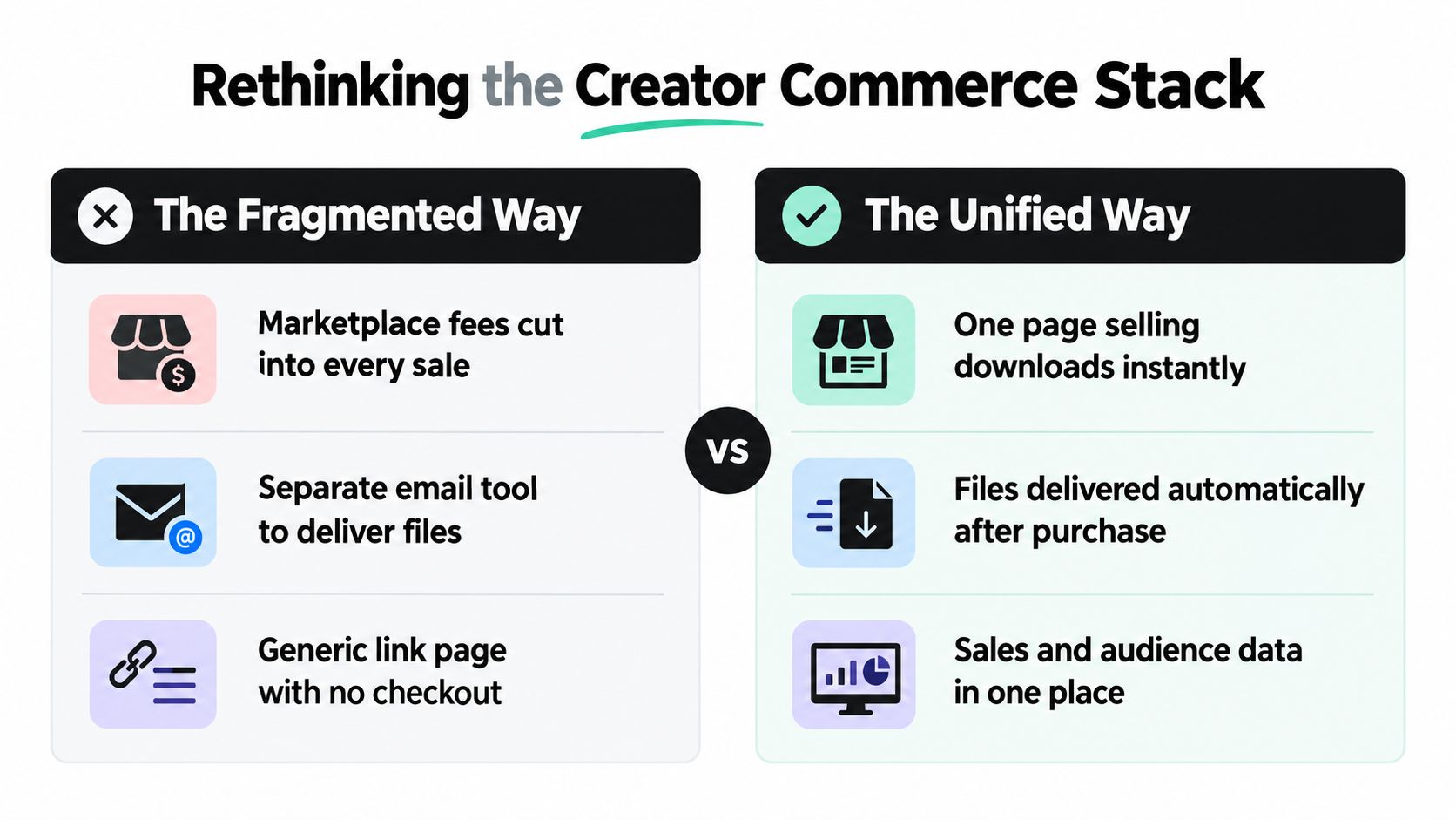
Creators often build this system one tool at a time: a marketplace for discovery, an email service for follow-up, a checkout tool for payment, and a link-list page to connect them. Each tool may solve a real problem, yet the combined setup adds subscriptions, integrations, maintenance, and failure points. Tool sprawl also makes it harder to see where a buyer leaves the purchase flow.
The financial cost deserves equal attention. Marketplace and transaction fee stacks can consume 15% to 30% of revenue, according to digital commerce conversion benchmarks. The impact is sharper for affordable templates, guides, presets, and checklists. A fixed amount of support and promotion still goes into every sale, while the fee removes a larger share of the transaction.
The cost of sending buyers elsewhere
A fragmented setup usually includes:
- Marketplace listing: You gain access to an existing audience, but accept platform rules, fee deductions, and limited control over the customer relationship.
- Separate email tool: You pay for another system and configure automations apart from payment and file delivery.
- Generic link page: You present several destinations, leaving the buyer to choose a route before evaluating the offer.
A single-page creator storefront brings those decisions together. A bento-style layout can place the product card, preview, email capture, social proof, and checkout action on one mobile-friendly page. The buyer gets context without being pushed through unrelated screens. A unified business platform for storefront, capture, and checkout can support this consolidated setup.
The benefit reaches beyond page design. Digital products avoid inventory, shipping, and geographic fulfillment, so the selling system becomes a major source of avoidable cost. Retiring overlapping tools and reducing platform deductions leaves more of each transaction for product updates, customer support, and promotion.
Practical rule: Every tool should increase qualified demand, improve conversion, deliver the product, or help retain the buyer. If it does none of those jobs, remove it.
Consolidation still requires sound positioning, useful content, and reliable email follow-up. It puts those functions closer to the buyer, protecting margin while reducing drop-off.
Preparing Your Digital Products for Instant Delivery
A digital download is only as good as the moment after payment. If the buyer receives a confusing folder, a broken link, or an email with no clear next step, the product feels unfinished even when the underlying content is excellent.
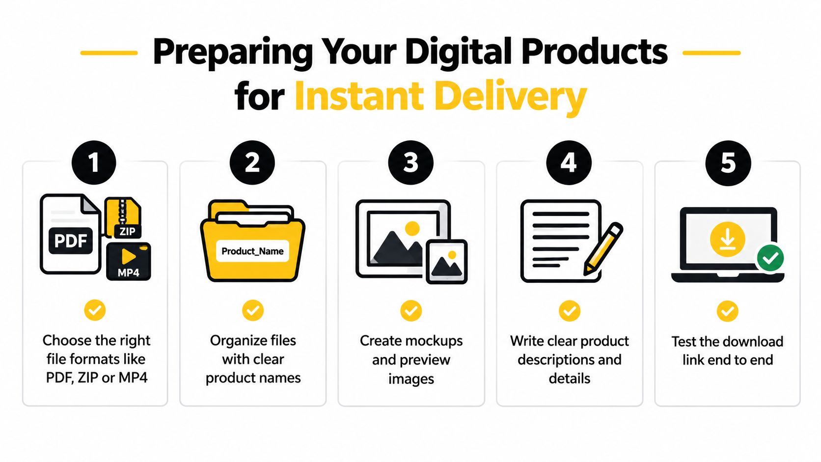
Start by choosing a format that matches the job. Use a PDF for a guide, workbook, checklist, or finished document. Put several related assets into a clearly named ZIP file when customers need editable templates, design resources, or multiple supporting files. Use MP4 for video lessons or demonstrations, and provide a short written orientation so buyers know where to begin.
Package the product like a customer will use it
Create a clean delivery folder before uploading anything. Give the main file a descriptive name, include a short “Start Here” document when the product has multiple components, and remove drafts, duplicate exports, and internal notes. A buyer shouldn't have to guess whether final-v7-revised-NEW.pdf is the correct file.
Use a practical preparation checklist:
- Choose the right format: Match the file type to the customer's intended use.
- Organize the assets: Separate the primary product from bonuses and instructions.
- Create previews: Show representative pages, template examples, or stills from a video.
- Explain the outcome: Describe what the buyer can accomplish, not just what the folder contains.
- Test the delivery: Complete a purchase yourself and open every file on a phone and desktop.
Validate demand before you overproduce
The safest first launch is a small minimum viable product. Publish a sample chapter, a short checklist, a demo template, or a lite version of the larger resource. The purpose isn't to present an incomplete product as finished. It's to test whether the problem, promise, and format attract real interest before you spend weeks building a full bundle.
Use the early version to collect direct signals. Watch which benefit people mention, which questions appear repeatedly, and whether visitors understand the offer without a long explanation. An email signup connected to the preview can reveal demand even when someone isn't ready to buy immediately.
Once the offer earns interest, expand it deliberately. Add the sections customers request, improve the examples that cause confusion, and bundle related files only when they strengthen the result. Guidance on digital-download workflows recommends this test-first process, along with building a small portfolio rather than relying on a single product (digital-download launch and pricing guidance). For the technical side of automated delivery, use this guide to delivering digital products.
Pricing Strategies and Licensing for Digital Files
Digital products cost little to replicate, but low production cost does not make every download a low-priced offer. Customers pay for time saved, decisions simplified, framework quality, and confidence that the resource will help them complete a specific task.
Use two pricing lenses. Cost-based pricing covers production, software, taxes, support, payment processing, and profit. Value-based pricing reflects the outcome customers gain and the urgency of reaching it. Cost-based pricing protects your margin from undercharging. Value-based pricing keeps specialized knowledge from being treated like a commodity.
Match the offer to the buying decision
A focused checklist can suit a low-friction purchase when the problem is narrow and the result is easy to understand. A toolkit can support a higher price when it combines templates, instructions, examples, and implementation support. Avoid adding files just to make a bundle appear larger. Every component should help the customer move from a defined problem toward the promised outcome.
Use audience evidence to position the offer. Ask subscribers what they have tried, record the language they use for the obstacle, and compare competing products by scope rather than headline price. Test the offer and price with an MVP or controlled experiment instead of relying on instinct. The digital product pricing strategy resource recommends pricing around expenses and desired profit, then checking the decision against audience evidence.
Your sales setup also affects the price you can sustain. Marketplace fees, separate checkout software, email tools, and extra automation can reduce the amount you keep. If a marketplace takes 15% to 30% after transaction and processing charges (conversion and fee benchmarks), a small price reduction can leave little room for support or promotion. A single link-in-bio storefront that combines product presentation, email capture, and checkout can reduce tool sprawl and keep the buying path shorter. Model your net revenue before publishing, including taxes, refunds, software costs, and customer support.
Make licensing easy to understand
A license should answer three questions before the buyer needs to contact you:
- Who can use the file? State whether access covers one person, one business, or a wider team.
- What can they change? Explain whether editing, adapting, or incorporating the asset into client work is allowed.
- What can't they do? Prohibit unauthorized redistribution, resale, or public reposting where appropriate.
Place the main terms beside the product description and inside the delivery file. Plain language reduces hesitation at checkout and limits support requests. If the product concerns regulated advice, contracts, finance, health, or employment, have the wording reviewed for the markets you serve.
Cross-border sales require tax and refund planning. Depending on the buyer's location, you may need to account for VAT, GST, or sales tax, while EU sellers may use systems such as OSS for reporting. Digital purchases in the EU can also involve a 14-day cooling-off right, unless the customer waives it after download access begins, as outlined in e-commerce regulations for digital products. Set these rules before launch, not after the first international order.
Setting Up a Link in Bio Storefront with Instant Checkout
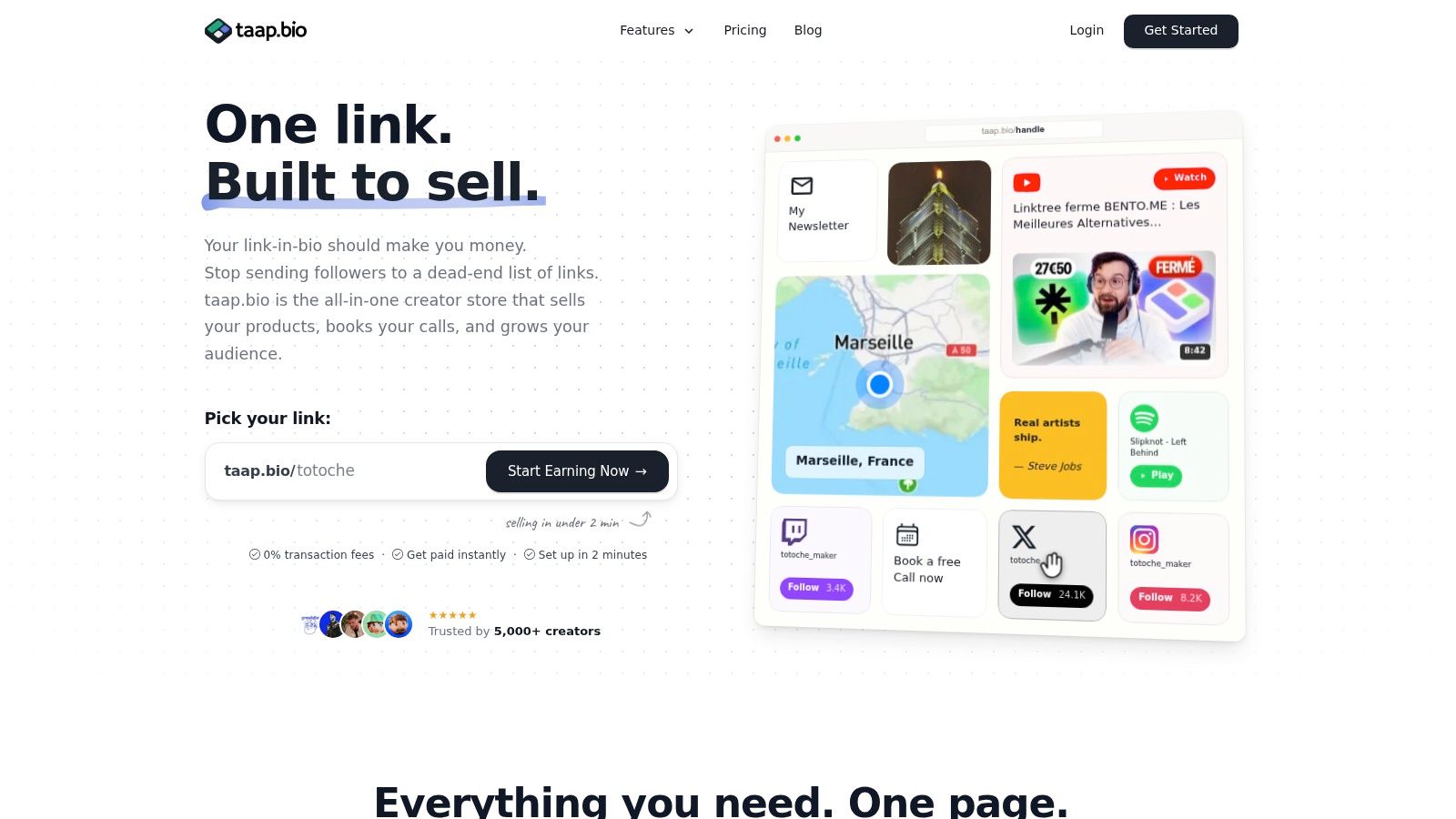
A revenue-focused bio page has one job: help a visitor understand what you sell and take the next useful action without making them hunt for the checkout. Start with a bento layout that gives your main download visual priority, then support it with a concise introduction, a preview, and a signup option for visitors who aren't ready to purchase.
Build the page around one primary action
Choose the product that deserves the first click. Give it a clear title, a specific outcome, and a thumbnail that shows the product in use. “The Freelancer Proposal Kit” tells a visitor more than “Business Templates,” while a preview of the actual pages makes the offer easier to evaluate.
Then configure the product block:
- Upload the file or connect the delivery destination: Make sure the buyer receives the correct asset after payment.
- Write the checkout description: Explain who the product is for, what it contains, and what the customer can do with it.
- Set the price and license: Keep the purchase decision visible and state the usage terms plainly.
- Collect essential buyer details: Ask for the information needed for delivery and follow-up, but don't add unnecessary fields.
- Customize the confirmation message: Tell the buyer where to access the file and what action to take first.
A single-page flow works best when every block earns its space. A product preview should answer a buyer's question. An email widget should offer a relevant reason to subscribe. A video should demonstrate the result, not just decorate the page.
For broader landing-page principles, review this practical resource on how to build a landing page that converts. It's useful when you're deciding how much copy, proof, and visual information to place above the checkout action.
The page should remain usable on a phone. Check button size, image cropping, file descriptions, and checkout fields from the same device your social audience uses. If a visitor has to pinch, scroll past unrelated offers, or wait for multiple redirects, simplify the page before sending traffic to it.
A built-in checkout and automatic file delivery remove several failure points. The payment confirmation, download access, and follow-up email can happen as one connected experience instead of passing data between separate services. The digital product storefront guide provides a useful reference for structuring this type of page.
Capturing Email Buyers and Building an Owned Audience
A social profile gives you reach, but it doesn't give you control over distribution. An algorithm can change the visibility of your posts, an account can become inaccessible, and a follower may never see the launch announcement you spent hours creating.
Email capture turns a passing visit into a permission-based relationship. Place a signup widget beside your product rather than hiding it on a separate page, and offer a clear reason to subscribe. That reason might be a useful sample, a product update, a short tutorial, or early access to a new collection.
Capture the right information at the right moment
The checkout is the natural point to collect a buyer's email because delivery already depends on it. Keep the transaction focused, then use post-purchase messages to learn more about the customer's goals and recommend a relevant next step. Don't turn a simple download into a lengthy intake form.
For non-buyers, use a low-friction signup. A one-tap form can collect permission without interrupting the browsing experience, while a downloadable sample can connect the free experience to the paid product. Segment subscribers based on what they requested or purchased, not on assumptions about their interests.
Your audience becomes an asset when you can contact it without asking an algorithm for permission.
Exportability matters, too. An owned list should be portable, clearly consented, and organized well enough to move between email systems if your needs change. Keep records of signup context and use a provider that supports the privacy requirements of your audience. Practical guidance on building an email list covers this transition from rented attention to a channel you can manage directly.
The list also improves product decisions. If several subscribers ask for a version of the same template for another profession, that's evidence for your next offer. If buyers download a guide but don't open the follow-up, revise the subject line, timing, or promised next step. Email isn't just a broadcast channel. It's a feedback loop connected to your storefront.
Promoting Your Downloads and Analyzing Conversions
A viewer sees your tutorial, visits your profile, then abandons the purchase after moving between a marketplace, email form, and separate checkout. Each handoff creates drop-off, while marketplace fees reduce the margin on every sale. Send that traffic to one link-in-bio page with a clear bento layout, product blocks, email capture, and a short checkout flow.
Promotion should demonstrate the problem your download solves. A creator selling a client onboarding template might show a chaotic process, then point viewers to the template as the practical next step. A musician can share a sound pack in use, giving listeners a reason to buy instead of posting only an announcement. Use the same product promise in social posts, videos, podcast descriptions, and email so visitors recognize the offer immediately.
Read the funnel in the right order
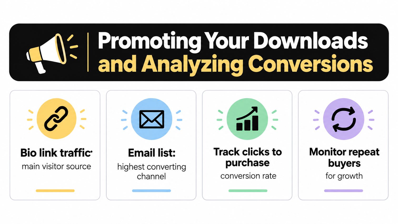
Review page visits, product-block clicks, checkout starts, completed purchases, and repeat purchases in sequence. Traffic with few product clicks usually points to weak positioning or layout. Strong product interest followed by incomplete checkouts suggests friction around price, trust, payment fields, delivery, or licensing.
Use benchmarks as context, not as a promise. General ecommerce sessions often convert at about 2% to 3%, while digital-product guidance places a competitive range at 3% to 5%, with 5% or higher often framed as top-tier performance (conversion rate benchmark guidance). A result below 2% calls for investigation. Test one change at a time, such as the headline, preview, price, checkout fields, or license explanation.
Widget-level analytics show which blocks move visitors toward purchase. Remove elements that attract attention without supporting signups or sales, and keep payment and delivery on the same short path. Digital commerce remains established, although music downloads represented about 9.4% of digital music revenue in 2025 as streaming reshaped the category (digital music download industry data). Buyers still pay for files when ownership, portability, or direct access solves a clear need.
taap.bio combines product blocks, checkout, instant delivery, email capture, and analytics on one drag-and-drop link-in-bio page. Use taap.bio to replace scattered tools with a storefront that reduces handoffs and protects more margin.