Most advice on how to create digital products to sell starts in the wrong place. It tells you to pick a format, build the thing, polish the design, and then hope demand shows up after the fact. That sequence burns time, hides risk, and rewards the creator's taste more than the buyer's behavior.
The smarter move is simpler. Validate demand first, then build a narrow version of the product, then use one page to handle the storefront, checkout, scheduling, and email capture instead of stitching together a messy stack of tools. If the page doesn't pull intent, the product idea isn't ready.
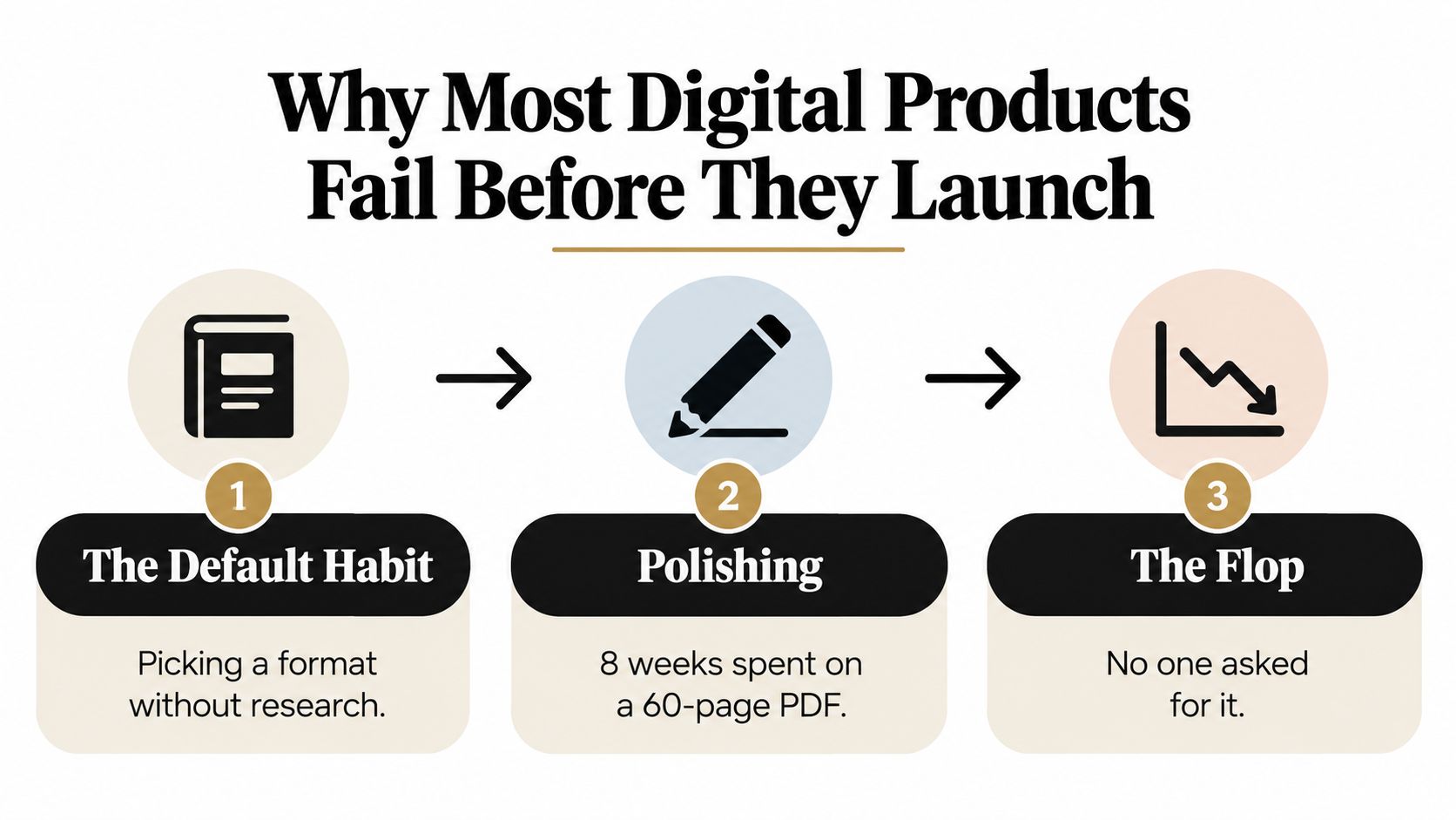
Table of contents
Why Most Digital Products Fail Before They Launch
The most common failure isn't a weak skill set, it's building before proving demand. Creators spend weeks polishing a PDF, a course outline, or a template pack, then discover the market never asked for that exact offer. A practical launch methodology is to start with a one-page landing page, run a small paid or community test, and look for a 2 to 3 percent email or pre-order conversion signal before committing to full production, with 5 to 10 target users in beta to sharpen the offer and collect testimonials launchmystore.io.
The real cost is hidden
A bad product idea doesn't just waste money. It also drains creative energy, delays learning, and makes you overvalue sunk effort. If you build first, you usually end up defending the product instead of listening to the market.
Practical rule: if people won't raise a hand for the promise, they're not going to care about the polished deliverable.
That's why the first decision isn't format, design, or branding. It's whether the problem is real enough, painful enough, and narrow enough to deserve a product. The rest is execution, and execution gets easier once the signal is clear.
Choosing the Right Digital Product Format for Your Audience
Format choice is strategy, not decoration. A template, an ebook, a course, an audio product, and a paid booking each solve a different buying habit, and your audience already has preferences about how they want the answer delivered. If you fight that habit, conversion gets harder.
Match the format to the buyer's urgency
A short ebook or Notion template works when the buyer wants a fast answer and you want a low-friction product you can ship quickly. A cohort course fits a more expensive transformation, but it asks more from you, because live support and community management become part of the offer. Audio products sit in the middle, especially when the outcome is repetitive or calming, like meditation, review, or practice.
Paid one-to-one bookings are often the smartest first digital product for practitioners. You learn exactly what people will pay for, you don't spend weeks creating a large asset before you know if it sells, and the service itself reveals the digital product people will buy later. That's useful data, not a compromise.
| Format | Build effort | Typical price | Best for | Key trade-off |
|---|---|---|---|---|
| Ebook | Low | Low ticket | Fast expertise packaging | Easy to launch, easy to imitate |
| Template | Low | Low to mid ticket | Repeated workflows | Needs a very clear use case |
| Audio product | Medium | Low to mid ticket | Guided or repeatable outcomes | Harder to differentiate without a strong angle |
| Course | High | Mid to premium | Teaching a full transformation | Higher support burden |
| Paid booking | Very low | Premium | Service-led creators | Limits scale unless you productize the insights |
If you're comparing formats and positioning, the way taap.bio's digital products overview frames product types is a useful reference point, especially if you want a storefront that can handle more than one offer in one place.
Don't choose the format you enjoy making. Choose the format your buyer is already willing to consume.
The most useful filter is simple. Pick the smallest format that can still deliver the outcome cleanly, then let the market tell you whether to expand it.
Validating Demand Before You Build Anything
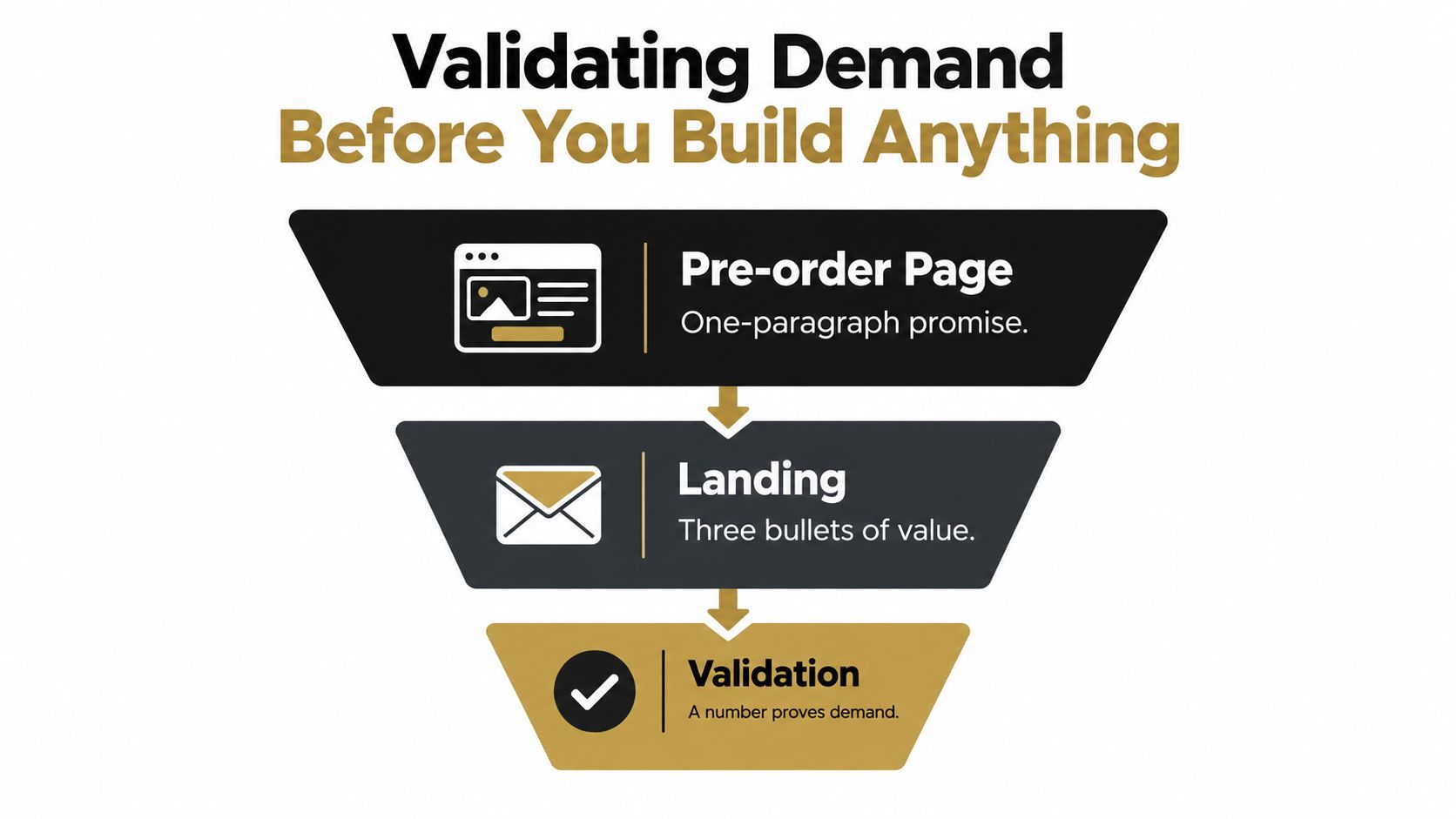
Validation is where creators avoid expensive dead ends. A page, a price, and a clear promise tell you more than weeks of guessing. Build a simple pre-order page with one sentence on the outcome, three bullets on the payoff, and a buy button that is impossible to miss.
Read weak signals for what they are
A few clicks are not proof. Early interest without purchases usually means the promise is vague, the audience is too broad, or the problem is annoying but not urgent enough to buy now. Treat that as a warning, not a reason to keep polishing.
Keep the test small and controlled. Send traffic from an email list, a social post, or a modest paid test, then watch whether people stop, read, and buy. If the page gets attention but no checkout activity, the offer needs sharper language or a different angle.
The next check is conversation. Talk to a handful of target users and listen for the words they use, what they would pay, and what current options still miss. Those calls do not replace the page, they explain why the page works or stalls.
For audience clarity, How to find your niche is a useful starting point. Vague buyers create vague offers, and vague offers do not sell.
Know when to walk away
Some ideas will never clear the bar. If people nod politely but refuse to commit, the pain is too soft, the timing is off, or the product solves a problem they do not rank near the top of their list. Walking away early saves time you can put into a stronger idea.
Use validation to test wording, not ego. The page should say what changes after the buyer pays, what format they get, and why acting now makes sense. If you cannot write that cleanly, the product is not ready.
A good test also sets up the business behind the product. One page can capture interest, take payment, and collect email leads without stitching together five tools. That matters because the true goal is not applause, it is finding out whether people will exchange money for a promise before you build the promise out.
Building a Tight v1 You Can Ship This Week
Your first version should behave like a diagnostic tool. It should reveal whether the problem is urgent, whether the promise is clear, and whether buyers care enough to complete checkout. That means you strip the product down to one transformation, not a full library of features.
Build only the path to the outcome
Start with a single problem and a single buyer. Draft the outline fast, then write only the modules that move the buyer from frustration to result. A short, focused product usually beats a bloated one because buyers want relief, not a museum of every idea you had.
The production loop is straightforward. Outline the offer in one focused session, draft in concentrated work blocks, package the files into labeled folders, and run a friend-test for broken links and obvious typos. If something doesn't help the buyer move from problem to outcome, cut it.
How to create a landing page without a website is relevant here because you don't need a sprawling site to launch a tight offer. One page can carry the product, the proof, and the checkout if the message is sharp enough.
Ship files that feel complete, not oversized
Your buyer doesn't need a 120-page manuscript if a compact guide solves the problem more cleanly. They need a file that opens, makes sense immediately, and leads them through the next step without confusion. Clean packaging matters because it reduces support requests and refund friction.
A tight v1 is not a lesser product. It's the version that tells you what the market actually values.
That's why the first release should be judged by usefulness, not by how much work it took to make. You want feedback, refund reasons, and support questions, because those are the raw materials of a better second version.
Pricing for Revenue and Long-Term Growth
Price the outcome, not the hours. Buyers don't care how long it took you to build the template or record the lessons, they care what the product does for them. If the offer removes a painful task, saves time, or replaces an external cost, price around that value.
Use anchors, not guesswork
A useful way to think about pricing is to compare the product with the cost of the problem. If the offer saves meaningful time, a low-ticket price can still feel like a bargain. If it replaces a service or gives a buyer a path to a larger business result, the price needs to reflect that bigger shift.
For creators who want structure, a three-tier approach works well. A low-ticket item brings in impulse buyers, a core offer carries most of the revenue, and a premium tier adds support or customization for people who want more hand-holding. If you want to sanity-check how pricing pages are structured in adjacent creator tools, see PlotStudio AI plans and note how pricing is framed around clear offer levels rather than vague feature lists.
| Tier | Price Range | Typical Conversion | Best For |
|---|---|---|---|
| Low ticket | Low | Higher volume | Impulse buys and list growth |
| Core offer | Mid | Balanced volume and value | The main product you want to scale |
| Premium | Higher | Lower volume, higher touch | Buyers who want support or customization |
Your pricing page should do one job, make the value feel obvious. If the buyer has to do mental gymnastics to justify the cost, the price is too abstract or the outcome is too weak.
Digital product pricing strategy is worth reviewing if you're refining your offer ladder, especially when you're deciding whether the product should sit alone or support a larger ecosystem of offers.
Setting Up Your Storefront, Checkout, and Delivery
A fragmented stack leaks money. If the storefront lives in one place, checkout in another, scheduling in a third, and email capture in a fourth, every handoff gives the buyer a new reason to leave. Consolidation is a competitive advantage because it reduces friction before the buyer even notices it.
One page should do the heavy lifting
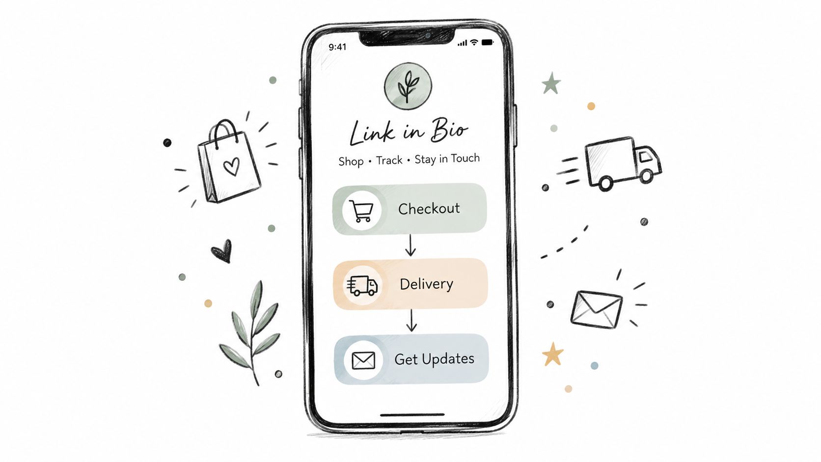
Your page needs four essentials, nothing more complicated than that. A branded storefront with product cards and a clear promise above the fold, a checkout that accepts cards and Apple Pay, instant delivery by email or secure download link, and a calendar widget for paid bookings. If those pieces live together, the page stays focused and the buyer keeps moving.
A tool like taap.bio is built for that single-page flow, with storefront, checkout, scheduling, and email capture in one place. That matters when you're selling file-based products like ebooks, templates, presets, courses, or audio files, because the whole purchase can happen without the buyer bouncing through half a dozen tabs.
The setup only works if you tag visits and sales cleanly. You need to know which traffic source brings buyers, not just which one brings clicks. Otherwise, you'll keep optimizing the loudest channel instead of the most profitable one.
If you're tightening the search side of the funnel, SemDash's ecommerce keyword guide is a solid reference for thinking about how buyers search before they land on a product page.
Remove the extra tools before launch day
Don't build a complicated automation chain unless you need one. A clean checkout and immediate delivery are enough for most creators, especially at the start. The faster the handoff, the lower the chance that a buyer gets confused, distracted, or suspicious.
Instant digital delivery is the standard to aim for because buyers expect access right away. Delays create support tickets. Support tickets create anxiety. Anxiety kills repeat buying.
Launching, Measuring, and Iterating in the First 30 Days
A messy launch is still better than an unlaunched product. The first live version gives you behavior, and behavior beats speculation every time. The point isn't to look polished, it's to get real people into the funnel and see where they stop.
Track the friction, not just the revenue
In the first week, announce the product to your warm list, post the storefront link in a few channels, and resist the urge to rewrite the sales page every few hours. Then track five things daily, checkout-start rate, completion rate, refund rate, email opt-in rate, and revenue per visitor. Each one points to a different bottleneck, from weak messaging to checkout friction to a mismatch between promise and delivery.
A low opt-in rate usually means the page isn't compelling enough to trade attention for an email. A high cart-abandonment rate usually means the offer is getting interest, but the checkout is too slow, too confusing, or too abrupt. A refund spike means the promise and the actual product don't match closely enough.
Planning a creator launch in 2026 is useful if you want a broader launch rhythm, but the actual work happens after the first clicks, when you're deciding what to fix and what to leave alone.
Use a short 30-day cadence
Week one is for shipping and collecting signals. Week two is for patching the worst funnel leak. Week three is for testing price or adding a bonus if the core offer is sound. Week four is for deciding whether to double down or sunset the product.
Launch fast, measure honestly, and change one thing at a time.
That cadence keeps you out of the trap where the product lives in endless revision and never earns enough evidence to justify the next move. The goal is not perfect launch performance. The goal is a product you can improve because the market has already started talking back.
If you want a single page that can sell, book, and collect emails without a messy stack, taap.bio gives you that setup in one place. It's built for creators who want to validate demand first, then run the storefront, checkout, and delivery without stitching together separate tools.