

You’ve probably felt the limits of a standard link-in-bio page already. It starts as a quick fix. Add your newsletter, your latest video, your store, your portfolio, maybe a booking link. A week later it’s a stack of buttons with no rhythm, no hierarchy, and no reason for anyone to stay.
That’s the problem. Most link pages act like traffic routers when they should act like destinations.
A good custom landing page builder gives you more than a place to paste URLs. It gives you a canvas for identity. For creators, freelancers, musicians, and small brands, that shift matters. Your page should show what you make, what’s current, and where you want people to go next without forcing everything into the same bland rectangle.
Table of contents
Beyond the Boring List of Links
A vertical list made sense when link-in-bio tools were mostly shortcuts. They were built to solve one simple problem: social platforms gave you one link, so you needed a page that held the rest. That solved access, but not presentation.
Today, presentation is the job.
With the average landing page converting at 5.89% and top performers reaching over 10%, a generic link list is no longer enough, especially for creators looking for a stronger home base or planning a move before the projected 2026 Bento.me shutdown, as noted in these landing page benchmarks. A page that looks interchangeable sends the wrong signal before a visitor clicks anything.
The better model is the bento box layout. Instead of lining up every destination in a single column, you treat each piece of your online presence as its own block. A music player gets room to breathe. A YouTube block can sit beside a newsletter signup. A portfolio block can be larger than a secondary social profile because it deserves more attention.
That’s what makes a custom landing page builder worth using. It lets you compose a page the way you’d arrange a poster, a storefront, or a mood board.
Why the old format stops working
A plain list usually fails in three ways:
- Everything has equal weight. Your most important CTA looks the same as a casual social link.
- No story is being told. Visitors don’t understand what you do in a glance.
- The page feels disposable. People click through it rather than engage with it.
A strong link-in-bio page shouldn’t feel like a hallway. It should feel like the room.
That’s why more creators are moving toward visual layouts that combine content, brand, and action. If you’re comparing that shift to the old “tree of links” model, this breakdown of a link tree website alternative shows why visual composition changes how the page works.
The shift in mindset
Think less like a list manager and more like an editor.
Your page can feature:
- a latest release
- a highlighted offer
- social proof
- current work
- media people can interact with immediately
That’s not cosmetic polish. It changes what a visit feels like. Someone lands, understands your world, and gets a clear next step.
Planning Your Visual Bento Box Layout
Users often open a builder and start dragging blocks around too early. The result usually looks busy because no decision was made about priority before the layout started.
Low-code custom landing page builders can accelerate development by 90%, but clear planning still does the heavy lifting, especially when you’re deciding hierarchy and keeping the page focused around a single main action, according to Guideflow’s review of landing page builders.
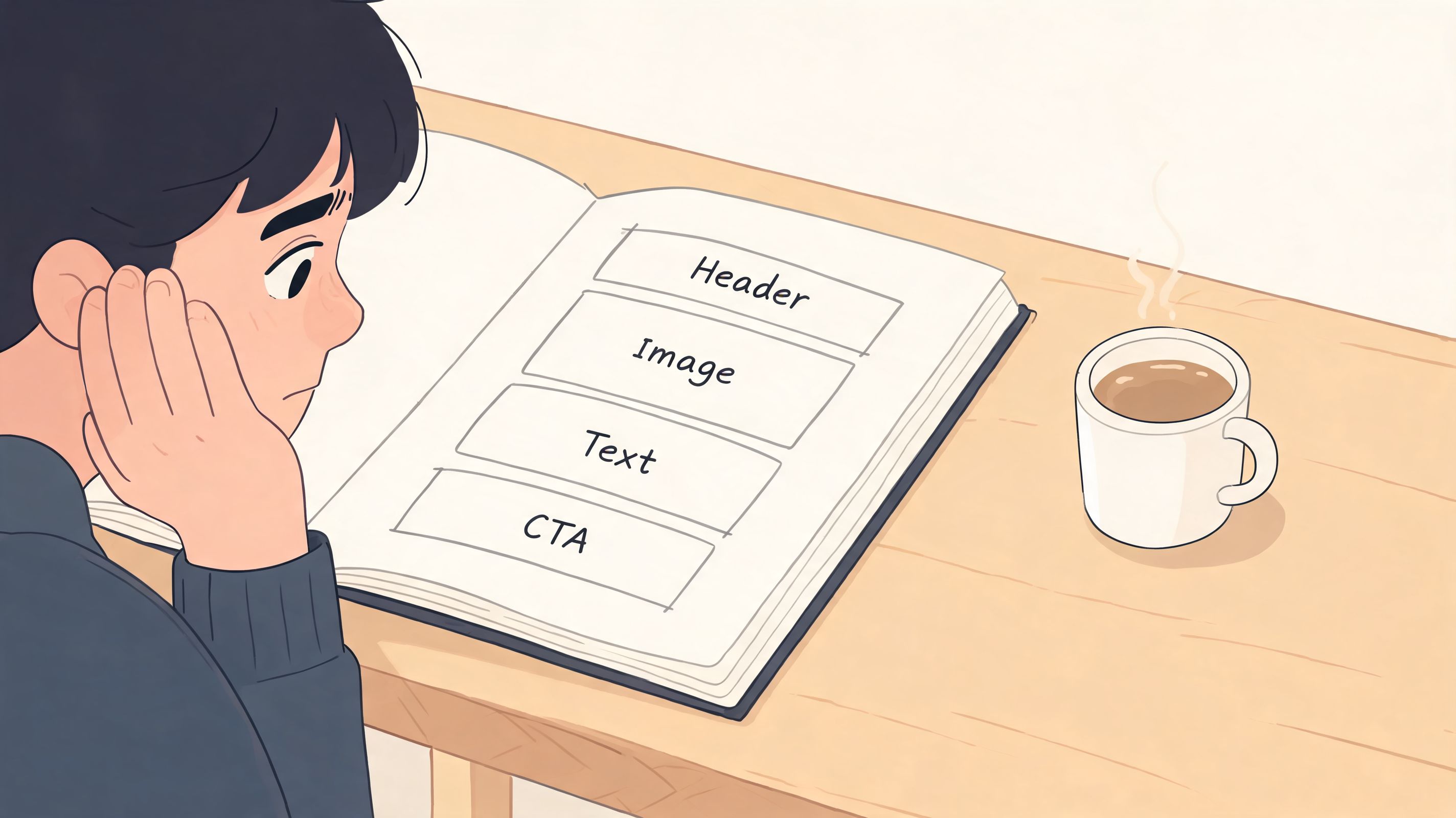
Start with content, not layout
Before you place anything, write down what belongs on the page. Not everything you’ve ever published. Just the pieces that matter right now.
A simple planning pass looks like this:
Choose one primary goal
Newsletter signup, booking inquiry, music stream, product click, portfolio review. Pick one.List supporting blocks
These are the pieces that help the main goal. Testimonials, latest posts, platform widgets, a short intro, featured work.Cut what competes
If a block doesn’t support your main action or your identity, remove it for now.
A bento layout works because it’s selective. Empty space and contrast are part of the design.
Sketch the page like a mood board
Don’t worry about perfect dimensions at first. Use rough boxes.
Try assigning roles:
- Hero block for the main CTA or primary piece of content
- Proof block for testimonials, featured clients, or audience trust
- Freshness block for recent content
- Personality block for media, quote, image, or visual signature
In this aspect, asymmetry helps. A page feels more alive when every block isn’t identical. A larger block naturally tells the visitor, “look here first.”
Practical rule: if you can’t tell what should be clicked first within two seconds, the layout needs more contrast.
Plan desktop and mobile separately
A lot of creators design on a laptop and assume the page will sort itself out on mobile. It rarely does. A wide, playful composition on desktop can collapse into visual confusion on a phone.
Use this planning table before you build:
| View | Best approach | Common mistake |
|---|---|---|
| Desktop | Let the layout breathe with larger feature blocks and varied sizing | Filling every corner because the canvas looks roomy |
| Mobile | Stack the most important content in a clean sequence | Shrinking everything instead of reordering it |
| Both | Keep one dominant CTA visible early | Giving equal space to every block |
If you want inspiration for how modular layouts create rhythm without becoming chaotic, this look at bento box web design is useful.
The strongest layouts don’t happen in the editor. They happen in the choices you make before the editor.
Bringing Your Page to Life with Smart Widgets
The biggest jump in quality happens when your page stops being a collection of exits and starts behaving like a live surface. That’s where smart widgets matter.
Most landing page builder reviews reduce integrations to a checklist item, but the difference between a static link and a dynamic widget with live data or inline playback changes how people use the page, as discussed in Unbounce’s broader view of landing pages and integrations.
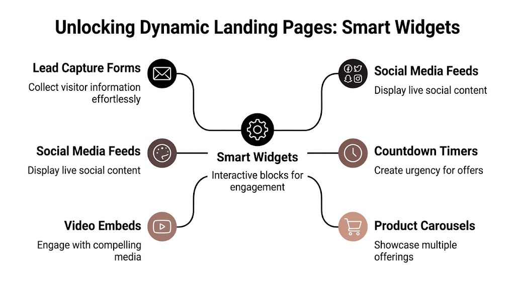
A page gets more interesting when visitors can do something immediately. Listen. Browse. Watch. Scan recent work. Follow without hunting for context.
Three creator setups that work
A musician’s page shouldn’t make people leave before hearing the music. Inline audio changes that. Instead of linking out to Spotify and hoping they stay engaged, the better move is placing a track or album block directly in the composition so the page itself becomes part of the listening experience.
A designer or developer has a different problem. Their work often lives across platforms. GitHub, Behance, Dribbble, Figma, YouTube. A live widget works better than a row of logos because it shows activity, not just destinations. Visitors can tell at a glance whether the work is current.
For a content creator, freshness is the selling point. A block showing recent videos, social posts, or audience-facing content gives the page motion. It feels maintained.
Static links tell people where you are. Live widgets show what you’re doing.
What a smart widget should add
A widget earns its place when it does at least one of these jobs well:
- Shows recency so the page doesn’t feel stale
- Adds interaction like playback or preview behavior
- Provides context such as follower counts, thumbnails, or contribution history
- Reduces friction by keeping people on-page longer before they decide where to go next
One of the clearest examples is a Spotify block with inline playback. That’s more useful than an icon link because it removes the interruption. The user doesn’t have to switch apps or tabs just to sample your work.
A custom landing page builder is far more powerful when each block holds real information instead of acting like a dressed-up button.
To see the idea in motion, this walkthrough is worth watching:
Choosing widgets without cluttering the page
The temptation is to add everything. That’s usually a mistake. A good widget mix feels curated.
Use this filter:
Lead with your strongest platform
If your YouTube channel drives your brand, give it visible space. If your portfolio wins clients, make that larger.Pair one live media block with one action block
For example, latest videos plus booking link. Or Spotify player plus merch link.Let supporting platforms stay smaller
Not every profile needs equal prominence.
One example of this approach is taap.bio’s widget system, which uses modular blocks for things like social feeds, portfolio previews, and audio embeds rather than limiting the page to standard links.
A better mental model
Think of each widget as a window, not a badge.
A badge says “I have an Instagram.” A window says “here’s what my Instagram looks like right now.”
That distinction is why some pages feel alive and others feel like profile directories.
Mastering Visual Hierarchy and Branding
Once the structure is in place, design starts doing real work. A visitor should know where to look first, what matters most, and what kind of person or brand they’re dealing with before they read much.
While the median landing page conversion rate sits at 6.6%, pages with stronger user experience can see performance improve by up to 400%, which is a useful reminder that typography, spacing, and layout choices affect action, not just aesthetics, according to these UX and conversion benchmarks.
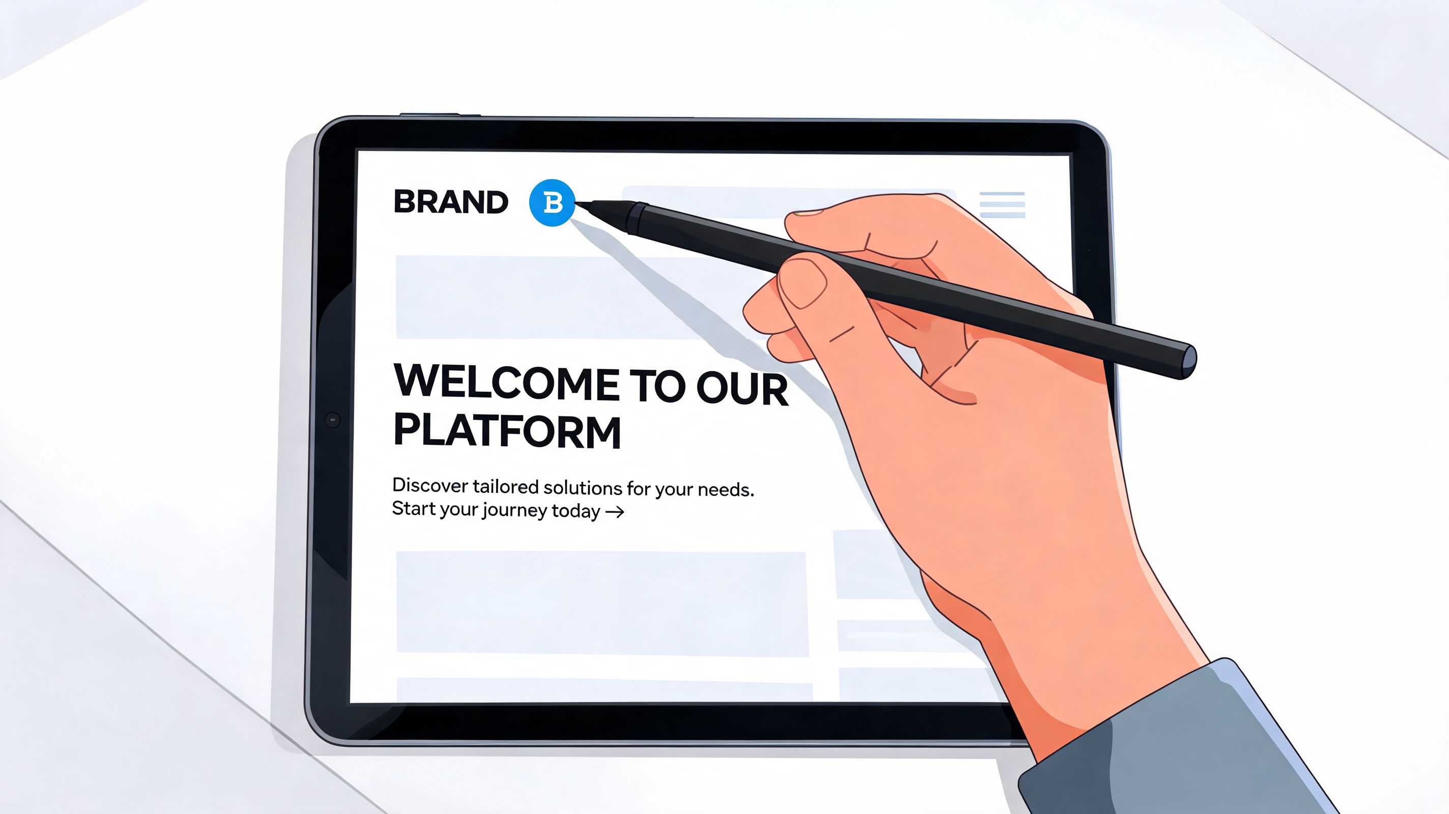
Size is your first design language
In a bento-style page, block size is a decision about importance.
Use larger blocks for:
- your main call to action
- flagship content
- core credibility elements
Keep secondary items smaller:
- less important social accounts
- older content
- utility links like FAQs or contact methods
This sounds obvious, but many pages fail because the creator sizes blocks based on what looks balanced rather than what deserves attention. Balance matters. Priority matters more.
If you want a strong primer on how designers guide attention with visual hierarchy, that resource does a good job of connecting theory to practical visual choices.
Typography and color should simplify the page
A strong page rarely needs many fonts. One headline style and one body style usually carry the whole composition. If every block has its own voice, the page starts to feel like several mini-sites fighting each other.
Color should work the same way.
A practical setup:
- one background color
- one primary accent
- one neutral text color
- one CTA color reserved for action
That last part matters. If every block is shouting with the same saturation, nothing stands out. Save your highest-contrast color for the action you care about most.
Design check: blur your eyes and look at the page from a distance. The first focal point should still be obvious.
Media needs rhythm, not volume
Images, GIFs, and autoplaying video can lift a page quickly. They can also wreck it quickly. The mistake isn’t using motion. It’s using motion everywhere.
A better pattern is selective energy:
- one moving element near the top
- one static proof or portfolio block nearby
- calmer blocks below to let the eye rest
That contrast creates pace.
If the page includes media from several platforms, keep the framing consistent. Similar corner radius, spacing, and caption treatment make wildly different content sources feel like one brand system.
For a deeper breakdown of layout, spacing, and emphasis in this style, this article on visual hierarchy in web design is a useful companion.
Branding is not decoration
Branding on a custom landing page builder isn’t the logo in the corner. It’s the repeated visual logic across the whole page.
People notice:
- whether your colors feel intentional
- whether your text sounds like you
- whether your page seems edited or assembled
That’s why polished pages convert better. They remove doubt. They make the creator or business feel established.
Optimizing for Devices and Migrating Your Audience
A page can look polished on desktop and still underperform where most of your visitors arrive. Device optimization and audience migration are closely related because both affect continuity. If the move is awkward or the mobile page is frustrating, people drop.
Mobile devices account for 83% of landing page traffic, convert 8% lower than desktop, and every extra second of load time costs 7% in conversions, which is why mobile-specific layout decisions matter so much even for visually rich pages.
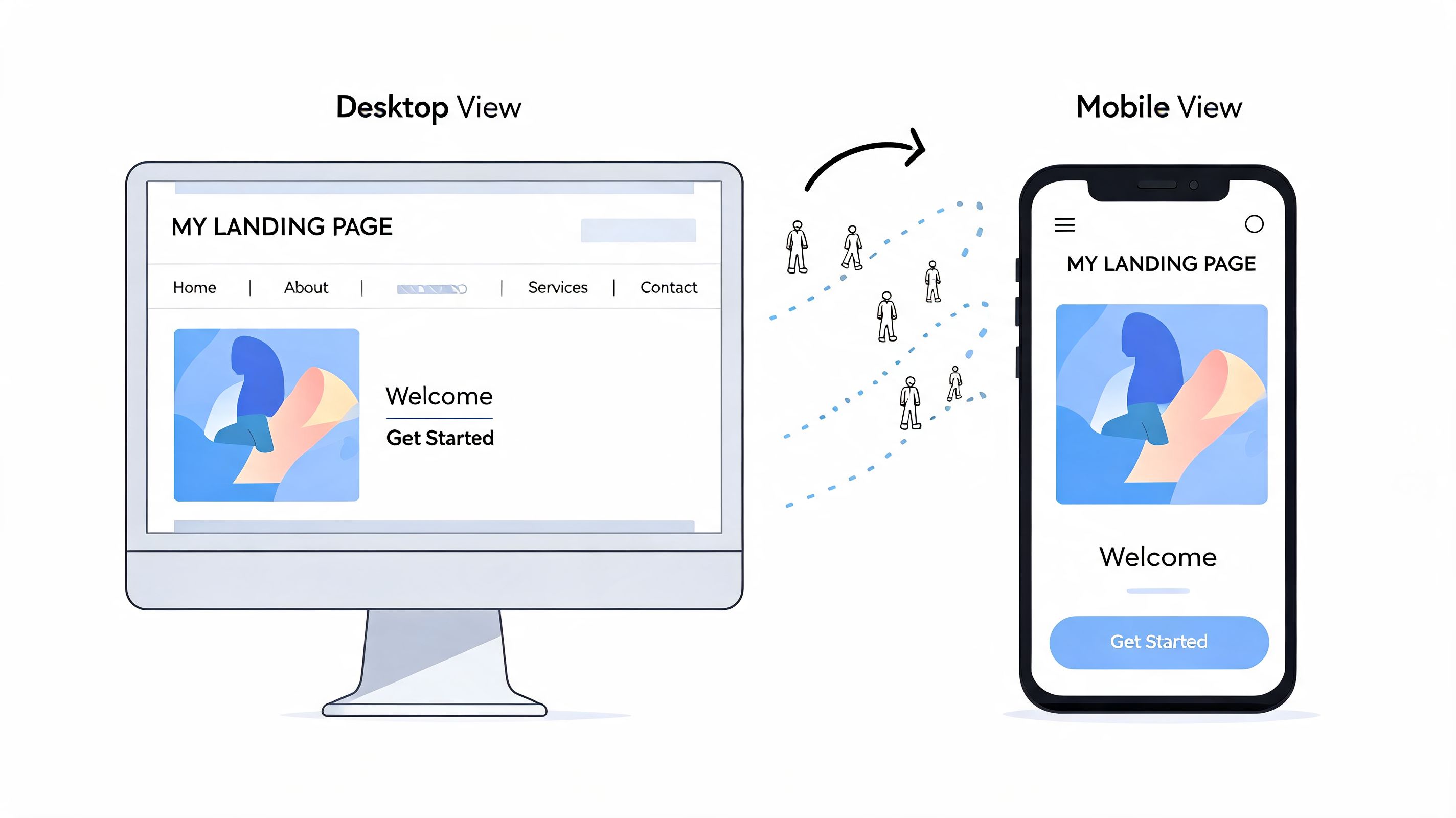
Build mobile as its own experience
Desktop invites exploration. Mobile rewards clarity.
On a larger screen, an asymmetrical grid can feel editorial. On a phone, people move fast and scan vertically. That usually means your mobile version should be more linear, with fewer side-by-side relationships and a more obvious reading path.
A simple rule set helps:
Put the main action early
Don’t make people scroll through decorative blocks before they find the reason they came.Reduce visual complexity
Keep fewer simultaneous choices visible on first view.Check tap comfort
Tiny blocks that look elegant on desktop can become annoying targets on mobile.Trim heavy elements
If a media block slows the page or muddies the top section, move it lower.
The mobile layout isn’t the smaller version of your page. It’s the version most people will actually use.
Make the transition obvious for followers
If you’re moving from Linktree, Bento.me, or another older setup, don’t just switch the URL and hope your audience adapts. People need a signal that the new page is intentional.
Use a short migration playbook:
Update every profile link on the same day
Instagram, TikTok, YouTube, X, email signature, newsletter footer, and creator bios should all match.Post a brief announcement
Tell followers the page has changed and why. Keep it practical. New hub, latest content, easier navigation.Pin or highlight the announcement where relevant
Stories, profile highlights, pinned posts, and channel descriptions help catch repeat visitors.Keep familiar cues on the new page
Use the same avatar, similar handle language, and recognizable color palette so the shift doesn’t feel disorienting.
What to check before you send traffic
Before you push everyone to the new page, test it like a visitor would.
| Checkpoint | What to verify |
|---|---|
| First screen | Main action is visible without confusion |
| Mobile flow | Blocks stack in a sensible order |
| Media behavior | Audio, video, and previews load cleanly |
| Link confidence | Titles are clear and match user intent |
| Brand continuity | The page still feels like your identity |
Migration isn’t just technical. It’s social. People are willing to follow a better experience if the handoff feels smooth.
Your Page Is Now a Destination
Once your page becomes interactive, branded, and organized around a clear goal, it stops being a holding area. It starts doing work for you.
That’s the difference many creators miss. They still treat the page like a utility link, even after they’ve built something richer. But a well-made custom landing page builder setup can support discovery, trust, and conversion at the same time.
Small upgrades that increase value over time
A destination page gets stronger when you maintain it like a living asset.
Focus on three habits:
Refine your block titles
“Watch the latest breakdown” is better than “YouTube.” “Book a project call” is better than “Contact.”Give pages and links search-friendly language
Clear naming helps humans first, and it also improves how your page is understood when shared, indexed, or previewed.Use analytics to spot intent Watch which blocks attract clicks and which ones get ignored. That tells you the true interests of your visitors, not what you assumed they cared about.
Treat the page like a mini homepage
A homepage introduces. A strong bio page can do the same thing faster.
It can:
- frame your work
- show proof
- feature current output
- direct people to the next action
That’s why landing page strategy matters even for solo creators. If you want a broader marketing perspective on how to enhance your campaign success with landing pages, that article is a helpful reminder that clarity and focus beat clutter almost every time.
A great creator page doesn’t ask visitors to figure you out. It arranges the answer for them.
For the ongoing side of optimization, this guide to landing page best practices is worth bookmarking and revisiting after the page is live.
What works in practice is usually simple:
- feature one clear action
- keep the composition current
- remove blocks that don’t earn their space
- let your strongest content stay visible
What doesn’t work is trying to turn the page into a storage unit for every platform you’ve ever touched.
The pages that feel professional are edited. They make choices. They present a point of view.
If you want a visual link-in-bio page that feels more like a curated landing page than a stack of buttons, taap.bio offers a drag-and-drop bento-style builder with modular blocks, separate mobile and desktop editing, and smart widgets that can display live content from the platforms you already use.


