You've got the course built, the posts are going out, and the DMs are warm, but the sales still feel stuck in the same messy middle. Someone taps your bio link, skims a page, hesitates at checkout, and disappears before the payment ever lands. That's usually not a content problem, it's a path problem.
Selling an online course is easiest when the buyer can move from interest to payment without feeling like they've entered a maze. The strongest creator stores keep the promise, the proof, the checkout, and the delivery on one page, so the sale feels immediate instead of stitched together.
Table of contents
Why Most Course Launches Leak Revenue Before Checkout
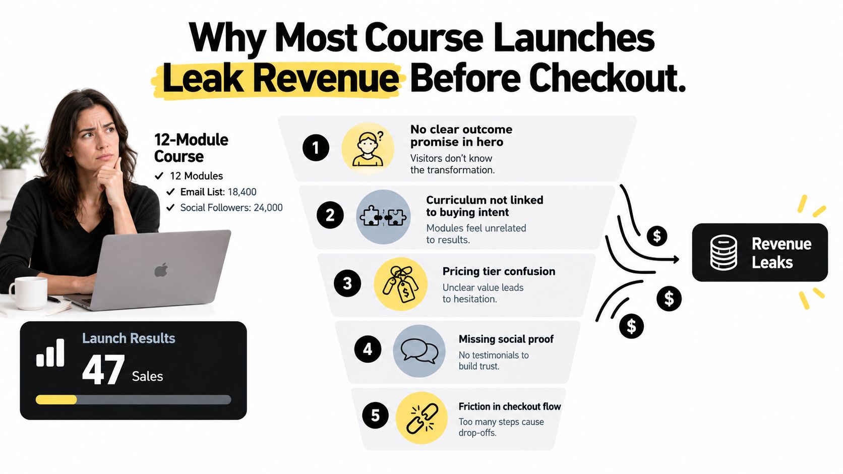
A coach with a 12-module course and a decent following can still end up with a disappointing launch if the path is clumsy. I've seen launches stall not because the course was weak, but because every extra step made buyers hesitate. One tap becomes three, then five, then a lost sale.
The biggest leaks are structural. First, people drop off the bio link when they hit an extra hop before the offer even loads. Second, checkout pages that ask for an account create needless resistance. Third, redirect chains between the sales page and payment make the purchase feel less certain. Fourth, file delivery that arrives later by email breaks the sense of instant gratification. Fifth, if analytics don't show where visitors leave, you end up fixing the wrong thing.
The path matters more than the pitch
If your offer is good but the path is noisy, buyers feel the friction before they feel the value. A single-page creator store with built-in checkout and instant file delivery removes the most common reasons for abandonment. The visitor taps once, reads once, pays once, and gets access without waiting for a separate email chain.
That matters because most underperforming launches aren't really product failures. They're funnel-friction failures. The course might need sharper positioning, but in many cases the bigger lift comes from cleaning up the route to purchase.
Practical rule: if the buyer has to wonder where the course lives, how they'll get it, or what happens after payment, you've already weakened conversion.
Five leaks to fix first
- Bio link detours. Keep the course on the first page the buyer sees, not behind a mini-website.
- Account gates. Don't ask people to create another login unless it's required.
- Payment redirection. Every redirect increases hesitation and makes the sale feel less controlled.
- Delayed delivery. Instant access beats “check your inbox later” every time.
- Blind analytics. If you can't see where buyers stop, you'll keep guessing.
The cleanest repair is consolidation. One page, one checkout, one delivery flow. The fewer moving parts, the less revenue leaks out before the sale.
Shaping an Offer That Buyers Actually Want to Pay For
A course converts when the buyer can repeat the outcome back to you in plain language. If your headline sounds polished but doesn't sound like the problem they complain about in DMs, it's too abstract. I'd start by writing one sentence that names the transformation, then testing it against the exact words your audience already uses.
The curriculum should earn the price, not just fill time. A 5 to 8 module structure works better when each module produces something tangible, like a worksheet, template, swipe file, or decision framework. Buyers don't pay for hours, they pay for reduced uncertainty and faster execution.
Your proof assets belong on the same page as the offer, not hidden in a separate folder. Two or three testimonials with named outcomes, one before-and-after case study, a short demo clip, and one credibility line that names the actual result all help the buyer decide faster. If you're still collecting vague praise, keep refining until the evidence sounds specific enough to remove doubt.
For buyer research and message language, I'd also review buyer persona development so the offer matches what real prospects say, not what internal planning documents sound like.
A simple readiness check
Use this before you spend a dollar on traffic:
- The promise is sharp. A stranger can tell what changes after buying.
- The modules feel linked to the promise. Nothing reads like filler.
- The proof feels concrete. Outcomes are named, not implied.
- The demo reduces fear. Buyers can see the format and the experience.
- The page can answer obvious objections. Time, access, support, and fit are clear.
If one of those is weak, fix it before launch. A course with a fuzzy promise and strong traffic still leaks. A course with a crisp promise and a calm storefront has a much better chance of converting.
Pricing Your Course for Real Conversion Rates
Price doesn't just affect revenue per sale, it changes how hard the page has to work. For lower-priced courses, a single payment often feels cleanest, especially when the buyer wants speed and simplicity. Higher prices usually need more reassurance, more proof, and a lower-friction entry point.
Single-payment pricing can work well when the offer is straightforward and the audience already trusts you. A two-installment option can make the monthly commitment easier to accept, but it usually lowers revenue per sale, so you have to know what trade-off you're making. Tiered bundles can raise average order value when the add-on is genuinely useful, but complexity can also slow the decision if you pile on too many choices.
If you're comparing how creators price adjacent offers, the training video subscription cost page from VideoLearningAI is useful context because it shows how recurring or packaged education products are framed beside one-time course pricing.
| Structure | Conversion Rate | Avg Order Value | Refund Rate | Best Fit |
|---|---|---|---|---|
| Single payment | Usually strongest for a simple decision | Clear and predictable | Often cleaner when expectations are tight | Buyers who want one clean checkout |
| Two installments | Often easier to accept up front | Lower per sale than a single payment | Can rise if the buyer overextends | Higher-consideration buyers who need flexibility |
| Tiered bundle | Can lift basket size when the add-on is relevant | Higher because of the extra offer | Depends on whether the add-on matches intent | Creators with a course plus booking or asset pack |
Anchor the price, then simplify the page
The page should show the value stack, then the actual price, then the reason the price makes sense. Rounded prices usually read cleaner than awkward decimals, especially in creator stores where the decision is already emotional. The monthly number under the payment plan also matters, because buyers react to the smaller immediate commitment first.
I'd keep the structure tight. Pick one primary price, one payment option if needed, and one clear bundle only if it helps the buyer. More tiers can look clever to you and confusing to everyone else.
For a pricing framework that keeps the offer from drifting, digital product pricing strategy is a useful reference point.
Decision rule: choose one structure, set the anchor, and don't add a fourth tier mid-launch. Complexity kills clarity faster than a modestly higher price ever will.
Building the Single-Page Course Funnel That Closes the Sale
A course sale gets easier when the buyer stays in one place. A single-page creator store lets them see the promise, scan the modules, check the proof, read the price, and finish the purchase without hopping between a landing page, cart, email tool, scheduler, and file host.
The page order still matters. Lead with the outcome and proof, then the curriculum, then pricing, then the FAQ, then checkout. If checkout appears too early, people back out before they understand the offer. If the curriculum appears before the promise, it starts to feel like a syllabus instead of a sale.
For the page-level layout details behind this shape, see online course landing page.
taap.bio is one option for this setup because it combines a bento-style public page, checkout, paid bookings, email capture, and digital file delivery in one flow. That lets you sell a course, offer an upgrade call, and keep non-buyers in the same path without sending them through extra tools.
Here's the seven-block page shape I'd use:
- Hero block. Lead with the transformation and a clear outcome statement.
- Curriculum block. Show the module path and what each part produces.
- Pricing block. Make the primary offer and any bundle obvious.
- Testimonial block. Put proof where hesitation usually starts.
- FAQ block. Answer objections before they turn into exits.
- Checkout block. Keep the purchase path on the same page.
- Thank-you block. Deliver files, links, or access immediately.
The same page can handle a paid booking block for course-adjacent calls. If someone is not ready for the full course, or wants implementation support, that booking can use the same checkout engine. Buyers do not have to leave the page to schedule or pay.
Instant delivery matters here. PDFs, video files, or Notion access can reach the buyer as part of the same transaction, which keeps the promise of “buy now, use now” intact.
A creator store works differently from a stitched stack. Because checkout and delivery share one engine, a single refund or access fix repairs the whole path instead of three separate tools.
Launch Strategies That Warm Traffic Before the Sales Page
Cold traffic rarely needs the same treatment as a warm list. If people already know you, a direct launch can work. If they're seeing you for the first time, they usually need a smaller commitment before they'll buy a course.
A warm launch works best when the list is segmented by behavior. A founder story on day one, social proof on day two, and cart open on day three gives people a short runway without dragging the decision out. The goal isn't to educate endlessly, it's to make the offer feel familiar before the checkout appears.
A webinar is better when the course needs demonstration. Register through the same email capture block, teach one module in 45 minutes, then pitch a time-limited bundle on the checkout block. People buy faster when they've watched the method in action rather than just read about it.
A lead magnet is strongest when the topic is easy to sample. A free mini-course or template can be delivered instantly, then followed by a short email sequence that opens the cart. That path gives cold visitors a reason to stay in your ecosystem long enough to consider the paid offer.
For email list mechanics that feed any of these paths, how to build an email list is a sensible companion resource.
| Launch Path | Traffic Source | Expected Conversion | Setup Time |
|---|---|---|---|
| Warm launch | Existing audience and waitlist | Strongest on engaged lists | Fastest |
| Webinar | Registered attendees | Higher intent after training | Moderate |
| Lead magnet | Cold traffic | Lower, but scalable | Moderate to longer |
Keeping the same page across all three paths
The page doesn't need rebuilding every time you change launch strategy. Set the cart-open date, make the offer expire when it should, and recycle non-buyers into a lower-ticket tripwire if that's part of the plan. The funnel stays intact because the same storefront handles capture, sale, and follow-up.
That consistency matters more than the launch style itself. Buyers behave differently, but they still want the same thing, proof, clarity, and a simple way to pay.
Tracking What Matters Once the Course Goes Live
Most creators watch vanity numbers because they're easy to look at. Revenue moves when you watch the small leaks inside the funnel. The dashboard has to show where visitors stop, not just where the money eventually lands.
These are the eight metrics that matter most:
- Link-in-bio click-through rate. If it's under 2%, the social hook is weak, so rewrite the caption or the featured promise.
- Checkout-block view rate. If it's under 40%, the curriculum or pricing block is probably buried, so move the offer higher.
- Add-to-cart rate. If visitors reach the offer but don't act, the page may be asking for too much too soon.
- Cart abandonment. If it's over 70%, trust friction is high, so add proof and clearer refund terms.
- Paid-booking conversion. If the booking block isn't moving, the upsell may be too early or too broad.
- Email capture rate. If it's weak, the lead magnet or call to action doesn't feel worth the exchange.
- Refund rate. If it's over 8%, the promise and delivery are out of alignment.
- Revenue per visitor. This tells you whether the page is improving as a whole, not just in pieces.
taap.bio surfaces storefront analytics in one dashboard, so the traffic, checkout, and engagement signals don't get split across different tools. That makes weekly review easier because you're not stitching together exports from five platforms just to find the weak spot.
Weekly cadence: traffic on Monday, funnel on Wednesday, fulfillment on Friday. That rhythm keeps you from changing too many things at once.
If you want a separate lens on measurement, tracking conversions is a useful companion because it keeps the review focused on the numbers that change revenue.
A one-page Monday scorecard
Print this and fill it out before you touch the page:
- Traffic source: where visitors came from
- Link clicks: whether the hook is earning attention
- Offer views: whether the page is drawing people deeper
- Checkout starts: whether intent is turning into action
- Purchases: what finally converted
- Refunds: what broke expectation
- Notes: one change to test this week
The point isn't to track everything. It's to spot the one or two bottlenecks that are keeping the storefront from doing its job.
Legal, Fulfillment, and Your 30-Day Action Plan
The backend gets ignored until a chargeback, a tax question, or a missing file turns it into a fire drill. Automatic delivery should be on from day one, buyer emails should be stored for refund and tax communication, and your terms of sale should cover refunds, chargebacks, and acceptable use in plain language. If you're selling across regions, decide whether sales tax or VAT applies based on your nexus rules in 2026, not after the first dispute lands.
One-page legal clarity is usually enough for a small creator store. You don't need a giant policy library to start, but you do need terms buyers can read before they pay. Keep accounting in mind too, because monthly buyer record exports make reconciliation much less painful later.
A practical 30-day build plan
- Days 1 to 5. Finalize the curriculum, record the modules, and set up automatic file delivery.
- Days 6 to 10. Collect and store buyer emails so refund, tax, and support communication is already in place.
- Days 11 to 15. Draft the refund policy and terms of sale.
- Days 16 to 20. Connect the payment processor and verify the checkout flow.
- Days 21 to 25. Add legal disclaimers and check that the buyer journey reads cleanly on mobile.
- Days 26 to 30. Test the full path from link tap to delivery, then launch to a small warm segment before opening wider.
By the end of the month, you should know whether the offer is clear, the checkout works, and the delivery feels immediate. That's a much better position than launching first and sorting out the plumbing under pressure.
If you want to sell from one page instead of juggling a landing page, checkout, scheduler, and email capture tool, take a look at taap.bio. It's built for creator stores that need the course, the booking, and the delivery to live together without friction. If you're ready to simplify the funnel and make the sale path feel clean, visit taap.bio and map your course onto one page.