You've got a product idea, a few interested followers, and a browser full of tabs for checkout, email, bookings, file delivery, and landing pages. Before the first customer pays, you've already built a small software company you don't want to run.
That's the wrong starting point. Learning how to sell digital products is less about assembling an impressive stack and more about creating one clear path from attention to payment to delivery. Put the offer, checkout, email capture, and next step in one consolidated creator page, then improve that path with real buyer feedback.
Table of contents
The One Mistake That Sinks Most Digital Sellers
Most new digital sellers don't fail because the product is useless. They fail because they spread the buying experience across too many tools before they've proved anyone wants the offer.
A storefront, a separate checkout, a booking calendar, an email popup, a course platform, and a landing page may each look reasonable on their own. Together, they create extra logins, monthly bills, setup work, redirects, and opportunities for a buyer to disappear. You also end up measuring disconnected pieces instead of seeing whether one visitor moved from product interest to purchase.
Start with one decision point
Your creator page should answer four questions immediately:
- What do you sell? State the result, not just the file type.
- Who is it for? Name the audience or situation clearly.
- What should visitors do next? Give them one primary action.
- What happens after payment? Explain delivery and support before they need to ask.
This doesn't mean every visitor must buy the same product. It means every offer should live inside the same controlled experience. Your flagship download can sit first, a paid service can follow, and an email opt-in can capture people who aren't ready yet.
Practical rule: Build the smallest page that can accept payment, deliver the product, and collect a future lead. Customize it after buyers show you what needs fixing.
That structure also protects the asset you're creating. Digital files can be copied, redistributed, or used outside the permission you intended, so define personal and commercial usage plainly. A safe trade secrets guide can help you think through protection before you publish sensitive methods, proprietary frameworks, or valuable business material.
Let the page force better decisions
A single page makes weak offers obvious. If your headline needs a paragraph of explanation, the product probably isn't specific enough. If you need several buttons to explain the path, you may be selling multiple ideas instead of one outcome.
Use this order:
- Lead with a clear promise.
- Show the main product and its practical result.
- Add proof such as a preview, sample, or walkthrough.
- Make checkout immediate.
- Offer email signup for visitors who aren't ready.
- Present one relevant next purchase after delivery.
The rest of your business should strengthen this path. Product selection creates the right offer, pricing removes hesitation, delivery builds trust, marketing sends qualified visitors, and analytics show where they stop.
Choosing What to Sell Based on Real Demand
A creator page with five offers will not rescue a weak product. Start with the problem people already bring to you, then choose one offer that solves it clearly from a single page.
Review direct messages, comments, support emails, client calls, and community questions. Mark repeated requests about learning a skill, saving time, improving an aesthetic result, or getting access to your judgment. The strongest product idea usually appears in a complaint someone has already expressed in their own words.
Market data supports focused creator businesses. One creator economy report estimates that the global creator economy will reach $254 billion in 2025 and projects $480 billion by 2027, with growth implying roughly 22% to 24% CAGR. It also identifies education and reusable assets as important digital product categories. The same source reports about $32 billion in 2026 for digital products, including $12.8 billion, or 40%, from online courses, $7.7 billion from templates and digital assets, and $4.8 billion from ebooks. Creator economy market data offers the cited market estimates. Use those categories as prompts, not proof that your audience wants them.
Match the problem to the format
| Tier | Price Range | Creation Time | Margin | Refund Risk | Best For |
|---|---|---|---|---|---|
| Entry | Low-cost | Short | High | Lower when the outcome is clear | Checklists, presets, swipe files, and focused downloads |
| Core | Mid-tier | Moderate | High | Moderate | Self-paced courses, workshops, and template systems with instructions |
| Premium | High-touch | Longer and ongoing | Strong but time-dependent | Higher if expectations are vague | Coaching, cohorts, audits, and done-for-you work |
Use an entry offer to test the language customers respond to and the urgency of the problem. Build the core product around your repeatable method. Choose a premium offer only when buyers want your judgment, feedback, or implementation, rather than another file.
Your page should make that choice obvious. Give each tier a distinct job and outcome. Keep the entry product easy to understand, make the core offer the clearest expression of your method, and reserve premium pricing for work that requires your time. This keeps buyers from comparing minor variations while reducing the number of tools and checkout paths you must maintain.
Education and reusable assets remain strong starting points, but expertise and audience evidence decide the category. Review what digital products sell the most for additional category ideas, then sharpen the subject for a defined buyer. A generic planner competes on appearance. A planning system for a specific job, workflow, or life stage competes on usefulness.
Validate before building the large version
Create a small, useful version first. A concise checklist, sample lesson, working spreadsheet, or limited template pack can show whether people understand the promise and care enough to act. Sell or distribute it through the same consolidated creator page you plan to use for the larger offer, so you test demand and the buying path together.
Watch for meaningful signals:
- Specific questions: People ask how it works, what it includes, or whether it fits their situation.
- Repeated objections: These reveal what the page must answer before checkout.
- Requests for access: People ask when they can buy or whether a fuller version exists.
- Usage feedback: Early users expose missing instructions and unnecessary features.
Launch the narrowest offer that solves one recurring problem. Let sales, questions, and refund reasons determine what belongs in the next tier, while one clear page keeps friction low and leaves more revenue in your business.
Pricing and Packaging That Actually Converts
Price isn't a reward for how long you worked. It signals who the offer is for, how serious the problem is, and how much confidence you have in the result.
A price that feels affordable to an independent creator may feel suspiciously low to a business buyer. A price that works for a professional service buyer may be unreachable for a student. Anchor the offer against the cost of the problem, the alternative solution, and the amount of implementation your product removes.
Build a clear offer ladder
Give buyers a reason to choose, not a maze of nearly identical packages. A practical structure is:
- Starter: One focused asset that delivers a quick win.
- Flagship: The complete system, with instructions, examples, and support material.
- Premium: The flagship product plus access, feedback, customization, or additional implementation help.
The middle option should be the product you most want to sell. Make it substantially more useful than the starter without making the premium option feel like a fake decoy.
Bundles work when the parts belong together. Pair a template with its setup guide, examples, and troubleshooting notes. Pair a course with worksheets and a review session. Don't bundle unrelated files just to inflate the perceived volume.
Price for value, then test one variable
A tracked dataset found that sellers launching at $50 or more earned a median of $312 on product number one, compared with $134 for products priced from $15 to $29. The same dataset reported that products priced at $200 or more sold 3.6 times as many units as products priced from $1 to $49. These results come from the digital product sales benchmark, and they don't mean every creator should raise prices blindly. They do show why low pricing isn't automatically safer.
Change one element at a time:
- The price
- The package contents
- The headline
- The guarantee or refund language
- The checkout presentation
Judge the result by conversion and buyer quality, not revenue alone. A higher price can produce fewer sales but better customers, clearer positioning, and fewer support requests.
Use licenses to prevent confusion
Your license should match how buyers are likely to use the product. Personal use can cover an individual's own work. Commercial use can permit use in client projects or business operations. Extended commercial rights can cover broader redistribution or use across a team.
Put the license beside the purchase decision, not inside a folder buyers discover later. Make it plain enough that a customer can understand what they may do without contacting you.
For a deeper treatment of packaging and positioning, use this digital product pricing strategy. Your page should make the value, boundaries, and next step obvious before the buyer reaches the payment form.
Setting Up Your Storefront Without the Tool Sprawl
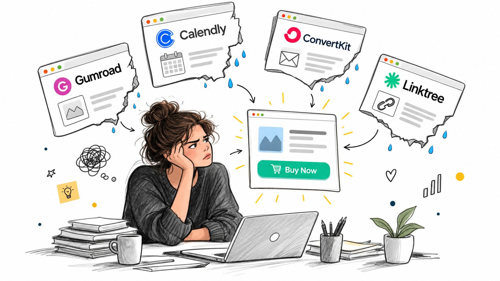
A disconnected stack makes you pay for every handoff. The buyer clicks from a social profile to a link page, then to a product page, then to checkout, then to a delivery system, while your email capture and booking calendar operate somewhere else.
That structure creates operational work without creating more value. Keep the customer on one creator storefront where the product block, checkout, booking option, email form, and delivery experience belong to the same page.
Configure the page in selling order
Start with the parts that affect a purchase. Don't spend the first afternoon adjusting decorative details.
- Profile and promise: Use a recognizable image and one sentence that states who you help and what changes.
- Featured offer: Pin the product that represents your strongest current solution.
- Supporting action: Add a related service, booking option, or smaller product beneath it.
- Email capture: Offer a useful mini-resource instead of asking people to subscribe for vague updates.
- FAQ: Answer delivery, usage rights, support, and refund questions in plain language.
- Thank-you experience: Deliver the file immediately and point buyers toward the most relevant next action.
The page should work on a phone without requiring visitors to hunt for the buy button. Use previews that show the product in context. A template seller can show a completed page, not just a blank grid. A course creator can show the lesson map and a short sample. A consultant can show the booking outcome and preparation process.
Replace handoffs with one useful flow
A consolidated page doesn't eliminate every specialist tool. It gives you a default operating model. If a dedicated learning system becomes necessary later, add it because the product requires it, not because your page looks incomplete without one.
The platform choice should account for checkout, file delivery, scheduling, email ownership, analytics, taxes, and privacy. This guide to the best platform to sell digital products is useful when comparing those requirements.
Keep launch configuration deliberately plain. A clear headline, a visible product, working payment, instant delivery, and a functioning email form will teach you more than a polished page that isn't live.
Preparing Files, Delivery, and the Boring Stuff That Wins
Customers forgive a plain sales page faster than they forgive a missing file. A good product can still generate refund requests if the download fails, the instructions are buried, or the buyer can't tell what they're allowed to do.
Treat delivery as part of the product. The purchase is complete only when the customer can access the file, understand the first step, and get help without starting a support conversation from scratch.
Run the pre-launch checklist
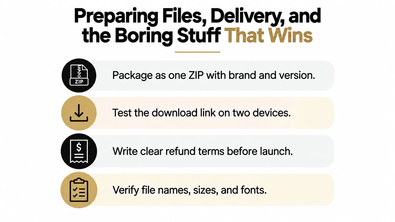
- Package cleanly: Put related files in one ZIP with your brand and version information in the filename.
- Test on real devices: Download and open the product on a phone, a Mac, and a PC before launch.
- Include a start guide: Add a short PDF that explains what the buyer received, where to begin, and how to get support.
- Use controlled access: Prefer signed or expiring delivery links over an openly shared folder.
- State the refund policy: Put the policy on the checkout page, not only in an account area or delivery email.
- Check every asset: Verify filenames, fonts, links, permissions, and file sizes.
- Test the full journey: Make a real end-to-end purchase and inspect the payment confirmation, download, inbox, and thank-you page.
Your delivery email should be useful even if the buyer never opens the ZIP immediately. Tell them what to do first and explain the expected result. That reduces uncertainty and gives support requests a clear starting point.
The guide to delivering digital products can help you think through the operational side, but the principle is simple. Make access immediate, instructions visible, and policies understandable.
Add a follow-up message after the purchase. Ask whether the buyer got access, point them to the first action, and invite a specific question. That message improves product usage and gives you better information than a generic request for feedback.
Marketing Your Digital Products on One Page
A storefront isn't a billboard you publish once. It's the shop window your audience sees repeatedly, so keep changing the angle while keeping the destination stable.
Use content to demonstrate the problem your product solves. Show a before-and-after workflow, explain one part of your method, critique a common mistake, or walk through a small piece of the finished asset. The content should create recognition first. The sales page can handle the full pitch.
Build a repeatable rhythm
A simple routine beats a complicated campaign you abandon.
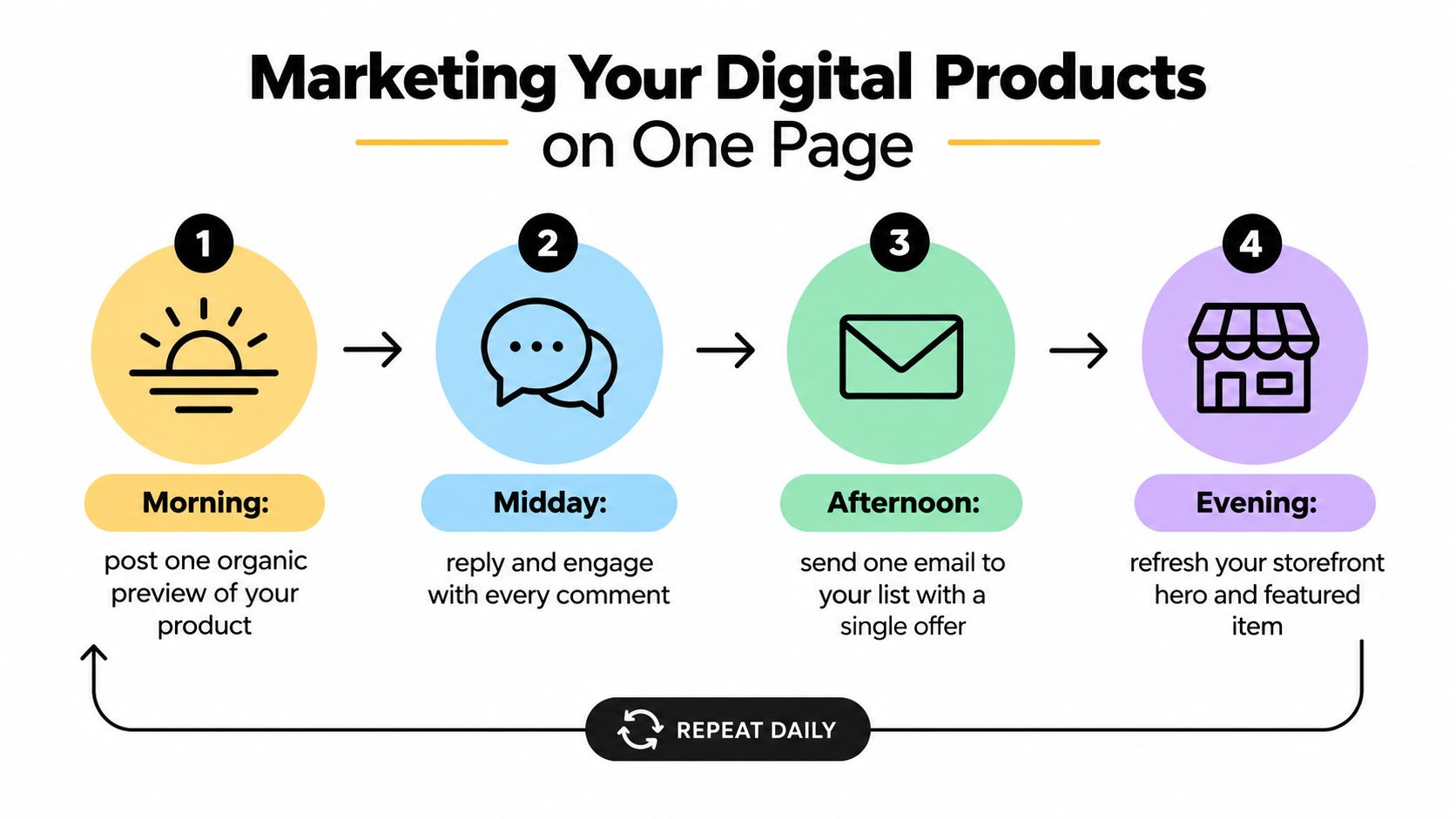
- Morning: Publish one useful preview that leads to the specific product block.
- Midday: Reply to comments and collect the language people use to describe their problem.
- Afternoon: Send an email with one story, one practical insight, and one offer.
- Evening: Refresh the featured image, opening line, or supporting proof on the storefront.
Email matters because social reach is rented. Your signup form should promise a useful asset or insight, then your messages should continue the same conversation. For ideas on building a more consistent list, use these practical email marketing tactics.
Do not send every visitor to your general homepage. If a post discusses a specific workflow, link directly to the product that resolves that workflow. Fewer choices usually make the next action easier.
Add paid promotion after the message works
Paid traffic magnifies a clear offer and an unclear one. Start only after organic content shows that people understand the problem and click through to the right page. Then retarget warm visitors with an ad that answers the objection they didn't resolve on the first visit.
Use distinct tracking labels for social posts, emails, partnerships, and advertisements. Compare purchases, not just clicks. A post with fewer visitors may produce better customers if it sends people who already understand the offer.
The guide to marketing digital products can help you extend this system, but keep the operating rule intact: one creator, one page, one clear offer per campaign. The page should change when buyer language changes, not whenever you feel pressure to redesign.
Analytics and Optimization for Solo Creators
Most creators don't need another dashboard. They need a short weekly view that identifies whether the problem is traffic, the offer, or the checkout.
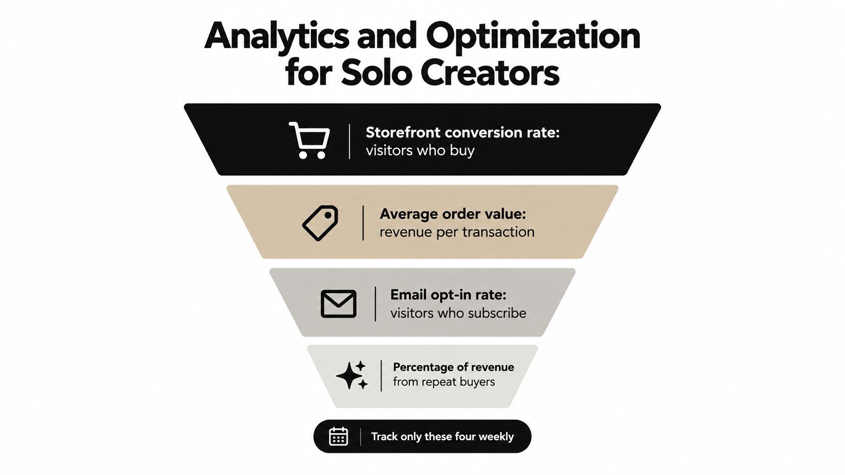
Track these four numbers:
- Storefront conversion rate: The share of visitors who purchase.
- Average order value: The revenue produced by each transaction.
- Email opt-in rate: The share of visitors who join your audience.
- Repeat-buyer revenue: The portion of revenue coming from existing customers rather than first-time buyers.
A benchmark across large landing-page datasets reports a 6.6% median conversion rate, with top performers reaching 10% or higher. It also reports that dynamic or personalized pages can produce a 37.9% relative improvement over static pages. The same benchmark identifies mobile conversion at 1% to 3%, compared with 3% to 5% on desktop. Review the sales funnel conversion benchmark for the source and context.
Ignore the numbers that flatter you
Follower count doesn't tell you whether the offer is understood. Page views don't tell you whether the right people arrived. Video plays can rise while sales remain unchanged.
If traffic is weak, improve distribution and content relevance. If traffic is healthy but conversion is weak, rewrite the offer page, preview, price presentation, or proof. If buyers begin checkout but don't finish, inspect payment friction, mobile layout, refund language, and delivery clarity.
A creator with strong traffic and a 0.8% conversion rate should test the offer page before buying more reach. That example uses the benchmark's conversion context, but the diagnosis is the important part. More visitors won't repair a page that fails to make the product feel specific and safe to buy.
Use one test per week
On Monday, record the four core numbers. Identify the weakest stage and choose one change. By Wednesday, publish the test. On Friday, review what changed and decide whether to keep it, reverse it, or test a related variable.
Keep the experiment narrow. Change the headline without changing the price. Improve the product preview without rewriting the entire page. Add a clearer delivery explanation without introducing another offer.
A consolidated storefront makes this review practical because purchases, signups, bookings, and page interactions share one destination. taap.bio offers a single-page creator store with digital product checkout and delivery, paid bookings, email capture, and widget-level analytics. Visit taap.bio to put your first offer, audience capture, and next action on one page instead of stitching together separate tools.