Most advice on how to sell digital products starts with choosing a niche, creating a polished product, and driving more traffic. That order is backwards. A strong product can't recover revenue lost when a visitor moves from a social profile to a link page, then to a separate storefront, then to another checkout, and finally to an email form that opens somewhere else.
The modern creator business is often less constrained by ideas than by audience concentration and conversion friction. Smaller creators can compete with larger accounts when they shorten the path from discovery to payment, capture the visitor before attention disappears, and make the purchase feel immediate. The opportunity is substantial: the global digital goods market was valued at USD 124.32 billion in 2025 and is projected to reach USD 511.43 billion by 2031, according to Mordor Intelligence's digital goods market report.
Table of contents
Why Digital Products Fail to Convert
A strong product can still lose sales before the buyer reaches checkout. Confusing offers, scattered tools, repeated forms, and off-page redirects each create another chance for hesitation, distraction, or technical failure. The hidden cost is not only a lower conversion rate. It is wasted acquisition spend and weaker unit economics.
That problem matters in a creator economy where reach is uneven. The IAB projects U.S. creator ad spend to reach $44 billion in 2026, while estimating the global creator economy at $252.3 billion in 2025. Industry reporting in the IAB's 2025 creator economy ad spend strategy report says the top 10% of creators captured 62% of ad revenue on one platform in 2025, and the top 1% earned 21% of payments. Smaller creators can still build profitable businesses, but broad exposure alone leaves too much revenue dependent on a fragile path from attention to payment.
A smaller, well-directed audience can outperform a larger account when the buyer reaches a clear offer quickly. The practical advantage comes from fewer decisions and a shorter route to purchase, not from adding another automation tool.
Practical rule: Treat every redirect between attention and payment as a conversion liability until your data proves otherwise.
Traffic isn't the same as demand
Traffic becomes demand only when visitors take a measurable next step. A social post may earn views, likes, and comments, yet produce little revenue when the profile link opens a directory filled with unrelated destinations.
Use a focused sequence:
- Discovery: A post, video, podcast, or collaboration creates interest.
- Decision: One relevant page presents the next action.
- Transaction: The buyer pays without being pushed into another context.
- Retention: The seller captures permission to continue the relationship.
The conversion optimization tips for reducing checkout friction apply to the entire path, not only the product page. A polished sales page cannot compensate for a checkout that asks buyers to repeat information, opens a new tab, or hides the final cost.
Consolidation is a strategic decision
A single link-in-bio page can serve as a compact storefront when it combines product blocks, email capture, bookings, and payment. Keeping these functions together gives the buyer one branded environment and limits the number of decisions between intent and completion.
Audit the path from a phone. Open your profile link, select a product, attempt checkout, subscribe to the list, and request a booking. Record every redirect, loading delay, duplicated form, and point where the visitor must decide what to do next.
The highest-impact fix is often deleting steps rather than adding software. Consolidating the storefront, checkout, and email capture into one page makes each visit easier to measure and gives more of the acquired attention a chance to become revenue.
Designing and Packaging High-Value Digital Offers
The product format should follow the problem, not the other way around. A static ebook can work when the buyer wants a reference, but it's a weak choice when the buyer needs a repeatable workflow, a current resource, or hands-on support.
Recent digital-sales trend coverage points toward personal, authentic, niche-specific, and immediately usable offers. One industry report says 73% of buyers prioritize immediate usability over brand reputation, and reports that niche-specific tools can outperform generic products by 4.2x revenue. These claims appear in the Digital Sales 2025 trend report, and the implication is practical: build something a defined buyer can use today.

Start with the workflow
Write the buyer's job before naming the product. “Learn marketing” is too broad. “Plan a week of short-form content without opening a blank document” describes a job with a visible outcome.
Use this sequence:
- Name the user: Identify the role, experience level, and situation.
- Define the recurring pain: Find the task that consumes time or creates uncertainty.
- Specify the first-use moment: Decide what the buyer should be able to do immediately after access.
- Remove unnecessary teaching: Include only the explanation needed to produce the outcome.
- Add an example: Show a completed version, not only a blank template.
Templates, swipe files, calculators, prompt libraries, presets, and checklists often work well because they compress effort. AI-assisted assets can add value when they include tested workflows, editing guidance, and quality controls. A folder of generic prompts isn't a defensible offer. A specialized system that helps a particular buyer produce a consistent result is.
For interface-heavy products, reviewing product design best practices can help you improve hierarchy, onboarding, instructions, and usability before you publish.
Build a product ladder
A product ladder gives buyers a logical next step without forcing every customer into the same offer. Keep the progression tied to increasing utility:
- Entry offer: A focused template, short guide, or small asset that solves one narrow problem.
- Core offer: A more complete toolkit, course, or collection that addresses the broader workflow.
- Recurring offer: A membership, update library, subscription, or ongoing resource that remains useful as the buyer's needs change.
- High-touch offer: A paid booking, review, consultation, or implementation session.
The recurring tier deserves careful design. Buyers won't stay subscribed for access to an abandoned folder. They stay for useful updates, fresh assets, accountability, or continuing access to a system that supports their work.
Pricing should reflect perceived value, implementation effort, and ongoing maintenance. Test whether customers need a one-time purchase or whether the problem naturally repeats. Use digital product pricing strategy to pressure-test the relationship between price, packaging, and buyer expectations.
Designing a Frictionless Storefront and Checkout Flow
Checkout is where interest becomes revenue, and it's also where many digital businesses leak the most. Baymard reports a global cart abandonment rate of 70.19% and estimates that resolving checkout usability issues alone could raise conversion by 35.26% for an average large ecommerce site, as detailed in its checkout usability research.
Those figures don't prove that every creator will achieve the same lift. They do establish the scale of the problem. If roughly seven in ten shoppers leave before purchasing, polishing a product thumbnail while ignoring payment flow is poor prioritization.
Instrument the actual funnel
Track the path as four events:
- Checkout start: The visitor opens the payment interface.
- Payment attempt: The visitor submits payment details.
- Authorization result: The payment provider accepts or rejects the transaction.
- Confirmed order: The system records a completed purchase and delivers the product.
Then segment those events by device, market, currency, and payment method. If mobile visitors start checkout but fail at authorization, the problem may involve payment support or form behavior. If buyers disappear before payment, the offer, price presentation, or required fields deserve attention.
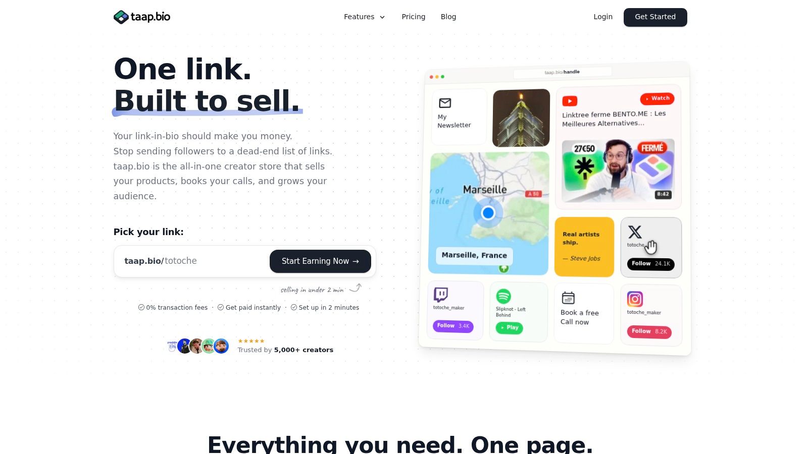
A one-page storefront works because it reduces context switching. The product description, proof, payment widget, email capture, and booking option can remain in one controlled environment. An integrated link-in-bio store such as taap.bio supports a drag-and-drop bento layout, built-in checkout, instant digital delivery, paid bookings, email signup, and widget-level analytics. Use it as one possible consolidation model, not as a substitute for testing your own funnel.
Reviewing a practical Grumspot checkout optimization guide can also help you identify common issues involving form design, payment friction, and unnecessary checkout steps.
Put the right blocks above the fold
Your first screen should answer three questions:
- What is this?
- Who is it for?
- What should I do next?
Place the primary product or booking action first. Put supporting content below it, including a short demonstration, a sample page, a preview image, frequently asked questions, and related offers. Don't bury the payment button beneath a long personal biography.
Instant file delivery matters because the buyer's motivation peaks immediately after payment. The system should confirm the transaction, explain where the product is located, and provide access without making the customer search through email or revisit the page.
For a deeper explanation of the mechanics, see what is one-page checkout.
The following video is useful when you're evaluating how a compact creator storefront can organize products, content, and actions in one place.
Capturing Emails and Automating the Sales Funnel
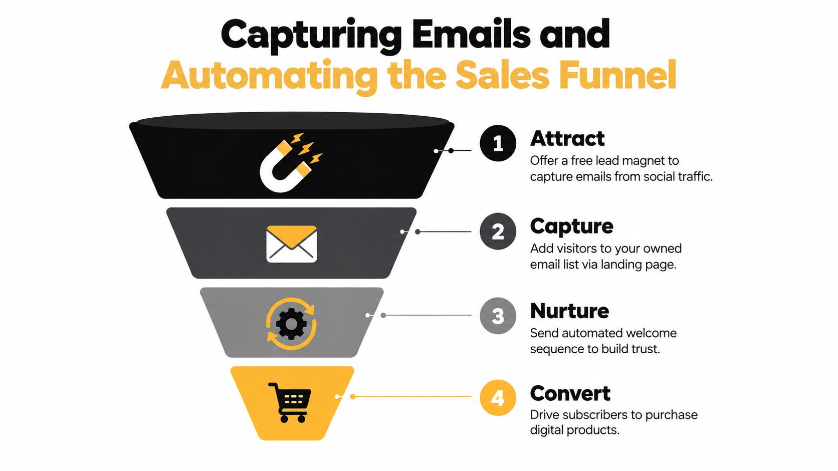
Social reach is rented attention. An email list gives you a permission-based channel that doesn't depend on a platform algorithm or a visitor remembering your username.
The strongest funnel starts with a useful lead magnet, not a generic “join my newsletter” box. Offer a small version of the paid outcome, such as a checklist, diagnostic, sample template, calculator, or short lesson. The free asset should attract the same person who would buy the core product. High subscriber volume from the wrong audience creates an impressive list and disappointing sales.
Use benchmarks as diagnostic ranges
Industry guidance for digital-product funnels suggests these working ranges:
| Funnel stage | Reference benchmark |
|---|---|
| Dedicated landing-page opt-in | 20% to 40% |
| Blog pop-up opt-in | 2% to 5% |
| Tripwire purchase from subscribers | 5% to 10% |
| Core-product purchase from subscribers | 2% to 5% |
| Upsell purchase from buyers | 10% to 25% |
| First nurture email open rate | 30% to 50% |
| Later nurture email open rate | 20% to 35% |
| Healthy email click-through rate | 3% to 5% |
These ranges come from SendOwl's digital-product sales funnel guidance. They aren't promises. Use them to locate the weak stage. A landing page below its reference range may need a sharper promise, while healthy opens and weak clicks point to message relevance or call-to-action problems.
Build the sequence around buyer intent
A useful welcome sequence earns the next email. Start by delivering the lead magnet and explaining how to use it. Follow with a specific mistake or missed opportunity, then demonstrate the improved workflow. Present the paid product only after the reader understands why the problem persists and how your method addresses it.
Segment subscribers according to behavior:
- New lead: Receives orientation and the promised free resource.
- Engaged lead: Clicks on a related topic and receives deeper educational content.
- Buyer: Gets onboarding, usage guidance, and a logical next offer.
- Inactive contact: Receives a re-engagement message rather than endless promotions.
A simple funnel model makes the economics visible. If you capture 100 subscribers, apply the stated reference ranges to estimate possible tripwire, core-product, and upsell outcomes. Don't multiply every benchmark blindly. Your audience, offer, price, traffic source, and message quality determine the actual result.
Use an on-page signup widget when possible. Sending a visitor to a separate email platform adds another handoff at precisely the moment you want permission. Once the list grows, export and segment contacts so you aren't trapped inside one vendor. For a practical implementation sequence, consult how to create a sales funnel.
Optimizing for Mobile Buyers and Global Compliance
A mobile buyer should reach the offer, understand it, and pay without leaving the page. Tool sprawl and off-page redirects weaken that path. A separate storefront, checkout, and email form create extra taps, slower loads, fragmented tracking, and more chances to abandon. Consolidating those jobs into one link-in-bio page gives creators a shorter route from discovery to purchase or signup.
Use the market context as a reason to prioritize mobile, not as a reason to copy a desktop layout. Smartphones and tablets accounted for 62.10% of digital goods market share in 2025, while subscriptions represented 56.20%. North America held 32.40% of revenue share in 2025, and Asia-Pacific is projected to record a 26.9% CAGR through 2031, according to Mordor Intelligence's market analysis.
Make small screens do less work
Test the complete purchase journey on a phone, starting from the link in your profile. Confirm that the first offer appears quickly, the price and deliverables are easy to find, and the checkout fields follow a sensible order. Keep product, payment, and email capture on the same page where possible. Remove decorative blocks and redirects that push the transaction out of view.
Use concise product copy:
- Outcome: State what the buyer will accomplish.
- Contents: List the files, lessons, or access included.
- Use case: Explain when the buyer should use it.
- Delivery: Tell them how and when access arrives.
- Next action: Give one prominent purchase or signup button.
Review authorization failures by device and market. If one payment method fails repeatedly for a specific group, fix that path before adding more options. The Quikly guide to increasing mobile conversions without eroding margins provides useful context for improving mobile usability while protecting margins. Conversion gains should come from removing effort, not automatically discounting the offer.
Treat privacy as part of the experience
Global selling creates data responsibilities even when the product is intangible. Collect only the information required to deliver the product or follow up with permission. Explain the purpose, link to an accessible privacy policy, and give subscribers a clear way to manage preferences.
Analytics should answer specific business questions without loading unrelated scripts. Track visits, product interactions, checkout starts, completed purchases, and email signups with tools that fit your legal obligations. Third-party tracking can slow the page and complicate consent notices. Lightweight, cookie-conscious analytics can reduce both performance and administration problems.
GDPR-friendly hosting and zero-cookie analytics do not replace legal review. Document vendors, retention practices, consent choices, and customer-access procedures before traffic expands across borders. A single page can simplify the technical path, but compliance still depends on how data is collected, stored, and used.
Scaling Revenue by Consolidating Your Tech Stack
Tool sprawl rarely appears as one dramatic expense. It arrives as a link page, a storefront, an email platform, a scheduling system, a website builder, an analytics product, and separate integrations that each demand maintenance. The result is more than a software bill. Every handoff adds setup work, data fragmentation, and another place where the buyer can leave.
A consolidated stack changes the unit economics. Instead of paying platform fees on each sale across several services, you can evaluate a flat-rate system that combines storefront, checkout, bookings, email capture, and analytics. The important comparison isn't the headline subscription alone. It's the subscription plus transaction charges, integration costs, support time, failed payments, and the revenue lost through redirects.
Audit the stack before replacing it
Export your last billing cycle and classify every tool by job. Then document which tools share customer data, which require manual updates, and which sit directly in the purchase path. A tool that costs little but causes regular checkout failures may be more expensive than its invoice suggests.
| Tool Category | Traditional Fragmented Stack | Consolidated Link-in-Bio Store |
|---|---|---|
| Profile and storefront | Linktree plus a separate website or storefront | One bento-style public page |
| Digital checkout | Gumroad or another standalone checkout | Built-in product payment block |
| Email capture | Mailchimp form and integration | On-page signup widget with contact export |
| Paid scheduling | Calendly plus a payment connection | On-page calendar with upfront payment |
| Analytics | Plausible or multiple scripts | Widget-level analytics in the same dashboard |
| Maintenance | Several logins, integrations, and billing cycles | One dashboard and one public flow |
The comparison doesn't mean every creator should abandon specialized software. A complex course business may need dedicated learning infrastructure, and an established brand may require custom ecommerce functionality. Consolidation makes the most sense when your current stack serves a modest catalog and your biggest issue is fragmented attention.
For creators evaluating an all-in-one business platform, the migration plan is straightforward. List your active offers, recreate the primary product and email action first, test the full mobile checkout, then move bookings and analytics after the core transaction works. Keep the old links available during the transition, and inspect every campaign bio, profile, and email footer before switching traffic.
Don't optimize for the most tools. Optimize for the shortest reliable path from attention to payment, ownership of your audience, and a cost structure you can explain per sale.
taap.bio combines a link-in-bio storefront, built-in checkout, instant digital delivery, paid bookings, email capture, and analytics in one drag-and-drop page, with 0% platform fees on sales and a $19/month plan after a 14-day trial, as stated in the publisher's product information. Visit taap.bio to replace unnecessary redirects and test a consolidated sales path for your digital products.