

You post a strong Reel, TikTok, or YouTube Short. People get curious. They tap your profile, hit your bio link, and land on a page that looks like a spare parts list.
That's where momentum dies.
A lot of creators still treat the bio page like storage. One button for YouTube. One for a store. One for a newsletter. Maybe one for bookings. It functions, but it doesn't carry the energy of the content that got the click in the first place. A good link in bio video setup fixes that by turning the page into part of the viewing experience instead of a dead-end menu.
Table of contents
Beyond the Link List Why Video is Your New Superpower
Most creators don't have a traffic problem. They have a continuity problem.
Someone watches a short video, likes the tone, wants more, and then gets sent to a generic stack of links. That jump feels small on paper, but in practice it breaks intent. The visitor has to remember what they wanted, scan options, and decide where to go next. Every extra choice gives them another chance to leave.
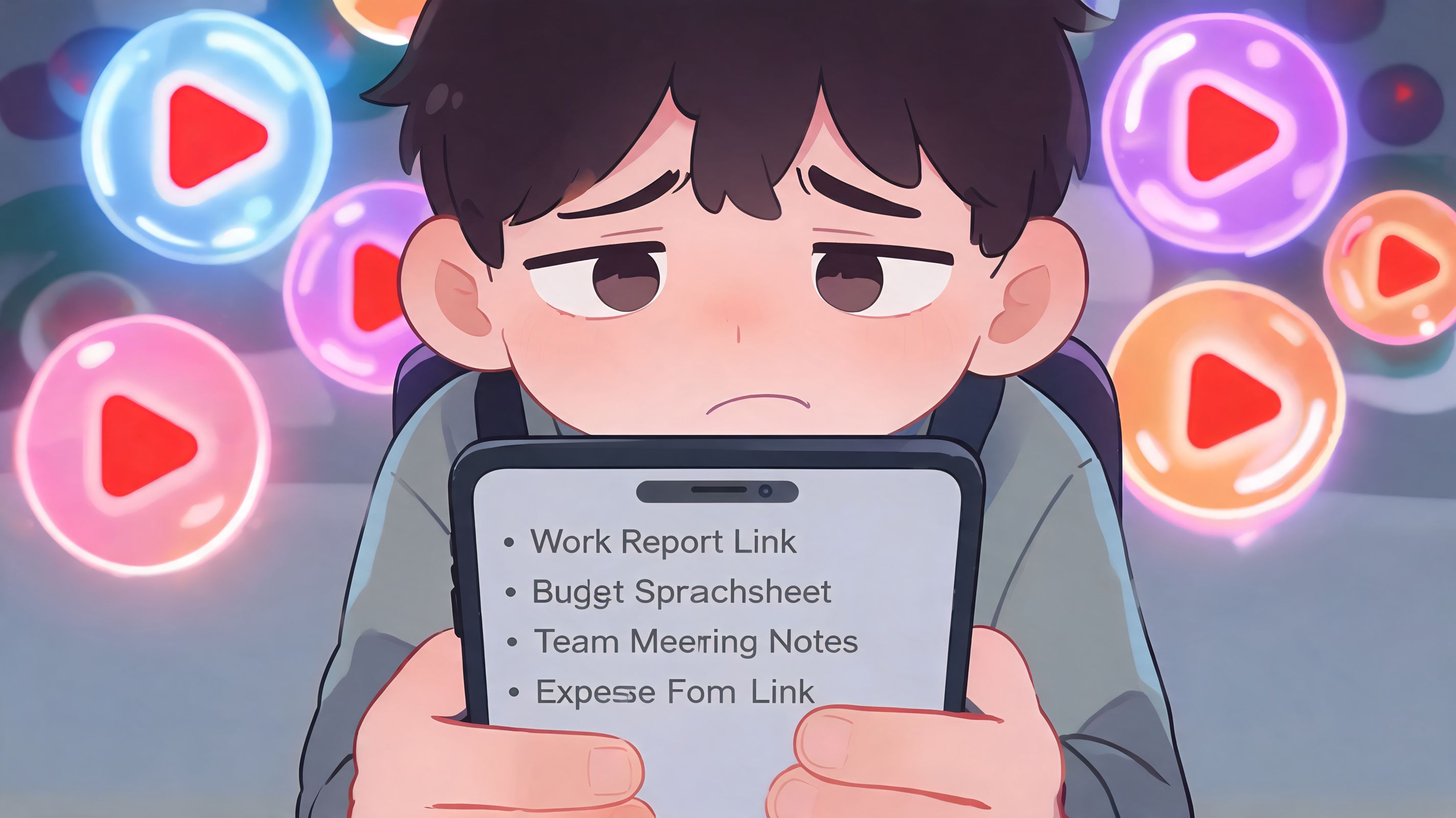
That's why the old “list of links” model is wearing out. It was built for navigation, not persuasion.
The basic link page isn't enough anymore
The wider creator market already treats link-in-bio tools as standard infrastructure. 82% of content creators use link-in-bio solutions as of 2025, up 23% from 2023, and 77% of users have fewer than 5,000 followers, which shows this isn't just for big accounts or celebrity creators (InfluenceFlow's 2025 guide to Instagram link-in-bio tools).
That stat matters for one reason. If nearly everyone has a link-in-bio page, then the plain version no longer stands out.
A static list is the minimum. A video-first page is the upgrade.
What video changes on the page
Embedded video does something a text button can't. It lets the visitor keep consuming before they commit.
Instead of asking them to click away to another platform, you can let them watch a teaser, a tutorial clip, a testimonial, a product demo, or a welcome video right there on the page. That lowers friction and makes the page feel like a continuation of your content, not a redirect hub.
Practical rule: If the click came from video, the landing experience should still feel like video.
That matters even more for smaller creators. If you're still building trust, a live video block can do the work that a plain “About me” button rarely does. It shows voice, style, delivery, and credibility in seconds.
A strong bio page now has a different job. It shouldn't just answer “where can I click?” It should answer “why should I stay?” If you need a refresher on how creators use this space strategically, this explanation of link in bio meaning is a useful starting point.
Here's the shift:
| Old page | Video-first page |
|---|---|
| Lists destinations | Extends the content experience |
| Forces more decisions upfront | Gives context before the next click |
| Looks interchangeable | Feels branded and specific |
| Sends traffic away immediately | Holds attention on-page |
The opportunity is simple. Almost everyone is using these tools now. Very few are making the page itself worth visiting.
Bringing Your Videos to Life on Your Page
There are two ways creators usually add video to a bio page.
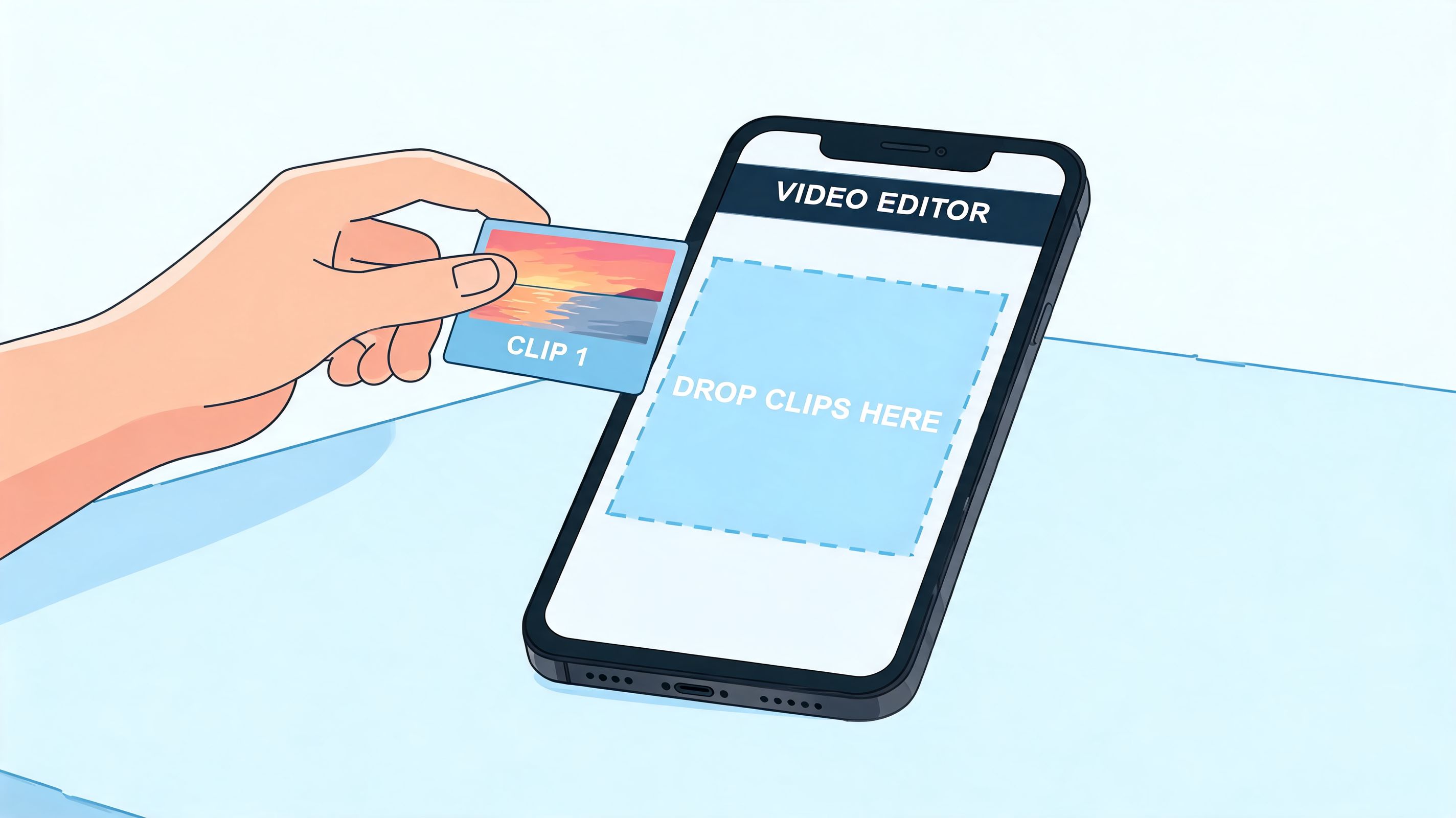
The first is the old method. Paste a YouTube or TikTok URL as a button and hope people click it. That works when someone is highly motivated, but it still asks them to leave your page before they've seen enough to care.
The second method is better. Put the video directly on the page so people can watch first and act second.
Why inline playback wins
The strongest argument for embedded video is simple user behavior. 68% of creators report higher engagement when users can watch content without leaving the page, and smart widgets boost time-on-page by 45% (YouTube research reference on live embeds and smart widgets).
That matches what creators see every day. If a visitor can sample your content instantly, they're more likely to stay long enough to click the next thing.
For anyone trying to increase top-of-funnel discovery before that click, Ascendly Marketing's guide for small businesses is a useful companion read because more profile visits only matter if the destination page keeps attention.
Three practical embed choices
Not every video block should do the same job. Choose the format based on intent.
One featured video
Use this when you want one clear outcome. A sales explainer, welcome message, launch trailer, or signature tutorial works well here.A recent feed widget
This is better for active creators who publish often and want the page to stay fresh without constant manual updates.A themed collection
Useful when your audience arrives with different needs. You might group product demos, client results, tutorials, or music releases.
A clean setup process
If you're building a video-first bio page, keep the build sequence tight:
- Pick your hero video first: Start with the clip that explains your offer, your content angle, or your value fastest.
- Match the source to the goal: YouTube works well for deeper education. TikTok fits fast, personality-driven clips.
- Place a CTA near the video: Don't make people hunt after they finish watching.
- Use a clear title above the embed: Visitors should know why this video matters before they hit play.
- Keep supporting links secondary: The video should lead. Extra destinations should support it, not compete with it.
A pasted link says “go somewhere else.” An embedded video says “start here.”
One practical option is a platform that supports live media blocks instead of only text buttons. For example, Taap.bio lets creators place YouTube and other live-content widgets directly on the page in a modular layout, which is a different approach from a standard vertical list. If you want the mechanics of adding video itself, this guide on embedding YouTube videos on a website covers the core setup logic.
Single video versus live feed
A single embed is stronger when you need focus. It's easier to control the narrative and pair it with one high-intent action such as book, buy, or subscribe.
A live feed is stronger when your content cadence is part of your proof. If you're a coach, musician, educator, or creator with frequent uploads, a live widget shows activity and range without extra maintenance.
Use the single-video format for campaigns. Use the live-feed format for brand depth. Most pages don't need both at the top.
Designing a Stunning Video-Centric Layout
Once video is on the page, layout becomes the conversion lever.
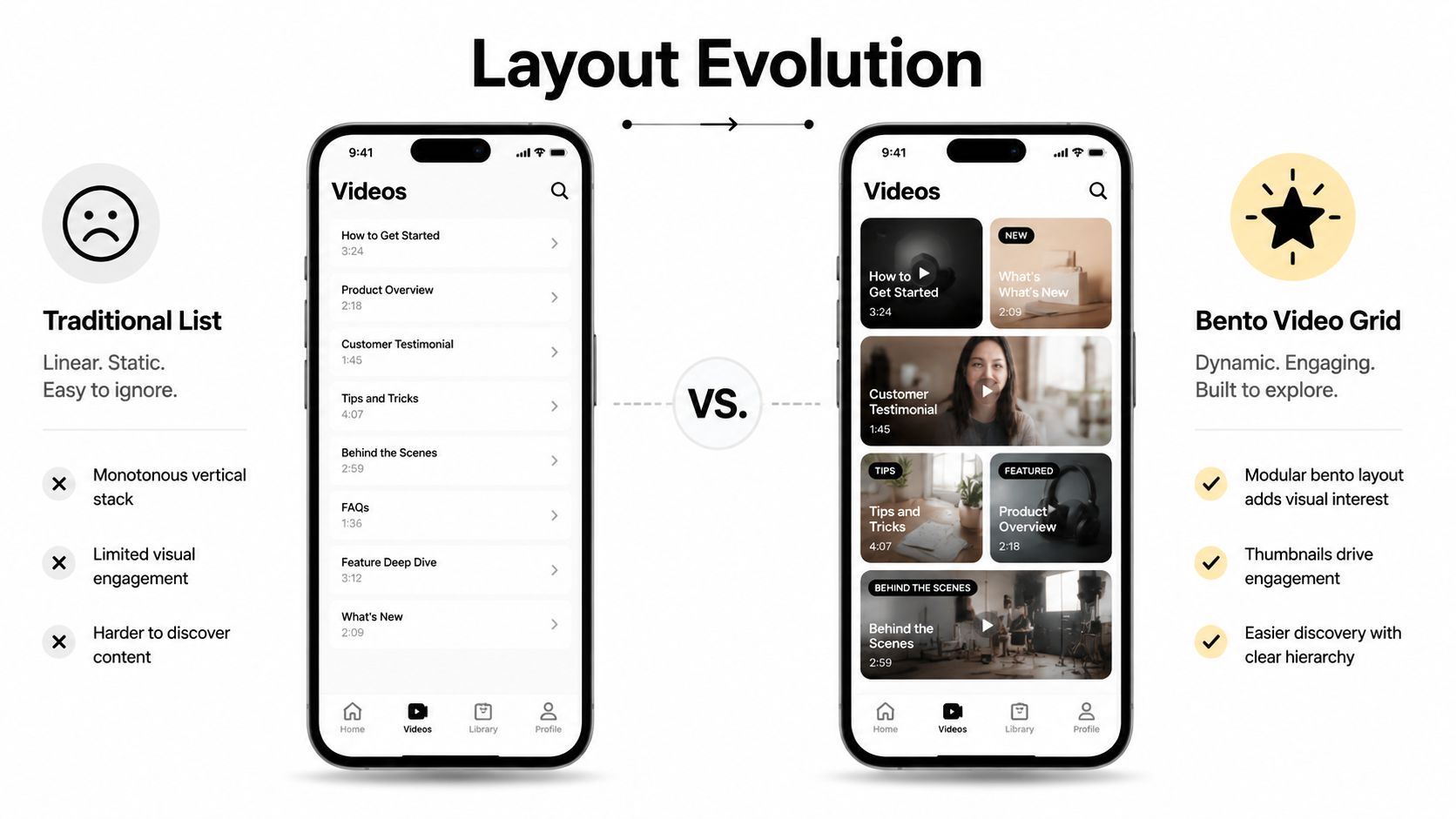
A lot of creators make the same mistake here. They add a video block, then arrange everything else like an old-school link list. The result is still functional, but it wastes the visual power of the content. A link in bio video page should guide the eye the way a storefront does.
Build one clear focal point
Your page needs a visual hierarchy. That starts with a hero block.
Make the most important video larger than everything around it. If you're launching a course, that might be the explainer. If you're a musician, it might be the newest release. If you're selling services, it might be a short results-focused intro or a testimonial clip.
Then surround it with supporting blocks that answer the visitor's next likely questions.
A simple arrangement often looks like this:
| Position | Block type | Purpose |
|---|---|---|
| Top center or top left | Hero video | Capture attention fast |
| Near hero | CTA button | Turn attention into action |
| Secondary row | More video thumbnails | Offer proof or depth |
| Lower section | Social proof or booking block | Reduce hesitation |
Think like a merchandiser, not a menu builder
The page shouldn't present every option equally. Equal sizing tells visitors that everything matters the same. That's almost never true.
Use size and placement to signal priority:
- Large block for the main video: This is your headline in visual form.
- Medium blocks for related proof: Tutorials, testimonials, demos, before-and-after content.
- Small utility blocks: Newsletter signup, store link, podcast, contact, or FAQ.
- Whitespace and spacing: These aren't decorative. They separate decisions.
Layout test: If you blur your page and squint, you should still be able to tell what the main action is.
This is why rigid vertical lists feel flat. They hide priority. A modular layout lets you create emphasis without relying only on wording. If you want to study that design approach more closely, this bento box web design guide is worth reviewing.
Mobile and desktop should not be treated the same
Creators often design on a laptop and assume it will feel fine on a phone. That's where strong pages lose performance.
A grid that looks balanced on desktop can become awkward on mobile if blocks stack in the wrong order. On small screens, the visitor's thumb and attention span shape everything. The first screen has to answer three questions quickly:
- What is this page about?
- What should I watch first?
- What should I do next?
For mobile, prioritize vertical flow over symmetry. Keep the hero video high. Keep the CTA close. Push lower-priority blocks down, even if that means the mobile version isn't a perfect replica of desktop.
A practical arrangement that works
For most creators, this structure is strong without being cluttered:
- Top row: Headline, profile image or brand marker, hero video
- Second row: One CTA button and one proof block
- Third row: Two or three smaller video tiles
- Lower area: Booking, email capture, shop, or content archive
This layout feels active because it gives the visitor content to consume and an obvious action to take. That's the difference between a bio page that gets browsed and one that gets used.
Turning Video Views into Clicks and Conversions
A polished layout helps, but conversion lives or dies in the handoff between watching and acting.
Most link-in-bio pages still lose people in the same place. The visitor arrives interested, sees too many choices, and does nothing. The page doesn't feel broken. It just asks for one decision too many.
Where the drop-off happens
The friction is measurable. Average bio-link CTR sits around 2% to 3%, too many links can reduce clicks by 20% to 30%, and pages that use visual video embeds as the primary CTA while limiting links can achieve a 2.3x CTR uplift (CreatorFlow's analysis of bio links versus DM automation).
That doesn't mean every page should become minimal to the point of being empty. It means every extra option has to earn its place.
What to place next to a video
A video block without a nearby CTA often gets attention but not action. Pair the content with the next step that logically follows from that exact clip.
Here are pairings that tend to make sense:
- Tutorial video + product link: “Shop this setup” or “Get the template”
- Client testimonial + booking button: “Book a call”
- Course teaser + enrollment CTA: “Join the program”
- Music clip + streaming link: “Listen to the full release”
- Welcome video + email form: “Get weekly updates”
That pairing matters more than clever button copy. Relevance beats creativity.
If someone finishes a video and has to scan your page to figure out what to do, the page is already making conversion harder than it needs to be.
A tighter conversion structure
One of the simplest fixes is to reduce the number of competing exits and strengthen the first visible choice.
Try this page logic:
- Lead with one video that matches current campaign intent.
- Put one primary CTA immediately below or beside it.
- Keep supporting links visible but clearly secondary.
- Remove stale offers and duplicate destinations.
- Rewrite vague labels into action labels.
“Watch now” is clearer than “Content.”
“Book a strategy call” is clearer than “Work with me.”
“Get the exact links” is clearer than “Resources.”
If you want to refine that click path more effectively, this CTR improvement guide is a solid resource.
Settings that affect behavior
Not every video setting helps conversions. Some hurt more than they help.
| Setting | Use it when | Avoid it when |
|---|---|---|
| Autoplay | The clip is short and visually clear without sound | The visitor needs audio context immediately |
| Loop | The video is a teaser or motion-driven brand clip | The video is instructional and needs progression |
| Thumbnail headline | The promise needs to be obvious before play | The video itself already shows the value instantly |
| Multiple video tiles | You want browsing and discovery | You need one focused next step |
Autoplay can work well for short visual loops, especially for product shots, portfolio reels, or attention-grabbing teasers. It's less useful when the whole value sits in spoken explanation. In that case, use a clear thumbnail and a sharper headline instead.
The key is simple. Don't ask the visitor to decide between eight things after they've just watched one thing. Let the video create intent, then make the next step feel obvious.
Measuring Performance and Advanced Tactics
A video-first bio page isn't finished when it looks good. It's finished when the data tells you the visitor path is getting clearer over time.
That shift matters because the gap between a decent page and a strong one usually isn't design talent. It's iteration. Creators who improve these pages consistently treat them like active conversion assets, not profile accessories.
What to watch first
A practical review cycle starts with a short list of signals:
- Primary CTA clicks: This tells you whether the page is translating attention into action.
- Video engagement on-page: Which block earns interaction first.
- Drop-off patterns: Where visitors stop before they click.
- Retention indicators: Whether embedded media is holding attention long enough for a second action.
The benchmark worth paying attention to here is that optimized pages see a 34% conversion increase and a 51% retention uplift via live embeds. Placing the top video CTA first boosts engagement 15% to 30%, and 1/3 of users abandon pages without clear video CTAs (Liinks analysis of advanced link-in-bio performance).
That gives you a usable principle. Measure the first thing people see, the first thing they play, and the first thing they click.
A simple monthly testing rhythm
Don't rebuild the whole page every week. Make one meaningful change at a time.
A clean testing cycle looks like this:
| Month focus | What to test | What you're looking for |
|---|---|---|
| Order | Which block appears first | Better engagement on the top CTA |
| Creative | Thumbnail, headline, or cover text | Stronger interaction with the main video |
| Layout | Grid arrangement or block sizing | Less hesitation and cleaner scrolling behavior |
| Offer match | CTA paired to the featured video | More downstream actions |
If your Reels are a major traffic source, Influtics' breakdown of Reels performance data is helpful context for understanding what content is likely to create the strongest profile intent before the bio click happens.
Advanced uses that make the page work harder
Once the basics are in place, the best gains usually come from pairing video with the right business action.
A few combinations work especially well:
Welcome video plus email capture
Good for creators turning casual viewers into subscribers.Testimonial videos beside a booking block
Strong for coaches, consultants, and freelancers who sell trust before they sell time.Demo clips near a product block
Useful for templates, digital products, presets, or tools that need a fast explanation.Content feed beside a membership or community invite
Good when you need to show ongoing output before asking for commitment.
The page performs best when every video answers a doubt and every nearby CTA captures the confidence that follows.
Dashboards matter here. When you can see which video block gets tapped, which CTA gets ignored, and which arrangement keeps visitors around longer, your creative decisions stop being guesses. For creators managing several channels and offers, social media dashboard tools can make that review process much easier.
Keep the mindset simple. Publish. Observe. Adjust. Repeat.
If your current bio page still looks like a stack of exits, rebuild it into a destination. taap.bio gives creators one place to showcase content, sell digital products, book calls, collect emails, and present everything in a visual page that feels closer to a storefront than a link list.


