

In a crowded digital feed, a powerful quote needs more than just great words. It needs a stunning visual design to capture attention, stop the scroll, and connect with your audience. The days of plain text on a simple background are over; today, the most impactful messages are wrapped in compelling, shareable art. This is why mastering the creation of beautiful pictures of quotes is essential for anyone looking to build a memorable brand identity.
This guide is your ultimate resource for doing just that. We move beyond generic advice to give you a curated collection of ten distinct, eye-catching design styles. You will find everything from minimalist typography and nature-inspired overlays to animated motion graphics and bold, geometric patterns.
More importantly, we provide actionable tips and templates for each style. You’ll learn not just what to create, but how to implement these visuals effectively. We'll show you exactly how to integrate these designs into your Taap.bio page, transforming a basic link list into a dynamic, bento-style digital storefront that truly represents your brand. Get ready to turn your favorite words into visual masterpieces.
Table of contents
1. Minimalist Typography Over Gradient Backgrounds
This design style places clean, bold typography at the forefront, using a smooth gradient background to add depth and emotional resonance. The quote itself is the star, but the subtle shift in colors, from a soft two-tone fade to a vibrant multi-color blend, creates a powerful mood. This approach makes for some truly beautiful pictures of quotes by balancing simplicity with visual intrigue, ensuring the message lands with impact.
The magic of this style is its versatility. A warm-to-cool gradient can evoke a sense of transition or growth, while a bright, punchy one can feel energetic and optimistic. It’s a popular choice on platforms like Pinterest and within Canva’s template library because it’s modern, clean, and incredibly effective at grabbing attention without overwhelming the viewer.
How to Make It Work for You
To create a professional and accessible design, focus on a few key details.
- Prioritize Readability: Your text must be easy to read. Aim for a contrast ratio of at least 7:1 between your text and the lightest part of the gradient. This ensures your quote is legible for everyone.
- Mind Your Margins: Give your text room to breathe. Maintain at least a 15-20% margin of empty space around the edges of the image to create a balanced, uncluttered look.
- Test Across Modes: Check how your chosen gradient and text colors appear in both light and dark modes on different devices. What looks great on one screen might be hard to see on another.
- Font Pairing: Stick to one or two complementary font families. A bold, sans-serif font for the main words paired with a lighter-weight serif for secondary text often works well.
2. Nature & Scenic Photography with Text Overlay
This classic style pairs inspiring quotes with the raw beauty of the natural world. By overlaying text on high-quality photographs of landscapes, forests, oceans, or mountains, the visual metaphor of nature powerfully reinforces themes of growth, resilience, and peace. The key is to position the text thoughtfully so it complements the composition without obscuring its most captivating elements, creating some of the most shared and beautiful pictures of quotes online.
The appeal of this style lies in its ability to ground an abstract idea in something tangible and universally understood. A quote about perseverance feels more potent when set against a rugged mountain peak, while a message of tranquility is deepened by an image of a calm forest. It’s a favorite for wellness influencers and environmental advocates because it connects profound words to the restorative power of nature.
How to Make It Work for You
Creating an impactful image with this method requires balancing the text and the photograph.
- Find High-Quality Imagery: Use royalty-free stock photo sites like Unsplash, Pexels, or Pixabay to find authentic and compelling nature shots. Avoid generic or low-resolution pictures.
- Ensure Text Readability: If the background is busy, add a subtle drop shadow to your text or place it within a semi-transparent box. This makes the words pop without ruining the photo.
- Choose the Right Font: A clean, modern sans-serif font often works best for a contemporary feel, while an elegant serif can add a touch of classicism. Keep the text to a few short lines for maximum impact.
- Harmonize Colors: Apply a subtle color filter or overlay to the entire image. This can help unify the colors of the photo and the text, making the final design look more cohesive and professional.
3. Hand-Lettered and Illustrated Calligraphy
This artistic approach swaps digital precision for a human touch, featuring custom hand-lettering and decorative illustrations. The style is defined by its organic, artisanal feel, using script fonts, brush strokes, and ornamental elements to create a quote that feels personal and authentic. From elegant calligraphy to playful watercolor designs, these beautiful pictures of quotes stand out with a warmth that computer-generated text often lacks.
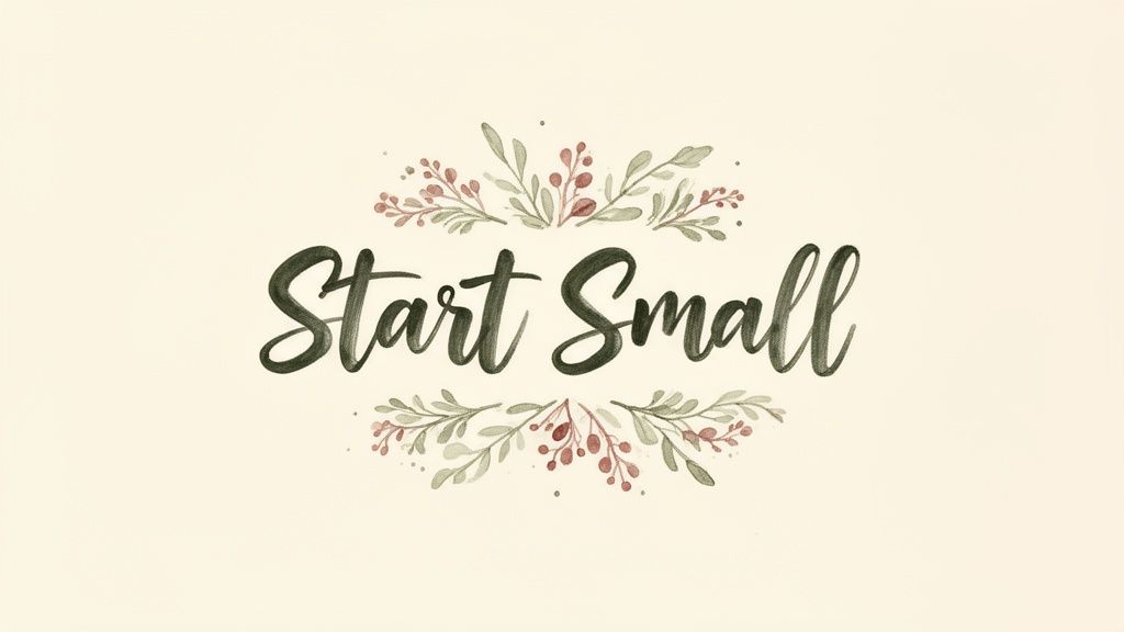
The charm of hand-lettering comes from its imperfections and personality. It’s a favorite among Etsy creators, wedding stationers, and Instagram artists like The Happy Ever Crafter because it connects with viewers on an emotional level. Incorporating botanical drawings, geometric borders, or simple ink textures around the text can turn a simple quote into a small piece of art, making the message more memorable and shareable.
How to Make It Work for You
To achieve a polished, artisanal look without sacrificing clarity, focus on balance and authenticity.
- Scan Physical Artwork: For a truly authentic effect, create your lettering on paper and scan it at a high resolution. This preserves the natural textures of the ink and paper.
- Balance Flourish with Readability: While decorative flourishes are key to this style, ensure they don't overpower the words. The main message should remain clear and easy to read at a glance.
- Keep Backgrounds Simple: A minimal background, such as a solid color or a subtle texture, allows the intricate lettering and illustrations to be the main focus.
- Hire an Artist: If DIY isn't your strength, consider commissioning a freelance lettering artist. This is a great way to showcase unique work, and you can display their art using a free online portfolio builder.
4. Geometric and Abstract Background Patterns
This style layers quotes over geometric shapes, abstract patterns, or minimalist line art to create visual interest through composition. Instead of a photograph, the background uses elements like grids, color blocks, or tessellations to build a modern and dynamic canvas. The result is a bold, contemporary aesthetic that feels intentional and design-forward, perfect for making a strong statement.

The appeal of this method lies in its structured creativity. It’s frequently seen in branding for design agencies, tech startups, and creators on Dribbble who want to project a polished and innovative image. These beautiful pictures of quotes stand out because their sharp lines and defined patterns guide the eye directly to the text, reinforcing the message with a sense of order and purpose.
How to Make It Work for You
To design a clean and effective geometric quote image, concentrate on balance and clarity.
- Limit Your Color Palette: Stick to three or four strategic colors plus black or white. This keeps the design from becoming chaotic and ensures the pattern complements, rather than competes with, the quote.
- Create Clear Focal Points: Position your text over a solid color block within the pattern or use a shape to frame the words. This technique dramatically improves readability against a busy background.
- Choose Cohesive Fonts: A clean, sans-serif font is an excellent choice as it matches the modern feel of geometric designs. This alignment creates a visually harmonious and professional look.
- Maintain Visual Hierarchy: Ensure the geometric elements serve the composition without distracting from the primary message. Use them to draw attention to the text, not away from it. To explore more ways to pair text with visuals, you can find further inspiration on how to create beautiful quotes on pictures.
5. Vintage and Retro Style with Typography
This approach taps into nostalgia by pairing quotes with design elements from past eras. It uses vintage color palettes like muted earth tones, distinctive typography from the 70s, 80s, or 90s, and textures like film grain or paper scuffs. The result is a quote image that feels authentic and grounded, evoking feelings of comfort, rebellion, or classic cool, depending on the decade referenced. This style produces beautiful pictures of quotes that feel both timeless and trendy.
The appeal of retro design is its strong cultural resonance. A bubbly, rounded font instantly recalls the 70s, while a neon-infused, geometric style points to the 80s. This aesthetic is powerful for brands like Urban Outfitters or indie creators aiming for an authentic, non-corporate feel. It connects the quote's message with a specific cultural mood, making it instantly relatable to audiences who appreciate a vintage vibe.
How to Make It Work for You
Creating a convincing retro look requires attention to period-specific details.
- Research Authentic Palettes: Don’t just guess at vintage colors. Look up real design examples from your target decade to find authentic color combinations. Muted mustards, oranges, and browns are great for a 70s look.
- Select Period-Appropriate Fonts: Use typefaces that define an era. Fonts like Raleway or Bebas Neue can work, but for true authenticity, explore font archives for typefaces popular in the 60s, 70s, or 80s.
- Use Texture Sparingly: Apply film grain, paper folds, or VHS-style static overlays to add a distressed quality. A light touch is more effective; too much texture can make the text unreadable.
- Check for Legibility: Vintage color palettes often have lower contrast. Always double-check that your quote is easy to read against the background, especially for viewers with visual impairments.
6. Inspirational Imagery with Silhouettes and Metaphors
This powerful technique pairs a quote with a silhouette or visual metaphor that reinforces its core message. The use of strong, identifiable shapes-like a person reaching for the stars, a bird taking flight, or a climber ascending a peak-adds a layer of immediate emotional depth. These beautiful pictures of quotes work because the imagery tells a story that complements and magnifies the text, creating a single, cohesive statement.
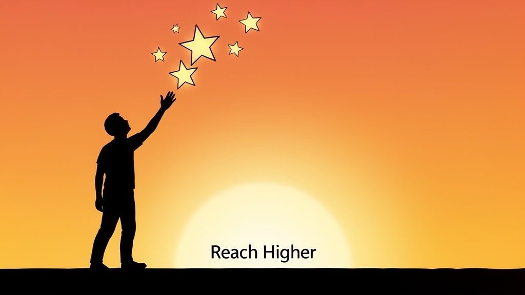
Popularized by motivational communities and LinkedIn thought leaders, this style excels at conveying aspiration and ambition. The anonymity of a silhouette allows viewers to project themselves onto the scene, making the message feel more personal and attainable. The visual metaphor does the heavy lifting, quickly establishing a mood of perseverance, freedom, or connection before the viewer even finishes reading the quote.
How to Make It Work for You
To make your message resonate, the connection between the image and text must be clear and impactful.
- Align Image and Message: Select a silhouette that directly corresponds to the quote's meaning. A quote about growth could feature a small sapling, while one about teamwork might show hands coming together.
- Create High Contrast: Ensure your silhouette stands out sharply against the background. Dark shapes against bright, aspirational color schemes like sunrises or sky tones are particularly effective. For those particularly interested in a classic aesthetic, finding captivating vintage art prints can add unique character to your typography designs.
- Add Subtle Depth: Use layered silhouettes or faint shadows to give your design a more professional and less flat appearance. This small detail can make the scene feel more dynamic.
- Represent Inclusively: When using human figures, consider showing a variety of silhouettes to ensure your message feels universal and inclusive to a wider audience.
7. Color Blocking with Bold Typography
This technique creates some of the most dynamic and beautiful pictures of quotes by pairing bold, unapologetic typography with distinct geometric blocks of color. The design divides the canvas into 2-4 contrasting fields, often horizontally, vertically, or diagonally. The result is a high-energy composition that feels modern, organized, and impossible to ignore, drawing inspiration from contemporary branding and advertising campaigns.
The power of this style lies in its structured confidence. By assigning specific colors to different parts of the canvas, you create a visual hierarchy that guides the eye directly to the quote. It’s a favorite approach for brands like Spotify and tech startups because it communicates clarity and purpose. The sharp lines and vibrant hues make the quote feel intentional and impactful, perfect for messages about focus, action, or bold ideas.
How to Make It Work for You
To execute this style effectively, precision is your most important tool.
- Use Color Theory: Create a striking palette by using complementary (opposite on the color wheel), triadic (three evenly spaced colors), or analogous (next to each other) color schemes. Limit your selection to four colors, including black or white, to maintain clarity.
- Choose Strong Fonts: This style demands a font with personality. Opt for a heavy or bold sans-serif like Montserrat Bold or Futura Bold that can stand its ground against the strong background colors.
- Create Clear Divisions: Ensure your color blocks have sharp, clean edges. Avoid soft gradients or blended overlaps, as the design's strength comes from its well-defined geometric separation.
- Test for Readability: Check your design on both mobile and desktop screens. The high contrast should generally work well, but it's crucial to confirm that no part of the text becomes hard to read on smaller displays.
8. Double Exposure and Photographic Blending
This artistic technique blends two or more photographs to create a single, layered image, often with a quote overlaid. It’s known for its use of silhouettes, typically of a person, filled with evocative scenes like forests, cityscapes, or oceans. The result is a deeply metaphorical image where the quote, the person, and the environment are all connected, producing some of the most beautiful pictures of quotes with profound artistic depth.
The power of double exposure lies in its ability to visually represent complex emotions or ideas. A silhouette filled with a stormy sea can represent inner turmoil, while one filled with a sunlit forest might suggest growth and peace. This style is popular in high-end portrait photography, music album art, and on Instagram accounts that specialize in artistic imagery, as it creates a memorable and thought-provoking visual narrative.
How to Make It Work for You
Creating a compelling double exposure image requires a good eye for composition and meaning.
- Establish a Clear Silhouette: The primary subject, often a profile or full-body silhouette, must be distinct and recognizable against a simple background. This forms the "container" for your second image.
- Choose Complementary Images: Select images that reinforce each other’s meaning. For example, blending a portrait with a meaningful landscape can tell a story about that person’s connection to nature or their inner world.
- Master Blend Modes: In editing software like Photoshop, experiment with blend modes like Screen, Lighten, or Overlay to see how the layers interact. Adjusting the opacity of the top layer, usually to around 70-85%, helps find the right balance. You can get more ideas on combining images by exploring different collage apps for Instagram.
- Unify the Colors: Use color grading or a subtle filter to harmonize the colors of the different photos. This crucial step makes the separate elements feel like they belong together in one cohesive piece.
9. Neon and Dark Mode with Glowing Text Effects
This trendy, contemporary style captures an electric, vibrant appearance by setting neon-colored text against a deep, dark background. The design often employs radiant pinks, electric blues, and vivid purples, using blur and glow effects to simulate the luminous quality of a real neon sign. It’s a dynamic way to create beautiful pictures of quotes that feel modern and energetic, making it a favorite for gaming, music, and tech-focused brands.
The power of this aesthetic lies in its high-contrast, attention-grabbing nature. It creates an immediate sense of moodiness and excitement, perfect for nightlife promotion, esports team identities, or any brand wanting to project a futuristic, cyberpunk vibe. This style is especially effective on platforms where dark mode is prevalent, ensuring your message pops off the screen.
How to Make It Work for You
Creating an authentic neon look requires attention to detail to avoid a flat or unreadable final image.
- Use True Neon Colors: For an authentic glow, start with specific hex codes known for their neon appearance. Colors like
#00FF00(neon green) or#FF006E(neon pink) are excellent starting points. - Simulate the Glow: Apply a 10-20px blur effect to a duplicated text layer positioned behind your main text. This simple trick creates a realistic, soft glow that makes the letters appear luminous.
- Choose Futuristic Fonts: Your font choice is critical. Opt for futuristic or monospaced fonts like 'Orbitron' or 'Space Mono' to complete the high-tech aesthetic.
- Check Accessibility: While high contrast is a hallmark of this style, ensure your text-to-background contrast ratio is at least 7:1 for readability. This is key for creating content that works for everyone.
- Optimize for Social: This look is perfect for Instagram Stories. To ensure your design fits perfectly, review the most current Instagram Story specs before you finalize your image.
10. Animated GIF and Motion Graphics Quotes
This dynamic style takes beautiful pictures of quotes to the next level by incorporating motion and transitions. Instead of a static image, the quote comes to life as text animates sequentially, backgrounds subtly shift or pulse, and gradients flow. This approach uses GIFs or short video loops to create eye-catching compositions that are far more engaging than a simple picture, making them perfect for grabbing attention on busy social feeds like Instagram Stories or TikTok.
The power of motion is its ability to direct the viewer's focus and add emotional weight. A gentle fade-in can feel thoughtful and profound, while a quick, punchy text animation can be energetic and motivating. This technique is favored by modern design agencies and content creators because it stops the scroll and holds a viewer's attention for longer, making the message more memorable. For dynamic visual art, you can also learn how to animate images with AI to bring static pictures to life.
How to Make It Work for You
To create a polished and effective animated quote, focus on purposeful movement.
- Prioritize Purpose Over Motion: Every animation should serve a purpose, such as emphasizing a key word or guiding the eye. Avoid gratuitous motion that distracts from the quote itself.
- Optimize for Web: Export your animation as an optimized GIF or a short MP4 video. This ensures it loads quickly and plays smoothly on social media and link-in-bio pages without frustrating your audience.
- Design a Static Fallback: Ensure the very first frame of your animation is a complete, legible image of the quote. This way, it still works even in places where the animation doesn't autoplay.
- Keep It Subtle: Small, refined movements often have a greater impact than large, fast ones. Consider a slow-moving gradient, a gentle pulse effect, or a simple text reveal to add a touch of sophistication.
10-Style Quote Image Comparison
| Style | 🔄 Implementation Complexity | ⚡ Resource Requirements | ⭐ Expected Outcomes | 📊 Ideal Use Cases | 💡 Key Advantages / Tips |
|---|---|---|---|---|---|
| Minimalist Typography Over Gradient Backgrounds | Low — simple layouts, contrast checks | Low — fonts & basic editor | Professional, modern, versatile | Social posts, headers, mobile-first quotes | Maintain strong contrast; limit fonts; quick to produce |
| Nature & Scenic Photography with Text Overlay | Medium — careful placement and grading | Medium — high-res images, licensing | Emotional, shareable, authentic | Wellness, lifestyle, inspirational brands | Use royalty-free sources; add subtle filters; keep text short |
| Hand-Lettered and Illustrated Calligraphy | High — bespoke art or skilled designer | High — artist time, scanning/props | Distinctive, artisanal, high engagement | Creatives, designers, premium prints | Hire a letterer if needed; balance ornament and legibility |
| Geometric and Abstract Background Patterns | Medium — vector composition skills | Medium — Figma/Illustrator, vector assets | Contemporary, brandable, scalable | Tech, design agencies, portfolios | Limit palette; position text on solid blocks for readability |
| Vintage and Retro Style with Typography | Medium — authentic color/texture work | Low–Medium — fonts, texture packs | Nostalgic, personality-driven | Retro brands, lifestyle, niche markets | Research period palettes; test contrast and legibility |
| Inspirational Imagery with Silhouettes and Metaphors | Medium — conceptual composition | Medium — silhouette assets or shoots | Universally relatable, motivational | Coaches, speakers, motivational content | Choose meaningful silhouettes; ensure high contrast |
| Color Blocking with Bold Typography | Low — straightforward layout & type | Low — strong fonts, color swatches | Extremely eye-catching, modern | Branding, ads, social promos | Limit colors to 3–4; test combinations on mobile |
| Double Exposure and Photographic Blending | High — advanced photo editing | High — Photoshop skills, quality photos | Artistic, memorable, portfolio-worthy | Photographers, artists, album art | Use blend modes; keep main silhouette clear |
| Neon and Dark Mode with Glowing Text Effects | Medium — glow and contrast tuning | Low–Medium — color values, testing on dark | Trendy, high-impact for younger audiences | Music, gaming, tech, nightlife brands | Use specific neon values; ensure 7:1 contrast; test on devices |
| Animated GIF and Motion Graphics Quotes | High — animation skills and workflow | High — After Effects, larger file sizes | Higher engagement and attention | Stories, Reels, dynamic portfolios, ads | Keep motion subtle; optimize export; ensure readable first frame |
Assemble Your Masterpiece: From Quote Images to a Cohesive Brand Story on Taap.bio
You've just explored a full spectrum of styles, from the quiet confidence of minimalist typography to the dynamic energy of animated GIF quotes. This collection isn't just about finding a single pretty image; it's about building a visual vocabulary. The true power of these beautiful pictures of quotes is unlocked when they stop being individual posts and start working together to tell your unique brand story.
Think of your digital presence, especially your link-in-bio page, as a curated gallery. Each quote image is a piece of art that communicates a specific mood, value, or idea. The way you arrange them creates a narrative. A large, scenic photo quote at the top can establish an emotional anchor, while a series of clean, color-blocked text tiles can break down your core principles in a digestible format. You are no longer just sharing links; you are building an experience.
From Individual Images to a Cohesive Narrative
Mastering this approach means moving beyond random acts of content. It’s about intentional curation. Consider the journey you want your audience to take.
- Establish a Visual Hierarchy: Use a bold, high-impact style like a Double Exposure or a Neon Glow quote as a "hero" block on your Taap.bio page to immediately grab attention.
- Create Thematic Flow: Group related ideas using a consistent style. For example, use three minimalist quotes in a row to share a step-by-step process or a set of core beliefs.
- Inject Personality and Surprise: Punctuate a clean, professional grid with a hand-lettered or illustrated quote. This acts as a visual break and infuses your page with authentic, human character.
By thoughtfully combining these visual elements, your Taap.bio page transforms from a simple utility into a destination. It becomes a direct reflection of your brand's aesthetic and ethos. You're not just telling people what you do; you're showing them who you are through a carefully composed visual story. This is how you create a memorable impression that inspires connection and action, turning casual visitors into a dedicated community. The key is to see each quote image not as an endpoint, but as a building block for a much larger, more compelling masterpiece. Start assembling yours today.
Ready to turn your collection of beautiful pictures of quotes into a stunning, interactive landing page? taap.bio gives you the perfect bento-box canvas to arrange your visual story, showcase your links, and build a brand experience that captivates your audience. Start creating your free, visually-rich link-in-bio page at taap.bio and bring your brand's narrative to life.


